Muistiinpano
Tämän sivun käyttö edellyttää valtuutusta. Voit yrittää kirjautua sisään tai vaihtaa hakemistoa.
Tämän sivun käyttö edellyttää valtuutusta. Voit yrittää vaihtaa hakemistoa.
Great add-ins provide unique, compelling functionality that extend Office apps in visually appealing ways. To build a successful add-in, you'll need to create an engaging first-time user experience, design a polished UI, and optimize performance. Follow the best practices in this article to help your users complete tasks quickly and efficiently.
Note
If you plan to publish your add-in to Microsoft Marketplace and make it available within the Office experience, make sure that you conform to the Commercial marketplace certification policies. For example, to pass validation, your add-in must work across all platforms that support the methods that you define (for more information, see section 1120.3 and the Office Add-in application and availability page).
Provide clear value
Build add-ins that help users complete tasks quickly and efficiently. Focus on scenarios that make sense for Office apps, such as:
- Make core authoring tasks faster and easier with fewer interruptions.
- Enable new scenarios within Office.
- Embed complementary services within Office apps.
- Improve the Office experience to enhance productivity.
Make sure users understand your add-in's value immediately by creating an engaging first-run experience.
When you're ready to promote your add-in, learn how to create an effective Microsoft Marketplace listing.
- Make your add-in's benefits clear in the title and description. Don't rely only on your brand to communicate what your add-in does.
- Ensure your add-in provides sufficient value to justify users' investment. It shouldn't be just a simple utility or have limited scope.
- If your add-in targets larger organizations and enterprises, several Microsoft Marketplace requirements differ from those of a general commercial marketplace add-in. For more information, see the submission FAQ.
Create an engaging first-run experience
New users are still deciding whether to use or abandon your add-in after downloading it from the store. Here's how to win them over.
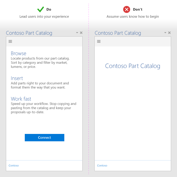
Make the next steps clear. Use videos, placemats, paging panels, or other resources to guide users through your add-in.
Lead with value, not registration. Reinforce your add-in's value proposition when it launches rather than immediately asking users to sign in.
Provide helpful guidance. Include teaching UI to guide users and make the experience feel personal.

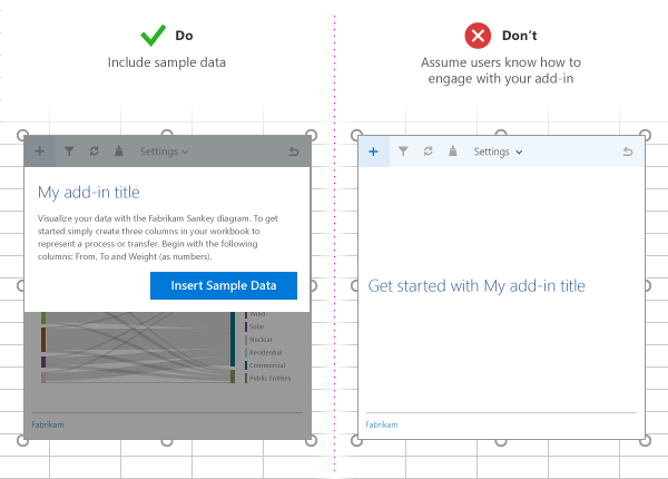
Show users what to expect. If your content add-in binds to data in the user's document, include sample data or a template to show users the expected data format.

Offer free trials. If your add-in requires a subscription, make some functionality available without one.
Simplify sign-up. Prefill information like email and display name, and skip email verifications when possible.
Avoid pop-ups. If you must use them, guide users on how to enable your pop-up window.
For patterns you can apply when developing your first-run experience, see UX design patterns for Office Add-ins.
Use add-in commands
Provide relevant UI entry points for your add-in by using add-in commands. These commands help users discover and access your add-in's functionality directly from the Office ribbon. For details and design best practices, see add-in commands.
Apply UX design principles
Follow these key principles to create add-ins that feel native to Office:
Match the Office experience. Ensure your add-in's look, feel, and functionality complement the Office experience. See Design the UI of Office Add-ins.
Prioritize content over chrome. Avoid unnecessary UI elements that don't add value to the user experience.
Keep users in control. Make sure users understand important decisions and can easily reverse actions your add-in performs.
Use branding thoughtfully. Inspire trust and help orient users, but don't overwhelm or advertise to them.
Minimize scrolling. Optimize for 1366 x 768 resolution.
Use licensed images only. Avoid legal and branding issues that come from unlicensed images.
Write clearly. Use clear and simple language in your add-in.
Design for accessibility. Make your add-in easy for all users to interact with and accommodate assistive technologies like screen readers. See our accessibility guidelines.
Support all platforms and input methods. Design for mouse/keyboard and touch. Ensure your UI responds well to different form factors.
Optimize for touch
Touch support is essential for modern Office add-ins.
Detect touch support. Use the Context.touchEnabled property to detect whether the Office app your add-in runs on is touch-enabled.
Note
This property isn't supported in Outlook.
Size controls appropriately. Make sure all controls work well with touch interaction. For example, buttons need adequate touch targets, and input boxes should be large enough for users to enter text easily.
Don't rely on hover or right-click. These input methods aren't available on touch devices.
Support both orientations. Ensure your add-in works in both portrait and landscape modes. Remember that on touch devices, the soft keyboard might hide part of your add-in.
Test on real devices. Use sideloading to test your add-in on actual touch devices.
Optimize and monitor add-in performance
Performance directly impacts user satisfaction. Follow these guidelines to keep your add-in fast and responsive:
Aim for quick loading. Your add-in should load in 500 ms or less to create the perception of fast UI responses.
Respond quickly to interactions. All user interactions should respond in under one second.
Show progress for long operations. Provide loading indicators for operations that take time.
Use a CDN. Host images, resources, and common libraries on a content delivery network (CDN). Load as much as possible from one place.
Follow web optimization best practices. In production, use only minified versions of libraries. Load only the resources you need and optimize how they're loaded.
Provide feedback for longer operations. When operations take time to execute, give users feedback based on the thresholds in the following table. For more information, see Resource limits and performance optimization for Office Add-ins.
Interaction class Target Upper bound Human perception Instant <=50 ms 100 ms No noticeable delay. Fast 50-100 ms 200 ms Minimally noticeable delay. No feedback necessary. Typical 100-300 ms 500 ms Quick, but too slow to be described as fast. No feedback necessary. Responsive 300-500 ms 1 second Not fast, but still feels responsive. No feedback necessary. Continuous >500 ms 5 seconds Medium wait, no longer feels responsive. Might need feedback. Captive >500 ms 10 seconds Long, but not long enough to do something else. Might need feedback. Extended >500 ms >10 seconds Long enough to do something else while waiting. Might need feedback. Long running >5 seconds >1 minute Users will certainly do something else. Monitor your service. Use telemetry to monitor service health and user success.
Minimize data exchanges. Reduce data exchanges between your add-in and the Office document. For more information, see Avoid using the context.sync method in loops.
Publish and market your add-in
Ready to share your add-in with the world? Here's how to get started.
Create a Partner Center account. This process can take time, so if you plan to publish to Microsoft Marketplace, start early. See Partner Center account.
Create an effective Microsoft Marketplace listing. Follow these tips:
- Use succinct, descriptive titles (128 characters or fewer).
- Write short, compelling descriptions that answer "What problem does this add-in solve?"
- Convey your add-in's value proposition clearly in the title and description. Don't rely only on your brand.
Learn more about creating effective Microsoft Marketplace listings.
Publish to Microsoft Marketplace. Follow the Microsoft Marketplace prepublish checklist and submission guide. Make sure to:
- Test your add-in thoroughly on all supported operating systems, browsers, and devices.
- Provide detailed testing instructions and resources for certification reviewers.
Create a website. Help users discover your add-in outside of Microsoft Marketplace.
Promote your add-in from your website. See how to promote your add-in.
Important
If your add-in targets larger organizations and enterprises, several Microsoft Marketplace requirements differ from those of a general commercial marketplace add-in. For more information, see the submission FAQ.
See also
Office Add-ins