ItemsControl.Items Property
Definition
Important
Some information relates to prerelease product that may be substantially modified before it’s released. Microsoft makes no warranties, express or implied, with respect to the information provided here.
Gets the collection used to generate the content of the ItemsControl.
public:
 property System::Windows::Controls::ItemCollection ^ Items { System::Windows::Controls::ItemCollection ^ get(); };
[System.ComponentModel.Bindable(true)]
public System.Windows.Controls.ItemCollection Items { get; }[<System.ComponentModel.Bindable(true)>]
member this.Items : System.Windows.Controls.ItemCollectionPublic ReadOnly Property Items As ItemCollectionProperty Value
The collection that is used to generate the content of the ItemsControl. The default is an empty collection.
- Attributes
Examples
The following examples demonstrate binding data to an ItemsControl. The first example creates a class called MyData that is a simple string collection.
public class MyData : ObservableCollection<string>
{
    public MyData()
    {
        Add("Item 1");
        Add("Item 2");
        Add("Item 3");
    }
}
Public Class MyData
    Inherits ObservableCollection(Of String)

    Public Sub New()  '

        Add("Item 1")
        Add("Item 2")
        Add("Item 3")

    End Sub
End Class
The following example binds the ItemsSource object of an ItemsControl to MyData.
<!--Create an instance of MyData as a resource.-->
<src:MyData x:Key="dataList"/>
<ListBox ItemsSource="{Binding Source={StaticResource dataList}}"/>
ListBox listBox1 = new ListBox();
MyData listData = new MyData();
Binding binding1 = new Binding();

binding1.Source = listData;
listBox1.SetBinding(ListBox.ItemsSourceProperty, binding1);
Dim listBox1 As New ListBox()
Dim listData As New MyData()
Dim binding1 As New Binding()

binding1.Source = listData
listBox1.SetBinding(ListBox.ItemsSourceProperty, binding1)
The following illustration shows the ListBox control created in the previous example.

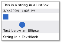
The following example demonstrates how to populate an ItemsControl by using the Items property. The example adds the following different types of items to the ListBox:
<!--Create a ListBox that contains a string, a Rectangle,
     a Panel, and a DateTime object. These items can be accessed
     via the Items property.-->
<ListBox xmlns:sys="clr-namespace:System;assembly=mscorlib"
         Name="simpleListBox">

  <!-- The <ListBox.Items> element is implicitly used.-->
  This is a string in a ListBox

  <sys:DateTime>2004/3/4 13:6:55</sys:DateTime>

  <Rectangle Height="40" Width="40"  Fill="Blue"/>

  <StackPanel Name="itemToSelect">
    <Ellipse Height="40" Fill="Blue"/>
    <TextBlock>Text below an Ellipse</TextBlock>
  </StackPanel>

  <TextBlock>String in a TextBlock</TextBlock>
</ListBox>
// Add a String to the ListBox.
listBox1.Items.Add("This is a string in a ListBox");

// Add a DateTime object to a ListBox.
DateTime dateTime1 = new DateTime(2004, 3, 4, 13, 6, 55);

listBox1.Items.Add(dateTime1);

// Add a Rectangle to the ListBox.
Rectangle rect1 = new Rectangle();
rect1.Width = 40;
rect1.Height = 40;
rect1.Fill = Brushes.Blue;
listBox1.Items.Add(rect1);

// Add a panel that contains multpile objects to the ListBox.
Ellipse ellipse1 = new Ellipse();
TextBlock textBlock1 = new TextBlock();

ellipse1.Width = 40;
ellipse1.Height = 40;
ellipse1.Fill = Brushes.Blue;

textBlock1.TextAlignment = TextAlignment.Center;
textBlock1.Text = "Text below an Ellipse";

stackPanel1.Children.Add(ellipse1);
stackPanel1.Children.Add(textBlock1);

listBox1.Items.Add(stackPanel1);
' Create a Button with a string as its content.
listBox1.Items.Add("This is a string in a ListBox")

' Create a Button with a DateTime object as its content.
Dim dateTime1 As New DateTime(2004, 3, 4, 13, 6, 55)

listBox1.Items.Add(dateTime1)

' Create a Button with a single UIElement as its content.
Dim rect1 As New Rectangle()
rect1.Width = 40
rect1.Height = 40
rect1.Fill = Brushes.Blue
listBox1.Items.Add(rect1)

' Create a Button with a panel that contains multiple objects
' as its content.
Dim ellipse1 As New Ellipse()
Dim textBlock1 As New TextBlock()

ellipse1.Width = 40
ellipse1.Height = 40
ellipse1.Fill = Brushes.Blue

textBlock1.TextAlignment = TextAlignment.Center
textBlock1.Text = "Text below an Ellipse"

stackPanel1.Children.Add(ellipse1)
stackPanel1.Children.Add(textBlock1)

listBox1.Items.Add(stackPanel1)
The following illustration shows the ListBox created in the previous example.

Note that the ItemCollection is a view, so you can use the view-related functionalities such as sorting, filtering, and grouping.
For example, if you have an instance of a ListBox, myListBox, you can do the following to sort the content of the ListBox. In this example, Content is the name of the property to sort by.
myListBox.Items.SortDescriptions.Add(
    new SortDescription("Content", ListSortDirection.Descending));
myListBox.Items.SortDescriptions.Add(New SortDescription("Content", ListSortDirection.Descending))
Note that when you do this, if the control is bound to a collection directly, the default collection view is used, and the sort criteria are applied to all other controls bound to the same collection directly. The view will not be the default view if the ItemsSource property is bound to a CollectionViewSource.
If your ItemsControl is bound directly to a collection, then you can do the following to get the default view:
CollectionView myView;
Private myView As CollectionView
myView = (CollectionView)CollectionViewSource.GetDefaultView(myItemsControl.ItemsSource);
myView = CType(CollectionViewSource.GetDefaultView(myItemsControl.ItemsSource), CollectionView)
Alternately, you can specify filtering, sorting, and grouping criteria in XAML or code by using a CollectionViewSource.
Remarks
This property may be used to add items to an ItemsControl. Adding a child to an ItemsControl object implicitly adds it to the ItemCollection for the ItemsControl object.
Note
This property can only be set in Extensible Application Markup Language (XAML) via the collection syntax shown, or by accessing the collection object and using its various methods such as Add. The property to access the collection object itself is read-only, and the collection itself is read-write.
Note that you use either the Items or the ItemsSource property to specify the collection that should be used to generate the content of your ItemsControl. When the ItemsSource property is set, the Items collection is made read-only and fixed-size.
When ItemsSource is in use, setting the ItemsSource property to null removes the collection and restores usage to Items, which will be an empty ItemCollection.
XAML Property Element Usage
<object>
  OneOrMoreElements
</object>
XAML Values
OneOrMoreElements One or more UIElement objects.
