Monitor environmental impact with the Executive dashboard
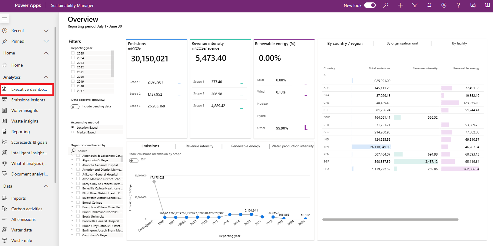
The Executive dashboard in Microsoft Sustainability Manager provides an overview of total emissions, revenue intensity, and renewable energy categorized by scope, geography, organizational unit, and facility.
To view the dashboard, select Executive dashboard under Analytics on the navigation pane.
Filter your results
You can filter this dashboard by Reporting year, Accounting method, Alternate result basis (preview) and Organizational hierarchy.
The options for Accounting method include:
Location Based: Reflects the average emissions intensity of grids on which energy consumption occurs.
Market Based: Reflects emissions from electricity you purposefully chose.
Note
For the preview release of Accounting method introduced in August 2024, only scope 2 emissions can be categorized as market-based. As a result, if you set Accounting method to Market Based on the dashboard, the dashboard shows all data for scope 1 and scope 3 emissions while showing only market-based data for scope 2 emissions.
For more information about filtering by Alternate result basis (preview), go to Calculate emissions for different standards (preview). The data that appears on the dashboard is a combination of your selections for Accounting method and Alternate result basis (preview). For example, if you set Accounting method as Market Based and Alternate result basis (preview) as GRI (which you would have to set up as a calculation model beforehand), only data that matches both criteria appears on the dashboard.
If your organization turned on Data approval management (preview), you can also set the Data approval (preview) toggle to Include pending data.
View summary statistics
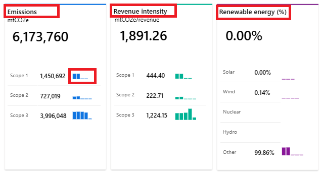
The tiles at the top of the dashboard let you quickly assess the following metrics:
Emissions: Total emissions, together with a breakdown by scope 1, scope 2, and scope 3.
Revenue intensity: Revenue intensity score, together with a breakdown by scope 1, scope 2, and scope 3. (Revenue intensity equals emissions divided by revenue.)
Renewable energy (%): Renewable energy as a percentage of total energy, together with a breakdown by renewable energy source.
These tiles include comparison bars that compare each metric to previous reporting periods in a trend chart.
View trends
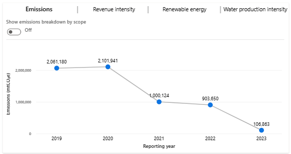
The bottom tile has three tabs that show a graphical representation of emissions, revenue intensity score, renewable energy, and water production intensity.
Emissions: This tab has a toggle that lets you view either total emissions in a trend line chart or emissions by scope. Emissions by scope appear in column charts for the three scopes that show emissions over time.
Revenue intensity score: This tab has a toggle that lets you view either revenue intensity in a trend line chart or revenue intensity categorized by scope. Revenue intensity by scope appears in column charts for the three scopes that show emissions over time.
Renewable energy: This tab has a toggle that lets you view either renewable energy as a percentage in a column chart over time or renewable energy breakdown by source. Renewable by source data appears in a column chart for each source showing the percentage of renewable energy as a percentage of total energy over time.
Water production intensity: This tab shows values for water production intensity consumed, discharged, and withdrawn. Water production intensity is the total amount of water used in relation to the total weight of products produced.
View data by country/region, organizational unit, or facility
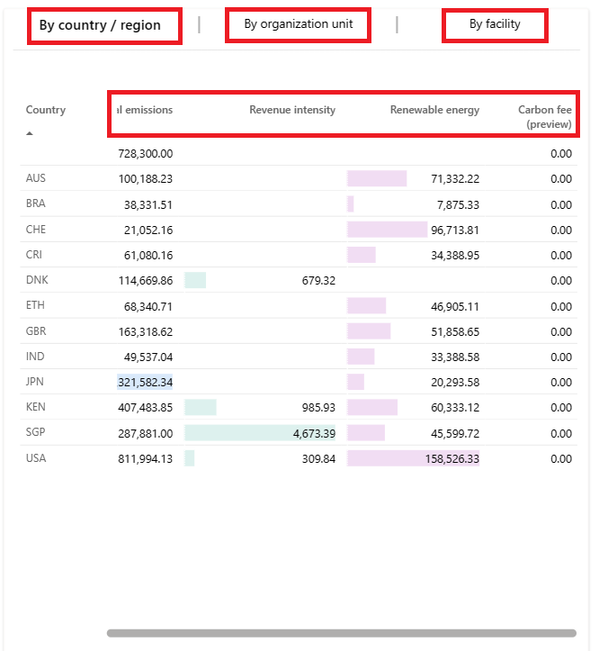
On the right area of the dashboard, you can select three tabs: By country/region, By organizational unit, and By facility. Each tab shows total emissions, revenue intensity score, and renewable energy for the corresponding delineation of data.
Note
To view revenue intensity for an organization unit, ensure that emissions are linked to the organizational unit in the same reporting year as your organizational unit revenue records. If revenue intensity data doesn't display as expected, be sure to include a month in your organizational unit revenue records and refresh the report.
If your organization set a carbon fee, you can also view the carbon fee on each tab.


