List Box control in Power Apps
A list in which the user can select one or multiple items.
Description
A List Box control always shows all available choices (unlike a Drop down control) and in which the user can choose more than one item at a time (unlike a Radio control).
Key properties
Default – The initial value of a control before it is changed by the user.
Note
You can only have one default selected item. If you need multiple selected items please use the Combo Box control.
Items – The source of data that appears in a control such as a gallery, a list, or a chart.
When you add a gallery, a list, or a chart, the property list shows Items by default so that you can easily specify the data that the new control should show. For example, you might set the Items property of a gallery to the Account table in Salesforce, a table named Inventory that you created in Excel and uploaded to the cloud, or a list named ConferenceSpeakers.
Additional properties
AccessibleLabel – Label for screen readers.
BorderColor – The color of a control's border.
BorderStyle – Whether a control's border is Solid, Dashed, Dotted, or None.
BorderThickness – The thickness of a control's border.
Color – The color of text in a control.
DisplayMode – Whether the control allows user input (Edit), only displays data (View), or is disabled (Disabled).
DisabledBorderColor – The color of a control's border if the control's DisplayMode property is set to Disabled.
DisabledColor – The color of text in a control if its DisplayMode property is set to Disabled.
DisabledFill – The background color of a control if its DisplayMode property is set to Disabled.
Fill – The background color of a control.
FocusedBorderColor – The color of a control's border when the control is focused.
FocusedBorderThickness – The thickness of a control's border when the control is focused.
Font – The name of the family of fonts in which text appears.
FontWeight – The weight of the text in a control: Bold, Semibold, Normal, or Lighter.
Height – The distance between a control's top and bottom edges.
HoverBorderColor – The color of a control's border when the user keeps the mouse pointer on that control.
HoverColor – The color of the text in a control when the user keeps the mouse pointer on it.
HoverFill – The background color of a control when the user keeps the mouse pointer on it.
Italic – Whether the text in a control is italic.
ItemPaddingLeft – The distance between text in a listbox and its left edge.
LineHeight – The distance between, for example, lines of text or items in a list.
OnChange – Actions to perform when the user changes the value of a control (for example, by adjusting a slider).
OnSelect – Actions to perform when the user taps or clicks a control.
PaddingBottom – The distance between text in a control and the bottom edge of that control.
PaddingLeft – The distance between text in a control and the left edge of that control.
PaddingRight – The distance between text in a control and the right edge of that control.
PaddingTop – The distance between text in a control and the top edge of that control.
PressedBorderColor – The color of a control's border when the user taps or clicks that control.
PressedColor – The color of text in a control when the user taps or clicks that control.
PressedFill – The background color of a control when the user taps or clicks that control.
Reset – Whether a control reverts to its default value.
Selected – The data record that represents the selected item.
Note
You can only have one default selected item. If you need multiple selected items please use the Combo Box control.
SelectedItems - Read-only. Represents a datatable of selected items for a multiselect listbox.
SelectedItemsText - Read-only. Represents a datatable of selected items text for a multiselect listbox.
SelectedText (Deprecated) – A string value that represents the selected item.
SelectionColor – The text color of a selected item or items in a list or the color of the selection tool in a pen control.
SelectionFill – The background color of a selected item or items in a list or a selected area of a pen control.
SelectMultiple – Whether a user can select more than one item in a listbox.
Size – The font size of the text that appears on a control.
Strikethrough – Whether a line appears through the text that appears on a control.
TabIndex – Keyboard navigation order in relation to other controls.
Tooltip – Explanatory text that appears when the user hovers over a control.
Underline – Whether a line appears under the text that appears on a control.
Visible – Whether a control appears or is hidden.
Width – The distance between a control's left and right edges.
X – The distance between the left edge of a control and the left edge of its parent container (screen if no parent container).
Y – The distance between the top edge of a control and the top edge of the parent container (screen if no parent container).
Related functions
Distinct( DataSource, ColumnName )
Example
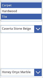
Add a List box control, name it CategoryList, and set its Items property to this formula:
["Carpet","Hardwood","Tile"]Don't know how to add, name, and configure a control?

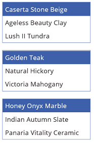
Add three Drop down controls, move them under CategoryList, and name them CarpetList, HardwoodList, and TileList.
Set the Items property of each Drop down control to one of these values:
CarpetList: ["Caserta Stone Beige","Ageless Beauty Clay", "Lush II Tundra"]
HardwoodList: ["Golden Teak","Natural Hickory", "Victoria Mahogany"]
TileList: ["Honey Onyx Marble","Indian Autumn Slate", "Panaria Vitality Ceramic"]

Set the Visible property of each Drop down control to one of these values:
CarpetList: If("Carpet" in CategoryList.SelectedItems.Value, true)
HardwoodList: If("Hardwood" in CategoryList.SelectedItems.Value, true)
TileList: If("Tile" in CategoryList.SelectedItems.Value, true)
Want more information about the If function or other functions?
Press F5, and then choose one or more items in CategoryList.
The appropriate Drop down control or controls appear based on your choice or choices.

(optional) Press Esc to return to the default workspace.
Accessibility guidelines
Color contrast
There must be adequate color contrast between:
- SelectionColor and SelectionFill
- SelectionFill and Fill
- HoverFill and Fill
- PressedFill and Fill
This is in addition to the standard color contrast requirements.
Screen reader support
- AccessibleLabel must be present.
Keyboard support
TabIndex must be zero or greater so that keyboard users can navigate to it.
Focus indicators must be clearly visible. Use FocusedBorderColor and FocusedBorderThickness to achieve this.
Note
The tab key navigates to or away from the List box. Arrow keys navigate the contents of the List box.