 サンプルを参照する
.NET Multi-platform App UI (.NET MAUI) データ バインディングを使用すると、2 つのオブジェクトのプロパティをリンクできるため、一方のオブジェクトを変更すると、もう一方のオブジェクトが変更されます。 これはとても役立つツールです。データ バインディングはコード内で完全に定義でき、XAML はショートカットと利便性を提供します。
データ バインディング
データ バインディングでは、ソースとターゲットと呼ばれる 2 つのオブジェクトのプロパティを接続します。 コードでは、次の 2 つの手順が必要です。
- ターゲット オブジェクトの
BindingContextプロパティは、ソース オブジェクトに設定する必要があります。 -
SetBindingメソッド (多くの場合、Bindingクラスと組み合わせて使用されます) は、ターゲット オブジェクトで呼び出して、そのオブジェクトのプロパティをソース オブジェクトのプロパティにバインドする必要があります。
ターゲット プロパティはバインド可能なプロパティである必要があります。つまり、ターゲット オブジェクトは BindableObject から派生する必要があります。
Label などの Text のプロパティは、バインド可能なプロパティ TextProperty に関連付けられています。
XAML では、Binding 呼び出しと SetBinding クラスの代わりに Binding マークアップ拡張を使用することを除いて、コードで必要なのと同じ 2 つの手順を実行する必要があります。 ただし、XAML でデータ バインディングを定義する場合、ターゲット オブジェクトの BindingContext を設定する方法は複数あります。 分離コードファイルから設定される場合もあれば、StaticResource や x:Static のマークアップ拡張子を使って設定される場合や、BindingContext プロパティ要素タグの内容として設定される場合もあります。
注
このページのデータ バインディング式では、コンパイルされたバインドが使用されます。 コンパイル済みバインディングの詳細については、「コンパイル 済みバインディング」を参照してください。
ビューからビューへのバインド
データ バインディングを定義して、同じページ上の 2 つのビューのプロパティをリンクできます。 この場合、BindingContext マークアップ拡張を使ってターゲット オブジェクトの x:Reference を設定します。
次の例では、Slider と2 つの Label ビューがあり、1 つは Slider 値でローテーションされ、もう 1 つは Slider 値を表示します。
<ContentPage xmlns="http://schemas.microsoft.com/dotnet/2021/maui"
             xmlns:x="http://schemas.microsoft.com/winfx/2009/xaml"
             x:Class="XamlSamples.SliderBindingsPage"
             Title="Slider Bindings Page"
             x:DataType="Slider">
    <StackLayout>
        <Label Text="ROTATION"
               BindingContext="{x:Reference slider}"
               Rotation="{Binding Path=Value}"
               FontAttributes="Bold"
               FontSize="18"
               HorizontalOptions="Center"
               VerticalOptions="Center" />
        <Slider x:Name="slider"
                Maximum="360"
                VerticalOptions="Center" />
        <Label BindingContext="{x:Reference slider}"
               Text="{Binding Value, StringFormat='The angle is {0:F0} degrees'}"
               FontAttributes="Bold"
               FontSize="18"
               HorizontalOptions="Center"
               VerticalOptions="Center" />
    </StackLayout>
</ContentPage>
Slider は x:Name 属性を含み、Label マークアップ拡張を使用して、2 つの x:Reference ビューによって参照されます。
x:Reference バインディング拡張は、参照される要素の名前、この場合は Name に設定する slider というプロパティを定義します。 ただし、ReferenceExtension マークアップ拡張を定義している x:Reference クラスは、ContentProperty の Name 属性も定義しています。これは、明示的に要求されていないことを意味します。
Binding マークアップ拡張自体は、BindingBase や Binding クラスと同様に、いくつかのプロパティを持つことができます。
ContentProperty の Binding は Path ですが、パスが Binding マークアップ拡張の最初の項目である場合、マークアップ拡張機能の「Path=」部分は省略できます。
2 番目の Binding マークアップ拡張機能は、StringFormat プロパティを設定します。 .NET MAUI では、バインディングは暗黙的な型変換を実行しません。文字列以外のオブジェクトを文字列として表示する必要がある場合は、型コンバーターを指定するか、StringFormat を使用する必要があります。
重要
書式設定文字列は、単一引用符で囲む必要があります。
バインディング モード
1 つのビューで、いくつかのプロパティにデータ バインディングを設定できます。 ただし、各ビューに含められるのは 1 つの BindingContext のみのため、そのビュー上の複数のデータ バインディングは、同じオブジェクトのすべてのプロパティを参照する必要があります。
この問題やその他の問題を解決するには、Mode 列挙型の要素に設定される BindingMode プロパティを使用します。
Default-
OneWay- 値はソースからターゲットに転送されます -
OneWayToSource- 値はターゲットからソースに転送されます。 -
TwoWay- 値はソースとターゲットの間で双方向に転送されます -
OneTime- データは、ソースからターゲットに移動しますが、BindingContextが変更された場合のみです
次の例は、OneWayToSource および TwoWay のバインディング モードの一般的な使い方を示しています。
<ContentPage xmlns="http://schemas.microsoft.com/dotnet/2021/maui"
             xmlns:x="http://schemas.microsoft.com/winfx/2009/xaml"
             x:Class="XamlSamples.SliderTransformsPage"
             Padding="5"
             Title="Slider Transforms Page">
    <Grid>
        <Grid.RowDefinitions>
            <RowDefinition Height="*" />
            <RowDefinition Height="Auto" />
            <RowDefinition Height="Auto" />
            <RowDefinition Height="Auto" />
            <RowDefinition Height="Auto" />
        </Grid.RowDefinitions>
        <Grid.ColumnDefinitions>
            <ColumnDefinition Width="*" />
            <ColumnDefinition Width="Auto" />
        </Grid.ColumnDefinitions>

        <!-- Scaled and rotated Label -->
        <Label x:Name="label"
               Text="TEXT"
               HorizontalOptions="Center"
               VerticalOptions="CenterAndExpand" />

        <!-- Slider and identifying Label for Scale -->
        <Slider x:Name="scaleSlider"
                x:DataType="Label"
                BindingContext="{x:Reference label}"
                Grid.Row="1" Grid.Column="0"
                Maximum="10"
                Value="{Binding Scale, Mode=TwoWay}" />
        <Label x:DataType="Slider"
               BindingContext="{x:Reference scaleSlider}"
               Text="{Binding Value, StringFormat='Scale = {0:F1}'}"
               Grid.Row="1" Grid.Column="1"
               VerticalTextAlignment="Center" />

        <!-- Slider and identifying Label for Rotation -->
        <Slider x:Name="rotationSlider"
                x:DataType="Label"
                BindingContext="{x:Reference label}"
                Grid.Row="2" Grid.Column="0"
                Maximum="360"
                Value="{Binding Rotation, Mode=OneWayToSource}" />
        <Label x:DataType="Slider"
               BindingContext="{x:Reference rotationSlider}"
               Text="{Binding Value, StringFormat='Rotation = {0:F0}'}"
               Grid.Row="2" Grid.Column="1"
               VerticalTextAlignment="Center" />

        <!-- Slider and identifying Label for RotationX -->
        <Slider x:Name="rotationXSlider"
                x:DataType="Label"
                BindingContext="{x:Reference label}"
                Grid.Row="3" Grid.Column="0"
                Maximum="360"
                Value="{Binding RotationX, Mode=OneWayToSource}" />
        <Label x:DataType="Slider"
               BindingContext="{x:Reference rotationXSlider}"
               Text="{Binding Value, StringFormat='RotationX = {0:F0}'}"
               Grid.Row="3" Grid.Column="1"
               VerticalTextAlignment="Center" />

        <!-- Slider and identifying Label for RotationY -->
        <Slider x:Name="rotationYSlider"
                x:DataType="Label"
                BindingContext="{x:Reference label}"
                Grid.Row="4" Grid.Column="0"
                Maximum="360"
                Value="{Binding RotationY, Mode=OneWayToSource}" />
        <Label x:DataType="Slider"
               BindingContext="{x:Reference rotationYSlider}"
               Text="{Binding Value, StringFormat='RotationY = {0:F0}'}"
               Grid.Row="4" Grid.Column="1"
               VerticalTextAlignment="Center" />
    </Grid>
</ContentPage>
この例では、4 つの Slider ビューが Scale の Rotate、RotateX、RotateY、Label プロパティを制御しようとしています。 最初は、Label のこれら 4 つのプロパティは、それぞれ Slider によって設定されているので、データ バインディングのターゲットであるように思えます。 しかし、BindingContext の Label は 1 つのオブジェクトにしかなりえず、4 つの異なるスライダーがあります。 そのため、4 つのスライダーの BindingContext はそれぞれ Label に設定され、バインディングはスライダーの Value プロパティに設定されます。
OneWayToSource と TwoWay モードを使用することにより、これらの Value プロパティは、Scale の Rotate、RotateX、RotateY、Label プロパティであるソース プロパティを設定できます。
Slider ビューの 3 つのバインディングは OneWayToSource で、Slider の値が BindingContext のプロパティ (Label という名前の label) の変更を引き起こすことを意味します。 これら 3 つの Slider ビューによって、Rotate の RotateX、RotateY、Label プロパティが変更されます。
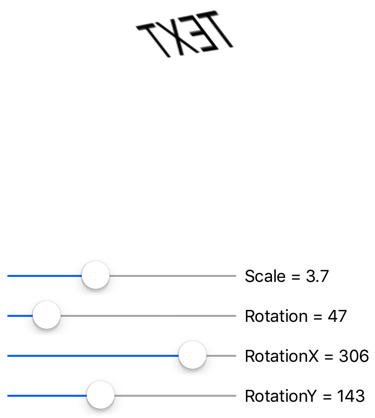
ただし、Scale プロパティのバインディングは TwoWay です。 これは、Scale プロパティの初期値が 1 であり、TwoWay バインディングを使用すると Slider の初期値が 0 ではなく 1 に設定されるためです。 このバインディングが OneWayToSource である場合、Scale プロパティの初期値は Slider の初期値から 0 に設定されます。
Labelは表示されません。
注
VisualElement クラスには、ScaleX プロパティと ScaleY プロパティもあり、それぞれ x 軸とy 軸で VisualElement をスケーリングします。
バインディングとコレクション
ListView は、ItemsSource 型の IEnumerable プロパティを定義し、そのコレクション内の項目を表示します。 これらの項目は、任意の型のオブジェクトにすることができます。 既定では、ListView は各項目の ToString メソッドを使用して、その項目を表示します。 これが望み通りの結果である場合もありますが、多くの場合、ToString は、オブジェクトの完全修飾クラス名のみを返します。
ただし、ListView コレクション内の項目は、テンプレート を使用して任意の方法で表示できます。これには、Cell から派生したクラスが含まれます。 テンプレートは、ListView 内のすべての項目に対して複製され、テンプレートに設定されているデータ バインディングが個々の複製に転送されます。 ViewCell クラスを使用して項目のカスタム セルを作成できます。
ListView は、NamedColor クラスの助けを借りて、.NET MAUI で使用できるすべての名前付き色の一覧を表示できます。
using System.Reflection;
using System.Text;

namespace XamlSamples
{
    public class NamedColor
    {
        public string Name { get; private set; }
        public string FriendlyName { get; private set; }
        public Color Color { get; private set; }

        // Expose the Color fields as properties
        public float Red => Color.Red;
        public float Green => Color.Green;
        public float Blue => Color.Blue;

        public static IEnumerable<NamedColor> All { get; private set; }

        static NamedColor()
        {
            List<NamedColor> all = new List<NamedColor>();
            StringBuilder stringBuilder = new StringBuilder();

            // Loop through the public static fields of the Color structure.
            foreach (FieldInfo fieldInfo in typeof(Colors).GetRuntimeFields())
            {
                if (fieldInfo.IsPublic &&
                    fieldInfo.IsStatic &&
                    fieldInfo.FieldType == typeof(Color))
                {
                    // Convert the name to a friendly name.
                    string name = fieldInfo.Name;
                    stringBuilder.Clear();
                    int index = 0;

                    foreach (char ch in name)
                    {
                        if (index != 0 && Char.IsUpper(ch))
                        {
                            stringBuilder.Append(' ');
                        }
                        stringBuilder.Append(ch);
                        index++;
                    }

                    // Instantiate a NamedColor object.
                    NamedColor namedColor = new NamedColor
                    {
                        Name = name,
                        FriendlyName = stringBuilder.ToString(),
                        Color = (Color)fieldInfo.GetValue(null)
                    };

                    // Add it to the collection.
                    all.Add(namedColor);
                }
            }
            all.TrimExcess();
            All = all;
        }
    }
}
各 NamedColor オブジェクトには、Name 型の FriendlyName プロパティと string プロパティ、Color 型の Color プロパティ、さらに、Red プロパティ、Green プロパティ、Blue プロパティがあります。 さらに、NamedColor 静的コンストラクターは、IEnumerable<NamedColor> クラス内の NamedColor 型のフィールドに対応する Color オブジェクトを含む Colors コレクションを作成し、そのパブリック静的 All プロパティに割り当てます。
静的 NamedColor.All プロパティを ItemsSource の ListView に設定するには、x:Static マークアップ拡張を使用します。
<ContentPage xmlns="http://schemas.microsoft.com/dotnet/2021/maui"
             xmlns:x="http://schemas.microsoft.com/winfx/2009/xaml"
             xmlns:local="clr-namespace:XamlSamples;assembly=XamlSamples"
             x:Class="XamlSamples.ListViewDemoPage"
             Title="ListView Demo Page">
    <ListView ItemsSource="{x:Static local:NamedColor.All}" />
</ContentPage>
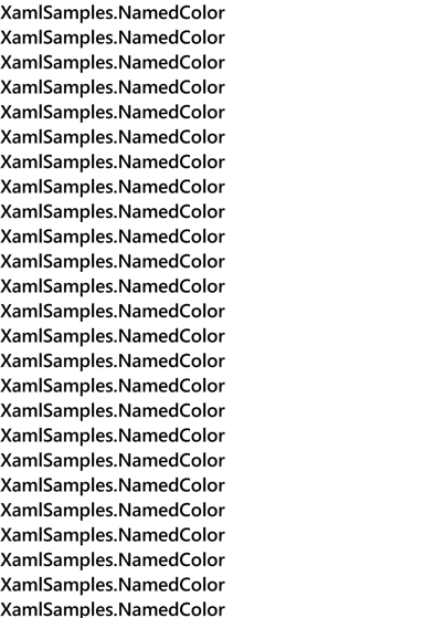
結果は、項目が XamlSamples.NamedColor 型であることを示します。
項目のテンプレートを定義するには、ItemTemplate を参照する DataTemplate に ViewCell を設定する必要があります。
ViewCell は、各項目を表示する 1 つ以上のビューのレイアウトを定義する必要があります。
<ListView ItemsSource="{x:Static local:NamedColor.All}">
    <ListView.ItemTemplate>
        <DataTemplate x:DataType="local:NamedColor">
            <ViewCell>
                <Label Text="{Binding FriendlyName}" />
            </ViewCell>
        </DataTemplate>
    </ListView.ItemTemplate>
</ListView>
注
セルとセルの子のバインディング ソースは、ListView.ItemsSource コレクションです。
この例では、Label 要素は、View の ViewCell プロパティに設定されます。
ViewCell.View タグは必要ありません。これは、View プロパティが ViewCell のコンテンツ プロパティであるためです。 この XAML は、各 FriendlyName オブジェクトの NamedColor プロパティを表示します。
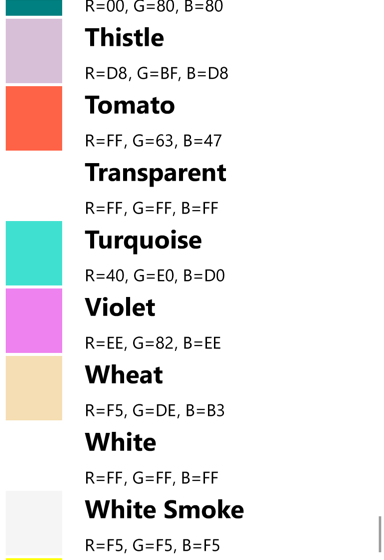
項目テンプレートを展開すると、詳細情報と実際の色を表示できます。
<ContentPage xmlns="http://schemas.microsoft.com/dotnet/2021/maui"
             xmlns:x="http://schemas.microsoft.com/winfx/2009/xaml"
             xmlns:local="clr-namespace:XamlSamples"
             x:Class="XamlSamples.ListViewDemoPage"
             Title="ListView Demo Page">
    <ContentPage.Resources>
        <x:Double x:Key="boxSize">50</x:Double>
        <x:Int32 x:Key="rowHeight">60</x:Int32>
        <local:FloatToIntConverter x:Key="intConverter" />
    </ContentPage.Resources>

    <ListView ItemsSource="{x:Static local:NamedColor.All}"
              RowHeight="{StaticResource rowHeight}">
        <ListView.ItemTemplate>
            <DataTemplate x:DataType="local:NamedColor">
                <ViewCell>
                    <StackLayout Padding="5, 5, 0, 5"
                                 Orientation="Horizontal"
                                 Spacing="15">
                        <BoxView WidthRequest="{StaticResource boxSize}"
                                 HeightRequest="{StaticResource boxSize}"
                                 Color="{Binding Color}" />
                        <StackLayout Padding="5, 0, 0, 0"
                                     VerticalOptions="Center">
                            <Label Text="{Binding FriendlyName}"
                                   FontAttributes="Bold"
                                   FontSize="14" />
                            <StackLayout Orientation="Horizontal"
                                         Spacing="0">
                                <Label Text="{Binding Red,
                                                      Converter={StaticResource intConverter},
                                                      ConverterParameter=255,
                                                      StringFormat='R={0:X2}'}" />
                                <Label Text="{Binding Green,
                                                      Converter={StaticResource intConverter},
                                                      ConverterParameter=255,
                                                      StringFormat=', G={0:X2}'}" />
                                <Label Text="{Binding Blue,
                                                      Converter={StaticResource intConverter},
                                                      ConverterParameter=255,
                                                      StringFormat=', B={0:X2}'}" />
                            </StackLayout>
                        </StackLayout>
                    </StackLayout>
                </ViewCell>
            </DataTemplate>
        </ListView.ItemTemplate>
    </ListView>
</ContentPage>
バインディングの値コンバーター
前の XAML の例では、それぞれの Red が有する個々の Green プロパティ、Blue プロパティ、NamedColor プロパティが表示されます。 これらのプロパティは float 型で、範囲は 0 から 1 です。 16 進数の値を表示する場合は、単純に "X2" 書式指定で StringFormat を使用することはできません。 この書式設定は整数に対してのみ機能するのに加え、float 値に 255 を乗算する必要があります。
この問題は、値コンバーター (バインディング コンバーター) で解決できます。 これは IValueConverter インターフェイスを実装するクラスなので、Convert と ConvertBack という 2 つのメソッドがあります。
Convert メソッドは、値がソースからターゲットに転送されるときに呼び出されます。
ConvertBack メソッドは、OneWayToSource または TwoWay バインディングでターゲットからソースへの転送に対して呼び出されます。
using System.Globalization;

namespace XamlSamples
{
    public class FloatToIntConverter : IValueConverter
    {
        public object Convert(object value, Type targetType, object parameter, CultureInfo culture)
        {
            float multiplier;

            if (!float.TryParse(parameter as string, out multiplier))
                multiplier = 1;

            return (int)Math.Round(multiplier * (float)value);
        }

        public object ConvertBack(object value, Type targetType, object parameter, CultureInfo culture)
        {
            float divider;

            if (!float.TryParse(parameter as string, out divider))
                divider = 1;

            return ((float)(int)value) / divider;
        }
    }
}
注
バインディングはソースからターゲットへの 1 つの方法に過ぎないため、この例では ConvertBack メソッドは役割を果たしません。
バインディングは、Converter プロパティを使用してバインディング コンバーターを参照します。 バインディング コンバーターは、ConverterParameter プロパティで指定されたパラメーターを受け入れることもできます。 ある程度の汎用性のために、これは乗数の指定方法です。 バインディング コンバーターは、有効な float 値のコンバーター パラメーターをチェックします。
コンバーターはページのリソース ディクショナリでインスタンス化されるため、複数のバインド間で共有できます。
<local:FloatToIntConverter x:Key="intConverter" />
3 つのデータ バインディングで、この単一インスタンスが参照されます。
<Label Text="{Binding Red,
                      Converter={StaticResource intConverter},
                      ConverterParameter=255,
                      StringFormat='R={0:X2}'}" />
項目テンプレートは、色、フレンドリ名、RGB 値を表示します。
ListView は、基になるデータで動的に発生する変更を処理できますが、特定の手順を実行する場合にのみ実行できます。 実行時に ItemsSource 変更の ListView プロパティに割り当てられた項目のコレクションの場合は、これらの項目の ObservableCollection<T> クラスを使用します。
ObservableCollection<T> は INotifyCollectionChanged インターフェイスを実装し、ListView は CollectionChanged イベントのハンドラーをインストールします。
実行時に項目自体のプロパティが変更された場合、コレクション内の項目は INotifyPropertyChanged インターフェイスを実装し、PropertyChanged イベントを使用してプロパティ値の変更を通知する必要があります。
次のステップ
データ バインディングは、ページ内の 2 つのオブジェクト間、またはビジュアル オブジェクトと基になるデータの間でプロパティをリンクするための強力なメカニズムを提供します。 しかし、アプリケーションがデータ ソースの操作を開始すると、一般的なアプリ アーキテクチャ パターンが便利なパラダイムとして出現し始めます。
GitHub で Microsoft と共同作業する
このコンテンツのソースは GitHub にあります。そこで、issue や pull request を作成および確認することもできます。 詳細については、共同作成者ガイドを参照してください。
.NET MAUI