表形式分類モデルを説明するには、カーネル SHAP (SHapley Additive exPlanations) を使用します。 Kernel SHAP は、モデルに依存しない方法であり、モデルの予測に対する各特徴の寄与を推定します。 Adult Census Income データセットでロジスティック回帰モデルをトレーニングし、SynapseML TabularSHAP トランスフォーマーを使用して特徴レベルの説明を計算します。
前提条件
Microsoft Fabric サブスクリプションを取得します。 または、無料の Microsoft Fabric 試用版にサインアップします。
Microsoft Fabric にサインインします。
ホーム ページの左下にあるエクスペリエンス スイッチャーを使用して Fabric に切り替えます。
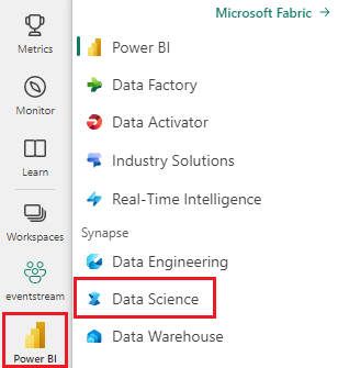
- ワークスペースに新しいノートブックを作成し、それを lakehouse にアタッチします。 詳細については、「 ノートブックの作成」を参照してください。
SynapseML、PySpark、pandas、plotly は、Fabricノートブック環境にプレインストールされています。 パッケージの追加インストールは必要ありません。
パッケージのインポートとヘルパー UDF の定義
Fabric ノートブックで、次のコードをセルに貼り付けて実行します。 この手順では、必要なライブラリをインポートし、後でベクター要素を抽出するための 2 つのユーザー定義関数 (UDF) を定義します。
import pyspark
from synapse.ml.explainers import TabularSHAP
from pyspark.ml import Pipeline
from pyspark.ml.classification import LogisticRegression
from pyspark.ml.feature import StringIndexer, OneHotEncoder, VectorAssembler
from pyspark.sql.types import FloatType, ArrayType
from pyspark.sql.functions import col, lit, rand, broadcast, udf
import pandas as pd

vec_access = udf(lambda v, i: float(v[i]), FloatType())
vec2array = udf(lambda vec: vec.toArray().tolist(), ArrayType(FloatType()))
確認: 新しいセルで次のコードを実行します。 出力 TabularSHAP imported successfullyが表示されます。
print("TabularSHAP imported successfully")
print(f"PySpark version: {pyspark.__version__}")
データの読み込みと分類モデルのトレーニング
Azure Blob Storageから Adult Census Income データセットを読み込み、ターゲット ラベルにインデックスを付け、ロジスティック回帰パイプラインをトレーニングします。
df = spark.read.parquet(
    "wasbs://publicwasb@mmlspark.blob.core.windows.net/AdultCensusIncome.parquet"
)

labelIndexer = StringIndexer(
    inputCol="income", outputCol="label", stringOrderType="alphabetAsc"
).fit(df)
print("Label index assignment: " + str(set(zip(labelIndexer.labels, [0, 1]))))

training = labelIndexer.transform(df).cache()

categorical_features = [
    "workclass",
    "education",
    "marital-status",
    "occupation",
    "relationship",
    "race",
    "sex",
    "native-country",
]
categorical_features_idx = [feat + "_idx" for feat in categorical_features]
categorical_features_enc = [feat + "_enc" for feat in categorical_features]
numeric_features = [
    "age",
    "education-num",
    "capital-gain",
    "capital-loss",
    "hours-per-week",
]

strIndexer = StringIndexer(
    inputCols=categorical_features, outputCols=categorical_features_idx
)
onehotEnc = OneHotEncoder(
    inputCols=categorical_features_idx, outputCols=categorical_features_enc
)
vectAssem = VectorAssembler(
    inputCols=categorical_features_enc + numeric_features, outputCol="features"
)
lr = LogisticRegression(featuresCol="features", labelCol="label", weightCol="fnlwgt")
pipeline = Pipeline(stages=[strIndexer, onehotEnc, vectAssem, lr])
model = pipeline.fit(training)
確認: 次のセルを実行します。 トレーニングデータの行数と、パイプラインの各ステージの確認が表示されるはずです。
print(f"Training rows: {training.count()}")
print(f"Pipeline stages: {[type(s).__name__ for s in model.stages]}")
assert training.count() > 30000, "Dataset should contain over 30,000 rows"
print("Model trained successfully")

# Expected output:
#Training rows: 32561
#Pipeline stages: ['StringIndexerModel', 'OneHotEncoderModel', #'VectorAssembler', 'LogisticRegressionModel']
#Model trained successfully
説明する観測値を選択する
スコア付けされたトレーニング データから 5 つの観測値をランダムに選択します。 これらの観測値は、SHAP の説明を生成するインスタンスです。
explain_instances = (
    model.transform(training).orderBy(rand()).limit(5).repartition(200).cache()
)
display(explain_instances)
確認: サンプル サイズを確認します。
count = explain_instances.count()
print(f"Explain instances: {count}")
assert count == 5, f"Expected 5 rows, got {count}"
print("Sample selected successfully")
TabularSHAP の構成と実行
TabularSHAP Explainer を作成し、選択した観測値に適用します。 主なパラメーターは次のとおりです。
| パラメーター | Description |
|---|---|
inputCols |
モデルが予測に使用する特徴列。 |
outputCol |
SHAP 出力値を含む列の名前。 |
numSamples |
カーネル SHAP 推定の摂動サンプルの数。 値が大きいほど正確ですが、遅くなります。 |
model |
説明対象のトレーニング済みパイプライン モデル。 |
targetCol |
説明対象のモデル出力列。 この例では、列は probability。 |
targetClasses |
説明対象のクラスインデックス
[1] クラス 1 の確率についてのみ説明します。
[0, 1]を使用して、両方のクラスについて説明します。 |
backgroundData |
特徴を統合するための参照分布として使用されるトレーニング データのサンプル。 |
shap = TabularSHAP(
    inputCols=categorical_features + numeric_features,
    outputCol="shapValues",
    numSamples=5000,
    model=model,
    targetCol="probability",
    targetClasses=[1],
    backgroundData=broadcast(training.orderBy(rand()).limit(100).cache()),
)

shap_df = shap.transform(explain_instances)
Note
この手順は、 numSamples とクラスターのサイズによっては数分かかる場合があります。
numSamples=5000 と 5 個の観測では、既定の Fabric Spark クラスターで 3~10 分程度かかると見込まれます。
確認: SHAP 出力列が存在することを確認します。
assert "shapValues" in shap_df.columns, "shapValues column missing"
print(f"SHAP output columns: {shap_df.columns}")
print("TabularSHAP transform completed")
SHAP 値の抽出
結果の DataFrame からクラス 1 の確率と SHAP 値を抽出します。 観察ごとに、SHAP 値ベクトルは基本値 (バックグラウンド データセットの平均出力) で始まり、その後に特徴ごとに 1 つの値が続きます。
shaps = (
    shap_df.withColumn("probability", vec_access(col("probability"), lit(1)))
    .withColumn("shapValues", vec2array(col("shapValues").getItem(0)))
    .select(
        ["shapValues", "probability", "label"] + categorical_features + numeric_features
    )
)

shaps_local = shaps.toPandas()
shaps_local.sort_values("probability", ascending=False, inplace=True, ignore_index=True)
pd.set_option("display.max_colwidth", None)
display(shaps_local)
検証: pandas DataFrame 構造体を確認します。
expected_cols = len(categorical_features) + len(numeric_features) + 3
print(f"DataFrame shape: {shaps_local.shape}")
print(f"Expected columns: {expected_cols}, Actual: {shaps_local.shape[1]}")
assert shaps_local.shape == (5, expected_cols), f"Unexpected shape: {shaps_local.shape}"
print("SHAP values extracted successfully")
SHAP 値を視覚化する
各特徴が予測された確率にどのように影響するかを示す観測値ごとに棒グラフを作成します。
from plotly.subplots import make_subplots
import plotly.graph_objects as go

features = categorical_features + numeric_features
features_with_base = ["Base"] + features

rows = shaps_local.shape[0]

fig = make_subplots(
    rows=rows,
    cols=1,
    subplot_titles="Probability: "
    + shaps_local["probability"].apply("{:.2%}".format)
    + "; Label: "
    + shaps_local["label"].astype(str),
)

for index, row in shaps_local.iterrows():
    feature_values = [0] + [row[feature] for feature in features]
    shap_values = row["shapValues"]
    list_of_tuples = list(zip(features_with_base, feature_values, shap_values))
    shap_pdf = pd.DataFrame(list_of_tuples, columns=["name", "value", "shap"])
    fig.add_trace(
        go.Bar(
            x=shap_pdf["name"],
            y=shap_pdf["shap"],
            hovertext="value: " + shap_pdf["value"].astype(str),
        ),
        row=index + 1,
        col=1,
    )

fig.update_yaxes(range=[-1, 1], fixedrange=True, zerolinecolor="black")
fig.update_xaxes(type="category", tickangle=45, fixedrange=True)
fig.update_layout(height=400 * rows, title_text="SHAP explanations")
fig.show()
確認: プロット オブジェクトが作成されたことを確認します。
print(f"Figure traces: {len(fig.data)}")
print(f"Figure height: {fig.layout.height}px")
assert len(fig.data) == 5, f"Expected 5 traces, got {len(fig.data)}"
print("Visualization created successfully")
結果を解釈する
各サブプロットは、1 つの観測値を表します。 バーには次が表示されます:
- 基本: バックグラウンド データセット全体の平均モデル出力 (ベースライン確率)。
- 正の SHAP 値: クラス 1 (収入が 50K を超える) に予測をプッシュする特徴。
- 負の SHAP 値: 予測をクラス 0 にプッシュする機能 (収入が 50K 以下)。
基本値とすべての特徴 SHAP 値の合計は、その観測値に対するモデルの予測確率と等しくなります。
Troubleshooting
| 問題 | 原因 | Resolution |
|---|---|---|
OutOfMemoryError TabularSHAP の実行中 |
numSamples は、使用可能なメモリに対して大きすぎます。 |
numSamplesを 1,000 に減らすか、Spark Executor メモリを増やします。 |
| SHAP 変換が遅い | 多くの機能を備えた高い numSamples により、コンピューティング時間が増加します。 |
探索的な結果を高速化するために、 numSamples を 1,000 から 2,000 に減らします。 最終的な分析のために増加します。 |
FileNotFoundException parquet の場合 |
mmlspark.blob.core.windows.netへのネットワーク アクセスがブロックされています。 |
Fabric ワークスペースに外部へのインターネット アクセスがあることを確認してください。 または、データセットを lakehouse にアップロードします。 |
shapValues 列に null が含まれている |
特徴値がトレーニング分布外の場合、一部の観測値は失敗する可能性があります。 | 入力機能で null 値または予期しない値を確認します。 結果から null をフィルター処理します。 |
display() 出力が表示されない |
コードは、Fabricノートブック環境の外部で実行されています。 | 標準Python環境では、shaps_local.head() または print(shaps_local) を使用します。 |
クリーンアップ
このチュートリアルのためにデータセットを lakehouse にアップロードした場合は、それを削除してストレージを解放します。
# Remove cached DataFrames from memory
training.unpersist()
explain_instances.unpersist()
print("Cached DataFrames released")