SharePoint Framework には、プロパティ ウィンドウ用の標準コントロール セットが含まれています。 ただし、基本的なコントロール以外の追加機能が必要となる場合があります。 コントロールや特定のユーザー インターフェイス上のデータを非同期更新しなければならないことがあります。 プロパティ ウィンドウ用のカスタム コントロールをビルドして、必要な機能を取得します。
この記事では、カスタム ドロップダウン コントロールをビルドします。このコントロールは、Web パーツのユーザー インターフェイスをブロックすることなく、外部サービスからデータを非同期的に読み込みます。
作業する Web パーツのソースは、GitHub で入手可能です (sp-dev-fx-webparts/samples/react-custompropertypanecontrols/)。
注:
この記事の手順を実行する前に、SharePoint Framework ソリューションをビルドするための開発環境を設定してください。
新しいプロジェクトを作成する
まず、プロジェクト用の新しいフォルダーを作成します。
md react-custompropertypanecontrolプロジェクト フォルダーに移動します。
cd react-custompropertypanecontrolプロジェクト フォルダーで SharePoint Framework Yeoman ジェネレーターを実行して、新しい SharePoint Framework プロジェクトをスキャホールディングします。
yo @microsoft/sharepointプロンプトが表示されたら、以下の値を入力します (以下で省略されたすべてのプロンプトに対して既定のオプションを選択します)。
- どの種類のクライアント側コンポーネントを作成しますか? WebPart
- Web パーツ名は何ですか? リスト アイテム
- どのテンプレートを使用しますか? React
コード エディターでプロジェクト フォルダーを開きます。
選択したリストを格納するための Web パーツ プロパティを定義する
ビルドする Web パーツには、選択した SharePoint リストに基づいてリスト項目が表示されます。 ユーザーは Web パーツ プロパティでリストを選択できるようになります。 選択したリストを格納するため、listName という Web パーツ プロパティを新たに作成します。
コード エディターで、src/webparts/listItems/ListItemsWebPartManifest.json ファイルを開きます。 既定の
descriptionプロパティをlistNameという新しいプロパティに置き換えます。{ ... "preconfiguredEntries": [{ ... "properties": { "listName": "" } }] }src/webparts/listItems/ListItemsWebPart.ts ファイルを開き、
IListItemsWebPartPropsインターフェイスを次のように更新します。export interface IListItemsWebPartProps { description: string; listName: string; }src/webparts/listItems/ListItemsWebPart.ts ファイルで、
render()メソッドを次のように変更します。export default class ListItemsWebPart extends BaseClientSideWebPart<IListItemsWebPartProps> { // ... public render(): void { const element: React.ReactElement<IListItemsProps> = React.createElement( ListItems, { listName: this.properties.listName, description: this.properties.description, isDarkTheme: this._isDarkTheme, environmentMessage: this._environmentMessage, hasTeamsContext: !!this.context.sdks.microsoftTeams, userDisplayName: this.context.pageContext.user.displayName } ); ReactDom.render(element, this.domElement); } // ... }getPropertyPaneConfiguration()メソッドを次のように更新します。export default class ListItemsWebPart extends BaseClientSideWebPart<IListItemsWebPartProps> { // ... protected getPropertyPaneConfiguration(): IPropertyPaneConfiguration { return { pages: [ { header: { description: strings.PropertyPaneDescription }, groups: [ { groupName: strings.BasicGroupName, groupFields: [ PropertyPaneTextField('listName', { label: strings.ListFieldLabel }) ] } ] } ] }; } // ... }src/webparts/listItems/loc/mystrings.d.ts ファイルで、既存の
IListItemsWebPartStringsインターフェイスにstring型の新しいプロパティListFieldLabelを追加します。declare interface IListItemsWebPartStrings { PropertyPaneDescription: string; BasicGroupName: string; .. ListFieldLabel: string; }src/webparts/listItems/loc/en-us.js ファイルで、次のように、返されたオブジェクトに新しいプロパティ
ListFieldLabelを追加します。define([], function() { return { "PropertyPaneDescription": "Description", "BasicGroupName": "Group Name", ... "ListFieldLabel": "List" } });src/webparts/listItems/components/IListItemsProps.ts ファイルを開き、次のようにリスト インターフェイスに
listNameプロパティを追加します。export interface IListItemsProps { description: string; isDarkTheme: boolean; environmentMessage: string; hasTeamsContext: boolean; userDisplayName: string; listName: string; }src/webparts/listItems/components/ListItems.tsx ファイルで、
render()メソッドのコンテンツを次のように変更します。export default class ListItems extends React.Component<IListItemsProps, {}> { public render(): React.ReactElement<IListItemsProps> { const { description, isDarkTheme, environmentMessage, hasTeamsContext, userDisplayName, listName } = this.props; return ( <section className={`${styles.listItems} ${hasTeamsContext ? styles.teams : ''}`}> <div className={styles.welcome}> <img alt="" src={isDarkTheme ? require('../assets/welcome-dark.png') : require('../assets/welcome-light.png')} className={styles.welcomeImage} /> <h2>Well done, {escape(userDisplayName)}!</h2> <div>{environmentMessage}</div> <div>List name: <strong>{escape(listName)}</strong></div> </div> </section> ); } }次のコマンドを実行して、プロジェクトが実行されていることを確認します。
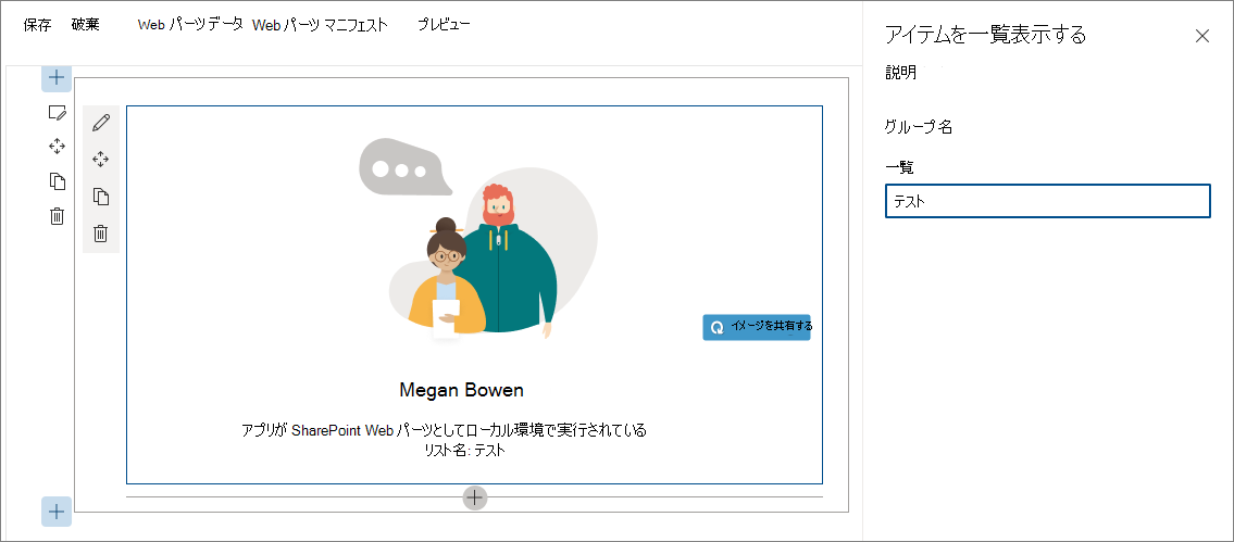
gulp serveWeb ブラウザーで、 リスト アイテム Web パーツをキャンバスに追加し、そのプロパティを開きます。 List プロパティの値セットが Web パーツ本文に表示されることを確認します。
非同期のドロップダウン プロパティ ウィンドウ コントロールを作成する
SharePoint Framework には、ユーザーが特定の値を選択できるようになる標準ドロップダウン コントロールが備わっています。 このドロップダウン コントロールをビルドする場合、すべての値があらかじめ分かっていなければなりません。 値を動的に読み込む場合、または外部サービスから非同期的に値を読み込み、Web パーツ全体をブロックしたくない場合は、カスタム ドロップダウン コントロールを作成することがオプションです。
SharePoint Framework で React を使用するカスタム プロパティ ウィンドウ コントロールを作成する場合、コントロールは、Web パーツにコントロールを登録するクラス、ドロップダウンをレンダリングし、そのデータを管理する React コンポーネントで構成されます。
非同期のドロップダウン プロパティ ウィンドウ コントロール React コンポーネントを追加する
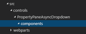
components フォルダーを作成します。 プロジェクトの src フォルダーで、3 つの新たなフォルダー階層を作成します。フォルダー階層が src/controls/PropertyPaneAsyncDropdown/components となるようにします。
非同期のドロップダウン React コンポーネント プロパティを定義します。 src/controls/PropertyPaneAsyncDropdown/components フォルダーで、IAsyncDropdownProps.ts という名前の新しいファイルを作成し、次のコードを入力します。
import { IDropdownOption } from 'office-ui-fabric-react/lib/components/Dropdown'; export interface IAsyncDropdownProps { label: string; loadOptions: () => Promise<IDropdownOption[]>; onChanged: (option: IDropdownOption, index?: number) => void; selectedKey: string | number; disabled: boolean; stateKey: string; }IAsyncDropdownPropsクラスは、カスタム プロパティ ウィンドウ コントロールが使用する React コンポーネントに設定可能なプロパティを定義します。-
labelプロパティは、ドロップダウン コントロールのラベルを指定します。 -
loadOptionsデリゲートに関連付けられている関数は、選択可能なオプションを読み込むためにコントロールによって呼び出されます。 -
onChangedデリゲートに関連付けられている関数は、ドロップダウン内のオプションをユーザーが選択すると呼び出されます。 -
selectedKeyプロパティは、選択値 (文字列または数値が可能) を指定します。 -
disabledプロパティは、ドロップダウン コントロールが無効かどうかを指定します。 -
stateKeyプロパティは、React コンポーネントによって再レンダリングを強制するときに使用します。
-
非同期のドロップダウン React コンポーネント インターフェイスを定義します。 src/controls/PropertyPaneAsyncDropdown/components フォルダーで、IAsyncDropdownState.ts という新しいファイルを作成し、次のコードを入力します。
import { IDropdownOption } from 'office-ui-fabric-react/lib/components/Dropdown'; export interface IAsyncDropdownState { loading: boolean; options: IDropdownOption[]; error: string; }IAsyncDropdownStateインターフェイスは、React コンポーネントの状態を記述します。-
loadingプロパティは、コンポーネントが特定の時点でオプションを読み込んでいるかどうかを判別します。 -
optionsプロパティには、選択可能なすべてのオプションが含まれます。 - エラーが発生すると、
errorプロパティに割り当てられ、このプロパティとユーザーの間で通信が行われます。
-
非同期のドロップダウン React コンポーネントを定義します。 src/controls/PropertyPaneAsyncDropdown/components フォルダーで、AsyncDropdown.tsx という新しいファイルを作成し、次のコードを入力します。
import * as React from 'react'; import { Dropdown, IDropdownOption } from 'office-ui-fabric-react/lib/components/Dropdown'; import { Spinner } from 'office-ui-fabric-react/lib/components/Spinner'; import { IAsyncDropdownProps } from './IAsyncDropdownProps'; import { IAsyncDropdownState } from './IAsyncDropdownState'; export default class AsyncDropdown extends React.Component<IAsyncDropdownProps, IAsyncDropdownState> { private selectedKey: React.ReactText; constructor(props: IAsyncDropdownProps, state: IAsyncDropdownState) { super(props); this.selectedKey = props.selectedKey; this.state = { loading: false, options: undefined, error: undefined }; } public componentDidMount(): void { this.loadOptions(); } public componentDidUpdate(prevProps: IAsyncDropdownProps, prevState: IAsyncDropdownState): void { if (this.props.disabled !== prevProps.disabled || this.props.stateKey !== prevProps.stateKey) { this.loadOptions(); } } private loadOptions(): void { this.setState({ loading: true, error: undefined, options: undefined }); this.props.loadOptions() .then((options: IDropdownOption[]): void => { this.setState({ loading: false, error: undefined, options: options }); }, (error: any): void => { this.setState((prevState: IAsyncDropdownState, props: IAsyncDropdownProps): IAsyncDropdownState => { prevState.loading = false; prevState.error = error; return prevState; }); }); } public render(): JSX.Element { const loading: JSX.Element = this.state.loading ? <div><Spinner label={'Loading options...'} /></div> : <div />; const error: JSX.Element = this.state.error !== undefined ? <div className={'ms-TextField-errorMessage ms-u-slideDownIn20'}>Error while loading items: {this.state.error}</div> : <div />; return ( <div> <Dropdown label={this.props.label} disabled={this.props.disabled || this.state.loading || this.state.error !== undefined} onChanged={this.onChanged.bind(this)} selectedKey={this.selectedKey} options={this.state.options} /> {loading} {error} </div> ); } private onChanged(option: IDropdownOption, index?: number): void { this.selectedKey = option.key; // reset previously selected options const options: IDropdownOption[] = this.state.options; options.forEach((o: IDropdownOption): void => { if (o.key !== option.key) { o.selected = false; } }); this.setState((prevState: IAsyncDropdownState, props: IAsyncDropdownProps): IAsyncDropdownState => { prevState.options = options; return prevState; }); if (this.props.onChanged) { this.props.onChanged(option, index); } } }AsyncDropdownクラスは、非同期のドロップダウン プロパティ ウィンドウ コントロールをレンダリングするために使用する React コンポーネントを表します。- このコンポーネントが初めて読み込まれると、
componentDidMount()メソッド、そのdisabledプロパティ、stateKeyプロパティのいずれかが変更し、これらのプロパティを介して渡されるloadOptions()メソッドが呼び出され、選択可能なオプションが読み込まれます。 - オプションが読み込まれた後、コンポーネント側で状態が更新され、選択可能なオプションが示されます。
- ドロップダウン自体は、Office UI Fabric React ドロップダウン コンポーネントを使用してレンダリングされます。
- 選択可能なオプションがコンポーネントによって読み込まれると、Office UI Fabric React スピナー コンポーネントによってスピナーが表示されます。
- このコンポーネントが初めて読み込まれると、
次の手順として、カスタム プロパティ ウィンドウ コントロールを定義します。 このコントロールは、プロパティ ウィンドウでプロパティを定義するときに Web パーツ内で使用され、既に定義されている React コンポーネントを使用してレンダリングします。
非同期のドロップダウン プロパティ ウィンドウ コントロールを追加する
非同期のドロップダウン プロパティ ウィンドウ コントロールのプロパティを定義します。 カスタム プロパティ ウィンドウ コントロールには、2 つのプロパティ セットがあります。
最初のプロパティ セットは公開されて、Web パーツ内の Web パーツ プロパティを定義するときに使用されます。 これらのプロパティはコンポーネント特有のプロパティです。たとえば、コントロールの隣に表示されるラベル、スピナーの最小値/最大値、ドロップダウンで選択可能なオプションなどです。 カスタム プロパティ ウィンドウ コントロールを定義する場合、これらのプロパティについて記述する型が、
IPropertyPaneField<TProperties>インターフェイスを実装するときにTProperties型として渡される必要があります。2 番目のプロパティ セットは、カスタム プロパティ ウィンドウ コントロールで内部使用される非公開のプロパティです。 カスタム コントロールが適切にレンダリングされるには、これらのプロパティが SharePoint Framework API に準拠していなければなりません。 これらのプロパティは、
IPropertyPaneCustomFieldProps@microsoft/sp-property-pane パッケージのインターフェイスを実装する必要があります。非同期のドロップダウン プロパティ ウィンドウ コントロールのパブリック プロパティを定義します。 src/controls/PropertyPaneAsyncDropdown フォルダーで、IPropertyPaneAsyncDropdownProps.ts という新しいファイルを作成し、次のコードを入力します。
import { IDropdownOption } from 'office-ui-fabric-react/lib/components/Dropdown'; export interface IPropertyPaneAsyncDropdownProps { label: string; loadOptions: () => Promise<IDropdownOption[]>; onPropertyChange: (propertyPath: string, newValue: any) => void; selectedKey: string | number; disabled?: boolean; }IPropertyPaneAsyncDropdownPropsインターフェイスで:-
label: ドロップダウンの隣に表示されるラベルを定義します。 -
loadOptions: 選択可能なドロップダウン オプションを読み込むために呼び出されるメソッドを定義します。 -
onPropertyChange: ユーザーがドロップダウンで値を選択するときに呼び出されるメソッドを定義します。 -
selectedKey: 選択されたドロップダウン値を返します。 -
disabled: コントロールが無効かどうかを指定します。
-
非同期のドロップダウン プロパティ ウィンドウ コントロールの内部プロパティを定義します。 src/controls/PropertyPaneAsyncDropdown フォルダーで、IPropertyPaneAsyncDropdownInternalProps.ts という新しいファイルを作成し、次のコードを入力します。
import { IPropertyPaneCustomFieldProps } from '@microsoft/sp-property-pane';
import { IPropertyPaneAsyncDropdownProps } from './IPropertyPaneAsyncDropdownProps';

export interface IPropertyPaneAsyncDropdownInternalProps extends IPropertyPaneAsyncDropdownProps, IPropertyPaneCustomFieldProps {
}
IPropertyPaneAsyncDropdownInternalProps インターフェイスは新しいプロパティは定義しませんが、既に定義されている IPropertyPaneAsyncDropdownProps インターフェイスと標準の SharePoint Framework IPropertyPaneCustomFieldProps インターフェイス (カスタム コントロールが適切に動作するために必須) のプロパティを組み合わせます。
非同期のドロップダウン プロパティ ウィンドウ コントロールを定義します。 src/controls/PropertyPaneAsyncDropdown フォルダーで、PropertyPaneAsyncDropdown.ts という新しいファイルを作成し、次のコードを入力します。
import * as React from 'react'; import * as ReactDom from 'react-dom'; import { IPropertyPaneField, PropertyPaneFieldType } from '@microsoft/sp-property-pane'; import { IDropdownOption } from 'office-ui-fabric-react/lib/components/Dropdown'; import { IPropertyPaneAsyncDropdownProps } from './IPropertyPaneAsyncDropdownProps'; import { IPropertyPaneAsyncDropdownInternalProps } from './IPropertyPaneAsyncDropdownInternalProps'; import AsyncDropdown from './components/AsyncDropdown'; import { IAsyncDropdownProps } from './components/IAsyncDropdownProps'; export class PropertyPaneAsyncDropdown implements IPropertyPaneField<IPropertyPaneAsyncDropdownProps> { public type: PropertyPaneFieldType = PropertyPaneFieldType.Custom; public targetProperty: string; public properties: IPropertyPaneAsyncDropdownInternalProps; private elem: HTMLElement; constructor(targetProperty: string, properties: IPropertyPaneAsyncDropdownProps) { this.targetProperty = targetProperty; this.properties = { key: properties.label, label: properties.label, loadOptions: properties.loadOptions, onPropertyChange: properties.onPropertyChange, selectedKey: properties.selectedKey, disabled: properties.disabled, onRender: this.onRender.bind(this), onDispose: this.onDispose.bind(this) }; } public render(): void { if (!this.elem) { return; } this.onRender(this.elem); } private onDispose(element: HTMLElement): void { ReactDom.unmountComponentAtNode(element); } private onRender(elem: HTMLElement): void { if (!this.elem) { this.elem = elem; } const element: React.ReactElement<IAsyncDropdownProps> = React.createElement(AsyncDropdown, { label: this.properties.label, loadOptions: this.properties.loadOptions, onChanged: this.onChanged.bind(this), selectedKey: this.properties.selectedKey, disabled: this.properties.disabled, // required to allow the component to be re-rendered by calling this.render() externally stateKey: new Date().toString() }); ReactDom.render(element, elem); } private onChanged(option: IDropdownOption, index?: number): void { this.properties.onPropertyChange(this.targetProperty, option.key); } }PropertyPaneAsyncDropdownクラスは標準の SharePoint FrameworkIPropertyPaneFieldインターフェイスを実装します。その際、IPropertyPaneAsyncDropdownPropsインターフェイスを、Web パーツ内から設定可能なパブリック プロパティのコントラクトとして使用します。 このクラスには、IPropertyPaneFieldインターフェイスによって定義される次の 3 つのパブリック プロパティが含まれています。-
type: カスタム プロパティ ウィンドウ コントロールにPropertyPaneFieldType.Customを設定する必要があります。 -
targetProperty: コントロールで使用する Web パーツ プロパティの名前を指定します。 -
properties: コントロール特有のプロパティを定義します。
propertiesプロパティが、クラスによって実装されるパブリックIPropertyPaneAsyncDropdownPropsインターフェイスではなく、内部のIPropertyPaneAsyncDropdownInternalProps型であることがわかります。 これは、propertiesプロパティが、SharePoint Framework が必要とするonRender()メソッドを定義できるようにするためです。onRender()メソッドがパブリックIPropertyPaneAsyncDropdownPropsインターフェイスの一部である場合、非同期のドロップダウン コントロールを Web パーツで使用すると、値を Web パーツ内に割り当てる操作が必要になりますが、これは望ましい処理ではありません。PropertyPaneAsyncDropdownクラスは、コントロールの再描画に使用できるパブリックrender()メソッドを定義します。 これは、あるドロップダウンに設定されている値によって別のドロップダウンで選択可能なオプションを判別するカスケード ドロップダウンなどの場合に役立ちます。 項目の選択後にrender()メソッドを呼び出して、依存関係のあるドロップダウンで、選択可能なオプションを読み込むことができます。 このためには、コントロールの変更を React が検出できるようにする必要があります。stateKeyの値を現行日付に設定するとこれを実行できます。 この仕組みを使用すると、onRender()メソッドが呼び出されるたびに、コンポーネントは再レンダリングされるだけでなく、選択可能なオプションの更新も行います。 [プロパティ] ウィンドウを閉じるたびに、要素のマウントを解除するonDispose()メソッドの実装を忘れないでください。-
非同期のドロップダウン プロパティ ウィンドウ コントロールを Web パーツで使用する
非同期のドロップダウン プロパティ ウィンドウ コントロールの準備が整ったら、次の手順として、リストをユーザーが選択できるように Web パーツ内でそのコントロールを使用します。
リスト情報インターフェイスを追加する
整合性の取れた方法で選択可能なリストに関する情報を渡すため、リストに関する情報を表すインターフェイスを定義します。 src/webparts/listItems フォルダーで、IListInfo.ts という新しいファイルを作成し、次のコードを入力します。
export interface IListInfo {
  Id: string;
  Title: string;
}
非同期のドロップダウン プロパティ ウィンドウ コントロールを使用して listName Web パーツ プロパティをレンダリングする
必要な型を参照します。 src/webparts/listItems/ListItemsWebPart.ts ファイルの上部セクションで、既に作成した
PropertyPaneAsyncDropdownクラスをインポートします。そのためには、以下のコードを追加します。import { PropertyPaneAsyncDropdown } from '../../controls/PropertyPaneAsyncDropdown/PropertyPaneAsyncDropdown';そのコードの後に、Web パーツ プロパティが動作するために必要な
IDropdownOptionインターフェイスへの参照と 2 つのヘルパー関数への参照を追加します。import { IDropdownOption } from 'office-ui-fabric-react/lib/components/Dropdown'; import { update, get } from '@microsoft/sp-lodash-subset';選択可能なリストを読み込むためのメソッドを追加します。
ListItemsWebPartクラスで、選択可能なリストを読み込むための次のようなloadLists()メソッドを追加します。 この記事ではモック データを使用しますが、SharePoint REST API を呼び出して現在の Web で選択可能なリストに基づいてリストを取得することもできます。 外部サービスからオプションを読み込む処理をシミュレートするため、このメソッドでは 2 秒の延期時間を使用します。private loadLists(): Promise<IDropdownOption[]> { return new Promise<IDropdownOption[]>((resolve: (options: IDropdownOption[]) => void, reject: (error: any) => void) => { setTimeout(() => { resolve([{ key: 'sharedDocuments', text: 'Shared Documents' }, { key: 'myDocuments', text: 'My Documents' }]); }, 2000); }); }ドロップダウン内の値の変更を処理するメソッドを追加します。
ListItemsWebPartクラスで、onListChange()という新しいメソッドを追加します。private onListChange(propertyPath: string, newValue: any): void { const oldValue: any = get(this.properties, propertyPath); // store new value in web part properties update(this.properties, propertyPath, (): any => { return newValue; }); // refresh web part this.render(); }List ドロップダウンでリストを選択すると、選択された値は Web パーツ プロパティに保持され、選択されたプロパティを反映するために Web パーツが再レンダリングされる必要があります。
非同期のドロップダウン プロパティ ウィンドウ コントロールを使用して、リストの Web パーツ プロパティをレンダリングします。
ListItemsWebPartクラスで、getPropertyPaneConfiguration()メソッドを変更すると、非同期のドロップダウン プロパティ ウィンドウ コントロールを使用してlistNameWeb パーツ プロパティをレンダリングできます。export default class ListItemsWebPart extends BaseClientSideWebPart<IListItemsWebPartProps> { // ... protected getPropertyPaneConfiguration(): IPropertyPaneConfiguration { return { pages: [ { header: { description: strings.PropertyPaneDescription }, groups: [ { groupName: strings.BasicGroupName, groupFields: [ new PropertyPaneAsyncDropdown('listName', { label: strings.ListFieldLabel, loadOptions: this.loadLists.bind(this), onPropertyChange: this.onListChange.bind(this), selectedKey: this.properties.listName }) ] } ] } ] }; } // ... }この時点で、新しく作成した非同期のドロップダウン プロパティ ウィンドウ コントロールを使用してリストを選択できます。 コントロールが予期したとおりに正しく動作することを確認するため、コンソールを開き、次のコマンドを実行します。
gulp serve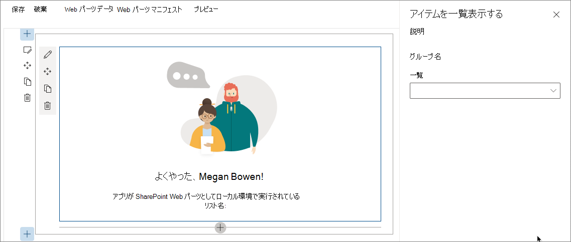
非同期のドロップダウン プロパティ ウィンドウ コントロールを使用してカスケード ドロップダウンを実装する
SharePoint Framework Web パーツをビルドする場合、既に選択された別のオプションに基づいて構成を実装しなければならないことがあります。 一般的な例として、最初にユーザーにリストを選択させ、そのリストに基づいてリスト項目を選択してもらう場合があります。 選択可能な項目リストは、選択したリストによって異なります。 前述の手順で実装した非同期のドロップダウン プロパティ ウィンドウ コントロールを使用してそのようなシナリオを実装する方法を次に取り上げます。
アイテム Web パーツ プロパティを追加する
コード エディターで、src/webparts/listItems/ListItemsWebPart.manifest.json ファイルを開きます。
propertiesセクションにitemという名前の新しいプロパティを追加します。次のようになります。{ ... "preconfiguredEntries": [{ ... "properties": { "description": "List items", "listName": "", "item": "" } }] }src/webparts/listItems/ListItemsWebPart.ts ファイル内の IListItemsWebPartProps インターフェイスのコードを次のように変更します。
export interface IListItemsWebPartProps {
  description: string;
  listName: string;
  item: string;
}
src/webparts/listItems/components/IListItemsProps.ts ファイルの内容を次のように更新して
itemプロパティを追加します。export interface IListItemsProps { ... listName: string; itemName: string; }src/webparts/listItems/ListItemsWebPart.ts ファイルで、
render()メソッドのコードを次のように変更してitemプロパティを含めます。export default class ListItemsWebPart extends BaseClientSideWebPart<IListItemsWebPartProps> { // ... public render(): void { const element: React.ReactElement<IListItemsProps> = React.createElement(ListItems, { listName: this.properties.listName, itemName: this.properties.item, ... }); ReactDom.render(element, this.domElement); } // ... }src/webparts/listItems/loc/mystrings.d.ts ファイルで、
IListItemsWebPartStringsインターフェイスを次のように変更してItemFieldLabelプロパティを含めます。declare interface IListItemsWebPartStrings { ... PropertyPaneDescription: string; BasicGroupName: string; ListFieldLabel: string; ItemFieldLabel: string; }src/webparts/listItems/loc/en-us.js ファイルで、
ItemFieldLabel文字列に関して欠けている定義を追加します。define([], function() { return { ... "PropertyPaneDescription": "Description", "BasicGroupName": "Group Name", "ListFieldLabel": "List", "ItemFieldLabel": "Item" } });
アイテム Web パーツ プロパティの値をレンダリングする
src/webparts/listItems/components/ListItems.tsx ファイルで、render() メソッドを次のように変更します。
export default class ListItems extends React.Component<IListItemsProps, {}> {
  public render(): React.ReactElement<IListItemsProps> {
    const {
      description,
      isDarkTheme,
      environmentMessage,
      hasTeamsContext,
      userDisplayName,
      listName,
      itemName
    } = this.props;

    return (
      <section className={`${styles.listItems} ${hasTeamsContext ? styles.teams : ''}`}>
        <div className={styles.welcome}>
          <img alt="" src={isDarkTheme ? require('../assets/welcome-dark.png') : require('../assets/welcome-light.png')} className={styles.welcomeImage} />
          <h2>Well done, {escape(userDisplayName)}!</h2>
          <div>{environmentMessage}</div>
          <div>List name: <strong>{escape(listName)}</strong></div>
          <div>Item name: <strong>{escape(itemName)}</strong></div>
        </div>
      </section>
    );
  }
}
リスト アイテムを読み込むためのメソッドを追加する
src/webparts/listItems/ListItemsWebPart.ts ファイルの ListItemsWebPart クラスで、選択したリストに基づいて選択可能なリスト項目を読み込むための新しいメソッドを追加します。 選択可能なリストを読み込むためのメソッドと同じようにモック データを使用します。 既に選択したリストに基づいて、loadItems() メソッドはモック リスト項目を返します。 リストが選択されていない場合、データなしで promise を解決します。
private loadItems(): Promise<IDropdownOption[]> {
  if (!this.properties.listName) {
    // resolve to empty options since no list has been selected
    return Promise.resolve([]);
  }

  const wp: ListItemsWebPart = this;

  return new Promise<IDropdownOption[]>((resolve: (options: IDropdownOption[]) => void, reject: (error: any) => void) => {
    setTimeout(() => {
      const items = {
        sharedDocuments: [
          {
            key: 'spfx_presentation.pptx',
            text: 'SPFx for the masses'
          },
          {
            key: 'hello-world.spapp',
            text: 'hello-world.spapp'
          }
        ],
        myDocuments: [
          {
            key: 'isaiah_cv.docx',
            text: 'Isaiah CV'
          },
          {
            key: 'isaiah_expenses.xlsx',
            text: 'Isaiah Expenses'
          }
        ]
      };
      resolve(items[wp.properties.listName]);
    }, 2000);
  });
}
項目の選択内容を処理するメソッドを追加する
ListItemsWebPart クラスで、onListItemChange() という新しいメソッドを追加します。 項目ドロップダウンで項目が選択されると、Web パーツは Web パーツ プロパティにその新しい値を格納し、Web パーツを再レンダリングしてユーザー インターフェイスで変更を反映する必要があります。
private onListItemChange(propertyPath: string, newValue: any): void {
  const oldValue: any = get(this.properties, propertyPath);
  // store new value in web part properties
  update(this.properties, propertyPath, (): any => { return newValue; });
  // refresh web part
  this.render();
}
プロパティ ウィンドウでアイテム Web パーツ プロパティをレンダリングする
ListItemsWebPartクラスに、itemsDropdownという名前の新しいクラス プロパティを追加します。export default class ListItemsWebPart extends BaseClientSideWebPart<IListItemsWebPartProps> { private itemsDropDown: PropertyPaneAsyncDropdown; // ... }getPropertyPaneConfiguration()メソッドのコードを次のように変更します:export default class ListItemsWebPart extends BaseClientSideWebPart<IListItemsWebPartProps> { // ... protected getPropertyPaneConfiguration(): IPropertyPaneConfiguration { // reference to item dropdown needed later after selecting a list this.itemsDropDown = new PropertyPaneAsyncDropdown('item', { label: strings.ItemFieldLabel, loadOptions: this.loadItems.bind(this), onPropertyChange: this.onListItemChange.bind(this), selectedKey: this.properties.item, // should be disabled if no list has been selected disabled: !this.properties.listName }); return { pages: [ { header: { description: strings.PropertyPaneDescription }, groups: [ { groupName: strings.BasicGroupName, groupFields: [ new PropertyPaneAsyncDropdown('listName', { label: strings.ListFieldLabel, loadOptions: this.loadLists.bind(this), onPropertyChange: this.onListChange.bind(this), selectedKey: this.properties.listName }), this.itemsDropDown ] } ] } ] }; } // ... }Item プロパティのドロップダウンは、listName プロパティのドロップダウンと同様に初期化されます。 唯一の相違点は、リストの選択後に項目ドロップダウンが更新される必要があるため、このコントロールのインスタンスをクラス変数に代入する必要があるという点です。
選択したリストの項目を読み込む
最初にリストが選択されていない場合、項目ドロップダウンは無効です。ユーザーがリストを選択した場合に限り、その後に有効になります。 リストを選択すると、項目ドロップダウンもそのリストからリスト項目を読み込みます。
このロジックを実装するには、既に定義した
onListChange()メソッドを次のように拡張します。private onListChange(propertyPath: string, newValue: any): void { const oldValue: any = get(this.properties, propertyPath); // store new value in web part properties update(this.properties, propertyPath, (): any => { return newValue; }); // reset selected item this.properties.item = undefined; // store new value in web part properties update(this.properties, 'item', (): any => { return this.properties.item; }); // refresh web part this.render(); // reset selected values in item dropdown this.itemsDropDown.properties.selectedKey = this.properties.item; // allow to load items this.itemsDropDown.properties.disabled = false; // load items and re-render items dropdown this.itemsDropDown.render(); }リストの選択後、選択された項目がリセットされ、Web パーツ プロパティに保持されてから、項目ドロップダウンにリセットされます。 項目を選択するためのドロップダウンが有効になり、ドロップダウンが更新されてオプションが読み込まれます。
すべてが予期したとおりに作動することを確認するため、コンソールで次のコマンドを実行します。
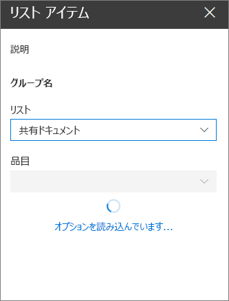
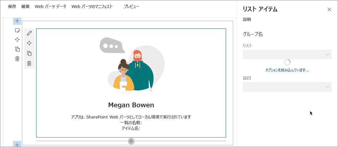
gulp serveWeb パーツをページに初めて追加してからプロパティ ウィンドウを開くと、ドロップダウンが無効で、オプションを読み込み中であることが示されます。
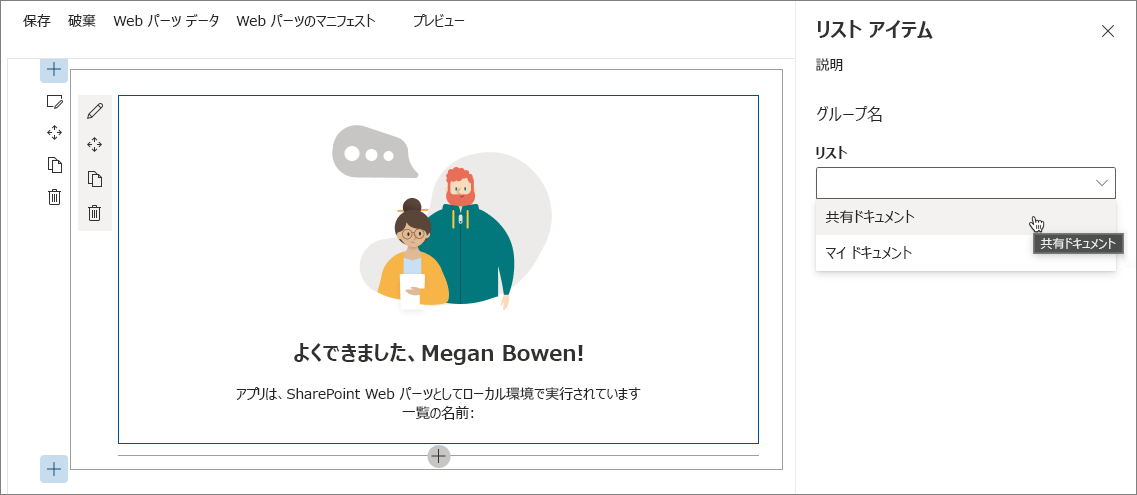
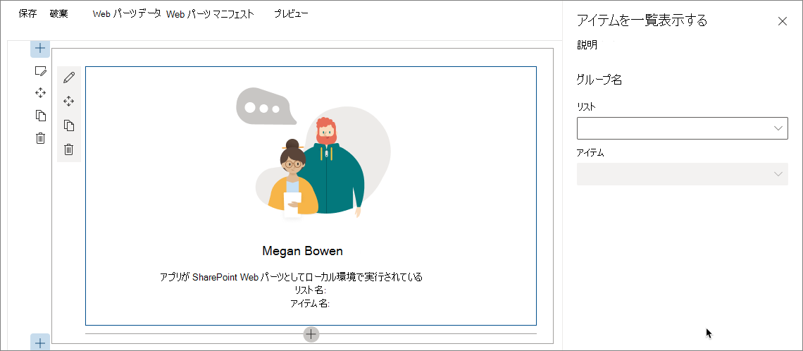
オプションが読み込まれると、List ドロップダウンが有効になります。 リストがまだ選択されていないため、Item ドロップダウンは無効なままです。
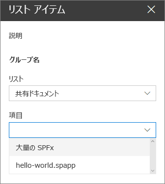
List ドロップダウンでリストを選択すると、Item ドロップダウンがそのリストで選択可能な項目を読み込みます。
選択可能な項目が読み込まれると、Item ドロップダウンが有効になります。
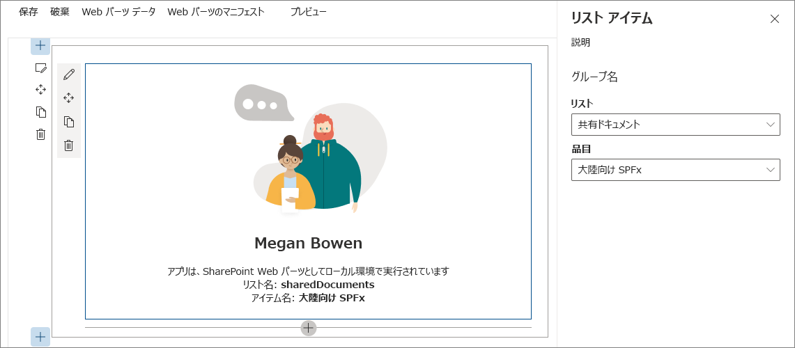
Item ドロップダウンで項目を選択すると、Web パーツが更新されて選択した項目が本体に表示されます。
ローカル Web サーバーを停止するには、コンソールで CTRL+C を押します。