SharePoint クライアント側 Web パーツのプロパティ ウィンドウをデザインするときに、別のプロパティで選択した値に基づいてオプションを表示する Web パーツ プロパティが 1 つ存在する場合があります。 通常、このシナリオはカスケード ドロップダウン コントロールを実装するときに使用します。 この記事では、カスタム プロパティ ウィンドウ コントロールを開発せずに、Web パーツ プロパティ ウィンドウでカスケード ドロップダウン コントロールを作成する方法を説明します。
作業する Web パーツのソースは、GitHub で入手可能です (sp-dev-fx-webparts/samples/react-custompropertypanecontrols/)。
注:
この記事の手順を実行する前に、必ず SharePoint のクライアント側の Web パーツ開発環境の設定をしておいてください。
新しいプロジェクトを作成する
まず、プロジェクト用の新しいフォルダーを作成します。
md react-cascadingdropdownsプロジェクト フォルダーに移動します。
cd react-cascadingdropdownsプロジェクト フォルダーで SharePoint Framework Yeoman ジェネレーターを実行して、新しい SharePoint Framework プロジェクトをスキャホールディングします。
yo @microsoft/sharepointプロンプトが表示されたら、以下の値を入力します (以下で省略されたすべてのプロンプトに対して既定のオプションを選択します)。
- ソリューション名は何ですか?: react-cascadingdropdowns
- どの種類のクライアント側コンポーネントを作成しますか?: WebPart
- Web パーツ名は何ですか?: リスト アイテム
- 使用するテンプレートは何ですか?: React
コード エディターでプロジェクト フォルダーを開きます。 この記事の手順とスクリーンショットでは Visual Studio Code を使用していますが、お好きなエディターをどれでも使用できます。
選択したリストを格納するための Web パーツ プロパティを定義する
選択した SharePoint リストからリスト アイテムを表示する Web パーツをビルドします。 ユーザーは Web パーツ プロパティ ウィンドウでリストを選択できるようになります。 選択したリストを格納するため、listName という Web パーツ プロパティを新たに作成します。
コード エディターで、src/webparts/listItems/ListItemsWebPartManifest.json ファイルを開きます。 既定の
descriptionプロパティをlistNameという新しいプロパティに置き換えます。{ ... "preconfiguredEntries": [{ ... "properties": { "listName": "" } }] }src/webparts/listItems/ListItemsWebPart.ts ファイルを開き、
IListItemsWebPartPropsインターフェイスを次のように置き換えます。export interface IListItemsWebPartProps { listName: string; }src/webparts/listItems/ListItemsWebPart.ts ファイルで、
render()メソッドを次のように変更します。export default class ListItemsWebPart extends BaseClientSideWebPart<IListItemsWebPartProps> { // ... public render(): void { const element: React.ReactElement<IListItemsProps> = React.createElement(ListItems, { listName: this.properties.listName }); ReactDom.render(element, this.domElement); } // ... }getPropertyPaneConfiguration()を次の値に更新します。export default class ListItemsWebPart extends BaseClientSideWebPart<IListItemsWebPartProps> { // ... protected getPropertyPaneConfiguration(): IPropertyPaneConfiguration { return { pages: [ { header: { description: strings.PropertyPaneDescription }, groups: [ { groupName: strings.BasicGroupName, groupFields: [ PropertyPaneTextField('listName', { label: strings.ListNameFieldLabel }) ] } ] } ] }; } // ... }src/webparts/listItems/loc/mystrings.d.ts ファイルで、
IListItemsStringsインターフェイスを次のように変更します。declare interface IListItemsStrings { PropertyPaneDescription: string; BasicGroupName: string; ListNameFieldLabel: string; }src/webparts/listItems/loc/en-us.js ファイルで、
ListNameFieldLabel文字列に関して欠けている定義を追加します。define([], function() { return { "PropertyPaneDescription": "Description", "BasicGroupName": "Group Name", "ListNameFieldLabel": "List" } });src/webparts/listItems/components/ListItems.tsx ファイルで、
render()メソッドのコンテンツを次のように変更します。public render(): JSX.Element { const { listName } = this.props; return ( <section className={`${styles.listItems} ${hasTeamsContext ? styles.teams : ''}`}> <div className={styles.welcome}> <img alt="" src={isDarkTheme ? require('../assets/welcome-dark.png') : require('../assets/welcome-light.png')} className={styles.welcomeImage} /> <h2>Well done, {escape(userDisplayName)}!</h2> <div>{environmentMessage}</div> <div>List name: <strong>{escape(listName)}</strong></div> </div> </section> ); }src/webparts/listItems/components/IListItemsProps.ts ファイルで、
IListItemsPropsインターフェイスを次の方に変更します。export interface IListItemsProps { listName: string; }次のコマンドを実行して、プロジェクトが実行されていることを確認します。
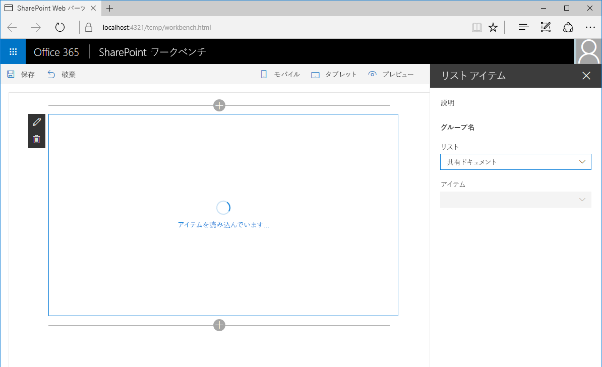
gulp serveWeb ブラウザーで、 リスト アイテム Web パーツをキャンバスに追加し、そのプロパティを開きます。 List プロパティの値セットが Web パーツ本文に表示されることを確認します。
ドロップダウンに選択する SharePoint リストを作成する
この時点で、ユーザーはリスト名を手動で入力して、Web パーツが使用する必要のあるリストを指定します。 この方法は間違えやすいため、理想的なのは、現在の SharePoint サイトに存在するいずれかのリストをユーザーが選択することです。
ドロップダウン コントロールを使用して listName プロパティをレンダリングする
ListItemsWebPartクラスで、Web パーツの上部セクションにあるPropertyPaneDropdownクラスへの参照を追加します。PropertyPaneTextFieldクラスを読み込むインポート句を次のように置き換えます。import { IPropertyPaneConfiguration, PropertyPaneTextField, PropertyPaneDropdown, IPropertyPaneDropdownOption } from '@microsoft/sp-property-pane';ListItemsWebPartクラスで、listsという名前の新しい変数を追加して、現在のサイトで選択可能なすべてのリストに関する情報を格納します。export default class ListItemsWebPart extends BaseClientSideWebPart<IListItemsWebPartProps> { private lists: IPropertyPaneDropdownOption[]; // ... }listsDropdownDisabledという名前の新しいクラス変数を追加します。 この変数は、リスト ドロップダウンを有効または無効にするかどうかを決定します。 Web パーツが現在のサイトで利用可能なリストについての情報を取得するまで、ドロップダウンを無効にする必要があります。export default class ListItemsWebPart extends BaseClientSideWebPart<IListItemsWebPartProps> { // ... private listsDropdownDisabled: boolean = true; // ... }getPropertyPaneConfiguration()メソッドを変更すると、ドロップダウン コントロールを使用してlistNameプロパティをレンダリングできます。export default class ListItemsWebPart extends BaseClientSideWebPart<IListItemsWebPartProps> { // ... protected getPropertyPaneConfiguration(): IPropertyPaneConfiguration { return { pages: [ { header: { description: strings.PropertyPaneDescription }, groups: [ { groupName: strings.BasicGroupName, groupFields: [ PropertyPaneDropdown('listName', { label: strings.ListNameFieldLabel, options: this.lists, disabled: this.listsDropdownDisabled }) ] } ] } ] }; } }次のコマンドを実行して、正常に動作していることを確認します。
gulp serve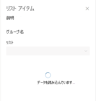
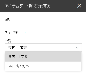
リスト ドロップダウンで選択可能なリストを表示する
既に、listName プロパティのドロップダウン コントロールと lists クラス プロパティを関連付けています。 まだ値を読み込んでいないので、Web パーツ プロパティ ウィンドウの List ドロップダウンは無効のままになっています。 このセクションでは、Web パーツを拡張して、選択可能なリストに関する情報を読み込みます。
ListItemsWebPartクラスで、選択可能なリストを読み込むためのメソッドを追加します。 モック データを使用しますが、SharePoint REST API を呼び出して現在の Web で選択可能なリストに基づいてリストを取得することもできます。 外部サービスからオプションを読み込む処理をシミュレートするため、このメソッドでは 2 秒の延期時間を使用します。export default class ListItemsWebPart extends BaseClientSideWebPart<IListItemsWebPartProps> { // ... private loadLists(): Promise<IPropertyPaneDropdownOption[]> { return new Promise<IPropertyPaneDropdownOption[]>((resolve: (options: IPropertyPaneDropdownOption[]) => void, reject: (error: any) => void) => { setTimeout((): void => { resolve([{ key: 'sharedDocuments', text: 'Shared Documents' }, { key: 'myDocuments', text: 'My Documents' }]); }, 2000); }); } }選択可能なリストに関する情報をリスト ドロップダウンに読み込む
ListItemsWebPartクラスで、次のコードを使用して、onPropertyPaneConfigurationStart()メソッドをオーバーライドします。export default class ListItemsWebPart extends BaseClientSideWebPart<IListItemsWebPartProps> { // ... protected onPropertyPaneConfigurationStart(): void { this.listsDropdownDisabled = !this.lists; if (this.lists) { return; } this.context.statusRenderer.displayLoadingIndicator(this.domElement, 'lists'); this.loadLists() .then((listOptions: IPropertyPaneDropdownOption[]): void => { this.lists = listOptions; this.listsDropdownDisabled = false; this.context.propertyPane.refresh(); this.context.statusRenderer.clearLoadingIndicator(this.domElement); this.render(); }); } // ... }onPropertyPaneConfigurationStart()メソッドは、Web パーツの Web パーツ プロパティ ウィンドウが開いた後、SharePoint Framework によって呼び出されます。- 最初に、メソッドは現在のサイトで選択可能なリストに関する情報が読み込まれているかどうかを確認します。
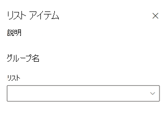
- リスト情報が読み込まれると、リスト ドロップダウンが有効になります。
- リストに関するリスト情報がまだ読み込まれていない場合は、Web パーツがリストに関する情報を読み込み中であることをユーザーに通知する読み込みインジケーターが表示されます。
選択可能なリストに関する情報が読み込まれた後、メソッドは取得したデータを
listsクラス変数に割り当てます。取得したデータはここからリスト ドロップダウンで使用することができます。次に、ユーザーがリストを選択できるようにドロップダウンが有効になります。
this.context.propertyPane.refresh()を呼び出すことにより、Web パーツ プロパティ ウィンドウが更新され、リスト ドロップダウンに最新の変更が反映されます。リスト情報が読み込まれると、読み込みインジケーターは
clearLoadingIndicator()メソッドの呼び出しによって削除されます。 このメソッドを呼び出すと、Web パーツのユーザー インターフェイスがクリアされ、Web パーツを強制的に再レンダリングするためにrender()メソッドが呼び出されます。すべてが正常に動作することを確認するために次のコマンドを実行します。
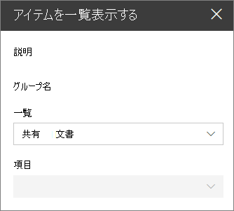
gulp serveキャンバスに Web パーツを追加して、そのプロパティ ウィンドウを開くと、リストが選択可能になっているリスト ドロップダウン フィールドが表示され、ユーザーはそこからリストを選択できます。
選択したリストから項目をユーザーが選択できるようにする
Web パーツをビルドする際は、多くの場合、選択した大陸に基づいて国/地域を選択する、または選択したリストからリスト アイテムを選択するなど、以前に選択した値によって決定される値のセットからユーザーがオプションを選択できるようにする必要があります。 このユーザー エクスペリエンスは、よくカスケード ドロップダウンとも呼ばれます。 標準の SharePoint Framework のクライアント側の Web パーツ機能を使用すると、Web パーツ プロパティ ウィンドウでカスケード ドロップダウンをビルドできます。 これを行うには、以前にビルドした Web パーツを拡張して、以前に選択したリストに基づいてリスト アイテムを選択できるようにします。
アイテム Web パーツ プロパティを追加する
コード エディターで、src/webparts/listItems/ListItemsWebPart.manifest.json ファイルを開きます。
propertiesセクションにitemNameという名前の新しいプロパティを追加します。次のようになります。{ // ... "properties": { "listName": "", "itemName": "" } // ... }src/webparts/listItems/IListItemsWebPartProps.ts ファイルのコードを次のように変更します。
export interface IListItemsWebPartProps {
  listName: string;
  itemName: string;
}
src/webparts/listItems/components/IListItemsProps.ts ファイルのコードを次のように変更します。
export interface IListItemsProps {
  listName: string;
  itemName: string;
}
src/webparts/listItems/ListItemsWebPart.ts ファイルで、
render()メソッドのコードを次のように変更します。export default class ListItemsWebPart extends BaseClientSideWebPart<IListItemsWebPartProps> { // ... public render(): void { const element: React.ReactElement<IListItemsProps> = React.createElement(ListItems, { listName: this.properties.listName, itemName: this.properties.itemName }); ReactDom.render(element, this.domElement); } // ... }src/webparts/listItems/loc/mystrings.d.ts ファイルで、
IListItemsStringsインターフェイスを次のように変更します。declare interface IListItemsStrings { PropertyPaneDescription: string; BasicGroupName: string; ListNameFieldLabel: string; ItemNameFieldLabel: string; }src/webparts/listItems/loc/en-us.js ファイルで、
ItemNameFieldLabel文字列に関して欠けている定義を追加します。define([], function() { return { "PropertyPaneDescription": "Description", "BasicGroupName": "Group Name", "ListNameFieldLabel": "List", "ItemNameFieldLabel": "Item" } });
アイテム Web パーツ プロパティの値をレンダリングする
src/webparts/listItems/components/ListItems.tsx ファイルで、render() メソッドを次のように変更します。
export default class ListItems extends React.Component<IListItemsProps, {}> {
  public render(): JSX.Element {
    const {
      listName,
      itemName
    } = this.props;

    return (
      <section className={`${styles.listItems} ${hasTeamsContext ? styles.teams : ''}`}>
        <div className={styles.welcome}>
          <img alt="" src={isDarkTheme ? require('../assets/welcome-dark.png') : require('../assets/welcome-light.png')} className={styles.welcomeImage} />
          <h2>Well done, {escape(userDisplayName)}!</h2>
          <div>{environmentMessage}</div>
          <div>List name: <strong>{escape(listName)}</strong></div>
          <div>Item name: <strong>{escape(itemName)}</strong></div>
        </div>
      </section>
    );
  }
}
ユーザーがリストからアイテムを選択できるようにする
ユーザーがドロップダウンを使用してリストを選択できるようにする方法と同様に、ユーザーは利用可能なアイテムのリストからアイテムを選択できる必要があります。
ListItemsWebPartクラスで、現在選択しているリストで利用可能なすべてのアイテムに関する情報を格納するために使用する、itemsという名前の新しい変数を追加します。export default class ListItemsWebPart extends BaseClientSideWebPart<IListItemsWebPartProps> { // ... private items: IPropertyPaneDropdownOption[]; // ... }itemsDropdownDisabledという名前の新しいクラス変数を追加します。 この変数は、アイテム ドロップダウンを有効または無効にするかどうかを決定します。 ユーザーは、リストを選択した後にのみ、アイテムを選択できる必要があります。export default class ListItemsWebPart extends BaseClientSideWebPart<IListItemsWebPartProps> { // ... private itemsDropdownDisabled: boolean = true; // ... }getPropertyPaneConfiguration()メソッドを変更すると、ドロップダウン コントロールを使用してitemNameプロパティをレンダリングできるようになります。export default class ListItemsWebPart extends BaseClientSideWebPart<IListItemsWebPartProps> { // ... protected getPropertyPaneConfiguration(): IPropertyPaneConfiguration { return { pages: [ { header: { description: strings.PropertyPaneDescription }, groups: [ { groupName: strings.BasicGroupName, groupFields: [ PropertyPaneDropdown('listName', { label: strings.ListNameFieldLabel, options: this.lists, disabled: this.listsDropdownDisabled }), PropertyPaneDropdown('itemName', { label: strings.ItemNameFieldLabel, options: this.items, disabled: this.itemsDropdownDisabled }) ] } ] } ] }; } }次のコマンドを実行して、正常に動作していることを確認します。
gulp serve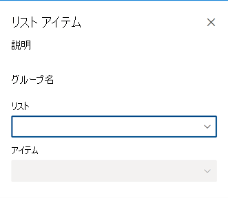
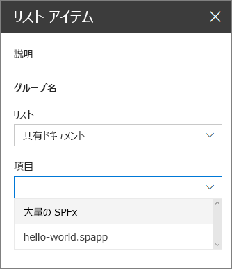
アイテム ドロップダウンに選択したリスト内の利用可能なアイテムを表示する
既に、ドロップダウン コントロールを定義して、Web パーツ プロパティ ウィンドウに itemName プロパティをレンダリングしました。 次は、Web パーツを拡張して、選択したリスト内の利用可能なアイテムに関する情報を読み込み、アイテム ドロップダウンにアイテムを表示します。
リスト アイテムを読み込むためのメソッドを追加する src/webparts/listItems/ListItemsWebPart.ts ファイルの
ListItemsWebPartクラスで、選択したリストに基づいて選択可能なリスト項目を読み込むための新しいメソッドを追加します。 (選択可能なリストを読み込むためのメソッドと同じようにモック データを使用します。)export default class ListItemsWebPart extends BaseClientSideWebPart<IListItemsWebPartProps> { // ... private loadItems(): Promise<IPropertyPaneDropdownOption[]> { if (!this.properties.listName) { // resolve to empty options since no list has been selected return Promise.resolve(); } const wp: ListItemsWebPart = this; return new Promise<IPropertyPaneDropdownOption[]>((resolve: (options: IPropertyPaneDropdownOption[]) => void, reject: (error: any) => void) => { setTimeout(() => { const items = { sharedDocuments: [ { key: 'spfx_presentation.pptx', text: 'SPFx for the masses' }, { key: 'hello-world.spapp', text: 'hello-world.spapp' } ], myDocuments: [ { key: 'isaiah_cv.docx', text: 'Isaiah CV' }, { key: 'isaiah_expenses.xlsx', text: 'Isaiah Expenses' } ] }; resolve(items[wp.properties.listName]); }, 2000); }); } }loadItems()メソッドは、以前に選択したリストのモック リスト アイテムを返します。 リストが選択されていない場合、データなしで promise を解決します。利用可能なアイテムに関する情報をアイテム ドロップダウンに読み込む
ListItemsWebPartクラスで、onPropertyPaneConfigurationStart()メソッドを拡張すると、選択したリストの項目を読み込無ことができます。export default class ListItemsWebPart extends BaseClientSideWebPart<IListItemsWebPartProps> { // ... protected onPropertyPaneConfigurationStart(): void { this.listsDropdownDisabled = !this.lists; this.itemsDropdownDisabled = !this.properties.listName || !this.items; if (this.lists) { return; } this.context.statusRenderer.displayLoadingIndicator(this.domElement, 'options'); this.loadLists() .then((listOptions: IPropertyPaneDropdownOption[]): Promise<IPropertyPaneDropdownOption[]> => { this.lists = listOptions; this.listsDropdownDisabled = false; this.context.propertyPane.refresh(); return this.loadItems(); }) .then((itemOptions: IPropertyPaneDropdownOption[]): void => { this.items = itemOptions; this.itemsDropdownDisabled = !this.properties.listName; this.context.propertyPane.refresh(); this.context.statusRenderer.clearLoadingIndicator(this.domElement); this.render(); }); } // ... }初期化時に、最初に Web パーツはアイテム ドロップダウンを有効にするかどうかを決定します。 ユーザーが既にリストを選択している場合は、そのリストからアイテムを選択できます。 リストが選択されていない場合は、アイテム ドロップダウンは無効になっています。
選択したリスト内の利用可能なアイテムに関する情報を読み込むために、選択可能なリストに関する情報を読み込む、既に定義済みのコードを拡張しました。 次に、コードによって、アイテム ドロップダウンで使用するため、取得した情報が
itemsクラス変数に割り当てられます。 最後に、コードによって、読み込みインジケーターがクリアされ、ユーザーが Web パーツの操作を開始できるようになります。すべてが正常に動作することを確認するために次のコマンドを実行します。
gulp serve必要に応じて、最初はアイテム ドロップダウンを無効にして、ユーザーにまずリストを選択するよう求めます。 ただし、この時点では、リストが選択された後でも、アイテム ドロップダウンは無効のままです。
リストの選択後に Web パーツ プロパティ ウィンドウを更新する ユーザーがプロパティ ウィンドウでリストを選択する場合は、Web パーツを更新して、アイテム ドロップダウンを有効にし、選択したリスト内の利用可能なアイテムのリストを表示する必要があります。
ListItemsWebPart.ts ファイルの
ListItemsWebPartクラスで、onPropertyPaneFieldChanged()メソッドを次のコードで上書きします。export default class ListItemsWebPart extends BaseClientSideWebPart<IListItemsWebPartProps> { // ... protected onPropertyPaneFieldChanged(propertyPath: string, oldValue: any, newValue: any): void { if (propertyPath === 'listName' && newValue) { // push new list value super.onPropertyPaneFieldChanged(propertyPath, oldValue, newValue); // get previously selected item const previousItem: string = this.properties.itemName; // reset selected item this.properties.itemName = undefined; // push new item value this.onPropertyPaneFieldChanged('itemName', previousItem, this.properties.itemName); // disable item selector until new items are loaded this.itemsDropdownDisabled = true; // refresh the item selector control by repainting the property pane this.context.propertyPane.refresh(); // communicate loading items this.context.statusRenderer.displayLoadingIndicator(this.domElement, 'items'); this.loadItems() .then((itemOptions: IPropertyPaneDropdownOption[]): void => { // store items this.items = itemOptions; // enable item selector this.itemsDropdownDisabled = false; // clear status indicator this.context.statusRenderer.clearLoadingIndicator(this.domElement); // re-render the web part as clearing the loading indicator removes the web part body this.render(); // refresh the item selector control by repainting the property pane this.context.propertyPane.refresh(); }); } else { super.onPropertyPaneFieldChanged(propertyPath, oldValue, newValue); } } // ... }ユーザーがリストを選択すると、Web パーツは新しく選択された値を維持します。 選択したリストが変更されたため、Web パーツは以前選択したリスト アイテムをリセットします。 リストが選択されたので、これで Web パーツ プロパティ ウィンドウにその特定のリストのリスト アイテムが読み込まれます。 アイテムの読み込み中に、ユーザーは項目を選択できません。
選択されているリストのアイテムが読み込まれると、それらのアイテムはアイテム ドロップダウンで参照可能な場所から items クラス変数に割り当てられます。 これで選択可能なリスト アイテムに関する情報が利用できるようになり、アイテム ドロップダウンが有効化され、ユーザーがアイテムを選択できるようになりました。 読み込みインジケーターは削除され、Web パーツを再度レンダリングする理由を示す Web パーツ本文が消去されます。 最後に、Web パーツ プロパティ ウィンドウが更新され、最新の変更が反映されます。