Windows アプリでの手描き入力を容易にする 2 つの異なるコントロールがあります。 InkCanvas と InkToolbar です。
InkCanvas コントロールは、基本的な Windows Ink 機能を提供します。 これを使用して、ペン入力をインク ストローク (色と太さの既定の設定を使用) または消去ストロークとしてレンダリングします。
InkCanvas の実装の詳細については、 Windows アプリでのペンとスタイラスの操作に関するページを参照してください。
完全に透過的なオーバーレイとして、InkCanvas には、インク ストロークのプロパティを設定するための組み込みの UI は用意されていません。 既定の手描き入力エクスペリエンスを変更し、ユーザーがインク ストロークのプロパティを設定し、他のカスタム 手描き入力機能をサポートできるようにする場合は、次の 2 つのオプションがあります。
分離コードでは、InkCanvas にバインドされた基になる InkPresenter オブジェクトを使用します。
InkPresenter API は、手描き入力エクスペリエンスの広範なカスタマイズをサポートします。 詳細については、「 Windows アプリでのペン操作とスタイラス操作」を参照してください。
InkToolbar を InkCanvas にバインドします。 既定では、InkToolbar には、ストローク サイズ、インクの色、ペン先などのインク関連機能をアクティブ化するための、カスタマイズ可能で拡張可能なボタンのコレクションが用意されています。
このトピックでは InkToolbar について説明します。
重要な API: InkCanvas クラス、 InkToolbar クラス、 InkPresenter クラス、 Windows.UI.Input.Inking
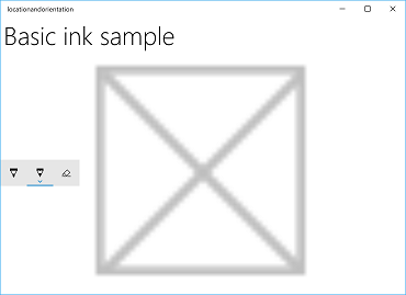
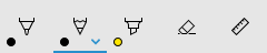
既定の InkToolbar
既定では、 InkToolbar にはステンシル (ルーラーまたは分度器) を描画、消去、強調表示、および表示するためのボタンが含まれています。 機能に応じて、インクの色、ストロークの太さ、すべてのインクの消去など、他の設定やコマンドがポップアップで提供されています。
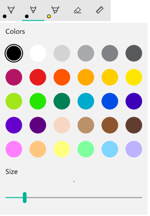
既定の Windows Ink ツール バー
既定の InkToolbar を手描 き入力アプリに追加するには、 InkCanvas と同じページに配置し、2 つのコントロールを関連付けます。
- MainPage.xaml で、手描き入力サーフェイスのコンテナー オブジェクト (この例では Grid コントロールを使用) を宣言します。
- InkCanvas オブジェクトをコンテナーの子として宣言します。 (InkCanvas サイズはコンテナーから継承されます)。
- InkToolbar を宣言し、TargetInkCanvas 属性を使用して InkCanvas にバインドします。
注
InkToolbar が InkCanvas の後に宣言されていることを確認します。 そうでない場合は、InkCanvas オーバーレイによって InkToolbar にアクセスできなくなります。
<Grid Background="{ThemeResource ApplicationPageBackgroundThemeBrush}">
<Grid.RowDefinitions>
<RowDefinition Height="Auto"/>
<RowDefinition Height="*"/>
</Grid.RowDefinitions>
<StackPanel x:Name="HeaderPanel" Orientation="Horizontal" Grid.Row="0">
<TextBlock x:Name="Header"
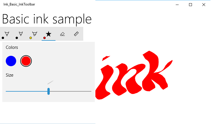
Text="Basic ink sample"
Style="{ThemeResource HeaderTextBlockStyle}"
Margin="10,0,0,0" />
</StackPanel>
<Grid Grid.Row="1">
<Image Source="Assets\StoreLogo.png" />
<InkCanvas x:Name="inkCanvas" />
<InkToolbar x:Name="inkToolbar"
VerticalAlignment="Top"
TargetInkCanvas="{x:Bind inkCanvas}" />
</Grid>
</Grid>
基本的なカスタマイズ
このセクションでは、Windows Ink ツール バーの基本的なカスタマイズ シナリオについて説明します。
位置と向きを指定する
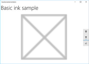
アプリにインク ツール バーを追加するときに、ツール バーの既定の場所と向きをそのまま使用するか、アプリまたはユーザーの必要に応じて設定できます。
XAML
VerticalAlignment プロパティ、HorizontalAlignment プロパティ、および Orientation プロパティを使用して、ツールバーの位置と方向を明示的に指定します。
| 既定値 | Explicit |
|---|---|
|
|
| Windows Ink ツール バーの既定の場所と向き | Windows Ink ツール バーの明示的な位置と向き |
XAML でインク ツール バーの位置と向きを明示的に設定するコードを次に示します。
<InkToolbar x:Name="inkToolbar"
    VerticalAlignment="Center"
    HorizontalAlignment="Right"
    Orientation="Vertical"
    TargetInkCanvas="{x:Bind inkCanvas}" />
ユーザー設定またはデバイスの状態に基づいて初期化する
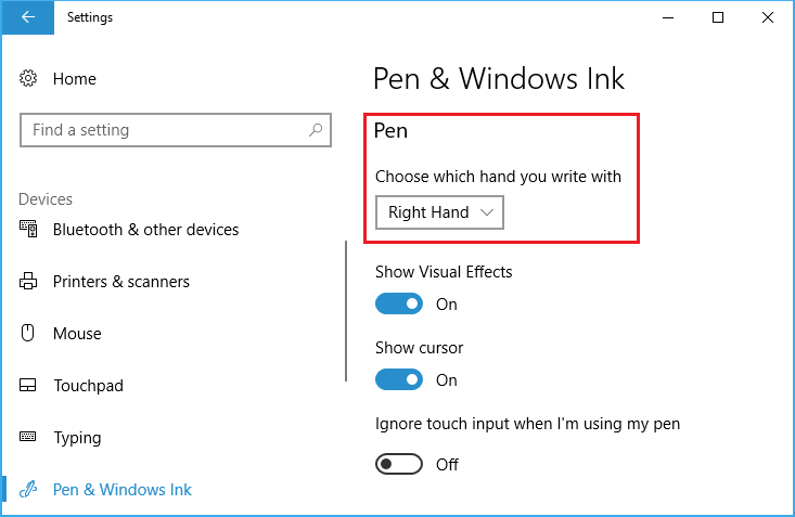
場合によっては、ユーザー設定またはデバイスの状態に基づいてインク ツール バーの場所と向きを設定することが必要になる場合があります。 次の例では、[設定] > [デバイス] > ペンと [Windows Ink > ペン] で指定した左または右の書き込み設定に基づいて、インク ツール バーの位置と向きを設定する方法を示します> どの手で書くかを選択します。
主要な手の設定
この設定は、Windows.UI.ViewManagement の HandPreference プロパティを使用してクエリを実行し、返された値に基づいて HorizontalAlignment を 設定できます。 この例では、左利きのユーザーの場合はアプリの左側、右利きのユーザーの場合は右側にツール バーを見つけます。
Ink ツール バーの位置と向きのサンプルからこのサンプルをダウンロードする (基本)
public MainPage()
{
    this.InitializeComponent();

    Windows.UI.ViewManagement.UISettings settings =
        new Windows.UI.ViewManagement.UISettings();
    HorizontalAlignment alignment =
        (settings.HandPreference ==
            Windows.UI.ViewManagement.HandPreference.LeftHanded) ?
            HorizontalAlignment.Left : HorizontalAlignment.Right;
    inkToolbar.HorizontalAlignment = alignment;
}
ユーザーまたはデバイスの状態に合わせて動的に調整する
バインドを使用して、ユーザー設定、デバイス設定、またはデバイスの状態の変更に基づいて UI の更新を確認することもできます。 次の例では、前の例を展開し、バインド、ViewMOdel オブジェクト、 および INotifyPropertyChanged インターフェイスを使用して、デバイスの向きに基づいてインク ツール バーを動的に配置する方法を示します。
Ink ツール バーの位置と向きのサンプルからこのサンプルをダウンロードする (動的)
まず、ViewModel を追加しましょう。
新しいフォルダーをプロジェクトに追加し、 ViewModels と呼びます。
ViewModels フォルダーに新しいクラスを追加します (この例では、 InkToolbarSnippetHostViewModel.csと呼ばれます)。
注
アプリケーションの有効期間にこの型のオブジェクトが 1 つだけ必要な場合は、 シングルトン パターン を使用しました
using System.ComponentModel名前空間をファイルに追加します。インスタンスと呼ばれる静的メンバー変数と、 Instance という名前の静的読み取り専用プロパティを追加 します。 このクラスが Instance プロパティを介してのみアクセスできるように、コンストラクターをプライベートにします。
注
このクラスは、プロパティ値が変更されたことをクライアントに通知するために使用される INotifyPropertyChanged インターフェイス (通常はクライアントをバインドする) から継承します。 これを使用して、デバイスの向きの変更を処理します (このコードを展開し、後の手順で詳しく説明します)。
using System.ComponentModel;

namespace locationandorientation.ViewModels
{
    public class InkToolbarSnippetHostViewModel : INotifyPropertyChanged
    {
        private static InkToolbarSnippetHostViewModel instance;

        public static InkToolbarSnippetHostViewModel Instance
        {
            get
            {
                if (null == instance)
                {
                    instance = new InkToolbarSnippetHostViewModel();
                }
                return instance;
            }
        }
    }

    private InkToolbarSnippetHostViewModel() { }
}
InkToolbarSnippetHostViewModel クラスに、 LeftHandedLayout (前の XAML のみの例と同じ機能) と PortraitLayout (デバイスの向き) の 2 つのブール プロパティを追加します。
注
PortraitLayout プロパティは設定可能であり、 PropertyChanged イベントの定義が含まれています。
public bool LeftHandedLayout
{
    get
    {
        bool leftHandedLayout = false;
        Windows.UI.ViewManagement.UISettings settings =
            new Windows.UI.ViewManagement.UISettings();
        leftHandedLayout = (settings.HandPreference ==
            Windows.UI.ViewManagement.HandPreference.LeftHanded);
        return leftHandedLayout;
    }
}

public bool portraitLayout = false;
public bool PortraitLayout
{
    get
    {
        Windows.UI.ViewManagement.ApplicationViewOrientation winOrientation =
            Windows.UI.ViewManagement.ApplicationView.GetForCurrentView().Orientation;
        portraitLayout =
            (winOrientation ==
                Windows.UI.ViewManagement.ApplicationViewOrientation.Portrait);
        return portraitLayout;
    }
    set
    {
        if (value.Equals(portraitLayout)) return;
        portraitLayout = value;
        PropertyChanged?.Invoke(this, new PropertyChangedEventArgs("PortraitLayout"));
    }
}
次に、いくつかのコンバーター クラスをプロジェクトに追加しましょう。 各クラスには、配置値 ( HorizontalAlignment または VerticalAlignment ) を返す Convert オブジェクトが含 まれています。
新しいフォルダーをプロジェクトに追加し、 Converters と呼びます。
Converters フォルダーに 2 つの新しいクラスを追加します (この例では、 それらを HorizontalAlignmentFromHandednessConverter.cs と VerticalAlignmentFromAppViewConverter.cs と呼びます)。
各ファイルに
using Windows.UI.Xaml名前空間とusing Windows.UI.Xaml.Data名前空間を追加します。各クラスを
publicに変更し、 IValueConverter インターフェイスを実装するように指定します。次に示すように、 Convert メソッドと ConvertBack メソッドを各ファイルに追加します (ConvertBack メソッドは実装されていません)。
- HorizontalAlignmentFromHandednessConverter は、右利きのユーザーの場合はアプリの右側、左利きのユーザーの場合はアプリの左側にインク ツール バーを配置します。
using System; using Windows.UI.Xaml; using Windows.UI.Xaml.Data; namespace locationandorientation.Converters { public class HorizontalAlignmentFromHandednessConverter : IValueConverter { public object Convert(object value, Type targetType, object parameter, string language) { bool leftHanded = (bool)value; HorizontalAlignment alignment = HorizontalAlignment.Right; if (leftHanded) { alignment = HorizontalAlignment.Left; } return alignment; } public object ConvertBack(object value, Type targetType, object parameter, string language) { throw new NotImplementedException(); } } }- VerticalAlignmentFromAppViewConverter は、アプリが縦向きのときにはインク ツール バーをアプリの中央に、横向きのときにはアプリの上部に配置します(これは使いやすさを向上させることを意図していますが、デモンストレーションのための任意の選択です)。
using System;

using Windows.UI.Xaml;
using Windows.UI.Xaml.Data;

namespace locationandorientation.Converters
{
    public class VerticalAlignmentFromAppViewConverter : IValueConverter
    {
        public object Convert(object value, Type targetType,
            object parameter, string language)
        {
            bool portraitOrientation = (bool)value;
            VerticalAlignment alignment = VerticalAlignment.Top;
            if (portraitOrientation)
            {
                alignment = VerticalAlignment.Center;
            }
            return alignment;
        }

        public object ConvertBack(object value, Type targetType,
            object parameter, string language)
        {
            throw new NotImplementedException();
        }
    }
}
次に、MainPage.xaml.cs ファイルを開きます。
-
using using locationandorientation.ViewModelsを名前空間の一覧に追加して、ViewModel を関連付けます。 -
using Windows.UI.ViewManagementを名前空間の一覧に追加して、デバイスの向きの変更をリッスンできるようにします。 - WindowSizeChangedEventHandler コードを追加します。
- ビューの DataContext を InkToolbarSnippetHostViewModel クラスのシングルトン インスタンスに設定します。
using Windows.UI.Xaml; using Windows.UI.Xaml.Controls; using locationandorientation.ViewModels; using Windows.UI.ViewManagement; namespace locationandorientation { public sealed partial class MainPage : Page { public MainPage() { this.InitializeComponent(); Window.Current.SizeChanged += (sender, args) => { ApplicationView currentView = ApplicationView.GetForCurrentView(); if (currentView.Orientation == ApplicationViewOrientation.Landscape) { InkToolbarSnippetHostViewModel.Instance.PortraitLayout = false; } else if (currentView.Orientation == ApplicationViewOrientation.Portrait) { InkToolbarSnippetHostViewModel.Instance.PortraitLayout = true; } }; DataContext = InkToolbarSnippetHostViewModel.Instance; } } }-
次に、MainPage.xaml ファイルを開きます。
コンバーターにバインドするための
xmlns:converters="using:locationandorientation.Converters"要素にPageを追加します。<Page x:Class="locationandorientation.MainPage" xmlns="http://schemas.microsoft.com/winfx/2006/xaml/presentation" xmlns:x="http://schemas.microsoft.com/winfx/2006/xaml" xmlns:local="using:locationandorientation" xmlns:converters="using:locationandorientation.Converters" xmlns:d="http://schemas.microsoft.com/expression/blend/2008" xmlns:mc="http://schemas.openxmlformats.org/markup-compatibility/2006" mc:Ignorable="d">PageResources要素を追加し、コンバーターへの参照を指定します。<Page.Resources> <converters:HorizontalAlignmentFromHandednessConverter x:Key="HorizontalAlignmentConverter"/> <converters:VerticalAlignmentFromAppViewConverter x:Key="VerticalAlignmentConverter"/> </Page.Resources>InkCanvas 要素と InkToolbar 要素を追加し、InkToolbar の VerticalAlignment プロパティと HorizontalAlignment プロパティをバインドします。
<InkCanvas x:Name="inkCanvas" />
<InkToolbar x:Name="inkToolbar"
            VerticalAlignment="{Binding PortraitLayout, Converter={StaticResource VerticalAlignmentConverter} }"
            HorizontalAlignment="{Binding LeftHandedLayout, Converter={StaticResource HorizontalAlignmentConverter} }"
            Orientation="Vertical"
            TargetInkCanvas="{x:Bind inkCanvas}" />
InkToolbarSnippetHostViewModel.cs ファイルに戻り、
PortraitLayoutクラスにLeftHandedLayoutプロパティとInkToolbarSnippetHostViewModelbool プロパティを追加し、そのプロパティ値が変更されたときにPortraitLayoutを再バインドできます。public bool LeftHandedLayout { get { bool leftHandedLayout = false; Windows.UI.ViewManagement.UISettings settings = new Windows.UI.ViewManagement.UISettings(); leftHandedLayout = (settings.HandPreference == Windows.UI.ViewManagement.HandPreference.LeftHanded); return leftHandedLayout; } } public bool portraitLayout = false; public bool PortraitLayout { get { Windows.UI.ViewManagement.ApplicationViewOrientation winOrientation = Windows.UI.ViewManagement.ApplicationView.GetForCurrentView().Orientation; portraitLayout = (winOrientation == Windows.UI.ViewManagement.ApplicationViewOrientation.Portrait); return portraitLayout; } set { if (value.Equals(portraitLayout)) return; portraitLayout = value; PropertyChanged?.Invoke(this, new PropertyChangedEventArgs("PortraitLayout")); } } #region INotifyPropertyChanged Members public event PropertyChangedEventHandler PropertyChanged; protected void OnPropertyChanged(string property) { PropertyChanged?.Invoke(this, new PropertyChangedEventArgs(property)); } #endregion
これで、ユーザーの主要な手の好みに適応し、ユーザーのデバイスの向きに動的に応答する手描き入力アプリが作成されました。
選択したボタンを指定する
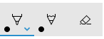
初期化時に鉛筆ボタンが選択された Windows Ink ツール バー
既定では、アプリが起動され、ツール バーが初期化されるときに、最初 (または左端) のボタンが選択されます。 既定の Windows Ink ツール バーでは、これがボールペン ボタンです。
フレームワークでは組み込みボタンの順序が定義されているため、最初のボタンは既定でアクティブ化するペンまたはツールではない可能性があります。
この既定の動作をオーバーライドし、ツール バーで選択したボタンを指定できます。
この例では、鉛筆ボタンが選択され、ボールペンの代わりに鉛筆がアクティブ化された状態で、既定のツール バーを初期化します。
- 前の例の InkCanvas と InkToolbar の XAML 宣言を使用します。
- 分離コードで、InkToolbar オブジェクトの Loaded イベントのハンドラーを設定します。
/// <summary>
/// An empty page that can be used on its own or navigated to within a Frame.
/// Here, we set up InkToolbar event listeners.
/// </summary>
public MainPage_CodeBehind()
{
    this.InitializeComponent();
    // Add handlers for InkToolbar events.
    inkToolbar.Loaded += inkToolbar_Loaded;
}
Loaded イベントのハンドラーで、次の手順を実行します。
- 組み込みの InkToolbarPencilButton への参照を取得します。
GetToolButton メソッドで InkToolbarTool.Pencil オブジェクトを渡すと、InkToolbarPencilButton の InkToolbarToolButton オブジェクトが返されます。
- ActiveTool を、前の手順で返されたオブジェクトに設定します。
/// <summary>
/// Handle the Loaded event of the InkToolbar.
/// By default, the active tool is set to the first tool on the toolbar.
/// Here, we set the active tool to the pencil button.
/// </summary>
/// <param name="sender"></param>
/// <param name="e"></param>
private void inkToolbar_Loaded(object sender, RoutedEventArgs e)
{
    InkToolbarToolButton pencilButton = inkToolbar.GetToolButton(InkToolbarTool.Pencil);
    inkToolbar.ActiveTool = pencilButton;
}
組み込みボタンを指定する
初期化時に含まれる特定のボタン
前述のように、Windows Ink ツール バーには、既定の組み込みボタンのコレクションが含まれています。 これらのボタンは、次の順序 (左から右) で表示されます。
この例では、組み込みのボールペン、鉛筆、消しゴムボタンのみでツールバーを初期化します。
これを行うには、XAML またはコードビハインドを使用します。
XAML
最初の例から InkCanvas と InkToolbar の XAML 宣言を変更します。
- InitialControls 属性を追加し、その値を "None" に設定します。 これにより、組み込みボタンの既定のコレクションがクリアされます。
- アプリに必要な特定の InkToolbar ボタンを追加します。 ここでは、 InkToolbarBallpointPenButton、 InkToolbarPencilButton、 InkToolbarEraserButton のみを追加します。
注
ボタンは、ここで指定した順序ではなく、フレームワークによって定義された順序でツール バーに追加されます。
<Grid Background="{ThemeResource ApplicationPageBackgroundThemeBrush}">
    <Grid.RowDefinitions>
        <RowDefinition Height="Auto"/>
        <RowDefinition Height="*"/>
    </Grid.RowDefinitions>
    <StackPanel x:Name="HeaderPanel" Orientation="Horizontal" Grid.Row="0">
        <TextBlock x:Name="Header"
                   Text="Basic ink sample"
                   Style="{ThemeResource HeaderTextBlockStyle}"
                   Margin="10,0,0,0" />
    </StackPanel>
    <Grid Grid.Row="1">
        <Image Source="Assets\StoreLogo.png" />
        <!-- Clear the default InkToolbar buttons by setting InitialControls to None. -->
        <!-- Set the active tool to the pencil button. -->
        <InkCanvas x:Name="inkCanvas" />
        <InkToolbar x:Name="inkToolbar"
                    VerticalAlignment="Top"
                    TargetInkCanvas="{x:Bind inkCanvas}"
                    InitialControls="None">
            <!--
             Add only the ballpoint pen, pencil, and eraser.
             Note that the buttons are added to the toolbar in the order
             defined by the framework, not the order we specify here.
            -->
            <InkToolbarEraserButton />
            <InkToolbarBallpointPenButton />
            <InkToolbarPencilButton/>
        </InkToolbar>
    </Grid>
</Grid>
コードビハインド
- 最初の例の InkCanvas と InkToolbar の XAML 宣言を使用します。
<Grid Background="{ThemeResource ApplicationPageBackgroundThemeBrush}">
    <Grid.RowDefinitions>
        <RowDefinition Height="Auto"/>
        <RowDefinition Height="*"/>
    </Grid.RowDefinitions>
    <StackPanel x:Name="HeaderPanel" Orientation="Horizontal" Grid.Row="0">
        <TextBlock x:Name="Header"
                   Text="Basic ink sample"
                   Style="{ThemeResource HeaderTextBlockStyle}"
                   Margin="10,0,0,0" />
    </StackPanel>
    <Grid Grid.Row="1">
        <Image Source="Assets\StoreLogo.png" />
        <InkCanvas x:Name="inkCanvas" />
        <InkToolbar x:Name="inkToolbar"
        VerticalAlignment="Top"
        TargetInkCanvas="{x:Bind inkCanvas}" />
    </Grid>
</Grid>
- 分離コードで、InkToolbar オブジェクトの Loading イベントのハンドラーを設定します。
/// <summary>
/// An empty page that can be used on its own or navigated to within a Frame.
/// Here, we set up InkToolbar event listeners.
/// </summary>
public MainPage_CodeBehind()
{
    this.InitializeComponent();
    // Add handlers for InkToolbar events.
    inkToolbar.Loading += inkToolbar_Loading;
}
- InitialControls を "None" に設定します。
- アプリに必要なボタンのオブジェクト参照を作成します。 ここでは、 InkToolbarBallpointPenButton、 InkToolbarPencilButton、 InkToolbarEraserButton のみを追加します。
注
ボタンは、ここで指定した順序ではなく、フレームワークによって定義された順序でツール バーに追加されます。
- InkToolbar にボタンを追加します。
/// <summary>
/// Handles the Loading event of the InkToolbar.
/// Here, we identify the buttons to include on the InkToolbar.
/// </summary>
/// <param name="sender">The InkToolbar</param>
/// <param name="args">The InkToolbar event data.
/// If there is no event data, this parameter is null</param>
private void inkToolbar_Loading(FrameworkElement sender, object args)
{
    // Clear all built-in buttons from the InkToolbar.
    inkToolbar.InitialControls = InkToolbarInitialControls.None;

    // Add only the ballpoint pen, pencil, and eraser.
    // Note that the buttons are added to the toolbar in the order
    // defined by the framework, not the order we specify here.
    InkToolbarBallpointPenButton ballpoint = new InkToolbarBallpointPenButton();
    InkToolbarPencilButton pencil = new InkToolbarPencilButton();
    InkToolbarEraserButton eraser = new InkToolbarEraserButton();
    inkToolbar.Children.Add(eraser);
    inkToolbar.Children.Add(ballpoint);
    inkToolbar.Children.Add(pencil);
}
カスタム ボタンと手描き入力機能
InkToolbar を使用して提供されるボタン (および関連する手描き入力機能) のコレクションをカスタマイズおよび拡張できます。
InkToolbar は、ボタン タイプの 2 つの異なるグループで構成されます。
- 組み込みの描画、消去、強調表示ボタンを含む 「ツール」 ボタンのグループ。 カスタムのペンとツールはここに追加されます。
手記 機能の選択は相互に排他的です。
- 組み込みのルーラー ボタンを含む 「トグル」 ボタンのグループ。 カスタムトグルがここに追加されます。
手記 機能は相互に排他的ではなく、他のアクティブなツールと同時に使用できます。
アプリケーションと必要な手描き入力機能に応じて、次のいずれかのボタン (カスタム インク機能にバインドされている) を InkToolbar に追加できます。
- カスタム ペン – インク カラー パレットとペン先のプロパティ (図形、回転、サイズなど) がホスト アプリによって定義されるペン。
- カスタム ツール – ホスト アプリによって定義されるペン以外のツール。
- カスタム トグル – アプリ定義機能の状態をオンまたはオフに設定します。 オンにすると、この機能はアクティブなツールと連携して動作します。
手記 組み込みボタンの表示順序を変更することはできません。 デフォルトの表示順序は、ボールペン、鉛筆、蛍光ペン、消しゴム、ルーラーです。 カスタム ペンは最後のデフォルトのペンに追加され、最後のペン ボタンと消しゴム ボタンの間にカスタム ツール ボタンが追加され、ルーラー ボタンの後にカスタム トグル ボタンが追加されます。 (カスタム ボタンは、指定された順序で追加されます)。
カスタム ペン
インク カラー パレットとペンヒントのプロパティ (図形、回転、サイズなど) を定義するカスタム ペン (カスタム ペン ボタンを使用してアクティブ化) を作成できます。
カスタム書道ペン ボタン
この例では、基本的な書道インク ストロークを可能にする幅広い先端を持つカスタム ペンを定義します。 また、ボタンのポップアップに表示されるパレット内のブラシのコレクションもカスタマイズします。
コードビハインド
まず、カスタム ペンを定義し、分離コードで描画属性を指定します。 このカスタム ペンは、後で XAML から参照します。
- ソリューション エクスプローラーでプロジェクトを右クリックし、[追加] -> [新しい項目] を選択します。
- Visual C# -> Code で、新しいクラス ファイルを追加し、CalligraphicPen.cs呼び出します。
- Calligraphic.csで、既定の using ブロックを次のように置き換えます。
using System.Numerics;
using Windows.UI;
using Windows.UI.Input.Inking;
using Windows.UI.Xaml.Controls;
using Windows.UI.Xaml.Media;
- CalligraphicPen クラスが InkToolbarCustomPen から派生することを指定します。
class CalligraphicPen : InkToolbarCustomPen
{
}
- CreateInkDrawingAttributesCore をオーバーライドして、独自のブラシとストローク サイズを指定します。
class CalligraphicPen : InkToolbarCustomPen
{
    protected override InkDrawingAttributes
      CreateInkDrawingAttributesCore(Brush brush, double strokeWidth)
    {
    }
}
- InkDrawingAttributes オブジェクトを作成し、ペン先の図形、先端の回転、ストローク サイズ、インクの色を設定します。
class CalligraphicPen : InkToolbarCustomPen
{
    protected override InkDrawingAttributes
      CreateInkDrawingAttributesCore(Brush brush, double strokeWidth)
    {
        InkDrawingAttributes inkDrawingAttributes =
          new InkDrawingAttributes();
        inkDrawingAttributes.PenTip = PenTipShape.Circle;
        inkDrawingAttributes.Size =
          new Windows.Foundation.Size(strokeWidth, strokeWidth * 20);
        SolidColorBrush solidColorBrush = brush as SolidColorBrush;
        if (solidColorBrush != null)
        {
            inkDrawingAttributes.Color = solidColorBrush.Color;
        }
        else
        {
            inkDrawingAttributes.Color = Colors.Black;
        }

        Matrix3x2 matrix = Matrix3x2.CreateRotation(45);
        inkDrawingAttributes.PenTipTransform = matrix;

        return inkDrawingAttributes;
    }
}
XAML
次に、MainPage.xaml のカスタム ペンに必要な参照を追加します。
- CalligraphicPen.csで定義されているカスタム ペン (
CalligraphicPen) への参照と、カスタム ペン () でサポートされるCalligraphicPenPaletteを作成するローカル ページ リソース ディクショナリを宣言します。
<Page.Resources>
    <!-- Add the custom CalligraphicPen to the page resources. -->
    <local:CalligraphicPen x:Key="CalligraphicPen" />
    <!-- Specify the colors for the palette of the custom pen. -->
    <BrushCollection x:Key="CalligraphicPenPalette">
        <SolidColorBrush Color="Blue" />
        <SolidColorBrush Color="Red" />
    </BrushCollection>
</Page.Resources>
- 次に、子 InkToolbarCustomPenButton 要素を持つ InkToolbar を追加します。
カスタム ペン ボタンには、ページ リソースで宣言されている 2 つの静的リソース参照 ( CalligraphicPen と CalligraphicPenPalette) が含まれています。
また、ストローク サイズ スライダー (MinStrokeWidth、 MaxStrokeWidth、SelectedStrokeWidth)、 選択したブラシ (SelectedBrushIndex)、およびカスタム ペン ボタン (SymbolIcon) のアイコンの範囲も指定します。
<Grid Grid.Row="1">
    <InkCanvas x:Name="inkCanvas" />
    <InkToolbar x:Name="inkToolbar"
                VerticalAlignment="Top"
                TargetInkCanvas="{x:Bind inkCanvas}">
        <InkToolbarCustomPenButton
            CustomPen="{StaticResource CalligraphicPen}"
            Palette="{StaticResource CalligraphicPenPalette}"
            MinStrokeWidth="1" MaxStrokeWidth="3" SelectedStrokeWidth="2"
            SelectedBrushIndex ="1">
            <SymbolIcon Symbol="Favorite" />
            <InkToolbarCustomPenButton.ConfigurationContent>
                <InkToolbarPenConfigurationControl />
            </InkToolbarCustomPenButton.ConfigurationContent>
        </InkToolbarCustomPenButton>
    </InkToolbar>
</Grid>
カスタム トグル
アプリ定義機能の状態をオンまたはオフに設定するカスタム トグル (カスタム トグル ボタンを使用してアクティブ化) を作成できます。 オンにすると、この機能はアクティブなツールと連携して動作します。
この例では、タッチ入力による手描き入力を有効にするカスタム トグル ボタンを定義します (既定では、タッチ 手描き入力は有効になっていません)。
注
タッチによる手描き入力をサポートする必要がある場合は、この例で指定したアイコンと ツールヒント を使用して CustomToggleButton を使用して有効にすることをお勧めします。
通常、タッチ入力は、オブジェクトまたはアプリ UI の直接操作に使用されます。 タッチ 手描き入力が有効になっている場合の動作の違いを示すために、InkCanvas を ScrollViewer コンテナー内に配置し、ScrollViewer のサイズを InkCanvas よりも小さく設定します。
アプリが起動すると、ペンの手書き入力のみがサポートされ、タッチを使用して手描き入力サーフェイスをパンまたはズームします。 タッチ 手描き入力が有効になっている場合、タッチ入力を通じて手描き入力サーフェイスをパンまたはズームすることはできません。
注
InkCanvas と InkToolbar UX の両方のガイドラインについては、Inking コントロールを参照してください。 この例に関連する推奨事項を次に示します。
- InkToolbar と一般的な手描き入力は、アクティブなペンを通じて最も優れたエクスペリエンスを提供します。 ただし、アプリで必要な場合は、マウスとタッチによる手書き入力をサポートできます。
- タッチ入力で手描き入力をサポートする場合は、トグル ボタンの "Segoe MLD2 Assets" フォントの "ED5F" アイコンを使用し、"タッチ書き込み" ヒントを使用することをお勧めします。
XAML
- まず、イベント ハンドラー (Toggle_Custom) を指定する Click イベント リスナーを使用して InkToolbarCustomToggleButton 要素 (toggleButton) を宣言します。
<Grid Background="{ThemeResource ApplicationPageBackgroundThemeBrush}">
    <Grid.RowDefinitions>
        <RowDefinition Height="Auto"/>
        <RowDefinition Height="*"/>
    </Grid.RowDefinitions>

    <StackPanel Grid.Row="0"
                x:Name="HeaderPanel"
                Orientation="Horizontal">
        <TextBlock x:Name="Header"
                   Text="Basic ink sample"
                   Style="{ThemeResource HeaderTextBlockStyle}"
                   Margin="10" />
    </StackPanel>

    <ScrollViewer Grid.Row="1"
                  HorizontalScrollBarVisibility="Auto"
                  VerticalScrollBarVisibility="Auto">

        <Grid HorizontalAlignment="Left" VerticalAlignment="Top">
            <Grid.RowDefinitions>
                <RowDefinition Height="Auto"/>
                <RowDefinition Height="*"/>
            </Grid.RowDefinitions>

            <InkToolbar Grid.Row="0"
                        Margin="10"
                        x:Name="inkToolbar"
                        VerticalAlignment="Top"
                        TargetInkCanvas="{x:Bind inkCanvas}">
                <InkToolbarCustomToggleButton
                x:Name="toggleButton"
                Click="CustomToggle_Click"
                ToolTipService.ToolTip="Touch Writing">
                    <SymbolIcon Symbol="{x:Bind TouchWritingIcon}"/>
                </InkToolbarCustomToggleButton>
            </InkToolbar>

            <ScrollViewer Grid.Row="1"
                          Height="500"
                          Width="500"
                          x:Name="scrollViewer"
                          ZoomMode="Enabled"
                          MinZoomFactor=".1"
                          VerticalScrollMode="Enabled"
                          VerticalScrollBarVisibility="Auto"
                          HorizontalScrollMode="Enabled"
                          HorizontalScrollBarVisibility="Auto">

                <Grid x:Name="outputGrid"
                      Height="1000"
                      Width="1000"
                      Background="{ThemeResource SystemControlBackgroundChromeWhiteBrush}">
                    <InkCanvas x:Name="inkCanvas"/>
                </Grid>

            </ScrollViewer>
        </Grid>
    </ScrollViewer>
</Grid>
コードビハインド
前のスニペットでは、タッチ 手描き入力 (toggleButton) 用のカスタム トグル ボタンで Click イベント リスナーとハンドラー (Toggle_Custom) を宣言しました。 このハンドラーは、InkPresenter の InputDeviceTypes プロパティを使用して CoreInputDeviceTypes.Touch のサポートを切り替えるだけです。
また、SymbolIcon 要素と {x:Bind} マークアップ拡張を使用してボタンのアイコンを指定し、分離コード ファイル (TouchWritingIcon) で定義されているフィールドにバインドしました。
次のスニペットには、Click イベント ハンドラーと TouchWritingIcon の定義の両方が含まれています。
namespace Ink_Basic_InkToolbar
{
    /// <summary>
    /// An empty page that can be used on its own or navigated to within a Frame.
    /// </summary>
    public sealed partial class MainPage_AddCustomToggle : Page
    {
        Symbol TouchWritingIcon = (Symbol)0xED5F;

        public MainPage_AddCustomToggle()
        {
            this.InitializeComponent();
        }

        // Handler for the custom toggle button that enables touch inking.
        private void CustomToggle_Click(object sender, RoutedEventArgs e)
        {
            if (toggleButton.IsChecked == true)
            {
                inkCanvas.InkPresenter.InputDeviceTypes |= CoreInputDeviceTypes.Touch;
            }
            else
            {
                inkCanvas.InkPresenter.InputDeviceTypes &= ~CoreInputDeviceTypes.Touch;
            }
        }
    }
}
カスタム ツール
アプリで定義されているペン以外のツールを呼び出すカスタム ツール ボタンを作成できます。
既定では、 InkPresenter はすべての入力をインク ストロークまたは消去ストロークとして処理します。 これには、ペン バレル ボタン、マウスの右ボタンなどのセカンダリ ハードウェア アフォーダンスによって変更された入力が含まれます。 ただし、 InkPresenter は、特定の入力を未処理のままにするように構成できます。これにより、カスタム処理のためにアプリに渡すことができます。
この例では、カスタム ツール ボタンを定義します。このボタンを選択すると、後続のストロークがインクではなく選択なげなわ (破線) として処理およびレンダリングされます。 選択領域の境界内のすべてのインク ストロークが [選択済み] に設定されます。
注
InkCanvas と InkToolbar UX の両方のガイドラインについては、Inking コントロールを参照してください。 この例に関連する推奨事項を次に示します。
- ストロークの選択を指定する場合は、ツール ボタンの [Segoe MLD2 Assets] フォントの [EF20] アイコンを使用し、[選択ツール] ツールヒントを使用することをお勧めします。
XAML
まず、ストロークの選択が構成されているイベント ハンドラー (customToolButton_Click) を指定する Click イベント リスナーを使用して 、InkToolbarCustomToolButton 要素 (customToolButton) を宣言します。 (また、ストロークの選択をコピー、切断、貼り付けするためのボタンのセットも追加しました。
選択ストロークを描画するための Canvas 要素も追加します。 別のレイヤーを使用して選択ストロークを描画すると、 InkCanvas とそのコンテンツは変更されません。
<Grid Background="{ThemeResource ApplicationPageBackgroundThemeBrush}">
    <Grid.RowDefinitions>
        <RowDefinition Height="Auto"/>
        <RowDefinition Height="Auto"/>
        <RowDefinition Height="*"/>
    </Grid.RowDefinitions>
    <StackPanel x:Name="HeaderPanel" Orientation="Horizontal" Grid.Row="0">
        <TextBlock x:Name="Header"
                   Text="Basic ink sample"
                   Style="{ThemeResource HeaderTextBlockStyle}"
                   Margin="10,0,0,0" />
    </StackPanel>
    <StackPanel x:Name="ToolPanel" Orientation="Horizontal" Grid.Row="1">
        <InkToolbar x:Name="inkToolbar"
                    VerticalAlignment="Top"
                    TargetInkCanvas="{x:Bind inkCanvas}">
            <InkToolbarCustomToolButton
                x:Name="customToolButton"
                Click="customToolButton_Click"
                ToolTipService.ToolTip="Selection tool">
                <SymbolIcon Symbol="{x:Bind SelectIcon}"/>
            </InkToolbarCustomToolButton>
        </InkToolbar>
        <Button x:Name="cutButton"
                Content="Cut"
                Click="cutButton_Click"
                Width="100"
                Margin="5,0,0,0"/>
        <Button x:Name="copyButton"
                Content="Copy"
                Click="copyButton_Click"
                Width="100"
                Margin="5,0,0,0"/>
        <Button x:Name="pasteButton"
                Content="Paste"
                Click="pasteButton_Click"
                Width="100"
                Margin="5,0,0,0"/>
    </StackPanel>
    <Grid Grid.Row="2" x:Name="outputGrid"
              Background="{ThemeResource SystemControlBackgroundChromeWhiteBrush}"
              Height="Auto">
        <!-- Canvas for displaying selection UI. -->
        <Canvas x:Name="selectionCanvas"/>
        <!-- Canvas for displaying ink. -->
        <InkCanvas x:Name="inkCanvas" />
    </Grid>
</Grid>
コードビハインド
次に、MainPage.xaml.csのコードビハインドファイルにある InkToolbarCustomToolButton の Click イベントを処理します。
このハンドラーは、未処理の入力をアプリに渡すように InkPresenter を構成します。
このコードの詳細な手順については、「 Windows アプリでのペン操作と Windows Ink の高度な処理」セクションの「パススルー入力」を参照してください。
また、SymbolIcon 要素と {x:Bind} マークアップ拡張を使用してボタンのアイコンを指定し、分離コード ファイル (SelectIcon) で定義されているフィールドにバインドしました。
次のスニペットには、Click イベント ハンドラーと SelectIcon の定義の両方が含まれています。
namespace Ink_Basic_InkToolbar
{
    /// <summary>
    /// An empty page that can be used on its own or navigated to within a Frame.
    /// </summary>
    public sealed partial class MainPage_AddCustomTool : Page
    {
        // Icon for custom selection tool button.
        Symbol SelectIcon = (Symbol)0xEF20;

        // Stroke selection tool.
        private Polyline lasso;
        // Stroke selection area.
        private Rect boundingRect;

        public MainPage_AddCustomTool()
        {
            this.InitializeComponent();

            // Listen for new ink or erase strokes to clean up selection UI.
            inkCanvas.InkPresenter.StrokeInput.StrokeStarted +=
                StrokeInput_StrokeStarted;
            inkCanvas.InkPresenter.StrokesErased +=
                InkPresenter_StrokesErased;
        }

        private void customToolButton_Click(object sender, RoutedEventArgs e)
        {
            // By default, the InkPresenter processes input modified by
            // a secondary affordance (pen barrel button, right mouse
            // button, or similar) as ink.
            // To pass through modified input to the app for custom processing
            // on the app UI thread instead of the background ink thread, set
            // InputProcessingConfiguration.RightDragAction to LeaveUnprocessed.
            inkCanvas.InkPresenter.InputProcessingConfiguration.RightDragAction =
                InkInputRightDragAction.LeaveUnprocessed;

            // Listen for unprocessed pointer events from modified input.
            // The input is used to provide selection functionality.
            inkCanvas.InkPresenter.UnprocessedInput.PointerPressed +=
                UnprocessedInput_PointerPressed;
            inkCanvas.InkPresenter.UnprocessedInput.PointerMoved +=
                UnprocessedInput_PointerMoved;
            inkCanvas.InkPresenter.UnprocessedInput.PointerReleased +=
                UnprocessedInput_PointerReleased;
        }

        // Handle new ink or erase strokes to clean up selection UI.
        private void StrokeInput_StrokeStarted(
            InkStrokeInput sender, Windows.UI.Core.PointerEventArgs args)
        {
            ClearSelection();
        }

        private void InkPresenter_StrokesErased(
            InkPresenter sender, InkStrokesErasedEventArgs args)
        {
            ClearSelection();
        }

        private void cutButton_Click(object sender, RoutedEventArgs e)
        {
            inkCanvas.InkPresenter.StrokeContainer.CopySelectedToClipboard();
            inkCanvas.InkPresenter.StrokeContainer.DeleteSelected();
            ClearSelection();
        }

        private void copyButton_Click(object sender, RoutedEventArgs e)
        {
            inkCanvas.InkPresenter.StrokeContainer.CopySelectedToClipboard();
        }

        private void pasteButton_Click(object sender, RoutedEventArgs e)
        {
            if (inkCanvas.InkPresenter.StrokeContainer.CanPasteFromClipboard())
            {
                inkCanvas.InkPresenter.StrokeContainer.PasteFromClipboard(
                    new Point(0, 0));
            }
            else
            {
                // Cannot paste from clipboard.
            }
        }

        // Clean up selection UI.
        private void ClearSelection()
        {
            var strokes = inkCanvas.InkPresenter.StrokeContainer.GetStrokes();
            foreach (var stroke in strokes)
            {
                stroke.Selected = false;
            }
            ClearBoundingRect();
        }

        private void ClearBoundingRect()
        {
            if (selectionCanvas.Children.Any())
            {
                selectionCanvas.Children.Clear();
                boundingRect = Rect.Empty;
            }
        }

        // Handle unprocessed pointer events from modified input.
        // The input is used to provide selection functionality.
        // Selection UI is drawn on a canvas under the InkCanvas.
        private void UnprocessedInput_PointerPressed(
            InkUnprocessedInput sender, PointerEventArgs args)
        {
            // Initialize a selection lasso.
            lasso = new Polyline()
            {
                Stroke = new SolidColorBrush(Windows.UI.Colors.Blue),
                StrokeThickness = 1,
                StrokeDashArray = new DoubleCollection() { 5, 2 },
            };

            lasso.Points.Add(args.CurrentPoint.RawPosition);

            selectionCanvas.Children.Add(lasso);
        }

        private void UnprocessedInput_PointerMoved(
            InkUnprocessedInput sender, PointerEventArgs args)
        {
            // Add a point to the lasso Polyline object.
            lasso.Points.Add(args.CurrentPoint.RawPosition);
        }

        private void UnprocessedInput_PointerReleased(
            InkUnprocessedInput sender, PointerEventArgs args)
        {
            // Add the final point to the Polyline object and
            // select strokes within the lasso area.
            // Draw a bounding box on the selection canvas
            // around the selected ink strokes.
            lasso.Points.Add(args.CurrentPoint.RawPosition);

            boundingRect =
                inkCanvas.InkPresenter.StrokeContainer.SelectWithPolyLine(
                    lasso.Points);

            DrawBoundingRect();
        }

        // Draw a bounding rectangle, on the selection canvas, encompassing
        // all ink strokes within the lasso area.
        private void DrawBoundingRect()
        {
            // Clear all existing content from the selection canvas.
            selectionCanvas.Children.Clear();

            // Draw a bounding rectangle only if there are ink strokes
            // within the lasso area.
            if (!((boundingRect.Width == 0) ||
                (boundingRect.Height == 0) ||
                boundingRect.IsEmpty))
            {
                var rectangle = new Rectangle()
                {
                    Stroke = new SolidColorBrush(Windows.UI.Colors.Blue),
                    StrokeThickness = 1,
                    StrokeDashArray = new DoubleCollection() { 5, 2 },
                    Width = boundingRect.Width,
                    Height = boundingRect.Height
                };

                Canvas.SetLeft(rectangle, boundingRect.X);
                Canvas.SetTop(rectangle, boundingRect.Y);

                selectionCanvas.Children.Add(rectangle);
            }
        }
    }
}
カスタム インク レンダリング
既定では、インク入力は待機時間の短いバックグラウンド スレッドで処理され、描画時に "ウェット" でレンダリングされます。 ストロークが完了すると (ペンまたは指が持ち上げられたり、マウス ボタンが離されたり)、ストロークは UI スレッドで処理され、 InkCanvas レイヤーに "ドライ" レンダリングされます (アプリケーションコンテンツの上、ウェット インクを置き換えます)。
インク プラットフォームを使用すると、この動作をオーバーライドし、インク入力をカスタム乾燥することで、手描き入力エクスペリエンスを完全にカスタマイズできます。
カスタム乾燥の詳細については、「 Windows アプリでのペン操作と Windows Ink」を参照してください。
注
カスタム乾燥機能と InkToolbar
アプリが InkPresenter の既定のインク レンダリング動作をカスタムの乾燥実装でオーバーライドした場合、レンダリングされたインク ストロークは InkToolbar で使用できなくなり、InkToolbar の組み込みの消去コマンドは期待どおりに動作しません。 消去機能を提供するには、すべてのポインター イベントを処理し、各ストロークでヒット テストを実行し、組み込みの "すべてのインクの消去" コマンドをオーバーライドする必要があります。
関連資料
トピックのサンプル
その他のサンプル
GitHub で Microsoft と共同作業する
このコンテンツのソースは GitHub にあります。そこで、issue や pull request を作成および確認することもできます。 詳細については、共同作成者ガイドを参照してください。

Windows developer