이 자습서에서는 데이터를 간단한 가로 막대형 차트 형식으로 표시하는 Power BI 시각적 개체를 개발하는 방법을 보여 줍니다. 이 시각적 개체는 사용자 지정을 최소로 지원합니다. 이 설명서의 다른 페이지에서는 상황에 맞는 메뉴, 도구 설명 등과 같은 추가 사용자 지정을 추가하는 방법을 설명합니다.
이 자습서에서는 다음을 하는 방법을 알아볼 수 있습니다.
- 시각적 개체의 기능 정의
- 시각적 개체를 빌드하는 데 사용하는 소스 코드 이해
- 시각적 개체 렌더링
- 속성 창에 개체 추가
- 시각적 개체를 패키징합니다.
환경 설정
Power BI 시각적 개체 개발을 시작하기 전에, 이 섹션에 나열된 모든 것이 준비되어 있는지 확인합니다.
Power BI Pro 또는 PPU(사용자 단위 Premium) 계정. 활성 Microsoft Azure 구독이 없는 경우 평가판에 등록하세요.
VS Code(Visual Studio Code) VS Code는 JavaScript 및 TypeScript 애플리케이션 개발에 적합한 IDE(통합 개발 환경)입니다.
Windows PowerShell 버전 4 이상(Windows인 경우). 또는 터미널(Mac용).
Power BI 시각적 개체를 개발할 준비가 완료된 환경. Power BI 시각적 개체 개발을 위한 환경을 설정하세요.
이 자습서에서는 미국 영업 분석 보고서를 사용합니다. 이 보고서를 다운로드하여 Power BI 서비스에 업로드하거나 자신만의 보고서를 사용할 수 있습니다. Power BI 서비스 및 파일 업로드에 대한 자세한 내용은 Power BI 서비스에서 만들기 시작 자습서를 참조하세요.
참고 항목
D3 JavaScript 라이브러리가 설치의 일부로 설치되지 않은 경우 지금 설치합니다. PowerShell에서 npm i d3@latest --save 실행
막대형 차트 시각적 개체를 만들려면 다음 단계를 수행해야 합니다.
- 새 프로젝트 만들기
-
기능 파일 정의 -
capabilities.json - 시각적 개체 API 만들기
- 시각적 객체 패키지 -pbiviz.json
새 프로젝트 만들기
이 자습서는 시각적 개체를 구성하고 작성하는 방법을 이해하도록 돕기 위한 것입니다. 여기의 지침에 따라 바코드 시각적 개체를 처음부터 만들 수도 있고, 소스 코드 리포지토리를 복제하고 사용하여 시각적 개체를 직접 만들지 않고 진행할 수도 있습니다.
PowerShell을 열고 프로젝트를 만들려는 폴더로 이동합니다.
다음 명령을 입력합니다.
pbiviz new BarChart이제 시각적 개체의 파일이 포함되는 BarChart라는 폴더가 생성됩니다.
VS Code에서 [tsconfig.json](visual-project-structure.md#tsconfigjson) 파일을 열고 이름을 “files”에서 “src/barChart.ts”로 변경합니다.
"files": [
"src/barChart.ts"
]
tsconfig.json “files” 개체는 시각적 개체의 주 클래스가 있는 파일을 가리킵니다.
최종 tsconfig.json 파일은 다음과 같습니다.
package.json 파일에는 프로젝트 종속성 목록이 포함됩니다. package.json 파일을 이 파일로 대체합니다.
이제 다음 파일 및 폴더가 포함된 시각적 개체의 새 폴더가 있습니다.
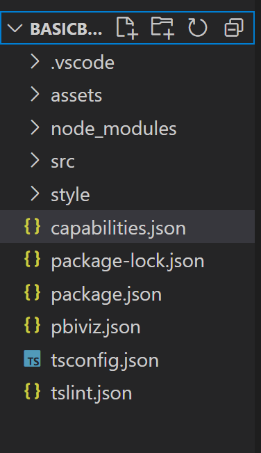
이러한 각 파일의 기능에 대한 자세한 설명은 Power BI 시각적 개체 프로젝트 구조를 참조하세요.
이 자습서에서 주로 설명하는 두 파일은 호스트에 시각적 개체를 설명하는 capabilities.json 파일과 시각적 개체의 API를 포함하는 src/barchart.ts 파일입니다.
기능 정의
capabilities.json 파일은 호스트에 데이터를 바인딩하는 위치입니다. 시각적 개체에서 허용하는 데이터 필드의 종류와 시각적 개체에 있어야 하는 기능을 설명합니다.
데이터 역할 정의
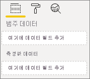
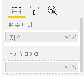
변수는 기능 파일의 dataRoles 섹션에서 정의하고 바인딩합니다. 여기 막대형 차트에서는 다음 두 가지 유형의 변수를 사용하려고 합니다.
- 범주 데이터 - 차트에서 다른 막대로 표현
- 숫자 또는 측정 데이터 - 각 막대의 높이로 표현
Visual Studio Code의 capabilities.json 파일에서 “dataRoles”라는 개체에 다음 JSON 조각이 표시되는지 확인합니다.
    "dataRoles": [
        {
            "displayName": "Category Data",
            "name": "category",
            "kind": "Grouping"
        },
        {
            "displayName": "Measure Data",
            "name": "measure",
            "kind": "Measure"
        }
    ],
데이터 매핑
다음으로, 호스트에 이러한 변수로 수행할 작업을 알리는 데이터 매핑을 추가합니다.
“dataViewMappings” 개체의 내용을 다음 코드로 바꿉니다.
"dataViewMappings": [
        {
            "conditions": [
                {
                    "category": {
                        "max": 1
                    },
                    "measure": {
                        "max": 1
                    }
                }
            ],
            "categorical": {
                "categories": {
                    "for": {
                        "in": "category"
                    }
                },
                "values": {
                    "select": [
                        {
                            "bind": {
                                "to": "measure"
                            }
                        }
                    ]
                }
            }
        }
    ],
위의 코드는 각 데이터 역할 개체가 한 번에 하나의 필드만 포함할 수 있다는 “조건”을 만듭니다. 여기서는 데이터 역할의 내부 name을 사용하여 각 필드를 참조합니다.
또한 각 필드가 올바른 변수에 매핑되도록 범주 데이터 매핑도 설정합니다.
속성 창의 개체 정의
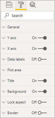
capabilities 파일의 “objects” 섹션에서는 서식 창에 표시되어야 하는 사용자 지정 가능한 기능을 정의합니다. 이러한 기능은 차트의 내용에는 영향을 주지 않지만 모양과 느낌을 변경할 수 있습니다.
개체 및 개체의 작동 방식에 대한 자세한 내용은 개체를 참조하세요.
다음 개체는 선택 사항입니다. 이 자습서의 선택적 섹션을 진행하여 색을 추가하고 X축을 렌더링하려면 해당 개체를 추가합니다.
“objects” 섹션의 내용을 다음 코드로 바꿉니다.
     "objects": {
        "enableAxis": {
            "properties": {
                "show": {
                    "type": {
                        "bool": true
                    }
                },
                "fill": {
                    "type": {
                        "fill": {
                            "solid": {
                                "color": true
                            }
                        }
                    }
                }
            }
        },
        "colorSelector": {
            "properties": {
                "fill": {
                    "type": {
                        "fill": {
                            "solid": {
                                "color": true
                            }
                        }
                    }
                }
            }
        }
     },
capabilities.json 파일을 저장합니다.
최종 capabilities 파일은 이 예제의 파일과 같습니다.
시각적 개체 API
모든 시각적 개체는 IVisual 인터페이스를 구현하는 클래스로 시작합니다.
src/visual.ts 파일은 이 클래스를 포함하는 기본 파일입니다.
이 자습서에서는 IVisual 파일 barChart.ts를 호출합니다. 아직 하지 않은 경우 파일을 다운로드하고 /src 폴더에 저장합니다. 이 섹션에서는 이 파일을 자세히 살펴보고 다양한 섹션을 설명합니다.
가져오기
파일의 첫 번째 섹션은 이 시각적 개체에 필요한 모듈을 가져옵니다. Power BI 시각적 개체 모듈 외에 d3 라이브러리도 가져옵니다.
다음 모듈은 barChart.ts 파일로 가져옵니다.
import {
    BaseType,
    select as d3Select,
    Selection as d3Selection
} from "d3-selection";
import {
    ScaleBand,
    ScaleLinear,
    scaleBand,
    scaleLinear
} from "d3-scale";
import "./../style/visual.less";

import { Axis, axisBottom } from "d3-axis";

import powerbi from "powerbi-visuals-api";

type Selection<T extends BaseType> = d3Selection<T, any, any, any>;

// powerbi.visuals
import DataViewCategoryColumn = powerbi.DataViewCategoryColumn;
import Fill = powerbi.Fill;
import ISandboxExtendedColorPalette = powerbi.extensibility.ISandboxExtendedColorPalette;
import ISelectionId = powerbi.visuals.ISelectionId;
import IVisual = powerbi.extensibility.IVisual;
import IVisualHost = powerbi.extensibility.visual.IVisualHost;
import PrimitiveValue = powerbi.PrimitiveValue;
import VisualUpdateOptions = powerbi.extensibility.visual.VisualUpdateOptions;
import VisualConstructorOptions = powerbi.extensibility.visual.VisualConstructorOptions;
import DataViewObjectPropertyIdentifier = powerbi.DataViewObjectPropertyIdentifier;

import { textMeasurementService } from "powerbi-visuals-utils-formattingutils";
import { FormattingSettingsService } from "powerbi-visuals-utils-formattingmodel";

import { BarChartSettingsModel } from "./barChartSettingsModel";
import { dataViewObjects} from "powerbi-visuals-utils-dataviewutils";
인터페이스
다음으로 가시적 인터페이스를 정의합니다. 막대형 차트 시각적 개체를 설명하기 위해 다음 인터페이스를 사용합니다.
- BarChartDataPoint
이 인터페이스는 다음과 같이 정의됩니다.
/**
 * Interface for BarChart data points.
 *
 * @interface
 * @property {PrimitiveValue} value     - Data value for point.
 * @property {string} category          - Corresponding category of data value.
 * @property {string} color             - Color corresponding to data point.
 * @property {string} strokeColor       - Stroke color for data point column.
 * @property {number} strokeWidth       - Stroke width for data point column.
 * @property {ISelectionId} selectionId - Id assigned to data point for cross filtering
 *                                        and visual interaction.
 */
interface BarChartDataPoint {
    value: PrimitiveValue;
    category: string;
    color: string;
    strokeColor: string;
    strokeWidth: number;
    selectionId: ISelectionId;
}
시각적 개체 변환
데이터 구조를 정의했으므로 createSelectorDataPoints 함수를 사용하여 데이터 구조에 데이터를 매핑해야 합니다. 이 함수는 데이터 뷰에서 데이터를 받고 시각적 개체에서 사용할 수 있는 형식으로 변환합니다. 이 경우 이전 섹션에서 설명한 BarChartDataPoint[] 인터페이스를 반환합니다.
DataView에는 시각화할 데이터가 포함됩니다. 데이터는 범주, 표 형식 등 여러 형식일 수 있습니다. 막대형 차트와 같은 범주 시각적 개체를 빌드하려면 의 ‘범주’ 속성을 사용합니다.DataView
이 함수는 시각적 개체가 업데이트될 때마다 호출됩니다.
/**
 * Function that converts queried data into a viewmodel that will be used by the visual.
 *
 * @function
 * @param {VisualUpdateOptions} options - Contains references to the size of the container
 *                                        and the dataView which contains all the data
 *                                        the visual had queried.
 * @param {IVisualHost} host            - Contains references to the host which contains services
 */
function createSelectorDataPoints(options: VisualUpdateOptions, host: IVisualHost): BarChartDataPoint[] {
    const barChartDataPoints: BarChartDataPoint[] = []
    const dataViews = options.dataViews;

    if (!dataViews
        || !dataViews[0]
        || !dataViews[0].categorical
        || !dataViews[0].categorical.categories
        || !dataViews[0].categorical.categories[0].source
        || !dataViews[0].categorical.values
    ) {
        return barChartDataPoints;
    }

    const categorical = dataViews[0].categorical;
    const category = categorical.categories[0];
    const dataValue = categorical.values[0];

    const colorPalette: ISandboxExtendedColorPalette = host.colorPalette;

    const strokeColor: string = getColumnStrokeColor(colorPalette);

    const strokeWidth: number = getColumnStrokeWidth(colorPalette.isHighContrast);

    for (let i = 0, len = Math.max(category.values.length, dataValue.values.length); i < len; i++) {
        const color: string = getColumnColorByIndex(category, i, colorPalette);

        const selectionId: ISelectionId = host.createSelectionIdBuilder()
            .withCategory(category, i)
            .createSelectionId();

        barChartDataPoints.push({
            color,
            strokeColor,
            strokeWidth,
            selectionId,
            value: dataValue.values[i],
            category: `${category.values[i]}`,
        });
    }

    return barChartDataPoints;
}
참고 항목
barChart.ts 파일의 새로운 일부 함수는 색과 X축 만들기를 처리합니다. 해당 함수는 선택 사항이며 이 자습서 뒷부분에서 자세히 설명합니다. 지금은 IVisual 함수로 이어집니다.
시각적 개체 렌더링
데이터가 정의되면 IVisual 인터페이스를 구현하는 BarChart 클래스를 사용하여 시각적 개체를 렌더링합니다.
IVisual 인터페이스는 시각적 개체 API 페이지에 설명되어 있습니다. 시각적 개체를 만드는 constructor 메서드와 시각적 개체를 다시 로드할 때마다 호출되는 update 메서드를 포함합니다.
시각적 개체를 렌더링하기 전에 클래스의 멤버를 선언해야 합니다.
export class BarChart implements IVisual {
    private svg: Selection<SVGSVGElement>;
    private host: IVisualHost;
    private barContainer: Selection<SVGElement>;
    private xAxis: Selection<SVGGElement>;
    private barDataPoints: BarChartDataPoint[];
    private formattingSettings: BarChartSettingsModel;
    private formattingSettingsService: FormattingSettingsService;

    private barSelection: Selection<BaseType>;

    static Config = {
        xScalePadding: 0.1,
        solidOpacity: 1,
        transparentOpacity: 1,
        margins: {
            top: 0,
            right: 0,
            bottom: 25,
            left: 30,
        },
        xAxisFontMultiplier: 0.04,
    };
}
시각적 개체 생성
constructor 함수는 시각적 개체를 처음 렌더링할 때 한 번만 호출됩니다. 이 함수는 막대형 차트와 X축을 위한 빈 SVG 컨테이너를 만듭니다. 여기서는 d3 라이브러리를 사용하여 SVG를 렌더링합니다.
/**
     * Creates instance of BarChart. This method is only called once.
     *
     * @constructor
     * @param {VisualConstructorOptions} options - Contains references to the element that will
     *                                             contain the visual and a reference to the host
     *                                             which contains services.
     */
    constructor(options: VisualConstructorOptions) {
        this.host = options.host;
        //Creating the formatting settings service.
        const localizationManager = this.host.createLocalizationManager();
        this.formattingSettingsService = new FormattingSettingsService(localizationManager);

        this.svg = d3Select(options.element)
            .append('svg')
            .classed('barChart', true);

        this.barContainer = this.svg
            .append('g')
            .classed('barContainer', true);

        this.xAxis = this.svg
            .append('g')
            .classed('xAxis', true);
    }
시각적 개체 업데이트
update 메서드는 시각적 개체의 크기나 해당 값 중 하나가 변경될 때마다 호출됩니다.
확장
막대 수와 현재 값이 시각적 개체의 정의된 너비 및 높이 제한에 맞도록 시각적 개체를 스케일링해야 합니다. 이는 원 카드 자습서의 update 메서드와 비슷합니다.
스케일링을 계산하기 위해 이전에 scaleLinear 라이브러리에서 가져온 scaleBand 및 d3-scale 메서드를 사용합니다.
options.dataViews[0].categorical.values[0].maxLocal 값은 모든 현재 데이터 요소의 가장 큰 값을 보유합니다. 해당 값으로 y축의 높이가 결정됩니다. x축 너비의 스케일링은 barchartdatapoint 인터페이스에서 시각적 개체에 바인딩된 범주 수에 따라 결정됩니다.
X축이 렌더링되는 경우에는 이 시각적 개체에서 X축에 전체 이름을 쓸 공간이 부족할 경우의 단어 분리도 처리합니다.
기타 update 기능
스케일링 외에 이 update 메서드는 선택 영역과 색도 처리합니다. 해당 기능은 선택 사항이며 나중에 설명합니다.
   /**
     * Updates the state of the visual. Every sequential databinding and resize will call update.
     *
     * @function
     * @param {VisualUpdateOptions} options - Contains references to the size of the container
     *                                        and the dataView which contains all the data
     *                                        the visual had queried.
     */
    public update(options: VisualUpdateOptions) {
        this.formattingSettings = this.formattingSettingsService.populateFormattingSettingsModel(BarChartSettingsModel, options.dataViews?.[0]);
        this.barDataPoints = createSelectorDataPoints(options, this.host);
        this.formattingSettings.populateColorSelector(this.barDataPoints);

        const width = options.viewport.width;
        let height = options.viewport.height;

        this.svg
            .attr("width", width)
            .attr("height", height);

        if (this.formattingSettings.enableAxis.show.value) {
            const margins = BarChart.Config.margins;
            height -= margins.bottom;
        }

        this.xAxis
            .style("font-size", Math.min(height, width) * BarChart.Config.xAxisFontMultiplier)
            .style("fill", this.formattingSettings.enableAxis.fill.value.value);

        const yScale: ScaleLinear<number, number> = scaleLinear()
            .domain([0, <number>options.dataViews[0].categorical.values[0].maxLocal])
            .range([height, 0]);

        const xScale: ScaleBand<string> = scaleBand()
            .domain(this.barDataPoints.map(d => d.category))
            .rangeRound([0, width])
            .padding(0.2);

        const xAxis: Axis<string> = axisBottom(xScale);

        this.xAxis.attr('transform', 'translate(0, ' + height + ')')
            .call(xAxis)
            .attr("color", this.formattingSettings.enableAxis.fill.value.value);

        const textNodes: Selection<SVGElement> = this.xAxis.selectAll("text");
        BarChart.wordBreak(textNodes, xScale.bandwidth(), height);

        this.barSelection = this.barContainer
            .selectAll('.bar')
            .data(this.barDataPoints);

        const barSelectionMerged = this.barSelection
            .enter()
            .append('rect')
            .merge(<any>this.barSelection);

        barSelectionMerged.classed('bar', true);

        barSelectionMerged
            .attr("width", xScale.bandwidth())
            .attr("height", (dataPoint: BarChartDataPoint) => height - yScale(<number>dataPoint.value))
            .attr("y", (dataPoint: BarChartDataPoint) => yScale(<number>dataPoint.value))
            .attr("x", (dataPoint: BarChartDataPoint) => xScale(dataPoint.category))
            .style("fill", (dataPoint: BarChartDataPoint) => dataPoint.color)
            .style("stroke", (dataPoint: BarChartDataPoint) => dataPoint.strokeColor)
            .style("stroke-width", (dataPoint: BarChartDataPoint) => `${dataPoint.strokeWidth}px`);

        this.barSelection
            .exit()
            .remove();
    }

    private static wordBreak(
        textNodes: Selection<SVGElement>,
        allowedWidth: number,
        maxHeight: number
    ) {
        textNodes.each(function () {
            textMeasurementService.wordBreak(
                this,
                allowedWidth,
                maxHeight);
        });
    }
서식 지정 모델 Utils를 사용하여 속성 창 채우기
IVisual 함수의 마지막 메서드는 getFormattingModel입니다. 이 메서드는 모든 서식 창 구성 요소 및 속성을 포함하는 최신 서식 창 서식 모델 개체를 빌드 하고 반환합니다. 그런 다음 서식 창 내에 개체를 배치합니다. 이 경우 enableAxis 파일의 colorSelector에 따라 show 및 fill에 대한 서식 속성을 포함하여 및 에 대한 서식 카드를 만듭니다.
속성 창에서 각 범주에 대한 색 선택기를 추가하려면 barDataPoints에서 for 루프를 추가하고 각 항목에 대해 서식 모델에 새 색 선택기 형식 속성을 추가합니다.
서식 모델을 빌드하려면 개발자가 모든 구성 요소를 잘 알고 있어야 합니다.
Format Pane의 서식 창의 구성 요소를 확인합니다.
getFormattingModel 내 FormattingModel utils의 API를 확인합니다.
파일을 다운로드하고 /src 폴더에 저장합니다. 서식 속정 클래스에서 서식 속성 및 해당 값을 선언합니다.
import { formattingSettings } from "powerbi-visuals-utils-formattingmodel";
import { BarChartDataPoint } from "./barChart";

import Card = formattingSettings.SimpleCard;
import Model = formattingSettings.Model;
import Slice = formattingSettings.Slice;
import ColorPicker = formattingSettings.ColorPicker;
import ToggleSwitch = formattingSettings.ToggleSwitch;

/**
 * Enable Axis Formatting Card
 */
class EnableAxisCardSettings extends Card {
    show = new ToggleSwitch({
        name: "show",
        displayName: undefined,
        value: false,
    });

    fill = new ColorPicker({
        name: "fill",
        displayName: "Color",
        value: { value: "#000000" }
    });
    topLevelSlice: ToggleSwitch = this.show;
    name: string = "enableAxis";
    displayName: string = "Enable Axis";
    slices: Slice[] = [this.fill];
}

/**
 * Color Selector Formatting Card
 */
class ColorSelectorCardSettings extends Card {
    name: string = "colorSelector";
    displayName: string = "Data Colors";

    // slices will be populated in barChart settings model `populateColorSelector` method
    slices: Slice[] = [];
}

/**
* BarChart formatting settings model class
*/
export class BarChartSettingsModel extends Model {
    // Create formatting settings model formatting cards
    enableAxis = new EnableAxisCardSettings();
    colorSelector = new ColorSelectorCardSettings();
    cards: Card[] = [this.enableAxis, this.colorSelector];

    /**
     * populate colorSelector object categories formatting properties
     * @param dataPoints
     */
    populateColorSelector(dataPoints: BarChartDataPoint[]) {
        const slices: Slice[] = this.colorSelector.slices;
        if (dataPoints) {
            dataPoints.forEach(dataPoint => {
                slices.push(new ColorPicker({
                    name: "fill",
                    displayName: dataPoint.category,
                    value: { value: dataPoint.color },
                    selector: dataPoint.selectionId.getSelector(),
                }));
            });
        }
    }
}
시각적 개체의 생성자 메서드에서 서식 설정 서비스 모델을 빌드하고 만듭니다.
서식 설정 서비스는 barChart 형식 설정을 수신하고 getFormattingModel API에 반환되는 FormattingModel 개체로 변환합니다.
지역화 기능을 사용하려면 서식 설정 서비스에 지역화 관리자를 추가합니다.
    import { FormattingSettingsService } from "powerbi-visuals-utils-formattingmodel";

    // ...
    // declare utils formatting settings service
    private formattingSettingsService: FormattingSettingsService;
    //...

    constructor(options: VisualConstructorOptions) {
        this.host = options.host;
        const localizationManager = this.host.createLocalizationManager();
        this.formattingSettingsService = new FormattingSettingsService(localizationManager);

        // Add here rest of your custom visual constructor code
    }
업데이트 API를 사용하여 서식 설정 모델을 업데이트합니다. 속성 창의 서식 속성이 변경 될 때마다 업데이트 API를 호출합니다. 가로 막대형 차트 선택기 데이터 요소를 만들고 서식 설정 모델로 채웁니다.
    // declare formatting settings model for bar chart
    private formattingSettings: BarChartSettingsModel;

    // ...

    public update(options: VisualUpdateOptions) {
        this.formattingSettings = this.formattingSettingsService.populateFormattingSettingsModel(BarChartSettingsModel, options.dataViews[0]);
        this.barDataPoints = createSelectorDataPoints(options, this.host);
        this.formattingSettings.populateColorSelector(this.barDataPoints);

        // Add the rest of your custom visual update API code here

    }
마지막으로, 새 getFormattingModel API는 위의 업데이트 API에서 만든 서식 설정 서비스 및 현재 서식 설정 모델을 사용하는 간단한 코드 줄입니다.
    public getFormattingModel(): powerbi.visuals.FormattingModel {
        return this.formattingSettingsService.buildFormattingModel(this.formattingSettings);
    }
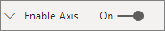
(선택 사항) X축 렌더링(정적 개체)
개체를 속성 창에 추가하여 시각적 개체를 추가로 사용자 지정할 수 있습니다. 이러한 사용자 지정은 사용자 인터페이스 변경 또는 쿼리된 데이터와 관련된 변경일 수 있습니다.
속성 창에서 해당 개체를 설정 또는 해제할 수 있습니다.
이 예제에서는 막대형 차트의 X축을 정적 개체로 렌더링합니다.
enableAxis 속성은 capabilities 파일과 barChartSettings 인터페이스에 이미 추가했습니다.
(선택 사항) 색 추가(데이터 바인딩된 개체)
데이터 바인딩된 개체는 정적 개체와 비슷하지만 일반적으로 데이터 선택을 처리합니다. 예를 들어 데이터 바인딩된 개체를 사용하면 각 데이터 요소와 연결되는 색을 대화형으로 선택할 수 있습니다.
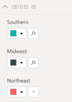
colorSelector 파일에서 개체를 이미 정의했습니다.
각 데이터 요소는 서로 다른 색으로 표시됩니다.
BarChartDataPoint 인터페이스에 색을 포함하고 IVisualHost에서 데이터 요소를 정의할 때 각 요소에 기본 색을 할당합니다.
function getColumnColorByIndex(
    category: DataViewCategoryColumn,
    index: number,
    colorPalette: ISandboxExtendedColorPalette,
): string {
    if (colorPalette.isHighContrast) {
        return colorPalette.background.value;
    }

    const defaultColor: Fill = {
        solid: {
            color: colorPalette.getColor(`${category.values[index]}`).value,
        }
    };

    const prop: DataViewObjectPropertyIdentifier = {
        objectName: "colorSelector",
        propertyName: "fill"
    };

    let colorFromObjects: Fill;
    if(category.objects?.[index]){
        colorFromObjects = dataViewObjects.getValue(category?.objects[index], prop);
    }

    return colorFromObjects?.solid.color ?? defaultColor.solid.color;
}

function getColumnStrokeColor(colorPalette: ISandboxExtendedColorPalette): string {
    return colorPalette.isHighContrast
        ? colorPalette.foreground.value
        : null;
}

function getColumnStrokeWidth(isHighContrast: boolean): number {
    return isHighContrast
        ? 2
        : 0;
}
colorPalette 함수의 createSelectorDataPoints 서비스가 이러한 색을 관리합니다.
createSelectorDataPoints은 각 데이터 요소를 반복하므로 색과 같은 범주 개체를 할당하는 데 적합합니다.
막대형 차트에 색을 추가하는 방법에 대한 자세한 지침은 Power BI 시각적 개체에 색 추가를 참조하세요.
참고 항목
최종 barChart.ts 파일이 이 barChart.ts 소스 코드와 같은지 확인하거나 barChart.ts 소스 코드를 다운로드하고 파일을 이 코드로 바꾸세요.
시각적 개체 테스트
Power BI 서버에서 시각적 개체를 실행하여 어떻게 표시되는지 확인합니다.
PowerShell에서 프로젝트의 폴더로 이동하여 개발 앱을 시작합니다.
pbiviz start시각적 개체는 컴퓨터에서 호스트되는 동안 실행됩니다.
Important
자습서를 마칠 때까지 PowerShell 창을 닫지 마세요. 시각적 개체의 실행을 중지하려면 Ctrl+C를 누르고, 일괄 처리 작업을 종료하라는 메시지가 표시되면 Y를 누르고 Enter 키를 누릅니다.
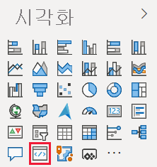
시각화 창에서 개발자 시각적 개체를 선택하여 Power BI 서비스에서 시각적 개체를 봅니다.
시각적 개체에 데이터를 추가합니다.
시각적 개체의 가장자리를 끌어 크기를 변경하고 스케일링이 조정되는 방식을 확인합니다.
X축을 설정 또는 해제로 전환합니다.
다른 범주의 색을 변경합니다.
기타 기능 추가
기능을 더 추가하여 시각적 개체를 추가로 사용자 지정할 수 있습니다. 시각적 개체의 기능을 향상하거나 모양과 느낌을 개선하거나 사용자에게 모양을 더 세밀하게 제어하도록 하는 기능을 추가할 수 있습니다. 예를 들어 다음을 수행할 수 있습니다.
- Add Selection and Interactions with Other Visuals(선택 영역 추가 및 다른 시각적 개체 조작)
- 불투명도를 제어하는 속성 창 슬라이더 추가
- Add support for tooltips(도구 설명에 대한 지원 추가)
- 방문 페이지 추가
- Add local language support(현지 언어 지원 추가)
시각적 개체를 패키징합니다.
시각적 개체를 Power BI Desktop에 로드하거나 Power BI 시각적 개체 갤러리에서 커뮤니티와 공유하려면 먼저 패키지해야 합니다.
시각적 개체를 공유하기 위한 준비를 위해 Power BI 시각적 개체 패키지의 지침에 따르세요.
참고 항목
도구 설명, 상황에 맞는 메뉴 등을 비롯한 더 많은 기능이 포함된 막대 차트의 전체 소스 코드는 Power BI 시각적 개체 샘플 막대형 차트를 참조하세요.