제목 표시줄 사용자 지정
Windows는 모든 창에 기본 제목 표시줄을 제공하며 앱의 성격에 맞게 수정할 수 있습니다. 기본 제목 표시줄에는 창 끌기 및 크기 조정과 같은 몇 가지 표준 구성 요소와 핵심 기능이 함께 제공됩니다.
앱의 제목 표시줄 꾸미기, 허용되는 제목 표시줄 영역의 콘텐츠 및 권장 UI 패턴에 대한 지침은 제목 표시줄 디자인 문서를 참조하세요.
Important
이 문서에서는 WinUI 3의 유무에 관계없이 Windows 앱 SDK 사용하는 앱의 제목 표시줄을 사용자 지정하는 방법을 보여줍니다. UWP 및 WinUI 2를 사용하는 앱의 경우 UWP에 대한 제목 표시줄 사용자 지정을 참조하세요.
- 적용 대상: Windows 앱 SDK, WinUI 3 데스크톱 앱
- 중요 API: AppWindow.TitleBar 속성, AppWindowTitleBar 클래스, AppWindow 클래스, Microsoft.UI.Xaml.Window 클래스, Window.ExtendsContentIntoTitleBar 속성, Window.SetTitleBar 메서드
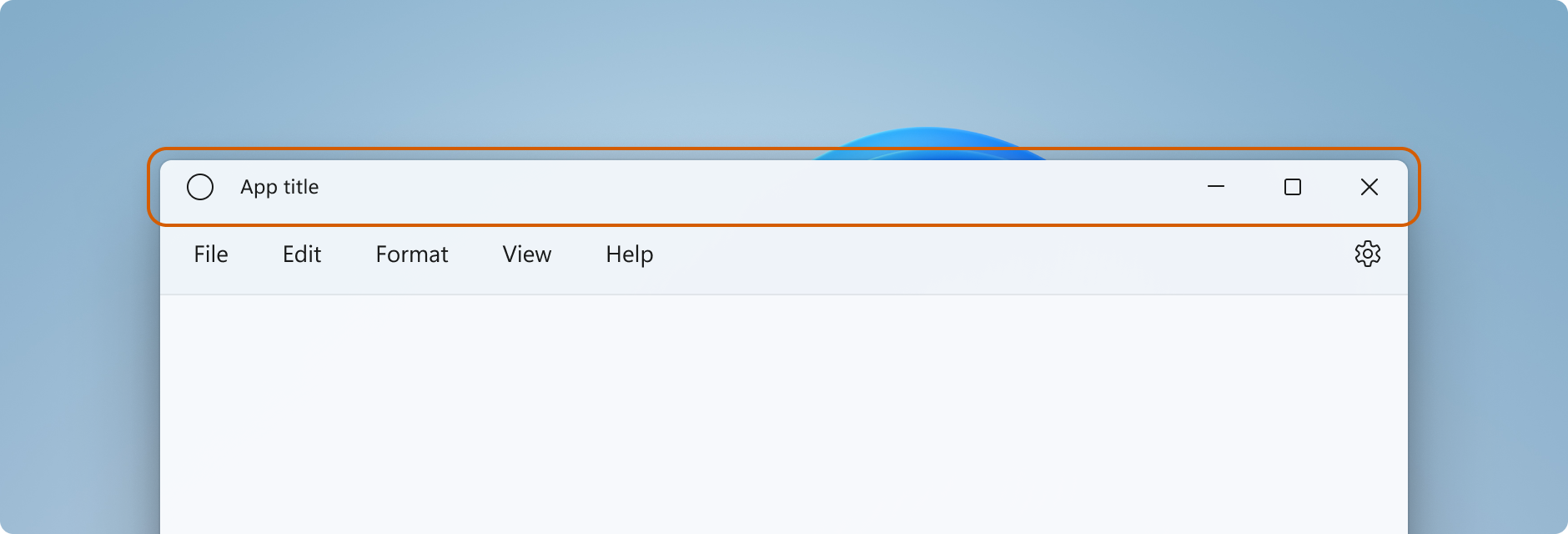
제목 표시줄 구성 요소
이 목록에서는 표준 제목 표시줄의 구성 요소에 대해 설명합니다.
- 사각 제목 표시줄
- 제목 텍스트
- 시스템 아이콘
- 시스템 메뉴 - 앱 아이콘을 클릭하거나 제목 표시줄을 마우스 오른쪽 단추로 클릭하여 액세스
- 캡션 컨트롤
- 최소화 버튼
- 최대화/복원 버튼
- 닫기 버튼
Windowing
Windows 앱 SDK 창 작업 기능은 Win32 HWND 모델을 기반으로 하는 Microsoft.UI.Windowing.AppWindow 클래스를 통해 수행됩니다. 앱에는 AppWindow와 최상위 HWND 간에 1:1 매핑이 있습니다. AppWindow 및 관련 클래스는 제목 표시줄의 사용자 지정을 포함하여 앱의 최상위 창의 여러 측면을 관리할 수 있는 API를 제공합니다. Windows에서 제공하는 기본 제목 표시줄을 UI의 나머지 부분과 혼합되도록 수정하거나 앱 캔버스를 제목 표시줄 영역으로 확장하고 고유한 제목 표시줄 콘텐츠를 제공할 수 있습니다.
WinUI 3의 창 기능은 Win32 HWND 모델을 기반으로 하는 Microsoft.UI.Xaml.Window 클래스를 통해 수행됩니다. WinUI 3을 사용하는 XAML 앱의 경우 XAML 창 API는 타이틀 표시줄을 사용자 지정하는 간단한 방법을 제공하지만 필요한 경우 AppWindow API에 액세스할 수 있습니다.
AppWindow로 작업하는 방법
Windows 앱 SDK가 지원하는 모든 UI 프레임워크(Win32, WPF, WinForms 또는 WinUI 3)에서 AppWindow API를 사용할 수 있으며 필요한 API만 사용하여 증분 방식으로 채택할 수 있습니다.
WinUI 3 XAML을 앱의 UI 프레임워크로 사용하는 경우 Window 및 AppWindow API를 모두 사용할 수 있습니다. Windows 앱 SDK 1.4부터 XAML Window 및 AppWindow는 제목 표시줄 사용자 지정에 동일한 AppWindowTitleBar 개체를 사용합니다. Window.AppWindow 속성을 사용하여 기존 XAML 창에서 AppWindow 개체를 가져옵니다. 이 AppWindow 개체를 사용하면 제목 표시줄 사용자 지정 API에 액세스할 수 있습니다.
제목 표시줄의 추가 기능에 액세스하려면 다음 AppWindow.TitleBar.ForegroundColor = Colors.White;과 같이 XAML 창에서 AppWindow API를 사용할 수 있습니다.
WinUI 3 1.3 이상을 사용하지 않는 경우 interop API를 사용하여 AppWindow를 가져와 AppWindow API를 사용하여 제목 표시줄을 사용자 지정합니다. interop API에 대한 자세한 내용은 앱 창 관리 - UI 프레임워크 및 HWND interop 및 Windowing 갤러리 샘플을 참조하세요.
제목 표시줄의 사용자 지정 수준
제목 표시줄에 적용할 수 있는 두 가지 꾸미기 래벨이 있습니다. 기본 제목 표시줄에 약간의 수정 내용을 적용하거나 앱 캔버스를 제목 표시줄 영역으로 확장하고 완전히 사용자 지정 콘텐츠를 제공합니다.
단순
제목 표시줄 색 변경과 같은 간단한 사용자 지정의 경우 AppWindowTitleBar 개체의 속성을 설정하여 제목 표시줄 요소에 사용할 색을 지정할 수 있습니다. 이 경우 시스템은 제목 표시줄의 다른 모든 측면(예: 앱 제목 그리기 및 끌기 영역 정의)에 대한 책임을 유지합니다.
전체
다른 옵션은 기본 시스템 제목 표시줄을 숨기고 사용자 지정 콘텐츠로 바꾸는 것입니다. 예를 들어, 제목 표시줄 영역에 텍스트, 검색 상자 또는 사용자 지정 메뉴를 배치할 수 있습니다. 또한 이 옵션을 사용하여 Mica와 같은 재질 배경을 제목 표시줄 영역으로 확장해야 합니다.
전체 사용자 지정을 선택하면 제목 표시줄 영역에 콘텐츠를 배치해야 하며 고유한 드래그 영역을 정의할 수 있습니다. 캡션 컨트롤(시스템 닫기, 최소화 및 최대화 단추)은 계속 사용할 수 있으며 시스템에서 처리되지만 앱 제목과 같은 요소는 사용할 수 없습니다. 앱에서 필요에 따라 직접 요소를 만들어야 합니다.
단순한 사용자 지정
제목 표시줄 제목, 색 또는 아이콘만 사용자 지정하려는 경우 앱 창의 제목 표시줄 개체에서 속성을 설정할 수 있습니다.
타이틀
기본적으로 제목 표시줄은 앱 형식을 창 제목(예: "WinUI Desktop")으로 표시합니다. 앱에 대한 의미 있는 표시 이름을 표시하도록 창 제목을 업데이트해야 합니다.
XAML 앱에는 Package.appxmanifest 파일에 설정된 표시 이름이 있습니다. 이 값을 가져와서 다음과 같이 Title 속성을 설정하는 데 사용할 수 있습니다.
Title = AppInfo.Current.DisplayInfo.DisplayName;
창 제목을 변경하려면 다음과 같이 Window.Title 속성을 한 줄 텍스트 값으로 설정합니다.
<Window
    ...
    Title="App title">
    ...
</Window>
public MainWindow()
{
    InitializeComponent();
    Title = "App title";
}
AppWindow API를 사용하여 창 제목을 변경하려면 다음과 같이 AppWindow.Title 속성을 한 줄 텍스트 값으로 설정합니다. 이 예제에서는 interop API를 사용하여 앱에 필요한 AppWindow를 가져오는 방법을 보여 줍니다. 이 API는 WinUI 3 1.3 이상을 사용하지 않습니다.
using Microsoft.UI;           // Needed for WindowId.
using Microsoft.UI.Windowing; // Needed for AppWindow.
using WinRT.Interop;          // Needed for XAML/HWND interop.

private AppWindow m_AppWindow;

public MainWindow()
{
    this.InitializeComponent();

    m_AppWindow = GetAppWindowForCurrentWindow();
    m_AppWindow.Title = "App title";
}

private AppWindow GetAppWindowForCurrentWindow()
{
    IntPtr hWnd = WindowNative.GetWindowHandle(this);
    WindowId wndId = Win32Interop.GetWindowIdFromWindow(hWnd);
    return AppWindow.GetFromWindowId(wndId);
}
색
기본 제목 표시줄 색을 사용자 지정하거나 기본 창 아이콘을 변경하려면 AppWindow API를 사용하거나 제목 표시줄을 완전히 사용자 지정하도록 선택해야 합니다.
이 예제에서는 AppWindowTitleBar의 인스턴스를 가져오고 해당 색 속성을 설정하는 방법을 보여 줍니다.
Important
앱이 Windows 10에서 실행되면 색 사용자 지정이 무시됩니다.
// Assumes "this" is a XAML Window. In projects that don't use
// WinUI 3 1.3 or later, use interop APIs to get the AppWindow.
AppWindow m_AppWindow = this.AppWindow;

private bool SetTitleBarColors()
{
    // Check to see if customization is supported.
    // The method returns true on Windows 10 since Windows App SDK 1.2,
    // and on all versions of Windows App SDK on Windows 11.
    if (AppWindowTitleBar.IsCustomizationSupported())
    {
        AppWindowTitleBar m_TitleBar = m_AppWindow.TitleBar;

        // Set active window colors.
        // Note: No effect when app is running on Windows 10
        // because color customization is not supported.
        m_TitleBar.ForegroundColor = Colors.White;
        m_TitleBar.BackgroundColor = Colors.Green;
        m_TitleBar.ButtonForegroundColor = Colors.White;
        m_TitleBar.ButtonBackgroundColor = Colors.SeaGreen;
        m_TitleBar.ButtonHoverForegroundColor = Colors.Gainsboro;
        m_TitleBar.ButtonHoverBackgroundColor = Colors.DarkSeaGreen;
        m_TitleBar.ButtonPressedForegroundColor = Colors.Gray;
        m_TitleBar.ButtonPressedBackgroundColor = Colors.LightGreen;

        // Set inactive window colors.
        // Note: No effect when app is running on Windows 10
        // because color customization is not supported.
        m_TitleBar.InactiveForegroundColor = Colors.Gainsboro;
        m_TitleBar.InactiveBackgroundColor = Colors.SeaGreen;
        m_TitleBar.ButtonInactiveForegroundColor = Colors.Gainsboro;
        m_TitleBar.ButtonInactiveBackgroundColor = Colors.SeaGreen;
        return true;
    }
    return false;
}
제목 표시줄 색상을 설정할 때 주의해야 할 몇 가지 사항이 있습니다.
- 버튼 배경색은 마우스 포인터가 닫기 버튼 위에 머물고 있는 상태 그리고 눌려진 상태에서는 적용되지 않습니다. 닫기 단추는 항상 해당 상태에 대해 시스템 지정 색상을 사용합니다.
- 색 속성을
null로 설정하면 기본 시스템 색으로 재설정 됩니다. - 투명한 색을 설정할 수 없습니다. 색상의 알파 채널은 무시됩니다.
Windows는 사용자에게 선택한 주목 효과 색을 제목 표시줄에 적용할 수 있는 옵션을 제공합니다. 제목 표시줄 색을 설정하는 경우 모든 색상을 명시적으로 설정하는 것이 좋습니다. 그러면 사용자 지정된 색상 설정으로 인한 의도하지 않은 색상 조합이 발생하지 않습니다.
아이콘 및 시스템 메뉴
시스템 아이콘을 숨기거나 사용자 지정 아이콘으로 바꿀 수 있습니다. 시스템 아이콘은 마우스 오른쪽 단추로 클릭하거나 한 번 탭할 때 시스템 메뉴를 표시합니다. 두 번 클릭하거나 탭하면 창이 닫힙니다.
시스템 아이콘 및 관련 동작을 표시하거나 숨기려면 제목 표시줄 IconShowOptions 속성을 설정합니다.
m_TitleBar.IconShowOptions = IconShowOptions.HideIconAndSystemMenu;
사용자 지정 창 아이콘을 사용하려면 AppWindow.SetIcon 메서드 중 하나를 호출하여 새 아이콘을 설정합니다.
SetIcon(String)SetIcon(String) 메서드는 현재 .ico 파일에서만 작동합니다. 이 메서드에 전달하는 문자열은 .ico 파일의 정규화된 경로입니다.
m_AppWindow.SetIcon("iconPath/iconName.ico");SetIcon(IconId)CreateIcon과 같은 아이콘 함수 중 하나에서 아이콘(
HICON)에 대한 핸들이 이미 있는 경우 GetIconIdFromIcon interop API를 사용하여 IconId를 가져올 수 있습니다. 그런 다음IconId을 SetIcon(IconId) 메서드에 전달하여 창 아이콘을 설정할 수 있습니다.m_AppWindow.SetIcon(iconId));
전체 사용자 지정
전체 제목 표시줄 사용자 지정을 선택하면 앱의 클라이언트 영역이 제목 표시줄 영역을 포함하여 전체 창을 포함하도록 확장됩니다. 창에서 계속 제공되는 캡션 단추를 제외한 전체 창에 대한 그리기 및 입력 처리를 담당합니다.
시스템 제목 표시줄을 숨기고 콘텐츠를 제목 표시줄 영역으로 확장하려면 앱 콘텐츠를 제목 표시줄 영역으로 확장하는 속성을 true로 설정합니다. XAML 앱에서 이 속성은 앱의 OnLaunched 메서드(App.xaml.cs) 또는 앱의 첫 번째 페이지에서 설정할 수 있습니다.
팁
모든 코드를 한 번에 보려면 전체 사용자 지정 예제 섹션을 참조하세요.
이 예제에서는 Window.ExtendsContentIntoTitleBar 속성을 true로 설정하는 방법을 보여 줍니다.
public MainWindow()
{
    this.InitializeComponent();

    // Hide system title bar.
    ExtendsContentIntoTitleBar = true;
}
주의
Window에 대한 XAML IntelliSense에 ExtendsContentIntoTitleBar가 표시되지만 XAML에서 설정하면 오류가 발생합니다. 대신 코드에서 이 속성을 설정합니다.
이 예제에서는 AppWindowTitleBar를 가져와 AppWindow.ExtendsContentIntoTitleBar 속성을 true로 설정하는 방법을 보여 줍니다. 이 예제는 앱에서 WinUI 3 1.3 이상을 사용하지 않는 경우 필요한 interop API를 사용하여 AppWindow를 가져오는 방법을 보여줍니다.
using Microsoft.UI;           // Needed for WindowId.
using Microsoft.UI.Windowing; // Needed for AppWindow.
using WinRT.Interop;          // Needed for XAML/HWND interop.

private AppWindow m_AppWindow;

public MainWindow()
{
    this.InitializeComponent();

    m_AppWindow = GetAppWindowForCurrentWindow();
    var titleBar = m_AppWindow.TitleBar;
    // Hide system title bar.
    titleBar.ExtendsContentIntoTitleBar = true;
}

private AppWindow GetAppWindowForCurrentWindow()
{
    IntPtr hWnd = WindowNative.GetWindowHandle(this);
    WindowId wndId = Win32Interop.GetWindowIdFromWindow(hWnd);
    return AppWindow.GetFromWindowId(wndId);
}
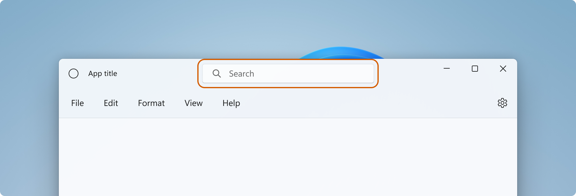
제목 표시줄 콘텐츠 및 기본 끌기 영역
앱이 제목 표시줄 영역으로 확장되면 제목 표시줄에 대한 UI를 정의하고 관리해야 합니다. 여기에는 일반적으로 최소한 제목 텍스트와 드래그 영역을 지정하는 것이 포함됩니다. 제목 표시줄의 드래그 영역은 사용자가 클릭하고 드래그해서 창을 이동할 수 있는 위치를 정의합니다. 또한 사용자가 마우스 오른쪽 버튼을 클릭하여 시스템 메뉴를 표시하는 곳입니다.
허용되는 제목 표시줄 콘텐츠 및 권장 UI 패턴에 대한 자세한 내용은 제목 표시줄 디자인을 참조하세요.
이 예제에서는 대화형 콘텐츠가 없는 사용자 지정 제목 표시줄 UI에 대한 XAML을 보여줍니다.
<Grid x:Name="AppTitleBar"
      Height="32">
    <Grid.ColumnDefinitions>
        <ColumnDefinition x:Name="LeftPaddingColumn" Width="0"/>
        <ColumnDefinition/>
        <ColumnDefinition x:Name="RightPaddingColumn" Width="0"/>
    </Grid.ColumnDefinitions>
    <Image x:Name="TitleBarIcon" Source="ms-appx:///Assets/StoreLogo.png"
           Grid.Column="1"
           HorizontalAlignment="Left"
           Width="16" Height="16"
           Margin="8,0,0,0"/>
    <TextBlock x:Name="TitleBarTextBlock"
               Text="App title"
               Style="{StaticResource CaptionTextBlockStyle}"
               Grid.Column="1"
               VerticalAlignment="Center"
               Margin="28,0,0,0"/>
</Grid>
Important
LeftPaddingColumn 및 RightPaddingColumn는 캡션 단추의 공간을 예약하는 데 사용됩니다. 이러한 열의 Width 값은 코드에서 설정되며 나중에 표시됩니다. 코드 및 설명은 시스템 캡션 단추 섹션을 참조하세요.
XAML 앱에는 Package.appxmanifest 파일에 설정된 표시 이름이 있습니다. 이 값을 가져와서 다음과 같이 사용자 지정 제목 표시줄에서 사용할 수 있습니다.
TitleBarTextBlock.Text = AppInfo.Current.DisplayInfo.DisplayName;
콘텐츠를 제목 표시줄 영역으로 확장하면 시스템 제목 표시줄이 숨겨지고 시스템 제목 표시줄과 동일한 화면 너비에 캡션 단추와 끌기 영역을 제공하는 기본 AppWindowTitleBar가 만들어집니다. 제목 표시줄에 대화형 콘텐츠를 배치하지 않으면 이 기본 끌기 영역을 있는 그대로 둘 수 있습니다. 제목 표시줄에 대화형 콘텐츠를 배치하는 경우 다음 섹션에서 다루는 대화형 지역을 지정해야 합니다.
주의
사용자 지정 끌기 영역을 정의할 때 기본 제목 표시줄 영역의 창 맨 위에 있을 필요는 없습니다. UI의 모든 부분을 끌기 영역으로 정의할 수 있습니다. 그러나 끌기 영역을 다른 위치에 배치하면 사용자가 검색하기 어려울 수 있습니다.
대화형 콘텐츠
단추, 메뉴 또는 검색 상자와 같은 대화형 컨트롤을 앱 상단에 배치하여 제목 표시줄에 표시되도록 할 수 있습니다. 그러나 사용자가 창을 이동할 수 있도록 허용하면서 대화형 요소가 사용자 입력을 받을 수 있도록 대화형 지역을 지정해야 합니다.
제목 표시줄 영역에 대화형 콘텐츠를 추가할 때 InputNonClientPointerSource 클래스를 사용하여 입력이 제목 표시줄에서 처리되지 않고 대화형 컨트롤로 전달되는 영역을 지정해야 합니다. 대화형 지역을 설정하려면 InputNonClientPointerSource.SetRegionRects 메서드를 호출합니다. 이 메서드는 설정되는 영역의 종류(이 경우 Passthrough)와 Passthrough 영역을 정의하는 사각형 배열을 지정하는 값을 사용합니다. 제목 표시줄의 크기가 변경되면 대화형 영역을 다시 계산하여 새 크기와 일치시키고 새 값을 사용하여 SetRegionRects를 호출해야 합니다.
이 예제에서는 검색 상자와 PersonPicture 계정 컨트롤이 있는 사용자 지정 제목 표시줄 UI를 보여줍니다. 입력이 전달되도록 이러한 컨트롤에 대한 대화형 사각형을 계산하고 설정하는 방법을 보여 줍니다.
다음은 이 코드와 관련하여 주의해야 할 몇 가지 중요한 사항입니다:
- 대화형 콘텐츠에 대한 제목 표시줄 디자인 지침을 따르려면
AppTitleBar그리드 높이를 48로 설정합니다. - 캡션 단추가 제목 표시줄과 높이가 같도록 PreferredHeightOption을
Tall로 설정합니다. - 컨트롤 크기 조정 및 지역 계산을 더 쉽게 하려면 레이아웃에 여러 개의 명명된 열과
Grid을 사용합니다. - 창과 함께 자동으로 크기가 조정되도록
AutoSuggestBox이 포함된 열에 별표(*) 크기와MinWidth를 사용합니다. - 창 크기가 조정된 경우에도 항상 끌 수 있는 작은 영역을 예약하려면
MinWidth을RightDragColumn에 설정하십시오. - MainWindow 생성자에서
ExtendsContentIntoTitleBar을true로 설정합니다. 나중에 호출되는 코드에서 설정하는 경우 기본 시스템 제목 표시줄이 먼저 표시되고 숨겨질 수 있습니다. AppTitleBar요소가 로드된 후 대화형 지역을 계산하기 위해 초기 호출을 합니다. 그렇지 않으면 계산에 사용되는 요소에 올바른 값이 있다는 보장이 없습니다.AppTitleBar요소의 크기(AppTitleBar_SizeChanged)가 변경된 후에만 대화형 사각형 계산을 업데이트합니다. 창Changed이벤트에 종속된 경우AppTitleBar크기가 조정되기 전에 이벤트가 발생하고 계산에서 잘못된 값을 사용하는 상황이 발생합니다(예: 창 최대화/최소화).- 사용자 지정 제목 표시줄이 사용되고 있는지 확인하기 위해
ExtendsContentIntoTitleBar를 검사한 후에만 사용자 지정 끌기/대화형 영역을 설정합니다.
<Grid x:Name="AppTitleBar"
      Height="48">
    <Grid.ColumnDefinitions>
        <ColumnDefinition x:Name="LeftPaddingColumn" Width="0"/>
        <ColumnDefinition x:Name="IconColumn" Width="Auto"/>
        <ColumnDefinition x:Name="TitleColumn" Width="Auto"/>
        <ColumnDefinition x:Name="LeftDragColumn" Width="*"/>
        <ColumnDefinition x:Name="SearchColumn" Width="4*" MinWidth="220"/>
        <ColumnDefinition x:Name="RightDragColumn" Width="*" MinWidth="48"/>
        <ColumnDefinition x:Name="AccountColumn" Width="Auto"/>
        <ColumnDefinition x:Name="RightPaddingColumn" Width="0"/>
    </Grid.ColumnDefinitions>
    <Image x:Name="TitleBarIcon"
           Source="ms-appx:///Assets/StoreLogo.png"
           Grid.Column="1"
           Width="16" Height="16"
           Margin="8,0,4,0"/>
    <TextBlock x:Name="TitleBarTextBlock"
               Text="App title"
               Style="{StaticResource CaptionTextBlockStyle}"
               Grid.Column="2"
               VerticalAlignment="Center">
    </TextBlock>
    <AutoSuggestBox x:Name="TitleBarSearchBox"
                    Grid.Column="4"
                    QueryIcon="Find"
                    PlaceholderText="Search"
                    VerticalAlignment="Center"
                    MaxWidth="600"/>
    <PersonPicture x:Name="PersonPic"
                   Grid.Column="6"
                   Height="32" Margin="0,0,16,0"/>
</Grid>
이 코드는 AutoSuggestBox 및 PersonPicture 컨트롤에 해당하는 대화형 영역을 계산하고 설정하는 방법을 보여 줍니다.
public sealed partial class MainWindow : Window
{
    public MainWindow()
    {
        this.InitializeComponent();

        // Assumes "this" is a XAML Window. In projects that don't use
        // WinUI 3 1.3 or later, use interop APIs to get the AppWindow.
        m_AppWindow = this.AppWindow;
        AppTitleBar.Loaded += AppTitleBar_Loaded;
        AppTitleBar.SizeChanged += AppTitleBar_SizeChanged;
        ExtendsContentIntoTitleBar = true;
        TitleBarTextBlock.Text = AppInfo.Current.DisplayInfo.DisplayName;
    }

    private void AppTitleBar_Loaded(object sender, RoutedEventArgs e)
    {
        if (ExtendsContentIntoTitleBar == true)
        {
            // Set the initial interactive regions.
            SetRegionsForCustomTitleBar();
        }
    }

    private void AppTitleBar_SizeChanged(object sender, SizeChangedEventArgs e)
    {
        if (ExtendsContentIntoTitleBar == true)
        {
            // Update interactive regions if the size of the window changes.
            SetRegionsForCustomTitleBar();
        }
    }

    private void SetRegionsForCustomTitleBar()
    {
        // Specify the interactive regions of the title bar.

        double scaleAdjustment = AppTitleBar.XamlRoot.RasterizationScale;

        RightPaddingColumn.Width = new GridLength(m_AppWindow.TitleBar.RightInset / scaleAdjustment);
        LeftPaddingColumn.Width = new GridLength(m_AppWindow.TitleBar.LeftInset / scaleAdjustment);

        GeneralTransform transform = TitleBarSearchBox.TransformToVisual(null);
        Rect bounds = transform.TransformBounds(new Rect(0, 0,
                                                         TitleBarSearchBox.ActualWidth,
                                                         TitleBarSearchBox.ActualHeight));
        Windows.Graphics.RectInt32 SearchBoxRect = GetRect(bounds, scaleAdjustment);

        transform = PersonPic.TransformToVisual(null);
        bounds = transform.TransformBounds(new Rect(0, 0,
                                                    PersonPic.ActualWidth,
                                                    PersonPic.ActualHeight));
        Windows.Graphics.RectInt32 PersonPicRect = GetRect(bounds, scaleAdjustment);

        var rectArray = new Windows.Graphics.RectInt32[] { SearchBoxRect, PersonPicRect };

        InputNonClientPointerSource nonClientInputSrc =
            InputNonClientPointerSource.GetForWindowId(this.AppWindow.Id);
        nonClientInputSrc.SetRegionRects(NonClientRegionKind.Passthrough, rectArray);
    }

    private Windows.Graphics.RectInt32 GetRect(Rect bounds, double scale)
    {
        return new Windows.Graphics.RectInt32(
            _X: (int)Math.Round(bounds.X * scale),
            _Y: (int)Math.Round(bounds.Y * scale),
            _Width: (int)Math.Round(bounds.Width * scale),
            _Height: (int)Math.Round(bounds.Height * scale)
        );
    }
}
Warning
AppWindow는 논리적 좌표를 사용하지 않는 UI 프레임워크와의 호환성을 위해 물리적 픽셀을 사용합니다. WPF 또는 WinUI 3, RightInset, LeftInset을 사용하는 경우 표시 눈금이 100%가 아닌 경우 지역을 계산하는 데 사용되는 값을 조정해야 합니다. 이 예제에서는 표시 크기 조정 설정을 고려할 scaleAdjustment 값을 가져옵니다.
- WinUI 3의 경우 XamlRoot.RasterizationScale 속성을 사용하여 배율 조정을 가져옵니다.
- WPF의 경우 Window.DpiChanged 이벤트를 처리하여 NewDpi 값을 가져오고 배율 조정을 계산할 수 있습니다.
시스템 캡션 단추
시스템은 앱 창의 왼쪽 위 또는 오른쪽 위 모서리를 시스템 캡션 버튼(최소화, 최대화/복원, 닫기)으로 선점 합니다. 시스템은 캡션 버튼 영역을 제어하여 창 끌기, 최소화, 최대화 및 닫기에 대한 최소 기능이 제공되도록 합니다. 시스템은 왼쪽에서 오른쪽으로 쓰는 언어의 경우 오른쪽 상단에, 오른쪽에서 왼쪽으로 쓰는 언어의 경우 왼쪽 상단에 닫기 단추를 그립니다.
캡션 컨트롤 영역 아래에 앱 배경과 같은 콘텐츠를 그릴 수 있지만 사용자가 조작할 수 있을 것으로 예상되는 UI를 배치해서는 안 됩니다. 자막 제어에 대한 입력이 시스템에 의해 처리되므로 입력을 수신하지 못합니다.
이전 예제의 이러한 라인은 제목 표시줄을 정의하는 XAML 안 패딩컬럼을 보여 줍니다. 마진 대신 패딩 칼럼을 사용하면 배경이 캡션 컨트롤 버튼(투명 버튼의 경우) 아래를 칠합니다. 오른쪽 및 왼쪽 안쪽 여백 열을 모두 사용하면 제목 표시줄이 오른쪽에서 왼쪽 및 왼쪽에서 오른쪽 레이아웃 모두에서 올바르게 작동합니다.
<Grid.ColumnDefinitions>
    <ColumnDefinition x:Name="LeftPaddingColumn" Width="0"/>
    <ColumnDefinition/>
    <ColumnDefinition x:Name="RightPaddingColumn" Width="0"/>
</Grid.ColumnDefinitions>
캡션 컨트롤 영역의 크기와 위치는 AppWindowTitleBar 클래스에 의해 전달되므로 제목 표시줄 UI의 레이아웃에서 이를 고려할 수 있습니다. 각 면에 있는 예약된 영역의 너비는 LeftInset 또는 RightInset 속성에 의해 지정되고 높이는 Height 속성에 의해 지정됩니다.
끌기 영역을 계산하고 설정할 때 안쪽 여백 열의 너비를 지정하는 방법은 다음과 같습니다.
RightPaddingColumn.Width =
    new GridLength(m_AppWindow.TitleBar.RightInset / scaleAdjustment);
LeftPaddingColumn.Width =
    new GridLength(m_AppWindow.TitleBar.LeftInset / scaleAdjustment);
Important
표시 크기 조정이 이러한 값에 미치는 영향에 대한 대화형 콘텐츠 섹션의 중요한 정보를 참조하세요.
사용자 지정 제목 표시줄에 대한 높은 제목 표시줄 지원
제목 표시줄에 검색 상자 또는 인물 사진과 같은 대화형 콘텐츠를 추가하는 경우 제목 표시줄의 높이를 늘려 이러한 요소에 대한 공간을 더 많이 제공하는 것이 좋습니다. 또한 더 높은 제목 표시줄을 사용하면 터치 조작이 더 쉬워집니다. AppWindowTitleBar.PreferredHeightOption 속성을 사용하면 기본값인 표준 높이에서 더 높은 높이로 제목 표시줄 높이를 늘릴 수 있습니다. Tall 제목 표시줄 모드를 선택하면 클라이언트 영역에서 시스템에서 오버레이로 그리는 캡션 단추가 최소/최대/닫기 문자 모양을 중심으로 더 크게 렌더링됩니다. 끌기 영역을 지정하지 않은 경우 시스템은 창의 너비와 설정한 PreferredHeightOption 값에 따라 결정되는 높이를 확장하는 영역을 그립니다.
이 예제에서는 PreferredHeightOption 속성을 설정하는 방법을 보여 줍니다.
// A taller title bar is only supported when drawing a fully custom title bar.
if (ExtendsContentIntoTitleBar == true)
{
    m_AppWindow.TitleBar.PreferredHeightOption = TitleBarHeightOption.Tall;
}
주의
PreferredHeightOption 속성을 설정하기 전에 AppWindowTitleBar.ExtendsContentIntoTitleBar 속성이 true여야 합니다. ExtendsContentIntoTitleBar가 false인 동안 PreferredHeightOption을 설정하려고 하면 예외가 발생됩니다.
캡션 단추의 색상 및 투명도
앱 콘텐츠를 제목 표시줄 영역으로 확장할 때 캡션 버튼의 배경을 투명하게 만들어 앱 배경이 보이도록 할 수 있습니다. 일반적으로 전체 투명도에 대해 배경을 Colors.Transparent로 설정합니다. 부분적인 투명도의 경우 속성을 설정할 색상의 알파 채널을 설정합니다.
이러한 제목 표시줄 속성은 투명할 수 있습니다.
- ButtonBackgroundColor
- ButtonHoverBackgroundColor
- ButtonPressedBackgroundColor
- ButtonInactiveBackgroundColor
다른 모든 색상 속성은 알파 채널을 계속 무시합니다. ExtendsContentIntoTitleBar이 false로 설정된 경우, 알파 채널은 모든 AppWindowTitleBar 색 속성에 대해 항상 무시됩니다.
버튼 배경색은 닫기 버튼 위 마우스가 머물고 있는 상태 및 눌린 상태에는 적용되지 않습니다. 닫기 단추는 항상 해당 상태에 대해 시스템 지정 색상을 사용합니다.
팁
Mica는 포커스된 창을 구분하는 데 도움이 되는 마음에 드는 소재입니다. Windows 11에서 오랜시간 켜있는 창의 배경으로 사용하는 것이 좋습니다. 창의 클라이언트 영역에 Mica를 적용한 경우 제목 표시줄 영역으로 확장하고 Mica가 보일 수 있도록 캡션 버튼을 투명하게 만들 수 있습니다. 자세한 내용은 Mica 소재를 참조하세요.
창이 비활성 상태일 때 제목 표시줄을 흐리게 표시합니다.
창이 활성 또는 비활성 상태일 때가 명확하게 구분되야 합니다. 최소한 제목 표시줄에 있는 텍스트, 아이콘 및 단추의 색상을 변경해야 합니다.
XAML 앱의 경우 Window.Activated 이벤트를 처리하여 창의 활성화 상태를 확인하고 필요에 따라 제목 표시줄 UI를 업데이트합니다.
public MainWindow()
{
    ...
    Activated += MainWindow_Activated;
}

private void MainWindow_Activated(object sender, WindowActivatedEventArgs args)
{
    if (args.WindowActivationState == WindowActivationState.Deactivated)
    {
        TitleBarTextBlock.Foreground =
            (SolidColorBrush)App.Current.Resources["WindowCaptionForegroundDisabled"];
    }
    else
    {
        TitleBarTextBlock.Foreground =
            (SolidColorBrush)App.Current.Resources["WindowCaptionForeground"];
    }
}
다른 UI 프레임워크의 경우 이벤트를 처리하여 창의 활성화 상태를 확인하고 필요에 따라 제목 표시줄 UI를 업데이트합니다. 창의 상태를 확인하는 방법은 앱에 사용하는 UI 프레임워크에 따라 달라집니다.
- Win32: WM_ACTIVATE 메시지를 수신 대기하고 응답합니다.
- WPF: Handle Window.Activated, Window.Deactivated.
- WinForms: Handle Form.Activated, Form.Deactivate.
제목 표시줄 다시 설정
앱이 실행되는 동안 시스템 제목 표시줄을 다시 설정하거나 전환하려면 AppWindowTitleBar.ResetToDefault를 호출할 수 있습니다.
m_AppWindow.TitleBar.ResetToDefault();
XAML 앱의 경우 다음과 같은 방법으로 제목 표시줄을 다시 설정할 수도 있습니다.
- SetTitleBar를 호출하여 앱이 실행되는 동안 새 제목 표시줄 요소로 전환합니다.
null와 함께 매개 변수로SetTitleBar을 호출하여 기본AppWindowTitleBar끌기 지역으로 다시 설정합니다.- 매개 변수로
null와 함께SetTitleBar을 호출하고 ExtendsContentIntoTitleBar tofalse를 기본 시스템 제목 표시줄로 되돌리기 설정합니다.
제목 표시줄 표시 및 숨기기
앱에 전체 화면 또는 컴팩트 오버레이 모드에 대한 지원을 추가하는 경우 앱이 이러한 모드 간에 전환될 때 제목 표시줄을 변경해야 할 수 있습니다. XAML 창은 전체 화면 모드를 지원하는 API를 제공하지 않습니다. 이를 위해 AppWindow API를 사용할 수 있습니다.
앱이 전체 화면 모드에서 실행되면 시스템은 제목 표시줄과 캡션 컨트롤 단추를 숨깁니다. AppWindow.Changed 이벤트를 처리하고 이벤트 인수 DidPresenterChange 속성을 검사 새 창 프레젠테이션에 대한 응답으로 제목 표시줄을 표시, 숨기기 또는 변경해야 하는지 결정할 수 있습니다.
이 예제에서는 이전 예제에서 AppTitleBar 요소를 표시하고 숨기도록 Changed 이벤트를 처리하는 방법을 보여 줍니다. 창이 컴팩트 오버레이 모드로 전환되면 제목 표시줄이 기본 시스템 제목 표시줄로 다시 설정됩니다(또는 컴팩트 오버레이에 최적화된 사용자 지정 제목 표시줄을 제공할 수 있음).
public MainWindow()
{
    this.InitializeComponent();

    m_AppWindow = this.AppWindow;
    m_AppWindow.Changed += AppWindow_Changed;
}

private void AppWindow_Changed(AppWindow sender, AppWindowChangedEventArgs args)
{
    if (args.DidPresenterChange)
    {
        switch (sender.Presenter.Kind)
        {
            case AppWindowPresenterKind.CompactOverlay:
                // Compact overlay - hide custom title bar
                // and use the default system title bar instead.
                AppTitleBar.Visibility = Visibility.Collapsed;
                sender.TitleBar.ResetToDefault();
                break;

            case AppWindowPresenterKind.FullScreen:
                // Full screen - hide the custom title bar
                // and the default system title bar.
                AppTitleBar.Visibility = Visibility.Collapsed;
                sender.TitleBar.ExtendsContentIntoTitleBar = true;
                break;

            case AppWindowPresenterKind.Overlapped:
                // Normal - hide the system title bar
                // and use the custom title bar instead.
                AppTitleBar.Visibility = Visibility.Visible;
                sender.TitleBar.ExtendsContentIntoTitleBar = true;
                break;

            default:
                // Use the default system title bar.
                sender.TitleBar.ResetToDefault();
                break;
        }
    }
}
참고 항목
전체 화면 및 컴팩트 오버레이 모드는 앱에서 지원하는 경우에만 입력할 수 있습니다. 자세한 내용은 앱 창, FullScreenPresenter 및 CompactOverlayPresenter 관리를 참조하세요.
권장 사항 및 금지 사항
- 창이 활성 또는 비활성 상태일 때 만든 내용이 명확하게 나타납니다. 최소한 제목 표시줄의 텍스트, 아이콘 및 단추 색상을 변경합니다.
- 앱 캔버스의 위쪽 가장자리를 따라 드래그 영역을 정의합니다. 시스템 제목 표시줄의 배치를 맞추면 사용자가 쉽게 찾을 수 있습니다.
- 앱 캔버스의 시각적 제목 표시줄(있는 경우)과 일치하는 드래그 영역을 정의합니다.
전체 사용자 지정의 예
이 예제는 전체 커스터마이징 섹션에 설명된 모든 코드를 보여 줍니다.
<Window
    x:Class="WinUI3_CustomTitleBar.MainWindow"
    xmlns="http://schemas.microsoft.com/winfx/2006/xaml/presentation"
    xmlns:x="http://schemas.microsoft.com/winfx/2006/xaml"
    xmlns:d="http://schemas.microsoft.com/expression/blend/2008"
    xmlns:mc="http://schemas.openxmlformats.org/markup-compatibility/2006"
    mc:Ignorable="d">

    <Grid>
        <Grid.RowDefinitions>
            <RowDefinition Height="Auto"/>
            <RowDefinition/>
        </Grid.RowDefinitions>

        <Grid x:Name="AppTitleBar"
      Height="48">
            <Grid.ColumnDefinitions>
                <ColumnDefinition x:Name="LeftPaddingColumn" Width="0"/>
                <ColumnDefinition x:Name="IconColumn" Width="Auto"/>
                <ColumnDefinition x:Name="TitleColumn" Width="Auto"/>
                <ColumnDefinition x:Name="LeftDragColumn" Width="*"/>
                <ColumnDefinition x:Name="SearchColumn" Width="4*" MinWidth="220"/>
                <ColumnDefinition x:Name="RightDragColumn" Width="*" MinWidth="48"/>
                <ColumnDefinition x:Name="AccountColumn" Width="Auto"/>
                <ColumnDefinition x:Name="RightPaddingColumn" Width="0"/>
            </Grid.ColumnDefinitions>
            <Image x:Name="TitleBarIcon"
           Source="ms-appx:///Assets/StoreLogo.png"
           Grid.Column="1"
           Width="16" Height="16"
           Margin="8,0,4,0"/>
            <TextBlock x:Name="TitleBarTextBlock"
                       Text="App title"
                       Style="{StaticResource CaptionTextBlockStyle}"
                       Grid.Column="2"
                       VerticalAlignment="Center">
            </TextBlock>
            <AutoSuggestBox x:Name="TitleBarSearchBox"
                            Grid.Column="4"
                            QueryIcon="Find"
                            PlaceholderText="Search"
                            VerticalAlignment="Center"
                            MaxWidth="600"/>
            <PersonPicture x:Name="PersonPic"
                           Grid.Column="6"
                           Height="32" Margin="0,0,16,0"/>
        </Grid>

        <NavigationView Grid.Row="1"
                        IsBackButtonVisible="Collapsed"
                        IsSettingsVisible="False">
            <StackPanel>
                <TextBlock Text="Content"
                           Style="{ThemeResource TitleTextBlockStyle}"
                           Margin="32,0,0,0"/>
                <StackPanel Grid.Row="1" VerticalAlignment="Center">
                    <Button Margin="4" x:Name="CompactoverlaytBtn"
                            Content="Enter CompactOverlay"
                            Click="SwitchPresenter"/>
                    <Button Margin="4" x:Name="FullscreenBtn"
                            Content="Enter FullScreen"
                            Click="SwitchPresenter"/>
                    <Button Margin="4" x:Name="OverlappedBtn"
                            Content="Revert to default (Overlapped)"
                            Click="SwitchPresenter"/>
                </StackPanel>
            </StackPanel>
        </NavigationView>
    </Grid>
</Window>
using Microsoft.UI.Input;
using Microsoft.UI.Windowing;
using Microsoft.UI.Xaml;
using Microsoft.UI.Xaml.Controls;
using Microsoft.UI.Xaml.Media;
using System;
using Windows.ApplicationModel;
using Rect = Windows.Foundation.Rect;

public sealed partial class MainWindow : Window
{
    private AppWindow m_AppWindow;

    public MainWindow()
    {
        this.InitializeComponent();

        // Assumes "this" is a XAML Window. In projects that don't use
        // WinUI 3 1.3 or later, use interop APIs to get the AppWindow.
        m_AppWindow = this.AppWindow;
        m_AppWindow.Changed += AppWindow_Changed;
        Activated += MainWindow_Activated;
        AppTitleBar.SizeChanged += AppTitleBar_SizeChanged;
        AppTitleBar.Loaded += AppTitleBar_Loaded;

        ExtendsContentIntoTitleBar = true;
        if (ExtendsContentIntoTitleBar == true)
        {
            m_AppWindow.TitleBar.PreferredHeightOption = TitleBarHeightOption.Tall;
        }
        TitleBarTextBlock.Text = AppInfo.Current.DisplayInfo.DisplayName;
    }

    private void AppTitleBar_Loaded(object sender, RoutedEventArgs e)
        {
            if (ExtendsContentIntoTitleBar == true)
            {
                // Set the initial interactive regions.
                SetRegionsForCustomTitleBar();
            }
        }

    private void AppTitleBar_SizeChanged(object sender, SizeChangedEventArgs e)
        {
            if (ExtendsContentIntoTitleBar == true)
            {
                // Update interactive regions if the size of the window changes.
                SetRegionsForCustomTitleBar();
            }
        }

    private void SetRegionsForCustomTitleBar()
    {
        // Specify the interactive regions of the title bar.

        double scaleAdjustment = AppTitleBar.XamlRoot.RasterizationScale;

        RightPaddingColumn.Width = new GridLength(m_AppWindow.TitleBar.RightInset / scaleAdjustment);
        LeftPaddingColumn.Width = new GridLength(m_AppWindow.TitleBar.LeftInset / scaleAdjustment);

        // Get the rectangle around the AutoSuggestBox control.
        GeneralTransform transform = TitleBarSearchBox.TransformToVisual(null);
        Rect bounds = transform.TransformBounds(new Rect(0, 0,
                                                         TitleBarSearchBox.ActualWidth,
                                                         TitleBarSearchBox.ActualHeight));
        Windows.Graphics.RectInt32 SearchBoxRect = GetRect(bounds, scaleAdjustment);

        // Get the rectangle around the PersonPicture control.
        transform = PersonPic.TransformToVisual(null);
        bounds = transform.TransformBounds(new Rect(0, 0,
                                                    PersonPic.ActualWidth,
                                                    PersonPic.ActualHeight));
        Windows.Graphics.RectInt32 PersonPicRect = GetRect(bounds, scaleAdjustment);

        var rectArray = new Windows.Graphics.RectInt32[] { SearchBoxRect, PersonPicRect };

        InputNonClientPointerSource nonClientInputSrc =
            InputNonClientPointerSource.GetForWindowId(this.AppWindow.Id);
        nonClientInputSrc.SetRegionRects(NonClientRegionKind.Passthrough, rectArray);
    }

    private Windows.Graphics.RectInt32 GetRect(Rect bounds, double scale)
    {
        return new Windows.Graphics.RectInt32(
            _X: (int)Math.Round(bounds.X * scale),
            _Y: (int)Math.Round(bounds.Y * scale),
            _Width: (int)Math.Round(bounds.Width * scale),
            _Height: (int)Math.Round(bounds.Height * scale)
        );
    }

    private void MainWindow_Activated(object sender, WindowActivatedEventArgs args)
    {
        if (args.WindowActivationState == WindowActivationState.Deactivated)
        {
            TitleBarTextBlock.Foreground =
                (SolidColorBrush)App.Current.Resources["WindowCaptionForegroundDisabled"];
        }
        else
        {
            TitleBarTextBlock.Foreground =
                (SolidColorBrush)App.Current.Resources["WindowCaptionForeground"];
        }
    }

    private void AppWindow_Changed(AppWindow sender, AppWindowChangedEventArgs args)
    {
        if (args.DidPresenterChange)
        {
            switch (sender.Presenter.Kind)
            {
                case AppWindowPresenterKind.CompactOverlay:
                    // Compact overlay - hide custom title bar
                    // and use the default system title bar instead.
                    AppTitleBar.Visibility = Visibility.Collapsed;
                    sender.TitleBar.ResetToDefault();
                    break;

                case AppWindowPresenterKind.FullScreen:
                    // Full screen - hide the custom title bar
                    // and the default system title bar.
                    AppTitleBar.Visibility = Visibility.Collapsed;
                    sender.TitleBar.ExtendsContentIntoTitleBar = true;
                    break;

                case AppWindowPresenterKind.Overlapped:
                    // Normal - hide the system title bar
                    // and use the custom title bar instead.
                    AppTitleBar.Visibility = Visibility.Visible;
                    sender.TitleBar.ExtendsContentIntoTitleBar = true;
                    break;

                default:
                    // Use the default system title bar.
                    sender.TitleBar.ResetToDefault();
                    break;
            }
        }
    }

    private void SwitchPresenter(object sender, RoutedEventArgs e)
    {
        if (AppWindow != null)
        {
            AppWindowPresenterKind newPresenterKind;
            switch ((sender as Button).Name)
            {
                case "CompactoverlaytBtn":
                    newPresenterKind = AppWindowPresenterKind.CompactOverlay;
                    break;

                case "FullscreenBtn":
                    newPresenterKind = AppWindowPresenterKind.FullScreen;
                    break;

                case "OverlappedBtn":
                    newPresenterKind = AppWindowPresenterKind.Overlapped;
                    break;

                default:
                    newPresenterKind = AppWindowPresenterKind.Default;
                    break;
            }

            // If the same presenter button was pressed as the
            // mode we're in, toggle the window back to Default.
            if (newPresenterKind == AppWindow.Presenter.Kind)
            {
                AppWindow.SetPresenter(AppWindowPresenterKind.Default);
            }
            else
            {
                // Else request a presenter of the selected kind
                // to be created and applied to the window.
                AppWindow.SetPresenter(newPresenterKind);
            }
        }
    }
}
관련된 문서

Windows developer
피드백
출시 예정: 2024년 내내 콘텐츠에 대한 피드백 메커니즘으로 GitHub 문제를 단계적으로 폐지하고 이를 새로운 피드백 시스템으로 바꿀 예정입니다. 자세한 내용은 다음을 참조하세요. https://aka.ms/ContentUserFeedback
다음에 대한 사용자 의견 제출 및 보기