Notikumi
Veidojiet inteliģentas lietotnes
17. marts 21 - 21. marts 10
Pievienojieties meetup sērijai, lai kopā ar citiem izstrādātājiem un ekspertiem izveidotu mērogojamus AI risinājumus, kuru pamatā ir reālas lietošanas gadījumi.
Reģistrēties tūlītŠī pārlūkprogramma vairs netiek atbalstīta.
Jauniniet uz Microsoft Edge, lai izmantotu jaunāko līdzekļu, drošības atjauninājumu un tehniskā atbalsta sniegtās priekšrocības.
Azure DevOps Services | Azure DevOps Server 2022 - Azure DevOps Server 2019
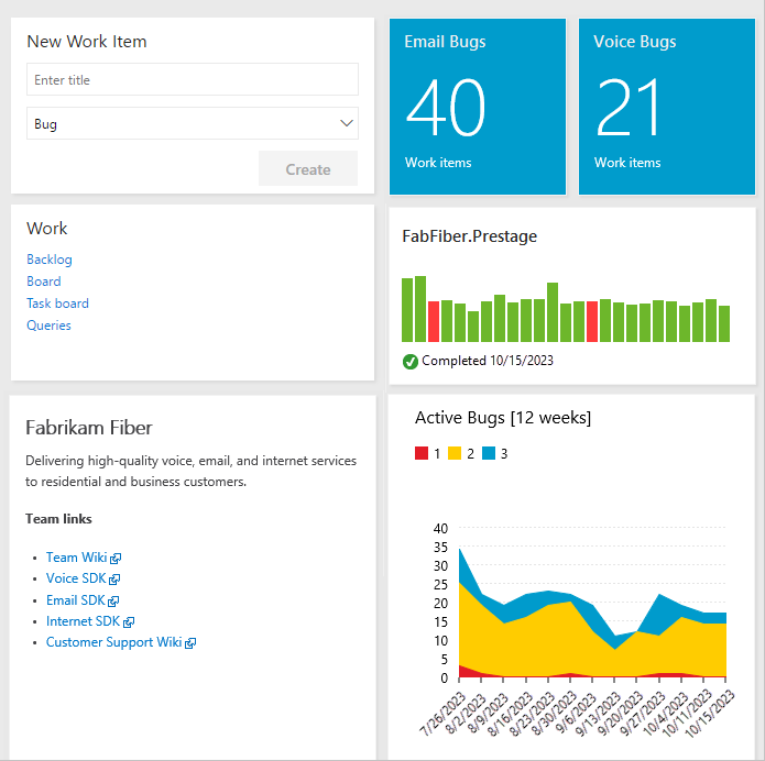
Gain visibility into your team's progress by adding one or more widgets or charts to your dashboard. Customizable, highly configurable dashboards provide you and your teams with the flexibility to share information, monitor progress and trends, and improve your workflow processes. Each team can tailor their dashboards to share information and monitor their progress.
If you're just starting out, read Add, rename, and delete dashboards. Looking for instructions on a specific task, in-context chart, widget, or report? See Dashboards, charts, and quick reference. For more information, see the Reporting roadmap.
Svarīgi
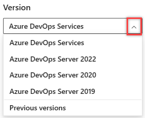
Select the version of this article that corresponds to your platform and version. The version selector is above the table of contents. Look up your Azure DevOps platform and version.
Access to Azure DevOps web portal features are managed through access levels assigned to users.
The following features provide support for viewing Azure DevOps data through the web portal:
The following features provide support for viewing Azure DevOps data by using Power BI:
Piezīme
Open Data Protocol (OData) is an ISO/IEC approved, OASIS standard that defines a set of best practices for building and consuming REST APIs. For more information, see OData documentation.
SQL Server Reporting Services is the legacy reporting solution available with Azure DevOps Server 2020 and earlier versions. The following features provide support for viewing Azure DevOps data by using SQL Server Reports Services and SQL Server Analysis Services.
Users with Stakeholder access get restricted privileges, granting them access to only those features outlined in the following table. For more information, see About access levels. In addition to access levels, certain features require permissions to execute.
Piezīme
Data displayed within a chart or widget is subject to permissions granted to the signed-in user. For more information, see FAQs on Azure DevOps dashboards, charts, and reports.
Supported features and tasks
Stakeholder
Basic
Dashboards (View)
✔️
✔️
Dashboards (Create and edit)
✔️
Charts, Widgets (View)
✔️
✔️
Charts, Widgets (Add and configure)
✔️
In-context reports
✔️
✔️
Analytics views
✔️
Power BI reports
✔️
✔️
SQL Server reports
✔️
✔️
For Dashboards, set individual dashboard permissions to grant or restrict the ability to edit or delete dashboards.
For Dashboards, set dashboard permissions at the team level for team dashboards.
Task
Readers
Contributors
Team admins
Project admins
View team and project dashboards
✔️
✔️
✔️
✔️
View team dashboards
✔️
✔️
✔️
Add and configure project dashboards
✔️
✔️
Add and configure team dashboards
✔️
✔️
✔️
For Power BI Integration and Analytics views, you set permissions for the service at the project level, and for shared Analytics views at the object level.
Task
Readers
Contributors
Project admins
View Analytics
✔️
✔️
✔️
View a shared Analytics view
✔️
✔️
Add a private or shared Analytics view
✔️
✔️
Edit and delete shared Analytics views
✔️
With dashboards, you can configure an array of charts and widgets.
Each team can add and configure multiple dashboards to:
Easily add and rearrange widgets on the dashboard to show recent changes made to view build status, bug trends, and more.
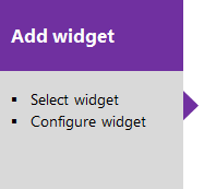
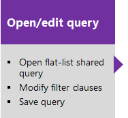
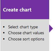
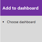
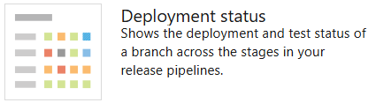
Select one of the following boxes to open the corresponding article.
With flat-list queries, you can create various charts to monitor status, progress, and trends. Before you monitor work progress and trends, plan your project and make progress on work you're tracking.
You can open a shared query, create a chart, and add it to the dashboard. After the chart is added to the dashboard, you can change the Chart for work items widget configuration to resize or change the chart parameters. Or, from the dashboard, you can add a Chart for work items widget and choose a shared query and set the chart parameters. You have multiple chart types from which to choose. Status charts include pie, bar, column, stacked bar, and pivot. Trend charts include stacked area, line, and area.
For more information, see Define a query and Track progress with status and trend query-based charts.
Select one of the following boxes to open the corresponding article.
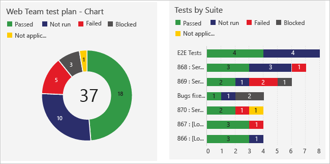
The steps to creating charts that track manual testing progress and results are similar to the ones for tracking work. The starting point is the test plan rather than a query. For example, you can find out how many test cases are ready to run, or how many tests are passing and failing in each test suite. And, just like work item query-based charts, you can add these charts to a dashboard.
For more information, see:
You add widgets to a dashboard to display a chart, information, or set of links. Most widgets are configurable. For a description of each supported widget for your platform and version, see the Widget catalog. Here are the widgets that support the indicated service.
Widgets are annotated as follows:
Boards
Boards
Pipelines
Test plans
Information and links


There's no chart or widget that tracks changes to sprint scope. However, you can determine work items added to a sprint or moved out of a sprint by using the Query Editor. For more information, see Query sprint scope changes.
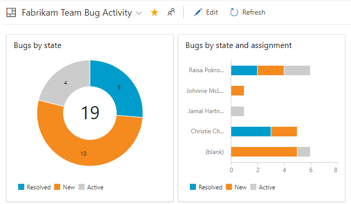
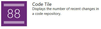
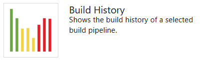
With the code tile widgets, you can monitor the activity occurring within a repository or branch folder. Build history displays a histogram of all builds run for a specific build pipeline. Bar colors use green for completed, red for failed, and yellow for completed without tests.
The Analytics service is the reporting platform for Azure DevOps. As described in What is Analytics?, it replaces the previous platform based on SQL Server Reporting Services. The Analytics service supports Analytics widgets, in-context Analytics reports, and Analytics views for Power BI reporting. For more information, see About Analytics views.
The Analytics service is the reporting platform for Azure DevOps. As described in What is the Analytics service?, it replaces the previous platform based on SQL Server Reporting Services. The Analytics service supports Analytics widgets and Analytics views for Power BI reporting.
Piezīme
Analytics is in preview for Azure DevOps Server 2019 and generally available for Azure DevOps Server 2020 and later versions.
For more information, see Widgets based on Analytics data and Add an Analytics widget to a dashboard.
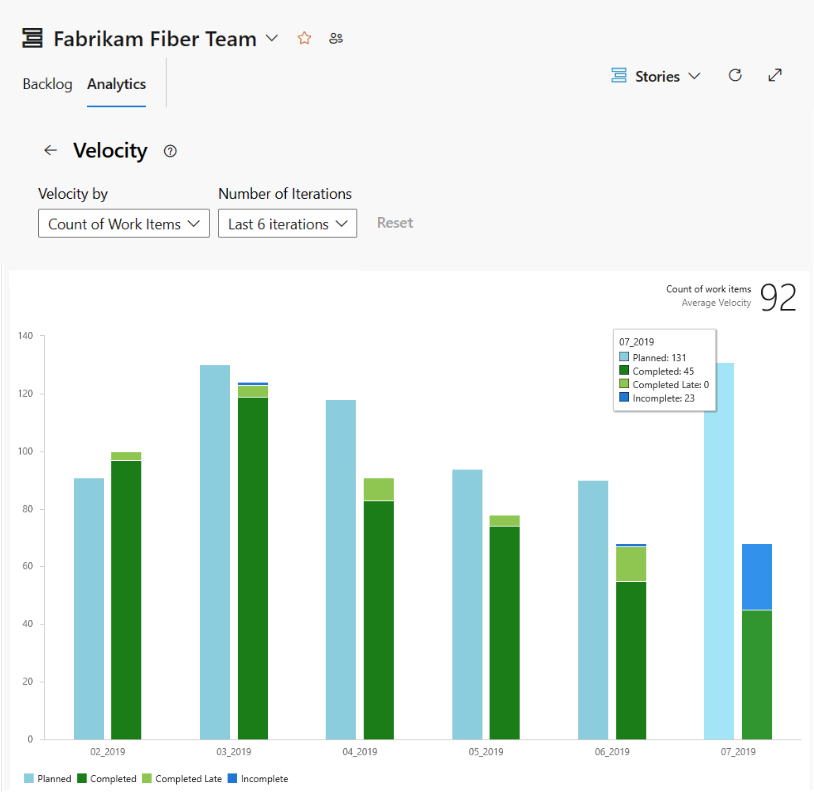
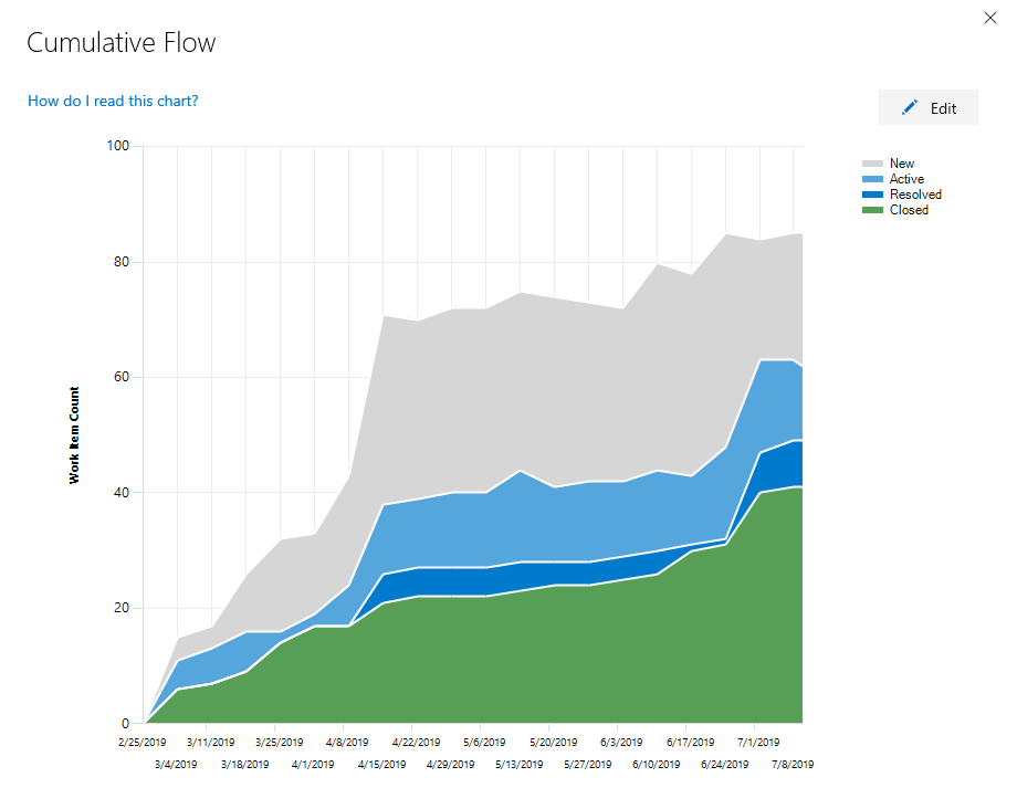
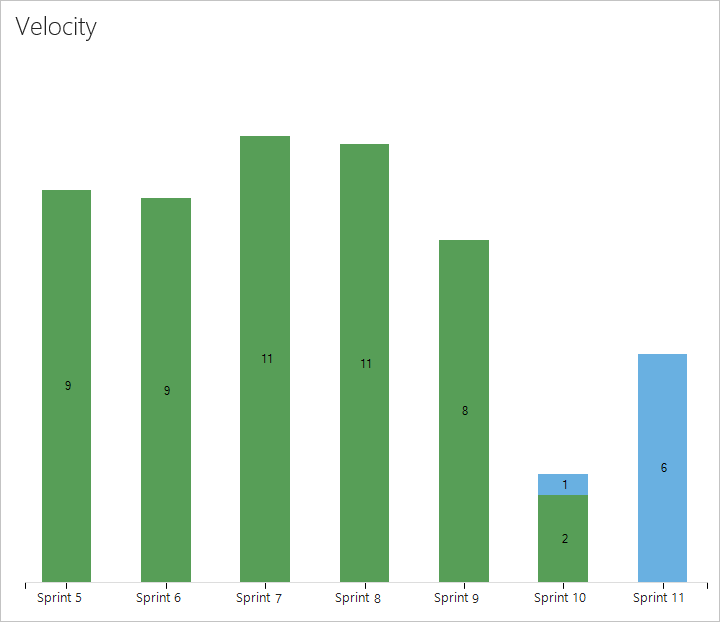
Azure Boards provides several in-context reports that derive from Analytics data. From your backlog or board, you can view the Cumulative Flow Diagram and team Velocity reports by selecting the Analytics tab. Each report provides interactive controls to provide each user the view of interest to them. From a Sprint backlog, you can view the Sprint Burndown Trend.
Use the interactive controls to choose the time frame, swimlanes, and workflow states or board columns.

Use the interactive controls to choose the count or sum field and number of iterations.
Use the interactive controls to choose the start and end of the sprint and count or sum field to use in the burndown. If you don't track Remaining Work in tasks, you can view burndown based on a count of work items or tasks.

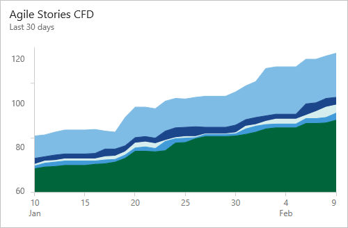
Azure Boards provides several in-context reports that derive from the work-tracking data store. From your backlog or board, you can view the Cumulative Flow Diagram and team Velocity reports by choosing the miniature charts that appear on each page. From a Sprint backlog, you can view the sprint burndown.
The CFD report shows the count of work items in the backlog based on their state over time.
Velocity is based on the values entered for Effort, Story Points, or Size fields for work items that belong to the Requirement category.
Each sprint provides access to two charts. The first tracks capacity for the team, team activities, such as Development, Test, or Design, and individual team members. The second tracks the sprint burndown for remaining work.
| Capacity bars | Burndown |
|---|---|

|

|
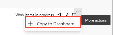
You can add the in-context reports to a dashboard by using the copy to dashboard option from the report's context menu.
Piezīme
You can't add the in-context reports to a dashboard. However, you might find a comparable widget listed in the widget catalog that tracks the same or similar data, which you can add to the dashboard.
For more information about these reports, see:
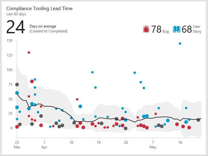
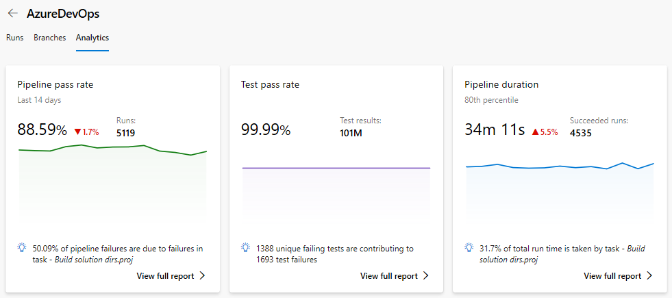
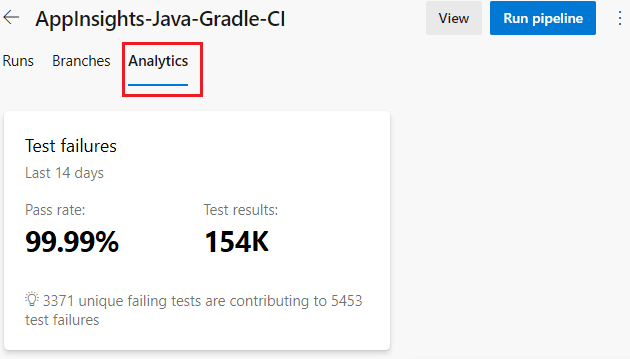
Several in-context reports are provided for Azure Pipelines. These reports derive from Analytics data. Open a pipeline or release summary for Test failures to view the reports and select the Analytics tab. Select View full report on a summary card for a detailed report.
For more information on each in-context Analytics report for pipeline runs, see:
You can also use Power BI and OData to create reports based on pipeline and test data. For more information, see the Overview of sample reports using OData queries.
The Pipeline pass rate report provides a trend of pipeline failure and task failure of the pipeline. You can view the pass rate of the pipeline over a configurable period of time, for example, 7, 14, or 30 days. Find more details in Task failure details, which not only highlights the trend but also lists the top failing tasks.
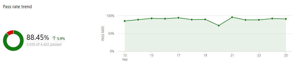
For more information, see Pipeline pass rate report.
The Test failures report provides a granular view of the top failing tests in the pipeline, along with the failure details. Summary charts are also provided for builds that indicate code coverage and test failures or success.

For more information, see Test failures report.
The Pipeline duration report provides the duration trend of a pipeline. It also highlights the average run time of the total successful runs over a period of time, for example, for 7, 14, or 30 days. The report also provides insights on the tasks that affected the duration of the pipeline.
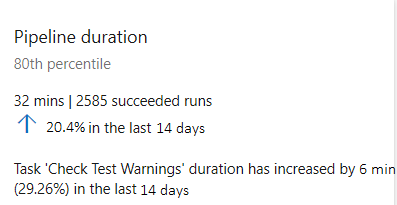
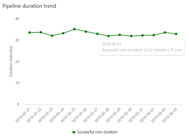
For more information, see Pipeline duration report.
Azure Pipelines provides an in-context Test failures report, derived from Analytics data. Open a release summary to view the report and select the Analytics tab. Select the summarized card for a detailed report. For more information, see Test failures report.
Add a custom field to add data to support reporting requirements.
Add data to support reporting requirements by adding a custom field: Inheritance process or On-premises XML process.
In addition to the widgets available in the widget catalog, you might find interesting widgets in the Marketplace.
Or, you can create your own widget by using the REST API. For more information, see Add a dashboard widget.
Azure provides various reporting tools and services to help you monitor and analyze the usage and performance of your resources, such as Virtual Machines (VMs), services, and overall usage.
Azure Monitor is a comprehensive solution for collecting, analyzing, and acting on telemetry from your cloud and on-premises environments. It helps you understand how your applications are performing and proactively identifies issues affecting them and the resources they depend on.
For more information, see Azure Monitor overview.
Azure Resource Graph lets you explore and query your Azure resources at scale. It lets you query across subscriptions and management groups, making it easier to manage large environments.
For more information, see What is Azure Resource Graph.
Azure Advisor is a personalized cloud consultant that helps you follow best practices to optimize your Azure deployments. It analyzes your resource configuration and usage telemetry and then recommends solutions to help improve the cost-effectiveness, performance, high availability, and security of your Azure resources.
For more information, see Introduction to Azure Advisor.
Notikumi
Veidojiet inteliģentas lietotnes
17. marts 21 - 21. marts 10
Pievienojieties meetup sērijai, lai kopā ar citiem izstrādātājiem un ekspertiem izveidotu mērogojamus AI risinājumus, kuru pamatā ir reālas lietošanas gadījumi.
Reģistrēties tūlītApmācība
Mācību ceļš
Use advance techniques in canvas apps to perform custom updates and optimization - Training
Use advance techniques in canvas apps to perform custom updates and optimization
Sertifikācija
Microsoft Certified: Power BI Data Analyst Associate - Certifications
Demonstrate methods and best practices that align with business and technical requirements for modeling, visualizing, and analyzing data with Microsoft Power BI.
Dokumentācija
Design effective dashboards - Azure DevOps
Learn about useful and actionable dashboards that you can create when working in Azure DevOps.
Add, rename, delete, and manage team dashboards - Azure DevOps
Learn how to create, rename, and delete team dashboards, manage dashboard permissions, and add widgets to view progress and trends in Azure DevOps.
Add built-in charts to a team dashboard - Azure DevOps
Learn how to add system-generated charts or query-based charts to a team dashboard.