Visualization types in Power BI
APPLIES TO:
Power BI Desktop
Power BI service
A visualization is an image created from data. Visualizations are also called "visuals." Some examples of visuals are: pie chart, line chart, map, and KPI. This article lists visualizations available in Power BI. We add new visualizations. Stay tuned!
And check out the Microsoft AppSource, where you find a growing list of Power BI visuals you can download and use in your own dashboards and reports. Feeling creative? Learn how to create and add your own visuals to this community site.
Visualizations in Power BI
All of these visualizations can be added to Power BI reports, specified in Q&A, and pinned to dashboards.
Area charts: Basic (Layered) and Stacked
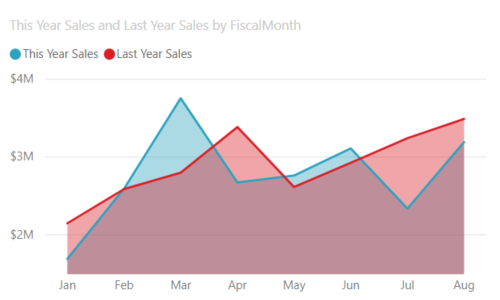
The basic area chart is based on the line chart with the area between the axis and line filled in. Area charts emphasize the magnitude of change over time, and can be used to draw attention to the total value across a trend. For example, data that represents profit over time can be plotted in an area chart to emphasize the total profit. On the other hand, stacked area charts display the cumulative total of multiple data series stacked on top of each other, showing how each series contributes to the total.
For more information, see Basic Area chart.
Bar and column charts
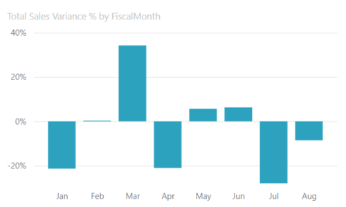
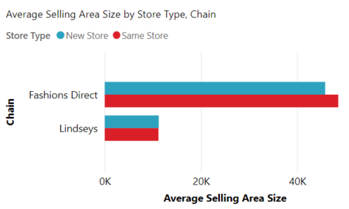
Bar charts are the standard for looking at a specific value across different categories.
Cards
Multi row
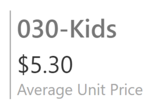
Multi row cards display one or more data points, one per row.
Single number
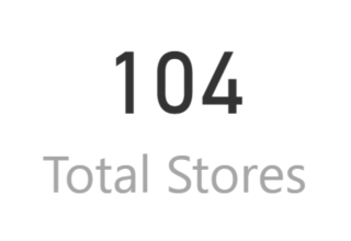
Single number cards display a single fact, a single data point. Sometimes a single number is the most important thing you want to track in your Power BI dashboard or report, such as total sales, market share year over year, or total opportunities.
For more information, see Create a Card (big number tile).
Combo charts
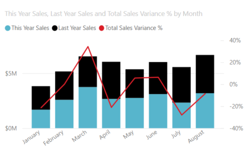
A combo chart combines a column chart and a line chart. Combining the two charts into one lets you make a quicker comparison of the data. Combo charts can have one or two Y axes, so be sure to look closely.
Combo charts are a great choice:
- When you have a line chart and a column chart with the same X axis.
- To compare multiple measures with different value ranges.
- To illustrate the correlation between two measures in one visual.
- To check whether one measure meets the target, which is defined by another measure.
- To conserve canvas space.
For more information, see Combo charts in Power BI.
Decomposition tree
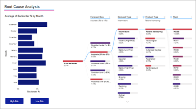
The decomposition tree visual lets you visualize data across multiple dimensions. It automatically aggregates data and enables drilling down into your dimensions in any order. It is also an artificial intelligence (AI) visualization, so you can ask it to find the next dimension to drill down into based on certain criteria. This capability makes it a valuable tool for ad hoc exploration and conducting root cause analysis.
Doughnut charts
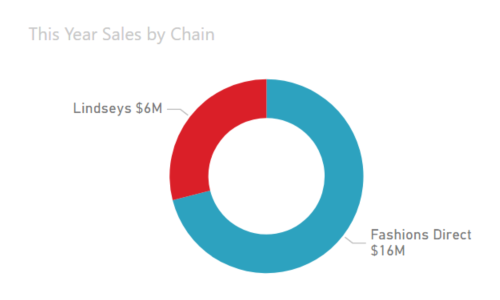
Doughnut charts are similar to pie charts. They show the relationship of parts to a whole. The only difference is that the center is blank and allows space for a label or icon.
For more information, see Doughnut charts in Power BI.
Funnel charts
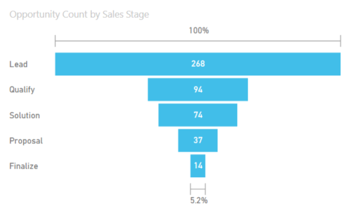
Funnels help visualize a process that has stages, and items flow sequentially from one stage to the next. One example is a sales process that starts with leads and ends with purchase fulfillment.
For example, a sales funnel that tracks customers through stages: Lead > Qualified Lead > Prospect > Contract > Close. At a glance, the shape of the funnel conveys the health of the process you're tracking. Each funnel stage represents a percentage of the total. So, in most cases, a funnel chart is shaped like a funnel -- with the first stage being the largest, and each subsequent stage smaller than its predecessor. A pear-shaped funnel is also useful -- it can identify a problem in the process. But typically, the first stage, the "intake" stage, is the largest.
For more information, see Funnel Charts in Power BI.
Gauge charts
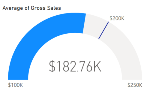
A radial gauge chart has a circular arc and displays a single value that measures progress toward a goal. The goal, or target value, is represented by the line (needle). Progress toward that goal is represented by the shading. And the value that represents that progress is shown in bold inside the arc. All possible values are spread evenly along the arc, from the minimum (left-most value) to the maximum (right-most value).
In the example, we are a car retailer, tracking our Sales team's average sales per month. Our goal is 200,000 and represented by the location of the needle. The minimum possible average sales is 100,000 and we set the maximum as 250,000. The blue shading shows that we're currently averaging approximately $180,000 this month. Luckily, we still have another week to reach our goal.
Radial gauges are a great choice to:
- Show progress toward a goal.
- Represent a percentile measure, like a KPI.
- Show the health of a single measure.
- Display information that can be quickly scanned and understood.
For more information, see Gauge Charts in Power BI.
Key influencers chart
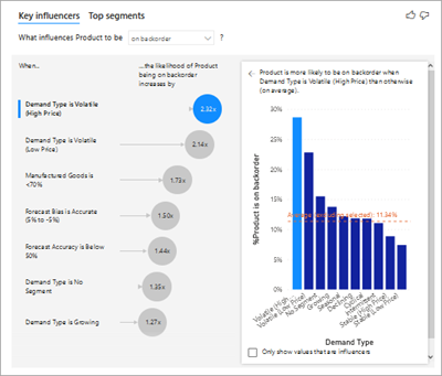
A key influencer chart displays the major contributors to a selected result or value.
Key influencers are a great choice to help you understand the factors that influence a key metric. For example, what influences customers to place a second order or why were sales so high last June.
For more information, see Key influencer charts in Power BI
KPIs
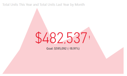
A Key Performance Indicator (KPI) is a visual cue that communicates the amount of progress made toward a measurable goal.
KPIs are a great choice:
- To measure progress (what am I ahead or behind on?).
- To measure distance to a metric (how far ahead or behind am I?).
For more information, see KPIs in Power BI.
Line charts
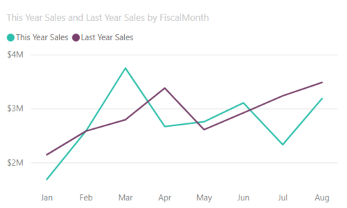
Line charts emphasize the overall shape of an entire series of values, usually over time.
Maps
Basic map
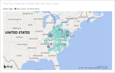
Use a basic map to associate both categorical and quantitative information with spatial locations.
For more information, see Tips and tricks for map visuals.
ArcGIS map
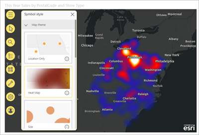
The combination of ArcGIS maps and Power BI takes mapping beyond the presentation of points on a map to a whole new level. The available options for base maps, location types, themes, symbol styles, and reference layers creates gorgeous informative map visuals. The combination of authoritative data layers (such as census data) on a map with spatial analysis conveys a deeper understanding of the data in your visual.
For more information, see ArcGIS maps in Power BI.
Azure map
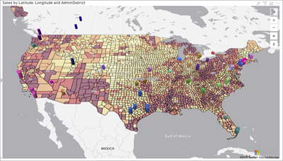
Tip
Used to associate both categorical and quantitative information with spatial locations.
For more information, see Azure Maps visual for Power BI.
Filled map (Choropleth)
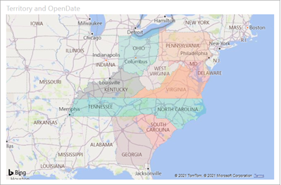
A filled map uses shading or tinting or patterns to display how a value differs in proportion across a geography or region. Quickly display these relative differences with shading that ranges from light (less-frequent/lower) to dark (more-frequent/more).
Tip
The more intense the color, the larger the value.
For more information, see Filled Maps in Power BI.
Shape map
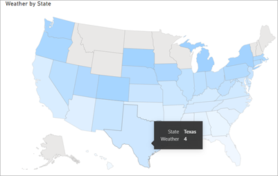
Shape maps compare regions on a map using color. A shape map can't show precise geographical locations of data points on a map. Instead, its main purpose is to show relative comparisons of regions on a map by coloring them differently.
For more information, see Shape Maps in Power BI.
Matrix
The matrix visual is a type of table visual (see Tables in this article) that supports a stepped layout. A table supports two dimensions, but a matrix makes it easier to display data meaningfully across multiple dimensions. Often, report designers include matrixes in reports and dashboards to allow users to select one or more element (rows, columns, cells) in the matrix to cross-highlight other visuals on a report page.
Tip
The matrix automatically aggregates the data and enables drilling down into the data.
For more information, see Matrix visuals in Power BI.
Pie charts
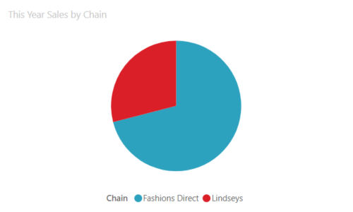
Pie charts show the relationship of parts to a whole.
Power Apps visual
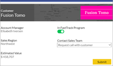
Report designers can create a Power App and embed it into a Power BI report as a visual. Consumers can interact with that visual within the Power BI report.
For more information, see Add a Power Apps visual to your report.
Q&A visual
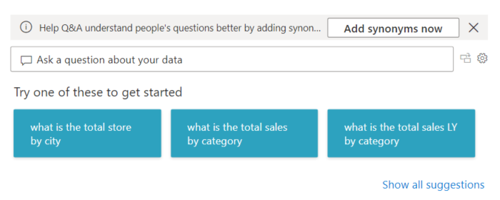
The Q&A visual provides users with a text box to query data in Power BI reports. Users can use natural language to query data, and the Q&A visual interprets the query and provides an appropriate visualization.
For example, if a user asks a question like "What were the product sales in 2019?" the Q&A visual queries the relevant data and create an appropriate visualization to display the results. This visualization can be in many different formats, such as a chart or a table.
Tip
Similar to the Q&A experience on dashboards, the Q&A visual lets you ask questions about your data using natural language.
For more information, see Q&A visuals in Power BI.
R script visuals
Tip
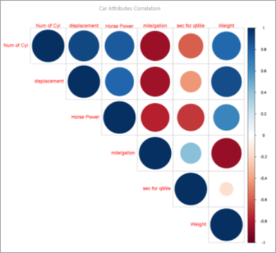
Visuals created with R scripts, commonly called R visuals, can present advanced data shaping and analytics such as forecasting, using the rich analytics and visualization power of R. R visuals can be created in Power BI Desktop and published to the Power BI service.
For more information, see R visuals in Power BI.
Ribbon chart
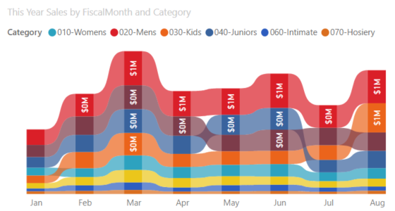
Ribbon charts show which data category has the highest rank (largest value). Ribbon charts are effective at showing rank change, with the highest range (value) always displayed on top for each time period.
For more information, see Ribbon charts in Power BI.
Scatter
Scatter, bubble, and dot plot chart
A scatter chart always has two value axes to show one set of numerical data along a horizontal axis and another set of numerical values along a vertical axis. The chart displays points at the intersection of an x and y numerical value, combining these values into single data points. These data points might be distributed evenly or unevenly across the horizontal axis, depending on the data.
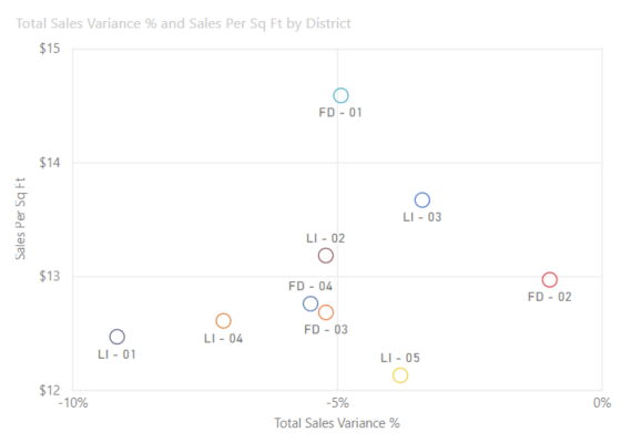
A bubble chart replaces data points with bubbles, with the bubble size representing an additional dimension of the data.
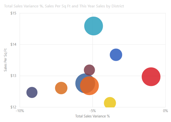
Both scatter and bubble charts can also have a play axis, which can show changes over time.
A dot plot chart is similar to a bubble chart and scatter chart except that it can plot numerical or categorical data along the X axis. This example happens to use squares instead of circles and plots sales along the X axis.
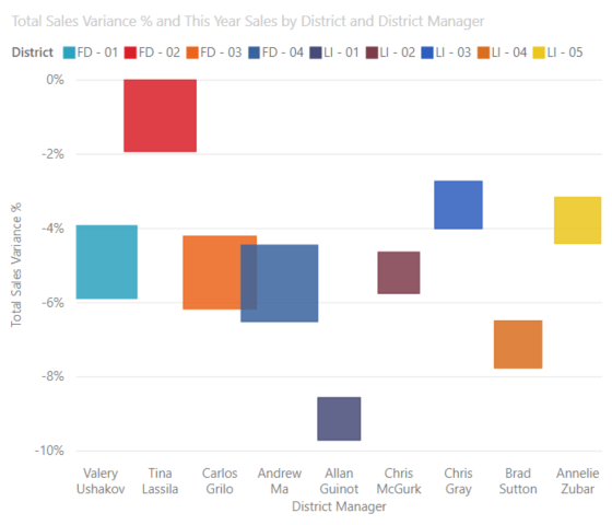
For more information, see Scatter charts in Power BI.
Scatter-high density
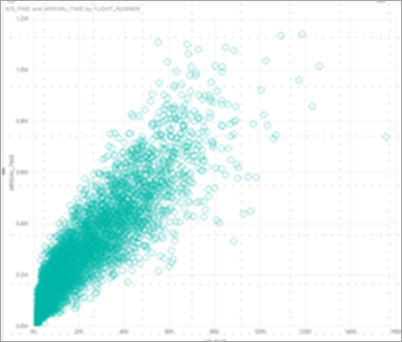
By definition, high-density data is sampled to quickly create visuals that are responsive to interactivity. High-density sampling uses an algorithm that eliminates overlapping points, and ensures that all points in the data set are represented in the visual. It doesn't just plot a representative sample of the data.
This ensures the best combination of responsiveness, representation, and clear preservation of important points in the overall data set.
For more information, see High Density Scatter charts in Power BI.
Slicers
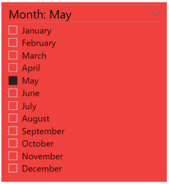
A slicer is a standalone chart that can be used to filter the other visuals on the page. Slicers come in many different formats (category, range, date, etc.) and can be formatted to allow selection of only one, many, or all of the available values.
Slicers are a great choice to:
- Display commonly used or important filters on the report canvas for easier access.
- Make it easier to see the current filtered state without having to open a drop-down list.
- Filter by columns that are unneeded and hidden in the data tables.
- Create more focused reports by putting slicers next to important visuals.
For more information, see Slicers in Power BI.
Smart narrative
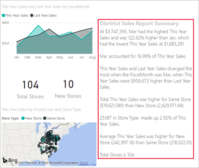
The Smart narrative adds text to reports to point out trends, key takeaways, and add explanations and context. The text helps users to understand the data and identify the important findings quickly.
For more information, see Create smart narrative summaries.
Standalone images

A standalone image is a graphic that is added to a report or dashboard.
For more information, see Add an image widget to a dashboard.
Tables
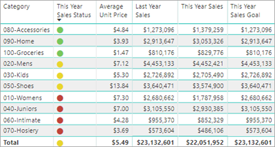
A table is a grid that contains related data in a logical series of rows and columns. It might also contain headers and a row for totals. Tables work well with quantitative comparisons where you are looking at many values for a single category. For example, this table displays five different measures for Category.
Tables are a great choice:
- To see and compare detailed data and exact values (instead of visual representations).
- To display data in a tabular format.
- To display numerical data by categories.
For more information, see Working with tables in Power BI.
Treemaps
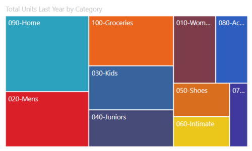
Treemaps are charts of colored rectangles, with size representing value. They can be hierarchical, with rectangles nested within the main rectangles. The space inside each rectangle is allocated based on the value being measured. And the rectangles are arranged in size from top left (largest) to bottom right (smallest).
Treemaps are a great choice:
- To display large amounts of hierarchical data.
- When a bar chart can't effectively handle the large number of values.
- To show the proportions between each part and the whole.
- To show the pattern of the distribution of the measure across each level of categories in the hierarchy.
- To show attributes using size and color coding.
- To spot patterns, outliers, most-important contributors, and exceptions.
For more information, see Treemaps in Power BI.
Waterfall charts
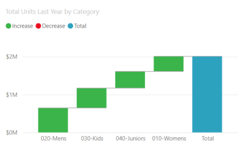
A waterfall chart shows a running total as values are added or subtracted. It's useful for understanding how an initial value (for example, net income) is affected by a series of positive and negative changes.
The columns are color coded so you can quickly tell increases and decreases. The initial and the final value columns often start on the horizontal axis, while the intermediate values are floating columns. Because of this "look", waterfall charts are also called bridge charts.
Waterfall charts are a great choice:
- When you have changes for the measure across time or across different categories.
- To audit the major changes contributing to the total value.
- To plot your company's annual profit by showing various sources of revenue and arrive at the total profit (or loss).
- To illustrate the beginning and the ending headcount for your company in a year.
- To visualize how much money you make and spend each month, and the running balance for your account.
For more information, see Waterfall charts in Power BI.
Related content
- Visualizations in Power BI reports
- Power BI Visuals Reference from sqlbi.com, guidance for picking the right visual for your data
