Create key influencers visualizations
APPLIES TO:
Power BI Desktop
Power BI service
The key influencers visual helps you understand the factors that drive a metric that interests you. It analyzes your data, ranks the factors that matter, and displays them as key influencers. For example, suppose you want to figure out what influences employee turnover, which is also known as churn. One factor might be employment contract length, and another factor might be commute time.
When to use key influencers
The key influencers visual is a great choice if you want to:
- See which factors affect the metric being analyzed.
- Contrast the relative importance of these factors. For example, do short-term contracts affect churn more than long-term contracts?
Features of the key influencers visual

Tabs: Select a tab and switch between views. Key influencers shows you the top contributors to the selected metric value. Top segments shows you the top segments that contribute to the selected metric value. A segment is made up of a combination of values. For example, one segment might be consumers who are long-term customers and live in the west region.
Drop-down box: The value of the metric under investigation. In this example, look at the metric Rating. The selected value is Low.
Restatement: It helps you interpret the visual in the left pane.
Left pane: The left pane contains one visual. In this case, the left pane shows a list of the top key influencers.
Restatement: It helps you interpret the visual in the right pane.
Right pane: The right pane contains one visual. In this case, the column chart displays all the values for the key influencer Theme that was selected in the left pane. The specific value of usability from the left pane is shown in green. All the other values for Theme are shown in black.
Average line: The average is calculated for all possible values for Theme except usability (which is the selected influencer). So the calculation applies to all the values in black. It tells you what percentage of the other Themes had a low rating. In this case, 11.35% had a low rating (shown by the dotted line).
Check box: Filters out the visual in the right pane to only show values that are influencers for that field. In this example, the visual is filtered to display usability, security, and navigation.
Analyze a metric that is categorical
- Your Product Manager wants you to figure out which factors lead customers to leave negative reviews about your cloud service. To follow along in Power BI Desktop, open the Customer Feedback PBIX file.
Note
The Customer Feedback data set is based on [Moro et al., 2014] S. Moro, P. Cortez, and P. Rita. "A Data-Driven Approach to Predict the Success of Bank Telemarketing." Decision Support Systems, Elsevier, 62:22-31, June 2014.
Under Build visual on the Visualizations pane, select the Key influencers icon.

Move the metric you want to investigate into the Analyze field. To see what drives a customer rating of the service to be low, select Customer Table > Rating.
Move fields that you think might influence Rating into the Explain by field. You can move as many fields as you want. In this case, start with:
- Country-Region
- Role in Org
- Subscription Type
- Company Size
- Theme
Leave the Expand by field empty. This field is only used when analyzing a measure or summarized field.
To focus on the negative ratings, select Low in the What influences Rating to be drop-down box.
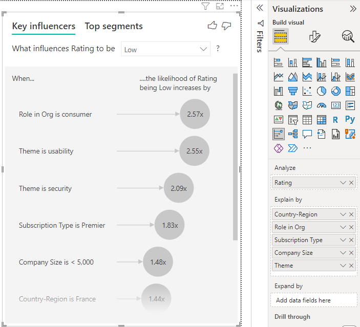
The analysis runs on the table level of the field that's being analyzed. In this case, it's the Rating metric. This metric is defined at a customer level. Each customer gives either a high score or a low score. All the explanatory factors must be defined at the customer level for the visual to make use of them.
In the previous example, all of the explanatory factors have either a one-to-one or a many-to-one relationship with the metric. In this case, each customer assigned a single theme to their rating. Similarly, customers come from one country or region, have one membership type, and hold one role in their organization. The explanatory factors are already attributes of a customer, and no transformations are needed. The visual can make immediate use of them.
Later in the tutorial, you look at more complex examples that have one-to-many relationships. In those cases, the columns have to first be aggregated down to the customer level before you can run the analysis.
Measures and aggregates used as explanatory factors are also evaluated at the table level of the Analyze metric. Some examples are shown later in this article.
Interpret categorical key influencers
Let's take a look at the key influencers for low ratings.
Top single factor that influences the likelihood of a low rating
The customer in this example can have three roles: consumer, administrator, and publisher. Being a consumer is the top factor that contributes to a low rating.

More precisely, your consumers are 2.57 times more likely to give your service a negative score. The key influencers chart lists Role in Org is consumer first in the list on the left. By selecting Role in Org is consumer, Power BI shows more details in the right pane. The comparative effect of each role on the likelihood of a low rating is shown.
- 14.93% of consumers give a low score.
- On average, all other roles give a low score 5.78% of the time.
- Consumers are 2.57 times more likely to give a low score compared to all other roles. You can determine this score by dividing the green bar by the red dotted line.
Second single factor that influences the likelihood of a low rating
The key influencers visual compares and ranks factors from many different variables. The second influencer has nothing to do with Role in Org. Select the second influencer in the list, which is Theme is usability.

The second most important factor is related to the theme of the customer’s review. Customers who commented about the usability of the product were 2.55 times more likely to give a low score compared to customers who commented on other themes, such as reliability, design, or speed.
Between the visuals, the average, which is shown by the red dotted line, changed from 5.78% to 11.35%. The average is dynamic because it's based on the average of all other values. For the first influencer, the average excluded the customer role. For the second influencer, it excluded the usability theme.
Select the Only show values that are influencers check box to filter by using only the influential values. In this case, they're the roles that drive a low score. Twelve themes are reduced to the four that Power BI identified as the themes that drive low ratings.

Interact with other visuals
Every time you select a slicer, filter, or other visual on the canvas, the key influencers visual reruns its analysis on the new portion of data. For example, you can move Company Size into the report and use it as a slicer. Use it to see if the key influencers for your enterprise customers are different than the general population. An enterprise company size is larger than 50,000 employees.
Select >50,000 to rerun the analysis, and you can see that the influencers changed. For large enterprise customers, the top influencer for low ratings has a theme related to security. You might want to investigate further to see if there are specific security features your large customers are unhappy about.

Interpret continuous key influencers
So far, you learned how to use the visual to explore how different categorical fields influence low ratings. It's also possible to have continuous factors such as age, height, and price in the Explain by field. Let’s look at what happens when Tenure is moved from the customer table into Explain by. Tenure depicts how long a customer uses the service.
As tenure increases, the likelihood of receiving a lower rating also increases. This trend suggests that the longer-term customers are more likely to give a negative score. This insight is interesting, and one that you might want to follow up on later.
The visualization shows that every time tenure goes up by 13.44 months, on average the likelihood of a low rating increases by 1.23 times. In this case, 13.44 months depict the standard deviation of tenure. So the insight you receive looks at how increasing tenure by a standard amount, which is the standard deviation of tenure, affects the likelihood of receiving a low rating.
The scatter plot in the right pane plots the average percentage of low ratings for each value of tenure. It highlights the slope with a trend line.

Binned continuous key influencers
In some cases, you may find that your continuous factors were automatically turned into categorical ones. If the relationship between the variables isn't linear, we can't describe the relationship as simply increasing or decreasing (like we do in the previous example).
We run correlation tests to determine how linear the influencer is compared to the target. If the target is continuous, we run Pearson correlation and if the target is categorical, we run Point Biserial correlation tests. If we detect the relationship isn't sufficiently linear, we conduct supervised binning and generate a maximum of five bins. To figure out which bins make the most sense, we use a supervised binning method. The supervised binning method looks at the relationship between the explanatory factor and the target being analyzed.
Interpret measures and aggregates as key influencers
You can use measures and aggregates as explanatory factors inside your analysis. For example, what effect does the count of customer support tickets have on the score you receive. Or, what effect does the average duration of an open ticket have on the score you receive.
In this case, you want to see if the number of support tickets that a customer has influences the score they give. Now you bring in Support Ticket ID from the support ticket table. Because a customer can have multiple support tickets, you aggregate the ID to the customer level. Aggregation is important because the analysis runs on the customer level, so all drivers must be defined at that level of granularity.
Let's look at the count of IDs. Each customer row has a count of support tickets associated with it. In this case, as the count of support tickets increases, the likelihood of the rating being low goes up 4.08 times. The screenshot shows the average number of support tickets by different Rating values evaluated at the customer level.

Interpret the results: Top segments
You can use the Key influencers tab to assess each factor individually. You also can use the Top segments tab to see how a combination of factors affects the metric that you're analyzing.
Top segments initially show an overview of all the segments that Power BI discovered. The following example shows that six segments were found. The percentage of low ratings within the segment determines the ranking. Segment 1, for example, has 74.3% customer ratings that are low. The higher the bubble, the higher the proportion of low ratings. The size of the bubble represents how many customers are within the segment.

Selecting a bubble displays the details of that segment. If you select Segment 1, for example, you find that it represents established customers. They've been customers for over 29 months and have more than four support tickets. Finally, they're not publishers, so they're either consumers or administrators.
In this group, 74.3% of the customers gave a low rating. The average customer gave a low rating 11.7% of the time, so this segment has a larger proportion of low ratings. It's 63 percentage points higher. Segment 1 also contains approximately 2.2% of the data, so it represents an addressable portion of the population.

Adding counts
Sometimes an influencer can have a significant effect but represent little of the data. For example, Theme is usability is the third biggest influencer for low ratings. However, there might have only been a handful of customers who complained about usability. Counts can help you prioritize which influencers you want to focus on.
You can turn on counts through the Analysis card of the formatting pane.
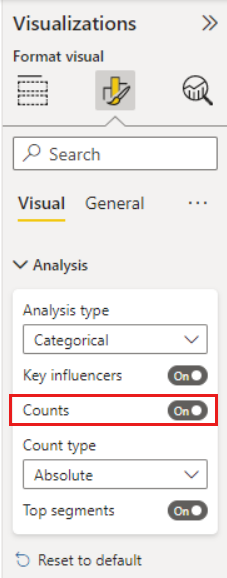
After counts are enabled, you’ll see a ring around each influencer’s bubble, which represents the approximate percentage of data that influencer contains. The more of the bubble the ring circles, the more data it contains. We can see that Theme is usability contains a small proportion of data.

You can also use the Sort by toggle in the bottom left of the visual to sort the bubbles by count first instead of impact. Subscription Type is Premier is the top influencer based on count.

Having a full ring around the circle means the influencer contains 100% of the data. You can change the count type to be relative to the maximum influencer using the Count type dropdown in the Analysis card of the formatting pane. Now the influencer with the most amount of data is represented by a full ring and all other counts are relative to it.

Analyze a metric that is numeric
If you move an unsummarized numerical field into the Analyze field, you have a choice how to handle that scenario. You can change the behavior of the visual by going into the Formatting Pane and switching between Categorical Analysis Type and Continuous Analysis Type.

A Categorical Analysis Type is described earlier in this article. For instance, if you look at survey scores ranging from 1 to 10, you can ask "What influences Survey Scores to be 1?"
A Continuous Analysis Type changes the question to a continuous one. Using the previous example, our new question is "What influences Survey Scores to increase/decrease?"
This distinction is helpful when you have lots of unique values in the field you're analyzing. In the next example, we look at house prices. It isn't meaningful to ask "What influences House Price to be 156,214?" as that is specific and we're likely not to have enough data to infer a pattern.
Instead we may want to ask, "What influences House Price to increase," which allows us to treat house prices as a range rather than distinct values.

Interpret the results: Key influencers
Note
The examples in this section use public domain House Prices data. You can download the sample dataset if you want to follow along.
In this scenario, we look at "What influences House Price to increase." A number of explanatory factors could impact a house price like Year Built (year the house was built), KitchenQual (kitchen quality), and YearRemodAdd (year the house was remodeled).
In the example below, we look at our top influencer, which is kitchen quality being Excellent. The results are similar to the ones we saw when we were analyzing categorical metrics with a few important differences:
- The column chart on the right is looking at the averages rather than percentages. It therefore shows us what the average house price of a house with an excellent kitchen is (green bar) compared to the average house price of a house without an excellent kitchen (dotted line)
- The number in the bubble is still the difference between the red dotted line and green bar but it’s expressed as a number ($158.49K) rather than a likelihood (1.93x). So on average, houses with excellent kitchens are almost $160 K more expensive than houses without excellent kitchens.

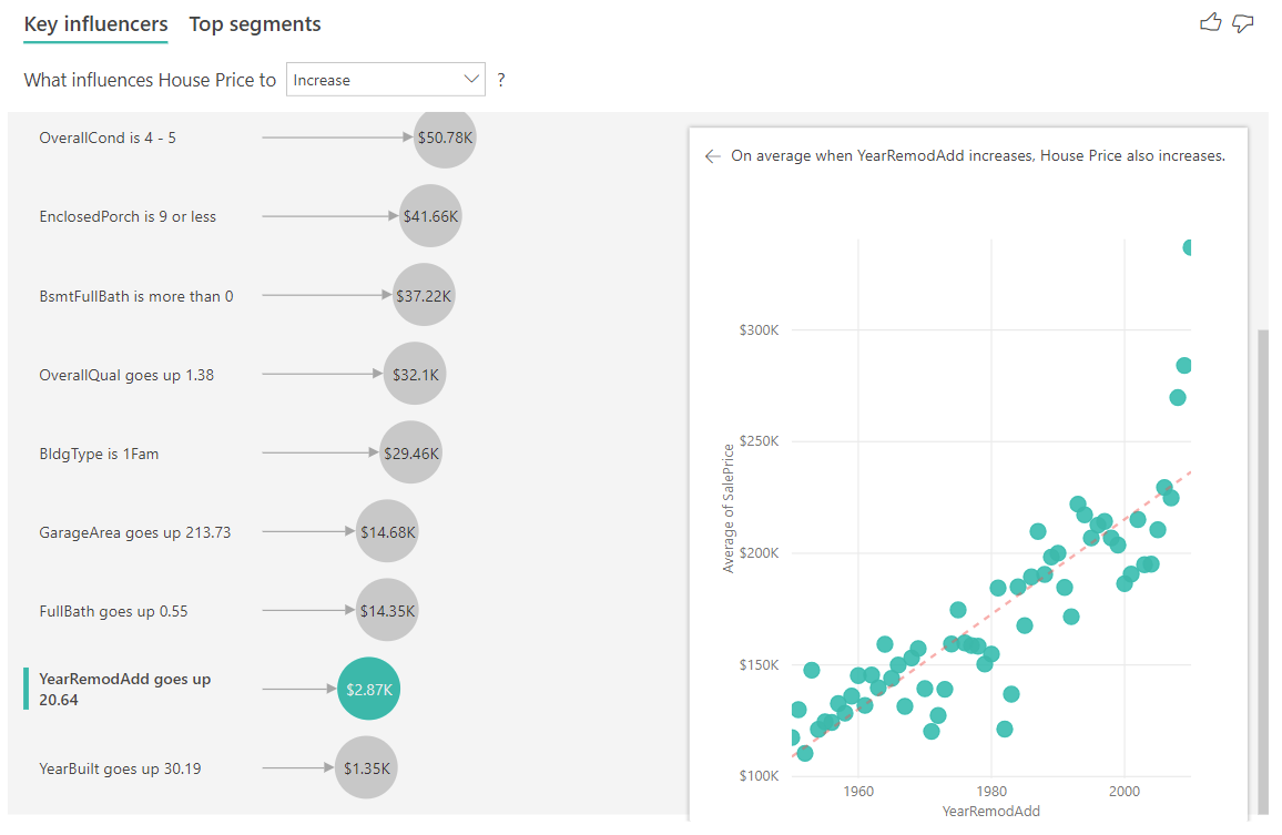
In the example below, we look at the impact a continuous factor (year house was remodeled) has on house price. The differences compared to how we analyze continuous influencers for categorical metrics are as follows:
- The scatter plot in the right pane plots the average house price for each distinct value of year remodeled.
- The value in the bubble shows by how much the average house price increases (in this case, $2.87k) when the year the house was remodeled increases by its standard deviation (in this case, 20 years)
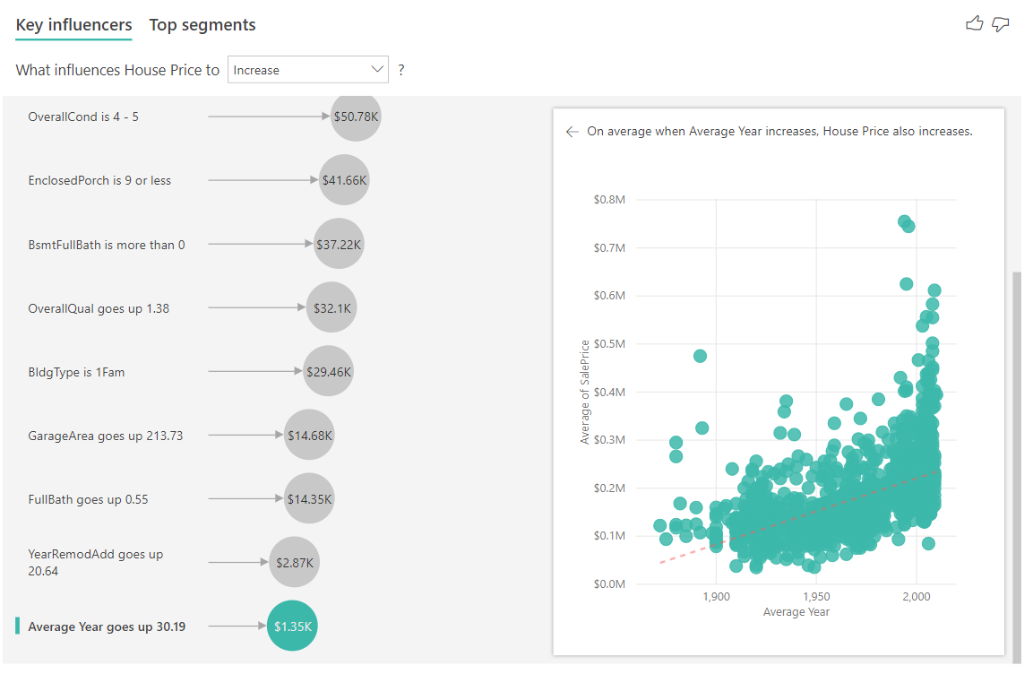
Finally, in the case of measures, we're looking at the average year a house was built. The analysis is as follows:
- The scatterplot in the right pane plots the average house price for each distinct value in the table
- The value in the bubble shows by how much the average house price increases (in this case $1.35 K) when the average year increases by its standard deviation (in this case 30 years)
Interpret the results: Top Segments
Top segments for numerical targets show groups where the house prices on average are higher than in the overall dataset. For example, below we can see that Segment 1 is made up of houses where GarageCars (number of cars the garage can fit) is greater than 2 and the RoofStyle is Hip. Houses with those characteristics have an average price of $355 K compared to the overall average in the data which is $180 K.

Analyze a metric that is a measure or a summarized column
For a measure or summarized column, the analysis defaults to the Continuous Analysis Type described earlier in this article. It can't be changed. The biggest difference between analyzing a measure/summarized column and an unsummarized numeric column is the level at which the analysis runs.
For unsummarized columns, the analysis always runs at the table level. In the house price example, we analyzed the House Price metric to see what influences a house price to increase/decrease. The analysis automatically runs on the table level. Our table has a unique ID for each house so the analysis runs at a house level.

For measures and summarized columns, we don't immediately know what level to analyze them at. If House Price was summarized as an Average, we would need to consider what level we would like this average house price calculated. Is it the average house price at a neighborhood level? Or perhaps a regional level?
Measures and summarized columns are automatically analyzed at the level of the Explain by fields used. Imagine we want to examine three fields in Explain By: Kitchen Quality, Building Type and Air Conditioning. Average House Price would be calculated for each unique combination of those three fields. It's often helpful to switch to a table view to take a look at what the data being evaluated looks like.
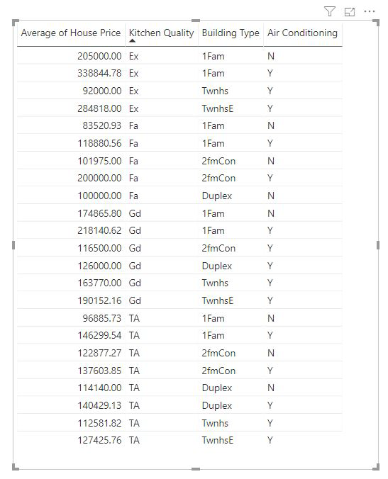
This analysis is very summarized and so it might be hard for the regression model to find any patterns in the data it can learn from. We should run the analysis at a more detailed level to get better results. If we wanted to analyze the house price at the house level, we'd need to explicitly add the ID field to the analysis. Nevertheless, we don't want the house ID to be considered an influencer. It isn't helpful to learn that as house ID increases, the price of a house increase. The Expand By field well option comes in handy here. You can use Expand By to add fields you want to use for setting the level of the analysis without looking for new influencers.
Take a look at what the visualization looks like once we add ID to Expand By. Once you define the level at which you want your measure evaluated, interpreting influencers is exactly the same as for unsummarized numeric columns.

To learn how Power BI uses ML.NET behind the scenes to reason over data and surface insights in a natural way, see Power BI identifies key influencers using ML.NET.
Considerations and troubleshooting
What are the limitations for the visual?
The key influencers visual has some limitations:
- Direct Query isn't supported
- Live Connection to Azure Analysis Services and SQL Server Analysis Services is not supported
- Publish to web isn't supported
- .NET Framework 4.6 or higher is required
- SharePoint Online embedding isn't supported

I see an error that no influencers or segments were found. Why is that?

This error occurs when you included fields in Explain by but no influencers were found.
- You included the metric you were analyzing in both Analyze and Explain by. Remove it from Explain by.
- Your explanatory fields have too many categories with few observations. This situation makes it hard for the visualization to determine which factors are influencers. It’s hard to generalize based on only a few observations. If you're analyzing a numeric field, you may want to switch from Categorical Analysis to Continuous Analysis in the Formatting Pane under the Analysis card.
- Your explanatory factors have enough observations to generalize, but the visualization didn't find any meaningful correlations to report.
I see an error that the metric I'm analyzing doesn't have enough data to run the analysis on. Why is that?
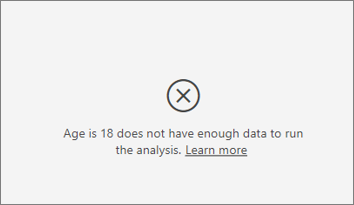
The visualization works by looking at patterns in the data for one group compared to other groups. For example, it looks for customers who gave low ratings compared to customers who gave high ratings. If the data in your model has only a few observations, patterns are hard to find. If the visualization doesn’t have enough data to find meaningful influencers, it indicates that more data is needed to run the analysis.
We recommend that you have at least 100 observations for the selected state. In this case, the state is customers who churn. You also need at least 10 observations for the states you use for comparison. In this case, the comparison state is customers who don't churn.
If you're analyzing a numeric field, you may want to switch from Categorical Analysis to Continuous Analysis in the Formatting Pane under the Analysis card.
I see an error that when 'Analyze' is not summarized, the analysis always runs at the row level of its parent table. Changing this level via 'Expand by' fields is not allowed. Why is that?
When analyzing a numeric or categorical column, the analysis always runs at the table level. For example, if you're analyzing house prices and your table contains an ID column, the analysis is automatically run at the house ID level.
When you're analyzing a measure or summarized column, you need to explicitly state at which level you would like the analysis to run at. You can use Expand by to change the level of the analysis for measures and summarized columns without adding new influencers. If House price was defined as a measure, you could add the house ID column to Expand by to change the level of the analysis.
I see an error that a field in Explain by isn't uniquely related to the table that contains the metric I'm analyzing. Why is that?
The analysis runs on the table level of the field that's being analyzed. For example, if you analyze customer feedback for your service, you might have a table that tells you whether a customer gave a high rating or a low rating. In this case, your analysis is running at the customer table level.
If you have a related table defined at a more granular level than the table that contains your metric, you see this error. Here's an example:
- You analyze what drives customers to give low ratings of your service.
- You want to see if the device on which the customer is consuming your service influences the reviews they give.
- A customer can consume the service in multiple different ways.
- In the following example, customer 10000000 uses both a browser and a tablet to interact with the service.

If you try to use the device column as an explanatory factor, you see the following error:
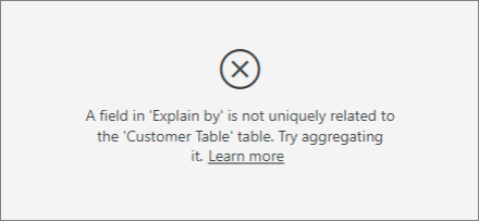
This error appears because the device isn't defined at the customer level. One customer can consume the service on multiple devices. For the visualization to find patterns, the device must be an attribute of the customer. There are several solutions that depend on your understanding of the business:
- You can change the summarization of devices to count. For example, use count if the number of devices might affect the score that a customer gives.
- You can pivot the device column to see if consuming the service on a specific device influences a customer’s rating.
In this example, the data was pivoted to create new columns for browser, mobile, and tablet (make sure you delete and re-create your relationships in the modeling view after pivoting your data). You can now use these specific devices in Explain by. All devices turn out to be influencers, and the browser has the largest effect on customer score.
More precisely, customers who don't use the browser to consume the service are 3.79 times more likely to give a low score than the customers who do. Lower down in the list, for mobile the inverse is true. Customers who use the mobile app are more likely to give a low score than the customers who don’t.

I see a warning that measures weren't included in my analysis. Why is that?

The analysis runs on the table level of the field that's being analyzed. If you analyze customer churn, you might have a table that tells you whether a customer churned or not. In this case, your analysis runs at the customer table level.
Measures and aggregates are by default analyzed at the table level. If there were a measure for average monthly spending, it would be analyzed at the customer table level.
If the customer table doesn't have a unique identifier, you can't evaluate the measure and it's ignored by the analysis. To avoid this situation, make sure the table with your metric has a unique identifier. In this case, it's the customer table and the unique identifier is customer ID. It’s also easy to add an index column by using Power Query.
I see a warning that the metric I'm analyzing has more than 10 unique values and that this amount might affect the quality of my analysis. Why is that?
The AI visualization can analyze categorical fields and numeric fields. For categorical fields, an example might be Churn is Yes or No, and Customer Satisfaction is High, Medium, or Low. Increasing the number of categories to analyze means there are fewer observations per category. This situation makes it harder for the visualization to find patterns in the data.
When analyzing numeric fields, you have a choice between treating the numeric fields like text in which case you run the same analysis as you do for categorical data (Categorical Analysis). If you have lots of distinct values, we recommend you switch the analysis to Continuous Analysis as that means we can infer patterns from when numbers increase or decrease rather than treating them as distinct values. You can switch from Categorical Analysis to Continuous Analysis in the Formatting Pane under the Analysis card.
To find stronger influencers, we recommend that you group similar values into a single unit. For example, if you have a metric for price, you're likely to obtain better results by grouping similar prices into High, Medium, and Low categories vs. using individual price points.

There are factors in my data that look like they should be key influencers, but they aren't. How can that happen?
In the following example, customers who are consumers drive low ratings, with 14.93% of ratings that are low. The administrator role also has a high proportion of low ratings, at 13.42%, but it isn't considered an influencer.
The reason for this determination is that the visualization also considers the number of data points when it finds influencers. The following example has more than 29,000 consumers and 10 times fewer administrators, about 2,900. Only 390 of them gave a low rating. The visual doesn’t have enough data to determine whether it found a pattern with administrator ratings or if it’s just a chance finding.

What are the data point limits for key influencers? We run the analysis on a sample of 10,000 data points. The bubbles on the one side show all the influencers that were found. The column charts and scatterplots on the other side abide by the sampling strategies for those core visuals.
How do you calculate key influencers for categorical analysis?
Behind the scenes, the AI visualization uses ML.NET to run a logistic regression to calculate the key influencers. A logistic regression is a statistical model that compares different groups to each other.
If you want to see what drives low ratings, the logistic regression looks at how customers who gave a low score differ from the customers who gave a high score. If you have multiple categories, such as high, neutral, and low scores, you look at how the customers who gave a low rating differ from the customers who didn't give a low rating. In this case, how do the customers who gave a low score differ from the customers who gave a high rating or a neutral rating?
The logistic regression searches for patterns in the data and looks for how customers who gave a low rating might differ from the customers who gave a high rating. It might find, for example, that customers with more support tickets give a higher percentage of low ratings than customers with few or no support tickets.
The logistic regression also considers how many data points are present. For example, if customers who play an admin role give proportionally more negative scores but there are only a few administrators, this factor isn't considered influential. This determination is made because there aren't enough data points available to infer a pattern. A statistical test, known as a Wald test, is used to determine whether a factor is considered an influencer. The visual uses a p-value of 0.05 to determine the threshold.
How do you calculate key influencers for numeric analysis?
Behind the scenes, the AI visualization uses ML.NET to run a linear regression to calculate the key influencers. A linear regression is a statistical model that looks at how the outcome of the field you're analyzing changes based on your explanatory factors.
For example, if we're analyzing house prices, a linear regression looks at the effect that having an excellent kitchen hAs on the house price. Do houses with excellent kitchens generally have lower or higher house prices compared to houses without excellent kitchens?
The linear regression also considers the number of data points. For example, if houses with tennis courts have higher prices but we have few houses with a tennis court, this factor isn't considered influential. This determination is made because there aren't enough data points available to infer a pattern. A statistical test, known as a Wald test, is used to determine whether a factor is considered an influencer. The visual uses a p-value of 0.05 to determine the threshold.
How do you calculate segments?
Behind the scenes, the AI visualization uses ML.NET to run a decision tree to find interesting subgroups. The objective of the decision tree is to end up with a subgroup of data points that's relatively high in the metric you're interested in. It could be customers with low ratings or houses with high prices.
The decision tree takes each explanatory factor and tries to reason which factor gives it the best split. For example, if you filter the data to include only large enterprise customers, does that separate out customers who gave a high rating vs. a low rating? Or perhaps is it better to filter the data to include only customers who commented about security?
After the decision tree does a split, it takes the subgroup of data and determines the next best split for that data. In this case, the subgroup is customers who commented on security. After each split, the decision tree also considers whether it has enough data points for this group to be representative enough to infer a pattern. If not, then it's an anomaly in the data and not a real segment. Another statistical test is applied to check for the statistical significance of the split condition with p-value of 0.05.
After the decision tree finishes running, it takes all the splits, such as security comments and large enterprise, and creates Power BI filters. This combination of filters is packaged up as a segment in the visual.
Why do certain factors become influencers or stop being influencers as I move more fields into the Explain by field?
The visualization evaluates all explanatory factors together. A factor might be an influencer by itself, but when considered with other factors it might not. Suppose you want to analyze what drives a house price to be high, with bedrooms and house size as explanatory factors:
- By itself, more bedrooms might be a driver for house prices to be high.
- Including house size in the analysis means you now look at what happens to bedrooms while house size remains constant.
- If house size is fixed at 1,500 square feet, it's unlikely that a continuous increase in the number of bedrooms dramatically increases the house price.
- Bedrooms might not be as important of a factor as it was before house size was considered.
Sharing your report with a Power BI colleague requires that you both have individual Power BI Pro licenses or that the report is saved in Premium capacity. See sharing reports.
