Notitie
Voor toegang tot deze pagina is autorisatie vereist. U kunt proberen u aan te melden of de directory te wijzigen.
Voor toegang tot deze pagina is autorisatie vereist. U kunt proberen de mappen te wijzigen.
In dit onderwerp beschrijven we opdrachten in Windows-toepassingen. In het bijzonder bespreken we hoe u de klassen XamlUICommand en StandardUICommand (samen met de ICommand-interface) kunt gebruiken om opdrachten te delen en te beheren voor verschillende typen besturingselementen, ongeacht het gebruikte apparaat en invoertype.
Opdrachten delen over verschillende besturingselementen, ongeacht het apparaat en het invoertype
Belangrijke API's
- Microsoft. UI. Xaml.Input.ICommand en System.Windows. Input.ICommand
- XamlUICommand
- StandardUICommand
Overzicht
Opdrachten kunnen rechtstreeks worden aangeroepen via gebruikersinterface-interacties, zoals klikken op een knop of het selecteren van een item in een contextmenu. Ze kunnen ook indirect worden aangeroepen via een invoerapparaat, zoals een toetsenbordversneller, beweging, spraakherkenning of een hulpprogramma voor automatisering/toegankelijkheid. Zodra de opdracht is aangeroepen, kan deze worden verwerkt door een besturingselement (tekstnavigatie in een besturingselement voor bewerken), een venster (terugnavigatie) of de toepassing (exit).
Opdrachten kunnen worden uitgevoerd op een specifieke context in uw app, zoals het verwijderen van tekst of het ongedaan maken van een actie, of ze kunnen contextvrij zijn, zoals het dempen van audio of het aanpassen van helderheid.
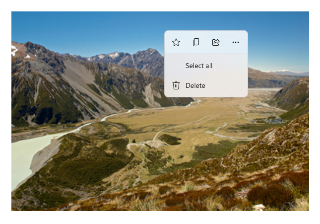
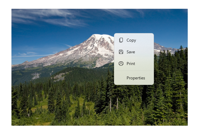
In de volgende afbeelding ziet u twee opdrachtinterfaces (een CommandBar en een zwevende contextuele CommandBarFlyout) die enkele van dezelfde opdrachten delen.
Opdrachtbalk
Contextmenu in de Microsoft Foto's-galerij
Commando-interacties
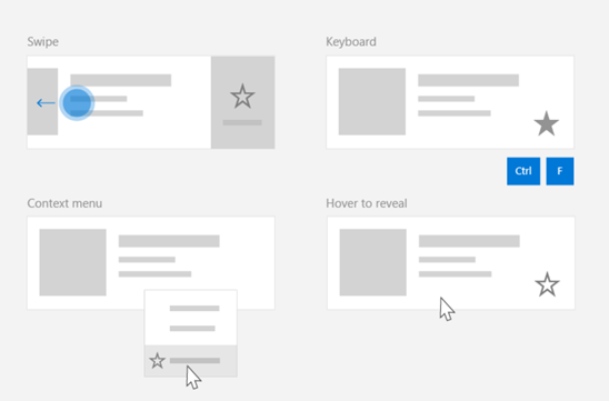
Vanwege de verschillende apparaten, invoertypen en UI-oppervlakken die van invloed kunnen zijn op hoe een opdracht wordt aangeroepen, raden we u aan om uw opdrachten beschikbaar te maken via zoveel mogelijk opdrachtoppervlakken. Dit kan een combinatie zijn van Swipe, MenuBar, CommandBar, CommandBarFlyout en traditioneel contextmenu.
Gebruik invoerspecifieke accelerators voor kritieke opdrachten. Met invoerversnellers kan een gebruiker sneller acties uitvoeren, afhankelijk van het invoerapparaat dat ze gebruiken.
Hier volgen enkele algemene invoerversnellers voor verschillende invoertypen:
- Aanwijzer - Knoppen voor aanwijzen met muis en pen
- Toetsenbord - Sneltoetsen (toegangstoetsen en acceleratortoetsen)
- Aanraken - Swipen
- Aanraken - Ophalen om gegevens te vernieuwen
U moet rekening houden met het invoertype en de gebruikerservaringen om de functionaliteit van uw toepassing universeel toegankelijk te maken. Verzamelingen (met name gebruikers bewerkbare verzamelingen) bevatten doorgaans verschillende specifieke opdrachten die heel anders worden uitgevoerd, afhankelijk van het invoerapparaat.
In de volgende tabel ziet u enkele typische verzamelingsopdrachten en manieren om deze opdrachten beschikbaar te maken.
| Command | Invoeronafhankelijk | Muisversneller | Toetsenbordversneller | Aanraakversneller |
|---|---|---|---|---|
| Item verwijderen | Contextmenu | Hoverknop | DEL-sleutel | Swipe om te verwijderen |
| Vlagitem | Contextmenu | Hoverknop | Ctrl+Shift+G | Swipe om te markeren |
| Gegevens vernieuwen | Contextmenu | N/A | F5-toets | Naar beneden trekken om te vernieuwen |
| Een item favoriet maken | Contextmenu | Hoverknop | F, Ctrl+S | Swipe naar favoriet |
Altijd een contextmenu opgeven We raden u aan alle relevante contextuele opdrachten op te geven in een traditioneel contextmenu of CommandBarFlyout, omdat beide worden ondersteund voor alle invoertypen. Als een opdracht bijvoorbeeld alleen wordt weergegeven tijdens een aanwijzer-hovergebeurtenis, kan deze niet worden gebruikt op een apparaat met alleen aanraakscherm.
Opdrachten in Windows-toepassingen
Er zijn een aantal manieren waarop u opdrachten kunt delen en beheren in een Windows-toepassing. U kunt event handlers definiëren voor standaardinteracties, zoals klikken, in code-behind (dit kan behoorlijk inefficiënt zijn, afhankelijk van de complexiteit van uw gebruikersinterface), u kunt event listener binden voor standaardinteracties met een gedeelde handler, of u kunt de Command-eigenschap van de besturing binden aan een ICommand-implementatie die de commandologica beschrijft.
Als u rijke en uitgebreide gebruikerservaringen wilt bieden op verschillende opdrachtinterfaces efficiënt en met minimale codeduplicatie, raden we u aan de opdrachtkoppelingsfuncties te gebruiken die in dit onderwerp worden beschreven (zie de individuele gebeurtenisonderwerpen voor standaardafhandeling van gebeurtenissen).
Als u een besturingselement wilt binden aan een gedeelde opdrachtresource, kunt u de ICommand-interfaces zelf implementeren of kunt u uw opdracht bouwen vanuit de basisklasse XamlUICommand of een van de platformopdrachten die zijn gedefinieerd door de afgeleide klasse StandardUICommand .
- Met de interface ICommand (Microsoft.UI.Xaml.Input.ICommand of System.Windows.Input.ICommand) kunt u volledig aangepaste, herbruikbare opdrachten maken voor gebruik in uw hele app.
- XamlUICommand biedt ook deze mogelijkheid, maar vereenvoudigt de ontwikkeling door een set ingebouwde opdrachteigenschappen weer te geven, zoals het opdrachtgedrag, sneltoetsen (toegangstoets en sneltoets), pictogram, label en beschrijving.
- StandardUICommand vereenvoudigt het verder door u te laten kiezen uit een set standaardplatformopdrachten met vooraf gedefinieerde eigenschappen.
Belangrijk
In WinUI-toepassingen zijn opdrachten implementaties van de Microsoft. UI. Xaml.Input.ICommand (C++) of system.Windows. Input.ICommand (C#) interface, afhankelijk van het gekozen taalframework.
Opdrachtervaringen met behulp van de klasse StandardUICommand
Afgeleid van XamlUICommand (afgeleid van Microsoft. UI. Xaml.Input.ICommand voor C++ of System.Windows. Input.ICommand voor C#), de klasse StandardUICommand bevat een set standaardplatformopdrachten met vooraf gedefinieerde eigenschappen, zoals pictogram, toetsenbordversneller en beschrijving.
Een StandardUICommand biedt een snelle en consistente manier om algemene opdrachten zoals Save of Deletete definiëren. U hoeft alleen de execute- en canExecute-functies op te geven.
Example
StandardUICommandSample
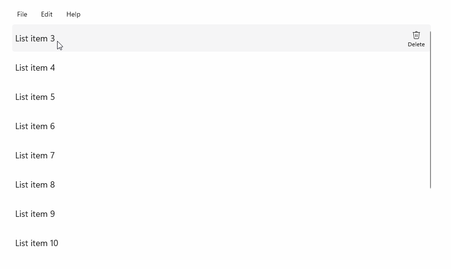
In dit voorbeeld laten we zien hoe u een eenvoudige ListView kunt verbeteren met een opdracht Item verwijderen die is geïmplementeerd via de klasse StandardUICommand , terwijl u de gebruikerservaring optimaliseert voor een verscheidenheid aan invoertypen met behulp van een menubalk, swipe-besturingselement , muisaanwijzerknoppen en contextmenu.
Xaml:
De voorbeeldgebruikersinterface bevat een ListView van vijf items. De Delete StandardUICommand is gebonden aan een MenuBarItem, een SwipeItem, een AppBarButton- en ContextFlyout-menu.
<Page
    x:Class="StandardUICommandSample.MainPage"
    xmlns="http://schemas.microsoft.com/winfx/2006/xaml/presentation"
    xmlns:x="http://schemas.microsoft.com/winfx/2006/xaml"
    xmlns:local="using:StandardUICommandSample"
    xmlns:d="http://schemas.microsoft.com/expression/blend/2008"
    xmlns:mc="http://schemas.openxmlformats.org/markup-compatibility/2006"
    xmlns:muxcontrols="using:Microsoft.UI.Xaml.Controls"
    mc:Ignorable="d"
    Background="{ThemeResource ApplicationPageBackgroundThemeBrush}">

    <Page.Resources>
        <Style x:Key="HorizontalSwipe"
               TargetType="ListViewItem"
               BasedOn="{StaticResource ListViewItemRevealStyle}">
            <Setter Property="Height" Value="60"/>
            <Setter Property="Padding" Value="0"/>
            <Setter Property="HorizontalContentAlignment" Value="Stretch"/>
            <Setter Property="VerticalContentAlignment" Value="Stretch"/>
            <Setter Property="BorderThickness" Value="0"/>
        </Style>
    </Page.Resources>

    <Grid Loaded="ControlExample_Loaded">
        <Grid.RowDefinitions>
            <RowDefinition Height="Auto" />
            <RowDefinition Height="Auto" />
            <RowDefinition Height="*"/>
        </Grid.RowDefinitions>

        <StackPanel Grid.Row="0"
                    Padding="10"
                    BorderThickness="0,0,0,1"
                    BorderBrush="LightBlue"
                    Background="AliceBlue">
            <TextBlock Style="{StaticResource HeaderTextBlockStyle}">
                StandardUICommand sample
            </TextBlock>
            <TextBlock Style="{StaticResource SubtitleTextBlockStyle}" Margin="0,0,0,10">
                This sample shows how to use the StandardUICommand class to
                share a platform command and consistent user experiences
                across various controls.
            </TextBlock>
            <TextBlock Style="{StaticResource SubtitleTextBlockStyle}" Margin="0,0,0,0">
                Specifically, we define a standard delete command and add it
                to a variety of command surfaces, all of which share a common
                icon, label, keyboard accelerator, and description.
            </TextBlock>
        </StackPanel>

        <muxcontrols:MenuBar Grid.Row="1" Padding="10">
            <muxcontrols:MenuBarItem Title="File">
            </muxcontrols:MenuBarItem>
            <muxcontrols:MenuBarItem Title="Edit">
                <MenuFlyoutItem x:Name="DeleteFlyoutItem"/>
            </muxcontrols:MenuBarItem>
            <muxcontrols:MenuBarItem Title="Help">
            </muxcontrols:MenuBarItem>
        </muxcontrols:MenuBar>

        <ListView x:Name="ListViewRight" Grid.Row="2"
                  Loaded="ListView_Loaded"
                  IsItemClickEnabled="True"
                  SelectionMode="Single"
                  SelectionChanged="ListView_SelectionChanged"
                  ItemContainerStyle="{StaticResource HorizontalSwipe}">
            <ListView.ItemTemplate>
                <DataTemplate x:DataType="local:ListItemData">
                    <UserControl PointerEntered="ListViewSwipeContainer_PointerEntered"
                                 PointerExited="ListViewSwipeContainer_PointerExited">
                        <UserControl.ContextFlyout>
                            <MenuFlyout>
                                <MenuFlyoutItem
                                    Command="{x:Bind Command}"
                                    CommandParameter="{x:Bind Text}" />
                            </MenuFlyout>
                        </UserControl.ContextFlyout>
                        <Grid AutomationProperties.Name="{x:Bind Text}">
                            <VisualStateManager.VisualStateGroups>
                                <VisualStateGroup x:Name="HoveringStates">
                                    <VisualState x:Name="HoverButtonsHidden" />
                                    <VisualState x:Name="HoverButtonsShown">
                                        <VisualState.Setters>
                                            <Setter Target="HoverButton.Visibility"
                                                    Value="Visible" />
                                        </VisualState.Setters>
                                    </VisualState>
                                </VisualStateGroup>
                            </VisualStateManager.VisualStateGroups>
                            <SwipeControl x:Name="ListViewSwipeContainer" >
                                <SwipeControl.RightItems>
                                    <SwipeItems Mode="Execute">
                                        <SwipeItem x:Name="DeleteSwipeItem"
                                                   Background="Red"
                                                   Command="{x:Bind Command}"
                                                   CommandParameter="{x:Bind Text}"/>
                                    </SwipeItems>
                                </SwipeControl.RightItems>
                                <Grid VerticalAlignment="Center">
                                    <TextBlock Text="{x:Bind Text}"
                                               Margin="10"
                                               FontSize="18"
                                               HorizontalAlignment="Left"
                                               VerticalAlignment="Center"/>
                                    <AppBarButton x:Name="HoverButton"
                                                  IsTabStop="False"
                                                  HorizontalAlignment="Right"
                                                  Visibility="Collapsed"
                                                  Command="{x:Bind Command}"
                                                  CommandParameter="{x:Bind Text}"/>
                                </Grid>
                            </SwipeControl>
                        </Grid>
                    </UserControl>
                </DataTemplate>
            </ListView.ItemTemplate>
        </ListView>
    </Grid>
</Page>
Code-behind
- Eerst definiëren we een
ListItemDataklasse die een tekenreeks en ICommand bevat voor elke ListViewItem in onze ListView.
public class ListItemData
{
    public String Text { get; set; }
    public ICommand Command { get; set; }
}
- In de klasse MainPage definiëren we een verzameling
ListItemDataobjecten voor de DataTemplate van de ListViewItemTemplate. Vervolgens vullen we deze met een initiële verzameling van vijf items (met tekst en bijbehorende StandardUICommand Delete).
/// <summary>
/// ListView item collection.
/// </summary>
ObservableCollection<ListItemData> collection =
    new ObservableCollection<ListItemData>();

/// <summary>
/// Handler for the layout Grid control load event.
/// </summary>
/// <param name="sender">Source of the control loaded event</param>
/// <param name="e">Event args for the loaded event</param>
private void ControlExample_Loaded(object sender, RoutedEventArgs e)
{
    // Create the standard Delete command.
    var deleteCommand = new StandardUICommand(StandardUICommandKind.Delete);
    deleteCommand.ExecuteRequested += DeleteCommand_ExecuteRequested;

    DeleteFlyoutItem.Command = deleteCommand;

    for (var i = 0; i < 5; i++)
    {
        collection.Add(
            new ListItemData {
                Text = "List item " + i.ToString(),
                Command = deleteCommand });
    }
}

/// <summary>
/// Handler for the ListView control load event.
/// </summary>
/// <param name="sender">Source of the control loaded event</param>
/// <param name="e">Event args for the loaded event</param>
private void ListView_Loaded(object sender, RoutedEventArgs e)
{
    var listView = (ListView)sender;
    // Populate the ListView with the item collection.
    listView.ItemsSource = collection;
}
- Vervolgens definiëren we de ICommand ExecuteRequested-handler waar we de opdracht item verwijderen implementeren.
/// <summary>
/// Handler for the Delete command.
/// </summary>
/// <param name="sender">Source of the command event</param>
/// <param name="e">Event args for the command event</param>
private void DeleteCommand_ExecuteRequested(
    XamlUICommand sender, ExecuteRequestedEventArgs args)
{
    // If possible, remove specified item from collection.
    if (args.Parameter != null)
    {
        foreach (var i in collection)
        {
            if (i.Text == (args.Parameter as string))
            {
                collection.Remove(i);
                return;
            }
        }
    }
    if (ListViewRight.SelectedIndex != -1)
    {
        collection.RemoveAt(ListViewRight.SelectedIndex);
    }
}
- Ten slotte definiëren we handlers voor verschillende ListView-gebeurtenissen, waaronder PointerEntered, PointerExited en SelectionChanged-gebeurtenissen . De aanwijzer-gebeurtenis-handlers worden gebruikt om de knop Verwijderen voor elk item weer te geven of te verbergen.
/// <summary>
/// Handler for the ListView selection changed event.
/// </summary>
/// <param name="sender">Source of the selection changed event</param>
/// <param name="e">Event args for the selection changed event</param>
private void ListView_SelectionChanged(object sender, SelectionChangedEventArgs e)
{
    if (ListViewRight.SelectedIndex != -1)
    {
        var item = collection[ListViewRight.SelectedIndex];
    }
}

/// <summary>
/// Handler for the pointer entered event.
/// Displays the delete item "hover" buttons.
/// </summary>
/// <param name="sender">Source of the pointer entered event</param>
/// <param name="e">Event args for the pointer entered event</param>
private void ListViewSwipeContainer_PointerEntered(
    object sender, PointerRoutedEventArgs e)
{
    if (e.Pointer.PointerDeviceType ==
        Windows.Devices.Input.PointerDeviceType.Mouse ||
        e.Pointer.PointerDeviceType ==
        Windows.Devices.Input.PointerDeviceType.Pen)
    {
        VisualStateManager.GoToState(
            sender as Control, "HoverButtonsShown", true);
    }
}

/// <summary>
/// Handler for the pointer exited event.
/// Hides the delete item "hover" buttons.
/// </summary>
/// <param name="sender">Source of the pointer exited event</param>
/// <param name="e">Event args for the pointer exited event</param>

private void ListViewSwipeContainer_PointerExited(
    object sender, PointerRoutedEventArgs e)
{
    VisualStateManager.GoToState(
        sender as Control, "HoverButtonsHidden", true);
}
Opdrachtervaringen met de klasse XamlUICommand
Als u een opdracht wilt maken die niet is gedefinieerd door de klasse StandardUICommand , of als u meer controle wilt over het uiterlijk van de opdracht, is de XamlUICommand-klasse afgeleid van de ICommand-interface , het toevoegen van verschillende UI-eigenschappen (zoals een pictogram, label, beschrijving en sneltoetsen), methoden en gebeurtenissen om snel de gebruikersinterface en het gedrag van een aangepaste opdracht te definiëren.
Met XamlUICommand kunt u de gebruikersinterface opgeven via de besturingsbinding, zoals een pictogram, label, beschrijving en sneltoetsen (zowel een toegangstoets als een toetsenbordversneller), zonder de afzonderlijke eigenschappen in te stellen.
Example
XamlUICommandSample
Download de code voor dit voorbeeld (XamlUICommand) Veel platformbesturingselementen gebruiken achter de schermen de eigenschappen van XamlUICommand, net als ons StandardUICommand-voorbeeld in de vorige sectie.
Xaml:
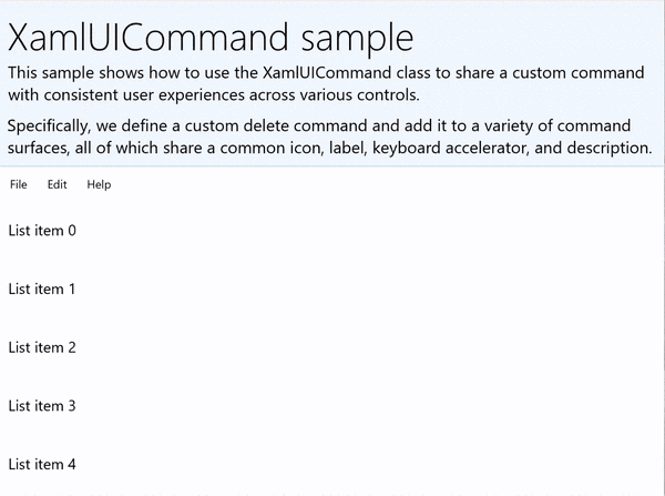
De voorbeeldgebruikersinterface bevat een ListView van vijf items. De aangepaste XamlUICommand CustomXamlUICommand is gebonden aan een MenuBarItem, een SwipeItem, een AppBarButton- en ContextFlyout-menu.
<Page
x:Class="XamlUICommand_Sample.MainPage"
xmlns="http://schemas.microsoft.com/winfx/2006/xaml/presentation"
xmlns:x="http://schemas.microsoft.com/winfx/2006/xaml"
xmlns:local="using:XamlUICommand_Sample"
xmlns:d="http://schemas.microsoft.com/expression/blend/2008"
xmlns:mc="http://schemas.openxmlformats.org/markup-compatibility/2006"
xmlns:muxcontrols="using:Microsoft.UI.Xaml.Controls"
mc:Ignorable="d"
Background="{ThemeResource ApplicationPageBackgroundThemeBrush}">
<Page.Resources>
<XamlUICommand x:Name="CustomXamlUICommand"
ExecuteRequested="DeleteCommand_ExecuteRequested"
Description="Custom XamlUICommand"
Label="Custom XamlUICommand">
<XamlUICommand.IconSource>
<FontIconSource FontFamily="Wingdings" Glyph="M"/>
</XamlUICommand.IconSource>
<XamlUICommand.KeyboardAccelerators>
<KeyboardAccelerator Key="D" Modifiers="Control"/>
</XamlUICommand.KeyboardAccelerators>
</XamlUICommand>
<Style x:Key="HorizontalSwipe"
TargetType="ListViewItem"
BasedOn="{StaticResource ListViewItemRevealStyle}">
<Setter Property="Height" Value="70"/>
<Setter Property="Padding" Value="0"/>
<Setter Property="HorizontalContentAlignment" Value="Stretch"/>
<Setter Property="VerticalContentAlignment" Value="Stretch"/>
<Setter Property="BorderThickness" Value="0"/>
</Style>
</Page.Resources>
<Grid Loaded="ControlExample_Loaded" Name="MainGrid">
<Grid.RowDefinitions>
<RowDefinition Height="Auto" />
<RowDefinition Height="Auto" />
<RowDefinition Height="*"/>
</Grid.RowDefinitions>
<StackPanel Grid.Row="0"
Padding="10"
BorderThickness="0,0,0,1"
BorderBrush="LightBlue"
Background="AliceBlue">
<TextBlock Style="{StaticResource HeaderTextBlockStyle}">
XamlUICommand sample
</TextBlock>
<TextBlock Style="{StaticResource SubtitleTextBlockStyle}" Margin="0,0,0,10">
This sample shows how to use the XamlUICommand class to
share a custom command with consistent user experiences
across various controls.
</TextBlock>
<TextBlock Style="{StaticResource SubtitleTextBlockStyle}" Margin="0,0,0,0">
Specifically, we define a custom delete command and add it
to a variety of command surfaces, all of which share a common
icon, label, keyboard accelerator, and description.
</TextBlock>
</StackPanel>
<muxcontrols:MenuBar Grid.Row="1">
<muxcontrols:MenuBarItem Title="File">
</muxcontrols:MenuBarItem>
<muxcontrols:MenuBarItem Title="Edit">
<MenuFlyoutItem x:Name="DeleteFlyoutItem"
Command="{StaticResource CustomXamlUICommand}"/>
</muxcontrols:MenuBarItem>
<muxcontrols:MenuBarItem Title="Help">
</muxcontrols:MenuBarItem>
</muxcontrols:MenuBar>
<ListView x:Name="ListViewRight" Grid.Row="2"
Loaded="ListView_Loaded"
IsItemClickEnabled="True"
SelectionMode="Single"
SelectionChanged="ListView_SelectionChanged"
ItemContainerStyle="{StaticResource HorizontalSwipe}">
<ListView.ItemTemplate>
<DataTemplate x:DataType="local:ListItemData">
<UserControl PointerEntered="ListViewSwipeContainer_PointerEntered"
PointerExited="ListViewSwipeContainer_PointerExited">
<UserControl.ContextFlyout>
<MenuFlyout>
<MenuFlyoutItem
Command="{x:Bind Command}"
CommandParameter="{x:Bind Text}" />
</MenuFlyout>
</UserControl.ContextFlyout>
<Grid AutomationProperties.Name="{x:Bind Text}">
<VisualStateManager.VisualStateGroups>
<VisualStateGroup x:Name="HoveringStates">
<VisualState x:Name="HoverButtonsHidden" />
<VisualState x:Name="HoverButtonsShown">
<VisualState.Setters>
<Setter Target="HoverButton.Visibility"
Value="Visible" />
</VisualState.Setters>
</VisualState>
</VisualStateGroup>
</VisualStateManager.VisualStateGroups>
<SwipeControl x:Name="ListViewSwipeContainer">
<SwipeControl.RightItems>
<SwipeItems Mode="Execute">
<SwipeItem x:Name="DeleteSwipeItem"
Background="Red"
Command="{x:Bind Command}"
CommandParameter="{x:Bind Text}"/>
</SwipeItems>
</SwipeControl.RightItems>
<Grid VerticalAlignment="Center">
<TextBlock Text="{x:Bind Text}"
Margin="10"
FontSize="18"
HorizontalAlignment="Left"
VerticalAlignment="Center"/>
<AppBarButton x:Name="HoverButton"
IsTabStop="False"
HorizontalAlignment="Right"
Visibility="Collapsed"
Command="{x:Bind Command}"
CommandParameter="{x:Bind Text}"/>
</Grid>
</SwipeControl>
</Grid>
</UserControl>
</DataTemplate>
</ListView.ItemTemplate>
</ListView>
</Grid>
</Page>
Code-behind
- Eerst definiëren we een
ListItemDataklasse die een tekenreeks en ICommand bevat voor elke ListViewItem in onze ListView.
public class ListItemData
{
    public String Text { get; set; }
    public ICommand Command { get; set; }
}
- In de klasse MainPage definiëren we een verzameling
ListItemDataobjecten voor de DataTemplate van de ListViewItemTemplate. Vervolgens vullen we deze met een initiële verzameling van vijf items (met tekst en bijbehorende XamlUICommand).
ObservableCollection<ListItemData> collection = new ObservableCollection<ListItemData>();

private void ControlExample_Loaded(object sender, RoutedEventArgs e)
{
    for (var i = 0; i < 5; i++)
    {
        collection.Add(
           new ListItemData { Text = "List item " + i.ToString(), Command = CustomXamlUICommand });
    }
}

private void ListView_Loaded(object sender, RoutedEventArgs e)
{
    var listView = (ListView)sender;
    listView.ItemsSource = collection;
}
- Vervolgens definiëren we de ICommand ExecuteRequested-handler waar we de opdracht item verwijderen implementeren.
private void DeleteCommand_ExecuteRequested(
   XamlUICommand sender, ExecuteRequestedEventArgs args)
{
    if (args.Parameter != null)
    {
        foreach (var i in collection)
        {
            if (i.Text == (args.Parameter as string))
            {
                collection.Remove(i);
                return;
            }
        }
    }
    if (ListViewRight.SelectedIndex != -1)
    {
        collection.RemoveAt(ListViewRight.SelectedIndex);
    }
}
- Ten slotte definiëren we handlers voor verschillende ListView-gebeurtenissen, waaronder PointerEntered, PointerExited en SelectionChanged-gebeurtenissen . De aanwijzer-gebeurtenis-handlers worden gebruikt om de knop Verwijderen voor elk item weer te geven of te verbergen.
private void ListView_SelectionChanged(object sender, SelectionChangedEventArgs e)
{
    if (ListViewRight.SelectedIndex != -1)
    {
        var item = collection[ListViewRight.SelectedIndex];
    }
}

private void ListViewSwipeContainer_PointerEntered(object sender, PointerRoutedEventArgs e)
{
    if (e.Pointer.PointerDeviceType ==
        Windows.Devices.Input.PointerDeviceType.Mouse ||
        e.Pointer.PointerDeviceType == Windows.Devices.Input.PointerDeviceType.Pen)
    {
        VisualStateManager.GoToState(sender as Control, "HoverButtonsShown", true);
    }
}

private void ListViewSwipeContainer_PointerExited(object sender, PointerRoutedEventArgs e)
{
    VisualStateManager.GoToState(sender as Control, "HoverButtonsHidden", true);
}
Opdrachtervaringen met behulp van de ICommand-interface
Standaard WinUI-besturingselementen (knop, lijst, selectie, agenda, voorspellende tekst) bieden de basis voor veel algemene opdrachtervaringen. Zie Besturingselementen en patronen voor Windows-apps voor een volledige lijst met besturingstypen.
De meest eenvoudige manier om een gestructureerde opdrachtervaring te ondersteunen, is door een implementatie van de ICommand-interface (Microsoft) te definiëren. UI. Xaml.Input.ICommand voor C++ of System.Windows. Input.ICommand voor C#). Deze ICommand-instantie kan vervolgens worden gebonden aan besturingselementen zoals knoppen.
Opmerking
In sommige gevallen kan het net zo efficiënt zijn om een methode te binden aan de gebeurtenis Click en een eigenschap aan de eigenschap IsEnabled.
Example
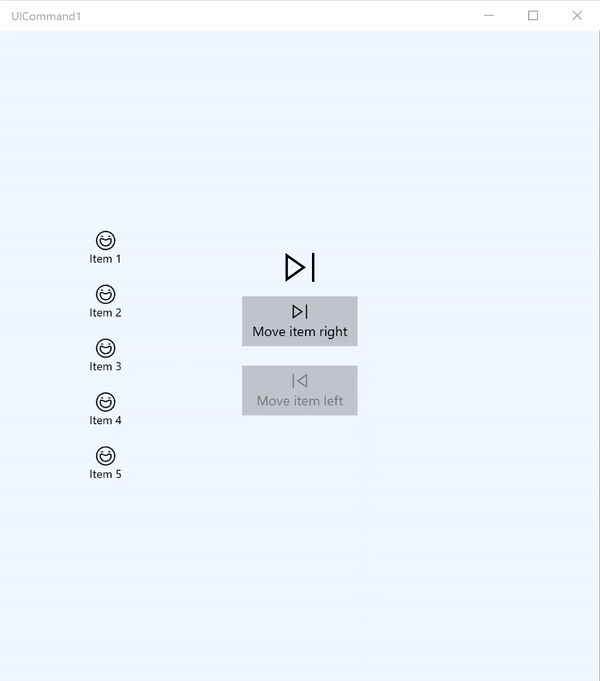
Voorbeeld van ICommand
In dit basisvoorbeeld laten we zien hoe één opdracht kan worden aangeroepen met een knopklik, een toetsenbordversneller en het draaien van een muiswiel.
<Page
x:Class="UICommand1.View.MainPage"
xmlns="http://schemas.microsoft.com/winfx/2006/xaml/presentation"
xmlns:x="http://schemas.microsoft.com/winfx/2006/xaml"
xmlns:vm="using:UICommand1.ViewModel"
xmlns:d="http://schemas.microsoft.com/expression/blend/2008"
xmlns:mc="http://schemas.openxmlformats.org/markup-compatibility/2006"
mc:Ignorable="d"
Background="{ThemeResource ApplicationPageBackgroundThemeBrush}">
<Page.Resources>
<vm:OpacityConverter x:Key="opaque" />
</Page.Resources>
<Grid Name="ItemGrid"
Background="AliceBlue"
PointerWheelChanged="Page_PointerWheelChanged">
<Grid.ColumnDefinitions>
<ColumnDefinition Width="*"/>
<ColumnDefinition Width="2*"/>
<ColumnDefinition Width="*"/>
</Grid.ColumnDefinitions>
<ListView Grid.Column="0" VerticalAlignment="Center"
x:Name="CommandListView"
ItemsSource="{x:Bind Path=ViewModel.ListItemLeft}"
SelectionMode="None" IsItemClickEnabled="False"
HorizontalAlignment="Right">
<ListView.ItemTemplate>
<DataTemplate x:DataType="vm:ListItemData">
<Grid VerticalAlignment="Center">
<AppBarButton Label="{x:Bind ListItemText}">
<AppBarButton.Icon>
<SymbolIcon Symbol="{x:Bind ListItemIcon}"/>
</AppBarButton.Icon>
</AppBarButton>
</Grid>
</DataTemplate>
</ListView.ItemTemplate>
</ListView>
<Grid Grid.Column="1" Margin="0,0,0,0"
HorizontalAlignment="Center"
VerticalAlignment="Center">
<Grid.RowDefinitions>
<RowDefinition Height="*"/>
<RowDefinition Height="*"/>
<RowDefinition Height="*"/>
</Grid.RowDefinitions>
<StackPanel Grid.Row="1">
<FontIcon FontFamily="{StaticResource SymbolThemeFontFamily}"
FontSize="40" Glyph=""
Opacity="{x:Bind Path=ViewModel.ListItemLeft.Count,
Mode=OneWay, Converter={StaticResource opaque}}"/>
<Button Name="MoveItemRightButton"
Margin="0,10,0,10" Width="120" HorizontalAlignment="Center"
Command="{x:Bind Path=ViewModel.MoveRightCommand}">
<Button.KeyboardAccelerators>
<KeyboardAccelerator
Modifiers="Control"
Key="Add" />
</Button.KeyboardAccelerators>
<StackPanel>
<SymbolIcon Symbol="Next"/>
<TextBlock>Move item right</TextBlock>
</StackPanel>
</Button>
<Button Name="MoveItemLeftButton"
Margin="0,10,0,10" Width="120" HorizontalAlignment="Center"
Command="{x:Bind Path=ViewModel.MoveLeftCommand}">
<Button.KeyboardAccelerators>
<KeyboardAccelerator
Modifiers="Control"
Key="Subtract" />
</Button.KeyboardAccelerators>
<StackPanel>
<SymbolIcon Symbol="Previous"/>
<TextBlock>Move item left</TextBlock>
</StackPanel>
</Button>
<FontIcon FontFamily="{StaticResource SymbolThemeFontFamily}"
FontSize="40" Glyph=""
Opacity="{x:Bind Path=ViewModel.ListItemRight.Count,
Mode=OneWay, Converter={StaticResource opaque}}"/>
</StackPanel>
</Grid>
<ListView Grid.Column="2"
x:Name="CommandListViewRight"
VerticalAlignment="Center"
IsItemClickEnabled="False"
SelectionMode="None"
ItemsSource="{x:Bind Path=ViewModel.ListItemRight}"
HorizontalAlignment="Left">
<ListView.ItemTemplate>
<DataTemplate x:DataType="vm:ListItemData">
<Grid VerticalAlignment="Center">
<AppBarButton Label="{x:Bind ListItemText}">
<AppBarButton.Icon>
<SymbolIcon Symbol="{x:Bind ListItemIcon}"/>
</AppBarButton.Icon>
</AppBarButton>
</Grid>
</DataTemplate>
</ListView.ItemTemplate>
</ListView>
</Grid>
</Page>
Hier is de code-behind voor de hierboven genoemde gebruikersinterface.
In code-behind maken we verbinding met ons weergavemodel dat onze opdrachtcode bevat. Daarnaast definiëren we een handler voor invoer van het muiswiel, waarmee ook onze opdrachtcode wordt verbonden.
using Microsoft.UI.Xaml;
using Microsoft.UI.Xaml.Input;
using Microsoft.UI.Xaml.Controls;
using UICommand1.ViewModel;
using Windows.System;
using Windows.UI.Core; // for CoreVirtualKeyStates
using Microsoft.UI.Input; // for InputKeyboardSource

namespace UICommand1.View
{
    /// <summary>
    /// An empty page that can be used on its own or navigated to within a Frame.
    /// </summary>
    public sealed partial class MainPage : Page
    {
        // Reference to our view model.
        public UICommand1ViewModel ViewModel { get; set; }

        // Initialize our view and view model.
        public MainPage()
        {
            this.InitializeComponent();
            ViewModel = new UICommand1ViewModel();
        }

        /// <summary>
        /// Handle mouse wheel input and assign our
        /// commands to appropriate direction of rotation.
        /// </summary>
        /// <param name="sender"></param>
        /// <param name="e"></param>
        private void Page_PointerWheelChanged(object sender, PointerRoutedEventArgs e)
        {
            var props = e.GetCurrentPoint(sender as UIElement).Properties;

            // Require CTRL key and accept only vertical mouse wheel movement
            // to eliminate accidental wheel input.
            if ((Microsoft.UI.Input.InputKeyboardSource.GetKeyStateForCurrentThread(VirtualKey.Control) !=
                CoreVirtualKeyStates.None) && !props.IsHorizontalMouseWheel)
            {
                bool delta = props.MouseWheelDelta < 0 ? true : false;

                switch (delta)
                {
                    case true:
                        ViewModel.MoveRight();
                        break;
                    case false:
                        ViewModel.MoveLeft();
                        break;
                    default:
                        break;
                }
            }
        }
    }
}
Dit is de code uit ons weergavemodel
In ons weergavemodel definiëren we de uitvoeringsdetails voor de twee opdrachten in onze app, vullen we één ListView en bieden we een transparantiewaarde-omzetter voor het verbergen of weergeven van een extra element van de gebruikersinterface op basis van het aantal items in deze ListView.
using System;
using System.Collections.ObjectModel;
using System.ComponentModel;
using Microsoft.UI.Xaml.Controls;
using Microsoft.UI.Xaml.Data;

namespace UICommand1.ViewModel
{
    /// <summary>
    /// UI properties for our list items.
    /// </summary>
    public class ListItemData
    {
        /// <summary>
        /// Gets and sets the list item content string.
        /// </summary>
        public string ListItemText { get; set; }
        /// <summary>
        /// Gets and sets the list item icon.
        /// </summary>
        public Symbol ListItemIcon { get; set; }
    }

    /// <summary>
    /// View Model that sets up a command to handle invoking the move item buttons.
    /// </summary>
    public class UICommand1ViewModel
    {
        /// <summary>
        /// The command to invoke when the Move item left button is pressed.
        /// </summary>
        public RelayCommand MoveLeftCommand { get; private set; }

        /// <summary>
        /// The command to invoke when the Move item right button is pressed.
        /// </summary>
        public RelayCommand MoveRightCommand { get; private set; }

        // Item collections
        public ObservableCollection<ListItemData> ListItemLeft { get; } =
           new ObservableCollection<ListItemData>();
        public ObservableCollection<ListItemData> ListItemRight { get; } =
           new ObservableCollection<ListItemData>();

        public ListItemData listItem;

        /// <summary>
        /// Sets up a command to handle invoking the move item buttons.
        /// </summary>
        public UICommand1ViewModel()
        {
            MoveLeftCommand =
               new RelayCommand(new Action(MoveLeft), CanExecuteMoveLeftCommand);
            MoveRightCommand =
               new RelayCommand(new Action(MoveRight), CanExecuteMoveRightCommand);

            LoadItems();
        }

        /// <summary>
        ///  Populate our list of items.
        /// </summary>
        public void LoadItems()
        {
            for (var x = 0; x <= 4; x++)
            {
                listItem = new ListItemData();
                listItem.ListItemText = "Item " + (ListItemLeft.Count + 1).ToString();
                listItem.ListItemIcon = Symbol.Emoji;
                ListItemLeft.Add(listItem);
            }
        }

        /// <summary>
        /// Move left command valid when items present in the list on right.
        /// </summary>
        /// <returns>True, if count is greater than 0.</returns>
        private bool CanExecuteMoveLeftCommand()
        {
            return ListItemRight.Count > 0;
        }

        /// <summary>
        /// Move right command valid when items present in the list on left.
        /// </summary>
        /// <returns>True, if count is greater than 0.</returns>
        private bool CanExecuteMoveRightCommand()
        {
            return ListItemLeft.Count > 0;
        }

        /// <summary>
        /// The command implementation to execute when the Move item right button is pressed.
        /// </summary>
        public void MoveRight()
        {
            if (ListItemLeft.Count > 0)
            {
                listItem = new ListItemData();
                ListItemRight.Add(listItem);
                listItem.ListItemText = "Item " + ListItemRight.Count.ToString();
                listItem.ListItemIcon = Symbol.Emoji;
                ListItemLeft.RemoveAt(ListItemLeft.Count - 1);
                MoveRightCommand.RaiseCanExecuteChanged();
                MoveLeftCommand.RaiseCanExecuteChanged();
            }
        }

        /// <summary>
        /// The command implementation to execute when the Move item left button is pressed.
        /// </summary>
        public void MoveLeft()
        {
            if (ListItemRight.Count > 0)
            {
                listItem = new ListItemData();
                ListItemLeft.Add(listItem);
                listItem.ListItemText = "Item " + ListItemLeft.Count.ToString();
                listItem.ListItemIcon = Symbol.Emoji;
                ListItemRight.RemoveAt(ListItemRight.Count - 1);
                MoveRightCommand.RaiseCanExecuteChanged();
                MoveLeftCommand.RaiseCanExecuteChanged();
            }
        }

        /// <summary>
        /// Views subscribe to this event to get notified of property updates.
        /// </summary>
        public event PropertyChangedEventHandler PropertyChanged;

        /// <summary>
        /// Notify subscribers of updates to the named property
        /// </summary>
        /// <param name="propertyName">The full, case-sensitive, name of a property.</param>
        protected void NotifyPropertyChanged(string propertyName)
        {
            PropertyChangedEventHandler handler = this.PropertyChanged;
            if (handler != null)
            {
                PropertyChangedEventArgs args = new PropertyChangedEventArgs(propertyName);
                handler(this, args);
            }
        }
    }

    /// <summary>
    /// Convert a collection count to an opacity value of 0.0 or 1.0.
    /// </summary>
    public class OpacityConverter : IValueConverter
    {
        /// <summary>
        /// Converts a collection count to an opacity value of 0.0 or 1.0.
        /// </summary>
        /// <param name="value">The count passed in</param>
        /// <param name="targetType">Ignored.</param>
        /// <param name="parameter">Ignored</param>
        /// <param name="language">Ignored</param>
        /// <returns>1.0 if count > 0, otherwise returns 0.0</returns>
        public object Convert(object value, Type targetType, object parameter, string language)
        {
            return ((int)value > 0 ? 1.0 : 0.0);
        }

        /// <summary>
        /// Not used, converter is not intended for two-way binding.
        /// </summary>
        /// <param name="value">Ignored</param>
        /// <param name="targetType">Ignored</param>
        /// <param name="parameter">Ignored</param>
        /// <param name="language">Ignored</param>
        /// <returns></returns>
        public object ConvertBack(object value, Type targetType, object parameter, string language)
        {
            throw new NotImplementedException();
        }
    }
}
Ten slotte is hier onze implementatie van de ICommand-interface
Hier definiëren we een opdracht waarmee de ICommand-interface wordt geïmplementeerd en eenvoudigweg de functionaliteit ervan doorgeeft aan andere objecten.
using System;
using System.Windows.Input;

namespace UICommand1
{
    /// <summary>
    /// A command whose sole purpose is to relay its functionality
    /// to other objects by invoking delegates.
    /// The default return value for the CanExecute method is 'true'.
    /// <see cref="RaiseCanExecuteChanged"/> needs to be called whenever
    /// <see cref="CanExecute"/> is expected to return a different value.
    /// </summary>
    public class RelayCommand : ICommand
    {
        private readonly Action _execute;
        private readonly Func<bool> _canExecute;

        /// <summary>
        /// Raised when RaiseCanExecuteChanged is called.
        /// </summary>
        public event EventHandler CanExecuteChanged;

        /// <summary>
        /// Creates a new command that can always execute.
        /// </summary>
        /// <param name="execute">The execution logic.</param>
        public RelayCommand(Action execute)
            : this(execute, null)
        {
        }

        /// <summary>
        /// Creates a new command.
        /// </summary>
        /// <param name="execute">The execution logic.</param>
        /// <param name="canExecute">The execution status logic.</param>
        public RelayCommand(Action execute, Func<bool> canExecute)
        {
            if (execute == null)
                throw new ArgumentNullException("execute");
            _execute = execute;
            _canExecute = canExecute;
        }

        /// <summary>
        /// Determines whether this <see cref="RelayCommand"/> can execute in its current state.
        /// </summary>
        /// <param name="parameter">
        /// Data used by the command. If the command does not require
        /// data to be passed, this object can be set to null.
        /// </param>
        /// <returns>true if this command can be executed; otherwise, false.</returns>
        public bool CanExecute(object parameter)
        {
            return _canExecute == null ? true : _canExecute();
        }

        /// <summary>
        /// Executes the <see cref="RelayCommand"/> on the current command target.
        /// </summary>
        /// <param name="parameter">
        /// Data used by the command. If the command does not require
        /// data to be passed, this object can be set to null.
        /// </param>
        public void Execute(object parameter)
        {
            _execute();
        }

        /// <summary>
        /// Method used to raise the <see cref="CanExecuteChanged"/> event
        /// to indicate that the return value of the <see cref="CanExecute"/>
        /// method has changed.
        /// </summary>
        public void RaiseCanExecuteChanged()
        {
            var handler = CanExecuteChanged;
            if (handler != null)
            {
                handler(this, EventArgs.Empty);
            }
        }
    }
}
Samenvatting
WinUI biedt een robuust en flexibel opdrachtsysteem waarmee u apps kunt bouwen die opdrachten delen en beheren voor besturingstypen, apparaten en invoertypen.
Gebruik de volgende benaderingen bij het bouwen van opdrachten voor uw Windows-apps:
- Luisteren naar en afhandelen van gebeurtenissen in XAML/code-behind
- Binden aan een gebeurtenisafhandelingsmethode, zoals Klikken
- XamlUICommand-objecten maken met uw eigen waarden voor een vooraf gedefinieerde set eigenschappen
- StandardUICommand-objecten maken met een set vooraf gedefinieerde platformeigenschappen en -waarden
Volgende stappen
Zie ook
Besturingselementen en patronen voor Windows-apps
Samples
Onderwerpvoorbeelden
- Opdrachtvoorbeeld (StandardUICommand)
- Opdrachtvoorbeeld (XamlUICommand)
- Commando-voorbeeld (ICommand)
Andere voorbeelden
Met ons samenwerken op GitHub
De bron voor deze inhoud vindt u op GitHub, waar u ook problemen en pull-aanvragen kunt maken en controleren. Bekijk onze gids voor inzenders voor meer informatie.

Windows developer