Notitie
Voor toegang tot deze pagina is autorisatie vereist. U kunt proberen u aan te melden of de directory te wijzigen.
Voor toegang tot deze pagina is autorisatie vereist. U kunt proberen de mappen te wijzigen.
Important
InkCanvas, InkToolbar, and InkPresenter are experimental APIs. Inking support was added in Windows App SDK 2.4.1-experimental. This article describes Windows App SDK 2.5.4-experimental, which changed how you connect an InkToolbar. These APIs aren't available in the stable channel. They might change or be removed in a future release. Don't use them in production apps.
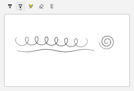
Use the experimental InkCanvas control to let users draw ink with a pen, mouse, or touch. Add an InkToolbar to give users a ballpoint pen, pencil, highlighter, and eraser, with color and size options. Each canvas has an InkPresenter that collects and renders ink input. The presenter's InkStrokeContainer stores the strokes, so you can save, load, copy, and create ink in code.
To try the controls, install the Windows App SDK 2.5.4-experimental package and matching runtime. For download links and setup information, see Latest Windows App SDK downloads.
Is this the right control?
Use an ink canvas when users need to:
- Take handwritten notes or annotate content.
- Sketch, draw diagrams, or sign their name.
- Create freehand content that your app saves and lets them edit later.
The experimental inking APIs don't include handwriting or shape recognition. To collect text, use a text box.
If you need inking in a production app, see Known control gaps for the status of these controls in the stable channel and for alternatives.
Understand the inking model
The inking APIs work together:
| API | Role |
|---|---|
InkCanvas |
The XAML element that displays ink and receives ink input. Its InkPresenter property returns the presenter for the canvas. |
InkPresenter |
Collects ink input, renders strokes, and holds the input settings and default drawing attributes. You can't create an InkPresenter yourself. Get it from InkCanvas.InkPresenter. |
InkStrokeContainer |
Stores strokes. Use it to save, load, select, copy, and paste ink. Get it from InkPresenter.StrokeContainer. |
InkToolbar |
An optional toolbar that lets users choose a pen, pencil, highlighter, or eraser, and change ink color and size. |
InkCanvas doesn't have a Background property. To give the drawing area a background and a border, place the canvas inside a container such as a Border, and set the size on the container. The default ink color is black, so the examples in this article use a white background.
Several of these types have the same names as types in the Windows Runtime Windows.UI.Input.Inking namespace, such as InkPresenter, InkStrokeContainer, and InkHighContrastAdjustment. The inking controls use the Microsoft.UI.Xaml.Controls versions. Strokes and drawing attributes still use Windows Runtime types, such as InkStroke, InkDrawingAttributes, and InkStrokeBuilder. If you import both namespaces and use an ambiguous name, the C# compiler reports error CS0104.
The examples in this article import Microsoft.UI.Xaml.Controls and use alias directives for the Windows.UI.Input.Inking types that they need:
using Microsoft.UI.Xaml.Controls;
using InkDrawingAttributes = Windows.UI.Input.Inking.InkDrawingAttributes;
using InkStroke = Windows.UI.Input.Inking.InkStroke;
You can also import both namespaces and use fully qualified names for the ambiguous types, as the WinUI 3 Gallery sample does.
InkPresenter also provides lower-level APIs that this article doesn't cover:
StrokeInputraises events when a stroke starts, continues, ends, or is canceled.UnprocessedInputraises pointer events for input that the presenter doesn't process as ink.InputConfigurationsets whether the presenter processes input from a pen's eraser and primary barrel button.InputProcessingConfigurationsets whether input draws ink, erases ink, or isn't processed, and how the presenter handles right-drag input.ActivateCustomDryingreturns anInkSynchronizerfor apps that render committed ink themselves.
Set up your project
The inking APIs are marked experimental. When you use them in a C# project, the C# compiler reports warning CS8305 and the XAML compiler reports warning WMC1501. If your project treats warnings as errors, these warnings stop the build.
After you decide to use the experimental APIs, you can suppress these warnings. Add the following properties to your C# project file (.csproj):
<PropertyGroup>
  <NoWarn>$(NoWarn);CS8305</NoWarn>
  <MSBuildWarningsAsMessages>$(MSBuildWarningsAsMessages);WMC1501</MSBuildWarningsAsMessages>
</PropertyGroup>
The examples in this article use C#. Each complete example shows the XAML for a page and the page's code-behind class, MainPage.
Create an ink canvas
The WinUI 3 Gallery app includes interactive examples of WinUI controls and features. Get the app from the Microsoft Store or browse the source code on GitHub.

The following example places a canvas inside a white Border. The code-behind sets the input device types so that users can draw with a pen, mouse, or touch.
<Border
    Height="300"
    Background="White"
    BorderBrush="{ThemeResource SystemControlForegroundChromeHighBrush}"
    BorderThickness="1">
    <InkCanvas x:Name="inkCanvas" AutomationProperties.Name="Drawing surface" />
</Border>
using Microsoft.UI.Xaml.Controls;
using Windows.UI.Core;

public sealed partial class MainPage : Page
{
    public MainPage()
    {
        InitializeComponent();

        // Mouse input doesn't draw ink by default. Choose every device type that can draw ink.
        inkCanvas.InkPresenter.InputDeviceTypes =
            CoreInputDeviceTypes.Pen | CoreInputDeviceTypes.Mouse | CoreInputDeviceTypes.Touch;
    }
}
To keep them short, some later examples don't repeat this code. Set InputDeviceTypes in every page where users draw with a mouse.
Connect an ink toolbar
Place an InkToolbar near the canvas, and set its TargetInkCanvas property to connect the two:
<StackPanel Spacing="8">
    <InkToolbar
        x:Name="inkToolbar"
        AutomationProperties.Name="Drawing tools"
        TargetInkCanvas="{x:Bind inkCanvas}" />
    <Border
        Height="300"
        Background="White"
        BorderBrush="{ThemeResource SystemControlForegroundChromeHighBrush}"
        BorderThickness="1">
        <InkCanvas x:Name="inkCanvas" AutomationProperties.Name="Drawing surface" />
    </Border>
</StackPanel>
Starting with Windows App SDK 2.5.4-experimental, you can instead connect a toolbar directly to an InkPresenter by setting the TargetInkPresenter property. Set it in code:
inkToolbar.TargetInkPresenter = inkCanvas.InkPresenter;
You can also set it in XAML: TargetInkPresenter="{x:Bind inkCanvas.InkPresenter}". Set only one of the two target properties.
By default, the toolbar shows ballpoint pen, pencil, highlighter, eraser, and stencil (ruler) buttons. To change which buttons appear, see Customize the ink toolbar.
Choose input devices
The InputDeviceTypes property uses the CoreInputDeviceTypes flags enumeration from the Windows.UI.Core namespace. Mouse input doesn't draw ink by default. Combine values to choose which devices draw ink:
// Add mouse input and keep the other device types.
inkCanvas.InkPresenter.InputDeviceTypes |= CoreInputDeviceTypes.Mouse;

// Stop accepting ink from touch input.
inkCanvas.InkPresenter.InputDeviceTypes &= ~CoreInputDeviceTypes.Touch;

// Check whether pen input is enabled.
bool isPenEnabled = inkCanvas.InkPresenter.InputDeviceTypes.HasFlag(CoreInputDeviceTypes.Pen);
To stop collecting ink from every device, for example to show a drawing that users can't change, set IsInputEnabled to false:
inkCanvas.InkPresenter.IsInputEnabled = false;
To let users turn an input device on or off from the toolbar, see Add a custom toggle button.
Set drawing attributes
Drawing attributes, such as color, size, and pen tip shape, control how strokes look. They use the Windows Runtime InkDrawingAttributes class. To change the attributes for new strokes, call CopyDefaultDrawingAttributes, change the copy, and pass it to UpdateDefaultDrawingAttributes:
InkDrawingAttributes attributes = inkCanvas.InkPresenter.CopyDefaultDrawingAttributes();
attributes.Color = Colors.DarkBlue;
attributes.Size = new Size(4, 4);
inkCanvas.InkPresenter.UpdateDefaultDrawingAttributes(attributes);
Colors is in the Microsoft.UI namespace, and Size is in the Windows.Foundation namespace. The new attributes apply to strokes that users draw after the call. Existing strokes keep their attributes.
When you connect an InkToolbar, the active tool and its color and size settings determine the drawing attributes. To read the current attributes, use the toolbar's InkDrawingAttributes property.
Create pen presets
If you don't use a toolbar, you can offer your own pen presets. The following example applies ballpoint, pencil, highlighter, or calligraphy attributes when the user selects a preset or changes the size.
<StackPanel Spacing="12">
    <RadioButtons
        x:Name="presetButtons"
        Header="Pen preset"
        MaxColumns="4"
        SelectedIndex="0"
        SelectionChanged="PresetButtons_SelectionChanged">
        <x:String>Ballpoint</x:String>
        <x:String>Pencil</x:String>
        <x:String>Highlighter</x:String>
        <x:String>Calligraphy</x:String>
    </RadioButtons>
    <Slider
        x:Name="sizeSlider"
        Width="240"
        HorizontalAlignment="Left"
        Header="Size"
        Maximum="16"
        Minimum="1"
        Value="4"
        ValueChanged="SizeSlider_ValueChanged" />
    <Border
        Width="480"
        Height="280"
        HorizontalAlignment="Left"
        Background="White"
        BorderBrush="{ThemeResource SystemControlForegroundChromeHighBrush}"
        BorderThickness="1">
        <InkCanvas x:Name="inkCanvas" AutomationProperties.Name="Drawing surface" />
    </Border>
</StackPanel>
using System;
using System.Numerics;
using Microsoft.UI;
using Microsoft.UI.Xaml.Controls;
using Microsoft.UI.Xaml.Controls.Primitives;
using Windows.Foundation;
using Windows.UI.Core;
using InkDrawingAttributes = Windows.UI.Input.Inking.InkDrawingAttributes;
using PenTipShape = Windows.UI.Input.Inking.PenTipShape;

public sealed partial class MainPage : Page
{
    public MainPage()
    {
        InitializeComponent();

        inkCanvas.InkPresenter.InputDeviceTypes =
            CoreInputDeviceTypes.Pen | CoreInputDeviceTypes.Mouse | CoreInputDeviceTypes.Touch;
        ApplyPreset();
    }

    private void PresetButtons_SelectionChanged(object sender, SelectionChangedEventArgs e) => ApplyPreset();

    private void SizeSlider_ValueChanged(object sender, RangeBaseValueChangedEventArgs e) => ApplyPreset();

    private void ApplyPreset()
    {
        // SelectionChanged and ValueChanged can occur while the page is still loading.
        if (inkCanvas is null || presetButtons is null || sizeSlider is null)
        {
            return;
        }

        double size = sizeSlider.Value;
        InkDrawingAttributes attributes;

        switch (presetButtons.SelectedItem as string)
        {
            case "Pencil":
                // CreateForPencil returns attributes for pencil-style strokes.
                attributes = InkDrawingAttributes.CreateForPencil();
                attributes.Color = Colors.DimGray;
                attributes.Size = new Size(size, size);
                break;

            case "Highlighter":
                attributes = new InkDrawingAttributes
                {
                    Color = Colors.Yellow,
                    DrawAsHighlighter = true,
                    PenTip = PenTipShape.Rectangle,
                    Size = new Size(size, size * 3),
                };
                break;

            case "Calligraphy":
                attributes = new InkDrawingAttributes
                {
                    Color = Colors.DarkBlue,
                    PenTip = PenTipShape.Rectangle,
                    Size = new Size(Math.Max(1, size / 2), size * 2),
                    // Rotate the nib 45 degrees so the stroke width changes with the stroke direction.
                    PenTipTransform = Matrix3x2.CreateRotation(MathF.PI / 4),
                };
                break;

            default:
                attributes = new InkDrawingAttributes
                {
                    Color = Colors.Black,
                    PenTip = PenTipShape.Circle,
                    Size = new Size(size, size),
                };
                break;
        }

        // The new attributes apply to strokes that the user draws after this call.
        inkCanvas.InkPresenter.UpdateDefaultDrawingAttributes(attributes);
    }
}
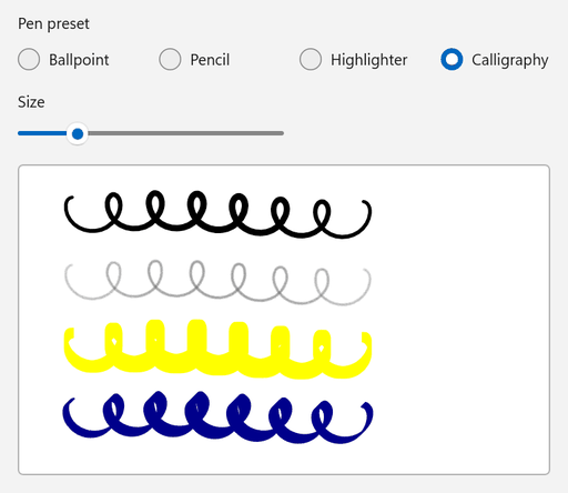
InkDrawingAttributes.CreateForPencilreturns attributes for pencil strokes. TheKindproperty is read-only, so use this method to create pencil attributes.DrawAsHighlighterrenders the stroke as a highlighter overlay.PenTipsets the shape of the pen tip, andPenTipTransformrotates or scales it. A rotated rectangular tip produces calligraphy-style strokes.
Respond to ink changes
The presenter raises StrokesCollected after a user draws strokes and StrokesErased after a user erases them. The Strokes property of each event's arguments contains the affected strokes. The following code keeps a stroke count up to date in a TextBlock named strokeCountText:
inkCanvas.InkPresenter.StrokesCollected += (sender, args) => UpdateStrokeCount();
inkCanvas.InkPresenter.StrokesErased += (sender, args) => UpdateStrokeCount();
private void UpdateStrokeCount()
{
    int count = inkCanvas.InkPresenter.StrokeContainer.GetStrokes().Count;
    strokeCountText.Text = $"{count} strokes";
}
These events occur when users draw or erase ink. When you change strokes in code, for example with Clear, LoadAsync, or AddStroke, update your UI after the call.
Save and load ink
InkStrokeContainer saves ink in Ink Serialized Format (ISF). To choose how the data is stored, pass an InkPersistenceFormat value to SaveAsync:
| Format | Output |
|---|---|
GifWithEmbeddedIsf |
A GIF image that contains the ink data. Image viewers can display the file, and your app can load the ink again for editing. |
Isf |
Ink data only, without an image. This is the most compact format. |
Add the following methods to the code-behind of a page that contains an InkCanvas named inkCanvas. SaveInkAsync writes the ink to a file, and LoadInkAsync replaces the ink on the canvas with the ink from a file. LoadAsync removes the existing strokes before it adds the loaded strokes, so you don't need to call Clear first.
using System;
using System.IO;
using System.Threading.Tasks;
using Microsoft.UI.Xaml.Controls;
using Windows.Storage.Streams;
using InkPersistenceFormat = Windows.UI.Input.Inking.InkPersistenceFormat;

public sealed partial class MainPage : Page
{
    private async Task SaveInkAsync(string path)
    {
        InkStrokeContainer container = inkCanvas.InkPresenter.StrokeContainer;

        // File.Create replaces any existing file, so the file contains only the new ink.
        using FileStream fileStream = File.Create(path);
        using IOutputStream output = fileStream.AsOutputStream();

        // GifWithEmbeddedIsf writes a GIF image that also contains the editable ink data.
        await container.SaveAsync(output, InkPersistenceFormat.GifWithEmbeddedIsf);
        await output.FlushAsync();
    }

    private async Task LoadInkAsync(string path)
    {
        InkStrokeContainer container = inkCanvas.InkPresenter.StrokeContainer;

        using FileStream fileStream = File.OpenRead(path);
        using IInputStream input = fileStream.AsInputStream();

        // LoadAsync removes the current strokes before it adds the loaded strokes.
        await container.LoadAsync(input);
    }
}
AsOutputStream and AsInputStream convert .NET streams to the Windows Runtime stream types that SaveAsync and LoadAsync use. To await these Windows Runtime methods, the file needs the using System; directive. Without it, the compiler reports error CS4036.
To let users choose a file, use the Windows App SDK file pickers, which return the path of the selected file. For more information, see Save a file with a Windows App SDK picker and Open files and folders with Windows App SDK pickers.
To keep ink in memory, for example to restore it later in the same session, save it to an InMemoryRandomAccessStream. Pass the stream's GetOutputStreamAt(0) result to SaveAsync, and pass its GetInputStreamAt(0) result to LoadAsync. The WinUI 3 Gallery sample uses this approach.
Copy and paste ink
InkStrokeContainer can copy strokes to the clipboard and paste ink from it. CopySelectedToClipboard copies only selected strokes, so the following example selects every stroke on the left canvas before it copies them. CanPasteFromClipboard checks whether the clipboard contains ink. PasteFromClipboard adds the ink at the position that you pass, and returns the bounding rectangle of the area that changed.
<StackPanel Spacing="12">
    <StackPanel Orientation="Horizontal" Spacing="8">
        <Button Click="CopyButton_Click" Content="Copy left canvas" />
        <Button
            x:Name="pasteButton"
            Click="PasteButton_Click"
            Content="Paste into right canvas"
            IsEnabled="False" />
    </StackPanel>
    <StackPanel Orientation="Horizontal" Spacing="12">
        <Border
            Width="300"
            Height="220"
            Background="White"
            BorderBrush="{ThemeResource SystemControlForegroundChromeHighBrush}"
            BorderThickness="1">
            <InkCanvas x:Name="sourceCanvas" AutomationProperties.Name="Source drawing surface" />
        </Border>
        <Border
            Width="300"
            Height="220"
            Background="White"
            BorderBrush="{ThemeResource SystemControlForegroundChromeHighBrush}"
            BorderThickness="1">
            <InkCanvas x:Name="targetCanvas" AutomationProperties.Name="Target drawing surface" />
        </Border>
    </StackPanel>
    <TextBlock x:Name="statusText" Text="Draw on the left canvas, then copy it." TextWrapping="Wrap" />
</StackPanel>
using System.Collections.Generic;
using Microsoft.UI.Xaml;
using Microsoft.UI.Xaml.Controls;
using Windows.Foundation;
using Windows.UI.Core;
using InkStroke = Windows.UI.Input.Inking.InkStroke;

public sealed partial class MainPage : Page
{
    public MainPage()
    {
        InitializeComponent();

        foreach (InkCanvas canvas in new[] { sourceCanvas, targetCanvas })
        {
            canvas.InkPresenter.InputDeviceTypes =
                CoreInputDeviceTypes.Pen | CoreInputDeviceTypes.Mouse | CoreInputDeviceTypes.Touch;
        }
    }

    private void CopyButton_Click(object sender, RoutedEventArgs e)
    {
        InkStrokeContainer source = sourceCanvas.InkPresenter.StrokeContainer;
        IReadOnlyList<InkStroke> strokes = source.GetStrokes();
        if (strokes.Count == 0)
        {
            statusText.Text = "Draw on the left canvas first.";
            return;
        }

        // CopySelectedToClipboard copies only selected strokes, so select all strokes first.
        foreach (InkStroke stroke in strokes)
        {
            stroke.Selected = true;
        }

        source.CopySelectedToClipboard();

        foreach (InkStroke stroke in strokes)
        {
            stroke.Selected = false;
        }

        pasteButton.IsEnabled = targetCanvas.InkPresenter.StrokeContainer.CanPasteFromClipboard();
        statusText.Text = $"Copied {strokes.Count} stroke(s) to the clipboard.";
    }

    private void PasteButton_Click(object sender, RoutedEventArgs e)
    {
        InkStrokeContainer target = targetCanvas.InkPresenter.StrokeContainer;
        if (!target.CanPasteFromClipboard())
        {
            statusText.Text = "The clipboard doesn't contain ink.";
            return;
        }

        // Place the pasted ink near the upper-left corner of the target canvas.
        Rect pasted = target.PasteFromClipboard(new Point(16, 16));
        statusText.Text = $"Pasted ink into a {pasted.Width:0} x {pasted.Height:0} area.";
    }
}
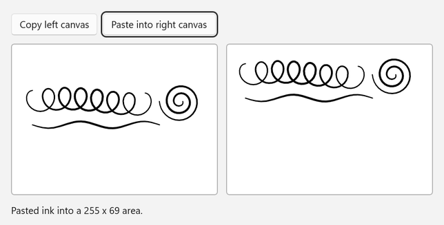
To work with some of the strokes, set the Selected property of each stroke that you want, or call SelectWithLine or SelectWithPolyLine. To delete or move the selected strokes, call DeleteSelected or MoveSelected.
Create strokes in code
Use the Windows Runtime InkStrokeBuilder class to create strokes from points, and add them to the canvas with AddStroke. The following example adds a star and a signature line.
<StackPanel Spacing="12">
    <StackPanel Orientation="Horizontal" Spacing="8">
        <Button Click="AddStarButton_Click" Content="Add star" />
        <Button Click="AddSignatureLineButton_Click" Content="Add signature line" />
        <Button Click="ClearButton_Click" Content="Clear" />
    </StackPanel>
    <Border
        Width="480"
        Height="280"
        HorizontalAlignment="Left"
        Background="White"
        BorderBrush="{ThemeResource SystemControlForegroundChromeHighBrush}"
        BorderThickness="1">
        <InkCanvas x:Name="inkCanvas" AutomationProperties.Name="Drawing surface" />
    </Border>
</StackPanel>
using System;
using System.Collections.Generic;
using System.Linq;
using System.Numerics;
using Microsoft.UI;
using Microsoft.UI.Xaml;
using Microsoft.UI.Xaml.Controls;
using Windows.Foundation;
using Windows.UI;
using InkDrawingAttributes = Windows.UI.Input.Inking.InkDrawingAttributes;
using InkPoint = Windows.UI.Input.Inking.InkPoint;
using InkStroke = Windows.UI.Input.Inking.InkStroke;
using InkStrokeBuilder = Windows.UI.Input.Inking.InkStrokeBuilder;

public sealed partial class MainPage : Page
{
    public MainPage()
    {
        InitializeComponent();
    }

    private void AddStarButton_Click(object sender, RoutedEventArgs e)
    {
        // Alternate between outer and inner points to draw a five-pointed star.
        Point center = new(inkCanvas.ActualWidth / 2, 90);
        List<Point> points = new();
        for (int i = 0; i <= 10; i++)
        {
            double radius = i % 2 == 0 ? 70 : 28;
            double angle = -Math.PI / 2 + i * Math.PI / 5;
            points.Add(new Point(center.X + radius * Math.Cos(angle), center.Y + radius * Math.Sin(angle)));
        }

        AddStroke(points, Colors.Goldenrod, 4);
    }

    private void AddSignatureLineButton_Click(object sender, RoutedEventArgs e)
    {
        double left = 40;
        double right = inkCanvas.ActualWidth - 40;
        double baseline = inkCanvas.ActualHeight - 40;

        AddStroke(new[] { new Point(left, baseline), new Point(right, baseline) }, Colors.Gray, 2);
        AddStroke(new[] { new Point(left, baseline - 28), new Point(left + 18, baseline - 10) }, Colors.Gray, 2);
        AddStroke(new[] { new Point(left + 18, baseline - 28), new Point(left, baseline - 10) }, Colors.Gray, 2);
    }

    private void ClearButton_Click(object sender, RoutedEventArgs e)
    {
        inkCanvas.InkPresenter.StrokeContainer.Clear();
    }

    private void AddStroke(IEnumerable<Point> points, Color color, double size)
    {
        InkStrokeBuilder builder = new();
        builder.SetDefaultDrawingAttributes(new InkDrawingAttributes
        {
            Color = color,
            Size = new Size(size, size),
            // Keep straight segments and sharp corners instead of smoothing them into curves.
            FitToCurve = false,
        });

        // Give every point the same pressure so that the stroke has a uniform width.
        IEnumerable<InkPoint> inkPoints = points.Select(point => new InkPoint(point, 0.5f));
        InkStroke stroke = builder.CreateStrokeFromInkPoints(inkPoints, Matrix3x2.Identity);
        inkCanvas.InkPresenter.StrokeContainer.AddStroke(stroke);
    }
}
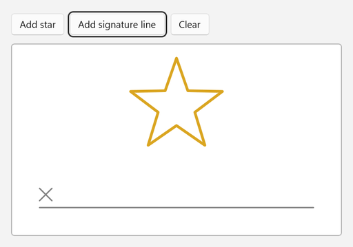
CreateStrokeFromInkPointscreates a stroke fromInkPointvalues. Each point combines a position on the canvas with a pressure value.- The Windows Runtime documentation recommends
CreateStrokeFromInkPointsinstead ofCreateStrokefor strokes that you add to an ink presenter. - When
FitToCurveisfalse, the stroke uses straight segments between points instead of curves.
A stroke can belong to only one container. To copy strokes to another canvas, add clones of the strokes:
private void CopyStrokesTo(InkCanvas target)
{
    foreach (InkStroke stroke in inkCanvas.InkPresenter.StrokeContainer.GetStrokes())
    {
        target.InkPresenter.StrokeContainer.AddStroke(stroke.Clone());
    }
}
Customize the ink toolbar
Choose the initial controls
The InitialControls property determines which built-in buttons the toolbar creates:
| Value | Built-in buttons |
|---|---|
All (default) |
Ballpoint pen, pencil, highlighter, eraser, and stencil (ruler) |
PensOnly |
Ballpoint pen, pencil, and highlighter |
AllExceptPens |
Eraser and stencil (ruler) |
None |
None. Declare the buttons that you want as children of the toolbar. |
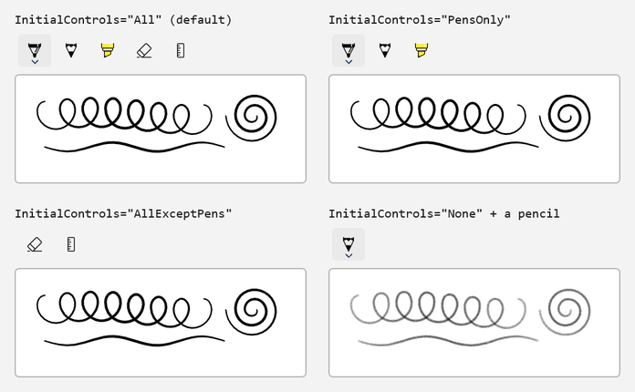
The following example declares the same four buttons as the WinUI 3 Gallery sample, gives each one an accessible name, and selects the ballpoint pen when the toolbar loads:
<StackPanel Spacing="8">
    <InkToolbar
        x:Name="inkToolbar"
        AutomationProperties.Name="Drawing tools"
        InitialControls="None"
        TargetInkCanvas="{x:Bind inkCanvas}">
        <InkToolbarBallpointPenButton x:Name="ballpointButton" AutomationProperties.Name="Ballpoint pen" />
        <InkToolbarPencilButton AutomationProperties.Name="Pencil" />
        <InkToolbarHighlighterButton AutomationProperties.Name="Highlighter" />
        <InkToolbarEraserButton AutomationProperties.Name="Eraser" />
    </InkToolbar>
    <Border
        Height="300"
        Background="White"
        BorderBrush="{ThemeResource SystemControlForegroundChromeHighBrush}"
        BorderThickness="1">
        <InkCanvas x:Name="inkCanvas" AutomationProperties.Name="Drawing surface" />
    </Border>
</StackPanel>
using Microsoft.UI.Xaml.Controls;

public sealed partial class MainPage : Page
{
    public MainPage()
    {
        InitializeComponent();

        // Select a starting tool after the toolbar loads.
        inkToolbar.Loaded += (sender, args) =>
        {
            if (inkToolbar.ActiveTool is null)
            {
                inkToolbar.ActiveTool = ballpointButton;
            }
        };
    }
}
To show a command that erases all ink, set the eraser button's IsClearAllVisible property to true. The toolbar raises the EraseAllClicked event when the user selects the command.
Customize a pen's colors and widths
Each pen button has a Palette of brushes and stroke width settings. Set Palette in code. For details, see Known limitations. The following example replaces a ballpoint pen's palette with four brand colors, limits the stroke width, and shows the attributes of the active pen.
<StackPanel Spacing="12">
    <InkToolbar
        x:Name="inkToolbar"
        AutomationProperties.Name="Drawing tools"
        InitialControls="AllExceptPens"
        TargetInkCanvas="{x:Bind inkCanvas}">
        <InkToolbarBallpointPenButton
            x:Name="brandPen"
            AutomationProperties.Name="Brand pen"
            MaxStrokeWidth="16"
            MinStrokeWidth="2"
            SelectedStrokeWidth="6" />
    </InkToolbar>
    <RadioButtons
        x:Name="colorButtons"
        Header="Pen color"
        MaxColumns="4"
        SelectedIndex="0"
        SelectionChanged="ColorButtons_SelectionChanged">
        <x:String>Blue</x:String>
        <x:String>Green</x:String>
        <x:String>Orange</x:String>
        <x:String>Purple</x:String>
    </RadioButtons>
    <TextBlock x:Name="penInfo" />
    <Border
        Width="480"
        Height="240"
        HorizontalAlignment="Left"
        Background="White"
        BorderBrush="{ThemeResource SystemControlForegroundChromeHighBrush}"
        BorderThickness="1">
        <InkCanvas x:Name="inkCanvas" AutomationProperties.Name="Drawing surface" />
    </Border>
</StackPanel>
using System.Linq;
using Microsoft.UI.Xaml.Controls;
using Microsoft.UI.Xaml.Media;
using Windows.UI;

public sealed partial class MainPage : Page
{
    private static readonly Color[] BrandColors =
    {
        Color.FromArgb(0xFF, 0x00, 0x78, 0xD4), // Blue
        Color.FromArgb(0xFF, 0x10, 0x7C, 0x10), // Green
        Color.FromArgb(0xFF, 0xD8, 0x3B, 0x01), // Orange
        Color.FromArgb(0xFF, 0x5C, 0x2D, 0x91), // Purple
    };

    public MainPage()
    {
        InitializeComponent();

        // Replace the pen's default palette and select the first color.
        brandPen.Palette = BrandColors.Select(color => (Brush)new SolidColorBrush(color)).ToList();
        brandPen.SelectedBrushIndex = 0;

        inkToolbar.InkDrawingAttributesChanged += (sender, args) => ShowPenInfo();

        // The toolbar sets up its buttons when it loads, so select the starting tool then.
        inkToolbar.Loaded += (sender, args) =>
        {
            inkToolbar.ActiveTool = brandPen;
            ShowPenInfo();
        };
    }

    private void ColorButtons_SelectionChanged(object sender, SelectionChangedEventArgs e)
    {
        // SelectionChanged can occur while the page is still loading.
        if (brandPen is null || colorButtons is null || penInfo is null || colorButtons.SelectedIndex < 0)
        {
            return;
        }

        // SelectedBrushIndex selects an entry in Palette, like choosing a color in the pen flyout.
        brandPen.SelectedBrushIndex = colorButtons.SelectedIndex;
        inkToolbar.ActiveTool = brandPen;
        ShowPenInfo();
    }

    private void ShowPenInfo()
    {
        // InkDrawingAttributes describes the ink that the active tool draws.
        if (inkToolbar.InkDrawingAttributes is { } attributes)
        {
            penInfo.Text = $"Color {attributes.Color}, width {attributes.Size.Width:0} (range {brandPen.MinStrokeWidth:0}-{brandPen.MaxStrokeWidth:0})";
        }
    }
}
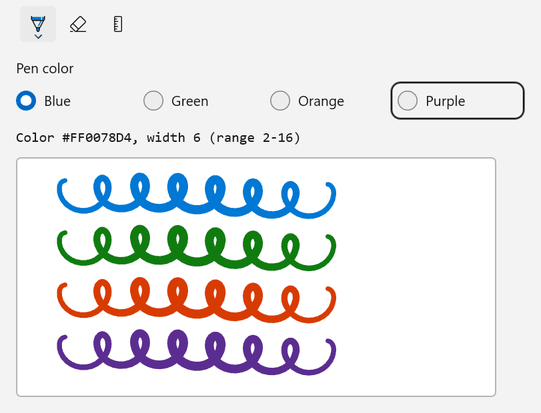
SelectedBrushIndex selects a color from Palette. SelectedStrokeWidth, MinStrokeWidth, and MaxStrokeWidth set the current stroke width and the range that users can choose from. The toolbar raises InkDrawingAttributesChanged when the attributes of the active tool change.
Select the active tool
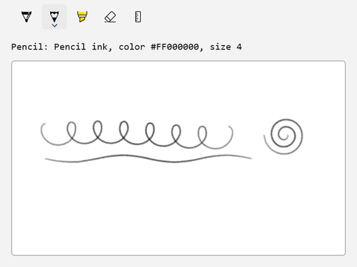
Set ActiveTool to select a tool, and handle ActiveToolChanged to respond when the user selects another one. GetToolButton returns a built-in tool button of the kind that you pass. The built-in buttons might not exist until the toolbar loads, so select a starting tool in the toolbar's Loaded event handler.
<StackPanel Spacing="12">
    <InkToolbar
        x:Name="inkToolbar"
        AutomationProperties.Name="Drawing tools"
        TargetInkCanvas="{x:Bind inkCanvas}" />
    <TextBlock x:Name="toolInfo" />
    <Border
        Width="480"
        Height="280"
        HorizontalAlignment="Left"
        Background="White"
        BorderBrush="{ThemeResource SystemControlForegroundChromeHighBrush}"
        BorderThickness="1">
        <InkCanvas x:Name="inkCanvas" AutomationProperties.Name="Drawing surface" />
    </Border>
</StackPanel>
using Microsoft.UI.Xaml.Controls;

public sealed partial class MainPage : Page
{
    public MainPage()
    {
        InitializeComponent();

        inkToolbar.ActiveToolChanged += (sender, args) => ShowToolInfo();
        inkToolbar.InkDrawingAttributesChanged += (sender, args) => ShowToolInfo();

        // The toolbar creates its built-in buttons when it loads, so select the starting tool then.
        inkToolbar.Loaded += (sender, args) =>
        {
            inkToolbar.ActiveTool = inkToolbar.GetToolButton(InkToolbarTool.Pencil);
            ShowToolInfo();
        };
    }

    private void ShowToolInfo()
    {
        if (inkToolbar.ActiveTool is not { } tool)
        {
            toolInfo.Text = "No active tool";
            return;
        }

        toolInfo.Text = inkToolbar.InkDrawingAttributes is { } attributes
            ? $"{tool.ToolKind}: {attributes.Kind} ink, color {attributes.Color}, size {attributes.Size.Width:0}"
            : $"{tool.ToolKind}";
    }
}
Change the orientation
To show the toolbar vertically, for example next to the canvas, set Orientation to Vertical:
<Grid HorizontalAlignment="Left" ColumnSpacing="8">
    <Grid.ColumnDefinitions>
        <ColumnDefinition Width="Auto" />
        <ColumnDefinition Width="Auto" />
    </Grid.ColumnDefinitions>
    <InkToolbar
        VerticalAlignment="Top"
        AutomationProperties.Name="Drawing tools"
        Orientation="Vertical"
        TargetInkCanvas="{x:Bind inkCanvas}" />
    <Border
        Grid.Column="1"
        Width="440"
        Height="320"
        VerticalAlignment="Top"
        Background="White"
        BorderBrush="{ThemeResource SystemControlForegroundChromeHighBrush}"
        BorderThickness="1">
        <InkCanvas x:Name="inkCanvas" AutomationProperties.Name="Drawing surface" />
    </Border>
</Grid>
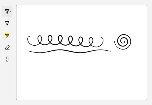
The ButtonFlyoutPlacement property sets where button flyouts open relative to the toolbar. The default value, Auto, lets the toolbar choose the position.
Add a custom toggle button
Use an InkToolbarCustomToggleButton to add a setting that users turn on and off from the toolbar. The following example adds a toggle that controls touch input. Pen and mouse input always draw ink.
<StackPanel Spacing="12">
    <InkToolbar AutomationProperties.Name="Drawing tools" TargetInkCanvas="{x:Bind inkCanvas}">
        <InkToolbarCustomToggleButton
            x:Name="touchWritingToggle"
            AutomationProperties.Name="Touch writing"
            Checked="TouchWritingToggle_Changed"
            ToolTipService.ToolTip="Touch writing"
            Unchecked="TouchWritingToggle_Changed">
            <SymbolIcon Symbol="TouchPointer" />
        </InkToolbarCustomToggleButton>
    </InkToolbar>
    <TextBlock x:Name="deviceInfo" />
    <Border
        Width="480"
        Height="280"
        HorizontalAlignment="Left"
        Background="White"
        BorderBrush="{ThemeResource SystemControlForegroundChromeHighBrush}"
        BorderThickness="1">
        <InkCanvas x:Name="inkCanvas" AutomationProperties.Name="Drawing surface" />
    </Border>
</StackPanel>
using Microsoft.UI.Xaml;
using Microsoft.UI.Xaml.Controls;
using Windows.UI.Core;

public sealed partial class MainPage : Page
{
    public MainPage()
    {
        InitializeComponent();

        // Pen and mouse input always draw ink. The custom toggle controls touch input.
        inkCanvas.InkPresenter.InputDeviceTypes = CoreInputDeviceTypes.Pen | CoreInputDeviceTypes.Mouse;
        ShowDevices();
    }

    private void TouchWritingToggle_Changed(object sender, RoutedEventArgs e)
    {
        if (touchWritingToggle.IsChecked == true)
        {
            inkCanvas.InkPresenter.InputDeviceTypes |= CoreInputDeviceTypes.Touch;
        }
        else
        {
            inkCanvas.InkPresenter.InputDeviceTypes &= ~CoreInputDeviceTypes.Touch;
        }

        ShowDevices();
    }

    private void ShowDevices()
    {
        deviceInfo.Text = $"InputDeviceTypes = {inkCanvas.InkPresenter.InputDeviceTypes}";
    }
}
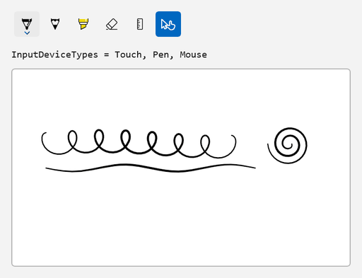
The toggle shows only an icon, so the example gives it an accessible name and a tooltip. In this example, the toolbar also creates its default buttons, and the custom toggle appears after them.
The toolbar supports other custom buttons:
InkToolbarCustomToolButtonadds a tool of your own.InkToolbarCustomPenButtonadds a pen that creates its own drawing attributes. Set itsCustomPenproperty to an instance of a class that derives fromInkToolbarCustomPenand overrides theCreateInkDrawingAttributesCoremethod.
Create the toolbar in code
You can also create the canvas and the toolbar in code. The following example adds them to a Border named inkHost, connects the toolbar with TargetInkPresenter, and selects the pencil when the toolbar loads.
<Border x:Name="inkHost" HorizontalAlignment="Left" />
using Microsoft.UI;
using Microsoft.UI.Xaml;
using Microsoft.UI.Xaml.Automation;
using Microsoft.UI.Xaml.Controls;
using Microsoft.UI.Xaml.Media;
using Windows.UI.Core;

public sealed partial class MainPage : Page
{
    public MainPage()
    {
        InitializeComponent();
        CreateInkingUI();
    }

    private void CreateInkingUI()
    {
        InkCanvas canvas = new();
        AutomationProperties.SetName(canvas, "Drawing surface");
        canvas.InkPresenter.InputDeviceTypes =
            CoreInputDeviceTypes.Pen | CoreInputDeviceTypes.Mouse | CoreInputDeviceTypes.Touch;

        InkToolbar toolbar = new() { TargetInkPresenter = canvas.InkPresenter };
        AutomationProperties.SetName(toolbar, "Drawing tools");

        // The toolbar creates its built-in buttons when it loads.
        toolbar.Loaded += (sender, args) => toolbar.ActiveTool = toolbar.GetToolButton(InkToolbarTool.Pencil);

        Border canvasFrame = new()
        {
            Width = 480,
            Height = 280,
            Background = new SolidColorBrush(Colors.White),
            BorderBrush = new SolidColorBrush(Colors.DarkGray),
            BorderThickness = new Thickness(1),
            Child = canvas,
        };

        StackPanel layout = new() { Spacing = 8 };
        layout.Children.Add(toolbar);
        layout.Children.Add(canvasFrame);

        inkHost.Child = layout;
    }
}
Known limitations
- The inking controls are available only in experimental releases of the Windows App SDK. They aren't available in the stable channel.
- The inking APIs don't include handwriting or shape recognition.
- Mouse input doesn't draw ink until you add
CoreInputDeviceTypes.MousetoInputDeviceTypes.
The following issues were reported with Windows App SDK 2.4.1-experimental. The 2.5.4-experimental release notes don't list them as fixed:
- The ruler and protractor stencils don't work.
RenderTargetBitmapdoesn't capture ink. To create an image of the ink, save it in theGifWithEmbeddedIsfformat.- Setting a pen button's
Paletteproperty in XAML causes a XAML parse error. SetPalettein code instead, as shown in Customize a pen's colors and widths. - Button flyouts can appear empty, and changing
ButtonFlyoutPlacementmight not change where they open.
Changes from 2.4.1-experimental
If you used the inking APIs in Windows App SDK 2.4.1-experimental, update your code for these changes in 2.5.4-experimental:
| API in 2.4.1-experimental | Change in 2.5.4-experimental |
|---|---|
InkToolbar.TargetInkPresenter (type Object) |
The property type is InkPresenter. |
InkPresenter.GetHighContrastAdjustment and InkPresenter.SetHighContrastAdjustment methods |
Replaced by the InkPresenter.HighContrastAdjustment property. |
InkStrokeInput.GetInkPresenter and InkUnprocessedInput.GetInkPresenter methods |
Replaced by an InkPresenter property on each class. |
InkToolbarEraserButton.SelectedEraser, IsStrokeEraserVisible, and ArePrecisionErasersVisible properties; InkToolbar.EraserFlyoutItemClicked event; InkToolbarEraserKind, InkToolbarEraserFlyoutItemKind, and InkToolbarEraserFlyoutItemClickedEventArgs types |
Removed. |
| Not available | InkPresenter.ActivateCustomDrying method and InkSynchronizer class added. |
Accessibility and high contrast
Ink is visual content, so plan how all users can use your inking features:
- Give each canvas and toolbar an accessible name with
AutomationProperties.Name, as the examples in this article do. Give custom buttons that show only an icon a name and a tooltip. InkCanvasAutomationPeerexposes the canvas to UI Automation, but it doesn't describe the strokes. If the ink has meaning, such as a signature or a labeled diagram, provide a text alternative.- Drawing ink requires pointer input. Don't make ink the only way to complete a task. For example, let users type their name as an alternative to signing it.
- The automation peers for the built-in tool buttons support the SelectionItem and ExpandCollapse control patterns. Test keyboard navigation and the button flyouts with the toolbar configuration that your app uses.
When a contrast theme is active, the presenter can replace ink colors with system colors. To choose this behavior, set the HighContrastAdjustment property to an InkHighContrastAdjustment value from the Microsoft.UI.Xaml.Controls namespace. The Windows Runtime documentation for the enumeration with the same name describes the values this way:
| Value | Ink color in a contrast theme |
|---|---|
UseSystemColorsWhenNecessary |
The ink's own color if it contrasts enough with the background. Otherwise, a system color. |
UseSystemColors |
A system color. Highlighter ink uses the system highlighter color. |
UseOriginalColors |
The ink's own color. |
inkCanvas.InkPresenter.HighContrastAdjustment = InkHighContrastAdjustment.UseSystemColorsWhenNecessary;
To keep them short, the examples in this article set a white background directly. In your app, define the canvas background in theme dictionaries so that it follows the active theme, as described in Contrast themes. Then test your app with each contrast theme, and check that the ink, the background, and the border stay distinguishable.
For more information, see Expose basic accessibility information and Keyboard accessibility.
See also
- WinUI 3 Gallery InkCanvas sample source code
- Windows App SDK 2.5.4-experimental release notes
- Microsoft.UI.Xaml.Controls namespace
- Windows.UI.Input.Inking namespace
- Pen haptic feedback in Windows apps
- Pen interactions and Windows Ink (UWP)
- Inking controls (UWP)
- What's supported when migrating from UWP to WinUI 3
Met ons samenwerken op GitHub
De bron voor deze inhoud vindt u op GitHub, waar u ook problemen en pull-aanvragen kunt maken en controleren. Bekijk onze gids voor inzenders voor meer informatie.

Windows developer