LookupDesign type
Important
The finance and operations (Dynamics 365) mobile app and platform are no longer supported. The platform components supporting the mobile app will be removed in a future update. The mobile app has also been removed from app stores. Previously installed instances of the app will continue to work. For more information, see Removed or deprecated platform features.
Lookup design object type.
Hierarchy
InputControlDesign
└─ LookupDesign
Index
Properties
- alignItems
- alignSelf
- bindings
- border
- color
- flexFlow
- flexSize
- fontSize
- fontWeight
- justifyItems
- label
- labelPosition
- name
- padding
- type
Properties
alignItems
alignItems: string (optional)
This property is an alias for the CSS property "align-items". Please refer to this web page for documentation on the "align-items" property.
Inherited from Design.alignItems
alignSelf
alignSelf: string (optional)
bindings
bindings: any (optional)
border
border: "none" | "solid" | "left" | "right" | "top" | "bottom" (optional)
The border behavior of a control. This property will not be inherited by the children.
color
color: string (optional)
The foreground color of the container.
This will modify the color of all headers, items, labels, and icons within the container.
Consider setting the background color at the same time as necessary when setting this attribute.
Note: if color is set to "theme", the theme color of the app will be used.
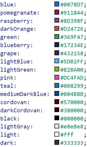
The following colors are available:

flexFlow
flexFlow: string (optional)
Specifying this property makes the component a flex container component. This property is an alias for the CSS property "flex-flow". Please refer to this web page for documentation on the "flex-flow" property.
flexSize
flexSize: string (optional)
One number or two numbers written as a string. For example, "(size to grow) [(size-to-shrink)]" to accommodate available space in the immediate flex container. This property is an alias for the CSS property "flex". Please refer to this web page for documentation on the "flex" property.
fontSize
fontSize: "medium" | "xx-small" | "x-small" | "small" | "large" | "x-large" | "xx-large" (optional)
The proportional text size
fontWeight
fontWeight: "normal" | "bold" (optional)
Normal or bold text.
Inherited from Design.fontWeight
justifyItems
justifyItems: "flex-start" | "flex-end" | "center" | "space-between" (optional)
This property is an alias for the CSS property "justify-content". Please refer to this web page for documentation on the "justify-content" property.
Inherited from Design.justifyItems
label
label: string (optional)
labelPosition
labelPosition: "stacked" | "hidden" | "inline" (optional)
Determines how a label is positioned, if at all. By default, labelPosition is set to stacked.
Inherited from Design.labelPosition
name
name: string (optional)
padding
padding: "none" | "small" | "std" (optional)
Allows specifying the component's padding behavior. A component will inherit the padding behavior specified by its parent container components.
type
type: ControlType (optional)
The type of the control as a string.