Notatka
Dostęp do tej strony wymaga autoryzacji. Może spróbować zalogować się lub zmienić katalogi.
Dostęp do tej strony wymaga autoryzacji. Możesz spróbować zmienić katalogi.
W tym temacie opisano polecenie w aplikacjach systemu Windows. W szczególności omawiamy sposób używania klas XamlUICommand i StandardUICommand (wraz z interfejsem ICommand) do udostępniania poleceń i zarządzania nimi w różnych typach kontrolek, niezależnie od używanego urządzenia i typu danych wejściowych.
Udostępnianie poleceń w różnych kontrolkach, niezależnie od typu urządzenia i danych wejściowych
Ważne interfejsy API
Przegląd
Polecenia można wywoływać bezpośrednio za pośrednictwem interakcji interfejsu użytkownika, takich jak kliknięcie przycisku lub wybranie elementu z menu kontekstowego. Mogą być również wywoływane pośrednio za pośrednictwem urządzenia wejściowego, takiego jak akcelerator klawiatury, gest, rozpoznawanie mowy lub narzędzie automatyzacji/ułatwień dostępu. Po uruchomieniu polecenia można następnie obsłużyć kontrolkę (nawigację tekstową w elemencie sterującym edycji), okno (nawigację wsteczną) lub aplikację (wyłączenie).
Polecenia mogą działać w określonym kontekście w aplikacji, takim jak usuwanie tekstu lub cofanie akcji, lub mogą być wolne od kontekstu, takie jak wyciszanie dźwięku lub dostosowywanie jasności.
Na poniższej ilustracji przedstawiono dwa interfejsy poleceń ( CommandBar i przestawny kontekstowy CommandBarFlyout), które współużytkuje niektóre z tych samych poleceń.
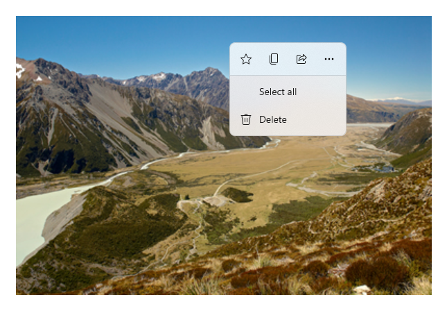
Pasek poleceń
Menu kontekstowe w galerii Microsoft Photos
Interakcje poleceń
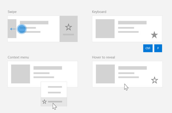
Ze względu na różne urządzenia, typy danych wejściowych i powierzchnie interfejsu użytkownika, które mogą mieć wpływ na sposób wywoływanego polecenia, zalecamy uwidacznianie poleceń za pomocą jak największej liczby powierzchni poleceń. Mogą one obejmować kombinację funkcji Swipe, MenuBar, CommandBar, CommandBarFlyout i tradycyjnego menu kontekstowego.
W przypadku poleceń krytycznych użyj akceleratorów specyficznych dla danych wejściowych. Akceleratory wejściowe umożliwiają użytkownikowi szybsze wykonywanie akcji w zależności od używanego urządzenia wejściowego.
Oto kilka typowych akceleratorów wejściowych dla różnych typów danych wejściowych:
- Wskaźnik — przyciski najechania myszą i piórem
- Klawiatura — skróty klawiszy dostępu i klawisze akceleracji
- Dotyk — przesunięcie
- Touch — przeciągnij, aby odświeżyć dane
Należy wziąć pod uwagę typ danych wejściowych i środowiska użytkownika, aby zapewnić uniwersalną dostępność funkcji aplikacji. Na przykład kolekcje (szczególnie edytowalne dla użytkowników) zwykle zawierają różne polecenia, które są wykonywane zupełnie inaczej w zależności od urządzenia wejściowego.
W poniższej tabeli przedstawiono niektóre typowe polecenia zbioru i sposoby ich prezentacji.
| Command | Niezależny od danych wejściowych | Przyspieszenie myszy | Akcelerator klawiatury | Akcelerator dotykowy |
|---|---|---|---|---|
| Usuń element | Menu kontekstowe | Przycisk aktywowania | Klawisz DEL | Szybkie przesunięcie w celu usunięcia |
| Element flagi | Menu kontekstowe | Przycisk aktywowania | Ctrl+Shift+G | Przesuń, aby oznaczyć |
| Odświeżanie danych | Menu kontekstowe | N/A | klawisz F5 | Przeciągnij, aby odświeżyć |
| Dodaj element do ulubionych | Menu kontekstowe | Przycisk aktywowania | F, Ctrl+S | Szybkie przesunięcie do ulubionych |
Zawsze podaj menu kontekstowe Zalecamy uwzględnienie wszystkich odpowiednich poleceń kontekstowych w tradycyjnym menu kontekstowym lub CommandBarFlyout, ponieważ oba te polecenia są obsługiwane dla wszystkich typów danych wejściowych. Jeśli na przykład polecenie jest ujawniane tylko podczas zdarzenia najechania wskaźnikiem, nie może być używane na urządzeniu wyłącznie dotykowym.
Polecenia w aplikacjach systemu Windows
Istnieje kilka sposobów na udostępnianie i zarządzanie doświadczeniami związanymi z poleceniami w aplikacji Windows. Można zdefiniować programy obsługi zdarzeń dla standardowych interakcji, takich jak Kliknięcie, w kodzie (może to być dość nieefektywne, w zależności od złożoności interfejsu użytkownika), można powiązać odbiornik zdarzeń dla standardowych interakcji z udostępnioną procedurą obsługi lub powiązać właściwość Command kontrolki z implementacją ICommand opisjącą logikę poleceń.
Aby zapewnić zaawansowane i kompleksowe środowiska użytkownika na różnych powierzchniach poleceń wydajnie i przy minimalnym duplikowaniu kodu, zalecamy użycie funkcji powiązania poleceń opisanych w tym temacie (w celu obsługi standardowych zdarzeń, zobacz poszczególne tematy zdarzeń).
Aby powiązać kontrolkę z udostępnionym zasobem polecenia, możesz zaimplementować interfejsy ICommand samodzielnie lub utworzyć polecenie z klasy bazowej XamlUICommand lub jednego z poleceń platformy zdefiniowanych przez klasę pochodną StandardUICommand .
- Interfejs ICommand (Windows.UI.Xaml.Input.ICommand lub System.Windows.Input.ICommand) umożliwia tworzenie w pełni dostosowanych poleceń wielokrotnego użytku w aplikacji.
- XamlUICommand zapewnia również tę funkcję, ale upraszcza programowanie, ujawniając zestaw wbudowanych właściwości poleceń, takich jak zachowanie polecenia, skróty klawiaturowe (klucz dostępu i klucz akceleratora), ikona, etykieta i opis.
- StandardUICommand upraszcza dalsze działania, umożliwiając wybranie zestawu standardowych poleceń platformy ze wstępnie zdefiniowanymi właściwościami.
Ważne
W aplikacjach WinUI polecenia są implementacjami interfejsu Windows.UI.Xaml.Input.ICommand (C++) lub Interfejsu System.Windows.Input.ICommand (C#), w zależności od wybranej struktury językowej.
Doświadczenia z poleceniami przy użyciu klasy StandardUICommand
Pochodzi z XamlUICommand (pochodzi z Windows.UI.Xaml.Input.ICommand dla języka C++ lub System.Windows.Input.ICommand dla języka C#), klasa StandardUICommand uwidacznia zestaw standardowych poleceń platformy z wstępnie zdefiniowanymi właściwościami, takimi jak ikona, akcelerator klawiatury i opis.
StandardUICommand zapewnia szybki i spójny sposób definiowania typowych poleceń, takich jak Save lub Delete. Wystarczy, że podasz funkcje „execute” i „canExecute”.
Example
StandardUICommandSample
| Pobierz kod dla tego przykładu |
|---|
| Przykład poleceń (StandardUICommand) |
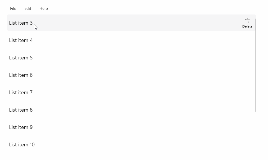
W tym przykładzie pokazano, jak ulepszyć podstawowy ListView za pomocą polecenia usunięcia elementu zaimplementowanego za pomocą klasy StandardUICommand, jednocześnie optymalizując środowisko użytkownika dla różnych typów danych wejścia przy użyciu MenuBar, kontrolki Swipe, przycisków najeżdżanych i menu kontekstowego.
Xaml:
Przykładowy interfejs użytkownika zawiera element ListView z pięcioma elementami. Polecenie Delete StandardUICommand jest powiązane z MenuBarItem, SwipeItem, AppBarButton i menu ContextFlyout.
<Page
    x:Class="StandardUICommandSample.MainPage"
    xmlns="http://schemas.microsoft.com/winfx/2006/xaml/presentation"
    xmlns:x="http://schemas.microsoft.com/winfx/2006/xaml"
    xmlns:local="using:StandardUICommandSample"
    xmlns:d="http://schemas.microsoft.com/expression/blend/2008"
    xmlns:mc="http://schemas.openxmlformats.org/markup-compatibility/2006"
    xmlns:muxcontrols="using:Microsoft.UI.Xaml.Controls"
    mc:Ignorable="d"
    Background="{ThemeResource ApplicationPageBackgroundThemeBrush}">

    <Page.Resources>
        <Style x:Key="HorizontalSwipe"
               TargetType="ListViewItem"
               BasedOn="{StaticResource ListViewItemRevealStyle}">
            <Setter Property="Height" Value="60"/>
            <Setter Property="Padding" Value="0"/>
            <Setter Property="HorizontalContentAlignment" Value="Stretch"/>
            <Setter Property="VerticalContentAlignment" Value="Stretch"/>
            <Setter Property="BorderThickness" Value="0"/>
        </Style>
    </Page.Resources>

    <Grid Loaded="ControlExample_Loaded">
        <Grid.RowDefinitions>
            <RowDefinition Height="Auto" />
            <RowDefinition Height="Auto" />
            <RowDefinition Height="*"/>
        </Grid.RowDefinitions>

        <StackPanel Grid.Row="0"
                    Padding="10"
                    BorderThickness="0,0,0,1"
                    BorderBrush="LightBlue"
                    Background="AliceBlue">
            <TextBlock Style="{StaticResource HeaderTextBlockStyle}">
                StandardUICommand sample
            </TextBlock>
            <TextBlock Style="{StaticResource SubtitleTextBlockStyle}" Margin="0,0,0,10">
                This sample shows how to use the StandardUICommand class to
                share a platform command and consistent user experiences
                across various controls.
            </TextBlock>
            <TextBlock Style="{StaticResource SubtitleTextBlockStyle}" Margin="0,0,0,0">
                Specifically, we define a standard delete command and add it
                to a variety of command surfaces, all of which share a common
                icon, label, keyboard accelerator, and description.
            </TextBlock>
        </StackPanel>

        <muxcontrols:MenuBar Grid.Row="1" Padding="10">
            <muxcontrols:MenuBarItem Title="File">
            </muxcontrols:MenuBarItem>
            <muxcontrols:MenuBarItem Title="Edit">
                <MenuFlyoutItem x:Name="DeleteFlyoutItem"/>
            </muxcontrols:MenuBarItem>
            <muxcontrols:MenuBarItem Title="Help">
            </muxcontrols:MenuBarItem>
        </muxcontrols:MenuBar>

        <ListView x:Name="ListViewRight" Grid.Row="2"
                  Loaded="ListView_Loaded"
                  IsItemClickEnabled="True"
                  SelectionMode="Single"
                  SelectionChanged="ListView_SelectionChanged"
                  ItemContainerStyle="{StaticResource HorizontalSwipe}">
            <ListView.ItemTemplate>
                <DataTemplate x:DataType="local:ListItemData">
                    <UserControl PointerEntered="ListViewSwipeContainer_PointerEntered"
                                 PointerExited="ListViewSwipeContainer_PointerExited">
                        <UserControl.ContextFlyout>
                            <MenuFlyout>
                                <MenuFlyoutItem
                                    Command="{x:Bind Command}"
                                    CommandParameter="{x:Bind Text}" />
                            </MenuFlyout>
                        </UserControl.ContextFlyout>
                        <Grid AutomationProperties.Name="{x:Bind Text}">
                            <VisualStateManager.VisualStateGroups>
                                <VisualStateGroup x:Name="HoveringStates">
                                    <VisualState x:Name="HoverButtonsHidden" />
                                    <VisualState x:Name="HoverButtonsShown">
                                        <VisualState.Setters>
                                            <Setter Target="HoverButton.Visibility"
                                                    Value="Visible" />
                                        </VisualState.Setters>
                                    </VisualState>
                                </VisualStateGroup>
                            </VisualStateManager.VisualStateGroups>
                            <SwipeControl x:Name="ListViewSwipeContainer" >
                                <SwipeControl.RightItems>
                                    <SwipeItems Mode="Execute">
                                        <SwipeItem x:Name="DeleteSwipeItem"
                                                   Background="Red"
                                                   Command="{x:Bind Command}"
                                                   CommandParameter="{x:Bind Text}"/>
                                    </SwipeItems>
                                </SwipeControl.RightItems>
                                <Grid VerticalAlignment="Center">
                                    <TextBlock Text="{x:Bind Text}"
                                               Margin="10"
                                               FontSize="18"
                                               HorizontalAlignment="Left"
                                               VerticalAlignment="Center"/>
                                    <AppBarButton x:Name="HoverButton"
                                                  IsTabStop="False"
                                                  HorizontalAlignment="Right"
                                                  Visibility="Collapsed"
                                                  Command="{x:Bind Command}"
                                                  CommandParameter="{x:Bind Text}"/>
                                </Grid>
                            </SwipeControl>
                        </Grid>
                    </UserControl>
                </DataTemplate>
            </ListView.ItemTemplate>
        </ListView>
    </Grid>
</Page>
Kod w tle
- Najpierw definiujemy klasę
ListItemData, która zawiera ciąg tekstowy i ICommand dla każdego elementu ListViewItem w ListView.
public class ListItemData
{
    public String Text { get; set; }
    public ICommand Command { get; set; }
}
- W klasie MainPage definiujemy kolekcję obiektów
ListItemDatadla DataTemplate w ListViewItemTemplate. Następnie wypełniamy ją początkową kolekcją pięciu elementów (tekstem i skojarzonym poleceniem StandardUICommand Delete).
/// <summary>
/// ListView item collection.
/// </summary>
ObservableCollection<ListItemData> collection =
    new ObservableCollection<ListItemData>();

/// <summary>
/// Handler for the layout Grid control load event.
/// </summary>
/// <param name="sender">Source of the control loaded event</param>
/// <param name="e">Event args for the loaded event</param>
private void ControlExample_Loaded(object sender, RoutedEventArgs e)
{
    // Create the standard Delete command.
    var deleteCommand = new StandardUICommand(StandardUICommandKind.Delete);
    deleteCommand.ExecuteRequested += DeleteCommand_ExecuteRequested;

    DeleteFlyoutItem.Command = deleteCommand;

    for (var i = 0; i < 5; i++)
    {
        collection.Add(
            new ListItemData {
                Text = "List item " + i.ToString(),
                Command = deleteCommand });
    }
}

/// <summary>
/// Handler for the ListView control load event.
/// </summary>
/// <param name="sender">Source of the control loaded event</param>
/// <param name="e">Event args for the loaded event</param>
private void ListView_Loaded(object sender, RoutedEventArgs e)
{
    var listView = (ListView)sender;
    // Populate the ListView with the item collection.
    listView.ItemsSource = collection;
}
- Następnie zdefiniujemy procedurę obsługi ICommand ExecuteRequested, w której implementujemy polecenie usuwania elementu.
/// <summary>
/// Handler for the Delete command.
/// </summary>
/// <param name="sender">Source of the command event</param>
/// <param name="e">Event args for the command event</param>
private void DeleteCommand_ExecuteRequested(
    XamlUICommand sender, ExecuteRequestedEventArgs args)
{
    // If possible, remove specified item from collection.
    if (args.Parameter != null)
    {
        foreach (var i in collection)
        {
            if (i.Text == (args.Parameter as string))
            {
                collection.Remove(i);
                return;
            }
        }
    }
    if (ListViewRight.SelectedIndex != -1)
    {
        collection.RemoveAt(ListViewRight.SelectedIndex);
    }
}
- Na koniec definiujemy programy obsługi dla różnych zdarzeń ListView, w tym PointerEntered, PointerExited i SelectionChanged . Programy obsługi zdarzeń wskaźnika służą do pokazywania lub ukrywania przycisku Usuń dla każdego elementu.
/// <summary>
/// Handler for the ListView selection changed event.
/// </summary>
/// <param name="sender">Source of the selection changed event</param>
/// <param name="e">Event args for the selection changed event</param>
private void ListView_SelectionChanged(object sender, SelectionChangedEventArgs e)
{
    if (ListViewRight.SelectedIndex != -1)
    {
        var item = collection[ListViewRight.SelectedIndex];
    }
}

/// <summary>
/// Handler for the pointer entered event.
/// Displays the delete item "hover" buttons.
/// </summary>
/// <param name="sender">Source of the pointer entered event</param>
/// <param name="e">Event args for the pointer entered event</param>
private void ListViewSwipeContainer_PointerEntered(
    object sender, PointerRoutedEventArgs e)
{
    if (e.Pointer.PointerDeviceType ==
        Windows.Devices.Input.PointerDeviceType.Mouse ||
        e.Pointer.PointerDeviceType ==
        Windows.Devices.Input.PointerDeviceType.Pen)
    {
        VisualStateManager.GoToState(
            sender as Control, "HoverButtonsShown", true);
    }
}

/// <summary>
/// Handler for the pointer exited event.
/// Hides the delete item "hover" buttons.
/// </summary>
/// <param name="sender">Source of the pointer exited event</param>
/// <param name="e">Event args for the pointer exited event</param>

private void ListViewSwipeContainer_PointerExited(
    object sender, PointerRoutedEventArgs e)
{
    VisualStateManager.GoToState(
        sender as Control, "HoverButtonsHidden", true);
}
Doświadczenia związane z poleceniami przy użyciu klasy XamlUICommand
Jeśli musisz utworzyć polecenie, które nie jest zdefiniowane przez klasę StandardUICommand lub chcesz mieć większą kontrolę nad wyglądem polecenia, klasa XamlUICommand pochodzi z interfejsu ICommand , dodając różne właściwości interfejsu użytkownika (takie jak ikona, etykieta, opis i skróty klawiaturowe), metody i zdarzenia umożliwiające szybkie zdefiniowanie interfejsu użytkownika i zachowania polecenia niestandardowego.
XamlUICommand umożliwia określenie interfejsu użytkownika poprzez powiązanie z kontrolką, taką jak ikona, etykieta, opis oraz skróty klawiaturowe (zarówno klawisz dostępu, jak i akcelerator klawiatury), bez konieczności ustawiania poszczególnych właściwości.
Example
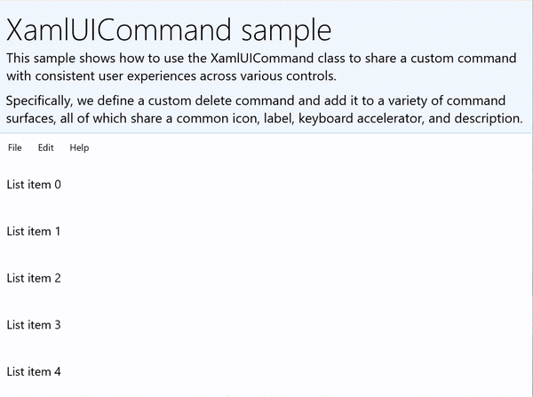
XamlUICommandSample
| Pobierz kod dla tego przykładu | | -------------------- | | Przykład poleceń WinUI (XamlUICommand) | | Pobierz kod dla tego przykładu | | -------------------- | | Przykład poleceń (XamlUICommand) | Wiele kontrolek platformy używa właściwości XamlUICommand za kulisami, podobnie jak w naszym przykładzie StandardUICommand w poprzedniej sekcji.
Xaml:
Przykładowy interfejs użytkownika zawiera element ListView z pięcioma elementami. Niestandardowy XamlUICommand CustomXamlUICommand jest powiązany z MenuBarItem, SwipeItem, AppBarButton i menu ContextFlyout.
<Page
x:Class="XamlUICommand_Sample.MainPage"
xmlns="http://schemas.microsoft.com/winfx/2006/xaml/presentation"
xmlns:x="http://schemas.microsoft.com/winfx/2006/xaml"
xmlns:local="using:XamlUICommand_Sample"
xmlns:d="http://schemas.microsoft.com/expression/blend/2008"
xmlns:mc="http://schemas.openxmlformats.org/markup-compatibility/2006"
xmlns:muxcontrols="using:Microsoft.UI.Xaml.Controls"
mc:Ignorable="d"
Background="{ThemeResource ApplicationPageBackgroundThemeBrush}">
<Page.Resources>
<XamlUICommand x:Name="CustomXamlUICommand"
ExecuteRequested="DeleteCommand_ExecuteRequested"
Description="Custom XamlUICommand"
Label="Custom XamlUICommand">
<XamlUICommand.IconSource>
<FontIconSource FontFamily="Wingdings" Glyph="M"/>
</XamlUICommand.IconSource>
<XamlUICommand.KeyboardAccelerators>
<KeyboardAccelerator Key="D" Modifiers="Control"/>
</XamlUICommand.KeyboardAccelerators>
</XamlUICommand>
<Style x:Key="HorizontalSwipe"
TargetType="ListViewItem"
BasedOn="{StaticResource ListViewItemRevealStyle}">
<Setter Property="Height" Value="70"/>
<Setter Property="Padding" Value="0"/>
<Setter Property="HorizontalContentAlignment" Value="Stretch"/>
<Setter Property="VerticalContentAlignment" Value="Stretch"/>
<Setter Property="BorderThickness" Value="0"/>
</Style>
</Page.Resources>
<Grid Loaded="ControlExample_Loaded" Name="MainGrid">
<Grid.RowDefinitions>
<RowDefinition Height="Auto" />
<RowDefinition Height="Auto" />
<RowDefinition Height="*"/>
</Grid.RowDefinitions>
<StackPanel Grid.Row="0"
Padding="10"
BorderThickness="0,0,0,1"
BorderBrush="LightBlue"
Background="AliceBlue">
<TextBlock Style="{StaticResource HeaderTextBlockStyle}">
XamlUICommand sample
</TextBlock>
<TextBlock Style="{StaticResource SubtitleTextBlockStyle}" Margin="0,0,0,10">
This sample shows how to use the XamlUICommand class to
share a custom command with consistent user experiences
across various controls.
</TextBlock>
<TextBlock Style="{StaticResource SubtitleTextBlockStyle}" Margin="0,0,0,0">
Specifically, we define a custom delete command and add it
to a variety of command surfaces, all of which share a common
icon, label, keyboard accelerator, and description.
</TextBlock>
</StackPanel>
<muxcontrols:MenuBar Grid.Row="1">
<muxcontrols:MenuBarItem Title="File">
</muxcontrols:MenuBarItem>
<muxcontrols:MenuBarItem Title="Edit">
<MenuFlyoutItem x:Name="DeleteFlyoutItem"
Command="{StaticResource CustomXamlUICommand}"/>
</muxcontrols:MenuBarItem>
<muxcontrols:MenuBarItem Title="Help">
</muxcontrols:MenuBarItem>
</muxcontrols:MenuBar>
<ListView x:Name="ListViewRight" Grid.Row="2"
Loaded="ListView_Loaded"
IsItemClickEnabled="True"
SelectionMode="Single"
SelectionChanged="ListView_SelectionChanged"
ItemContainerStyle="{StaticResource HorizontalSwipe}">
<ListView.ItemTemplate>
<DataTemplate x:DataType="local:ListItemData">
<UserControl PointerEntered="ListViewSwipeContainer_PointerEntered"
PointerExited="ListViewSwipeContainer_PointerExited">
<UserControl.ContextFlyout>
<MenuFlyout>
<MenuFlyoutItem
Command="{x:Bind Command}"
CommandParameter="{x:Bind Text}" />
</MenuFlyout>
</UserControl.ContextFlyout>
<Grid AutomationProperties.Name="{x:Bind Text}">
<VisualStateManager.VisualStateGroups>
<VisualStateGroup x:Name="HoveringStates">
<VisualState x:Name="HoverButtonsHidden" />
<VisualState x:Name="HoverButtonsShown">
<VisualState.Setters>
<Setter Target="HoverButton.Visibility"
Value="Visible" />
</VisualState.Setters>
</VisualState>
</VisualStateGroup>
</VisualStateManager.VisualStateGroups>
<SwipeControl x:Name="ListViewSwipeContainer">
<SwipeControl.RightItems>
<SwipeItems Mode="Execute">
<SwipeItem x:Name="DeleteSwipeItem"
Background="Red"
Command="{x:Bind Command}"
CommandParameter="{x:Bind Text}"/>
</SwipeItems>
</SwipeControl.RightItems>
<Grid VerticalAlignment="Center">
<TextBlock Text="{x:Bind Text}"
Margin="10"
FontSize="18"
HorizontalAlignment="Left"
VerticalAlignment="Center"/>
<AppBarButton x:Name="HoverButton"
IsTabStop="False"
HorizontalAlignment="Right"
Visibility="Collapsed"
Command="{x:Bind Command}"
CommandParameter="{x:Bind Text}"/>
</Grid>
</SwipeControl>
</Grid>
</UserControl>
</DataTemplate>
</ListView.ItemTemplate>
</ListView>
</Grid>
</Page>
Kod w tle
- Najpierw definiujemy klasę
ListItemData, która zawiera ciąg tekstowy i ICommand dla każdego elementu ListViewItem w ListView.
public class ListItemData
{
    public String Text { get; set; }
    public ICommand Command { get; set; }
}
- W klasie MainPage definiujemy kolekcję obiektów
ListItemDatadla DataTemplate w ListViewItemTemplate. Następnie wypełniamy ją początkową kolekcją pięciu elementów (tekstem i skojarzonym poleceniem XamlUICommand).
ObservableCollection<ListItemData> collection = new ObservableCollection<ListItemData>();

private void ControlExample_Loaded(object sender, RoutedEventArgs e)
{
    for (var i = 0; i < 5; i++)
    {
        collection.Add(
           new ListItemData { Text = "List item " + i.ToString(), Command = CustomXamlUICommand });
    }
}

private void ListView_Loaded(object sender, RoutedEventArgs e)
{
    var listView = (ListView)sender;
    listView.ItemsSource = collection;
}
- Następnie zdefiniujemy procedurę obsługi ICommand ExecuteRequested, w której implementujemy polecenie usuwania elementu.
private void DeleteCommand_ExecuteRequested(
   XamlUICommand sender, ExecuteRequestedEventArgs args)
{
    if (args.Parameter != null)
    {
        foreach (var i in collection)
        {
            if (i.Text == (args.Parameter as string))
            {
                collection.Remove(i);
                return;
            }
        }
    }
    if (ListViewRight.SelectedIndex != -1)
    {
        collection.RemoveAt(ListViewRight.SelectedIndex);
    }
}
- Na koniec definiujemy programy obsługi dla różnych zdarzeń ListView, w tym PointerEntered, PointerExited i SelectionChanged . Programy obsługi zdarzeń wskaźnika służą do pokazywania lub ukrywania przycisku Usuń dla każdego elementu.
private void ListView_SelectionChanged(object sender, SelectionChangedEventArgs e)
{
    if (ListViewRight.SelectedIndex != -1)
    {
        var item = collection[ListViewRight.SelectedIndex];
    }
}

private void ListViewSwipeContainer_PointerEntered(object sender, PointerRoutedEventArgs e)
{
    if (e.Pointer.PointerDeviceType ==
        Windows.Devices.Input.PointerDeviceType.Mouse ||
        e.Pointer.PointerDeviceType == Windows.Devices.Input.PointerDeviceType.Pen)
    {
        VisualStateManager.GoToState(sender as Control, "HoverButtonsShown", true);
    }
}

private void ListViewSwipeContainer_PointerExited(object sender, PointerRoutedEventArgs e)
{
    VisualStateManager.GoToState(sender as Control, "HoverButtonsHidden", true);
}
Doświadczenia z poleceniami przy użyciu interfejsu ICommand
Standardowe kontrolki WinUI (przycisk, lista, wybór, kalendarz, tekst predykcyjny) zapewniają podstawę dla wielu typowych środowisk poleceń. Aby uzyskać pełną listę typów kontrolek, zobacz Kontrolki i wzorce dla aplikacji systemu Windows.
Najbardziej podstawowym sposobem obsługi środowiska poleceń strukturalnych jest zdefiniowanie implementacji interfejsu ICommand (Windows.UI.Xaml.Input.ICommand dla języka C++ lub System.Windows.Input.ICommand dla języka C#). To wystąpienie ICommand można następnie powiązać z kontrolkami, takimi jak przyciski.
Uwaga / Notatka
W niektórych przypadkach równie wydajne może być powiązanie metody ze zdarzeniem Click oraz właściwości z właściwością IsEnabled. Standardowe kontrolki WinUI (przycisk, lista, wybór, kalendarz, tekst predykcyjny) zapewniają podstawę dla wielu typowych środowisk poleceń. Aby uzyskać pełną listę typów kontrolek, zobacz Kontrolki i wzorce dla aplikacji systemu Windows.
Example
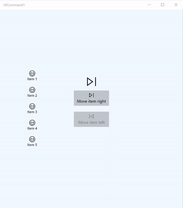
Przykład ICommand
| Pobierz kod dla tego przykładu |
|---|
| Przykład polecenia (ICommand) |
W tym podstawowym przykładzie pokazano, jak można wywołać pojedyncze polecenie za pomocą kliknięcia przycisku, akceleratora klawiatury i obracania kółka myszy.
| Pobierz kod dla tego przykładu |
|---|
| Przykład polecenia (ICommand) |
<Page
x:Class="UICommand1.View.MainPage"
xmlns="http://schemas.microsoft.com/winfx/2006/xaml/presentation"
xmlns:x="http://schemas.microsoft.com/winfx/2006/xaml"
xmlns:vm="using:UICommand1.ViewModel"
xmlns:d="http://schemas.microsoft.com/expression/blend/2008"
xmlns:mc="http://schemas.openxmlformats.org/markup-compatibility/2006"
mc:Ignorable="d"
Background="{ThemeResource ApplicationPageBackgroundThemeBrush}">
<Page.Resources>
<vm:OpacityConverter x:Key="opaque" />
</Page.Resources>
<Grid Name="ItemGrid"
Background="AliceBlue"
PointerWheelChanged="Page_PointerWheelChanged">
<Grid.ColumnDefinitions>
<ColumnDefinition Width="*"/>
<ColumnDefinition Width="2*"/>
<ColumnDefinition Width="*"/>
</Grid.ColumnDefinitions>
<ListView Grid.Column="0" VerticalAlignment="Center"
x:Name="CommandListView"
ItemsSource="{x:Bind Path=ViewModel.ListItemLeft}"
SelectionMode="None" IsItemClickEnabled="False"
HorizontalAlignment="Right">
<ListView.ItemTemplate>
<DataTemplate x:DataType="vm:ListItemData">
<Grid VerticalAlignment="Center">
<AppBarButton Label="{x:Bind ListItemText}">
<AppBarButton.Icon>
<SymbolIcon Symbol="{x:Bind ListItemIcon}"/>
</AppBarButton.Icon>
</AppBarButton>
</Grid>
</DataTemplate>
</ListView.ItemTemplate>
</ListView>
<Grid Grid.Column="1" Margin="0,0,0,0"
HorizontalAlignment="Center"
VerticalAlignment="Center">
<Grid.RowDefinitions>
<RowDefinition Height="*"/>
<RowDefinition Height="*"/>
<RowDefinition Height="*"/>
</Grid.RowDefinitions>
<StackPanel Grid.Row="1">
<FontIcon FontFamily="{StaticResource SymbolThemeFontFamily}"
FontSize="40" Glyph=""
Opacity="{x:Bind Path=ViewModel.ListItemLeft.Count,
Mode=OneWay, Converter={StaticResource opaque}}"/>
<Button Name="MoveItemRightButton"
Margin="0,10,0,10" Width="120" HorizontalAlignment="Center"
Command="{x:Bind Path=ViewModel.MoveRightCommand}">
<Button.KeyboardAccelerators>
<KeyboardAccelerator
Modifiers="Control"
Key="Add" />
</Button.KeyboardAccelerators>
<StackPanel>
<SymbolIcon Symbol="Next"/>
<TextBlock>Move item right</TextBlock>
</StackPanel>
</Button>
<Button Name="MoveItemLeftButton"
Margin="0,10,0,10" Width="120" HorizontalAlignment="Center"
Command="{x:Bind Path=ViewModel.MoveLeftCommand}">
<Button.KeyboardAccelerators>
<KeyboardAccelerator
Modifiers="Control"
Key="Subtract" />
</Button.KeyboardAccelerators>
<StackPanel>
<SymbolIcon Symbol="Previous"/>
<TextBlock>Move item left</TextBlock>
</StackPanel>
</Button>
<FontIcon FontFamily="{StaticResource SymbolThemeFontFamily}"
FontSize="40" Glyph=""
Opacity="{x:Bind Path=ViewModel.ListItemRight.Count,
Mode=OneWay, Converter={StaticResource opaque}}"/>
</StackPanel>
</Grid>
<ListView Grid.Column="2"
x:Name="CommandListViewRight"
VerticalAlignment="Center"
IsItemClickEnabled="False"
SelectionMode="None"
ItemsSource="{x:Bind Path=ViewModel.ListItemRight}"
HorizontalAlignment="Left">
<ListView.ItemTemplate>
<DataTemplate x:DataType="vm:ListItemData">
<Grid VerticalAlignment="Center">
<AppBarButton Label="{x:Bind ListItemText}">
<AppBarButton.Icon>
<SymbolIcon Symbol="{x:Bind ListItemIcon}"/>
</AppBarButton.Icon>
</AppBarButton>
</Grid>
</DataTemplate>
</ListView.ItemTemplate>
</ListView>
</Grid>
</Page>
Oto kod dla poprzedniego interfejsu użytkownika.
W części kodu zwanej code-behind łączymy się z naszym modelem widoku, który zawiera nasz kod polecenia. Ponadto definiujemy procedurę obsługi danych wejściowych z kółka myszy, która również łączy nasz kod polecenia.
using Windows.UI.Xaml;
using Windows.UI.Xaml.Input;
using Windows.UI.Xaml.Controls;
using UICommand1.ViewModel;
using Windows.System;
using Windows.UI.Core;

namespace UICommand1.View
{
    /// <summary>
    /// An empty page that can be used on its own or navigated to within a Frame.
    /// </summary>
    public sealed partial class MainPage : Page
    {
        // Reference to our view model.
        public UICommand1ViewModel ViewModel { get; set; }

        // Initialize our view and view model.
        public MainPage()
        {
            this.InitializeComponent();
            ViewModel = new UICommand1ViewModel();
        }

        /// <summary>
        /// Handle mouse wheel input and assign our
        /// commands to appropriate direction of rotation.
        /// </summary>
        /// <param name="sender"></param>
        /// <param name="e"></param>
        private void Page_PointerWheelChanged(object sender, PointerRoutedEventArgs e)
        {
            var props = e.GetCurrentPoint(sender as UIElement).Properties;

            // Require CTRL key and accept only vertical mouse wheel movement
            // to eliminate accidental wheel input.
            if ((Window.Current.CoreWindow.GetKeyState(VirtualKey.Control) !=
                CoreVirtualKeyStates.None) && !props.IsHorizontalMouseWheel)
            {
                bool delta = props.MouseWheelDelta < 0 ? true : false;

                switch (delta)
                {
                    case true:
                        ViewModel.MoveRight();
                        break;
                    case false:
                        ViewModel.MoveLeft();
                        break;
                    default:
                        break;
                }
            }
        }
    }
}
Oto kod z naszego modelu wyświetlania
Nasz model wyświetlania to miejsce, w którym definiujemy szczegóły wykonania dla dwóch poleceń w naszej aplikacji, wypełniamy jeden element ListView i udostępniamy konwerter wartości nieprzezroczystości do ukrywania lub wyświetlania dodatkowego interfejsu użytkownika na podstawie liczby elementów każdego widoku ListView.
using System;
using System.Collections.ObjectModel;
using System.ComponentModel;
using Windows.UI.Xaml.Controls;
using Windows.UI.Xaml.Data;

namespace UICommand1.ViewModel
{
    /// <summary>
    /// UI properties for our list items.
    /// </summary>
    public class ListItemData
    {
        /// <summary>
        /// Gets and sets the list item content string.
        /// </summary>
        public string ListItemText { get; set; }
        /// <summary>
        /// Gets and sets the list item icon.
        /// </summary>
        public Symbol ListItemIcon { get; set; }
    }

    /// <summary>
    /// View Model that sets up a command to handle invoking the move item buttons.
    /// </summary>
    public class UICommand1ViewModel
    {
        /// <summary>
        /// The command to invoke when the Move item left button is pressed.
        /// </summary>
        public RelayCommand MoveLeftCommand { get; private set; }

        /// <summary>
        /// The command to invoke when the Move item right button is pressed.
        /// </summary>
        public RelayCommand MoveRightCommand { get; private set; }

        // Item collections
        public ObservableCollection<ListItemData> ListItemLeft { get; } =
           new ObservableCollection<ListItemData>();
        public ObservableCollection<ListItemData> ListItemRight { get; } =
           new ObservableCollection<ListItemData>();

        public ListItemData listItem;

        /// <summary>
        /// Sets up a command to handle invoking the move item buttons.
        /// </summary>
        public UICommand1ViewModel()
        {
            MoveLeftCommand =
               new RelayCommand(new Action(MoveLeft), CanExecuteMoveLeftCommand);
            MoveRightCommand =
               new RelayCommand(new Action(MoveRight), CanExecuteMoveRightCommand);

            LoadItems();
        }

        /// <summary>
        ///  Populate our list of items.
        /// </summary>
        public void LoadItems()
        {
            for (var x = 0; x <= 4; x++)
            {
                listItem = new ListItemData();
                listItem.ListItemText = "Item " + (ListItemLeft.Count + 1).ToString();
                listItem.ListItemIcon = Symbol.Emoji;
                ListItemLeft.Add(listItem);
            }
        }

        /// <summary>
        /// Move left command valid when items present in the list on right.
        /// </summary>
        /// <returns>True, if count is greater than 0.</returns>
        private bool CanExecuteMoveLeftCommand()
        {
            return ListItemRight.Count > 0;
        }

        /// <summary>
        /// Move right command valid when items present in the list on left.
        /// </summary>
        /// <returns>True, if count is greater than 0.</returns>
        private bool CanExecuteMoveRightCommand()
        {
            return ListItemLeft.Count > 0;
        }

        /// <summary>
        /// The command implementation to execute when the Move item right button is pressed.
        /// </summary>
        public void MoveRight()
        {
            if (ListItemLeft.Count > 0)
            {
                listItem = new ListItemData();
                ListItemRight.Add(listItem);
                listItem.ListItemText = "Item " + ListItemRight.Count.ToString();
                listItem.ListItemIcon = Symbol.Emoji;
                ListItemLeft.RemoveAt(ListItemLeft.Count - 1);
                MoveRightCommand.RaiseCanExecuteChanged();
                MoveLeftCommand.RaiseCanExecuteChanged();
            }
        }

        /// <summary>
        /// The command implementation to execute when the Move item left button is pressed.
        /// </summary>
        public void MoveLeft()
        {
            if (ListItemRight.Count > 0)
            {
                listItem = new ListItemData();
                ListItemLeft.Add(listItem);
                listItem.ListItemText = "Item " + ListItemLeft.Count.ToString();
                listItem.ListItemIcon = Symbol.Emoji;
                ListItemRight.RemoveAt(ListItemRight.Count - 1);
                MoveRightCommand.RaiseCanExecuteChanged();
                MoveLeftCommand.RaiseCanExecuteChanged();
            }
        }

        /// <summary>
        /// Views subscribe to this event to get notified of property updates.
        /// </summary>
        public event PropertyChangedEventHandler PropertyChanged;

        /// <summary>
        /// Notify subscribers of updates to the named property
        /// </summary>
        /// <param name="propertyName">The full, case-sensitive, name of a property.</param>
        protected void NotifyPropertyChanged(string propertyName)
        {
            PropertyChangedEventHandler handler = this.PropertyChanged;
            if (handler != null)
            {
                PropertyChangedEventArgs args = new PropertyChangedEventArgs(propertyName);
                handler(this, args);
            }
        }
    }

    /// <summary>
    /// Convert a collection count to an opacity value of 0.0 or 1.0.
    /// </summary>
    public class OpacityConverter : IValueConverter
    {
        /// <summary>
        /// Converts a collection count to an opacity value of 0.0 or 1.0.
        /// </summary>
        /// <param name="value">The count passed in</param>
        /// <param name="targetType">Ignored.</param>
        /// <param name="parameter">Ignored</param>
        /// <param name="language">Ignored</param>
        /// <returns>1.0 if count > 0, otherwise returns 0.0</returns>
        public object Convert(object value, Type targetType, object parameter, string language)
        {
            return ((int)value > 0 ? 1.0 : 0.0);
        }

        /// <summary>
        /// Not used, converter is not intended for two-way binding.
        /// </summary>
        /// <param name="value">Ignored</param>
        /// <param name="targetType">Ignored</param>
        /// <param name="parameter">Ignored</param>
        /// <param name="language">Ignored</param>
        /// <returns></returns>
        public object ConvertBack(object value, Type targetType, object parameter, string language)
        {
            throw new NotImplementedException();
        }
    }
}
Na koniec oto nasza implementacja interfejsu ICommand
W tym miejscu definiujemy polecenie, które implementuje interfejs ICommand i po prostu przekazuje jego funkcjonalność do innych obiektów.
using System;
using System.Windows.Input;

namespace UICommand1
{
    /// <summary>
    /// A command whose sole purpose is to relay its functionality
    /// to other objects by invoking delegates.
    /// The default return value for the CanExecute method is 'true'.
    /// <see cref="RaiseCanExecuteChanged"/> needs to be called whenever
    /// <see cref="CanExecute"/> is expected to return a different value.
    /// </summary>
    public class RelayCommand : ICommand
    {
        private readonly Action _execute;
        private readonly Func<bool> _canExecute;

        /// <summary>
        /// Raised when RaiseCanExecuteChanged is called.
        /// </summary>
        public event EventHandler CanExecuteChanged;

        /// <summary>
        /// Creates a new command that can always execute.
        /// </summary>
        /// <param name="execute">The execution logic.</param>
        public RelayCommand(Action execute)
            : this(execute, null)
        {
        }

        /// <summary>
        /// Creates a new command.
        /// </summary>
        /// <param name="execute">The execution logic.</param>
        /// <param name="canExecute">The execution status logic.</param>
        public RelayCommand(Action execute, Func<bool> canExecute)
        {
            if (execute == null)
                throw new ArgumentNullException("execute");
            _execute = execute;
            _canExecute = canExecute;
        }

        /// <summary>
        /// Determines whether this <see cref="RelayCommand"/> can execute in its current state.
        /// </summary>
        /// <param name="parameter">
        /// Data used by the command. If the command does not require
        /// data to be passed, this object can be set to null.
        /// </param>
        /// <returns>true if this command can be executed; otherwise, false.</returns>
        public bool CanExecute(object parameter)
        {
            return _canExecute == null ? true : _canExecute();
        }

        /// <summary>
        /// Executes the <see cref="RelayCommand"/> on the current command target.
        /// </summary>
        /// <param name="parameter">
        /// Data used by the command. If the command does not require
        /// data to be passed, this object can be set to null.
        /// </param>
        public void Execute(object parameter)
        {
            _execute();
        }

        /// <summary>
        /// Method used to raise the <see cref="CanExecuteChanged"/> event
        /// to indicate that the return value of the <see cref="CanExecute"/>
        /// method has changed.
        /// </summary>
        public void RaiseCanExecuteChanged()
        {
            var handler = CanExecuteChanged;
            if (handler != null)
            {
                handler(this, EventArgs.Empty);
            }
        }
    }
}
Podsumowanie
WinUI to niezawodny i elastyczny system poleceń, który umożliwia tworzenie aplikacji, które udostępniają polecenia i zarządzają nimi w różnych typach kontrolek, urządzeniach i typach wejściowych.
Podczas kompilowania poleceń dla aplikacji systemu Windows należy użyć następujących metod:
- Nasłuchiwanie i obsługa zdarzeń w języku XAML/code-behind
- Powiązanie z metodą obsługi zdarzeń, taką jak Click WinUI, zapewnia niezawodny i elastyczny system poleceń, który umożliwia tworzenie aplikacji, które udostępniają polecenia i zarządzają nimi w różnych typach kontrolek, urządzeniach i typach danych wejściowych.
- Tworzenie obiektów XamlUICommand z własnymi wartościami dla wstępnie zdefiniowanego zestawu właściwości
- Tworzenie obiektów StandardUICommand z zestawem wstępnie zdefiniowanych właściwości i wartości platformy
Dalsze kroki
Otwórz aplikację Galeria WinUI 3 i zobacz XamlUICommand w działaniu
Zobacz także
Kontrolki i wzorce dla aplikacji systemu Windows
Samples
Przykłady tematów
Inne przykłady
Współpracuj z nami w serwisie GitHub
Źródło tej zawartości można znaleźć w witrynie GitHub, gdzie można również tworzyć i przeglądać problemy i żądania ściągnięcia. Więcej informacji znajdziesz w naszym przewodniku dla współtwórców.
