Notatka
Dostęp do tej strony wymaga autoryzacji. Może spróbować zalogować się lub zmienić katalogi.
Dostęp do tej strony wymaga autoryzacji. Możesz spróbować zmienić katalogi.
Ważne
W tym samouczku jest używany język C++/CX. Firma Microsoft wydała C++/WinRT: całkowicie nowoczesną standardową projekcję języka C++17 dla interfejsów API środowiska uruchomieniowego systemu Windows (WinRT). Aby uzyskać więcej informacji na temat tego języka, zobacz C++/WinRT.
Program Microsoft Visual Studio umożliwia tworzenie aplikacji działającej w systemie Windows przy użyciu języka C++/CX z interfejsem użytkownika zdefiniowanym w języku XAML (Extensible Application Markup Language).
Uwaga / Notatka
W tym samouczku jest używany program Visual Studio Community 2019. Jeśli używasz innej wersji programu Visual Studio, może to wyglądać nieco inaczej.
Zanim zaczniesz
- Aby ukończyć ten samouczek, musisz użyć programu Visual Studio Community lub jednej z wersji innych niż Community programu Visual Studio na komputerze z systemem Windows. Aby pobrać plik, zobacz Pobierz narzędzia.
- Aby nadążać, powinieneś mieć podstawową wiedzę na temat języka C++/CX, XAML oraz pojęć w XAML: omówienie.
- Aby wykonać te czynności, należy użyć domyślnego układu okna w programie Visual Studio. Aby zresetować układ domyślny, na pasku menu wybierz pozycję Okno>Resetuj układ okna.
Porównywanie aplikacji klasycznych C++ z aplikacjami platformy UWP
Jeśli masz doświadczenie w programowaniu aplikacji klasycznych na Windows przy użyciu języka C++, prawdopodobnie przekonasz się, że niektóre elementy tworzenia aplikacji na platformę UWP są znajome, ale inne wymagają nauki.
Co to jest to samo?
Można użyć biblioteki STL, CRT (z pewnymi wyjątkami) i dowolnej innej biblioteki języka C++, o ile kod wywołuje tylko funkcje systemu Windows, które są dostępne w środowisku środowiska uruchomieniowego systemu Windows.
Jeśli jesteś przyzwyczajony do wizualnych powierzchni projektowych, nadal możesz użyć projektanta wbudowanego w program Microsoft Visual Studio lub możesz użyć bardziej funkcjonalnego programu Blend for Visual Studio. Jeśli jesteś przyzwyczajony do kodowania interfejsu użytkownika ręcznie, możesz ręcznie kodować kod XAML.
Nadal tworzysz aplikacje korzystające z typów systemu operacyjnego Windows i własnych typów niestandardowych.
Nadal używasz debugera programu Visual Studio, profilera i innych narzędzi programistycznych.
Nadal tworzysz aplikacje kompilowane w natywnym kodzie maszynowym kompilatora Visual C++. Aplikacje platformy UWP w języku C++/CX nie są wykonywane w zarządzanym środowisku uruchomieniowym.
Co nowego?
Zasady projektowe aplikacji UWP są bardzo różne od zasad dla aplikacji klasycznych. Obramowania okien, etykiety, okna dialogowe itd. są mniej wyróżniane. Zawartość jest najważniejsza. Wspaniałe aplikacje platformy UWP obejmują te zasady od samego początku etapu planowania.
Używasz języka XAML do zdefiniowania całego interfejsu użytkownika. Rozdzielenie między interfejsem użytkownika i podstawową logiką programu jest znacznie jaśniejsze w aplikacji platformy UWP niż w aplikacji MFC lub Win32. Inne osoby mogą pracować nad wyglądem interfejsu użytkownika w pliku XAML podczas pracy nad zachowaniem w pliku kodu.
Programujesz przede wszystkim w odniesieniu do nowego, łatwego w nawigacji, obiektowego interfejsu API, środowiska uruchomieniowego systemu Windows, chociaż na urządzeniach z systemem Windows Win32 jest nadal dostępny dla niektórych funkcji.
Używasz języka C++/CX do używania i tworzenia obiektów środowiska uruchomieniowego systemu Windows. Język C++/CX umożliwia obsługę wyjątków języka C++, delegatów, zdarzeń i automatyczne liczenie odwołań dynamicznie utworzonych obiektów. Podczas korzystania z języka C++/CX, szczegóły podstawowej architektury COM i systemu Windows są ukryte przed kodem aplikacji. Aby uzyskać więcej informacji, zobacz C++/CX Language Reference.
Aplikacja jest kompilowana w pakiecie zawierającym również metadane dotyczące typów, które zawiera aplikacja, zasobów, których używa, oraz wymagane możliwości (dostęp do plików, dostęp do Internetu, dostęp do aparatu itd.).
W Sklepie Microsoft i Sklepie Windows Phone aplikacja jest weryfikowana jako bezpieczna przez proces certyfikacji i umożliwia odnalezienie milionów potencjalnych klientów.
Aplikacja Hello World Store w języku C++/CX
Nasza pierwsza aplikacja to "Hello World", która demonstruje niektóre podstawowe funkcje interakcyjności, układu i stylów. Utworzymy aplikację na podstawie szablonu projektu aplikacji uniwersalnej systemu Windows. Jeśli wcześniej utworzono aplikacje dla systemów Windows 8.1 i Windows Phone 8.1, warto pamiętać, że w programie Visual Studio trzeba mieć trzy projekty, jedną dla aplikacji systemu Windows, jedną dla aplikacji dla telefonu, a drugą z udostępnionym kodem. Platforma uniwersalna systemu Windows (UWP) umożliwia posiadanie tylko jednego projektu, który działa na wszystkich urządzeniach, w tym na komputerach stacjonarnych i laptopach z systemem Windows, takich jak tablety, telefony komórkowe, urządzenia VR itd.
Zaczniemy od podstaw:
Jak utworzyć projekt uniwersalny systemu Windows w programie Visual Studio.
Jak zrozumieć tworzone projekty i pliki.
Jak zrozumieć rozszerzenia składników w Visual C++ (C++/CX) i kiedy z nich korzystać.
Najpierw utwórz rozwiązanie w programie Visual Studio
W programie Visual Studio na pasku menu wybierz pozycję plik >Nowy projekt>....
W oknie dialogowym Tworzenie nowego projektu wybierz pozycję Pusta aplikacja (uniwersalny system Windows — C++/CX). Jeśli ta opcja nie jest widoczna, upewnij się, że masz zainstalowane narzędzia uniwersalnego programowania aplikacji systemu Windows. Aby uzyskać więcej informacji, zobacz
Get set up (Konfigurowanie).
szablony projektów 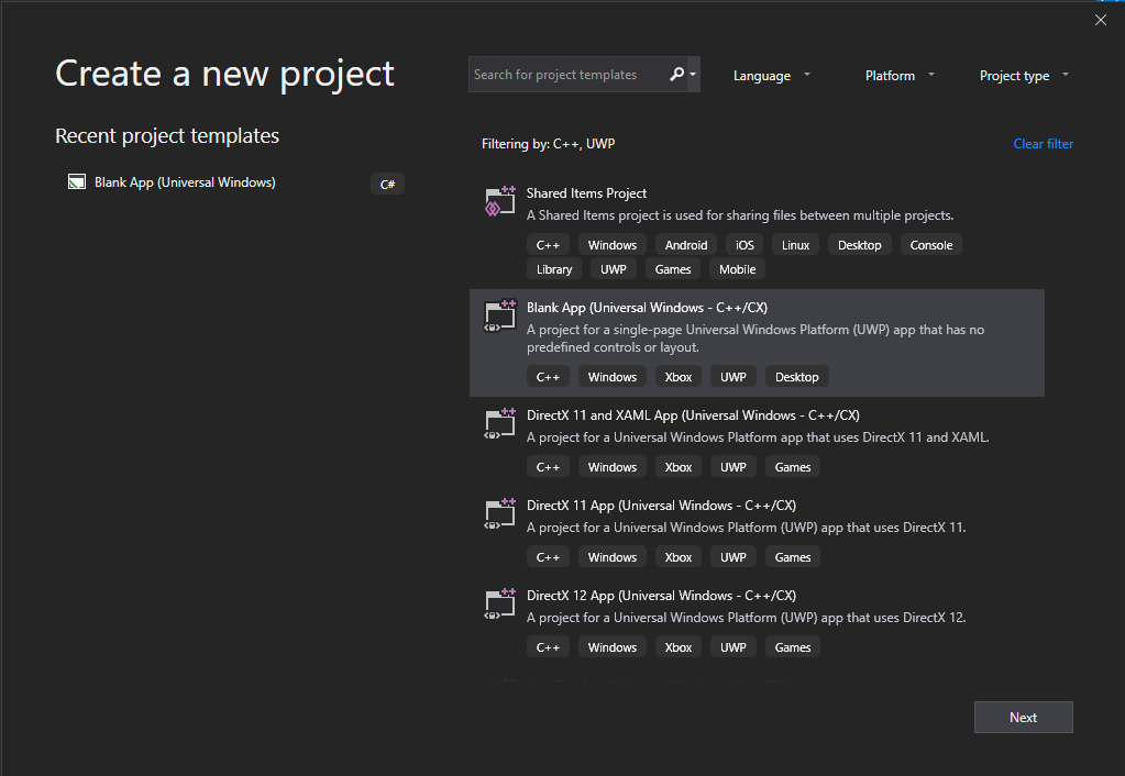
Wybierz pozycję Dalej, a następnie wprowadź nazwę projektu. Nadamy mu nazwę HelloWorld.
Wybierz przycisk Utwórz.
Uwaga / Notatka
Jeśli używasz programu Visual Studio po raz pierwszy, może zostać wyświetlone okno dialogowe Ustawienia z prośbą o włączenie trybu dewelopera . Tryb dewelopera to specjalne ustawienie, które umożliwia korzystanie z określonych funkcji, takich jak uprawnienia do bezpośredniego uruchamiania aplikacji, a nie tylko ze Sklepu. Aby uzyskać więcej informacji, przeczytaj Włączanie urządzenia na potrzeby programowania. Aby kontynuować pracę z tym przewodnikiem, wybierz tryb dewelopera, kliknij przycisk Taki zamknij okno dialogowe.
Pliki projektu zostały utworzone.
Zanim przejdziemy dalej, przyjrzyjmy się temu, co znajduje się w rozwiązaniu.
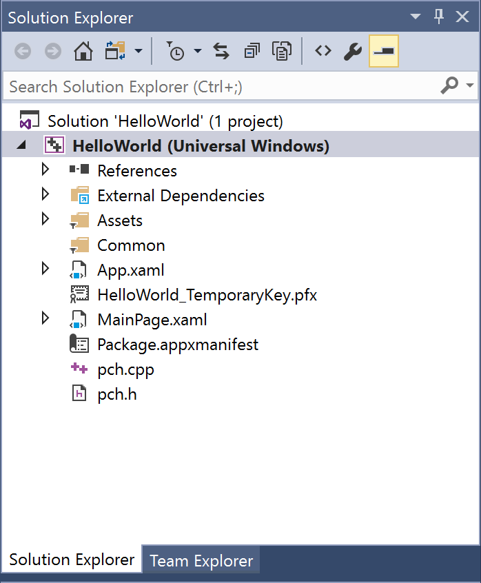
Informacje o plikach projektu
Każdy plik .xaml w folderze projektu ma odpowiadający plik .xaml.h oraz plik .xaml.cpp w tym samym folderze, a także plik .g oraz plik .g.hpp w folderze Pliki Generowane, który znajduje się na dysku, ale nie jest częścią projektu. Zmodyfikujesz pliki XAML, aby utworzyć elementy interfejsu użytkownika i połączyć je ze źródłami danych (DataBinding). Zmodyfikujesz pliki .h i .cpp, aby dodać niestandardową logikę obsługi zdarzeń. Automatycznie generowane pliki reprezentują transformację znaczników XAML do języka C++/CX. Nie modyfikuj tych plików, ale możesz je zbadać, aby lepiej zrozumieć, jak działa kod. Zasadniczo wygenerowany plik zawiera częściową definicję klasy dla elementu głównego XAML; ta klasa jest tą samą klasą, którą można zmodyfikować w plikach *.xaml.h i .cpp. Wygenerowane pliki deklarują elementy podrzędne interfejsu użytkownika XAML jako elementy członkowskie klasy, aby można było odwoływać się do nich w kodzie, który piszesz. Podczas budowania wygenerowany kod i Twój kod są łączone w kompletną definicję klasy, a następnie kompilowane.
Przyjrzyjmy się najpierw plikom projektu.
- App.xaml, App.xaml.h, App.xaml.cpp: Reprezentują obiekt Aplikacji, który jest punktem wejścia aplikacji. Plik App.xaml nie zawiera znaczników interfejsu użytkownika specyficznego dla strony, ale możesz dodać style interfejsu użytkownika i inne elementy, które mają być dostępne z dowolnej strony. Pliki kodu zawierają procedury obsługi zdarzeń OnLaunched i OnSuspending. Zazwyczaj dodasz tutaj kod niestandardowy, aby zainicjować aplikację podczas jej uruchamiania i przeprowadzić oczyszczanie po jego zawieszeniu lub zakończeniu.
- MainPage.xaml, MainPage.xaml.h, MainPage.xaml.cpp: Zawiera znaczniki XAML i kod zaplecza dla domyślnej strony "start" w aplikacji. Nie ma obsługi nawigacji ani wbudowanych kontrolek.
- pch.h, pch.cpp: Wstępnie skompilowany plik nagłówka oraz plik, który go zawiera w twoim projekcie. W pliku pch.h można uwzględnić wszelkie nagłówki, które nie zmieniają się często i są uwzględniane w innych plikach w rozwiązaniu.
- Package.appxmanifest: Plik XML opisujący możliwości urządzenia wymagane przez aplikację oraz informacje o wersji aplikacji i inne metadane. Aby otworzyć ten plik w Manifest Designer, wystarczy kliknąć go dwukrotnie.
- HelloWorld_TemporaryKey.pfx: Klucz umożliwiający wdrożenie aplikacji na tym komputerze z poziomu programu Visual Studio.
Pierwsze spojrzenie na kod
Jeśli zbadasz kod w pliku App.xaml.h, App.xaml.cpp w projekcie udostępnionym, zauważysz, że jest to głównie kod C++, który wygląda znajomo. Jednak niektóre elementy składni mogą nie być tak znane, jeśli dopiero zaczynasz korzystać z aplikacji środowiska Uruchomieniowego systemu Windows lub pracujesz z językiem C++/cli. Poniżej przedstawiono najbardziej typowe elementy składni inne niż standardowe, które są widoczne w języku C++/CX:
klasy referencyjne
Prawie wszystkie klasy środowiska uruchomieniowego systemu Windows, które obejmują wszystkie typy w interfejsie API systemu Windows — kontrolki XAML, strony w aplikacji, samą klasę aplikacji, wszystkie obiekty urządzeń i sieci, wszystkie typy kontenerów — są deklarowane jako klasą ref. (Kilka typów Windows to klasa wartości lub struktura wartości). Klasa ref jest dostępna dla dowolnego języka. W języku C++/CX okres istnienia tych typów podlega automatycznemu zliczaniu odwołań (a nie zbieraniu śmieci), aby nie musieć nigdy jawnie usuwać tych obiektów. Możesz również utworzyć własne klasy referencyjne.
namespace HelloWorld
{
   /// <summary>
   /// An empty page that can be used on its own or navigated to within a Frame.
   /// </summary>
   public ref class MainPage sealed
   {
      public:
      MainPage();
   };
}
Wszystkie typy środowiska uruchomieniowego systemu Windows muszą być zadeklarowane w przestrzeni nazw i w przeciwieństwie do języka ISO C++ same typy mają modyfikator ułatwień dostępu. Modyfikator publiczny public sprawia, że klasa jest widoczna dla składników Windows Runtime poza przestrzenią nazw. Zapiecz ętowany
ref new i ^ (hats)
Należy zadeklarować zmienną typu ref class, używając operatora ^ (hat), i utworzyć instancję obiektu za pomocą słowa kluczowego ref new. Następnie uzyskujesz dostęp do metod wystąpienia obiektu za pomocą operatora -> podobnie jak wskaźnik języka C++. Metody statyczne są dostępne za pomocą operatora :: tak samo jak w języku ISO C++.
W poniższym kodzie używamy w pełni kwalifikowanej nazwy do utworzenia obiektu i używamy operatora -> w celu wywołania metody instancji.
Windows::UI::Xaml::Media::Imaging::BitmapImage^ bitmapImage =
     ref new Windows::UI::Xaml::Media::Imaging::BitmapImage();

bitmapImage->SetSource(fileStream);
Zazwyczaj w pliku .cpp dodalibyśmy dyrektywę using namespace Windows::UI::Xaml::Media::Imaging i słowo kluczowe auto, tak aby ten sam kod wyglądał następująco:
auto bitmapImage = ref new BitmapImage();
bitmapImage->SetSource(fileStream);
Właściwości
Klasa ref może mieć właściwości, które, podobnie jak w językach zarządzanych, są specjalnymi funkcjami składowymi, które są widoczne jako pola w kodzie klienckim.
public ref class SaveStateEventArgs sealed
{
   public:
   // Declare the property
   property Windows::Foundation::Collections::IMap<Platform::String^, Platform::Object^>^ PageState
   {
      Windows::Foundation::Collections::IMap<Platform::String^, Platform::Object^>^ get();
   }
   ...
};

   ...
   // consume the property like a public field
   void PhotoPage::SaveState(Object^ sender, Common::SaveStateEventArgs^ e)
   {
      if (mruToken != nullptr && !mruToken->IsEmpty())
   {
      e->PageState->Insert("mruToken", mruToken);
   }
}
Delegaci
Podobnie jak w językach z zarządzaną pamięcią, delegat jest typem referencyjnym, który enkapsuluje funkcję z określonym podpisem. Są one najczęściej używane z zdarzeniami i procedurami obsługi zdarzeń
// Delegate declaration (within namespace scope)
public delegate void LoadStateEventHandler(Platform::Object^ sender, LoadStateEventArgs^ e);

// Event declaration (class scope)
public ref class NavigationHelper sealed
{
   public:
   event LoadStateEventHandler^ LoadState;
};

// Create the event handler in consuming class
MainPage::MainPage()
{
   auto navigationHelper = ref new Common::NavigationHelper(this);
   navigationHelper->LoadState += ref new Common::LoadStateEventHandler(this, &MainPage::LoadState);
}
Dodawanie zawartości do aplikacji
Dodajmy zawartość do aplikacji.
Krok 1. Modyfikowanie strony początkowej
W eksploratorze rozwiązań otwórz plik MainPage.xaml.
Utwórz elementy sterujące dla interfejsu użytkownika, dodając następujący kod XAML do głównej siatki Gridbezpośrednio przed jego tagiem zamykającym. Zawiera on
StackPanel, który zawiera TextBlock TextBox Button TextBlock .<StackPanel x:Name="contentPanel" Margin="120,30,0,0"> <TextBlock HorizontalAlignment="Left" Text="Hello World" FontSize="36"/> <TextBlock Text="What's your name?"/> <StackPanel x:Name="inputPanel" Orientation="Horizontal" Margin="0,20,0,20"> <TextBox x:Name="nameInput" Width="300" HorizontalAlignment="Left"/> <Button x:Name="inputButton" Content="Say "Hello""/> </StackPanel> <TextBlock x:Name="greetingOutput"/> </StackPanel>W tym momencie utworzono bardzo podstawową aplikację uniwersalną systemu Windows. Aby zobaczyć, jak wygląda aplikacja platformy UWP, naciśnij F5, aby skompilować, wdrożyć i uruchomić aplikację w trybie debugowania.
Domyślny ekran powitalny jest wyświetlany jako pierwszy. Ma obraz (zasoby\SplashScreen.scale-100.png) i kolor tła określony w pliku manifestu aplikacji. Aby dowiedzieć się, jak dostosować ekran powitalny, zobacz Dodawanie ekranu powitalnego.
Gdy ekran powitalny zniknie, zostanie wyświetlona aplikacja. Zostanie wyświetlona strona główna aplikacji.
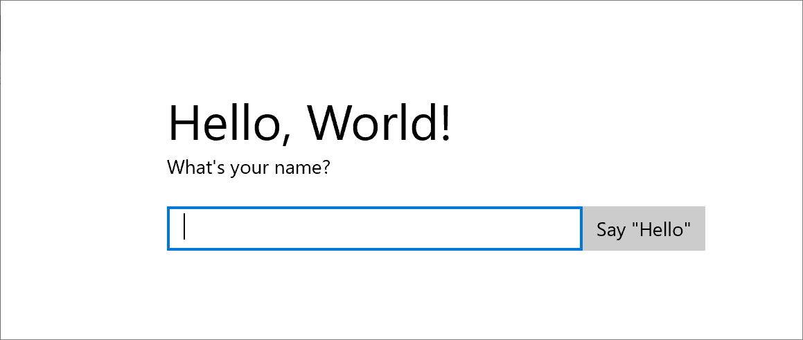
Nie robi to zbyt wiele — ale gratulacje, utworzono pierwszą aplikację platformy uniwersalnej systemu Windows!
Aby zatrzymać debugowanie i zamknąć aplikację, wróć do programu Visual Studio i naciśnij Shift+F5.
Aby uzyskać więcej informacji, zobacz Uruchamianie aplikacji ze sklepu w programie Visual Studio.
W aplikacji możesz wpisać tekst w polu tekstowym, ale kliknięcie przycisku nic nie robi. W kolejnych krokach utworzysz procedurę obsługi zdarzenia Kliknij przycisku , która wyświetla powitanie spersonalizowane dla użytkownika.
Krok 2. Tworzenie procedury obsługi zdarzeń
W pliku MainPage.xaml w widoku XAML lub widoku projektu wybierz przycisk "Say Hello" Przycisk w StackPanel dodanym wcześniej.
Otwórz okno właściwości , naciskając F4, a następnie wybierz przycisk Zdarzenia (
 ).
).Znajdź zdarzenie Kliknij. W polu tekstowym wpisz nazwę funkcji obsługującej zdarzenie Click. W tym przykładzie wpisz "Button_Click".
okno właściwości
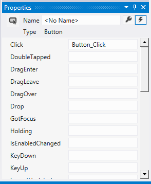
Naciśnij Enter. Metoda obsługi zdarzeń jest tworzona w MainPage.xaml.cpp i otwierana, aby można było dodać kod wykonywany w momencie wystąpienia zdarzenia.
Jednocześnie w pliku MainPage.xaml kod XAML dla przycisku jest aktualizowany w celu zadeklarowania programu obsługi zdarzeń Click w następujący sposób:
<Button Content="Say "Hello"" Click="Button_Click"/>
Możesz także po prostu dodać ten fragment do kodu XAML ręcznie, co może się przydać, jeśli projektant nie zostanie załadowany. Jeśli wpiszesz to ręcznie, wpisz "Click", a następnie pozwól, aby IntelliSense pokazało opcję dodania nowej procedury obsługi zdarzeń. W ten sposób program Visual Studio tworzy niezbędną deklarację metody i szablon.
Nie można załadować projektanta, jeśli podczas renderowania wystąpi nieobsługiwany wyjątek. Renderowanie w projektancie obejmuje uruchomienie wersji projektowej widoku. Może być przydatne wyłączenie uruchomionego kodu użytkownika. Można to zrobić, zmieniając ustawienie w oknie dialogowym narzędzia , Opcje. W obszarze projektanta XAMLusuń zaznaczenie Uruchom kod projektu w projektancie XAML (jeśli jest obsługiwany).
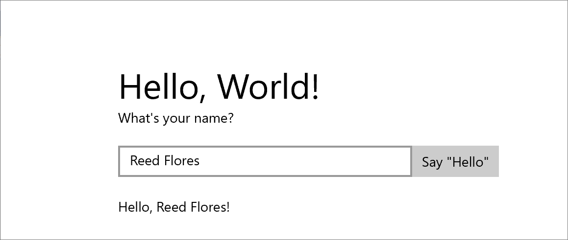
- W pliku MainPage.xaml.cpp dodaj następujący kod do właśnie utworzonej procedury obsługi zdarzenia Button_Click. Ten kod pobiera nazwę użytkownika z kontrolki
nameInputTextBox i używa jej do utworzenia powitania.greetingOutputTextBlock wyświetla wynik.
void HelloWorld::MainPage::Button_Click(Platform::Object^ sender, Windows::UI::Xaml::RoutedEventArgs^ e)
{
    greetingOutput->Text = "Hello, " + nameInput->Text + "!";
}
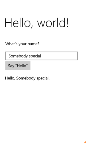
- Ustaw projekt jako uruchomienie, a następnie naciśnij F5, aby skompilować i uruchomić aplikację. Po wpisaniu nazwy w polu tekstowym i kliknięciu przycisku aplikacja wyświetli spersonalizowane powitanie.
ekran aplikacji 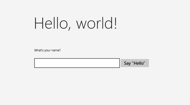
Krok 3. Styl strony początkowej
Wybieranie motywu
Łatwo dostosować wygląd i działanie aplikacji. Domyślnie aplikacja używa zasobów, które mają jasny styl. Zasoby systemowe zawierają również jasny motyw. Wypróbujmy to i zobaczmy, jak wygląda.
Aby przełączyć się do motywu ciemnego
Otwórz plik App.xaml.
W otwierającym tagu aplikacji , edytuj właściwość RequestedTheme i ustaw jej wartość na Dark:
RequestedTheme="Dark"Oto pełny tag Application z motywem ciemnym:
<Application
x:Class="HelloWorld.App"
xmlns="http://schemas.microsoft.com/winfx/2006/xaml/presentation"
xmlns:x="http://schemas.microsoft.com/winfx/2006/xaml"
xmlns:local="using:HelloWorld"
RequestedTheme="Dark">
Naciśnij F5, aby skompilować i uruchomić go. Zwróć uwagę, że używa motywu ciemnego.
ekran aplikacji
Którego motywu należy użyć? Którykolwiek chcesz. Oto nasze elementy: w przypadku aplikacji, które najczęściej wyświetlają obrazy lub wideo, zalecamy motyw ciemny; w przypadku aplikacji zawierających dużo tekstu zalecamy motyw jasny. Jeśli używasz niestandardowego schematu kolorów, użyj motywu, który najlepiej pasuje do wyglądu i działania aplikacji. W pozostałej części tego samouczka używamy motywu Light na zrzutach ekranu.
Uwaga Motyw jest stosowany po uruchomieniu aplikacji i nie można go zmienić podczas działania aplikacji.
Używanie stylów systemowych
W tej chwili w aplikacji systemu Windows tekst jest bardzo mały i trudny do odczytania. Naprawmy to, stosując styl systemowy.
Aby zmienić styl elementu
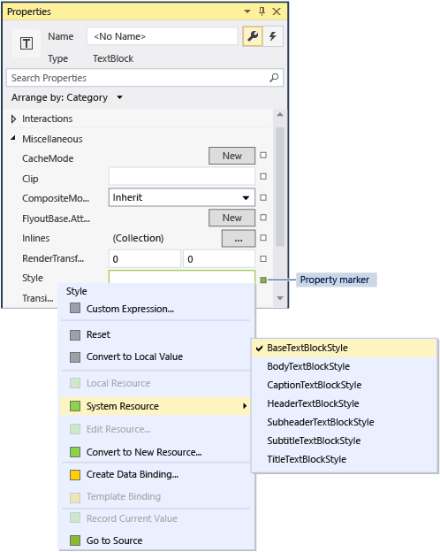
W projekcie systemu Windows otwórz plik MainPage.xaml.
W widoku XAML lub widoku projektu wybierz pozycję "Jak się nazywasz?"TextBlock, które dodałeś wcześniej.
W oknie Właściwości (F4) wybierz przycisk Właściwości (
 ) w prawym górnym rogu.
Rozwiń grupę Tekst i ustaw rozmiar czcionki na 18 pikseli.
Rozwiń grupę Różne i znajdź właściwość Styl.
Kliknij znacznik właściwości (zielone pole po prawej stronie właściwości Style), a następnie w menu wybierz pozycję Zasób systemu>BaseTextBlockStyle.
BaseTextBlockStyle to zasób zdefiniowany w ResourceDictionary w <głównym>\Program Files\Windows Kits\10\Include\winrt\xaml\design\generic.xaml.
okno właściwości
Na powierzchni projektowej XAML zmienia się wygląd tekstu. W edytorze XAML kod XAML dla TextBlock jest aktualizowany:
<TextBlock Text="What's your name?" Style="{ThemeResource BaseTextBlockStyle}"/>
Powtórz proces, aby ustawić rozmiar czcionki i przypisać BaseTextBlockStyle do elementu
greetingOutputTextBlock.Porada Chociaż w tym TextBlocknie ma tekstu, to po najechaniu wskaźnikiem na powierzchnię projektową XAML niebieski kontur pokazuje, gdzie się znajduje, aby można go było wybrać.
Kod XAML wygląda teraz następująco:
<StackPanel x:Name="contentPanel" Margin="120,30,0,0">
<TextBlock Style="{ThemeResource BaseTextBlockStyle}" FontSize="18" Text="What's your name?"/>
<StackPanel x:Name="inputPanel" Orientation="Horizontal" Margin="0,20,0,20">
<TextBox x:Name="nameInput" Width="300" HorizontalAlignment="Left"/>
<Button x:Name="inputButton" Content="Say "Hello"" Click="Button_Click"/>
</StackPanel>
<TextBlock Style="{ThemeResource BaseTextBlockStyle}" FontSize="18" x:Name="greetingOutput"/>
</StackPanel>
- Naciśnij F5, aby skompilować i uruchomić aplikację. Teraz wygląda następująco:
ekran aplikacji 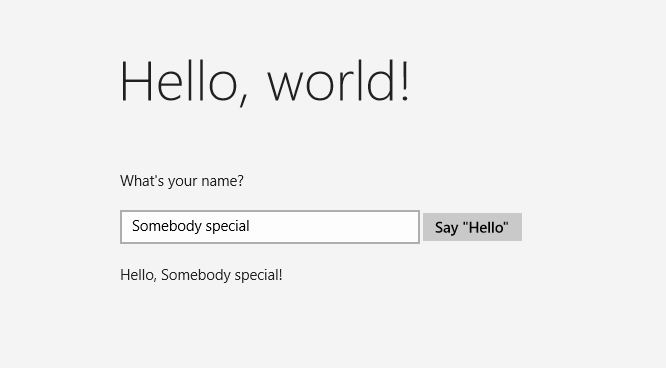
Krok 4. Dostosowanie interfejsu użytkownika do różnych rozmiarów okien
Teraz dostosujemy interfejs użytkownika do różnych rozmiarów ekranu, aby wyglądał dobrze na urządzeniach przenośnych. W tym celu należy dodać VisualStateManager i ustawić właściwości, które są stosowane dla różnych stanów wizualizacji.
Aby dostosować układ interfejsu użytkownika
- W edytorze XAML dodaj ten blok XAML po otwierającym tagu elementu Grid root.
<VisualStateManager.VisualStateGroups>
    <VisualStateGroup>
        <VisualState x:Name="wideState">
            <VisualState.StateTriggers>
                <AdaptiveTrigger MinWindowWidth="641" />
            </VisualState.StateTriggers>
        </VisualState>
        <VisualState x:Name="narrowState">
            <VisualState.StateTriggers>
                <AdaptiveTrigger MinWindowWidth="0" />
            </VisualState.StateTriggers>
            <VisualState.Setters>
                <Setter Target="contentPanel.Margin" Value="20,30,0,0"/>
                <Setter Target="inputPanel.Orientation" Value="Vertical"/>
                <Setter Target="inputButton.Margin" Value="0,4,0,0"/>
            </VisualState.Setters>
        </VisualState>
    </VisualStateGroup>
</VisualStateManager.VisualStateGroups>
- Debugowanie aplikacji na komputerze lokalnym. Zwróć uwagę, że interfejs użytkownika wygląda tak samo jak poprzednio, chyba że okno zostanie węższe niż 641 pikseli niezależnych od urządzenia (DIPs).
- Debugowanie aplikacji w emulatorze urządzenia przenośnego. Zwróć uwagę, że interfejs użytkownika używa właściwości zdefiniowanych w
narrowStatei jest wyświetlany poprawnie na małym ekranie.
Jeśli w poprzednich wersjach języka XAML użyto VisualStateManager, możesz zauważyć, że w tym miejscu kod XAML używa uproszczonej składni.
VisualState o nazwie wideState ma AdaptiveTrigger z właściwością MinWindowWidth ustawioną na 641. Oznacza to, że stan ma być stosowany tylko wtedy, gdy szerokość okna nie jest mniejsza niż minimalna 641 DIPs. Nie definiujesz żadnych obiektów Setter dla tego stanu, dlatego używa właściwości układu zdefiniowanych w języku XAML dla zawartości strony.
Drugi VisualState, narrowState, ma AdaptiveTrigger z właściwością MinWindowWidth ustawioną na 0. Ten stan jest stosowany, gdy szerokość okna jest większa niż 0, ale mniej niż 641 DIPs. (Przy 641 DIPs jest stosowany wideState). W tym stanie zdefiniujesz niektóre obiekty Setter, aby zmienić właściwości układu kontrolek w interfejsie użytkownika:
- Lewy margines elementu
contentPanelmożna zmniejszyć z zakresu od 120 do 20. - Zmieniasz orientacji
elementu z Pozioma naPionowa . - Do elementu
inputButtondodaj górny margines o wartości 4 DIP.
Podsumowanie
Gratulacje, udało Ci się ukończyć pierwszy samouczek! Nauczyliśmy się, jak dodawać zawartość do aplikacji uniwersalnych systemu Windows, jak dodawać do nich interakcyjność i jak zmieniać wygląd.
Dalsze kroki
Jeśli masz projekt aplikacji uniwersalnej systemu Windows przeznaczony dla systemu Windows 8.1 i/lub Windows Phone 8.1, możesz przeprowadzić jego przenoszenie do systemu Windows 10 lub Windows 11. Nie ma w tym celu żadnego procesu automatycznego, ale można to zrobić ręcznie. Zacznij od nowego projektu uniwersalnego systemu Windows, aby uzyskać najnowszą strukturę systemu projektu i pliki manifestu, skopiować pliki kodu do struktury katalogów projektu, dodać elementy do projektu i ponownie napisać kod XAML przy użyciu VisualStateManager zgodnie ze wskazówkami w tym temacie. Aby uzyskać więcej informacji, zobacz Przenoszenie projektu środowiska uruchomieniowego systemu Windows 8 do projektu platformy uniwersalnej systemu Windows (UWP) i Przenoszenie do platformy uniwersalnej systemu Windows (C++).
Jeśli masz istniejący kod C++, który chcesz zintegrować z aplikacją platformy UNIWERSALNEJ systemu Windows, na przykład w celu utworzenia nowego interfejsu użytkownika platformy UNIWERSALNEJ systemu Windows dla istniejącej aplikacji, zobacz How to: Use existing C++ code in a Universal Windows project.