Windows Presentation Foundation
.NET Framework 的一部分,它提供统一的编程模型,用于在 Windows 上构建业务线桌面应用程序。
119 个问题
' cx='32' cy='32' r='32' /%3E%3Ctext x='50%25' y='55%25' dominant-baseline='middle' text-anchor='middle' fill='%23FFF' %3EHL%3C/text%3E%3C/svg%3E)
你好
我正在寻找一个允许控制表内子表的表控件。请参阅旧 DOS 应用程序的附加屏幕转储,其中可以执行此操作。右边的 3 列都是相同的,但最左边的列对于每个子表都不同。我的问题是是否有人知道可以做到这一点的表控件。
我可以使用现有的表控件,并让面板本身包含一个表控件。但是,当添加新项目时,很难垂直调整子表的大小。
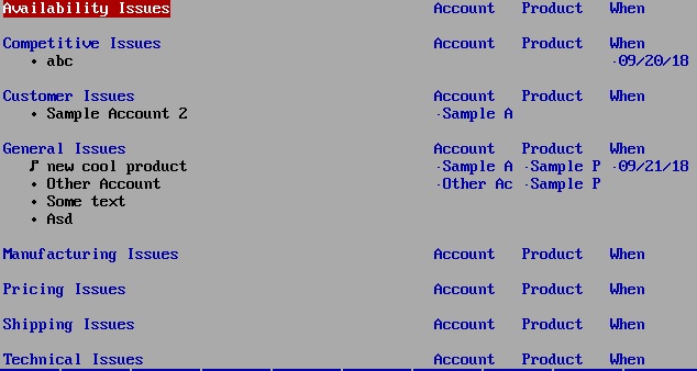
Note:此问题总结整理于:Look for UI table control that allows to define sub-tables
' cx='32' cy='32' r='32' /%3E%3Ctext x='50%25' y='55%25' dominant-baseline='middle' text-anchor='middle' fill='%23FFF' %3EJX%3C/text%3E%3C/svg%3E)
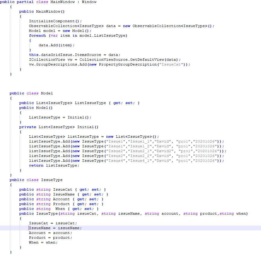
我为您制作了以下示例,如果我误解了您的问题,请检查并告诉我。 xaml 代码为:
 <Window.Resources>
        <Style x:Key="ExpanderStyle" TargetType="{x:Type Expander}">
            <Setter Property="IsExpanded" Value="True"></Setter>
            <Setter Property="Template">
                <Setter.Value>
                    <ControlTemplate TargetType="{x:Type Expander}">
                        <Grid>
                            <Grid.RowDefinitions>
                                <RowDefinition></RowDefinition>
                                <RowDefinition Name="ContentRow" Height="0"></RowDefinition>
                            </Grid.RowDefinitions>
                            <Border Grid.Row="0" Name="border" BorderThickness="0,0,0,0">
                                <WrapPanel>
                                    <ContentPresenter  Margin="20 10 0 10"  VerticalAlignment="Center"  ContentSource="Header"  RecognizesAccessKey="True" />
                                </WrapPanel>
                            </Border>
                            <ContentPresenter Grid.Row="1"></ContentPresenter>
                        </Grid>
                        <ControlTemplate.Triggers>
                            <Trigger Property="IsExpanded" Value="true">
                                <Setter TargetName="ContentRow" Property="Height" Value="{Binding ElementName=Content, Path=DesiredHeight}" />
                            </Trigger>
                            <Trigger Property="IsExpanded" Value="false">
                                <Setter TargetName="border" Property="BorderThickness" Value="0 0 0 1" />
                            </Trigger>
                        </ControlTemplate.Triggers>
                    </ControlTemplate>
                </Setter.Value>
            </Setter>
        </Style>
        <Style x:Key="GroupHeaderStyle" TargetType="{x:Type GroupItem}">
            <Setter Property="Template">
                <Setter.Value>
                    <ControlTemplate TargetType="{x:Type GroupItem}">
                        <Expander IsExpanded="True" Style="{StaticResource ExpanderStyle}">
                            <Expander.Header>
                                <WrapPanel>
                                    <TextBlock Text="{Binding Path=Name}" Width="200" HorizontalAlignment="Left"/>
                                    <TextBlock Text="Account" Width="200"/>
                                    <TextBlock Text="Product" Width="200" />
                                    <TextBlock Text="When"  Width="200" />
                                </WrapPanel>
                            </Expander.Header>
                            <Expander.Content>
                                <ItemsPresenter />
                            </Expander.Content>
                        </Expander>
                    </ControlTemplate>
                </Setter.Value>
            </Setter>
        </Style>

    </Window.Resources>
    <Grid>
        <DataGrid  Name="dataGridIssue"  AutoGenerateColumns="False" RowHeaderWidth="0" HorizontalGridLinesBrush="{x:Null}" VerticalGridLinesBrush="{x:Null}" Background="{x:Null}">
            <DataGrid.GroupStyle>
                <GroupStyle ContainerStyle="{StaticResource GroupHeaderStyle}">
                    <GroupStyle.Panel>
                        <ItemsPanelTemplate>
                            <DataGridRowsPresenter/>
                        </ItemsPanelTemplate>
                    </GroupStyle.Panel>
                </GroupStyle>
            </DataGrid.GroupStyle>
            <DataGrid.Columns>
                <DataGridTextColumn Binding="{Binding Path=IssueName}" Width="200"></DataGridTextColumn>
                <DataGridTextColumn Binding="{Binding Path=Account}" Width="200"></DataGridTextColumn>
                <DataGridTextColumn Binding="{Binding Path=Product}" Width="200"></DataGridTextColumn>
                <DataGridTextColumn Binding="{Binding Path=When}" Width="200"></DataGridTextColumn>
            </DataGrid.Columns>
        </DataGrid>
    </Grid>
cs代码为:
结果图片为: 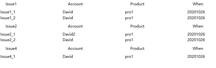
如果答案是正确的,请点击“接受答案”并点赞。 如果您对此答案还有其他疑问,请点击“评论”。
注意:如果您想接收相关电子邮件,请按照我们的文档中的步骤启用电子邮件通知 此线程的通知。