通过 ItemsRepeater 创建使用灵活布局系统、自定义视图和虚拟化的自定义集合体验。
与 ListView 不同,ItemsRepeater 不提供综合性的最终用户体验 - 它没有没有默认 UI,不提供任何围绕焦点、选择或用户交互的策略, 而是一个构建基块,你可以使用它来创建自己的基于集合的独特体验和自定义控件。 虽然它没有内置的策略,但允许你附加策略来构建所需的体验。 例如,你可以定义要使用的布局、键盘操作策略、选择策略等。
在概念上,可以将 ItemsRepeater 视为数据驱动的面板,而不是 ListView 之类的完整控件。 可以指定要显示的数据项的集合、用于为每个数据项生成 UI 元素的项模板,以及用于确定如何设置元素大小和位置的布局。 然后,ItemsRepeater 会根据数据源生成子元素,并按项模板和布局的指定显示它们。 显示的项不需是同类的,因为 ItemsRepeater 可以在加载内容后根据你在数据模板选择器中指定的条件来表示数据项。
这是正确的控件吗?
使用 ItemsRepeater 为数据集合创建自定义显示。 虽然可以使用它来呈现基本的项集,但通常会将它用作自定义控件模板中的显示元素。
如果需要现成的控件来显示列表或网格中的数据,尽量减少自定义,可考虑使用 ListView 或 GridView。
ItemsRepeater 没有内置的项集合。 如果需要直接提供项集合,而不是将其绑定到单独的数据源,则可能需要更多高级策略体验,因此应使用 ListView 或 GridView。
ItemsControl 和 ItemsRepeater 都支持可自定义的集合体验,但 ItemsRepeater 支持虚拟化 UI 布局,而 ItemsControl 则不支持。 建议使用 ItemsRepeater 而不是 ItemsControl,不管是为了直接呈现数据中的一些项,还是为了构建自定义集合控件。
通过 ItemsRepeater 进行滚动
ItemsRepeater 不是派生自控件,因此没有控件模板。 因此,它不包含任何内置的滚动功能,这一点不同于 ListView 或其他集合控件。
使用 ItemsRepeater 时,要提供滚动功能,则应将其包装在 ScrollViewer 控件中。
注意
如果应用会在较早的 Windows 版本(在 Windows 10 版本 1809 之前发行的版本)上运行,则还需将 ScrollViewer 托管在 ItemsRepeaterScrollHost 中。
<muxc:ItemsRepeaterScrollHost>
    <ScrollViewer>
        <muxc:ItemsRepeater ... />
    </ScrollViewer>
</muxc:ItemsRepeaterScrollHost>
如果应用只会在最新的 Windows 10 版本(1809 及更高版本)上运行,则不需使用 ItemsRepeaterScrollHost。
Windows 10 版本 1809 之前的 ScrollViewer 未实现 ItemsRepeater 所需的 IScrollAnchorProvider 接口。 有了 ItemsRepeaterScrollHost,ItemsRepeater 就可以与 ScrollViewer 在较早的版本上配合使用,正确保存用户所查看项的可见位置。 否则,当更改列表中的项或重设应用大小时,这些项在显示时可能会突然移动或消失。
创建 ItemsRepeater
- 重要 API:ItemsRepeater 类、ScrollViewer 类
WinUI 3 库应用包括大多数 WinUI 3 控件、特性和功能的交互式示例。 通过 Microsoft Store 获取应用,或在 GitHub 上获取源代码
要使用 ItemsRepeater,需通过设置 ItemsSource 属性为其提供要显示的数据。 然后,通过设置 ItemTemplate 属性,告知它如何显示项。
项目源
要填充视图,请将 ItemsSource 属性设置为数据项的集合。 此时,直接在代码中将 ItemsSource 设置为集合实例。
ObservableCollection<string> Items = new ObservableCollection<string>();

ItemsRepeater itemsRepeater1 = new ItemsRepeater();
itemsRepeater1.ItemsSource = Items;
还可以将 ItemsSource 属性绑定到 XAML 中的集合。 有关数据绑定的详细信息,请参阅数据绑定概述。
<ItemsRepeater ItemsSource="{x:Bind Items}"/>
项目模板
要指定数据项的可视化方式,请将 ItemTemplate 属性设置为已定义的 DataTemplate 或 DataTemplateSelector。 数据模板定义数据的可视化方式。 默认情况下,项显示在视图中,其 TextBlock 使用数据对象的字符串表现形式。
但是,你通常会希望更丰富地呈现自己的数据,因此需使用一个模板来定义一个或多个控件的布局和外观,以便使用控件来显示单个项。 可以将在模板中使用的控件绑定到数据对象的属性,或者以内联方式定义其静态内容。
数据模板
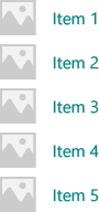
在此示例中,数据对象是简单的字符串。 DataTemplate 包含一个位于文本左侧的图像,并通过设置 TextBlock 的样式以青色显示字符串。
注意
在 DataTemplate 中使用 x:Bind 标记扩展时,必须指定 DataTemplate 中的 DataType (x:DataType)。
<DataTemplate x:DataType="x:String">
    <Grid>
        <Grid.ColumnDefinitions>
            <ColumnDefinition Width="47"/>
            <ColumnDefinition/>
        </Grid.ColumnDefinitions>
        <Image Source="Assets/placeholder.png" Width="32" Height="32"
               HorizontalAlignment="Left"/>
        <TextBlock Text="{x:Bind}" Foreground="Teal"
                   FontSize="15" Grid.Column="1"/>
    </Grid>
</DataTemplate>
下面是项在使用此 DataTemplate 显示时的外观。
如果视图显示大量的项,则 DataTemplate 中用于项的元素数可能会对性能产生重大影响。 关于如何使用 DataTemplate 定义列表中项的外观,请参阅项容器和模板以获取详细信息和示例。
提示
在需要以内联方式声明模板而不是将其作为静态资源引用时,为了方便起见,可将 DataTemplate 或 DataTemplateSelector 指定为 ItemsRepeater 的直接子项。 系统会将它作为 ItemTemplate 属性的值分配。 例如,下面的代码是有效的:
<ItemsRepeater ItemsSource="{x:Bind Items}">
    <DataTemplate>
        <!-- ... -->
    </DataTemplate>
</ItemsRepeater>
提示
与 ListView 和其他集合控件不同,ItemsRepeater 不将 DataTemplate 中的元素与其他包含默认策略(例如边距、填充、选择视觉对象或基于视觉状态的指针)的项容器包装在一起。 ItemsRepeater 只呈现 DataTemplate 中定义的内容。 如果希望项的外观与列表视图项的外观相同,则可在数据模板中显式包括一个容器,例如 ListViewItem。 ItemsRepeater 会显示 ListViewItem 视觉对象,但不自动使用其他功能,例如不使用所选内容,也不显示多选复选框。
类似地,如果数据集合是一系列实际控件,例如按钮 (List<Button>),则可将 ContentPresenter 置于 DataTemplate 中来显示该控件。
数据模板选择器
在视图中显示的项不需是同一类型。 可以提供带 DataTemplateSelector 的 ItemTemplate 属性,以便根据指定条件选择不同的 DataTemplate。
以下示例假定 DataTemplateSelector 已经定义,可用于选择不同的 DataTemplate 来表示“大型”项和“小型”项。
<ItemsRepeater ...>
    <ItemsRepeater.ItemTemplate>
        <local:VariableSizeTemplateSelector Large="{StaticResource LargeItemTemplate}"
                                            Small="{StaticResource SmallItemTemplate}"/>
    </ItemsRepeater.ItemTemplate>
</ItemsRepeater>
定义与 ItemsRepeater 配合使用的 DataTemplateSelector 时,只需实现 SelectTemplateCore(Object) 方法的重写即可。 有关详细信息和示例,请参阅 DataTemplateSelector。
注意
要替代 DataTemplate 在更高级方案中管理元素创建方式,一个方法是实现你自己的 IElementFactory,将其用作 ItemTemplate。 它将负责按请求生成内容。
配置数据源
使用 ItemsSource 属性指定用于生成项内容的集合。 可以将 ItemsSource 设置为任何用于实现 IEnumerable 的类型。 通过数据源实现的其他集合接口决定了可供 ItemsRepeater 用来与数据交互的具体功能。
以下列表显示了可用的接口,以及何时可以考虑使用这其中的每个接口。
IEnumerable(.NET)/IIterable
可以用于小型静态数据集。
数据源至少必须实现 IEnumerable/IIterable 接口。 如果只支持此接口,则控件会循环访问所有内容一次,以便创建一个可以用来通过索引值访问项的副本。
IReadonlyList(.NET)/IVectorView
可以用于静态只读数据集。
允许控件按索引访问项,避免冗余的内部副本。
-
可以用于静态数据集。
允许控件按索引访问项,避免冗余的内部副本。
警告:在不实现 INotifyCollectionChanged 的情况下对列表/矢量进行的更改不会反映在 UI 中。
INotifyCollectionChanged(.NET)
要支持更改通知,建议使用此接口。
使控件能够观察并响应数据源中的更改并将这些更改反映在 UI 中。
-
支持更改通知
与 INotifyCollectionChanged 接口一样,此接口使控件能够观察并响应数据源中的更改。
警告:Windows.Foundation.IObservableVector<T> 不支持“移动”操作。 这可能会导致项的 UI 失去其视觉状态。 例如,某个项当前处于选中状态并且/或者有焦点,当通过“删除”和“添加”操作对其进行移动时,该项会失去焦点,不再处于选中状态。
Platform.Collections.Vector<T> 使用 IObservableVector<T> 并具有这种相同的限制。 如果需要支持“移动”操作,则请使用 INotifyCollectionChanged 接口。 .NET ObservableCollection<T> 类使用 INotifyCollectionChanged。
-
当唯一标识符可以与每个项关联时使用。 将“重置”用作集合更改操作时,建议使用此接口。
使控件在 INotifyCollectionChanged 或 IObservableVector 事件过程中收到硬性“重置”操作后能够极高效地恢复现有 UI。 在收到重置后,控件会使用提供的唯一 ID 将当前数据与其已创建的元素相关联。 如果没有用于索引映射的键,控件将不得不假定:它在根据数据创建 UI 时需要从头开始。
上面列出的接口(除 IKeyIndexMapping 外)在 ItemsRepeater 中提供的行为与其在 ListView 和 GridView 中提供的行为相同。
ItemsSource 上的以下接口可以在 ListView 和 GridView 控件中实现特殊功能,但目前对 ItemsRepeater 无效:
提示
我们很期待你的反馈! 请告诉我们你对 WinUI GitHub 项目的想法。 请考虑添加对现有建议(如 #374)的想法:为 ItemsRepeater 添加增量加载支持。
要在用户执行上下滚动操作时以增量方式加载数据,一种替代方法是观察 ScrollViewer 的视区的位置,在视区将要超出范围时加载更多的数据。
<ScrollViewer ViewChanged="ScrollViewer_ViewChanged">
    <ItemsRepeater ItemsSource="{x:Bind MyItemsSource}" .../>
</ScrollViewer>
private async void ScrollViewer_ViewChanged(object sender, ScrollViewerViewChangedEventArgs e)
{
    if (!e.IsIntermediate)
    {
        var scroller = (ScrollViewer)sender;
        var distanceToEnd = scroller.ExtentHeight - (scroller.VerticalOffset + scroller.ViewportHeight);

        // trigger if within 2 viewports of the end
        if (distanceToEnd <= 2.0 * scroller.ViewportHeight
                && MyItemsSource.HasMore && !itemsSource.Busy)
        {
            // show an indeterminate progress UI
            myLoadingIndicator.Visibility = Visibility.Visible;

            await MyItemsSource.LoadMoreItemsAsync(/*DataFetchSize*/);

            loadingIndicator.Visibility = Visibility.Collapsed;
        }
    }
}
更改项的布局
ItemsRepeater 所显示的项由 Layout 对象进行排列,该对象可以管理其子元素的大小和位置设置。 与 ItemsRepeater 配合使用时,Layout 对象支持 UI 虚拟化。 提供的布局为 StackLayout 和 UniformGridLayout。 默认情况下,ItemsRepeater 使用垂直方向的 StackLayout。
堆栈布局
StackLayout 可以将元素按水平或垂直方向排列到单行中。
可以通过设置 Spacing 属性来调整项之间的空间大小。 间距会应用到布局的 Orientation 属性所指定的方向。
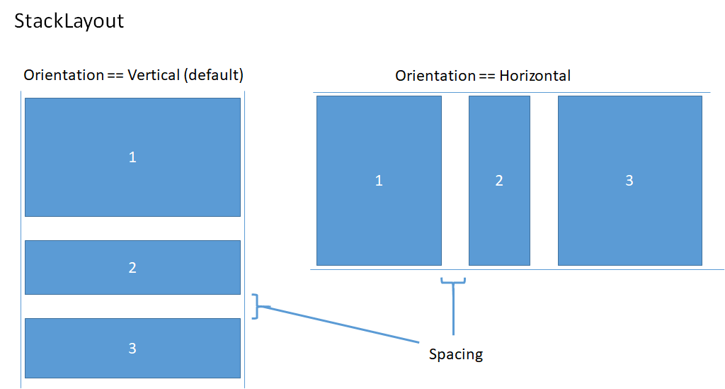
以下示例演示如何将 ItemsRepeater.Layout 属性设置为采用水平方向且间距为 8 个像素的 StackLayout。
<!-- xmlns:muxc="using:Microsoft.UI.Xaml.Controls" -->
<muxc:ItemsRepeater ItemsSource="{x:Bind Items}" ItemTemplate="{StaticResource MyTemplate}">
    <muxc:ItemsRepeater.Layout>
        <muxc:StackLayout Orientation="Horizontal" Spacing="8"/>
    </muxc:ItemsRepeater.Layout>
</muxc:ItemsRepeater>
UniformGridLayout
UniformGridLayout 将元素以换行布局按顺序放置。 当 Orientation 为 Horizontal 时,项按从左到右的顺序布局;当 Orientation 为 Vertical 时,项按从上到下的顺序布局。 每个项的大小设置相同。
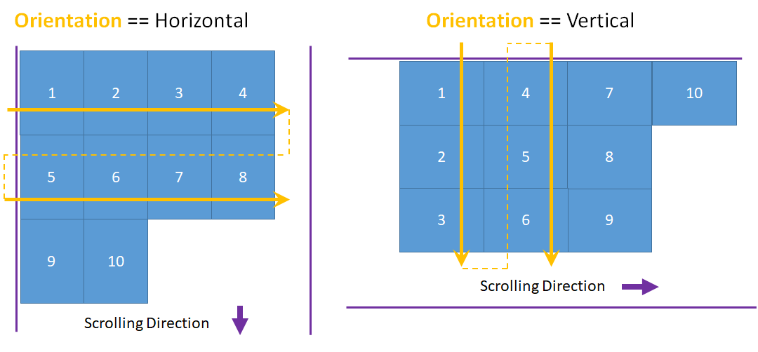
水平布局时,每行的项数受项的最小宽度影响。 垂直布局时,每列的项数受项的最小高度影响。
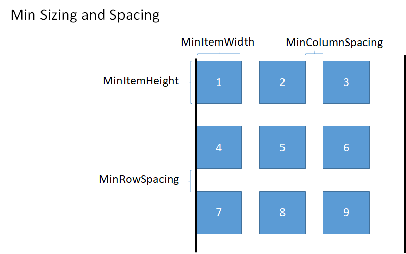
- 可以通过设置 MinItemHeight 和 MinItemWidth 属性,显式提供要使用的最小大小。
- 如果不指定最小大小,系统会将测得的第一个项的大小视为每个项的最小大小。
也可通过设置 MinColumnSpacing 和 MinRowSpacing 属性来设置布局时行和列之间的最小间距。
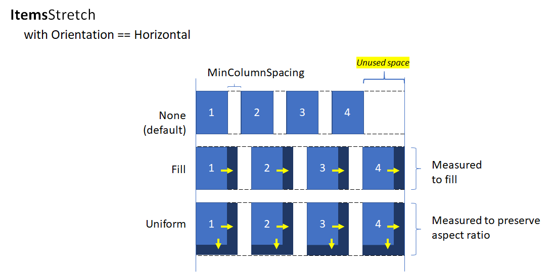
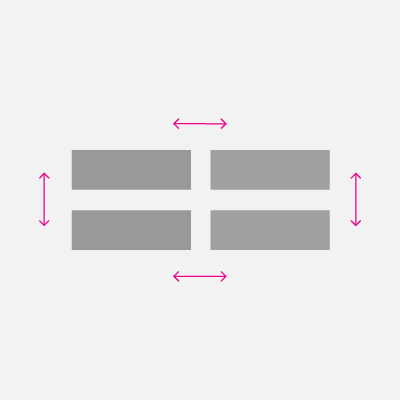
根据项的最小大小和间距确定行或列中的项数以后,在行或列最后一项的后面可能还留有未使用的空间(如前图所示)。 可以指定是忽略额外的空间、使用额外的空间来增加每个项的大小,还是使用额外空间来增加项的间距。 这可以通过 ItemsStretch 和 ItemsJustification 属性来控制。
可以设置 ItemsStretch 属性,以便指定如何增加项大小来填充未使用的空间。
以下列表显示了可用值。 这些定义假定默认的 Orientation 为 Horizontal。
- 注意:行末尾的额外空间保留不用。 这是默认情况。
- 填充:增加项的宽度,直至用完可用空间(如果为垂直方向的布局,则增加项的高度)。
- 统一:按纵横比增加项的宽度和高度,直至用完可用空间(如果为垂直方向的布局,则高度和宽度互换)。
下图显示水平布局中 ItemsStretch 值的效果。
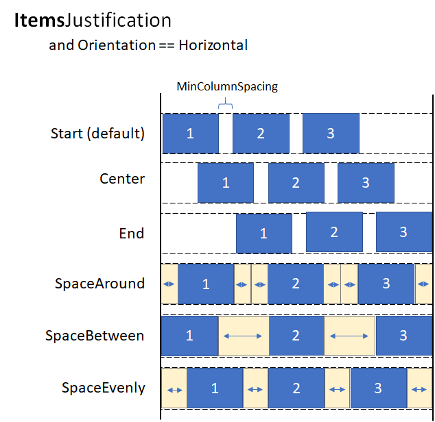
当 ItemsStretch 为 None 时,可以设置 ItemsJustification 属性,指定如何使用额外的空间来对齐项。
以下列表显示了可用值。 这些定义假定默认的 Orientation 为 Horizontal。
- 开始:项与行开头对齐。 行末尾的额外空间保留不用。 这是默认情况。
- 中心:项在行中心对齐。 额外空间在行的开头和末尾均匀分布。
- 结束:项与行末尾对齐。 行开头的额外空间保留不用。
- SpaceAround:项均匀分布。 在每个项的前面和后面添加的空间大小相同。
- SpaceBetween:项均匀分布。 在每个项之间添加的空间大小相同。 不在行的开头和末尾添加空间。
- SpaceEvenly:项均匀分布,在每个项之间以及行的开头和末尾留有相同大小的空间。
下图显示垂直布局中 ItemsStretch 值的效果(适用于列而非行)。
提示
ItemsStretch 属性影响布局的度量传递。 ItemsJustification 属性影响布局的排列传递。
以下示例演示如何将 ItemsRepeater.Layout 属性设置为 UniformGridLayout。
<!-- xmlns:muxc="using:Microsoft.UI.Xaml.Controls" -->
<muxc:ItemsRepeater ItemsSource="{x:Bind Items}"
                    ItemTemplate="{StaticResource MyTemplate}">
    <muxc:ItemsRepeater.Layout>
        <muxc:UniformGridLayout MinItemWidth="200"
                                MinColumnSpacing="28"
                                ItemsJustification="SpaceAround"/>
    </muxc:ItemsRepeater.Layout>
</muxc:ItemsRepeater>
生命周期事件
在 ItemsRepeater 中托管项时,可能需要在显示或停止显示某个项时采取某项操作,例如启动对某项内容的异步下载,将元素与某项用于跟踪选择情况的机制相关联,或者停止某个后台任务。
在虚拟化控件中,不能依赖于“已加载”/“已卸载”事件,因为元素在进行回收时可能未从实时可视化树中删除。 系统会改为提供其他事件来管理元素的生命周期。 下图显示某个元素在 ItemsRepeater 中的生命周期,以及何时会引发相关事件。
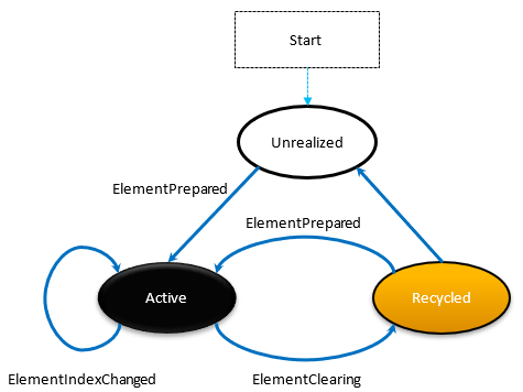
- 每当一个元素做好使用准备时,就会发生 ElementPrepared。 新创建的元素以及正通过回收队列反复使用的现有元素都是如此。
- 每次将一个元素发送到回收队列时,就会立即发生 ElementClearing,例如,当元素超出已实现项的范围时就是如此。
- 每个已实现的 UIElement(其中,它所代表的项的索引已更改)都会发生 ElementIndexChanged。 例如,在数据源中添加或删除另一个项时,在顺序上属于后到的项的索引会收到该事件。
以下示例演示如何使用这些事件来附加自定义选择服务,以便在使用 ItemsRepeater 来显示项的自定义控件中跟踪项的选择情况。
<!-- xmlns:muxc="using:Microsoft.UI.Xaml.Controls" -->
<UserControl ...>
    ...
    <ScrollViewer>
        <muxc:ItemsRepeater ItemsSource="{x:Bind Items}"
                            ItemTemplate="{StaticResource MyTemplate}"
                            ElementPrepared="OnElementPrepared"
                            ElementIndexChanged="OnElementIndexChanged"
                            ElementClearing="OnElementClearing">
        </muxc:ItemsRepeater>
    </ScrollViewer>
    ...
</UserControl>
interface ISelectable
{
    int SelectionIndex { get; set; }
    void UnregisterSelectionModel(SelectionModel selectionModel);
    void RegisterSelectionModel(SelectionModel selectionModel);
}

private void OnElementPrepared(ItemsRepeater sender, ElementPreparedEventArgs args)
{
    var selectable = args.Element as ISelectable;
    if (selectable != null)
    {
        // Wire up this item to recognize a 'select' and listen for programmatic
        // changes to the selection model to know when to update its visual state.
        selectable.SelectionIndex = args.Index;
        selectable.RegisterSelectionModel(this.SelectionModel);
    }
}

private void OnElementIndexChanged(ItemsRepeater sender, ElementIndexChangedEventArgs args)
{
    var selectable = args.Element as ISelectable;
    if (selectable != null)
    {
        // Sync the ID we use to notify the selection model when the item
        // we represent has changed location in the data source.
        selectable.SelectionIndex = args.NewIndex;
    }
}

private void OnElementClearing(ItemsRepeater sender, ElementClearingEventArgs args)
{
    var selectable = args.Element as ISelectable;
    if (selectable != null)
    {
        // Disconnect handlers to recognize a 'select' and stop
        // listening for programmatic changes to the selection model.
        selectable.UnregisterSelectionModel(this.SelectionModel);
        selectable.SelectionIndex = -1;
    }
}
数据的排序、筛选和重置
传统上,在执行数据集筛选或排序等操作时,可能会将上一数据集与新数据进行比较,然后通过 INotifyCollectionChanged 发出细化的更改通知。 但是,通常情况下,彻底将旧数据替换为新数据并改用重置操作来触发集合更改通知会更容易。
通常情况下,重置会导致控件释放现有子元素并重新开始,从头在滚动位置 0 构建 UI,因为控件不了解数据在重置过程中的具体变化。
但是,如果作为 ItemsSource 分配的集合以实现 IKeyIndexMapping 接口的方式支持唯一标识符,则 ItemsRepeater 可以快速标识以下内容:
- 对于重置前后已存在的数据来说可重用的 UIElement
- 以前可见但已删除的项
- 添加的将可见的新项
这样可以让 ItemsRepeater 避免从滚动位置 0 重新开始。 另外还可以让它在重置时针对没有更改的数据快速还原 UIElements,从而提高性能。
以下示例演示如何在某个垂直堆栈中显示项的列表。在该堆栈中,MyItemsSource 是一个用于包装项的基础列表的自定义数据源。 它公开一个 Data 属性,该属性可以用于重新分配一个将要用作项源的新列表,后者随后触发重置。
<ScrollViewer x:Name="sv">
    <ItemsRepeater x:Name="repeater"
                ItemsSource="{x:Bind MyItemsSource}"
                ItemTemplate="{StaticResource MyTemplate}">
       <ItemsRepeater.Layout>
           <StackLayout ItemSpacing="8"/>
       </ItemsRepeater.Layout>
   </ItemsRepeater>
</ScrollViewer>
public MainPage()
{
    this.InitializeComponent();

    // Similar to an ItemsControl, a developer sets the ItemsRepeater's ItemsSource.
    // Here we provide our custom source that supports unique IDs which enables
    // ItemsRepeater to be smart about handling resets from the data.
    // Unique IDs also make it easy to do things apply sorting/filtering
    // without impacting any state (i.e. selection).
    MyItemsSource myItemsSource = new MyItemsSource(data);

    repeater.ItemsSource = myItemsSource;

    // ...

    // We can sort/filter the data using whatever mechanism makes the
    // most sense (LINQ, database query, etc.) and then reassign
    // it, which in our implementation triggers a reset.
    myItemsSource.Data = someNewData;
}

// ...


public class MyItemsSource : IReadOnlyList<ItemBase>, IKeyIndexMapping, INotifyCollectionChanged
{
    private IList<ItemBase> _data;

    public MyItemsSource(IEnumerable<ItemBase> data)
    {
        if (data == null) throw new ArgumentNullException();

        this._data = data.ToList();
    }

    public IList<ItemBase> Data
    {
        get { return _data; }
        set
        {
            _data = value;

            // Instead of tossing out existing elements and re-creating them,
            // ItemsRepeater will reuse the existing elements and match them up
            // with the data again.
            this.CollectionChanged?.Invoke(
                this,
                new NotifyCollectionChangedEventArgs(NotifyCollectionChangedAction.Reset));
        }
    }

    #region IReadOnlyList<T>

    public ItemBase this[int index] => this.Data != null
        ? this.Data[index]
        : throw new IndexOutOfRangeException();

    public int Count => this.Data != null ? this.Data.Count : 0;
    public IEnumerator<ItemBase> GetEnumerator() => this.Data.GetEnumerator();
    IEnumerator IEnumerable.GetEnumerator() => this.GetEnumerator();

    #endregion

    #region INotifyCollectionChanged

    public event NotifyCollectionChangedEventHandler CollectionChanged;

    #endregion

    #region IKeyIndexMapping

    private int lastRequestedIndex = IndexNotFound;
    private const int IndexNotFound = -1;

    // When UniqueIDs are supported, the ItemsRepeater caches the unique ID for each item
    // with the matching UIElement that represents the item.  When a reset occurs the
    // ItemsRepeater pairs up the already generated UIElements with items in the data
    // source.
    // ItemsRepeater uses IndexForUniqueId after a reset to probe the data and identify
    // the new index of an item to use as the anchor.  If that item no
    // longer exists in the data source it may try using another cached unique ID until
    // either a match is found or it determines that all the previously visible items
    // no longer exist.
    public int IndexForUniqueId(string uniqueId)
    {
        // We'll try to increase our odds of finding a match sooner by starting from the
        // position that we know was last requested and search forward.
        var start = lastRequestedIndex;
        for (int i = start; i < this.Count; i++)
        {
            if (this[i].PrimaryKey.Equals(uniqueId))
                return i;
        }

        // Then try searching backward.
        start = Math.Min(this.Count - 1, lastRequestedIndex);
        for (int i = start; i >= 0; i--)
        {
            if (this[i].PrimaryKey.Equals(uniqueId))
                return i;
        }

        return IndexNotFound;
    }

    public string UniqueIdForIndex(int index)
    {
        var key = this[index].PrimaryKey;
        lastRequestedIndex = index;
        return key;
    }

    #endregion
}
创建自定义集合控件
可以使用 ItemsRepeater 创建一个自定义集合控件,该控件带有自己的控件类型,可以呈现每个项。
注意
这类似于使用 ItemsControl,但不是从 ItemsControl 派生并将 ItemsPresenter 置于控件模板中,而是从 Control 派生并将 ItemsRepeater 插入控件模板中。 自定义集合控件的“有一个”ItemsRepeater 与“是一个”ItemsControl 的比较。 这意味着,还必须显式选择要公开的属性,而不是选择不支持哪些继承的属性。
以下示例演示如何将 ItemsRepeater 置于名为 MediaCollectionView 的自定义控件的模板中并公开其属性。
<!-- xmlns:muxc="using:Microsoft.UI.Xaml.Controls" -->
<Style TargetType="local:MediaCollectionView">
    <Setter Property="Template">
        <Setter.Value>
            <ControlTemplate TargetType="local:MediaCollectionView">
                <Border
                    Background="{TemplateBinding Background}"
                    BorderBrush="{TemplateBinding BorderBrush}"
                    BorderThickness="{TemplateBinding BorderThickness}">
                    <ScrollViewer x:Name="ScrollViewer">
                        <muxc:ItemsRepeater x:Name="ItemsRepeater"
                                            ItemsSource="{TemplateBinding ItemsSource}"
                                            ItemTemplate="{TemplateBinding ItemTemplate}"
                                            Layout="{TemplateBinding Layout}"
                                            TabFocusNavigation="{TemplateBinding TabFocusNavigation}"/>
                    </ScrollViewer>
                </Border>
            </ControlTemplate>
        </Setter.Value>
    </Setter>
</Style>
public sealed class MediaCollectionView : Control
{
    public object ItemsSource
    {
        get { return (object)GetValue(ItemsSourceProperty); }
        set { SetValue(ItemsSourceProperty, value); }
    }

    // Using a DependencyProperty as the backing store for ItemsSource.  This enables animation, styling, binding, etc...
    public static readonly DependencyProperty ItemsSourceProperty =
        DependencyProperty.Register(nameof(ItemsSource), typeof(object), typeof(MediaCollectionView), new PropertyMetadata(0));

    public DataTemplate ItemTemplate
    {
        get { return (DataTemplate)GetValue(ItemTemplateProperty); }
        set { SetValue(ItemTemplateProperty, value); }
    }

    // Using a DependencyProperty as the backing store for ItemTemplate.  This enables animation, styling, binding, etc...
    public static readonly DependencyProperty ItemTemplateProperty =
        DependencyProperty.Register(nameof(ItemTemplate), typeof(DataTemplate), typeof(MediaCollectionView), new PropertyMetadata(0));

    public Layout Layout
    {
        get { return (Layout)GetValue(LayoutProperty); }
        set { SetValue(LayoutProperty, value); }
    }

    // Using a DependencyProperty as the backing store for Layout.  This enables animation, styling, binding, etc...
    public static readonly DependencyProperty LayoutProperty =
        DependencyProperty.Register(nameof(Layout), typeof(Layout), typeof(MediaCollectionView), new PropertyMetadata(0));

    public MediaCollectionView()
    {
        this.DefaultStyleKey = typeof(MediaCollectionView);
    }
}
显示分组的项
可以将一个 ItemsRepeater 嵌套在另一个 ItemsRepeater 的 ItemTemplate 中,创建嵌套式虚拟化布局。 此框架可以尽量减少对那些不可见的或不靠近当前视区的元素进行不必要的实现,因此可以高效地使用资源。
以下示例演示如何在垂直堆栈中显示分组项的列表。 外部 ItemsRepeater 生成每个组。 在每个组的模板中,另一 ItemsRepeater 生成项。
<!-- xmlns:muxc="using:Microsoft.UI.Xaml.Controls" -->

<Page.Resources>
    <muxc:StackLayout x:Key="MyGroupLayout"/>
    <muxc:StackLayout x:Key="MyItemLayout" Orientation="Horizontal"/>
</Page.Resources>

<ScrollViewer>
  <muxc:ItemsRepeater ItemsSource="{x:Bind AppNotifications}"
                      Layout="{StaticResource MyGroupLayout}">
    <muxc:ItemsRepeater.ItemTemplate>
      <DataTemplate x:DataType="ExampleApp:AppNotifications">
        <!-- Group -->
        <StackPanel>
          <!-- Header -->
          <TextBlock Text="{x:Bind AppTitle}"/>
          <!-- Items -->
          <muxc:ItemsRepeater ItemsSource="{x:Bind Notifications}"
                              Layout="{StaticResource MyItemLayout}"
                              ItemTemplate="{StaticResource MyTemplate}"/>
          <!-- Footer -->
          <Button Content="{x:Bind FooterText}"/>
        </StackPanel>
      </DataTemplate>
    </muxc:ItemsRepeater.ItemTemplate>
  </muxc:ItemsRepeater>
</ScrollViewer>
下图显示了使用以上示例作为指南创建的基本布局。
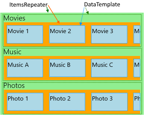
下一示例演示某个应用的布局。该应用的各种类别可以随用户首选项变化,并且以水平滚动列表形式呈现。 此示例的布局也如上图所示。
<!-- xmlns:muxc="using:Microsoft.UI.Xaml.Controls" -->
<!-- Include the <muxc:ItemsRepeaterScrollHost> if targeting Windows 10 versions earlier than 1809. -->
<ScrollViewer>
  <muxc:ItemsRepeater ItemsSource="{x:Bind Categories}"
                      Background="LightGreen">
    <muxc:ItemsRepeater.ItemTemplate>
      <DataTemplate x:DataType="local:Category">
        <StackPanel Margin="12,0">
          <TextBlock Text="{x:Bind Name}" Style="{ThemeResource TitleTextBlockStyle}"/>
          <!-- Include the <muxc:ItemsRepeaterScrollHost> if targeting Windows 10 versions earlier than 1809. -->
          <ScrollViewer HorizontalScrollMode="Enabled"
                                          VerticalScrollMode="Disabled"
                                          HorizontalScrollBarVisibility="Auto" >
            <muxc:ItemsRepeater ItemsSource="{x:Bind Items}"
                                Background="Orange">
              <muxc:ItemsRepeater.ItemTemplate>
                <DataTemplate x:DataType="local:CategoryItem">
                  <Grid Margin="10"
                        Height="60" Width="120"
                        Background="LightBlue">
                    <TextBlock Text="{x:Bind Name}"
                               Style="{StaticResource SubtitleTextBlockStyle}"
                               Margin="4"/>
                  </Grid>
                </DataTemplate>
              </muxc:ItemsRepeater.ItemTemplate>
              <muxc:ItemsRepeater.Layout>
                <muxc:StackLayout Orientation="Horizontal"/>
              </muxc:ItemsRepeater.Layout>
            </muxc:ItemsRepeater>
          </ScrollViewer>
        </StackPanel>
      </DataTemplate>
    </muxc:ItemsRepeater.ItemTemplate>
  </muxc:ItemsRepeater>
</ScrollViewer>
将元素引入视图
XAML 框架在遇到以下两种情况之一时就已经处理将 FrameworkElement 引入视图的操作:1) 获得键盘焦点;2) 获得讲述人焦点。 其他情况可能也需要将元素显式引入视图。 例如,响应用户操作,或者在页面导航后还原 UI 的状态。
将虚拟化元素引入视图涉及以下操作:
- 实现项的 UIElement
- 运行布局,确保元素的位置有效
- 发起将实现的元素引入视图的请求
以下示例演示了在完成页面导航后,还原简单的垂直列表中某个项的滚动位置时需执行的这些步骤。 如果是使用嵌套 ItemsRepeaters 的分层数据,则方法基本上是相同的,但必须在每个级别的层次结构中使用该方法。
<ScrollViewer x:Name="scrollviewer">
  <ItemsRepeater x:Name="repeater" .../>
</ScrollViewer>
public class MyPage : Page
{
    // ...

     protected override void OnNavigatedTo(NavigationEventArgs e)
    {
        base.OnNavigatedTo(e);

        // retrieve saved offset + index(es) of the tracked element and then bring it into view.
        // ...

        var element = repeater.GetOrCreateElement(index);

        // ensure the item is given a valid position
        element.UpdateLayout();

        element.StartBringIntoView(new BringIntoViewOptions()
        {
            VerticalOffset = relativeVerticalOffset
        });
    }

    protected override void OnNavigatingFrom(NavigatingCancelEventArgs e)
    {
        base.OnNavigatingFrom(e);

        // retrieve and save the relative offset and index(es) of the scrollviewer's current anchor element ...
        var anchor = this.scrollviewer.CurrentAnchor;
        var index = this.repeater.GetElementIndex(anchor);
        var anchorBounds = anchor.TransformToVisual(this.scrollviewer).TransformBounds(new Rect(0, 0, anchor.ActualSize.X, anchor.ActualSize.Y));
        relativeVerticalOffset = this.scrollviewer.VerticalOffset - anchorBounds.Top;
    }
}
启用辅助功能
ItemsRepeater 不提供默认的辅助功能体验。 有关 Windows 应用的可用性的文档提供了详细信息,可帮助你确保应用提供包容性用户体验。 如果使用 ItemsRepeater 来创建自定义控件,则务必查看有关自定义的自动化对等的文档。
键盘操作
根据 XAML 的适用于键盘操作的 2D 定向导航中的说明,将会尽量减少针对焦点移动(由 ItemsRepeater 提供)的键盘操作支持。
ItemsRepeater 的 XYFocusKeyboardNavigation 模式默认为 Enabled。 考虑添加对常见键盘交互(例如 Home、End、PageUp、PageDown)的支持,具体取决于所要的体验。
ItemsRepeater 自动确保其项(不管是否已虚拟化)的默认 Tab 键顺序遵循数据中提供的项的顺序。 默认情况下,ItemsRepeater 的 TabFocusNavigation 属性设置为 Once,而不是设置为通常的默认值 Local。
注意
ItemsRepeater 不会自动记住上一个聚焦项。 这意味着,当用户使用 Shift+Tab 时,系统可能会将其转到上一个实现的项。
在屏幕阅读器中读出“Y 的项 X”
你需要管理相应自动化属性(例如 PositionInSet 和 SizeOfSet 的值)的设置,并确保这些属性在用户对项执行添加、移动、删除等操作时保持最新状态。
在某些自定义布局中,可能没有明显的视觉顺序。 用户的最低期望是,屏幕阅读器使用的 PositionInSet 和 SizeOfSet 属性的值会与项出现在数据中的顺序匹配(偏移量设置为 1 而不是基于 0 是为了符合自然的计数方式)。
要实现这一点,最好的方法是让项控件的自动化对等控件实现 GetPositionInSetCore 和 GetSizeOfSetCore 方法,并在控件所代表的数据集中报告项的位置。 此值只在运行时(通过辅助技术进行访问时)计算,让其保持最新状态不成问题。 此值与数据顺序相符。
以下示例演示在呈现名为 CardControl 的自定义控件时如何这样做。
<ScrollViewer >
    <ItemsRepeater x:Name="repeater" ItemsSource="{x:Bind MyItemsSource}">
       <ItemsRepeater.ItemTemplate>
           <DataTemplate x:DataType="local:CardViewModel">
               <local:CardControl Item="{x:Bind}"/>
           </DataTemplate>
       </ItemsRepeater.ItemTemplate>
   </ItemsRepeater>
</ScrollViewer>
internal sealed class CardControl : CardControlBase
{
    protected override AutomationPeer OnCreateAutomationPeer() => new CardControlAutomationPeer(this);

    private sealed class CardControlAutomationPeer : FrameworkElementAutomationPeer
    {
        private readonly CardControl owner;

        public CardControlAutomationPeer(CardControl owner) : base(owner) => this.owner = owner;

        protected override int GetPositionInSetCore()
          => ((ItemsRepeater)owner.Parent)?.GetElementIndex(this.owner) + 1 ?? base.GetPositionInSetCore();

        protected override int GetSizeOfSetCore()
          => ((ItemsRepeater)owner.Parent)?.ItemsSourceView?.Count ?? base.GetSizeOfSetCore();
    }
}
UWP 和 WinUI 2
重要
本文中的信息和示例是针对使用 Windows App SDK 和 WinUI 3 的应用优化的,但通常适用于使用 WinUI 2 的 UWP 应用。 有关特定于平台的信息和示例,请查看 UWP API 参考。
本部分包含在 UWP 或 WinUI 2 应用中使用该控件所需的信息。
用于 UWP 应用的 ItemsRepeater 需要 WinUI 2。 有关详细信息(包括安装说明),请参阅 WinUI 2。 此控件的 API 存在于 Microsoft.UI.Xaml.Controls 命名空间中。
- UWP API:ScrollViewer 类
- WinUI 2 Apis:ItemsRepeater 类
- 打开 WinUI 2 库应用,了解 ItemsRepeater 的实际应用。 WinUI 2 库应用包括大多数 WinUI 2 控件、特性和功能的交互式示例。 通过 Microsoft Store 获取应用,或在 GitHub 上获取源代码。
要将本文中的代码与 WinUI 2 配合使用,请使用 XAML 中的别名(我们使用 muxc)来表示项目中包含的 Windows UI 库 API。 有关详细信息,请参阅 WinUI 2 入门。
xmlns:muxc="using:Microsoft.UI.Xaml.Controls"

<muxc:ItemsRepeater />
