云母是一种不透明的动态材料,它将主题和桌面壁纸相结合来绘制应用和设置等长期存在的窗口的背景。 你可以将 Mica 应用于应用程序背景,从而吸引用户并创建视觉层次结构,通过增加哪些窗口处于焦点状态的清晰度来提高工作效率。 Mica 是专门为应用的性能优化而设计的,它只对桌面壁纸进行一次采样,就可创建其可视化效果。
浅色主题中的云母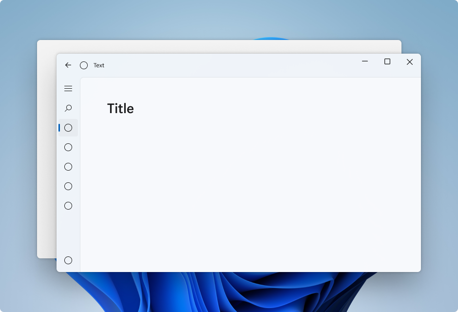
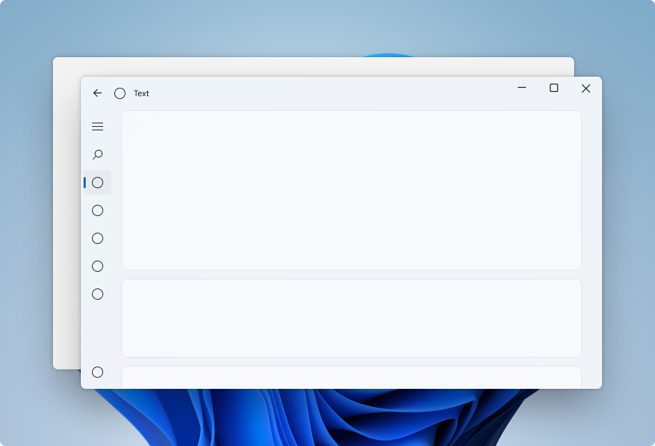
深色主题中的 Mica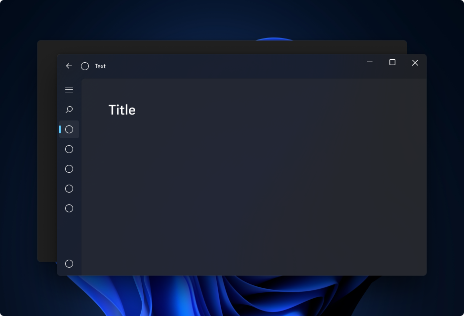
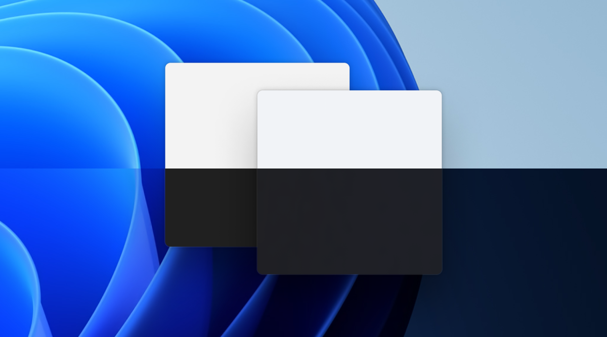
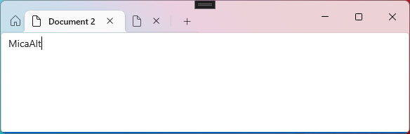
Mica Alt 是云母效果的一种变体,对用户桌面背景颜色的染色效果更强。 可将云母 Alt 应用于应用的背景,来提供比云母效果更深的视觉层次结构,尤其是在创建具有选项卡式标题栏的应用时。 Mica Alt 适用于使用 Windows App SDK 1.1 或更高版本的应用,同时在 Windows 11 版本 22000 或更高版本上运行。
下面的图像显示了带选项卡的标题栏中 Mica 和 Mica Alt 之间的区别。 这一张图使用云母效果,第二张图使用云母 Alt 效果。
何时使用云母或 Mica Alt
云母和云母 Alt 是在应用程序背景中显示的材料,它们显示在所有其他内容的下面。 每种材料都是不透明的,它们将用户的主题和桌面壁纸相结合,创建高度个性化的外观。 随着用户在屏幕上移动窗口,Mica 材质会动态调整,以便使用应用程序下的壁纸创建丰富的可视化效果。 此外,如果应用处于非活动状态,该材质可以通过回退到中性色来帮助用户专注于当前任务。
建议将 Mica 或 Mica Alt 用作应用程序的基础层,并在标题栏区域优先显示。 有关更具体的分层指南,请参阅分层与提升和本文中使用 Mica 的应用分层部分。
可用性和适应性
云母材料自动适应各种设备和应用场景。 它们专为性能而设计,因为它们只捕获一次背景壁纸来创建其可视化效果。
在高对比度模式下,用户继续看到他们选择的熟悉背景色,以代替 Mica 或 Mica Alt。此外,Mica 材料将显示为纯色回退颜色(SolidBackgroundFillColorBase 对于 Mica, SolidBackgroundFillColorBaseAlt 对于 Mica Alt),当:
- 用户关闭“设置”>“个性化设置”>“颜色”中的透明度。
- 启用节电模式。
- 应用在低端硬件上运行。
- 桌面上的应用窗口停用。
- Windows版本低于 22000。
通过 Mica 实现应用分层
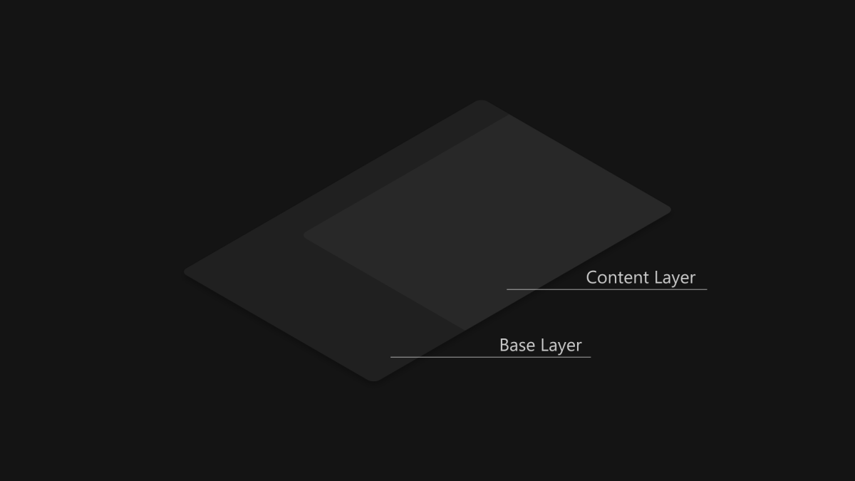
标准模式内容层
卡片模式内容层
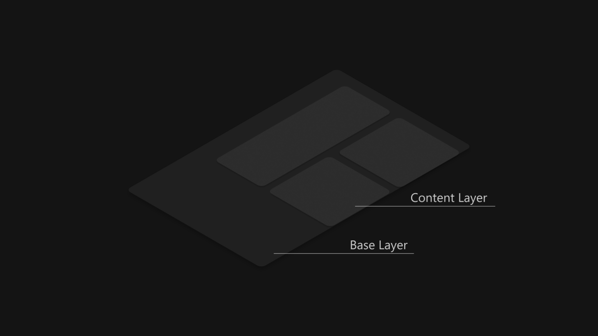
Mica 非常适合作为应用层次结构中的基础层,因为它具有非活动状态和活动状态并可进行轻微的个性化设置。 若要遵循两层的分层和提升系统,建议将Mica效果用作应用的基层,并叠加在基层上的内容层。 内容层应该选择后面的材料 Mica,并使用LayerFillColorDefaultBrush作为背景,这是一种低不透明度的纯色。 建议的内容层模式如下:
-
标准模式:需要与基层不同的分层差异的大型区域的连续背景。
LayerFillColorDefaultBrush应将其应用于 WinUI 3 应用图面的容器背景(例如 Grids、StackPanels、Frames 等)。 -
卡片模式:针对使用多个分区式和不连续 UI 组件设计的应用程序的分段式卡片。 有关使用
LayerFillColorDefaultBrush卡片 UI 的定义,请参阅 分层和提升 指南。
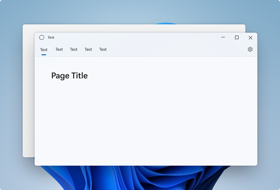
若要使应用的窗口具有无缝的外观,Mica 应显示在标题栏中(如果选择将此材质应用到应用)。 可以通过将应用扩展到非客户端区域,并创建透明的自定义标题栏来在标题栏中显示 Mica。 有关详细信息,请参阅标题栏。
下面的示例展示了应用于 NavigationView 的分层策略的常见实现,其中在标题栏区域可以看到 Mica 材质效果。
- 左侧导航视图中的标准模式。
- 顶部导航视图中的标准模式。
- 左侧 NavigationView 中的卡片模式。
左侧导航视图中的标准模式
默认情况下,左侧模式的 NavigationView 在内容区域中包含内容层。 此示例将 Mica 扩展到标题栏区域中,并创建自定义标题栏。
顶部导航视图中的标准模式
默认情况下,“顶部模式”的“NavigationView”在其内容区域中包含内容层。 此示例将 Mica 扩展到标题栏区域中,并创建自定义标题栏。
左导航视图中的卡片模式
若要在 NavigationView 中遵循卡片设计模式,需要通过覆盖背景和边框主题资源来删除默认内容层。 然后,可以在控件的内容区域中创建卡片。 此示例会创建多个卡片、将 Mica 扩展到标题栏区域中,并创建自定义标题栏。 有关卡片 UI 的详细信息,请参阅分层和提升指南。
使用 Mica Alt 的应用分层
Mica Alt 是云母的替代品,用作应用程序层次结构中的基础层,具有与云母相同的特性,如非活动状态、活动状态和细微个性化。 当需要标题栏元素与应用的命令区域(例如导航、菜单)之间形成对比度时,建议将 Mica Alt 应用作为应用的基础层。
使用 Mica Alt 的一种常见场景是在创建具有选项卡式标题栏的应用程序时。 若要按照分层和提升指南进行操作,我们建议将 Mica Alt 作为应用的基层,然后添加一个位于基层之上的命令层,最后添加一个位于命令层之上的内容层。 命令层应拾取其下方的材料 Mica Alt,并使用 LayerOnMicaBaseAltFillColorDefaultBrush(一种低不透明度纯色)作为背景。 内容层应使用 LayerFillColorDefaultBrush 这种低不透明度纯色,突出其下面的图层。 图层系统如下所示:
- Mica Alt:基础层。
-
命令层:需要与基层不同的分层区分。 必须将
LayerOnMicaBaseAltFillColorDefaultBrush应用于 WinUI 应用表面的命令区域(例如菜单栏、导航结构等) -
内容层:为需要与指令层有明显层次区别的大面积区域提供连续背景。 应将
LayerFillColorDefaultBrush应用于 WinUI 应用表面(例如网格、堆叠面板、框架等)的容器背景。
若要使应用程序窗口具有顺畅的外观,如果选择对应用程序使用此材质,标题栏中应显示 Mica Alt。 可通过将应用扩展至非客户端区域,并创建一个透明的自定义标题栏,在标题栏中显示 Mica Alt。
建议
- 对于要在其中看到 Mica 的所有层,请将 背景设置为 透明 ,以便 Mica 显示。
- 请勿在应用程序中多次使用背景材料。
- 请勿将背景材料应用于 UI 元素。 背景材质不会显示在元素本身上。 只有 UI 元素和窗口之间的所有层均设置为透明时,它才会显示。
示例

WinUI 3 示例库应用包含 WinUI 控件和功能的交互式示例。 从 Microsoft Store 或浏览 GitHub 上的源代码获取应用。
如何使用 Mica
若要在 WinUI 应用中使用 Mica,请参阅 在 Windows 11 的桌面应用中应用 Mica 或 Acrylic 材质。
若要在 Win32 应用中使用 Mica,请参阅 win32 桌面应用中的 Apply Mica for Windows 11。
