ListView
 流覽範例
流覽範例.NET 多平臺應用程式 UI (.NET MAUI) ListView 會顯示可選取資料項的可捲動垂直清單。 當 ListView 管理清單的外觀時,清單中每個項目的外觀是由 DataTemplate 使用 Cell 來顯示專案的 所定義。 .NET MAUI 包含用來顯示文字和影像組合的儲存格類型,您也可以定義顯示您想要之任何內容的自訂儲存格。 ListView 也包含顯示頁首和頁尾、分組數據、提取重新整理和操作功能表項的支援。
類別 ListView 衍生自 ItemsView<Cell> 類別,其繼承下列屬性:
ItemsSource型IEnumerable別為 的 ,指定要顯示的專案集合,且預設值為null。ItemTemplate類型 DataTemplate為 的 ,指定要套用至要顯示之專案集合中每個專案的範本。
ListView 會定義下列屬性:
Footer型object別為 的 ,指定將在清單結尾顯示的字串或檢視。FooterTemplate型 DataTemplate別為 的 ,指定要 DataTemplate 用來格式化 的Footer。GroupHeaderTemplate型 DataTemplate別為 的 ,定義 DataTemplate 用來定義每個群組標頭外觀的 。 這個屬性與GroupDisplayBinding屬性互斥。 因此,將此屬性設定GroupDisplayBinding為null。HasUnevenRows型bool別為 的 ,表示清單中的專案是否可以有不同高度的數據列。 此屬性的預設值為false。Header型object別為 的 ,指定將在清單開頭顯示的字串或檢視。HeaderTemplate型 DataTemplate別為 的 ,指定要 DataTemplate 用來格式化 的Header。HorizontalScrollBarVisibility型ScrollBarVisibility別為 的 ,表示何時會顯示水準滾動條。IsGroupingEnabled型bool別為 的 ,表示基礎數據是否應該顯示在群組中。 此屬性的預設值為false。IsPullToRefreshEnabled型bool別為 的 ,表示使用者是否可以向下撥動,讓 ListView 重新整理其數據。 此屬性的預設值為false。IsRefreshing型bool別為 的 ,表示 目前是否 ListView 正在重新整理。 此屬性的預設值為false。RefreshCommand型 ICommand別為 的 ,表示觸發重新整理時將會執行的命令。RefreshControlColor型 Color別為 的 ,決定重新整理發生時所顯示的重新整理視覺效果色彩。RowHeight型int別為 的 ,會在 是false時HasUnevenRows決定每個數據列的高度。SelectedItem型object別為 的 ,表示 中 ListView目前選取的專案。SelectionMode型ListViewSelectionMode別為 的 ,表示是否可以在 中 ListView 選取專案。 此屬性的預設值為Single。SeparatorColor型 Color別為 的 ,會定義分隔清單中專案之橫條的色彩。SeparatorVisibility型SeparatorVisibility別為 的 ,定義項目之間是否可見分隔符。VerticalScrollBarVisibility型ScrollBarVisibility別為 的 ,表示何時會顯示垂直滾動條。
所有這些屬性都受到 BindableProperty 物件支援,這表示這些屬性可以是數據系結的目標,並設定樣式。
此外, ListView 定義下列不受物件支援 BindableProperty 的屬性:
GroupDisplayBinding,型BindingBase別為 ,用於顯示群組標頭的系結。 這個屬性與GroupHeaderTemplate屬性互斥。 因此,將此屬性設定GroupHeaderTemplate為null。GroupShortNameBinding型BindingBase別為 的系結,用於在群組跳躍清單中顯示的名稱。CachingStrategy型ListViewCachingStrategy別為 的 ,定義的數據 ListView格重複使用策略。 這是一個唯讀屬性。
ListView 定義下列事件:
ItemAppearing,當項目的視覺表示加入 至 的 ListView視覺配置時,就會引發這個屬性。 此ItemVisibilityEventArgs事件隨附的物件會Item定義 和Index屬性。ItemDisappearing,當項目的視覺表示從的視覺配置 ListView中移除時,就會引發這個屬性。 此ItemVisibilityEventArgs事件隨附的物件會Item定義 和Index屬性。ItemSelected,會在選取清單中的新項目時引發。 此SelectedItemChangedEventArgs事件隨附的物件會SelectedItem定義 和SelectedItemIndex屬性。ItemTapped,會在點選中的 ListView 項目時引發。 此ItemTappedEventArgs事件隨附的物件會Group定義、Item和ItemIndex屬性。Refreshing,會在上 ListView觸發提取重新整理作業時引發。Scrolled, . 此ScrolledEventArgs事件隨附的物件會ScrollX定義 和ScrollY屬性。ScrollToRequested. 此ScrollToRequestedEventArgs事件隨附的物件會 Element定義、Mode、Position、ScrollX、、ScrollY和ShouldAnimate屬性。
使用數據填入 ListView
會將 ListView 其 ItemsSource 屬性設定為任何實作 的 IEnumerable集合,以填入數據。
重要
ListView如果需要在基礎集合中新增、移除或變更專案時重新整理 ,基礎集合應該是IEnumerable傳送屬性變更通知的集合,例如 ObservableCollection。
ListView 您可以使用數據系結將其屬性系結 ItemsSource 至 IEnumerable 集合,以填入數據。 在 XAML 中,這會透過 Binding 標記延伸來達成:
<ListView ItemsSource="{Binding Monkeys}" />
對等的 C# 程式碼為:
ListView listView = new ListView();
listView.SetBinding(ItemsView.ItemsSourceProperty, "Monkeys");
在此範例中 ItemsSource ,屬性數據會系結至 Monkeys 連接的 ViewModel 屬性。
注意
您可以啟用編譯的系結,以改善 .NET MAUI 應用程式中的數據系結效能。 如需詳細資訊,請參閱 編譯的系結。
如需數據系結的詳細資訊,請參閱 數據系結。
定義項目外觀
中每個項目 ListView 的外觀都可以藉由將 屬性設定 ItemTemplate 為 來 DataTemplate定義:
<ListView ItemsSource="{Binding Monkeys}">
    <ListView.ItemTemplate>
        <DataTemplate>
            <ViewCell>
                <Grid Padding="10">
                    <Grid.RowDefinitions>
                        <RowDefinition Height="Auto" />
                        <RowDefinition Height="Auto" />
                    </Grid.RowDefinitions>
                    <Grid.ColumnDefinitions>
                        <ColumnDefinition Width="Auto" />
                        <ColumnDefinition Width="Auto" />
                    </Grid.ColumnDefinitions>
                    <Image Grid.RowSpan="2"
                           Source="{Binding ImageUrl}"
                           Aspect="AspectFill"
                           HeightRequest="60"
                           WidthRequest="60" />
                    <Label Grid.Column="1"
                           Text="{Binding Name}"
                           FontAttributes="Bold" />
                    <Label Grid.Row="1"
                           Grid.Column="1"
                           Text="{Binding Location}"
                           FontAttributes="Italic"
                           VerticalOptions="End" />
                </Grid>
            </ViewCell>
        </DataTemplate>
    </ListView.ItemTemplate>
</ListView>
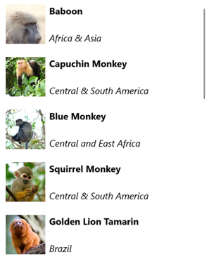
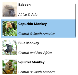
中指定的 DataTemplate 專案會定義清單中每個項目的外觀,而 的 DataTemplate 子系必須是 Cell 物件。 在此範例中,內的 DataTemplate 版面配置是由 管理 Grid。 Grid包含物件和兩Label個 Image 物件,這些物件都系結至 類別的屬性Monkey:
public class Monkey
{
    public string Name { get; set; }
    public string Location { get; set; }
    public string Details { get; set; }
    public string ImageUrl { get; set; }
}
下列螢幕快照顯示範本化清單中每個項目的結果:
如需數據範本的詳細資訊,請參閱 數據範本。
儲存格
中 ListView 每個項目的外觀是由 DataTemplate定義,而且 DataTemplate 必須參考 Cell 類別來顯示專案。 每個數據格都代表 中的數據 ListView項。 .NET MAUI 包含下列內建單元格:
- TextCell,它會在不同的行上顯示主要和次要文字。
- ImageCell,其會在不同行上顯示具有主要和次要文字的影像。
- SwitchCell,其中顯示可開啟或關閉的文字和切換。
- EntryCell,其中顯示可編輯的標籤和文字。
- ViewCell,這是自定義儲存格,其外觀是由定義 View。 當您想要完整定義 中 ListView每個項目的外觀時,應該使用這個儲存格類型。
一般而言,SwitchCell和 EntryCell 只會用於 ,TableView而且不會用於 。ListView 如需 和 EntryCell的詳細資訊SwitchCell,請參閱 TableView。
文字儲存格
在 TextCell 個別行上顯示主要和次要文字。 TextCell 會定義下列屬性:
Text型string別為 的 ,會定義要顯示的主要文字。TextColor型 Color別為 的 ,表示主要文字的色彩。Detail型string別為 的 ,會定義要顯示的次要文字。DetailColor型 Color別為 的 ,表示次要文字的色彩。Command型 ICommand別為 的 ,定義點選單元格時所執行的命令。CommandParameter型object別為 的 ,表示傳遞至命令的參數。
這些屬性是由 BindableProperty 物件所支援,這表示這些屬性可以是數據系結的目標,並設定樣式。
下列範例示範如何使用 TextCell 來定義 中的 ListView項目外觀:
<ListView ItemsSource="{Binding Food}">
    <ListView.ItemTemplate>
        <DataTemplate>
            <TextCell Text="{Binding Name}"
                      Detail="{Binding Description}" />
        </DataTemplate>
    </ListView.ItemTemplate>
</ListView>
下列螢幕快照顯示產生的儲存格外觀:
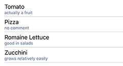
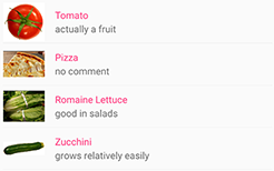
Image 儲存格
在 ImageCell 個別行上顯示具有主要和次要文字的影像。 ImageCell 繼承 來自 TextCell的屬性,並定義 ImageSource 型 ImageSource別 的 屬性,以指定要顯示在儲存格中的影像。 這個屬性是由 BindableProperty 物件所支援,這表示它可以是數據系結的目標,而且會設定樣式。
下列範例示範如何使用 ImageCell 來定義 中的 ListView項目外觀:
<ListView ItemsSource="{Binding Food}">
    <ListView.ItemTemplate>
        <DataTemplate>
            <ImageCell ImageSource="{Binding Image}"
                       Text="{Binding Name}"
                       Detail="{Binding Description}" />
        </DataTemplate>
    </ListView.ItemTemplate>
</ListView>
下列螢幕快照顯示產生的儲存格外觀:
檢視儲存格
ViewCell是自定義儲存格,其外觀是由定義View。 ViewCell 會 View 定義 型 View別 的屬性,其會定義代表單元格內容的檢視。 這個屬性是由 BindableProperty 物件所支援,這表示它可以是數據系結的目標,而且會設定樣式。
下列範例示範如何使用 ViewCell 來定義 中的 ListView項目外觀:
<ListView ItemsSource="{Binding Monkeys}">
    <ListView.ItemTemplate>
        <DataTemplate>
            <ViewCell>
                <Grid Padding="10">
                    <Grid.RowDefinitions>
                        <RowDefinition Height="Auto" />
                        <RowDefinition Height="Auto" />
                    </Grid.RowDefinitions>
                    <Grid.ColumnDefinitions>
                        <ColumnDefinition Width="Auto" />
                        <ColumnDefinition Width="Auto" />
                    </Grid.ColumnDefinitions>
                    <Image Grid.RowSpan="2"
                           Source="{Binding ImageUrl}"
                           Aspect="AspectFill"
                           HeightRequest="60"
                           WidthRequest="60" />
                    <Label Grid.Column="1"
                           Text="{Binding Name}"
                           FontAttributes="Bold" />
                    <Label Grid.Row="1"
                           Grid.Column="1"
                           Text="{Binding Location}"
                           FontAttributes="Italic"
                           VerticalOptions="End" />
                </Grid>
            </ViewCell>
        </DataTemplate>
    </ListView.ItemTemplate>
</ListView>
在內 ViewCell,配置可由任何 .NET MAUI 配置管理。 在此範例中,配置是由 管理 Grid。 Grid包含物件和兩Label個 Image 對象,這些物件全都系結至 類別的屬性Monkey。
下列螢幕快照顯示範本化清單中每個項目的結果:
選擇運行時間的項目外觀
您可以藉由將 屬性DataTemplateSelector設定ItemTemplate為物件,在執行時間根據專案值,選擇 中ListView每個項目的外觀:
<ContentPage ...
             xmlns:templates="clr-namespace:ListViewDemos.Templates">
    <ContentPage.Resources>
        <DataTemplate x:Key="AmericanMonkeyTemplate">
            <ViewCell>
                ...
            </ViewCell>
        </DataTemplate>

        <DataTemplate x:Key="OtherMonkeyTemplate">
            <ViewCell>
                ...
            </ViewCell>
        </DataTemplate>

        <templates:MonkeyDataTemplateSelector x:Key="MonkeySelector"
                                             AmericanMonkey="{StaticResource AmericanMonkeyTemplate}"
                                             OtherMonkey="{StaticResource OtherMonkeyTemplate}" />
    </ContentPage.Resources>

    <Grid Margin="20">
        <ListView ItemsSource="{Binding Monkeys}"
                  ItemTemplate="{StaticResource MonkeySelector}" />
    </Grid>
</ContentPage>
屬性 ItemTemplate 會設定為 MonkeyDataTemplateSelector 物件。 下列範例顯示 類別 MonkeyDataTemplateSelector :
public class MonkeyDataTemplateSelector : DataTemplateSelector
{
    public DataTemplate AmericanMonkey { get; set; }
    public DataTemplate OtherMonkey { get; set; }

    protected override DataTemplate OnSelectTemplate(object item, BindableObject container)
    {
        return ((Monkey)item).Location.Contains("America") ? AmericanMonkey : OtherMonkey;
    }
}
類別 MonkeyDataTemplateSelector 會 AmericanMonkey 定義 和 OtherMonkey DataTemplate 屬性,這些屬性會設定為不同的數據範本。 覆寫會 OnSelectTemplate 傳 AmericanMonkey 回範本,當猴子名稱包含 「America」 時,它會在 teal 中顯示猴子名稱和位置。 當猴子名稱不包含 「America」 時, OnSelectTemplate 覆寫會 OtherMonkey 傳回範本,以銀為單位顯示猴子名稱和位置:
如需數據範本選取器的詳細資訊,請參閱 建立 DataTemplateSelector。
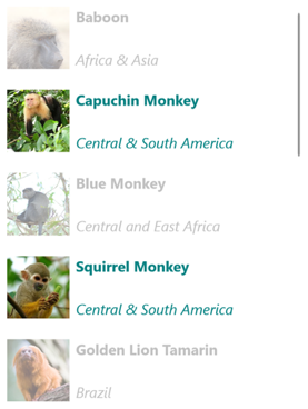
回應項目選取
根據預設, ListView 會啟用選取範圍。 不過,您可以藉由設定 SelectionMode 屬性來變更此行為。 ListViewSelectionMode 列舉會定義下列成員:
None– 表示無法選取專案。Single– 表示可以選取單一專案,並反白顯示選取的專案。 這是預設值。
ListViewItemSelected定義屬性變更時SelectedItem所引發的事件,可能是因為使用者從清單中選取專案,或是應用程式設定 屬性時所引發。 此 SelectedItemChangedEventArgs 事件隨附的物件具有 SelectedItem 和 SelectedItemIndex 屬性。
SelectionMode當 屬性設定為 Single時,可以選取 中的ListView單一專案。 選取專案時, SelectedItem 屬性會設定為所選取專案的值。 當這個屬性變更時, ItemSelected 就會引發 事件。
下列範例顯示 ListView 可回應單一項目選取項目的 :
<ListView ItemsSource="{Binding Monkeys}"
          ItemSelected="OnItemSelected">
    ...
</ListView>
在此範例中, OnItemSelected 事件處理程式會在事件引發時 ItemSelected 執行,而事件處理程式會擷取選取的專案:
void OnItemSelected(object sender, SelectedItemChangedEventArgs args)
{
    Monkey item = args.SelectedItem as Monkey;
}
下列螢幕快照顯示 中的單一 ListView項目選取專案:
清除選取項目
SelectedItem您可以藉由設定 屬性,或將它系結至 的物件,來null清除屬性。
停用選取範圍
ListView 選取項目預設為啟用。 不過,您可以將 屬性設定 SelectionMode 為 None來停用:
<ListView ...
          SelectionMode="None" />
SelectionMode當屬性設定為 None時,無法選取 中的ListView專案,SelectedItem屬性會維持null為 ,而且ItemSelected不會引發 事件。
快取資料
ListView 是顯示數據的強大檢視,但有一些限制。 使用自定義數據格時,捲動效能可能會受到影響,特別是當它們包含深層巢狀檢視階層,或使用需要複雜測量的特定版面配置時。 幸運的是,有一些技術可用來避免效能不佳。
ListView通常用來在畫面上顯示比適合的數據更多。 例如,音樂應用程式可能有具有數千個專案的歌曲連結庫。 為每個專案建立專案會浪費寶貴的記憶體並執行不佳。 不斷建立和終結數據列會要求應用程式持續具現化和清除物件,這也會效能不佳。
為了節省記憶體,每個平臺的原生 ListView 對等專案都有重複使用數據列的內建功能。 只有畫面上可見的儲存格會載入記憶體中,而內容會載入現有的儲存格。 此模式可防止應用程式具現化數千個物件,並節省時間和記憶體。
.NET MAUI 允許 ListView 透過 ListViewCachingStrategy 列舉重複使用儲存格,其定義下列成員:
RetainElement,指定 ListView 將針對清單中的每個項目產生儲存格。RecycleElement,指定 ListView 會藉由回收清單儲存格,嘗試將其記憶體使用量和執行速度降到最低。RecycleElementAndDataTemplate,如同RecycleElement同時確保 使用 DataTemplateSelector時ListView,DataTemplate物件會由清單中的專案類型快取。
保留元素
快 RetainElement 取策略會 ListView 指定 將針對清單中的每個項目產生單元格,而且是預設 ListView 行為。 它應該在下列情況下使用:
- 每個儲存格都有大量的系結(20-30+)。
- 單元格範本經常變更。
- 測試顯示快
RecycleElement取策略會導致執行速度降低。
使用自定義儲存格時,請務必辨識快取策略的後果 RetainElement 。 任何數據格初始化程式代碼都必須針對每個數據格建立執行,此程式代碼每秒可能會多次執行。 在此情況下,頁面上的版面配置技術,例如使用多個巢狀 Grid 物件,會在用戶捲動時即時設定和終結時,變成效能瓶頸。
回收元素
快 RecycleElement 取策略會指定 會 ListView 藉由回收清單儲存格,嘗試將其記憶體使用量和執行速度降到最低。 此模式不一定會提供效能改善,而且應該執行測試來判斷任何改善。 不過,這是慣用的選擇,而且應該在下列情況下使用:
- 每個儲存格都有一小到中等數量的系結。
- 每個數據格的
BindingContext會定義所有數據格數據。 - 每個儲存格基本上都類似,且儲存格範本未變更。
在虛擬化期間,數據格會更新其系結內容,因此如果應用程式使用此模式,則必須確保適當地處理系結內容更新。 數據格的所有數據都必須來自系結內容或一致性錯誤。 使用數據系結來顯示數據格數據,即可避免這個問題。 或者,單元格數據應該在覆寫中 OnBindingContextChanged 設定,而不是在自定義單元格的建構函式中設定,如下列範例所示:
public class CustomCell : ViewCell
{
    Image image = null;

    public CustomCell()
    {
        image = new Image();
        View = image;
    }

    protected override void OnBindingContextChanged()
    {
        base.OnBindingContextChanged();

        var item = BindingContext as ImageItem;
        if (item != null)
        {
            image.Source = item.ImageUrl;
        }
    }
}
使用 DataTemplateSelector 回收元素
ListView當 使用 DataTemplateSelector 來選取 DataTemplate時,快RecycleElement取策略不會快取DataTemplate物件。 相反地, DataTemplate 會針對清單中的每個資料項目選取 。
注意
快 RecycleElement 取策略要求當 DataTemplateSelector 要求 選取 DataTemplate 每個 DataTemplate 必須傳回相同 ViewCell 類型的 時。 例如,假設 有 ListView DataTemplateSelector 可以傳回 的 ,其中MyDataTemplateAViewCell會傳回 MyDataTemplateA 型別的 MyViewCellA,或 MyDataTemplateB (其中 MyDataTemplateB 傳回 ViewCell 型別的 MyViewCellB),則傳回時MyDataTemplateA必須傳回 ,否則會擲回MyViewCellA例外狀況。
使用 DataTemplates 回收元素
快 RecycleElementAndDataTemplate 取策略會 RecycleElement 以快取策略為基礎,藉由另外確保 ListView 當 使用 DataTemplateSelector 來選取 DataTemplate時, DataTemplate 物件會由清單中的專案類型快取。 因此, DataTemplate 每個項目類型會選取物件一次,而不是每個項目實例一次。
注意
快RecycleElementAndDataTemplate取策略要求 DataTemplate 所DataTemplateSelector傳回的對象必須使用採用 Type的DataTemplate建構函式。
設定快取策略
快 ListView 取策略可以藉由在 XAML 中藉由設定 CachingStrategy 屬性來定義:
<ListView CachingStrategy="RecycleElement">
    <ListView.ItemTemplate>
        <DataTemplate>
            <ViewCell>
              ...
            </ViewCell>
        </DataTemplate>
    </ListView.ItemTemplate>
</ListView>
在 C# 中,快取策略是透過建構函式多載來設定:
ListView listView = new ListView(ListViewCachingStrategy.RecycleElement);
在子類別化 ListView 中設定快取策略
CachingStrategy在子類別ListView化上設定 XAML 的屬性不會產生所需的行為,因為上ListView沒有 CachingStrategy 屬性。 此問題的解決方案是在接受ListViewCachingStrategy參數並將它傳遞給基類的子類別ListView上指定建構函式:
public class CustomListView : ListView
{
    public CustomListView (ListViewCachingStrategy strategy) : base (strategy)
    {
    }
    ...
}
ListViewCachingStrategy然後,可以使用 屬性從 XAML x:Arguments 指定列舉值:
<local:CustomListView>
    <x:Arguments>
        <ListViewCachingStrategy>RecycleElement</ListViewCachingStrategy>
    </x:Arguments>
</local:CustomListView>
頁首和頁尾
ListView 可以呈現頁首和頁尾,其會隨清單中的項目捲動。 頁首和頁尾可以是字串、檢視或 DataTemplate 物件。
ListView 定義下列屬性來指定頁首和頁尾:
Header型object別為 的 ,指定將在清單開頭顯示的字串、系結或檢視。HeaderTemplate型 DataTemplate別為 的 ,指定要 DataTemplate 用來格式化 的Header。Footer型object別為 的 ,指定將在清單結尾顯示的字串、系結或檢視。FooterTemplate型 DataTemplate別為 的 ,指定要 DataTemplate 用來格式化 的Footer。
這些屬性是由 BindableProperty 物件所支援,這表示屬性可以是數據系結的目標。
在頁首和頁尾中顯示字串
Header和 Footer 屬性可以設定為string值,如下列範例所示:
<ListView ItemsSource="{Binding Monkeys}"
          Header="Monkeys"
          Footer="2022">
    ...
</ListView>
下列螢幕快照顯示產生的標頭:
在頁首和頁尾中顯示檢視
Header和 Footer 屬性可以設定為檢視。 這可以是單一檢視或包含多個子檢視的檢視。 下列範例顯示 Header 和 Footer 屬性,每個設定為 Grid 包含 Label 物件的物件:
<ListView ItemsSource="{Binding Monkeys}">
    <ListView.Header>
        <Grid BackgroundColor="LightGray">
            <Label Margin="10,0,0,0"
                   Text="Monkeys"
                   FontSize="12"
                   FontAttributes="Bold" />
        </Grid>
    </ListView.Header>
    <ListView.Footer>
        <Grid BackgroundColor="LightGray">
            <Label Margin="10,0,0,0"
                   Text="Friends of Monkey"
                   FontSize="12"
                   FontAttributes="Bold" />
        </Grid>
    </ListView.Footer>
    ...
</ListView>
下列螢幕快照顯示產生的標頭:
顯示樣板化頁首和頁尾
HeaderTemplate和 FooterTemplate 屬性可以設定為DataTemplate用來格式化頁首和頁尾的物件。 在此案例中, Header 和 Footer 屬性必須系結至要套用之範本的目前來源,如下列範例所示:
<ListView ItemsSource="{Binding Monkeys}"
          Header="{Binding .}"
          Footer="{Binding .}">
    <ListView.HeaderTemplate>
        <DataTemplate>
            <Grid BackgroundColor="LightGray">
                <Label Margin="10,0,0,0"
                       Text="Monkeys"
                       FontSize="12"
                       FontAttributes="Bold" />
            </Grid>
        </DataTemplate>
    </ListView.HeaderTemplate>
    <ListView.FooterTemplate>
        <DataTemplate>
            <Grid BackgroundColor="LightGray">
                <Label Margin="10,0,0,0"
                       Text="Friends of Monkey"
                       FontSize="12"
                       FontAttributes="Bold" />
            </Grid>
        </DataTemplate>
    </ListView.FooterTemplate>
    ...
</ListView>
控制專案分隔符
根據預設,iOS 和 Android 上的項目之間 ListView 會顯示分隔符。 將 類型的 SeparatorVisibilityNone屬性設定SeparatorVisibility為 ,即可變更此行為:
<ListView ...
          SeparatorVisibility="None" />
此外,啟用分隔符時,可以使用 屬性來設定 SeparatorColor 色彩:
<ListView ...
          SeparatorColor="Blue" />
大小專案
根據預設,中的所有 ListView 專案的高度都相同,其衍生自 定義每個項目外觀之 的內容 DataTemplate 。 不過,您可以使用 和 RowHeight 屬性來變更HasUnevenRows此行為。 根據預設, HasUnevenRows 屬性為 false。
屬性 RowHeight 可以設定為 int ,表示 中 ListView每個專案的高度,前提是為 HasUnevenRows false。 當 設定為 true時HasUnevenRows,中的每個ListView專案可以有不同的高度。 每個專案的高度會衍生自項目 DataTemplate的內容,因此每個專案的大小都會調整為其內容。
只要 屬性為 true,即可在運行時間以程式設計方式調整個別ListView專案的大小,HasUnevenRows方法是變更 內DataTemplate專案的版面配置相關屬性。 下列範例會在點選物件時變更物件的高度 Image :
void OnImageTapped(object sender, EventArgs args)
{
    Image image = sender as Image;
    ViewCell viewCell = image.Parent.Parent as ViewCell;

    if (image.HeightRequest < 250)
    {
      image.HeightRequest = image.Height + 100;
      viewCell.ForceUpdateSize();
    }
}
在此範例中 OnImageTapped ,會執行事件處理程式,以回應 Image 正在點選的物件。 事件處理程式會更新 的高度 Image ,而且 Cell.ForceUpdateSize 方法會更新儲存格的大小,即使目前看不到。
警告
過度使用動態專案重設大小可能會導致 ListView 效能降低。
從右至左的版面配置
ListView可以將其 屬性RightToLeft設定為 ,以從右至左的流程方向配置其FlowDirection內容。 不過, FlowDirection 屬性應該在頁面或根版面配置上設定,這會導致頁面內的所有元素或根版面配置回應流程方向:
<ContentPage xmlns="http://schemas.microsoft.com/dotnet/2021/maui"
             xmlns:x="http://schemas.microsoft.com/winfx/2009/xaml"
             x:Class="ListViewDemos.RightToLeftListPage"
             Title="Right to left list"
             FlowDirection="RightToLeft">
    <Grid Margin="20">
        <ListView ItemsSource="{Binding Monkeys}">
            ...
        </ListView>
    </Grid>
</ContentPage>
具有父代的項目預設值 FlowDirection 為 MatchParent。 因此,ListView會從Grid繼承 FlowDirection 屬性值,而這個值接著會從 ContentPage繼承 FlowDirection 屬性值。
顯示群組數據
在持續捲動清單中呈現時,大型數據集通常變得不笨手笨腳。 在此案例中,將數據組織成群組可藉由更輕鬆地瀏覽數據來改善用戶體驗。
數據必須先分組,才能顯示數據。 這可以藉由建立群組清單來完成,其中每個群組都是項目清單。 群組清單應該是集合 IEnumerable<T> ,其中 T 會定義兩個數據片段:
- 組名。
IEnumerable定義屬於群組之專案的集合。
因此,分組數據的流程是:
- 建立模型化單一專案的型別。
- 建立模型化單一專案群組的類型。
- 建立
IEnumerable<T>集合,其中T是建立單一專案群組模型的類型。 此集合是群組的集合,可儲存群組數據。 - 將數據新增至
IEnumerable<T>集合。
範例
將數據分組時,第一個步驟是建立模型單一項目的類型。 下列範例顯示 類別 Animal :
public class Animal
{
    public string Name { get; set; }
    public string Location { get; set; }
    public string Details { get; set; }
    public string ImageUrl { get; set; }
}
類別 Animal 會建立單一專案的模型。 然後可以建立建立一組專案模型的類型。 下列範例顯示 類別 AnimalGroup :
public class AnimalGroup : List<Animal>
{
    public string Name { get; private set; }

    public AnimalGroup(string name, List<Animal> animals) : base(animals)
    {
        Name = name;
    }
}
類別 AnimalGroup 繼承自 類別, List<T> 並加入 Name 代表組名的屬性。
IEnumerable<T>然後可以建立群組的集合:
public List<AnimalGroup> Animals { get; private set; } = new List<AnimalGroup>();
此程式代碼會定義名為 Animals的集合,其中集合中的每個專案都是 AnimalGroup 物件。 每個 AnimalGroup 物件都包含名稱,以及 List<Animal> 定義 Animal 群組中物件的集合。
然後,可以將群組數據新增至 Animals 集合:
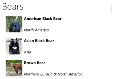
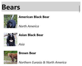
Animals.Add(new AnimalGroup("Bears", new List<Animal>
{
    new Animal
    {
        Name = "American Black Bear",
        Location = "North America",
        Details = "Details about the bear go here.",
        ImageUrl = "https://upload.wikimedia.org/wikipedia/commons/0/08/01_Schwarzbär.jpg"
    },
    new Animal
    {
        Name = "Asian Black Bear",
        Location = "Asia",
        Details = "Details about the bear go here.",
        ImageUrl = "https://upload.wikimedia.org/wikipedia/commons/thumb/b/b7/Ursus_thibetanus_3_%28Wroclaw_zoo%29.JPG/180px-Ursus_thibetanus_3_%28Wroclaw_zoo%29.JPG"
    },
    // ...
}));

Animals.Add(new AnimalGroup("Monkeys", new List<Animal>
{
    new Animal
    {
        Name = "Baboon",
        Location = "Africa & Asia",
        Details = "Details about the monkey go here.",
        ImageUrl = "https://upload.wikimedia.org/wikipedia/commons/thumb/f/fc/Papio_anubis_%28Serengeti%2C_2009%29.jpg/200px-Papio_anubis_%28Serengeti%2C_2009%29.jpg"
    },
    new Animal
    {
        Name = "Capuchin Monkey",
        Location = "Central & South America",
        Details = "Details about the monkey go here.",
        ImageUrl = "https://upload.wikimedia.org/wikipedia/commons/thumb/4/40/Capuchin_Costa_Rica.jpg/200px-Capuchin_Costa_Rica.jpg"
    },
    new Animal
    {
        Name = "Blue Monkey",
        Location = "Central and East Africa",
        Details = "Details about the monkey go here.",
        ImageUrl = "https://upload.wikimedia.org/wikipedia/commons/thumb/8/83/BlueMonkey.jpg/220px-BlueMonkey.jpg"
    },
    // ...
}));
此程式代碼會在集合中 Animals 建立兩個群組。 第一個AnimalGroupList<Animal>名稱為 Bears,並包含熊詳細數據的集合。 第二AnimalGroup個List<Animal>名稱為 Monkeys,並包含猴子詳細數據的集合。
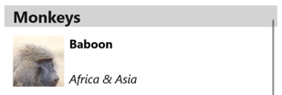
ListView 如果資料已正確分組,則會藉由將 IsGroupingEnabled 屬性設定為 true,來顯示分組的數據:
<ListView ItemsSource="{Binding Animals}"
          IsGroupingEnabled="True">
    <ListView.ItemTemplate>
        <DataTemplate>
            <ViewCell>
                <Grid Padding="10">
                    <Grid.RowDefinitions>
                        <RowDefinition Height="Auto" />
                        <RowDefinition Height="Auto" />
                    </Grid.RowDefinitions>
                    <Grid.ColumnDefinitions>
                        <ColumnDefinition Width="Auto" />
                        <ColumnDefinition Width="Auto" />
                    </Grid.ColumnDefinitions>
                    <Image Grid.RowSpan="2"
                           Source="{Binding ImageUrl}"
                           Aspect="AspectFill"
                           HeightRequest="60"
                           WidthRequest="60" />
                    <Label Grid.Column="1"
                           Text="{Binding Name}"
                           FontAttributes="Bold" />
                    <Label Grid.Row="1"
                           Grid.Column="1"
                           Text="{Binding Location}"
                           FontAttributes="Italic"
                           VerticalOptions="End" />
                </Grid>
            </ViewCell>
        </DataTemplate>
    </ListView.ItemTemplate>
</ListView>
對等的 C# 程式碼為:
ListView listView = new ListView
{
    IsGroupingEnabled = true
};
listView.SetBinding(ItemsView.ItemsSourceProperty, "Animals");
// ...
中的每個 ListView 項目的外觀都是藉由將其 ItemTemplate 屬性設定為 DataTemplate來定義。 如需詳細資訊,請參閱 定義項目外觀。
下列螢幕快照顯示 ListView 顯示群組資料:
注意
根據預設, ListView 會在群組標頭中顯示組名。 您可以藉由自定義群組標頭來變更此行為。
自定義群組標頭
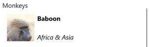
您可以將 屬性設定 ListView.GroupHeaderTemplate 為 DataTemplate,以自訂每個群組標頭的外觀:
<ListView ItemsSource="{Binding Animals}"
          IsGroupingEnabled="True">
    <ListView.GroupHeaderTemplate>
        <DataTemplate>
            <ViewCell>
                <Label Text="{Binding Name}"
                       BackgroundColor="LightGray"
                       FontSize="18"
                       FontAttributes="Bold" />
            </ViewCell>
        </DataTemplate>
    </ListView.GroupHeaderTemplate>
    ...
</ListView>
在此範例中,每個群組標頭都會設定為 Label ,以顯示組名,而且已設定其他外觀屬性。 下列螢幕快照顯示自訂的群組標頭:
重要
屬性 GroupHeaderTemplate 與 GroupDisplayBinding 屬性互斥。 因此,不應該設定這兩個屬性。
沒有範本的群組
ListView 不需將 屬性設定 ItemTemplate 為 DataTemplate,即可顯示正確分組的數據:
<ListView ItemsSource="{Binding Animals}"
          IsGroupingEnabled="true" />
在此案例中,您可以覆寫 ToString 模型單一專案之型別中的方法,以及建立單一專案群組模型的類型來顯示有意義的數據。
控件捲動
ListView 定義兩 ScrollTo 種方法,將專案捲動到檢視中。 其中一個多載會將指定的專案卷動到檢視中,而另一個多載則會將指定群組中的指定專案卷動到檢視中。 這兩個多載都有額外的自變數,允許指定卷動完成之後專案的確切位置,以及是否要以動畫顯示卷動。
ListView定義叫用其中ScrollTo一個ScrollToRequested方法時所引發的事件。 事件ScrollToRequestedEventArgs隨附ScrollToRequested的物件有許多屬性,包括 ShouldAnimate、 ElementMode和 Position。 其中有些屬性是從方法呼叫中指定的自變數設定。ScrollTo
此外, ListView 定義 Scrolled 引發的事件,以指出發生捲動。 事件 ScrolledEventArgs 隨附 Scrolled 的物件具有 ScrollX 和 ScrollY 屬性。
偵測卷動
ListView 定義 Scrolled 引發的事件,指出發生捲動。 類別 ItemsViewScrolledEventArgs ,表示事件隨附 Scrolled 的物件,會定義下列屬性:
ScrollX型double別為 的 ,代表卷動的 X 位置ScrollY型double別為 的 ,表示卷動的 Y 位置。
下列 XAML 範例顯示 ListView ,可設定 事件的事件處理程式 Scrolled :
<ListView Scrolled="OnListViewScrolled">
    ...
</ListView>
對等的 C# 程式碼為:
ListView listView = new ListView();
listView.Scrolled += OnListViewScrolled;
在此程式代碼範例中,當事件引發時Scrolled,OnListViewScrolled會執行事件處理程式:
void OnListViewScrolled(object sender, ScrolledEventArgs e)
{
    // Custom logic
}
重要
會 Scrolled 針對使用者起始的捲動和程式設計卷動引發 事件。
將專案捲動至檢視
方法會將 ScrollTo 指定的項目捲動至檢視中。 假設有名為 ListView listView的物件,下列範例示範如何將 Proboscis Monkey 專案卷動到檢視中:
MonkeysViewModel viewModel = BindingContext as MonkeysViewModel;
Monkey monkey = viewModel.Monkeys.FirstOrDefault(m => m.Name == "Proboscis Monkey");
listView.ScrollTo(monkey, ScrollToPosition.MakeVisible, true);
或者,可以藉由指定專案和群組,將群組數據中的專案卷動到檢視中。 下列範例示範如何將 Monkeys 群組中的 Proboscis Monkey 專案捲動到檢視中:
GroupedAnimalsViewModel viewModel = BindingContext as GroupedAnimalsViewModel;
AnimalGroup group = viewModel.Animals.FirstOrDefault(a => a.Name == "Monkeys");
Animal monkey = group.FirstOrDefault(m => m.Name == "Proboscis Monkey");
listView.ScrollTo(monkey, group, ScrollToPosition.MakeVisible, true);
注意
叫 ScrollToRequested 用 方法時 ScrollTo 會引發 事件。
停用卷動動畫
捲動動畫會在將專案卷動至檢視時顯示。 不過,將方法的ScrollTo自變數設定animated為 false,即可停用此動畫:
listView.ScrollTo(monkey, position: ScrollToPosition.MakeVisible, animate: false);
控制卷動位置
將專案卷動至檢視時,可以使用 方法的ScrollTo自變數指定position卷動完成後專案的確切位置。 這個自變數接受 ScrollToPosition 列舉成員。
MakeVisible
成員 ScrollToPosition.MakeVisible 表示項目應該捲動,直到檢視中可見為止:
listView.ScrollTo(monkey, position: ScrollToPosition.MakeVisible, animate: true);
啟動
成員 ScrollToPosition.Start 表示項目應該捲動至檢視的開頭:
listView.ScrollTo(monkey, position: ScrollToPosition.Start, animate: true);
置中
成員 ScrollToPosition.Center 表示項目應該捲動至檢視的中心:
listView.ScrollTo(monkey, position: ScrollToPosition.Center, animate: true);
結束
成員 ScrollToPosition.End 表示項目應該捲動至檢視的結尾:
listView.ScrollTo(monkey, position: ScrollToPosition.End, animate: true);
滾動條可見性
ListView 定義 HorizontalScrollBarVisibility 和 VerticalScrollBarVisibility 屬性,這些屬性是由可系結屬性所支援。 這些屬性會取得或設定 ScrollBarVisibility 列舉值,代表當可見水準或垂直滾動條時。 ScrollBarVisibility 列舉會定義下列成員:
Default表示平臺的默認滾動條行為,而 是 和VerticalScrollBarVisibility屬性的HorizontalScrollBarVisibility預設值。Always表示即使內容符合檢視,也會顯示滾動條。Never表示即使內容不符合檢視,也不會顯示滾動條。
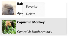
新增操作功能表
ListView 支援操作功能表專案,這些專案定義為 MenuItem 加入至 ViewCell.ContextActions 中每個專案之 集合的物件 DataTemplate :
<ListView x:Name="listView"
          ItemsSource="{Binding Monkeys}">
    <ListView.ItemTemplate>
        <DataTemplate>
            <ViewCell>
                <ViewCell.ContextActions>
                    <MenuItem Text="Favorite"
                              Command="{Binding Source={x:Reference listView}, Path=BindingContext.FavoriteCommand}"
                              CommandParameter="{Binding}" />
                    <MenuItem Text="Delete"
                              Command="{Binding Source={x:Reference listView}, Path=BindingContext.DeleteCommand}"
                              CommandParameter="{Binding}" />
                </ViewCell.ContextActions>

                ...
            </ViewCell>
        </DataTemplate>
    </ListView.ItemTemplate>
</ListView>
當中的ListView項目按下滑鼠右鍵時,就會MenuItem顯示物件:
如需功能表項的詳細資訊,請參閱 顯示功能表項。
提取以重新整理
ListView 支援提取以重新整理功能,藉由在項目清單上向下拉下,讓顯示的數據重新整理。
若要開啟提取以重新整理,請將 IsPullToRefreshEnabled 屬性設定為 true。 觸發重新整理時, ListView 會 Refreshing 引發 事件,並將 IsRefreshing 屬性設定為 true。 重新整理 內容 ListView 所需的程式代碼,應該由 事件的處理程式 Refreshing 執行,或由 ICommand 執行的 RefreshCommand 實作來執行。 ListView重新整理之後,IsRefreshing屬性應該設定為 false,或 EndRefresh 應該在上ListView呼叫 方法,表示重新整理已完成。
下列範例示範 ListView 使用提取重新整理的 :
<ListView ItemsSource="{Binding Animals}"
          IsPullToRefreshEnabled="true"
          RefreshCommand="{Binding RefreshCommand}"
          IsRefreshing="{Binding IsRefreshing}">
    <ListView.ItemTemplate>
        <DataTemplate>
            <ViewCell>
                ...
            </ViewCell>
        </DataTemplate>
    </ListView.ItemTemplate>
</ListView>
在此範例中,當使用者起始重新整理時, ICommand 會執行 屬性所 RefreshCommand 定義的 ,這應該會重新整理要顯示的專案。 重新整理會在重新整理時顯示,其中包含動畫進度圓形。 屬性的值 IsRefreshing 表示重新整理作業的目前狀態。 觸發重新整理時,這個屬性會自動轉換為 true。 重新整理完成後,您應該將 屬性 false重設為 。