RadioButton
 流覽範例
流覽範例.NET 多平臺應用程式 UI (.NET MAUI) RadioButton 是一種按鈕類型,可讓使用者從集合中選取一個選項。 每個選項都會以一個單選按鈕表示,而且您只能選取群組中的一個單選按鈕。 根據預設,每個 RadioButton 都會顯示文字:
不過,在某些平臺上,可以 RadioButton 顯示 View,而且所有平臺上的外觀 RadioButton 都可以使用 ControlTemplate來重新定義:
RadioButton 會定義下列屬性:
Content型object別為 的 ,定義string所RadioButton要顯示的 或 View 。IsChecked型bool別為 的 ,定義 是否已 RadioButton 檢查 。 這個屬性會使用系TwoWay結,且預設值為false。GroupName型string別為 的 ,定義指定哪些 RadioButton 控件互斥的名稱。 這個屬性預設值為null。Value型object別為 的 ,定義與 RadioButton相關聯的選擇性唯一值。BorderColor型 Color別為 的 ,定義框線筆劃色彩。BorderWidth型double別為 的 ,定義框線的 RadioButton 寬度。CharacterSpacing型double別為 的 ,定義任何顯示文字字元之間的間距。CornerRadius型int別為 的 ,其定義 的 RadioButton圓角半徑。FontAttributes型別為FontAttributes的 ,決定文字樣式。FontAutoScalingEnabled型bool別為的 ,定義應用程式的UI是否反映作業系統中設定的文字調整喜好設定。 此屬性的預設值為true。FontFamily,屬於類型string,其定義字型系列。FontSize型別為 的double,定義字型大小。TextColor型 Color別為 的 ,定義任何顯示文字的色彩。TextTransform型TextTransform別為 的 ,定義任何顯示文字的大小寫。
這些屬性是由 BindableProperty 物件所支援,這表示這些屬性可以是數據系結的目標,並設定樣式。
RadioButton 也會定義 CheckedChanged 當屬性變更時 IsChecked ,透過使用者或程序設計操作所引發的事件。 事件 CheckedChangedEventArgs 隨附 CheckedChanged 的物件具有名為 Value的單一屬性,類型 bool為 。 引發事件時,屬性的值 CheckedChangedEventArgs.Value 會設定為 屬性的新值 IsChecked 。
RadioButton 群組可由 類別管理 RadioButtonGroup ,其定義下列附加屬性:
GroupName型string別為 的 ,它會定義 中ILayout物件的組名RadioButton。SelectedValue型object別為 的 ,表示群組中ILayout已核取RadioButton物件的值。 這個附加屬性預設會使用系TwoWay結。
提示
雖然並非必要,但強烈建議您設定 GroupName 屬性,以確保 SelectedValue 屬性在所有平臺上都能正常運作。
如需附加屬性的詳細資訊 GroupName ,請參閱 Group RadioButtons。 如需附加屬性的詳細資訊 SelectedValue ,請參閱 回應 RadioButton 狀態變更。
建立 RadioButtons
的外觀 RadioButton 是由指派給 RadioButton.Content 屬性的數據類型所定義:
RadioButton.Content指派 屬性string時,它會顯示在每個平臺上,水平對齊單選按鈕圓形旁。RadioButton.ContentView指派 時,它會顯示在支援的平臺(iOS、Windows),而不支援的平臺則會回復為物件的字串表示View法(Android)。 在這兩種情況下,內容會在單選按鈕圓形旁邊水準對齊。- ControlTemplate當套用至 RadioButton時,View可以將 指派給
RadioButton.Content所有平臺上的 屬性。 如需詳細資訊,請參閱 重新定義 RadioButton 外觀。
顯示以字串為基礎的內容
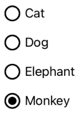
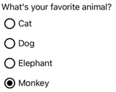
當指派 string屬性時,Content會顯示RadioButton文字:
<StackLayout>
    <Label Text="What's your favorite animal?" />
    <RadioButton Content="Cat" />
    <RadioButton Content="Dog" />
    <RadioButton Content="Elephant" />
    <RadioButton Content="Monkey"
                 IsChecked="true" />
</StackLayout>
在此範例中, RadioButton 物件會以隱含方式群組在相同的父容器內。 此 XAML 會導致下列螢幕快照所示的外觀:
顯示任意內容
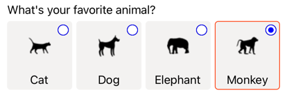
在 iOS 和 Windows 上,當指派 View屬性時Content,RadioButton可以顯示任意內容:
<StackLayout>
    <Label Text="What's your favorite animal?" />
    <RadioButton>
        <RadioButton.Content>
            <Image Source="cat.png" />
        </RadioButton.Content>
    </RadioButton>
    <RadioButton>
        <RadioButton.Content>
            <Image Source="dog.png" />
        </RadioButton.Content>
    </RadioButton>
    <RadioButton>
        <RadioButton.Content>
            <Image Source="elephant.png" />
        </RadioButton.Content>
    </RadioButton>
    <RadioButton>
        <RadioButton.Content>
            <Image Source="monkey.png" />
        </RadioButton.Content>
    </RadioButton>
</StackLayout>
在此範例中, RadioButton 物件會以隱含方式群組在相同的父容器內。 此 XAML 會導致下列螢幕快照所示的外觀:
在 Android 上, RadioButton 對象會顯示已設定為內容之 View 物件的字串型表示。
注意
ControlTemplate當套用至 RadioButton時,View可以將 指派給RadioButton.Content所有平臺上的 屬性。 如需詳細資訊,請參閱 重新定義 RadioButton 外觀。
將值與 RadioButtons 產生關聯
每個 RadioButton 物件都有 Value 類型的 object屬性,其會定義要與單選按鈕產生關聯的選擇性唯一值。 這可讓的值RadioButton與其內容不同,而且在對象顯示View物件時RadioButton特別有用。
下列 XAML 顯示在每個 RadioButton 物件上設定 Content 與 Value 屬性:
<StackLayout>
    <Label Text="What's your favorite animal?" />
    <RadioButton Value="Cat">
        <RadioButton.Content>
            <Image Source="cat.png" />
        </RadioButton.Content>
    </RadioButton>
    <RadioButton Value="Dog">
        <RadioButton.Content>
            <Image Source="dog.png" />
        </RadioButton.Content>
    </RadioButton>
    <RadioButton Value="Elephant">
        <RadioButton.Content>
            <Image Source="elephant.png" />
        </RadioButton.Content>
    </RadioButton>
    <RadioButton Value="Monkey">
        <RadioButton.Content>
            <Image Source="monkey.png" />
        </RadioButton.Content>
    </RadioButton>
</StackLayout>
在此範例中,每個都有 RadioButton Image 作為其內容,同時定義以字串為基礎的值。 這可讓您輕鬆地識別核取的單選按鈕值。
Group RadioButtons
單選按鈕會以群組方式運作,而且有三種方法可以分組單選按鈕:
- 將它們放在相同的父容器內。 這稱為 隱含 群組。
GroupName將群組中每個單選按鈕上的 屬性設定為相同的值。 這稱為 明確 群組。- 在
RadioButtonGroup.GroupName父容器上設定附加屬性,接著設定GroupName容器中任何 RadioButton 對象的屬性。 這也稱為 明確 群組。
重要
RadioButton 物件不一定屬於要分組的相同父系。 它們互斥,前提是它們共用組名。
使用 GroupName 屬性明確分組
下列 XAML 範例顯示藉由設定其GroupName屬性來明確分組RadioButton物件:
<Label Text="What's your favorite color?" />
<RadioButton Content="Red"
             GroupName="colors" />
<RadioButton Content="Green"
             GroupName="colors" />
<RadioButton Content="Blue"
             GroupName="colors" />
<RadioButton Content="Other"
             GroupName="colors" />
在此範例中,每個都是 RadioButton 互斥的,因為它會共用相同的 GroupName 值。
使用 RadioButtonGroup.GroupName 附加屬性明確分組
類別 RadioButtonGroup 會 GroupName 定義 類型 為 的 string附加屬性,該屬性可以在 對象上 Layout<View> 設定。 這可讓任何版面配置變成單選按鈕群組:
<StackLayout RadioButtonGroup.GroupName="colors">
    <Label Text="What's your favorite color?" />
    <RadioButton Content="Red" />
    <RadioButton Content="Green" />
    <RadioButton Content="Blue" />
    <RadioButton Content="Other" />
</StackLayout>
在此範例中,中的每個 RadioButton StackLayout 都會將其 GroupName 屬性設定為 colors,而且會互斥。
注意
ILayout當設定RadioButtonGroup.GroupName附加屬性的物件包含RadioButton設定其GroupName屬性的 RadioButton.GroupName 時,屬性的值會優先。
回應 RadioButton 狀態變更
選項按鈕有兩種狀態:已勾選或未勾選。 核取單選按鈕時,其 IsChecked 屬性為 true。 取消核取單選按鈕時,其 IsChecked 屬性為 false。 只要點選相同群組中的另一個單選按鈕,即可清除單選按鈕,但無法再次點選它來清除。 不過,您可以將選項按鈕的 IsChecked 屬性設定為 false,以程式設計方式清除該選項按鈕。
回應事件引發
IsChecked當屬性變更時,會透過使用者或程序設計操作引發CheckedChanged事件。 您可以註冊此事件的事件處理程式以回應變更:
<RadioButton Content="Red"
             GroupName="colors"
             CheckedChanged="OnColorsRadioButtonCheckedChanged" />
程式代碼後置包含 事件的處理程式 CheckedChanged :
void OnColorsRadioButtonCheckedChanged(object sender, CheckedChangedEventArgs e)
{
    // Perform required operation
}
自 sender 變數負責 RadioButton 此事件。 您可以使用這個來存取RadioButton物件,或區分共用相同CheckedChanged事件處理程式的多個RadioButton物件。
回應屬性變更
類別 RadioButtonGroup 會 SelectedValue 定義 類型 為 的 object附加屬性,該屬性可以在 對象上 ILayout 設定。 這個附加屬性代表在版面配置上定義之群組內核 RadioButton 取的值。
IsChecked當屬性變更時,透過使用者或程序設計操作,RadioButtonGroup.SelectedValue附加屬性也會變更。 因此, RadioButtonGroup.SelectedValue 附加屬性可以是系結至儲存用戶選取範圍之屬性的數據:
<StackLayout RadioButtonGroup.GroupName="{Binding GroupName}"
             RadioButtonGroup.SelectedValue="{Binding Selection}">
    <Label Text="What's your favorite animal?" />
    <RadioButton Content="Cat"
                 Value="Cat" />
    <RadioButton Content="Dog"
                 Value="Dog" />
    <RadioButton Content="Elephant"
                 Value="Elephant" />
    <RadioButton Content="Monkey"
                 Value="Monkey"/>
    <Label x:Name="animalLabel">
        <Label.FormattedText>
            <FormattedString>
                <Span Text="You have chosen:" />
                <Span Text="{Binding Selection}" />
            </FormattedString>
        </Label.FormattedText>
    </Label>
</StackLayout>
在此範例中,附加屬性的值 RadioButtonGroup.GroupName 是由 GroupName 系結內容上的 屬性所設定。 同樣地,附加屬性的值 RadioButtonGroup.SelectedValue 是由 Selection 系結內容上的 屬性所設定。 此外,屬性 Selection 會更新為 Value 已 RadioButton核取 的屬性。
RadioButton 視覺狀態
RadioButton 物件具有 Checked 和 Unchecked 視覺狀態,可用來在核取或取消核取 時 RadioButton 起始視覺變更。
下列 XAML 範例示範如何定義 和 Unchecked 狀態的Checked視覺狀態:
<ContentPage ...>
<ContentPage.Resources>
<Style TargetType="RadioButton">
<Setter Property="VisualStateManager.VisualStateGroups">
<VisualStateGroupList>
<VisualStateGroup x:Name="CheckedStates">
<VisualState x:Name="Checked">
<VisualState.Setters>
<Setter Property="TextColor"
Value="Green" />
<Setter Property="Opacity"
Value="1" />
</VisualState.Setters>
</VisualState>
<VisualState x:Name="Unchecked">
<VisualState.Setters>
<Setter Property="TextColor"
Value="Red" />
<Setter Property="Opacity"
Value="0.5" />
</VisualState.Setters>
</VisualState>
</VisualStateGroup>
</VisualStateGroupList>
</Setter>
</Style>
</ContentPage.Resources>
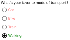
<StackLayout>
<Label Text="What's your favorite mode of transport?" />
<RadioButton Content="Car" />
<RadioButton Content="Bike" />
<RadioButton Content="Train" />
<RadioButton Content="Walking" />
</StackLayout>
</ContentPage>
在此範例中,隱含的 Style 以 RadioButton 物件為目標。 Checked VisualState指定檢查 時RadioButton,其 TextColor 屬性會設定為綠色,Opacity值為 1。 Unchecked VisualState指定當 處於未核取狀態時RadioButton,其 TextColor 屬性會設定為紅色,Opacity值為0.5。 因此,整體效果是,當 RadioButton 取消核取時,其為紅色且部分透明,且在核取時為綠色且不透明度:
如需視覺狀態的詳細資訊,請參閱 視覺狀態。
重新定義 RadioButton 外觀
根據預設, RadioButton 物件會使用處理程式,在支持的平臺上利用原生控件。 不過, RadioButton 可以使用 重新定義 ControlTemplate可視化結構,讓 RadioButton 物件在所有平臺上都有相同的外觀。 這是可能的,因為 RadioButton 類別繼承自 TemplatedView 類別。
下列 XAML 顯示 ControlTemplate 可用來重新定義 物件視覺結構的 RadioButton :
<ContentPage ...>
    <ContentPage.Resources>
        <ControlTemplate x:Key="RadioButtonTemplate">
            <Border Stroke="#F3F2F1"
                    StrokeThickness="2"
                    StrokeShape="RoundRectangle 10"
                    BackgroundColor="#F3F2F1"
                    HeightRequest="90"
                    WidthRequest="90"
                    HorizontalOptions="Start"
                    VerticalOptions="Start">
                <VisualStateManager.VisualStateGroups>
                    <VisualStateGroupList>
                        <VisualStateGroup x:Name="CheckedStates">
                            <VisualState x:Name="Checked">
                                <VisualState.Setters>
                                    <Setter Property="Stroke"
                                            Value="#FF3300" />
                                    <Setter TargetName="check"
                                            Property="Opacity"
                                            Value="1" />
                                </VisualState.Setters>
                            </VisualState>
                            <VisualState x:Name="Unchecked">
                                <VisualState.Setters>
                                    <Setter Property="BackgroundColor"
                                            Value="#F3F2F1" />
                                    <Setter Property="Stroke"
                                            Value="#F3F2F1" />
                                    <Setter TargetName="check"
                                            Property="Opacity"
                                            Value="0" />
                                </VisualState.Setters>
                            </VisualState>
                        </VisualStateGroup>
                    </VisualStateGroupList>
                </VisualStateManager.VisualStateGroups>
                <Grid Margin="4"
                      WidthRequest="90">
                    <Grid Margin="0,0,4,0"
                          WidthRequest="18"
                          HeightRequest="18"
                          HorizontalOptions="End"
                          VerticalOptions="Start">
                        <Ellipse Stroke="Blue"
                                 Fill="White"
                                 WidthRequest="16"
                                 HeightRequest="16"
                                 HorizontalOptions="Center"
                                 VerticalOptions="Center" />
                        <Ellipse x:Name="check"
                                 Fill="Blue"
                                 WidthRequest="8"
                                 HeightRequest="8"
                                 HorizontalOptions="Center"
                                 VerticalOptions="Center" />
                    </Grid>
                    <ContentPresenter />
                </Grid>
            </Border>
        </ControlTemplate>

        <Style TargetType="RadioButton">
            <Setter Property="ControlTemplate"
                    Value="{StaticResource RadioButtonTemplate}" />
        </Style>
    </ContentPage.Resources>
    <!-- Page content -->
</ContentPage>
在此範例中,的ControlTemplate根元素是定義 Border 和 Unchecked 視覺狀態的物件Checked。 物件Border會使用、 Ellipse和 ContentPresenter 對象的組合Grid來定義 的RadioButton視覺結構。 此範例也包含 隱含 樣式,將 指派 RadioButtonTemplate 給 ControlTemplate 頁面上任何 RadioButton 對象的屬性。
注意
物件 ContentPresenter 會標示顯示內容之視覺結構 RadioButton 中的位置。
下列 XAML 顯示RadioButton透過隱含樣式取用 ControlTemplate 的物件:
<StackLayout>
    <Label Text="What's your favorite animal?" />
    <StackLayout RadioButtonGroup.GroupName="animals"
                 Orientation="Horizontal">
        <RadioButton Value="Cat">
            <RadioButton.Content>
                <StackLayout>
                    <Image Source="cat.png"
                           HorizontalOptions="Center"
                           VerticalOptions="Center" />
                    <Label Text="Cat"
                           HorizontalOptions="Center"
                           VerticalOptions="End" />
                </StackLayout>
            </RadioButton.Content>
        </RadioButton>
        <RadioButton Value="Dog">
            <RadioButton.Content>
                <StackLayout>
                    <Image Source="dog.png"
                           HorizontalOptions="Center"
                           VerticalOptions="Center" />
                    <Label Text="Dog"
                           HorizontalOptions="Center"
                           VerticalOptions="End" />
                </StackLayout>
            </RadioButton.Content>
        </RadioButton>
        <RadioButton Value="Elephant">
            <RadioButton.Content>
                <StackLayout>
                    <Image Source="elephant.png"
                           HorizontalOptions="Center"
                           VerticalOptions="Center" />
                    <Label Text="Elephant"
                           HorizontalOptions="Center"
                           VerticalOptions="End" />
                </StackLayout>
            </RadioButton.Content>
        </RadioButton>
        <RadioButton Value="Monkey">
            <RadioButton.Content>
                <StackLayout>
                    <Image Source="monkey.png"
                           HorizontalOptions="Center"
                           VerticalOptions="Center" />
                    <Label Text="Monkey"
                           HorizontalOptions="Center"
                           VerticalOptions="End" />
                </StackLayout>
            </RadioButton.Content>
        </RadioButton>
    </StackLayout>
</StackLayout>
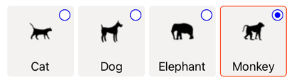
在此範例中,針對每個 RadioButton 定義的視覺結構會取代為 中 ControlTemplate定義的視覺結構,因此在運行時間,中的物件 ControlTemplate 會成為每個 RadioButton的可視化樹狀結構的一部分。 此外,每個 RadioButton 的內容會取代為 ContentPresenter 控制項範本中定義的 。 這會導致下列 RadioButton 外觀:
如需控件範本的詳細資訊,請參閱 控件範本。
停用 RadioButton
有時候應用程式會進入 RadioButton 正在檢查的狀態不是有效的作業。 在這種情況下, RadioButton 可以藉由將其 IsEnabled 屬性設定為 false來停用 。
意見反應
即將登場:在 2024 年,我們將逐步淘汰 GitHub 問題作為內容的意見反應機制,並將它取代為新的意見反應系統。 如需詳細資訊,請參閱:https://aka.ms/ContentUserFeedback。
提交並檢視相關的意見反應