本教學課程提供 Microsoft Fabric 中 Synapse 資料科學工作流程的端對端範例。 它會使用 R 來分析和視覺化美國的酪梨價格,以建立可預測未來酪梨價格的機器學習模型。
本教學課程涵蓋了下列步驟:
- 載入預設程式庫
- 載入資料
- 自訂資料
- 將新套件新增至工作階段
- 分析及視覺化資料
- 訓練模型

必要條件
取得 Microsoft Fabric 訂用帳戶。 或註冊免費的 Microsoft Fabric 試用版。
登入 Microsoft Fabric。
使用首頁左下角的體驗切換器切換到 Fabric。
開啟或建立筆記本。 若要了解操作說明,請參閱如何使用 Microsoft Fabric 筆記本。
將語言選項設定為 SparkR (R),以變更主要語言。
將筆記本連結至 Lakehouse。 在左側,選取 [新增],以新增現有的 Lakehouse 或建立 Lakehouse。
載入程式庫
使用預設 R 執行階段的程式庫:
library(tidyverse)
library(lubridate)
library(hms)
載入資料
從在網際網路下載的 CSV 檔案中讀取酪梨價格:
df <- read.csv('https://synapseaisolutionsa.z13.web.core.windows.net/data/AvocadoPrice/avocado.csv', header = TRUE)
head(df,5)
操作資料
首先,為資料行提供更方便的名稱。
# To use lowercase
names(df) <- tolower(names(df))

# To use snake case
avocado <- df %>%
  rename("av_index" = "x",
         "average_price" = "averageprice",
         "total_volume" = "total.volume",
         "total_bags" = "total.bags",
         "amount_from_small_bags" = "small.bags",
         "amount_from_large_bags" = "large.bags",
         "amount_from_xlarge_bags" = "xlarge.bags")

# Rename codes
avocado2 <- avocado %>%
  rename("PLU4046" = "x4046",
         "PLU4225" = "x4225",
         "PLU4770" = "x4770")

head(avocado2,5)
變更資料類型、移除不必要的資料行,並新增總使用量:
# Convert data
avocado2$year = as.factor(avocado2$year)
avocado2$date = as.Date(avocado2$date)
avocado2$month  = factor(months(avocado2$date), levels = month.name)
avocado2$average_price =as.numeric(avocado2$average_price)
avocado2$PLU4046 = as.double(avocado2$PLU4046)
avocado2$PLU4225 = as.double(avocado2$PLU4225)
avocado2$PLU4770 = as.double(avocado2$PLU4770)
avocado2$amount_from_small_bags = as.numeric(avocado2$amount_from_small_bags)
avocado2$amount_from_large_bags = as.numeric(avocado2$amount_from_large_bags)
avocado2$amount_from_xlarge_bags = as.numeric(avocado2$amount_from_xlarge_bags)


# Remove unwanted columns
avocado2 <- avocado2 %>%
  select(-av_index,-total_volume, -total_bags)

# Calculate total consumption
avocado2 <- avocado2 %>%
  mutate(total_consumption = PLU4046 + PLU4225 + PLU4770 + amount_from_small_bags + amount_from_large_bags + amount_from_xlarge_bags)
安裝新的套件
使用內嵌套件安裝,將新套件新增至工作階段:
install.packages(c("repr","gridExtra","fpp2"))
載入所需程式庫。
library(tidyverse)
library(knitr)
library(repr)
library(gridExtra)
library(data.table)
分析及視覺化資料
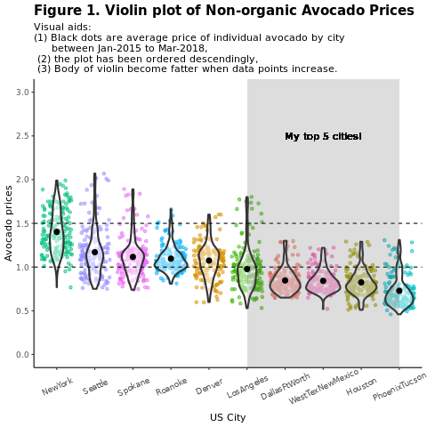
依區域比較傳統 (非有機) 酪梨價格:
options(repr.plot.width = 10, repr.plot.height =10)
# filter(mydata, gear %in% c(4,5))
avocado2 %>%
  filter(region %in% c("PhoenixTucson","Houston","WestTexNewMexico","DallasFtWorth","LosAngeles","Denver","Roanoke","Seattle","Spokane","NewYork")) %>%
  filter(type == "conventional") %>%
  select(date, region, average_price) %>%
  ggplot(aes(x = reorder(region, -average_price, na.rm = T), y = average_price)) +
  geom_jitter(aes(colour = region, alpha = 0.5)) +
  geom_violin(outlier.shape = NA, alpha = 0.5, size = 1) +
  geom_hline(yintercept = 1.5, linetype = 2) +
  geom_hline(yintercept = 1, linetype = 2) +
  annotate("rect", xmin = "LosAngeles", xmax = "PhoenixTucson", ymin = -Inf, ymax = Inf, alpha = 0.2) +
  geom_text(x = "WestTexNewMexico", y = 2.5, label = "My top 5 cities!", hjust = 0.5) +
  stat_summary(fun = "mean") +
  labs(x = "US city",
       y = "Avocado prices",
       title = "Figure 1. Violin plot of nonorganic avocado prices",
       subtitle = "Visual aids: \n(1) Black dots are average prices of individual avocados by city \n     between January 2015 and March 2018. \n(2) The plot is ordered descendingly.\n(3) The body of the violin becomes fatter when data points increase.") +
  theme_classic() +
  theme(legend.position = "none",
        axis.text.x = element_text(angle = 25, vjust = 0.65),
        plot.title = element_text(face = "bold", size = 15)) +
  scale_y_continuous(lim = c(0, 3), breaks = seq(0, 3, 0.5))
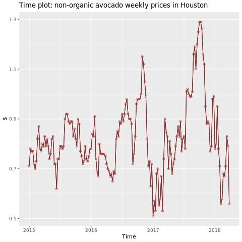
專注於休斯頓地區。
library(fpp2)
conv_houston <- avocado2 %>%
  filter(region == "Houston",
         type == "conventional") %>%
  group_by(date) %>%
  summarise(average_price = mean(average_price))

# Set up ts

conv_houston_ts <- ts(conv_houston$average_price,
                 start = c(2015, 1),
                 frequency = 52)
# Plot

autoplot(conv_houston_ts) +
  labs(title = "Time plot: nonorganic avocado weekly prices in Houston",
       y = "$") +
  geom_point(colour = "brown", shape = 21) +
  geom_path(colour = "brown")
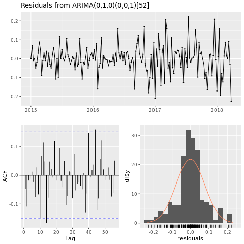
將機器學習模型定型
根據自動迴歸整合式移動平均 (ARIMA),為休斯頓區域建立價格預測模型:
conv_houston_ts_arima <- auto.arima(conv_houston_ts,
                                    d = 1,
                                    approximation = F,
                                    stepwise = F,
                                    trace = T)
checkresiduals(conv_houston_ts_arima)
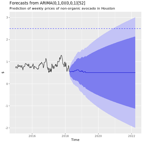
顯示來自休斯頓 ARIMA 模型的預測圖表:
conv_houston_ts_arima_fc <- forecast(conv_houston_ts_arima, h = 208)

autoplot(conv_houston_ts_arima_fc) + labs(subtitle = "Prediction of weekly prices of nonorganic avocados in Houston",
       y = "$") +
  geom_hline(yintercept = 2.5, linetype = 2, colour = "blue")