教學課程:建立 R 支援的 Power BI 視覺效果
身為開發人員,您可以建立自己的PowerBI視覺效果。 這些視覺效果可供您、您的組織或第三方使用。
本文是建立 Power BI R 支援的視覺效果的逐步指南。
在本教學課程中,您會了解如何:
- 建立 R 支援的視覺效果
- 在 Power BI Desktop 中編輯 R 腳稿
- 將連結庫新增至視覺效果的相依性檔案
- 新增靜態屬性
必要條件
- Power BI Pro 帳戶。 開始之前,請先註冊免費試用 。
- R 引擎。 您可以從許多位置免費下載一個,包括 Microsoft R Open 下載頁面 和 CRAN 存放 庫。 如需詳細資訊,請參閱 使用 R 建立 Power BI 視覺效果。
- Power BI Desktop。
- 適用於 Windows 使用者的 Windows PowerShell 第 4 版或更新版本,或 OSX 使用者的終端 機。
開始使用
準備視覺效果的一些範例數據。 您可以將這些值儲存至 Excel 資料庫或 .csv 檔案,並將其匯入 Power BI Desktop。
MonthNo 總單位數 1 2303 2 2319 3 1732 4 1615 5 1427 6 2253 7 1147 8 1515 9 2516 10 3131 11 3170 12 2762 若要建立視覺效果,請開啟 PowerShell 或 終端機,然後執行下列命令:
pbiviz new rVisualSample -t rvisual此命令會建立 rVisualSample 視覺效果的新資料夾。 結構是以範本為基礎
rvisual。 它會在視覺效果的根資料夾中建立名為 script.r 的檔案。 此檔案會保存執行以在呈現視覺效果時產生影像的 R 腳稿。 您可以在 Power BI Desktop 中建立 R 腳稿。從新建立
rVisualSample的目錄執行下列命令:pbiviz start在 Power BI Desktop 中,選取 [R 腳本視覺效果]:
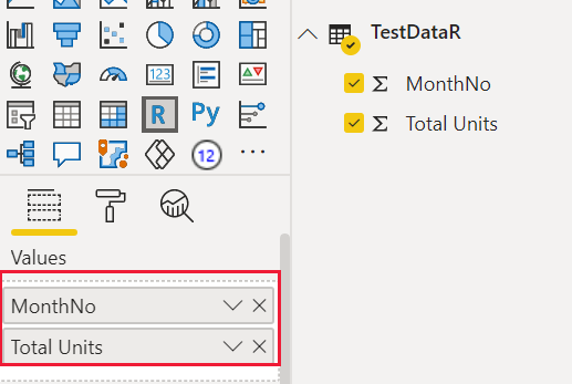
將 MonthNo 和 Total 單位拖曳至視覺效果的值,將數據指派給開發人員視覺效果。
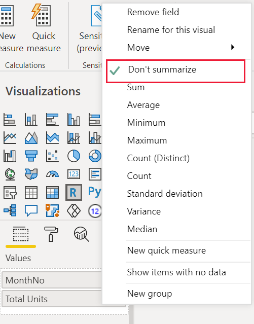
將 [總計單位] 的匯總類型設定為 [不要摘要]。
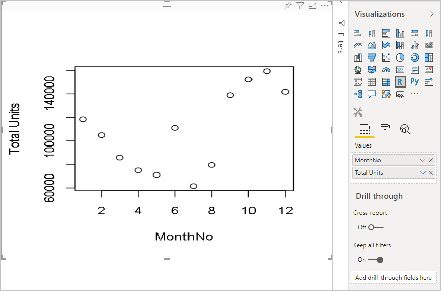
從 Power BI Desktop 中的 R 文稿編輯器中,輸入下列命令:
plot(dataset)此命令會使用語意模型中的值做為輸入來建立散佈圖。
選取 [ 執行腳本] 圖示以查看結果。
編輯 R 文稿
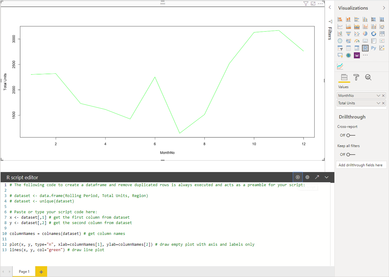
您可以修改 R 腳本來建立其他類型的視覺效果。 接下來,讓我們建立折線圖。
將下列 R 程式代碼貼到 R 文稿編輯器中。
x <- dataset[,1] # get the first column from semantic model
y <- dataset[,2] # get the second column from semantic model

columnNames = colnames(dataset) # get column names

plot(x, y, type="n", xlab=columnNames[1], ylab=columnNames[2]) # draw empty plot with axis and labels only
lines(x, y, col="green") # draw line plot
選取 [ 執行腳本] 圖示以查看結果。
當您的 R 文稿就緒時,請將它
script.r複製到位於視覺效果專案的根目錄中的檔案。在capabilities.json檔案中,將 :
name變更dataRoles為資料集,並將輸入設定dataViewMappings為數據集。{ "dataRoles": [ { "displayName": "Values", "kind": "GroupingOrMeasure", "name": "dataset" } ], "dataViewMappings": [ { "scriptResult": { "dataInput": { "table": { "rows": { "select": [ { "for": { "in": "dataset" } } ], "dataReductionAlgorithm": { "top": {} } } } }, ... } } ], }新增下列程式代碼以支援調整 src/visual.ts 檔案中的映射大小。
  public onResizing(finalViewport: IViewport): void {
      this.imageDiv.style.height = finalViewport.height + "px";
      this.imageDiv.style.width = finalViewport.width + "px";
      this.imageElement.style.height = finalViewport.height + "px";
      this.imageElement.style.width = finalViewport.width + "px";
  }
將連結庫新增至視覺套件
封裝 corrplot 會建立相互關聯矩陣的圖形顯示。 如需 的詳細資訊 corrplot,請參閱 Corrplot 套件簡介。
將連結
corrplot庫相依性新增至dependencies.json檔案。 以下是檔案內容的範例:{ "cranPackages": [ { "name": "corrplot", "displayName": "corrplot", "url": "https://cran.r-project.org/web/packages/corrplot/" } ] }現在,您可以在檔案
script.r中使用 corrplot 套件。library(corrplot) corr <- cor(dataset) corrplot(corr, method="circle", order = "hclust")使用
corrplot套件的結果看起來像下列範例: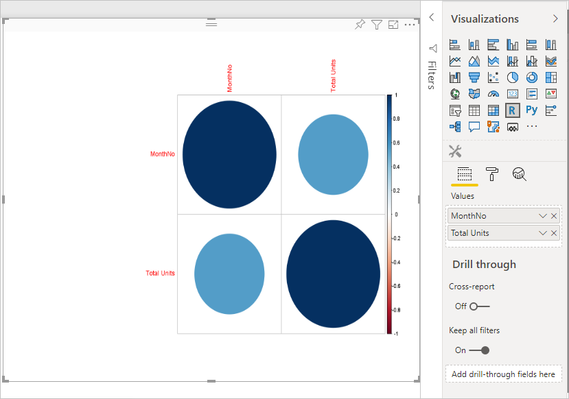
將靜態屬性新增至屬性窗格
既然我們有基本的 corrplot 視覺效果,讓我們將屬性新增至屬性窗格,讓用戶能夠變更視覺效果的外觀和風格。
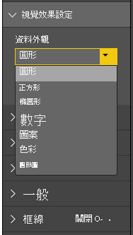
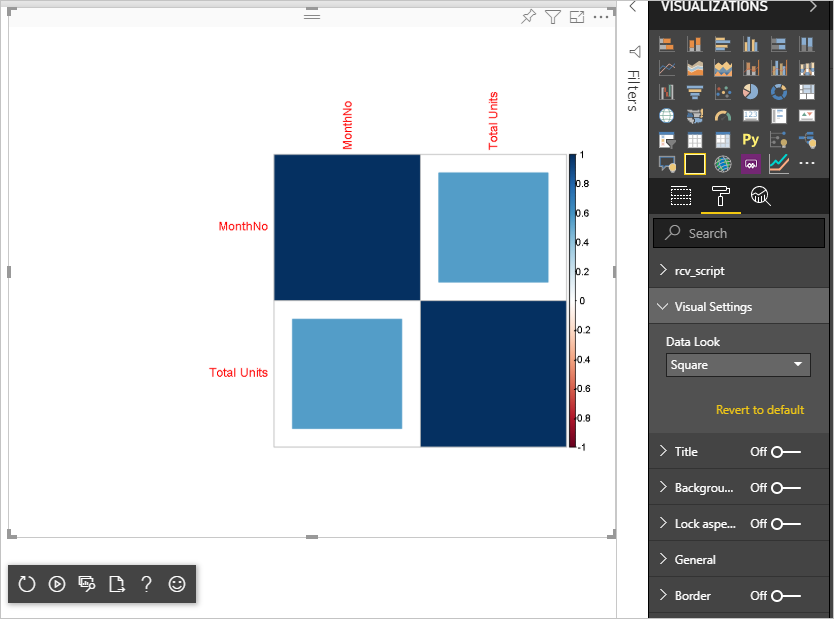
我們使用 method 自變數來設定數據點的形狀。 預設文本會使用圓形。 修改您的視覺效果,讓用戶在數個選項之間進行選擇。
在capabilities.json檔案中定義一個
object呼叫的設定,並提供下列屬性。"settings": { "properties": { "method": { "type": { "enumeration": [ { "value": "circle" }, { "value": "square" }, { "value": "ellipse" }, { "value": "number" }, { "value": "shade" }, { "value": "color" }, { "value": "pie" } ] } } } }開啟 src/settings.ts 檔案。 使用
VisualCardSettings公用屬性method、namedisplayName和slices建立類別,如程式代碼方塊中所示。import ItemDropdown = formattingSettings.ItemDropdown; const methodOptions = [ { displayName: "Circle", value: "circle" }, { displayName: "Square", value: "square" }, { displayName: "Ellipse", value: "ellipse" }, { displayName: "Number", value: "number" }, { displayName: "Shade", value: "shade" }, { displayName: "Color", value: "color" }, { displayName: "Pie", value: "pie" } ] class VisualCardSettings extends FormattingSettingsCard { method: FormattingSettingsSlice = new ItemDropdown({ name: "method", displayName: "Method", items: methodOptions, value: methodOptions[0] }); name: string = "settings"; displayName: string = "Settings"; slices: Array<FormattingSettingsSlice> = [this.method]; }在這些步驟之後,您可以變更視覺效果的 屬性。
最後,R 文稿必須具有預設屬性。 如果使用者未變更屬性值(在此案例中為圖形設定),視覺效果會使用此值。
對於屬性的 R 執行時間變數,命名慣例為
<objectname>_<propertyname>,在此案例中為settings_method。執行下列 R 文稿:
library(corrplot)
corr <- cor(dataset)

if (!exists("settings_method"))
{
    settings_method = "circle";
}

corrplot(corr, method=settings_method, order = "hclust")
封裝和匯入視覺效果
現在您可以封裝視覺效果,並將其匯入至任何 Power BI 報表。
在檔案中
pbivis.json填入displayName、supportUrl、description作者name和email,以及任何其他重要資訊。如果您想要變更視覺效果窗格上的視覺效果圖示,請取代 assets 資料夾中的 icon.png 檔案。
從視覺效果的根目錄執行:
pbiviz package如需封裝視覺效果的詳細資訊,請參閱 封裝自定義視覺效果
將視覺效果的 pbiviz 檔案匯入任何 Power BI 報表。 如需如何執行這項操作的指示,請參閱 將視覺效果檔案從本機計算機匯入 Power BI 。
您的最終視覺效果看起來像下列範例:
相關內容
意見反應
即將登場:在 2024 年,我們將逐步淘汰 GitHub 問題作為內容的意見反應機制,並將它取代為新的意見反應系統。 如需詳細資訊,請參閱:https://aka.ms/ContentUserFeedback。
提交並檢視相關的意見反應