Note
Access to this page requires authorization. You can try signing in or changing directories.
Access to this page requires authorization. You can try changing directories.
Note
The Retail Interest Group by Dynamics 365 Commerce has moved from Yammer to Viva Engage. If you don't have access to the new Viva Engage community, fill out this form (https://aka.ms/JoinD365commerceVivaEngageCommunity) to be added and stay engaged in the latest discussions.
This article explains container modules and how to add them to site pages in Microsoft Dynamics 365 Commerce.
A container module hosts other modules inside it. The primary purpose of a container module is to define the layout of the modules that it contains through its properties. For example, those modules can appear side by side in a two-column, three-column, four-column, or six-column layout. You can limit them to the width of the container, or they can fill the screen. You can also add a heading to every container module.
The three supported container modules are: container, container with 2-slots, and container with 3-slots. You can put modules of any type inside these containers.
Note
Always put modules inside a container module so you can limit them to the width of the container.
Examples of container modules in e-Commerce
- A site author wants a three-column layout, where three modules appear side by side. Therefore, the site author uses a container module of the container with 3-slots type.
- A site author wants a six-column layout, where six modules appear side by side. Therefore, the site author uses a container module that has six columns inside it.
- A site author wants to put a module on a page but doesn't want it to fill the screen. Therefore, the site author adds the module to a container module and sets the container's Width property to Fit container.
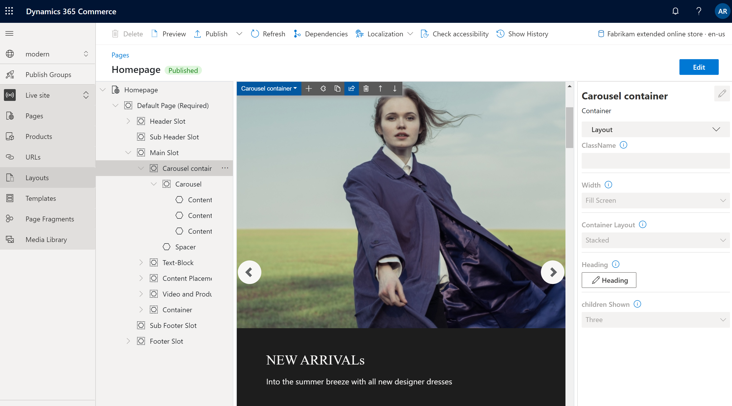
The following image shows an example of a container module that contains a carousel module in Commerce site builder. In this example, the Width property of the container module is set to Fill Screen.
Container module properties
| Property name | Values | Description |
|---|---|---|
| Heading | Heading text and heading tag (H1, H2, H3, H4, H5, or H6) | An optional heading for the container. By default, the H2 heading tag is used for the heading. However, you can change the tag to meet accessibility requirements. |
| Width | Fit container or Fill screen | If you set the value to Fit container (the default value), the modules inside the container are limited to the width of the container. If you set the value to Fill screen, the modules aren't limited to the container width but can fill the screen. |
| Number of columns | 1, 2, 3, 4, 6, or 12 | The number of columns in the container. A container can have up to 12 columns. |
Container with 2-slots
The container with 2-slots type is optimized for a two-column layout. This type of container has two slots to allow for a side-by-side view of the modules that are inside.
Use additional properties to optimize the layout for different view ports (mobile devices, tablets, computers, and so on). For every view port, define the width of each column. The following column width settings are available:
- 75%/25% – The first module has a column width of 75 percent, and the second module has a column width of 25 percent. A 25%/75% option is also available.
- 50%/50% – Both modules have equal column width.
- 67%/33% – The first module has a column width of 67 percent, and the second module has a column width of 33 percent. A 33%/67% option is also available.
- 100% – Both modules have a full-column width. Therefore, the modules are vertically stacked in a single column. Although this single-column layout goes against intent of the container with 2-slots type, it might be preferable for some view ports (for example, extra-small view ports such as mobile devices).
Container with 2-slots properties
| Property name | Values | Description |
|---|---|---|
| Heading | Heading text and heading tag | An optional heading for the container. |
| X-Small view port configuration | 25%/75%, 75%/25%, 50%/50%, 67%/33%, 33%/67%, or 100% | The layout for extra-small view ports. |
| Small view port configuration | 25%/75%, 75%/25%, 50%/50%, 67%/33%, 33%/67%, or 100% | The layout for small view ports, such as mobile devices. |
| Medium view port configuration | 25%/75%, 75%/25%, 50%/50%, 67%/33%, 33%/67%, or 100% | The layout for medium view ports, such as tablets. |
| Large view port configuration | 25%/75%, 75%/25%, 50%/50%, 67%/33%, 33%/67%, or 100% | The layout for large view ports, such as computers. |
Container with three slots
The container with three slots modules type is optimized for a three-column layout.
Use additional properties to optimize the layout for different view ports. For every view port, define the width of each column. The following column width settings are available:
- 33%/33%/33% – All three modules have equal column width.
- 50%/25%/25% – The first module has a column width of 50 percent, and each of the remaining two modules has a column width of 25 percent. 25%/50%/25% and 25%/25%/50% options are also available.
- 16%/16%/67% – Each of the first two modules has a column width of 16 percent, and the third module has a column width of 67 percent. 16%/67%/16% and 67%/16%/16% options are also available.
Container with three slots properties
| Property name | Values | Description |
|---|---|---|
| Heading | Heading text and heading tag | An optional heading for the container. |
| X-Small view port configuration | 33%/33%/33%, 50%/25%/25%, 25%/50%/25%, 25%/25%/50%, 16%/16%/67%, 16%/67%/16%, or 67%/16%/16% | The layout for extra-small view ports. |
| Small view port configuration | 33%/33%/33%, 50%/25%/25%, 25%/50%/25%, 25%/25%/50%, 16%/16%/67%, 16%/67%/16%, or 67%/16%/16% | The layout for small view ports, such as mobile devices. |
| Medium view port configuration | 33%/33%/33%, 50%/25%/25%, 25%/50%/25%, 25%/25%/50%, 16%/16%/67%, 16%/67%/16%, or 67%/16%/16% | The layout for medium view ports, such as tablets. |
| Large view port configuration | 33%/33%/33%, 50%/25%/25%, 25%/50%/25%, 25%/25%/50%, 16%/16%/67%, 16%/67%/16%, or 67%/16%/16% | The layout for large view ports, such as computers. |
Add a container module to a page
To add a container player module to a new page and set the required properties, follow these steps:
- Go to Templates, and select New to create a new template.
- In the New template dialog box, under Template name, enter Container template, and then select OK.
- In the Body slot, select the ellipsis (...), and then select Add module.
- In the Select modules dialog box, select the Default Page module, and then select OK.
- Select Save, select Finish editing to check in the template, and then select Publish to publish it.
- Go to Pages, and select New to create a new page.
- In the Create a new page dialog box, under Page name, enter Container page, and then select Next.
- Under Choose a template, select the Container template that you created, and then select Next.
- Under Choose a layout, select a page layout (for example, Flexible layout), and then select Next.
- Under Review and finish, review the page configuration. If you need to edit the page information, select Back. If the page information is correct, select Create page.
- In the Main slot of the new page, select the ellipsis (...), and then select Add module.
- In the Select modules dialog box, select the Container module, and then select OK.
- In the property pane for the container module, set the Number of columns property to 1 and the Width property to Fill container.
- In the Container slot, select the ellipsis (...), and then select Add module.
- In the Select modules dialog box, select the Content block module, and then select OK.
- In the property pane for the content block module, configure the heading, image, and layout.
- Select Save, and then select Preview to preview the page. You should see one feature module that fits within the width of the container module.
- In the property pane for the container module, change the value of the Number of columns property to 3.
- Add two more content block modules to the container module, and configure them.
- Select Save, and then select Preview to preview the page. You should now see three content block modules that appear side by side.
- After you create the layout that you want, select Finish editing to check in the page, and then select Publish to publish it.