Note
Access to this page requires authorization. You can try signing in or changing directories.
Access to this page requires authorization. You can try changing directories.
Note
The Retail Interest Group by Dynamics 365 Commerce has moved from Yammer to Viva Engage. If you don't have access to the new Viva Engage community, fill out this form (https://aka.ms/JoinD365commerceVivaEngageCommunity) to be added and stay engaged in the latest discussions.
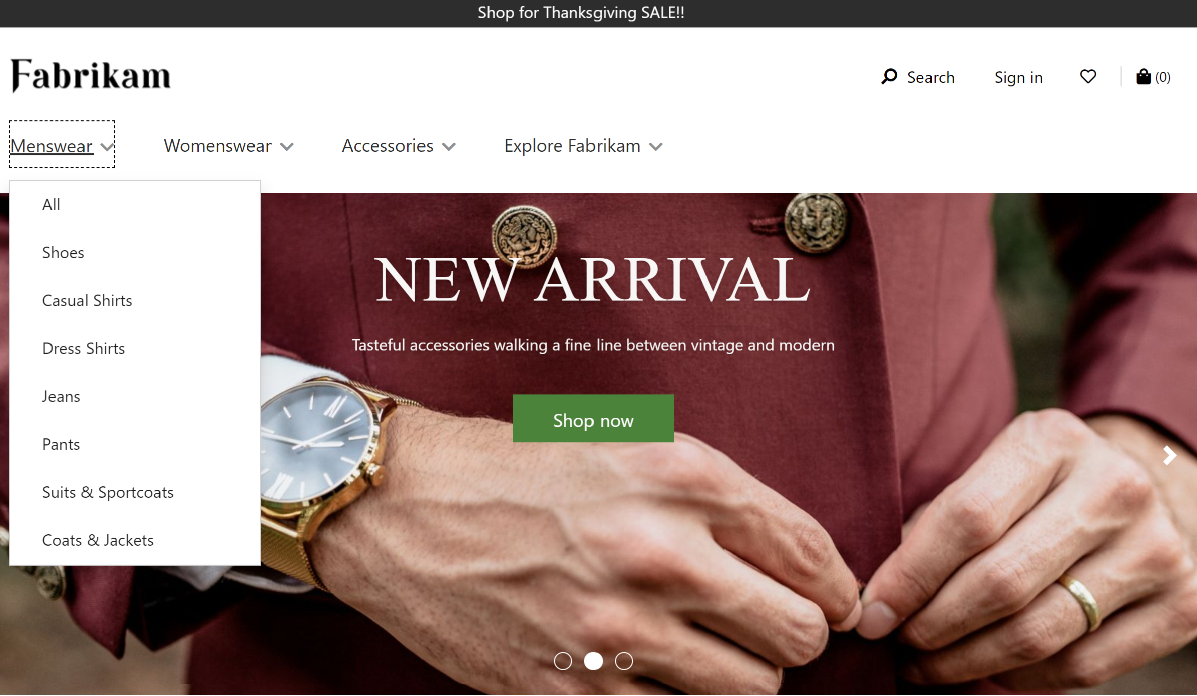
This article covers header modules and describes how to create page headers in Microsoft Dynamics 365 Commerce.
In Dynamics 365 Commerce, you configure a page header as a page fragment that includes the header, promo banner, and cookie consent modules.
The header module includes a site logo, links to the navigation hierarchy, links to other pages on the site, a cart icon module, a wishlist symbol, sign-in options, and the search bar. The header module automatically optimizes for the device that you're using to view the site (in other words, for a desktop device or a mobile device). For example, on a mobile device, the navigation bar is collapsed into a Menu button (which is sometimes referred to as a hamburger menu).
The following image shows an example of a header module on a home page.
Properties of a header module
A header module supports Logo image, Logo link, and My account links properties.
Use the Logo image and Logo link properties to define a logo on the page. For more information, see Add a logo.
Use the My account links property to define account pages that the site owner wants to show quick links for in the header.
Modules that are available within a header module
The following modules can be used in a header module:
Navigation menu – The navigation menu represents the channel navigation hierarchy and other static navigation links. For more information, see Navigation menu module.
Search – The search module lets users enter search terms to search for products. The URL of the default search page and the search query parameters must be provided at Site Settings > Extensions. The search module has properties that let you suppress the search button or label as you require. The search module also supports autosuggest options, such as product, keyword, and category search results.
Cart icon - The cart icon module represents the cart icon, which shows the number of items in the cart at any given time. For more information, see Cart icon module.
Site selector - The site selector module lets users browse across different predefined sites, based on market, regions, and locales. For more information, see Site selector module.
Store selector - The store selector module can be included in a header module's store selector slot. It lets users browse and find nearby stores. Users can also specify a preferred store, which is then shown in the header. When the store selector module is included in the header module, its Mode property must be set to Find stores. For more information, see Store selector module.
Note
- Support for using the cart icon module in header modules is available as of the Dynamics 365 Commerce version 10.0.11 release.
- Support for using the site selector module in header modules is available as of the Dynamics 365 Commerce version 10.0.14 release.
- Support for using the store selector module in header modules is available as of the Dynamics 365 Commerce version 10.0.15 release.
Header module in the Adventure Works theme
In the Adventure Works theme, the header module supports the Mobile Logo property. This property enables a logo to be specified for mobile viewports. The Mobile Logo property is available as a module definition extension.
Important
The Adventure Works theme is available as of the Dynamics 365 Commerce version 10.0.20 release.
Create a header fragment for a page
To create a header fragment, follow these steps:
- Go to Fragments, and select New to create a new fragment.
- In the Select a fragment dialog box, select the Container module, enter a name for the fragment, and then select OK.
- Select the Default container slot, and then, in the properties pane on the right, set the Width property to Fill Screen.
- In the Default container slot, select the ellipsis (...), and then select Add module.
- In the Select modules dialog box, select the Cookie consent, Header, and Promo banner modules, and then select OK.
- In the properties pane of the Promo banner module, select Add Message, and then select Message.
- In the Message dialog box, add text and links for the promotional content, and then select OK.
- In the properties pane of the Cookie consent module, add and configure text and a link to the site privacy page.
- In the Navigation menu slot of the header module, select the ellipsis (...), and then select Add module.
- In the Select modules dialog box, select the Navigation menu module, and then select OK.
- In the property pane for the navigation menu module, under Source for navigation menu, select Retail Server.
- In the property pane for the navigation menu module, under Static menu items, select Add Menu item, and then select Menu item.
- In the Menu item dialog box, under Menu Item Text enter "Contact."
- In the Menu item dialog box, under Menu Item Link target select Add a link.
- In the Add a link dialog box, select the URL for the site's "Contact" page, and then select OK.
- In the Menu item dialog box, select OK.
- In the Search slot of the header module, select the ellipsis (...), and then select Add module.
- In the Select modules dialog box, select the Search module, and then select OK.
- In the property pane for the search module, configure the properties as needed.
- In the Cart icon slot of the header module, select the ellipsis (...), and then select Add module.
- In the Select modules dialog box, select the Cart icon module, and then select OK.
- In the property pane for the cart icon module, configure the properties as needed. If you want the cart icon to display a cart summary (also known as a mini cart) when users hover over it, select Show mini cart.
- Select Save, select Finish editing to check in the fragment, and then select Publish to publish it.
To help ensure that a header appears on every page, follow these steps on every page template that is created for the site.
- In the Header slot of the Default page module, add the footer fragment that you created.
- Select Save, select Finish editing to check in the template, and then select Publish to publish it.