Note
Access to this page requires authorization. You can try signing in or changing directories.
Access to this page requires authorization. You can try changing directories.
Note
The Retail Interest Group by Dynamics 365 Commerce has moved from Yammer to Viva Engage. If you don't have access to the new Viva Engage community, fill out this form (https://aka.ms/JoinD365commerceVivaEngageCommunity) to be added and stay engaged in the latest discussions.
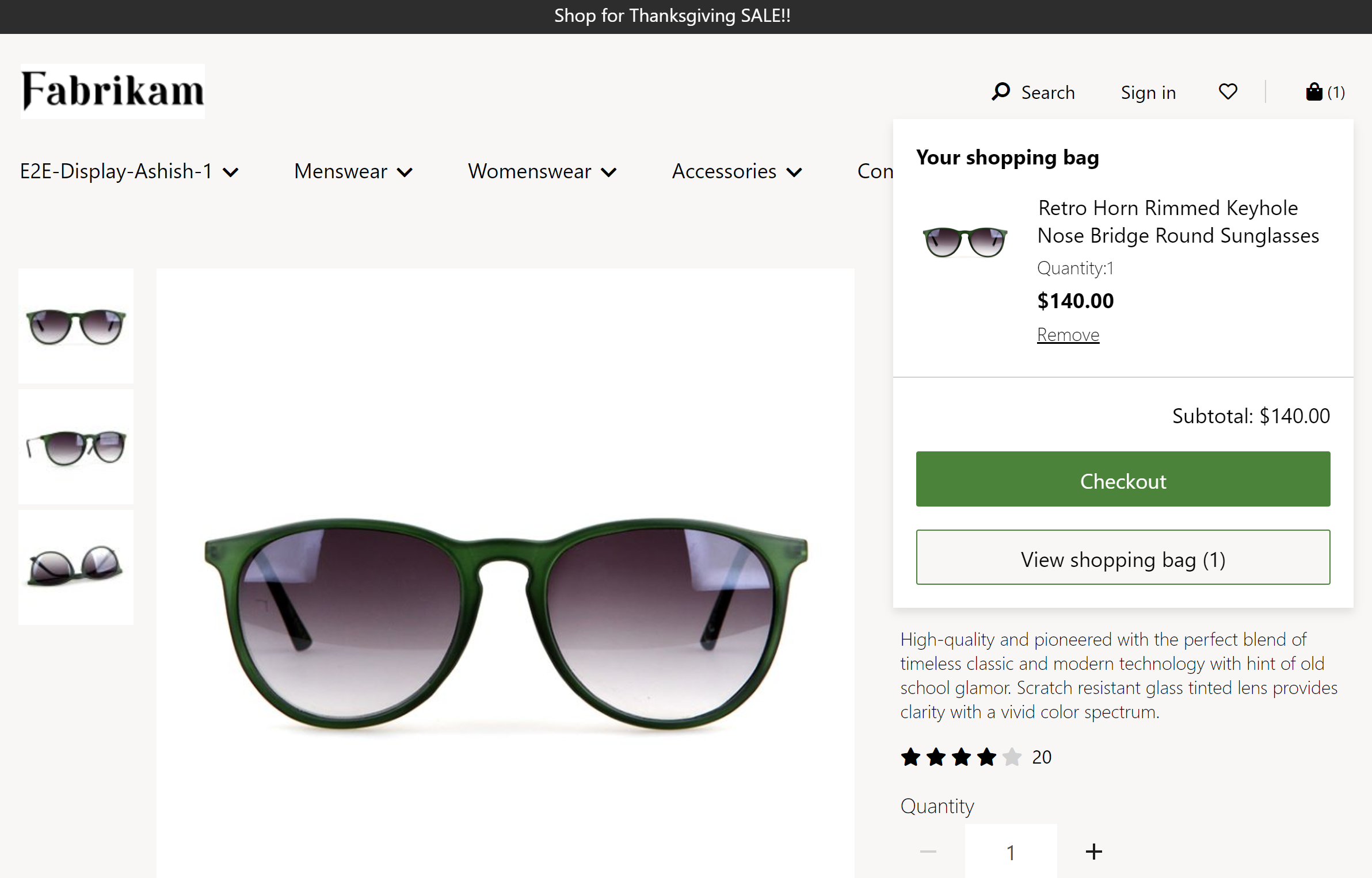
This article explains how to add the cart icon module to site pages in Microsoft Dynamics 365 Commerce.
The cart icon module represents the cart in the header module of the page, and shows the number of items in the cart. The cart icon module also displays a cart summary (also known as a mini cart) when the cart icon is hovered over. The mini cart provides the user with a summary of the items in the cart without having to navigate to the cart page. It also allows the user to proceed directly to the checkout page if they're happy with the summary. This flow reduces the number of page navigation clicks and makes checkout faster.
The following image shows an example of a cart icon module that displays a mini cart in the Fabrikam header.
Module properties
Show mini cart – When you set this property to True, a cart summary (mini cart) is shown when users hover over the cart icon. This functionality is supported only for desktop view ports.
Allow anonymous checkout – When you set this property to True, the mini cart allows users who aren't signed in to do a guest checkout. Starting in Commerce version 10.0.45, you must enable the Allow anonymous checkout configuration in the functionality profile associated with the online channel.
Important
The Allow anonymous checkout configuration in the functionality profile is disabled by default.
Order of items – This property controls the order in which items appear in the mini cart. When you select the New items added to top of the list option, new items added to the cart appear at the top of the list of mini cart items. When you select the default option New items added to bottom of the list, new items added to the cart appear at the bottom of the list of mini cart items. This property is available as part of the Commerce module library package starting with Commerce version 10.0.21.
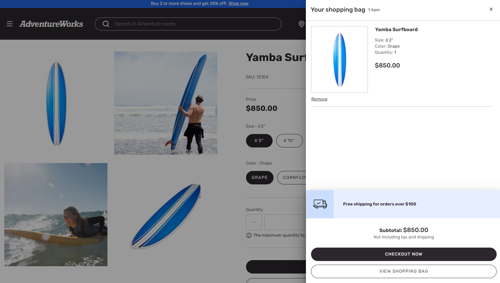
Module properties and slots in the Adventure Works theme
In the Adventure Works theme, the cart icon module includes two extra slots for the mini cart. The module definition extension includes these slots.
- Empty cart promotions – This slot takes a content block module. When the cart is empty, the specified content block module appears. Use the content block module for promotions, marketing content, and links to category pages, to help customers continue their shopping journey.
- Promotional content – Use this slot to showcase promotions, such as "Free shipping on orders over $100." Content block, text block, and image list modules can be used in the promotional content slot.
The following image shows an example of a cart icon module in the Adventure Works theme that displays promotional content on the mini cart.
Important
The Adventure Works theme slots are available as of the Dynamics 365 Commerce version 10.0.20 release.
Add a cart icon module to a page
For information about how to add a cart icon module, see Header module.