Note
Access to this page requires authorization. You can try signing in or changing directories.
Access to this page requires authorization. You can try changing directories.
[This article is prerelease documentation and is subject to change.]
Dynamic layout mode is the feature that enables you to customize how cards are arranged, sized, and organized within each tab of the process intelligence experience. In edit layout mode, you have complete control over your dashboard's visual structure, allowing you to create layouts optimized for specific analytical workflows.
Important
- This is a preview feature.
- Preview features aren’t meant for production use and may have restricted functionality. These features are available before an official release so that customers can get early access and provide feedback.
- For more information, go to our preview terms.
Enter edit layout mode
To begin to customize your layout, select Edit layout in the top-right corner of the interface. This action enables edit mode, allowing you to rearrange and resize cards on the canvas.
- The interface enters edit mode, making cards moveable and resizable.
- The Add card panel becomes accessible.
- Card resize handles become visible on selected cards.
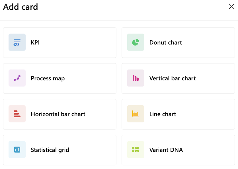
In edit layout mode, the Add card panel appears on the right side of the interface. This panel displays all card types in a grid layout.
The following screenshot is an example of the Add card panel.
Card types
The Add card panel shows the following card type options: .
- KPI: Display key performance indicators with large numeric values
- Donut chart: Show proportional data in a circular, segmented format.
- Process map: Visualize the process flow with activities and connections.
- Vertical bar chart: Compare values across categories using vertical bars.
- Horizontal bar chart: Compare values using horizontal bars.
- Line chart: Display trends and changes over time.
- Statistical grid: Present detailed data in a tabular format.
- Variant DNA: Analyze process variant patterns and characteristics
Add a card
To add a card to your layout:
In the Add card panel, select a card type tile.
- The card is immediately added to your dashboard.
- The new card appears in an uncustomized state.
Configure the card's data and appearance.
Drag and drop positioning
The following screenshot demonstrates the drag and drop capabilities in edit mode.
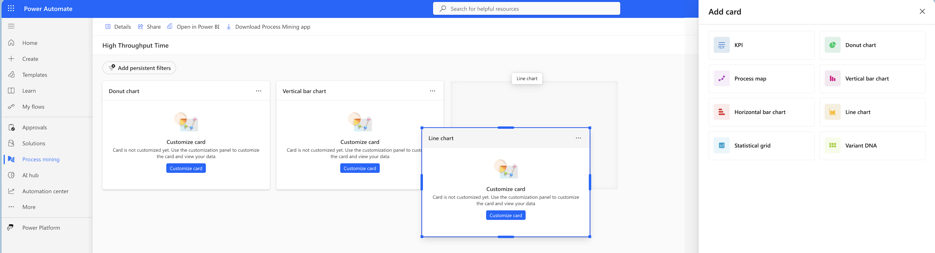
Notice the following in the screenshot:
- Multiple cards are visible: Donut chart, Vertical bar chart, and Line chart.
- A Line chart card is being repositioned. It shows with a blue selection border.
- Cards display in an uncustomized state with the Customize card button visible.
- The Add card panel remains accessible on the right side.
Move cards
The layout system uses a grid-based arrangement, which allows cards to snap to alignment positions as you move them. This arrangement ensures a clean, organized appearance.
To reposition a card:
In edit layout mode, hover over a card.
Select and hold (or click and hold) on the card's header area.
Drag the card to your desired position on the canvas.
As you drag, other cards automatically adjust to make room.
To drop the card in its new location, release your navigation device (or mouse button).
Resize cards
When you select a card in edit mode, it displays a blue border with circular resize handles, as shown in the following screenshot.
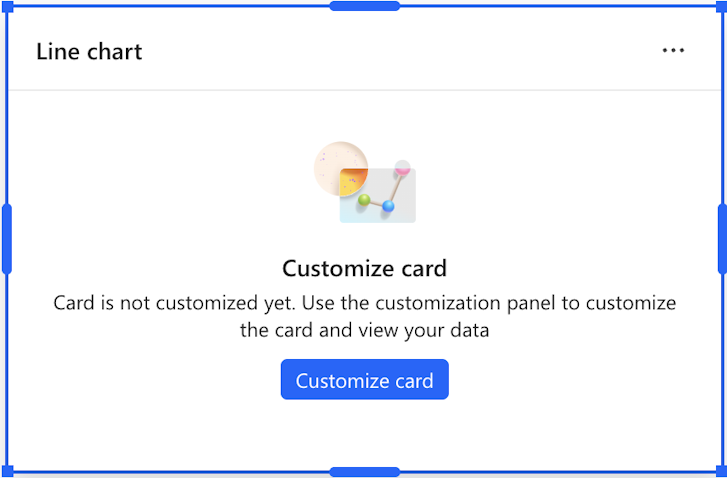
The resize handles appear in the following positions around the card's perimeter:
- Four corners: Top-left, top-right, bottom-left, and bottom-right.
- Four edge midpoints: Top center, bottom center, left center, and right center.
In the screenshot, you can see a Line chart card with bright blue circular handles at all eight positions around its perimeter.
To change a card's size:
Select the card. A blue border appears with handles.
Select and hold (or click and hold) on any resize handle.
Drag the handle to expand or contract the card:
- Corner handles: Resize both width and height simultaneously.
- Edge handles: Resize in one dimension only.
Release to apply the new size.
To ensure content remains readable and the layout stays functional, cards have minimum and maximum size constraints.
Uncustomized card state
When you first add a card or didn't yet configure it, the card displays in an uncustomized state.
To open the configuration panel where you can select data sources, choose metrics, and configure visualization settings specific to that card type, select Customize card.
Edit mode controls
While in edit layout mode, more controls display:
- Add card panel: Right-side panel for selecting new cards to add.
- Add persistent filters: Button to create filters that apply across all cards. They're saved with the tab layout and can't be removed when viewing the tab.
- Card context menus: Three-dot menus on each card for more options.
- Save/Exit controls: Options to save your layout changes or exit edit mode.
Layout best practices
- Group related metrics: Place connected visualizations near each other.
- Size by importance: Make critical KPIs and charts larger for visibility.
- Balance the layout: Distribute cards evenly across the canvas.
- Consider flow: Arrange cards in a logical reading order. Arrangement is typically left-to-right, top-to-bottom.
- Test at different screen sizes: Ensure your layout works well on various display resolutions.
Save your layout
Save changes made in edit layout mode by selecting Save when exiting edit mode.