Note
Access to this page requires authorization. You can try signing in or changing directories.
Access to this page requires authorization. You can try changing directories.
The Corporate Spend built-in sample contains a report and semantic model that analyzes the planned versus actual costs of an IT department. This comparison helps you understand how well the company planned for the year. You can investigate areas with huge deviations from the plan. The company in this example goes through a yearly planning cycle. Quarterly, it produces a new latest estimate to help analyze changes in IT spend over the fiscal year.

This sample is part of a series that shows how you can use Power BI with business-oriented data, reports, and dashboards. The company obviEnce created samples using real, anonymized data. The data is available as a built-in sample in the Power BI service and a .pbix Power BI Desktop file. For more information, see Samples for Power BI.
This tour explores the Corporate Spend built-in sample in the Power BI service. Because the report experience is similar in Power BI Desktop, you can also follow along by using the sample .pbix file in Power BI Desktop.
Prerequisites
You don't need a Power BI license to explore the samples in Power BI Desktop. You just need a Fabric free license to explore the sample in the Power BI service, and save it to your My workspace.
Get the sample
Before you can use the sample, get the sample in one of the following ways:
- Get the built-in sample in the service.
- Download the .pbix file.
Get the built-in sample
Open the Power BI service (
app.powerbi.com), and select Learn in the left navigation.On the Learning center page, under Sample reports, scroll until you see the Corporate Spend sample.
Select the sample. It opens in Reading mode.
Power BI imports the built-in sample, adding a report and semantic model to your current workspace.
Get the .pbix file for this sample
Alternatively, you can download the Corporate Spend sample as a .pbix file, which is designed for use with Power BI Desktop.
Open the GitHub Samples repository to the Corporate Spend sample .pbix file.
Select Download in the upper-right corner. The sample downloads automatically to your Downloads folder.
If you'd like to view it in the Power BI service, you can publish it there.
Open the file in Power BI Desktop and select File > Publish > Publish to Power BI or choose Publish in the Home ribbon.
In the Publish to Power BI dialog box, choose a workspace, and then Select.
Power BI imports the sample, adding the report and semantic model to your selected workspace.
Explore the report
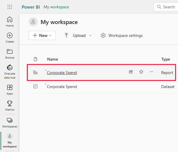
To open the Corporate Spend report, go to your workspace and select Corporate Spend.
A report can contain several pages with different visualizations. You can look at and interact with all the visualizations.
You can edit current visualizations and create your own visualizations that use the semantic model for this sample. This environment is a safe one to play in, because you can choose not to save your changes. But if you do save them, you can always return to the Learning center for a new copy of this sample.
Select Edit in the Power BI header bar to explore in the editing view:
- See how the pages are made, the fields in each chart, and the filters on the pages.
- Add pages and charts, based on the same data.
- Change the visualization type for each chart.
- Pin charts of interest to your dashboard.
Save or discard your changes.
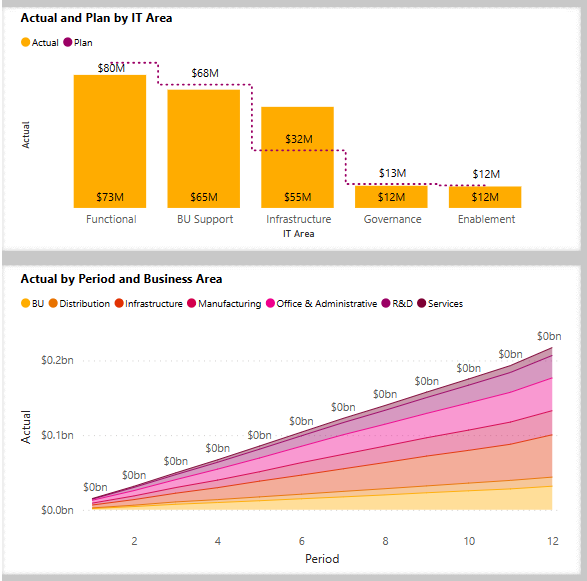
IT Spend Trend page
This section describes the visuals from the IT Spend Trend section of the sample report.
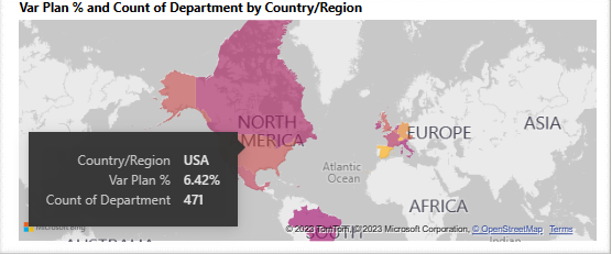
To see data for all regions, select All regions from Select Sales Region.
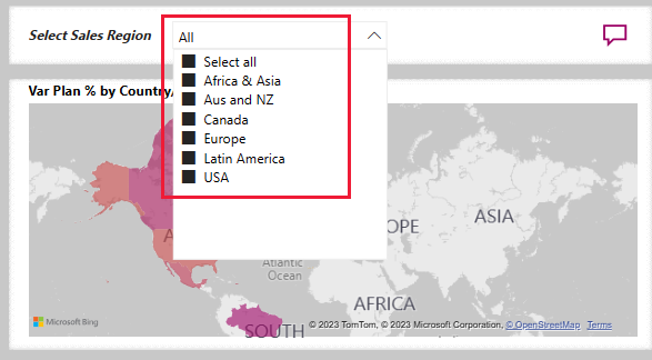
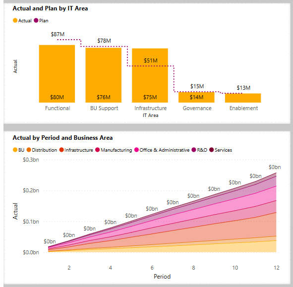
All the visualizations on the page reflect this selection. The Actual and Plan by IT Area and Actual by Period and Business Area visualizations show data from all regions.
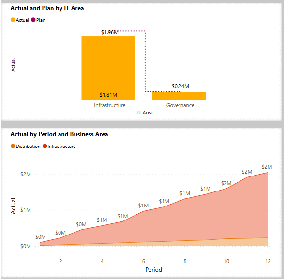
Select Aus and NZ from Select Sales Region, and then observe the Actual and Plan by IT Area chart.
Now select USA. You can compare actual and planned spend for different selections.
Learn about the decomposition tree
Use the decomposition tree visualization, or decomp tree, to visualize data across multiple dimensions. You can aggregate data and drill down into your dimensions in any order. This tool is valuable for improvised exploration and conducting root cause analysis.
There's a decomp tree in the IT Spend Trend page of the Corporate Spend sample. Open the report to experiment with the visualization.

For Select Sales Region, select All to query data from all regions.
Select the X next to Period and IT Area to remove those branches.
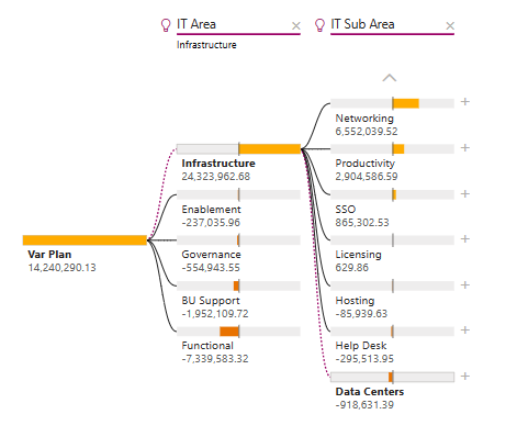
Next to Var Plan, select the plus sign, then select Sales Region.
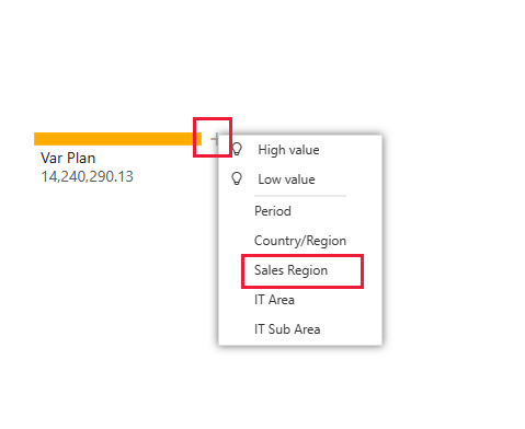
The decomp tree shows the six regions as branches.
Now select the plus sign next to Europe and then select IT Area.
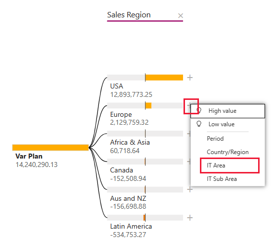
You can follow the branches down for the sales region you select. You can expand any of the branches in IT Area for a different data type.
Select the X next to IT Area and Sales Region to remove those branches.
Next to Var Plan, select the plus sign, then select High value.
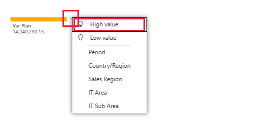
The visualization shows Var Plan broken down by IT Area. The High value selection considers all available fields and determines which one to drill into to get the highest value of the measure being analyzed.
Next to Infrastructure, select the plus sign, then select Low value. This option gets the lowest value for the measure being analyzed, in this example, IT Sub Area.
For more information, see Create and view decomposition tree visuals in Power BI.
Plan Variance Analysis page
Open the report and select the Plan Variance Analysis page from the Pages column. For Select Sales Region, select All.
The Var Plan by Business Area shows the variance for all regions.
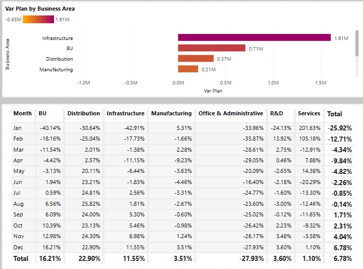
Below that visualization, the Var Plan % by Business Area is presented as a table of values. If you want to view it as a visualization parallel to the one above it, edit the report.
In the menu bar, select Edit.
Select the table then, under Visualizations, select the Stacked bar chart.
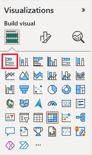
Visualizations offers many options to display your data.
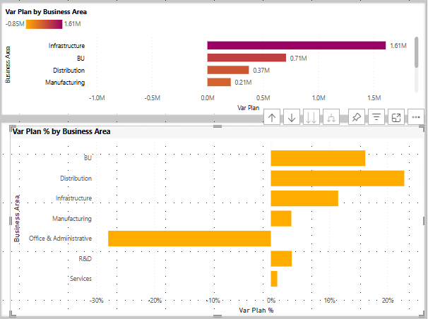
Select Reading view to exit the Edit mode and save your changes.
Customize tooltips
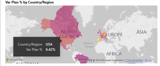
Power BI report visualizations display details about elements when you hover over them. For instance, open the Corporate Spend report and hover over a region in the map.
To see and edit tooltips:
Select Edit in the Power BI report bar to enter Edit mode.
Select the map visualization and, if necessary, expand Visualizations. Scroll down to see the Tooltips value.
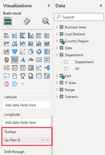
You can change of add data fields to the tooltip. Drag a value from the Data pane to the Tooltip.
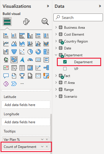
Select Reading view to leave Edit mode. Save your changes when prompted.
Now hover over a region again to see the value that you added.
For more information about tooltips, see Visual tooltips in Power BI.
Use hidden pages as tooltips
Power BI also supports a report page as a tooltip. To see an example, open the Corporate Spend report, select the IT Spend Trend page, and hover over Actual and Plan IT Area.
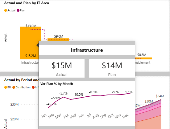
The displayed tooltip is a hidden report page. To see it, select Edit to enter Edit mode, then select the Tooltip tab.

You can create and edit this report page here. As a hidden page, it doesn't appear with the other pages in the report. Add as many visualizations to this page as you want. Remember that, as a tooltip, a large page covers up a lot of space in your report view.
For more information, see Create tooltips based on report pages.
Create a Corporate Spend dashboard
A Power BI dashboard is a single page containing visualizations that can come from one or more reports, and each report is based on one semantic model. You can also generate visualizations on the dashboard by using the Q&A Ask a question about your data feature to explore the data associated with a report. Think of a dashboard as an entryway into the underlying reports and semantic models. Select a visualization to take you to the report that was used to create it.
To create a dashboard in the Power BI service:
Open a report by selecting it in a workspace.
Hover over a visual and then select Pin visual.
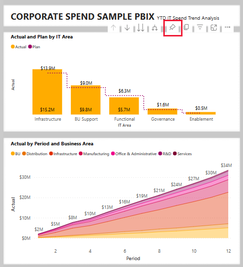
Or, to add all of the visuals to a dashboard, from the report menu, select ... (More options) > Pin to a dashboard.
In Pin to dashboard, select New Dashboard and enter a name for your dashboard.
You can add visuals to an existing dashboard to show visualizations from different reports.
Then select Pin Live.
Your new dashboard now appears in My workspace.
For more information, see Introduction to dashboards for Power BI designers.
Ask questions of the data
A dashboard offers the ability to ask questions about data in natural language to create visuals. It doesn't matter how you create your dashboard or which tiles it has. You can ask questions about any semantic model attached to your dashboard.
In the dashboard, select Ask a question about your data. Power BI suggests several questions as starting points.
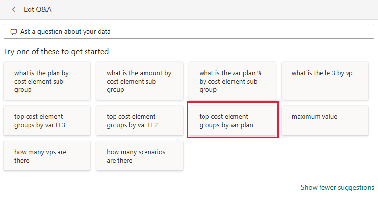
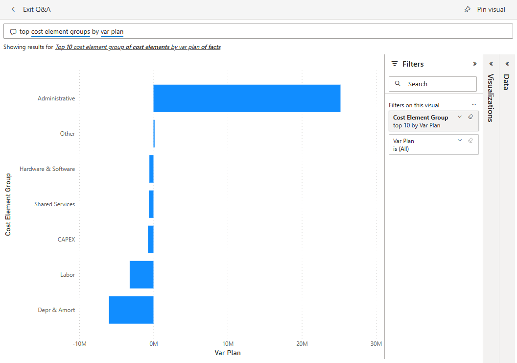
From Try one of these to get started, select top cost element groups by var plan.
In the Q&A box, clear the previous entry and enter what is the plan and var plan % by cost element sub group.
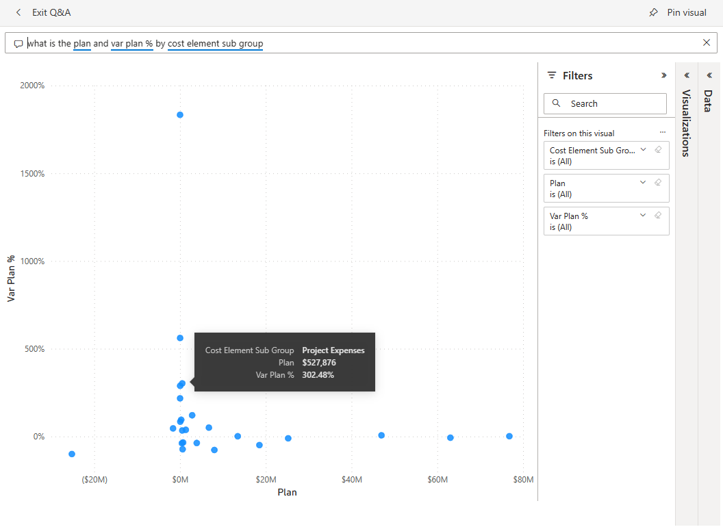
Hover over a point for details and values.
Select Exit Q&A to return to the dashboard.


Related content
We hope this tour has shown how Power BI dashboards, Q&A, and reports can provide insights into sample data. Now it's your turn. Connect to your own data. With Power BI, you can connect to a wide variety of data sources. To learn more, see Get started creating in the Power BI service.