Note
Access to this page requires authorization. You can try signing in or changing directories.
Access to this page requires authorization. You can try changing directories.
Controls allow app users to visualize data within table columns in addition to enabling interaction with them.
Controls exist to provide a more touch-friendly experience with model-driven apps. These include toggle, star rating, calendar, number input, and other controls.
Most controls are configured for a table column, but some controls, like the grid controls can be configured for the table.
Using controls in the form designer
To use these controls in the form designer:
Sign in to Power Apps.
Select Tables on the left navigation pane. If the item isn’t in the side panel pane, select …More and then select the item you want.
Select the required table and then select the Forms area.
Select the main form to be edited.
Select the column or section where you want to add the control.
In the right properties pane, select + Component to display the available controls, and then select the control you want.
Note
Different controls are available depending on the column or grid type. For example, star rating controls are only available for whole number columns.
Select the devices (web, tablet, and phone) you want the control to appear on.
Configure the values for each property.
Select Done when you’re done configuring the control.
Following are descriptions for each control you can use on forms.
Grid controls
Grid controls can be configured at the following levels:
- Table. When a grid control is configured for a table, all views for the table will use the grid control. More information: Configure a grid control for a table
- Form. Subgrids added to a form use a grid control to control the behavior of the subgrid.
Subgrid
The read-only subgrid allows you to present a view of data related to the current record where users can view and open the record from within the grid. More information: Add and configure a subgrid component on a form
Editable grid
With editable grids, users can do rich in-line editing of records directly from views and subgrids whether they're using a web app, tablet, or phone. More information: Make model-driven app grids (lists) editable using the editable grid control
Power Apps grid control
The Power Apps grid control represents the next evolution of the Power Apps grid control, allowing users to view, open, and edit records from views and subgrids. By default, the Power Apps grid control is read-only but you can configure it to be editable.
More information: Power Apps grid control
Configure a grid control for a table
- Sign in to Power Apps.
- Open solution explorer, expand Entities, and then select the table you want, such as the account table.
- Select the Controls tab, and then select the grid you want for the table.
- Depending on the grid control, specify the values you want, Save and then Publish the customization.
Display controls
Calendar
The Calendar control control displays scheduled activities and their associated details in a calendar. You can view, create, and delete your activities in a day, week, or month view. More information: Add the calendar control to tables
Canvas app
An embedded canvas app includes rich data integration capabilities that bring in contextual data from the host model-driven form to the embedded canvas app. Display the data you want from a variety of sources right next to data from Microsoft Dataverse. More information: Add an embedded canvas app on a model-driven form
External website
Add inline frames (iframes) to a form to integrate content from another website within the form. More information: Add an iframe to a model-driven app main form
HTML and image web resource
Display an HTML page or image file on a form via a web resource. More information: View and edit a web resource on a form
Knowledge search
Requires Dynamics 365 Customer Service app. Add a Knowledge Base Search control to a form to make it easy for users in your organization to find knowledge articles so they can answer common customer questions and resolve their issues right from the records, without having to switch to a different application. More information: Add the Knowledge Base Search control to forms
Quick view
The quick view control displays data from a row that is selected in a lookup on the form. The data displayed in the control is defined using a quick view form. The data displayed is not editable, but when the primary column is included in the quick view form, it becomes a link to open the related row. More information: Model-driven app quick view control properties
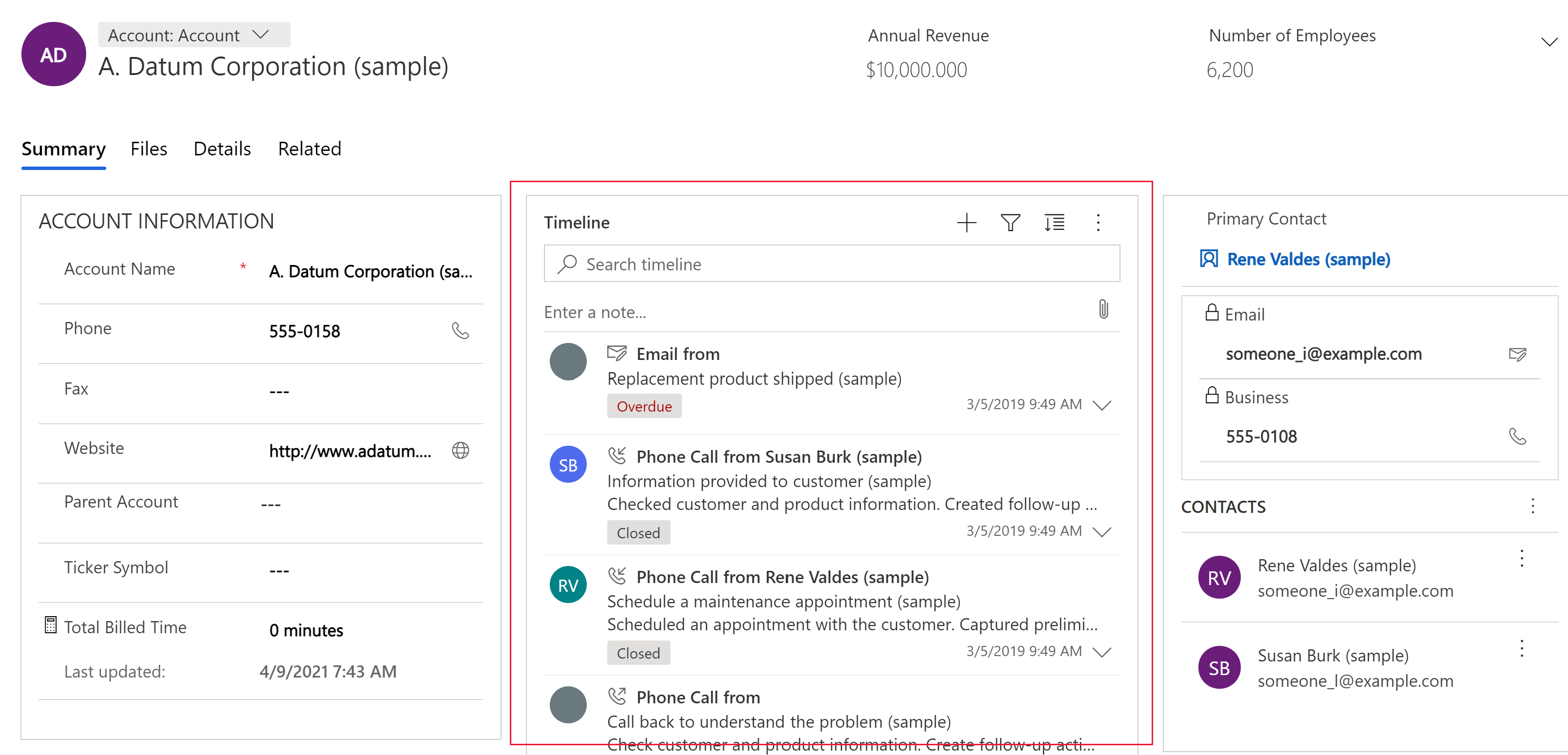
Timeline control
Provide a timeline of recent, relevant news articles and Twitter tweets for an account. More information: Set up the timeline control
| Property | Description |
|---|---|
| CC_Timeline_Title | Property to map for the title of each timeline item. |
| CC_Timeline_Title_Desc | Description for Title. |
| CC_Timeline_Label1 | Column to be displayed below the title of timeline item. |
| CC_Timeline_Label1_Desc | Description for Label 1. |
| CC_Timeline_Label2 | Column to be displayed after Label 1. |
| CC_Timeline_Label2_Desc | Description for Label 2. |
| CC_Timeline_Label3 | Column to be displayed after Label 2. |
| CC_Timeline_Label3_Desc | Description for Label 3. |
| CC_Timeline_Label4 | Column to be displayed after Label 3. |
| CC_Timeline_Label4_Desc | Description for Label 4. |
| CC_Timeline_Label5 | Column to be displayed after Label 4. |
| CC_Timeline_Label5_Desc | Description for Label 5. |
| CC_Timeline_Timestamp | Column to use for sorting timeline in reverse chronological order. |
| CC_Timeline_Timestamp_Desc | Description for Timestamp. |
| CC_Timeline_Group | Column to map for grouping timeline. |
| CC_Timeline_Group_Desc | Description for Group column. |
| CC_Timeline_GroupOrder | Order of the group the item belongs to relative to other groups (assign values 1, 2, 3, and so on for groups to be displayed). The group will be displayed in ascending value of group values assigned. |
| CC_Timeline_GroupOrder_Desc | Description for Group Order column. |
| CC_Timeline_URL | URL column to map for displaying the URL of each timeline item. |
| CC_Timeline_URL_Desc | Description for URL column. |
| CC_Timeline_ThumbnailURL | Column to map for thumbnail of image/icon to display for each item. |
| CC_Timeline_ThumbnailURL_Desc | Description for the ThumbnailURL column. |
| CC_Timeline_Filter | Column to map for timeline filter. |
| CC_Timeline_Filter_Desc | Description for Filter. |
| CC_Timeline_Footer | Web resource to display as the footer of the timeline. |
| CC_Timeline_Footer_Desc | Description for Footer column. |
Input controls
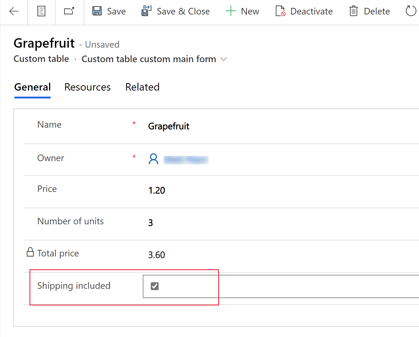
Checkbox
Let's the user to choose between binary values by checking or clearing a check box. It can be configured with yes/no choice columns.
Option set
The option set control presents a set of choices for your users to choose from when entering data. It is made available by default when introducing a choice column into a form. More information: Choices
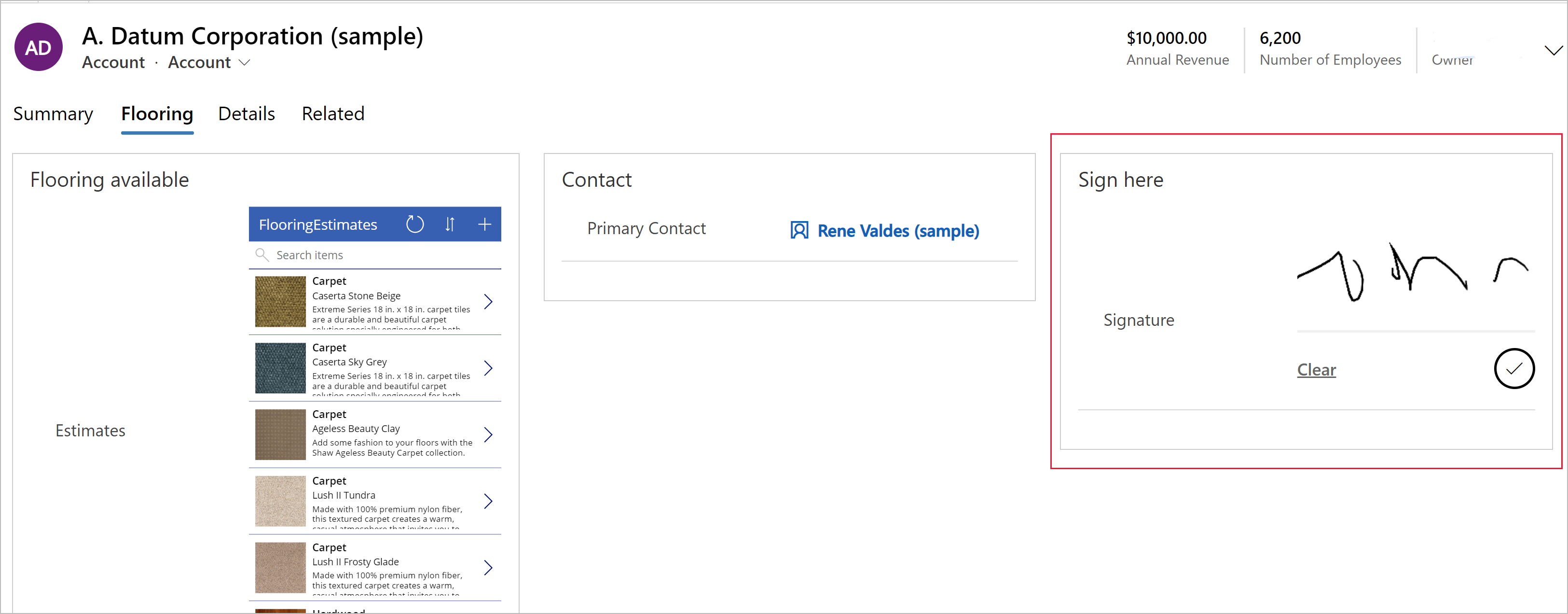
Pen input
Use the pen input control to capture written input such as signatures. The pen input control can be configured for multiline text columns for use with web, tablet, and phone clients.
Important
The minimum recommended Maximum Length specified for the column this control maps to is 15000.
| Property | Description |
|---|---|
| PenMode | Specify PenMode!Draw, PenMode!Erase, or PenMode!Select to determine what happens when a user drags a pointing device in a pen control. |
Rich text editor
The rich text editor control provides the app user a WYSIWYG editing area for formatting text. The control's input and output format is HTML. The control allows copied rich text, such as from a web browser or Word, to be pasted into the control. It can be configured with text columns. More information: Add the rich text editor control to a model-driven app
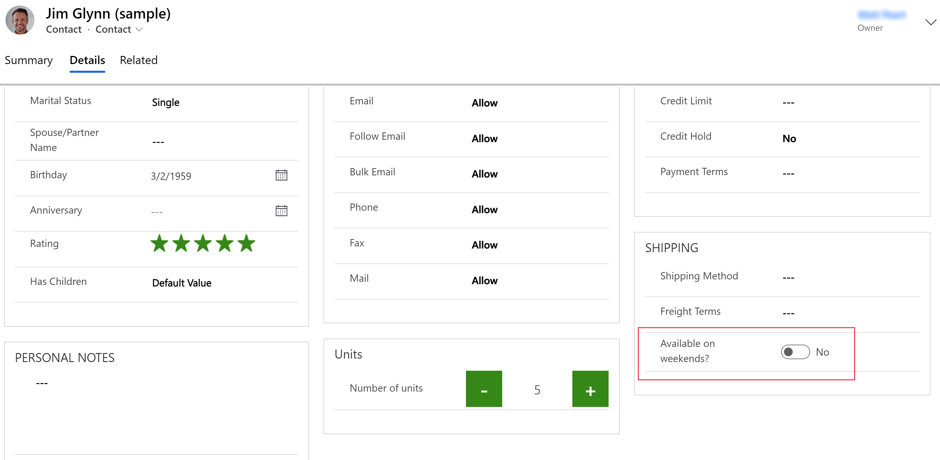
Toggle
The toggle control allows users to choose between binary values, such as on/off and yes/no, by toggling the button. It can be configured with yes/no choice columns.
AI Builder
Business card reader
Use the AI Builder business card reader control to detect business cards and extract their information. You can take photos directly in the component or load images that you've taken. More information: Use the business card reader component in model-driven apps
Power BI
Power BI report
Embed a Power BI report in a model-driven app dashboard. More information: Create or edit a Power BI embedded system dashboard
More components controls
Some components aren't displayed in the default Components list in the form designer but can be added to the list by selecting Get more components.
Form component
The form component control lets users edit information of a related table record directly from another table’s form. For example, here's the form component on a separate tab on the main account form, which lets the user edit a contact record without leaving the account form. More information: Edit related table records directly from another table’s main form
Collaboration controls
Collaboration controls give you the power to simplify your user’s workflow collaboration. Build model-driven apps that allow users to work with approvals, files, meetings, notes, and tasks from Microsoft 365 and Microsoft Teams without switching the context from app to app. More information: Collaboration controls
Legacy controls
Timer control
The timer control shows your users how much time is available to complete an action in the resolution of an active row or how much time has passed since the time to complete the action has passed. More information: Model-driven app timer control overview
News control
Only available in classic.
Gain valuable insights from the latest news about your customers, competitors, and contacts. The news control delivers relevant news from Bing News. More information: Set up and use the news control
Deprecated controls
Arc knob
Only available in classic.
The arc knob provides a way for users to enter data by sliding the knob, and shows up on the screen as an arc. The arc knob control provides whole number input and display only. Use this control for any numerical and money columns. You can use touch to change the value, you can also focus on the number and edit it using the keypad.
Important
- This control isn’t supported on Android 4.2 and 4.3 devices. It impacts the scrolling experience on those versions.
| Property | Description |
|---|---|
| Max | Set the maximum value to display on the gauge. |
| Min | Set the minimum value to display on the gauge. |
| Value | Get or set the value to display on the gauge. |
| Step | Set the amount to add or subtract from the current value when entering data with this control. |
Auto-complete
Only available in classic.
The auto-complete control filters an item list as you type and lets you select a value from the drop-down list. For example, you can use this control to let users choose from a dropdown list of states or countries/regions. This control maps to a Single Line of Text type column.
| Property | Description |
|---|---|
| Column | Shows the column the control is mapped to. |
| Source | Set the source for the data (Grouped Options, Choice, or View). |
| Choice | Select the option set for this column. |
| View | Select the table and view for this column. |
| Column | Select the column of the view’s primary table to use as the data source. |
Flip
The flip switch is like an on/off switch, providing a choice between two values.
Linear gauge
Only available in classic.
The linear gauge lets your users input numerical values by dragging a slider instead of typing in the exact quantity. The slider provides whole number input and display only. Use this control for any numerical and money columns.
Important
This control will be deprecated in April 2021. More information: Model-driven app controls deprecation
| Property | Description |
|---|---|
| Max | Set the maximum value to display on the gauge. |
| Min | Set the minimum value to display on the gauge. |
| Value | Get or set the value to display on the gauge. |
| Step | Set the amount to add or subtract from the current value when entering data with this control. |
Multimedia
Only available in classic.
You can embed videos to provide a richer customer experience for sales and people on the go. Use this control to map to a URL column that contains the audio or video link to play in the control.
Note
This control is supported on Android versions 4.4 and later.
YouTube videos aren’t currently supported on Windows 8 and Windows 8.1 tablets and phones. On Windows 10, only HTTPS videos (including YouTube) are supported.
Supported media types include:
Streaming MP4 files
YouTube videos
Azure media
Audio streams
| Property | Description |
|---|---|
| Media | Enter the URL of the media to play in this control. |
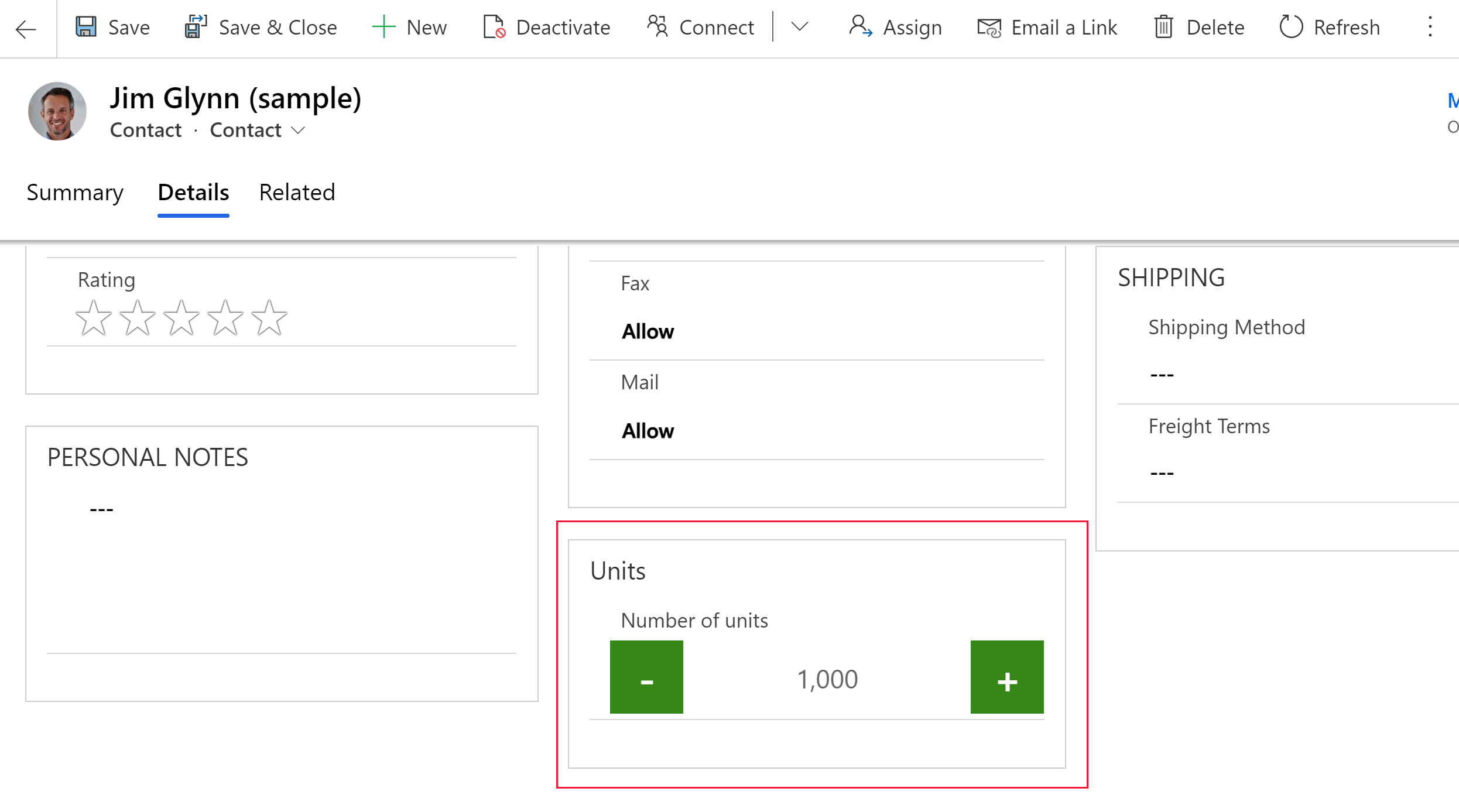
Number input
Use the number input control to help users enter data quickly. Users only have to tap the plus and minus buttons to change a numeric value in increments you set. Use this control for any numerical or money column. Users can also type a number directly into the column. This column is only supported in edit mode.
| Property | Description |
|---|---|
| Step | Set the amount to add or subtract from the current value when entering data with this control. |
| Column | Shows the column the control is mapped to. |
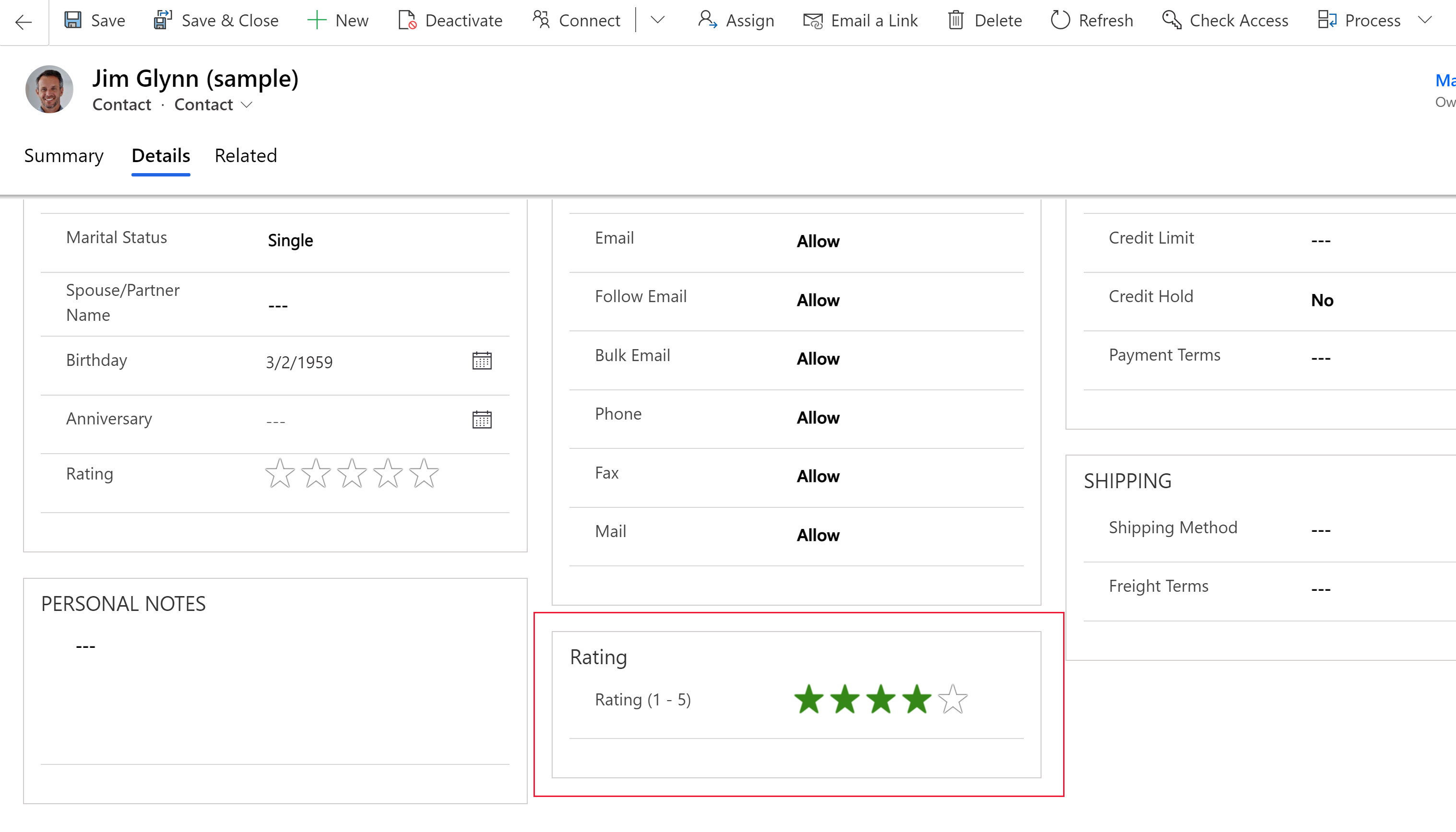
Star rating
Use the star rating to provide a visual representation of a rating. The maximum number of stars you can set is five. You can use this control with whole number columns. It can’t be used with decimal columns.
Important
- This control will be deprecated in April 2021. More information: Model-driven app controls deprecation
- Be sure to select the Hide on web option for this control.
| Property | Description |
|---|---|
| Max | Select the maximum number of stars for the control from the dropdown list. |