What's new in Workplace Analytics Azure Templates
Important
As of February 2022, this product is no longer being supported.
Azure templates for Workplace Analytics will continue to develop new templates and add new features and enhancements to the current set of templates. This page will be updated with each new release.
March 2022
To improve usability and reduce costs, you can upgrade your current Workplace Analytics Azure Templates from running on Azure Databricks to Azure Synapse Analytics. See Upgrade to Synapse Analytics for instructions.
Or if you're no longer using the templates, you can cancel the service used for the Workplace Analytics Azure Templates in the Azure portal. For details, see Cancel the service.
October 2021
The following new template features, enhancements, and changes are included in this month's release of the Organizational Network Analysis (ONA) Azure Template
- Organization Insights graph - The new Show Side By Side View option in the graph will show you two versions of the Organization Insights graph. You can use this feature for before and after comparisons within the set time period for the different specified groups, which can be colored by the Group Metrics or a specific organizational attribute. For more details, see Organization Insights graph.
- Group Insights metrics - The Group Metrics data for Group Stability and Group Cohesion have been updated to match more closely with the Organization Insights data. The underlying metric used for Group Stability is now based on the fluidity measure and for Group Cohesion is now based on the employee cohesion metric that's measured with the global clustering coefficient.
- Group Insights table - If a group ever has fewer individuals than the minimum group threshold, it will not be shown in the Group Insights table. For more details, see Group Insights.
July 2021
The following new template features, enhancements, and changes are included in this month's release.
Organizational Network Analysis (ONA)
This release adds a new Organization Insights section within the ONA Insights template option with an ONA graph that shows the number of connections employees have within the organization and the following new metrics.
- Workgroup Stability - Measures the change of informal workgroup memberships from month to month.
- Network Silo Behavior - Helps quantify how connected or siloed a network is. A low score suggests that employees communicate freely across workgroups and throughout the organization.
- Employee Cohesion - Employee Cohesion measures the extent to which employees’ connections (friends of friends) will also connect with each other, forming a triangle of connections.
- Community Detection - Identifies natural clusters of employees who collaborate more with each other than with the rest of the organization.
- Freedom - Measures how much of the collaboration within informal workgroups crosses the boundaries of the formal organizational hierarchy.
- Fluidity - Measures how much employees’ positions in the network shift over time.
See Insights to learn more about the new organizational insights and metrics that are now available as part of the Organizational Network Analysis Template.
Relationship Intelligence
Adds a newly enhanced Power BI report that includes a General insights section, which shows how your employees are engaging with your customers, and an Account-specific insights section about how your employees are engaging with a specific account. The report answers the following business questions:
- How have we been engaging with our accounts? – Shows what percentage of accounts your organization or select groups were meaningfully engaged with the defined group of accounts.
- How much attention are we investing in our accounts? – Shows the level of investment in accounts based on the interaction type, including the total cost and number of hours invested in collaboration with the account over the selected time period.
- How are our internal groups engaging with accounts? – Shows the average number of collaboration hours invested with accounts by internal groups and their time investment with accounts over the selected date range.
- How do accounts compare to each other by collaboration? – Includes the following information as related to account collaboration activity, such as email and meeting hours spent with accounts and the last date the organization engaged with them.
- What accounts or contacts are missing from our CRM system? – Shows individuals assigned to an account but that are not in your CRM data.
- Who are the contacts at an account and how are we engaging with them? – For the selected account, you can evaluate the following:
- How are my internal groups spending time with accounts? - For the selected account, you can see the top internal groups in the organization who have collaborated with account contacts per month.
- How are we communicating with an account? – Shows the following details about the selected account.
- What are the main topics of discussion with an account? – The Topics word cloud is based on subject lines for meetings and email.
- Which internal groups are collaborating with individuals from an account? - Shows which groups are collaborating with the selected account.
- How are individuals from an account collaborating with us? – You can select a specific account and an individual account contact to see how that person is collaborating with one or more of the organizational groups over the last three months.
To learn more, see Relationship Intelligence.
Process Explorer
- Interaction type selection for Starter Templates - You can now select the types of interactions you want to include in individual Starter Template categories. By default, both emails and meetings are selected for Starter Templates. However, you can now select to only analyze emails or only meetings for each category.
- Filters for categorization analysis - When creating a new analysis with the Starter Template categorization model, you can now select group attributes to filter your analysis by. When viewing your categorization analysis, you can now filter by these group attributes, along with interaction types and categories. Metrics, charts, and communication flow in your analysis will now change to reflect the applied filters.
To learn more, see Process Explorer.
Workspace Collaboration Optimizer
The Workspace Collaboration Optimizer is a new open-sourced set of Python-based web apps (Jupyter Notebooks) that can help with seating plans that are optimized for innovation and cross-team collaboration. The underlying algorithm minimizes the distance between teams who collaborate the most with each other. You can use this tool to generate seating plans quickly and objectively, in a data-driven way.
To learn more, see Workspace Collaboration Optimizer.
May 2021
The following new template features, enhancements, and changes are included in this month's release.
Organizational Network Analysis (ONA)
Insights is a new ONA Template option that uses a simplified set of settings to quickly surface insights about within-group and cross-group collaboration trends for your organization.
Within-group insights - Focus on internal group-member to group-member collaboration by highlighting each groups’ behavioral risks for the following important collaboration trends. You can use these to see how group metrics change over time and to better understand their collaboration trends.
- Isolation Risk shows which groups are disconnected from others or at risk of it. Groups who spend five or more hours collaborating within the group as compared to one hour collaborating outside the group are at risk of being siloed. Insular group members might be less likely to access, understand, or implement ideas from outside their group.
- Collaboration Balance shows which groups are balancing their efforts across multiple types of contacts. New ideas are key to driving innovation across your company. Access to these ideas is facilitated by fostering diverse connections while balancing time across different groups.
- Group Cohesion shows which groups have the cohesion needed to build trust. The number of connections within groups is critical to building trust. Group members who trust one another are more inclusive and better positioned to deliver successful results.
Cross-group insights - focus on how groups collaborate with other groups in their network. The insights highlight which groups are collaborating as expected and less than expected and which groups are not communicating at all. You can also see how these metrics have changed over time, to better understand your groups' collaboration trends.
Downloadable metrics - Same as for Analysis in ONA, you can also download the collaboration metrics and interaction matrix for any Insights that you create in ONA Insights.
Filter group count - When creating new analysis or applying settings or filters in ONA, you can now see the approximate count of people included in the analysis as compared to the total population that's included in the dataset. This makes it easier for you to understand the size of the network you are focusing on while adhering to the minimum-group size and threshold settings for the Azure Templates. This can help reduce occurrences of analysis starting to process only to fail due to conflicting with these minimum-group size settings.
To learn more, see Insights and Analysis, which are now available as part of the Organizational Network Analysis Template.
Process Explorer
- Interaction Type selection - You can now select the type of interaction that you want to analyze with the Process Explorer template. By default, both emails and meetings are included for process analysis. However, you can now select to only analyze emails or only meetings. Note: When only analyzing meetings, Email Thread Analysis will be unavailable.
- Filter group count - When creating new analysis or applying settings or filters, you'll now see the approximate count of people included in the analysis as compared to the total population included in the dataset. This makes it easier for you to understand the size of the collaboration you are focusing on while adhering to the minimum-group size and threshold settings for the Azure Templates. This can help reduce occurrences of analysis starting to process only to fail due to conflicting with these minimum-group size settings.
To learn more, see Process Explorer.
Relationship Intelligence
Enhanced filter functionality and metrics - In Relationship Overview, you'll see new metrics with more filter options that help focus analysis into specific accounts. These new metrics and filters are available as you drill into individual accounts.
Account sizes - You can now filter by the estimated number of people in your organization who interacted with or contacted customer accounts. The sizes are divided into the following values that you can filter for any combination.
- XS: 1 to 2 contacts
- X: 3 to 9 contacts
- M: 10 to 49 contacts
- L: 50 to 99 contacts
- XL: 100 to 499 contacts
- XXL: 500 or more contacts
Connectivity scores - Indicate how close of a relationship your organization has with each account. The scores are divided into the following values that you can filter into any combination.
- Low: 1 to 29
- Medium: 30 to 79
- High: 80 to 100
Connectivity tiers - Categorize each account into one of the following percentiles out of all of the accounts the organization engages with, which you can filter down to any combination of tiers.
- Bottom 5 percent
- Bottom 25 percent
- Bottom 50 percent
- Top 50 percent
- Top 25 percent
- Top 10 percent
- Top 5 percent
Connectivity rank by account size - Ranks each account by comparing its connectivity score with all the other accounts of a comparable size that your organization interacts with. You might see rank ties between one or more accounts who have the same connectivity score and size designation.
To learn more, see Relationship Intelligence.
January 2021
The following new template features, enhancements, and changes are included in this month's release.
Account Mapping
Account Mapping is now available on its own page. To enable more robust analysis of external collaboration, you can upload exported CRM data files (in .csv format) for your customer accounts and then match them to Microsoft 365 data to create a mapping file. You can then use account mappings to analyze external collaboration in the Organizational Network Analysis, Process Explorer, and Relationship Intelligence analysis.
For more details, see Account Mapping.
Organizational Network Analysis Azure Template
- External Collaboration Analysis - You can now use the Organizational Network Analysis Azure Template to analyze collaboration with external domains and accounts. Because this option adds new collaboration data (emails, meetings, and Teams chats and calls) to the analysis, you are limited to adding up to five external domains or accounts to keep datasets at a manageable size.
- Account Mapping - Use an Account Mapping file that matches the external domains to the external account names if you want to select external collaborators by account for your analysis.
- Advanced Color by and Group by modes - You can now use IF/ELSE controls to color and/or group individuals for analysis. For example: IF Account equals MyCompany, color by Organization, ELSE, color by Account. These settings make it easy to spot the various internal organizations and external accounts within the same graph.
- Expanded color palette - New color nodes are available in the combined and individual graph views with an expanded palette of 96 different colors.
- Databricks job queue optimization - New optimizations enable faster processing in Databricks within both the ONA and Relationship Intelligence Azure Templates. During analysis creation, you can select the Job Details (i) icon next to Status to view details about where the job is at in the process, and then select Job Queue to see what other jobs are running and where yours is in the queue.
To learn more, see Analysis in Organizational Network Analysis Azure Template.
Process Explorer Azure Template
A new Collaboration with External Accounts option is now available for analyzing how internal groups collaborate with individuals from domains or accounts outside of your company. Because all emails and meetings from a dataset are included when creating analysis in Process Explorer, you can use it to analyze interactions with specified external domains or accounts in addition to analyzing internal collaboration activity.
Note: The Generate ONA Graph option is disabled when analyzing collaboration with external accounts because the Communication Flow by Category is not available for this type of analysis at this time.
To learn more, see Process Explorer Azure Template.
Relationship Intelligence Azure Template and Power BI report
- Improved Settings - A new Settings page makes it easier to scope your analysis by selecting the date range, accounts of interest by various data attributes, their grouping attributes, and the interactions that involve specific internal groups.
- Internal collaborators - New level of analysis focused on internal collaborators, their connectivity score, and influencer rank.
- Domain details - This new table shows the CRM status of collaborators.
- Connectivity scores and filter - New line charts show the metrics that comprise the Connectivity score, including the number of contacts, collaboration hours, and recency of collaboration. A new filter is also available to focus your analysis on accounts based on their Connectivity score tier.
To learn more, see Relationship Intelligence.
Workspace Planning Azure Template
New flow - Floor plans are now organized into projects that are easier to keep organized and to iterate versions of. You can create a project, and then create floor plans within that project by using constraint files comprising of the requisite distance, interaction, space capacity, and team size data.
Improved file upload interface - You can now drag and drop constraint files and upload multiple files at the same time. Real-time status shows during the upload to confirm if individual files are in the valid schema or not. If a file is erroneous, you have the option to replace the one file for the upload.
Improved floor plan matrix - When you submit a new floor plan, the algorithm seats the teams in the optimal floor plan based on a number of factors, including their interactions, which uses collaboration data from Workplace Analytics.
- Automatic assignments - When you open a new floor plan, all teams are automatically assigned to workspaces. You can then manually update the assignments as needed.
- Progress indicators - You can now see percentages of the total number of assigned head count and workspaces for each group and workspace. These percentages dynamically update as you change floor plan assignments.
- Dynamic totals - The matrix shows the team names, team size, and a running count of how many are assigned to a workspace. It also dynamically shows the total capacity of each workspace and the number of assigned and unassigned seats and team head count as you make changes.
- Hide option - You can now hide teams or workspaces that are fully assigned so you can focus on teams that still need assignments and the workspaces with unassigned seats.
- Clear option - You can select to clear a row or column or even the entire floor plan to make manual editing easier.
- Optimized auto-assignment - At any point, when remaining headcount is unassigned, you can select to automatically assign the remaining people to unassigned workspaces. The auto-assignments are optimized based on interaction data and does not change any of the existing assignments.
Note: Because you can now edit and then select to auto-assign the remainder head count to available workspaces at any time, the separate modes for Interactive or Fixed Spaces are no longer necessary or available.
For details, see Workspace Planning Azure Template.
September 2020
The following new template and template features, enhancements, and changes are in this month's release.
Relationship Intelligence Azure Template and Power BI report
This release introduces the new Relationship Intelligence report for Power BI that analyzes formal and informal relationships within your organization and understand how these internal groups are communicating and spending their time with external collaborators, such as customers or partners.
This report uses account and contact information from a Customer Relationship Management (CRM) platform, such as Dynamics or Salesforce to analyze account-level insights into relationship patterns. To learn more, see Relationship Intelligence.
Workspace Planning Azure Template
This release adds a new option to the Workspace Planning Azure Template that enables you to clear a current floor plan, enter new values for fixed seats for team locations, and then re-run the new floor plan for optimization. For details, see Workspace Planning Azure Template.
Organizational Network Analysis (ONA) Azure Template
The following new ONA metrics are now available in ONA graphs:
- E-I Index - Indicates the size of an imbalance between external and internal collaboration for an individual within a group or for a group, which is only available in downloaded graph data.
- Qualitative Variation Index - Measures the diversity among the contacts (egonet) of an individual or a group, which is only available in downloaded graph data.
- Group Size - Represents the group size based on the number of people that share the same attribute in the selected time period, which is only available in combined view graphs.
- Density ratio - Compares the density values of a group to the expected density of a group's size within the context of the tenant, which is now available in group view graphs.
Zip file download - Ensures a data download file includes all data and is not restricted by Excel row limits.
Relocated Load Graph option - Load Graph is now on the main page for each dataset making it easier to find saved graphs.
Dark mode - This option enables you to change the background from white to dark for ONA. This mode enhances visual ergonomics by reducing eye strain, especially in low-light environments.
To learn more about ONA, see Organizational Network Analysis Azure Template. See measure calculations for more details about the metrics.
July 2020
The following new template and template features, enhancements, and changes are in this month's release.
Process Explorer Azure Template
Starter templates and topic detection - No more manually categorizing data for model categorization. Process Explorer now offers predefined factory starter templates, a user-defined template option, or a topic/category detection option for creating your own starter template. These new options automatically categorize the data by matching key phrases in email and meeting data subject lines. Topic detection occurs on all analyses to help you continually discover new insights in your data.
Communication flow by category - New analysis page that shows how specific categories are communicated across and within the various groups of an organization, including the following new functionality.
- Use the filters to specify how to group those who are communicating and which categories of communication to focus on.
- Use Self Links to see how a group communicated with itself on the specified categories.
- Change Link Weight to show by hours or by count in the communication flow and the links will scale accordingly.
- Adjust the Time Bar to show how the communication flows over the selected period of time.
- Use the buttons at the bottom of the page to play through an animation of the selected period of time and see how the communication flow evolves.
Email thread analysis - The key performance indicators and metrics automatically update with any uncategorized and categorized data available in the analysis. Users no longer need to access separate levels to see uncategorized or categorized thread analysis. The touchpoints metric now shows accumulated counts instead of distinct counts. InitiatorOrgGroup now uses organization instead of domain when organizational group information is available and InitiatorWpAStatus now uses the subject prefix.
Category analysis improvements - The Category Distribution table is now shown first in Category Analysis and the Time Spent on Category graph has improved graph tools and options.
Because of how the new categorization works, the Undo option is no longer available for failed analysis. Any existing analysis created with previous versions of Process Explorer cannot be viewed with this new modeling version.
To learn more, see Process Explorer Azure Template.
Join Datasets Azure Template
The Join Datasets Template has a new advanced settings option when defining new joins where you can customize how the data is grouped based on the datasets unique values.
The advanced functionality is useful when the date values in your external dataset do not correspond neatly to the dates of the Workplace Analytics data you want to analyze. However, another key column in your data does have comparable values, such as survey titles or names. For example, you could select and compare data from two different surveys for specified time periods of when the survey data was collected based on the names of the surveys in the SurveyName column.
To learn more, see Join Datasets Azure Template.
Organizational Network Analysis (ONA) Azure Template
- Improved workflow - Improved access to saved graphs by adding them to the analysis table.
- New chart enhancements - Updated labels to more neutral colors for improved readability in the graphs.
To learn more, see Analysis in Organizational Network Analysis Azure Template.
May 2020
The new Workspace Planning Azure Template is now available. This template enables a quantitative solution to effectively identify and place teams in a given workspace to maximize and foster physical workplace cross-team productivity and collaboration.
March 2020
The following new template and template features, enhancements, and changes are in this month's release.
Join Datasets Azure Template
The new Join Datasets Template enables you to securely join, group, and aggregate data exported from Workplace Analytics with other third-party data sources, such as sensitive, personnel data or HR data that you want to combine and analyze.
This template enforces the same data privacy settings that you set in Workplace Analytics, such as minimum group size, data exclusions, and other privacy settings. Note, this template requires the HR manager to upload additional identifier data into Workplace Analytics during the HR data upload process.
To learn more, see Join Datasets Azure Template.
Process Explorer Azure Template
Email thread analysis - You can skip categorization and focus on email analysis. Analysts can use Email Thread Analysis to quickly access information about email activity throughout the organization, without manually categorize email beforehand. The time ranges and filter options are the same as what's available for categorization analysis. An email thread includes a sent email and all its succeeding replies. This automated analysis includes the number of email threads, total emails sent, distinct touchpoints, hours of email workload, a number of thread averages, and more thread details in a downloadable table.
Time spent on categories - After categorizing a dataset, you can view time spent on specific categories in the Time Spent on Category section below the Category Distribution section of the dashboard. The following is available with this chart view:
- Hours on Topic - Shows the total number of hours spent based on the filters selected for the chart data, including the selected topics (categories) and communication types (all, email, or meeting activity) that have been categorized for the dataset for the selected period of time.
- Topic Filter - Select a specific topic to focus the chart on. The default is All, which shows all categories used in the dataset.
- Communication Filter - Select to filter the chart to view only email or meeting activity. The default is All, which shows all email and meeting activity that was categorized in the dataset.
- Time Filter - Select what period of time you want to see chart data for, such as last month, last quarter, last six months, or last year. The default is All, which shows all time periods available in the dataset.
Aggregated subject list for categorizing email and meetings - When categorizing email or meetings, the list now aggregates email or meetings with the same subject into one line in the list, so you can categorize them all at the same time. The new Frequency column shows how many meetings or emails have the same subject.
Classify on raw data only - To simplify dataset classifications, the option to only use meeting query data to analyze and categorize is no longer available. Classify on raw data, such as blob storage, is the only dataset option moving forward.
To learn more, see Process Explorer Azure Template.
Organizational Network Analysis (ONA) Azure Template
Microsoft Teams signals - You can now include Teams call and chat activity in your network analysis, independently or in any combination with emails and meetings. Note that if you include meetings and Teams calls in your analysis, only unscheduled calls are counted as Team calls to avoid double counting meeting call activity.
Advanced Threshold settings - New settings now available to specify thresholds for interactions, such as a minimum number of emails, meetings, chats, calls, and interactions across two or more types.
Multiple network boundaries analysis - For subgroup analysis, you can now analyze all values for a specific HR attribute by selecting Multiple Network Boundaries. After the subgroup analysis runs, you can download it as a .csv file for further analysis.
Additional monthly data - For subgroup analysis, you can select to compute monthly totals within the specified time period in addition to the totals for the full time period selected.
Graph view update - For graph views, the link thickness and color darkness are now set on by default. The line thickness and color darkness are based on how much time was spent between groups, where the thickest and darkest links are the ones with the most time spent between groups. You can change these defaults in Settings within the graph view.
New color-by graph options - For graph view, you can now select specific metrics to color the graph by, such as by degrees, influence index, bridging index, and boundary spanning. The resulting graph will have nodes colored by using a heat map gradient with the following color scheme. Note that this color-by option is unavailable in Combined View.
- The lowest values on one end of the spectrum show as light yellow.
- The highest values on the opposite end show as bright red.
- The nodes representing values in the middle show as variations of orange.
100K node support - The graph view now supports 100,000 nodes with the Combined View option.
Density table view improvements - New labels available for the sender and receiver of communications within the Density table view. New breadcrumbs show at the top to improve navigation.
Normalized metrics - The modularity metrics are now normalized throughout ONA.
To learn more, see Analysis in Organizational Network Analysis Azure Template.
Deploy and Configuration updates
- New UX changes incorporated into the Deployment steps.
- New API User and Data Owner roles and Scenario options available when adding users for these templates. See Add users and assign roles for details.
- For the new Join Datasets Template, you can set the number of days to retain data created and saved as joined datasets with the template.
To learn more, see Deploy and configure Workplace Analytics Azure Templates.
January 2020
The following new template enhancements and changes are in this month's release.
- The Job Details information for datasets now includes an Error Message column (last on the right) with more information about dataset failures for both the Organizational Network Analysis and the Process Explorer Azure Templates.
Organizational Network Analysis Azure Template
- A new Download interaction matrix option to download a .csv file with the person interactions and related data, such as date range and connection weights by hours and counts.
- When viewing Density graph data, the higher density (orange) and lower density (blue) cells are highlighted based on the modularity. The color indicates whether or not a group is more or less connected in the network, as compared to what's expected with a random network. See Density for more details.
- New option for monthly metrics generated for chart data, which computes both individual and group metrics for the set time period and for each month within that time period.
- Reach Index is no longer a chart option.
To learn more, see Analysis in Organizational Network Analysis Azure Template.
Process Explorer Azure Template
- New filter options in the Query Builder > Filter Dataset to select which meetings or emails you want to include or exclude in the data list for training the categorization model.
- A new Save Categorization Model option lets you save a model to reuse later, which can save you time and gives you the ability to analyze historical data patterns over different time frames.
- Pie chart visuals of categorized data now exclude the Uncategorized category, which enables you to focus on and analyze the data that you spent time categorizing.
To learn more, see Process Explorer Azure Template.
December 2019
The following new template enhancements are now available.
Organizational Network Analysis Azure Template
The following enhancements and features are included in the Organizational Network Analysis (ONA) Azure Template.
- Updated UX for Node Measures, including renaming some of the measures, such as:
- Eigen Centrality is now Influence Index
- Closeness is now Reach Index
- Network size is now Degrees
- Preliminary analysis now defaults to the Combined view of the graph. The Network view is only available when the node or link counts are less than the threshold settings defined by your Azure Templates admin in Admin > Configuration. For details, see Other configuration options.
- Improved UX for defining analysis and saving subsets of data within the graph view. For details, see To add new subgroup analysis.
- New metrics available for subgroup analysis, including Boundary Spanning, Bridging Index, Influence Index, and Reach Index.
- New in-depth information about Measure calculations for the Organizational Network Analysis Azure Template.
To learn more, see Analysis in Organizational Network Analysis Azure Template.
Process Explorer Azure Template
The following enhancements and features are included in the Process Explorer Azure Template.
New download option for datasets.
Additional options (filters, time range) that help reduce the size of the training dataset for cloud storage, which is required to be less than five million meetings and emails, for improved interactivity when building and training the template model(s) for auto-categorization of the full dataset.
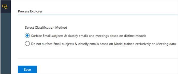
New Process Explorer Admin setting that specifies if the template shows email subjects and requires categorization to train emails by using a distinct model, or if it trains both email and meetings by using only meeting data.
To learn more, see Process Explorer Azure Template.
September 2019
The following new template enhancements are now available.
Process Explorer Azure Template
The following enhancements and features are included in the Process Explorer Azure Template.
- The following new Admin Classification options where after you select and save the option in Admin > Configuration, it'll persist for the life of that scenario:
- Surface email subjects and classify email and meetings based on distinct models.
- Do not surface email subjects and classify email based on model training exclusively on meeting data.
- Improved UX with a new dashboard layout for adding and editing categories, for categorizing meetings and email separately in different dashboards, and for analyzing data.
- If a dataset fails with the Status of a red x, you can use the new Undo action to revert to the last successfully saved version of the dataset.
To learn more, see Process Explorer Azure Template.
Organizational Network Analysis Azure Template
The following enhancements and features are included in the Organizational Network Analysis (ONA) Azure Template.
- Improved UX for adding new analysis.
- New date range options for improved data and graph analysis.
- New Download metrics option for the last saved version of the analysis that aligns with the time range, filters, and other values selected.
- Select the new Parameters icon to view the parameter details for a listed dataset.
To learn more, see Analysis in Organizational Network Analysis Azure Template.
Admin logs
As an admin, you can now audit user activity in Admin > Logs. Select the information (i) icon in the Message column to see more details about a specific activity.
August 2019
The following new template and template enhancements are now available.
Process Explorer Azure Template
This release adds a new Process Explorer template that helps you understand where your organization or team is investing or expending valuable time. You can use this template to categorize processes, projects, meetings, and other activities. You can either upload a .csv dataset for meeting activity or connect to a blob storage location for meeting and email activity.
To learn more, see Process Explorer Azure Template.
Organizational Network Analysis Azure Template
The following enhancements and features are included in the Organizational Network Analysis (ONA) Azure Template.
Comparative analysis
With the ONA template, you can now view and compare two networks side by side with two browser windows, such as to compare:
- Two different time periods to see how a network has evolved (before and after analysis)
- Between different metrics, such as betweenness and intersectionality, for the same time period
- Two different filters, such as by job title and level designation, for the same time period
Density measure
You can now analyze cohesion within groups and across groups by density, which is a new measure in the ONA template. This table view depicts the density score within and across the respective groups.
Save and view saved graphs
You can now save a data analysis graph in the template, and then view it as a saved graph later.
To learn more, see Analysis in Organizational Network Analysis Azure Template.