Eventi
Partecipa alla sfida fest per le competenze di intelligenza artificiale
8 apr, 15 - 28 mag, 07
Affinare le tue competenze di intelligenza artificiale e partecipare agli sweep per vincere un esame di certificazione gratuito
Register now!Questo browser non è più supportato.
Esegui l'aggiornamento a Microsoft Edge per sfruttare i vantaggi di funzionalità più recenti, aggiornamenti della sicurezza e supporto tecnico.
Nota
L'accesso a questa pagina richiede l'autorizzazione. È possibile provare ad accedere o modificare le directory.
L'accesso a questa pagina richiede l'autorizzazione. È possibile provare a modificare le directory.
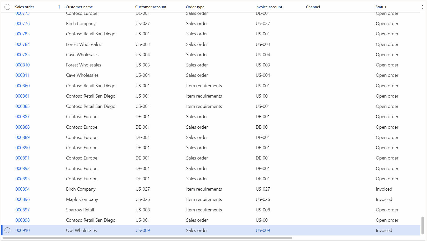
The new grid control provides several useful and powerful capabilities that you can use to enhance user productivity, construct more interesting views of your data, and get meaningful insights into your data. This article will cover the following capabilities:
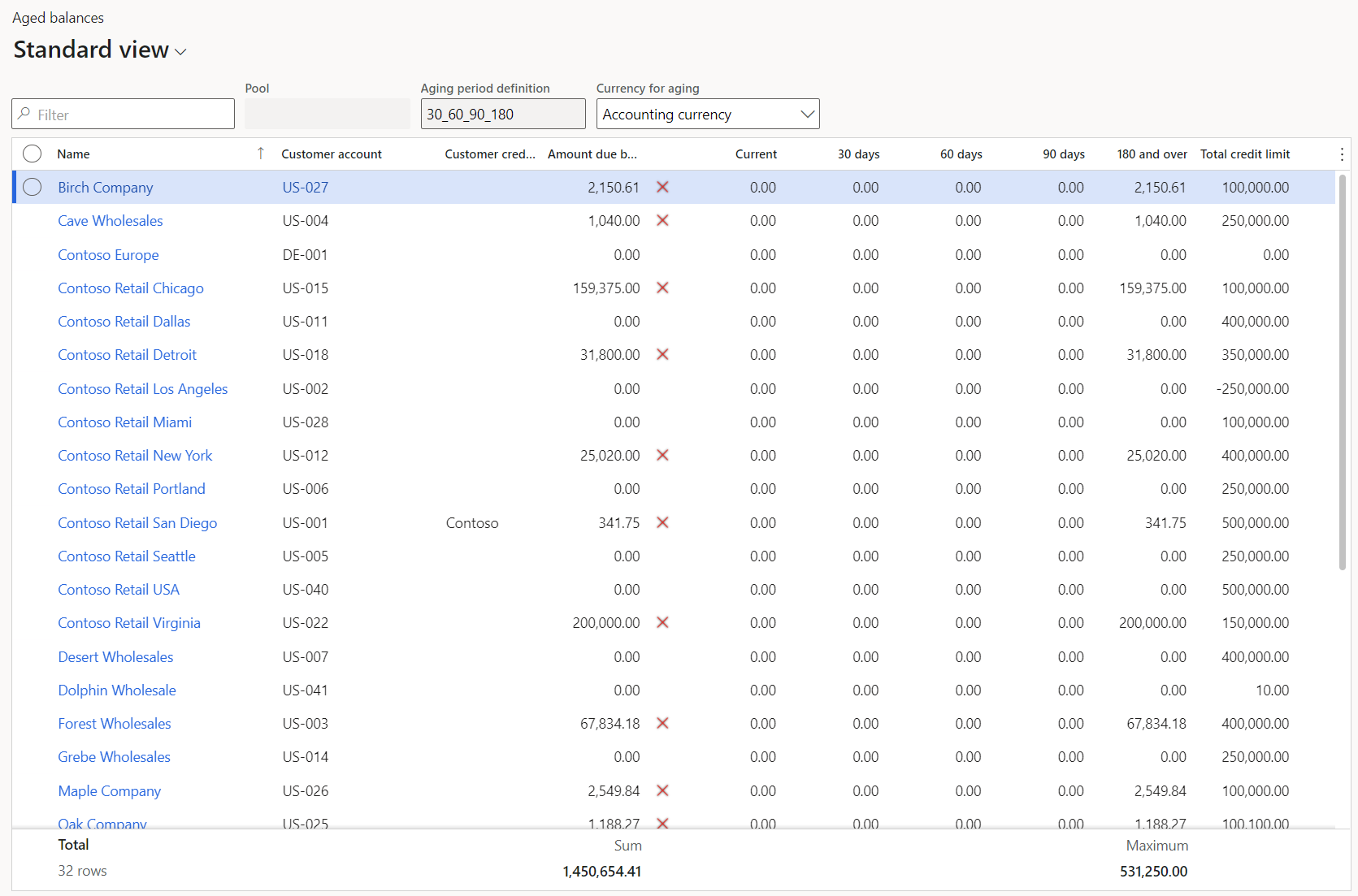
In finance and operations apps, users can view a calculated value for each numeric column in a grid. A footer section at the bottom of the grid shows these calculated values.
[ ]
]
In versions before 10.0.29, the total is the only supported calculated value. However, as of version 10.0.29, if your organization has enabled the Extended grid aggregation capabilities feature, users can select among the following four calculated values:
A single column can show only one type of calculated value. However, each column in the grid can be configured to show a different type of calculated value.
If more than one row is selected in the grid, the calculated value for the column is updated based on the values in the selected rows.
There is a footer area at the bottom of every tabular grid in finance and operations apps. The footer can show valuable information that is related to the data that appears in the grid. Here are some examples of this information:
This footer is hidden by default, but you can turn it on. To show the footer for a grid, select the Grid options button in the grid header, and then select the Show footer option. After you turn on the footer for a particular grid, that setting will be remembered until the user chooses to hide the footer. To hide the footer, select Hide footer on the Grid options menu.
Currently, no columns show calculated values by default. Instead, the setup is considered a one-time activity, like adjusting the widths of columns in grids. After you specify that you want to view a calculated value for a column, that setting will be remembered the next time that you visit the page.
There are two ways to configure a column to show a calculated value:
Select and hold (or right-click) in the column that you want to view a calculated value for. If the Extended grid aggregation capabilities feature is enabled, select View column totals, and then select the desired calculated value. If that feature isn't enabled, select Total this column. This action causes three events to occur:
After the footer is visible, select Show total (or Select calculated value if the Extended grid aggregation capabilities feature is enabled) in the footer area at the bottom of the column that you want to view a calculated value for. If there are no configured columns, that button will be available in the footer in all numeric columns.
After at least one column is configured to show a calculated value, the Show total (or Select calculated value) button will be available only on hover or focus. The action of selecting the button just saves your preference for viewing a calculated value in the column, so that the preference is applied during future visits to the page. In the footer, this state is indicated by a dash that appears in the column. (Note that the calculated value will appear immediately if the dataset is small enough.)
If you make a mistake and no longer want to view a calculated value in a specific column, select and hold (or right-click) in the column, and then select Hide total (or View column totals > None if the Extended grid aggregation capabilities feature is enabled). Alternatively, select Hide total (or Hide calculated value) in the footer in that column. This preference will also be saved for future visits to the page.
When you go to a page where the footer is visible and columns are already configured to show calculated values, those values might not be shown in the footer. The behavior depends on the size of the dataset on the page. If the dataset is small enough, the calculated values will be shown automatically, together with the number of rows in the dataset. If there are dashes in the footer under the columns that you configured, the dataset is too large for the system to show calculated values immediately. In this case, explicit action is required to calculate the values. To calculate the values, select the Calculate button in the footer. Alternatively, select and hold (or right-click) in a column that you want to view the total for, and then select Total this column (or View column totals and then the desired calculated value if the Extended grid aggregation capabilities feature is enabled).
If the calculation takes a long time to be completed, you can cancel the operation at any time by selecting Cancel. Sometimes, the dataset will be too large to calculate aggregate values (a limit that is imposed by your organization). In this case, you will instead be notified to filter your data more.
Nota
System administrators can modify the limit for the number of records that are available for calculating aggregates by adjusting the Maximum number of local records for each grid parameter on the Client performance options page. The default value is 25,000 records. Administrators should be careful when they adjust this value, because a value that is too large can exhaust the available memory on the user's machine. We recommend that the value not exceed 50,000 records.
Calculated values will be automatically updated as you update, delete, or create rows in the dataset.
In many business scenarios, the ability to quickly enter data into the system is very important. Before the introduction of the new grid control, users could change data only in the current row. Therefore, after they made changes in a row, users could not switch to a different row or create a new row until the system successfully validated the changes in the current row and (in the case of row creation) ran all the logic that is associated with the creation of a new row. To help reduce the time that users spend waiting for these operations to be completed, and to help improve user productivity, the new grid adjusts these actions so that they are asynchronous. Users can create new rows or move to other rows to make changes while previous row validations and row creation logic are pending.
[ ]
]
To support this new behavior, a new column for the row status has been added to the right of the row selection column when the grid is in edit mode. This column indicates one of the following statuses:
When you enter data ahead of the place where the system is processing, you can expect a few changes in the data entry experience:
In version 10.0.38 and later, users can update multiple selected rows in a single action by using the Bulk editing in grids feature, which can be enabled through Feature management.
To use this feature, follow these steps.
As when you paste from Excel (as described in the next section), the grid shows the updated contents in italic as a preview of the data changes. Select Discard to cancel the bulk editing or Save to initiate the save process. During the save process, the system uses the Typing ahead of the system save model to submit the updates one row at a time. This approach ensures that all form and field validations are run for each row. Monitor the progress and results of each validation by checking the row status at the beginning of the row.
Users have always been able to export data from grids in finance and operations apps to Microsoft Excel by using the Export to Excel mechanism. However, the ability to enter data ahead of the system enables the new grid to support copying tables from Excel and pasting them directly into grids in finance and operations apps. The grid cell that the paste operation is initiated from determines where the copied table begins to be pasted in. The contents of the grid are overwritten by the contents of the copied table, except in two cases:
Nota
Currently, this functionality can't be used in specific situations. For example, in grids using the segmented entry control like General journal lines.
Grids in finance and operations apps support a range selection capability that resembles the corresponding feature in Excel. This capability enables users to use the keyboard to select a range of cells (multiple rows and columns), which can then be copied and pasted as required.
As a productivity booster, users can enter mathematical formulas in numeric cells in a grid. They don't have to do the calculation in an app outside the system. For example, if you enter =15*4 and then press the Tab key to move out of the field, the system will evaluate the expression and save a value of 60 for the field.
[ ]
]
To make the system recognize a value as an expression, start the value with an equal sign (=). For more information about the supported operators and syntax, see Supported math symbols.
Nota
The ability to evaluate math expressions in numeric controls is available outside the grid.
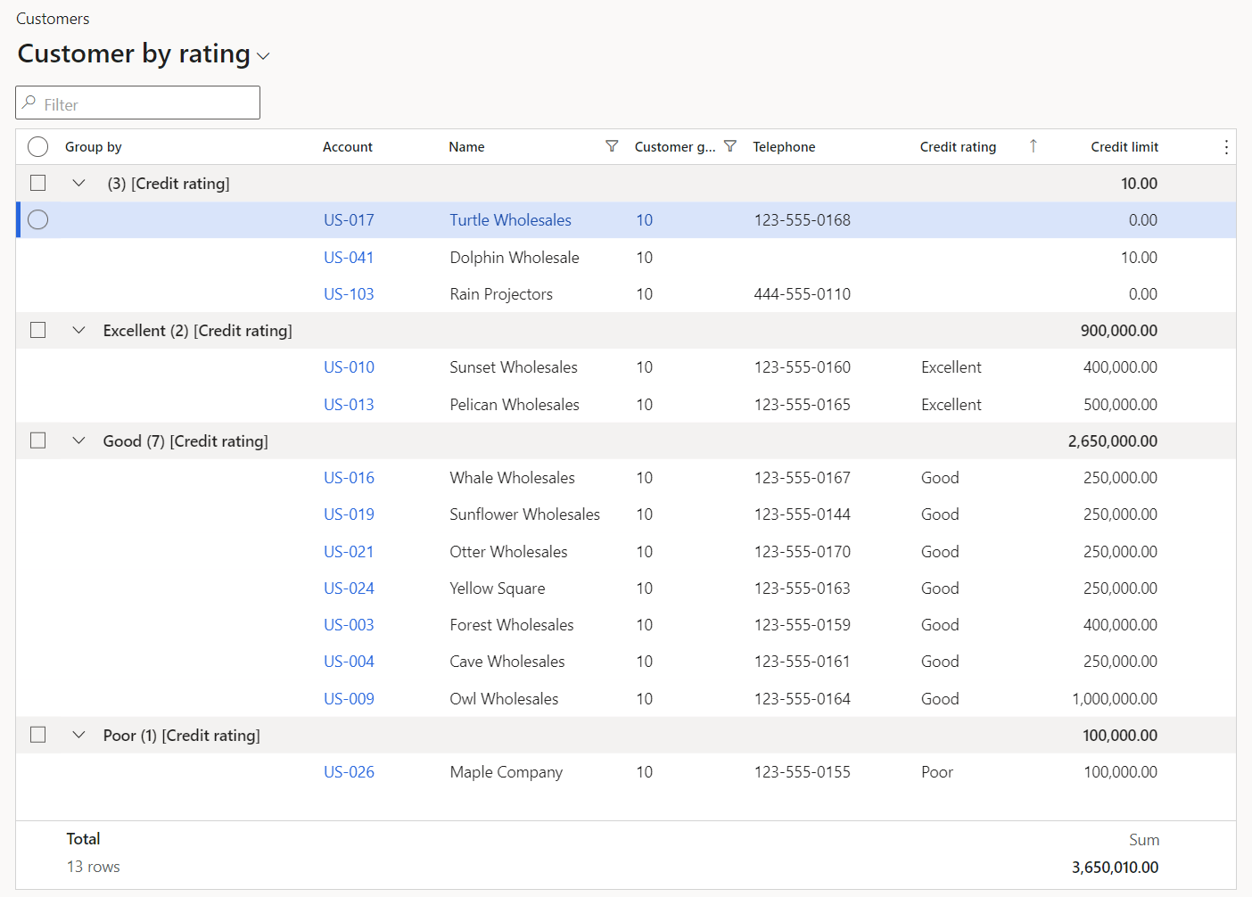
Business users often have to perform ad-hoc analysis of data. Although this analysis can be done by exporting data to Microsoft Excel and using pivot tables, the Grouping in grids capability lets users organize their tabular data in interesting ways within finance and operations apps. Grouping works together with the Calculated values capability to let you gain meaningful insights into the data by showing calculated values (for example, subtotals) at the group level.
[ ]
]
To use this capability, right-click the column that you want to group by, and select Group by this column. This action will sort the data by the selected column, add a new Group by column to the beginning of the grid, and insert "header rows" at the beginning of each group. These header rows provide the following information about each group:
With Saved views enabled, you can save grouping as part of a view on pages that allow queries to be saved to views. For example, those with large view selectors. See the Switching between views section for more details.
After you've grouped data by a single column, you can group the data by a different column by selecting Group by this column on the desired column. This process can be repeated until you have 5 nested levels of grouping, which is the maximum supported depth. At this point, you will no longer be able to group by additional columns.
At any point, you can remove the grouping on any column by right-clicking that column and selecting Ungroup. You can also remove the grouping from all columns by selecting Grid options and then Ungroup all.
After you group data by one or more columns, you can change the sort direction for any grouping column through the corresponding column header.
If you sort on a non-grouped column, the grouping remains intact. The data is sorted inside each group, based on the selected column.
The initial grouping of data will have all groups expanded. You can create summarized views of the data by collapsing individual groups, or you can use group expanding and collapsing to assist in navigating through the data. To expand or collapse a group, select the chevron (>) button in the corresponding group header row. Note that the expand/collapse state of individual groups is not saved in personalization.
In the same way that you can select (or unselect) all rows in the grid by selecting the check box at the top of the first column in the grid, you can also quickly select (or unselect) all the rows in a group by selecting the check box in the corresponding group header row. The check box in the group header row will always reflect the current selection state of rows in that group, regardless of whether all rows are selected, no rows are selected, or only some rows are selected.
When grouping data, the default behavior is to show the column name in the group header row. You can choose to suppress the column name in group header rows by selecting Grid options > Hide group column name.
When you group on Date or DateTime fields, you have the option to group by year, month, or day. The group "value" in the corresponding header row will match the format from that field. Additionally, for DateTime and Time fields, you can group by hour, minute, or second.
Importante
Users can't currently add a grouping column after they group on a segment of a date or time column.
Some columns in a grid might be important enough for context that you don't want them to scroll out of view. Instead, you might want the values in those columns to always be visible. The Freezing columns in grid capability provides this flexibility to users.
[ ]
]
To freeze a column, right-click in the column's header, and then select Freeze column. The first time that you complete this step, the selected column becomes the first column and will no longer scroll out of view. Any subsequent column that you freeze will be added to the right of the last frozen column. You can use the standard Move functionality to reorder frozen columns as you require. However, frozen columns can't be moved so that they appear among the set of unfrozen columns. Likewise, unfrozen columns can't be moved so that they appear among the set of frozen columns.
To unfreeze a column, right-click in the frozen column's header, and then select Unfreeze column.
Note that the row selection and row status columns in the new grid are always frozen as the first two columns. Therefore, when these columns are included in a grid, they will always be visible to users, regardless of the horizontal scroll position in the grid. These two columns can't be reordered.
As in Excel, users can force a column to be automatically resized based on the content that is currently shown in it. Just double-tap (or double-click) the sizing handles in the column. Alternatively, put the focus in the column header, and then select the A key (for autofit).
If your organization discovers a page that has some issues utilizing the new grid, an API is available to allow an individual form to use the legacy grid control while still permitting the rest of the system to utilize the new grid control. To opt out an individual page from the new grid, add the following call post super() in the run() method for the form.
this.forceLegacyGrid();
This API will eventually be deprecated to allow for removal of the legacy grid control. However, it will remain available for at least 12 months after its deprecation is announced. If any issues require that this API be used, report them to Microsoft.
If you have opted out an individual page from using the new grid, you might want to later re-enable the new grid after the underlying issues were solved. To do this, you simply need to remove the call to forceLegacyGrid(). The change will not take effect until one of the following occurs:
Some scenarios have arisen that don't lend themselves to working well with the Typing ahead of the system capability of the grid. (For example, some code that is triggered when a row is validated causes a datasource research to be triggered, and the research can then corrupt uncommitted edits on existing rows.) If your organization discovers such a scenario, an API is available that lets a developer opt an individual grid out of asynchronous row validation and revert to the legacy behavior.
When asynchronous row validation is disabled in a grid, users can't create a new row or move to a different existing row in the grid while there are validation issues on the current row. As a side effect of this action, tables can't be pasted from Excel into finance and operations grids.
To opt an individual grid out of asynchronous row validation, add the following call after super() in the run() method of the form.
<gridControl>.allowPreemptiveClient(false);
Nota
If a developer sets the WidthMode property to SizeToAvailable for columns inside the new grid, those columns initially have the same width that they would have if the property were set to SizeToContent. However, they stretch to use any extra available width inside the grid. If the property is set to SizeToAvailable for multiple columns, all those columns share any extra available width inside the grid. However, if a user manually resizes one of those columns, the column becomes static. It will remain at that width and will no longer stretch to take up extra available grid width.
As was discussed in the Differences when entering data ahead of the system section, if the "Typing ahead of the system" capability is enabled, and a user creates a new row by using the Down arrow key, the default behavior is to put the focus in the first column in the new row. This experience might differ from the experience in the legacy grid or when a New button is selected.
Users and organizations can create saved views that are optimized for data entry. (For example, you can reorder columns so that the first column is the one that you want to start to enter data in.) In addition, as of version 10.0.29, organizations can adjust this behavior by using the selectedControlOnCreate() method. This method lets a developer specify the column that should receive the initial focus when a new row is created by using the Down arrow key. As input, this API takes the control ID that corresponds to the column that should receive the initial focus.
When a grid is loading, if the system encounters an extensible control that is not React based, the system will force the legacy grid to render instead. When a user first encounters this situation, a message will be shown indicating the page needs to be refreshed. Afterwards, this page will load the legacy grid automatically without any further notifications to users until the next system update.
To overcome this situation permanently, extensible control authors can create a React version of the control for use in the grid. Once developed, the X++ class for the control can be decorated with the FormReactControlAttribute attribute to specify the location of the React bundle to load for that control. See the SegmentedEntryControl class as an example.
Eventi
Partecipa alla sfida fest per le competenze di intelligenza artificiale
8 apr, 15 - 28 mag, 07
Affinare le tue competenze di intelligenza artificiale e partecipare agli sweep per vincere un esame di certificazione gratuito
Register now!