Nota
L'accesso a questa pagina richiede l'autorizzazione. È possibile provare ad accedere o modificare le directory.
L'accesso a questa pagina richiede l'autorizzazione. È possibile provare a modificare le directory.
In questo argomento viene descritto il comando nelle applicazioni Windows. In particolare, viene illustrato come usare le classi XamlUICommand e StandardUICommand (insieme all'interfaccia ICommand) per condividere e gestire i comandi in vari tipi di controllo, indipendentemente dal dispositivo e dal tipo di input in uso.
Condividere i comandi tra vari controlli, indipendentemente dal tipo di dispositivo e di input
API importanti
Informazioni generali
I comandi possono essere richiamati direttamente tramite interazioni dell'interfaccia utente, ad esempio facendo clic su un pulsante o selezionando un elemento da un menu di scelta rapida. Possono anche essere richiamati indirettamente tramite un dispositivo di input, ad esempio un acceleratore di tastiera, un movimento, un riconoscimento vocale o uno strumento di automazione/accessibilità. Una volta richiamato, il comando può quindi essere gestito da un controllo (navigazione di testo in un controllo di modifica), da una finestra (navigazione indietro) o dall'applicazione (uscita).
I comandi possono operare su un contesto specifico all'interno dell'app, ad esempio l'eliminazione di testo o l'annullamento di un'azione oppure possono essere senza contesto, ad esempio la disattivazione dell'audio o la regolazione della luminosità.
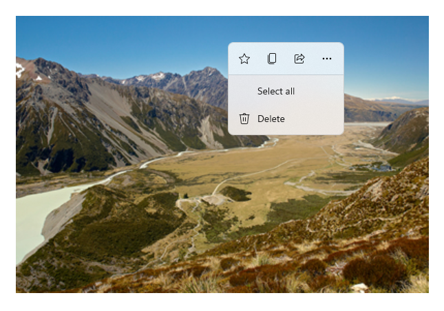
L'immagine seguente mostra due interfacce di comando: una CommandBar e un CommandBarFlyout contestuale mobile, che condividono alcuni degli stessi comandi.
Barra dei comandi
Menu di scelta rapida nella galleria di Microsoft Photos
Interazioni con i comandi
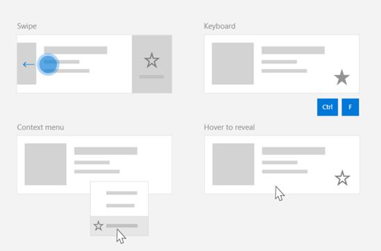
A causa della varietà di dispositivi, tipi di input e superfici dell'interfaccia utente che possono influire sul modo in cui viene richiamato un comando, è consigliabile esporre i comandi attraverso il maggior numero possibile di superfici di comando. Questi possono includere una combinazione di Swipe, MenuBar, CommandBar, CommandBarFlyout e menu di scelta rapida tradizionale.
Per i comandi critici, usare acceleratori specifici dell'input. Gli acceleratori di input consentono a un utente di eseguire azioni più rapidamente a seconda del dispositivo di input in uso.
Ecco alcuni acceleratori di input comuni per vari tipi di input:
- Puntatore - Pulsanti al passaggio del mouse o penna
- Tastiera - Tasti di scelta rapida (tasti di accesso e tasti di accelerazione)
- Tocco - Scorrimento rapido
- Tocco - Scorri verso il basso per aggiornare i dati
È necessario considerare il tipo di input e le esperienze utente per rendere le funzionalità dell'applicazione universalmente accessibili. Ad esempio, le raccolte (in particolare quelle modificabili dall'utente) includono in genere un'ampia gamma di comandi specifici eseguiti in modo molto diverso a seconda del dispositivo di input.
La tabella seguente illustra alcuni comandi di raccolta tipici e modi per esporre tali comandi.
| Command | indipendente dall'input | Acceleratore del mouse | Acceleratore da tastiera | Acceleratore di tocco |
|---|---|---|---|---|
| Elimina elemento | Menu di scelta rapida | Pulsante di passaggio del mouse | Tasto CANC | Scorri per eliminare |
| Contrassegna elemento | Menu di scelta rapida | Pulsante di passaggio del mouse | CTRL + MAIUSC + G | Scorrimento rapido per contrassegnare |
| Aggiornare i dati | Menu di scelta rapida | N/A | Tasto F5 | Trascina verso il basso per aggiornare |
| Elemento preferito | Menu di scelta rapida | Pulsante di passaggio del mouse | F, Ctrl+S | Scorrere rapidamente fino ai preferiti |
Fornire sempre un menu di scelta rapida È consigliabile includere tutti i comandi contestuali pertinenti in un menu di scelta rapida tradizionale o CommandBarFlyout, perché entrambi sono supportati per tutti i tipi di input. Ad esempio, se un comando viene esposto solo durante un evento di passaggio del puntatore, non può essere usato in un dispositivo solo tocco.
Comandi nelle applicazioni Windows
Esistono alcuni modi per condividere e gestire le esperienze di comando in un'applicazione Windows. È possibile definire gestori eventi per interazioni standard, ad esempio Click, nel code-behind (questo può risultare piuttosto inefficiente, a seconda della complessità dell'interfaccia utente), è possibile associare il listener di eventi per le interazioni standard a un gestore condiviso oppure associare la proprietà Command del controllo a un'implementazione ICommand che descrive la logica del comando.
Per offrire esperienze utente complete e complete sulle superfici dei comandi in modo efficiente e con una duplicazione minima del codice, è consigliabile usare le funzionalità di associazione dei comandi descritte in questo argomento (per la gestione degli eventi standard, vedere gli argomenti relativi ai singoli eventi).
Per associare un controllo a una risorsa di comando condivisa, puoi implementare manualmente le interfacce ICommand oppure puoi compilare il comando dalla classe di base XamlUICommand o da uno dei comandi della piattaforma definiti dalla classe derivata StandardUICommand .
- L'interfaccia ICommand (Windows.UI.Xaml.Input.ICommand o System.Windows.Input.ICommand) consente di creare comandi completamente personalizzati e riutilizzabili nell'app.
- XamlUICommand offre anche questa funzionalità, ma semplifica lo sviluppo esponendo un set di proprietà predefinite dei comandi, ad esempio il comportamento dei comandi, i tasti di scelta rapida (tasto di scelta rapida e tasto di scelta rapida), l'icona, l'etichetta e la descrizione.
- StandardUICommand semplifica ulteriormente le operazioni consentendo di scegliere tra un set di comandi della piattaforma standard con proprietà predefinite.
Importante
Nelle applicazioni WinUI i comandi sono implementazioni dell'interfaccia Windows.UI.Xaml.Input.ICommand (C++) o dell'interfaccia System.Windows.Input.ICommand (C#), a seconda del framework di linguaggio scelto.
Esperienze di comando con la classe StandardUICommand
Derivato da XamlUICommand (derivato da Windows.UI.Xaml.Input.ICommand per C++ o System.Windows.Input.ICommand per C#), la classe StandardUICommand espone un set di comandi della piattaforma standard con proprietà predefinite, ad esempio icona, acceleratore di tastiera e descrizione.
StandardUICommand offre un modo rapido e coerente per definire comandi comuni, ad Save esempio o Delete. Tutto quello che devi fare è fornire le funzioni execute e canExecute.
Example
StandardUICommandSample
| Scaricare il codice per questo esempio |
|---|
| Esempio di comando (StandardUICommand) |
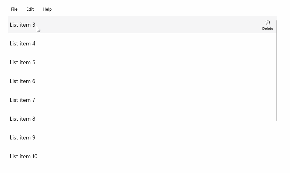
In questo esempio viene illustrato come migliorare un controllo ListView di base con un comando Elimina elemento implementato tramite la classe StandardUICommand , ottimizzando l'esperienza utente per un'ampia gamma di tipi di input usando un controllo MenuBar, un controllo Swipe , pulsanti al passaggio del mouse e un menu di scelta rapida.
Xaml:
L'interfaccia utente di esempio include un controllo ListView di cinque elementi. Delete StandardUICommand è collegato a MenuBarItem, SwipeItem, AppBarButton e menu ContextFlyout.
<Page
    x:Class="StandardUICommandSample.MainPage"
    xmlns="http://schemas.microsoft.com/winfx/2006/xaml/presentation"
    xmlns:x="http://schemas.microsoft.com/winfx/2006/xaml"
    xmlns:local="using:StandardUICommandSample"
    xmlns:d="http://schemas.microsoft.com/expression/blend/2008"
    xmlns:mc="http://schemas.openxmlformats.org/markup-compatibility/2006"
    xmlns:muxcontrols="using:Microsoft.UI.Xaml.Controls"
    mc:Ignorable="d"
    Background="{ThemeResource ApplicationPageBackgroundThemeBrush}">

    <Page.Resources>
        <Style x:Key="HorizontalSwipe"
               TargetType="ListViewItem"
               BasedOn="{StaticResource ListViewItemRevealStyle}">
            <Setter Property="Height" Value="60"/>
            <Setter Property="Padding" Value="0"/>
            <Setter Property="HorizontalContentAlignment" Value="Stretch"/>
            <Setter Property="VerticalContentAlignment" Value="Stretch"/>
            <Setter Property="BorderThickness" Value="0"/>
        </Style>
    </Page.Resources>

    <Grid Loaded="ControlExample_Loaded">
        <Grid.RowDefinitions>
            <RowDefinition Height="Auto" />
            <RowDefinition Height="Auto" />
            <RowDefinition Height="*"/>
        </Grid.RowDefinitions>

        <StackPanel Grid.Row="0"
                    Padding="10"
                    BorderThickness="0,0,0,1"
                    BorderBrush="LightBlue"
                    Background="AliceBlue">
            <TextBlock Style="{StaticResource HeaderTextBlockStyle}">
                StandardUICommand sample
            </TextBlock>
            <TextBlock Style="{StaticResource SubtitleTextBlockStyle}" Margin="0,0,0,10">
                This sample shows how to use the StandardUICommand class to
                share a platform command and consistent user experiences
                across various controls.
            </TextBlock>
            <TextBlock Style="{StaticResource SubtitleTextBlockStyle}" Margin="0,0,0,0">
                Specifically, we define a standard delete command and add it
                to a variety of command surfaces, all of which share a common
                icon, label, keyboard accelerator, and description.
            </TextBlock>
        </StackPanel>

        <muxcontrols:MenuBar Grid.Row="1" Padding="10">
            <muxcontrols:MenuBarItem Title="File">
            </muxcontrols:MenuBarItem>
            <muxcontrols:MenuBarItem Title="Edit">
                <MenuFlyoutItem x:Name="DeleteFlyoutItem"/>
            </muxcontrols:MenuBarItem>
            <muxcontrols:MenuBarItem Title="Help">
            </muxcontrols:MenuBarItem>
        </muxcontrols:MenuBar>

        <ListView x:Name="ListViewRight" Grid.Row="2"
                  Loaded="ListView_Loaded"
                  IsItemClickEnabled="True"
                  SelectionMode="Single"
                  SelectionChanged="ListView_SelectionChanged"
                  ItemContainerStyle="{StaticResource HorizontalSwipe}">
            <ListView.ItemTemplate>
                <DataTemplate x:DataType="local:ListItemData">
                    <UserControl PointerEntered="ListViewSwipeContainer_PointerEntered"
                                 PointerExited="ListViewSwipeContainer_PointerExited">
                        <UserControl.ContextFlyout>
                            <MenuFlyout>
                                <MenuFlyoutItem
                                    Command="{x:Bind Command}"
                                    CommandParameter="{x:Bind Text}" />
                            </MenuFlyout>
                        </UserControl.ContextFlyout>
                        <Grid AutomationProperties.Name="{x:Bind Text}">
                            <VisualStateManager.VisualStateGroups>
                                <VisualStateGroup x:Name="HoveringStates">
                                    <VisualState x:Name="HoverButtonsHidden" />
                                    <VisualState x:Name="HoverButtonsShown">
                                        <VisualState.Setters>
                                            <Setter Target="HoverButton.Visibility"
                                                    Value="Visible" />
                                        </VisualState.Setters>
                                    </VisualState>
                                </VisualStateGroup>
                            </VisualStateManager.VisualStateGroups>
                            <SwipeControl x:Name="ListViewSwipeContainer" >
                                <SwipeControl.RightItems>
                                    <SwipeItems Mode="Execute">
                                        <SwipeItem x:Name="DeleteSwipeItem"
                                                   Background="Red"
                                                   Command="{x:Bind Command}"
                                                   CommandParameter="{x:Bind Text}"/>
                                    </SwipeItems>
                                </SwipeControl.RightItems>
                                <Grid VerticalAlignment="Center">
                                    <TextBlock Text="{x:Bind Text}"
                                               Margin="10"
                                               FontSize="18"
                                               HorizontalAlignment="Left"
                                               VerticalAlignment="Center"/>
                                    <AppBarButton x:Name="HoverButton"
                                                  IsTabStop="False"
                                                  HorizontalAlignment="Right"
                                                  Visibility="Collapsed"
                                                  Command="{x:Bind Command}"
                                                  CommandParameter="{x:Bind Text}"/>
                                </Grid>
                            </SwipeControl>
                        </Grid>
                    </UserControl>
                </DataTemplate>
            </ListView.ItemTemplate>
        </ListView>
    </Grid>
</Page>
Code-behind
- Prima di tutto, definiamo una
ListItemDataclasse che contiene una stringa di testo e ICommand per ogni oggetto ListViewItem in ListView.
public class ListItemData
{
    public String Text { get; set; }
    public ICommand Command { get; set; }
}
- Nella classe MainPage viene definita una raccolta di
ListItemDataoggetti per l'oggetto DataTemplatedell'elemento ListViewItemTemplate. Lo si popola quindi con una raccolta iniziale di cinque elementi (con testo e l'elemento StandardUICommand Delete associato).
/// <summary>
/// ListView item collection.
/// </summary>
ObservableCollection<ListItemData> collection =
    new ObservableCollection<ListItemData>();

/// <summary>
/// Handler for the layout Grid control load event.
/// </summary>
/// <param name="sender">Source of the control loaded event</param>
/// <param name="e">Event args for the loaded event</param>
private void ControlExample_Loaded(object sender, RoutedEventArgs e)
{
    // Create the standard Delete command.
    var deleteCommand = new StandardUICommand(StandardUICommandKind.Delete);
    deleteCommand.ExecuteRequested += DeleteCommand_ExecuteRequested;

    DeleteFlyoutItem.Command = deleteCommand;

    for (var i = 0; i < 5; i++)
    {
        collection.Add(
            new ListItemData {
                Text = "List item " + i.ToString(),
                Command = deleteCommand });
    }
}

/// <summary>
/// Handler for the ListView control load event.
/// </summary>
/// <param name="sender">Source of the control loaded event</param>
/// <param name="e">Event args for the loaded event</param>
private void ListView_Loaded(object sender, RoutedEventArgs e)
{
    var listView = (ListView)sender;
    // Populate the ListView with the item collection.
    listView.ItemsSource = collection;
}
- Successivamente, definiamo il gestore ICommand ExecuteRequested in cui implementiamo il comando di eliminazione dell'elemento.
/// <summary>
/// Handler for the Delete command.
/// </summary>
/// <param name="sender">Source of the command event</param>
/// <param name="e">Event args for the command event</param>
private void DeleteCommand_ExecuteRequested(
    XamlUICommand sender, ExecuteRequestedEventArgs args)
{
    // If possible, remove specified item from collection.
    if (args.Parameter != null)
    {
        foreach (var i in collection)
        {
            if (i.Text == (args.Parameter as string))
            {
                collection.Remove(i);
                return;
            }
        }
    }
    if (ListViewRight.SelectedIndex != -1)
    {
        collection.RemoveAt(ListViewRight.SelectedIndex);
    }
}
- Infine, definiamo i gestori per vari eventi ListView, inclusi gli eventi PointerEntered, PointerExited e SelectionChanged . I gestori eventi del puntatore vengono usati per visualizzare o nascondere il pulsante Elimina per ogni elemento.
/// <summary>
/// Handler for the ListView selection changed event.
/// </summary>
/// <param name="sender">Source of the selection changed event</param>
/// <param name="e">Event args for the selection changed event</param>
private void ListView_SelectionChanged(object sender, SelectionChangedEventArgs e)
{
    if (ListViewRight.SelectedIndex != -1)
    {
        var item = collection[ListViewRight.SelectedIndex];
    }
}

/// <summary>
/// Handler for the pointer entered event.
/// Displays the delete item "hover" buttons.
/// </summary>
/// <param name="sender">Source of the pointer entered event</param>
/// <param name="e">Event args for the pointer entered event</param>
private void ListViewSwipeContainer_PointerEntered(
    object sender, PointerRoutedEventArgs e)
{
    if (e.Pointer.PointerDeviceType ==
        Windows.Devices.Input.PointerDeviceType.Mouse ||
        e.Pointer.PointerDeviceType ==
        Windows.Devices.Input.PointerDeviceType.Pen)
    {
        VisualStateManager.GoToState(
            sender as Control, "HoverButtonsShown", true);
    }
}

/// <summary>
/// Handler for the pointer exited event.
/// Hides the delete item "hover" buttons.
/// </summary>
/// <param name="sender">Source of the pointer exited event</param>
/// <param name="e">Event args for the pointer exited event</param>

private void ListViewSwipeContainer_PointerExited(
    object sender, PointerRoutedEventArgs e)
{
    VisualStateManager.GoToState(
        sender as Control, "HoverButtonsHidden", true);
}
Esperienze di comando con la classe XamlUICommand
Se devi creare un comando non definito dalla classe StandardUICommand o vuoi un maggiore controllo sull'aspetto del comando, la classe XamlUICommand deriva dall'interfaccia ICommand , aggiungendo varie proprietà dell'interfaccia utente (ad esempio un'icona, un'etichetta, una descrizione e i tasti di scelta rapida), metodi ed eventi per definire rapidamente l'interfaccia utente e il comportamento di un comando personalizzato.
XamlUICommand consente di specificare l'interfaccia utente attraverso il binding dei controlli, come un'icona, un'etichetta, una descrizione e le scorciatoie da tastiera (sia un tasto di accesso che un acceleratore da tastiera), senza impostare le singole proprietà.
Example
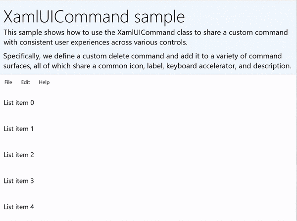
XamlUICommandSample
| Scaricare il codice per questo esempio | | -------------------- | | Esempio di comando winUI (XamlUICommand) | | Scaricare il codice per questo esempio | | -------------------- | | Esempio di comando (XamlUICommand) | Molti controlli della piattaforma usano le proprietà XamlUICommand sotto le quinte, proprio come il nostro esempio StandardUICommand nella sezione precedente.
Xaml:
L'interfaccia utente di esempio include un controllo ListView di cinque elementi. XamlUICommand CustomXamlUICommand personalizzato è associato a un MenuBarItem, SwipeItem, a un AppBarButton e a un ContextFlyout menu.
<Page
x:Class="XamlUICommand_Sample.MainPage"
xmlns="http://schemas.microsoft.com/winfx/2006/xaml/presentation"
xmlns:x="http://schemas.microsoft.com/winfx/2006/xaml"
xmlns:local="using:XamlUICommand_Sample"
xmlns:d="http://schemas.microsoft.com/expression/blend/2008"
xmlns:mc="http://schemas.openxmlformats.org/markup-compatibility/2006"
xmlns:muxcontrols="using:Microsoft.UI.Xaml.Controls"
mc:Ignorable="d"
Background="{ThemeResource ApplicationPageBackgroundThemeBrush}">
<Page.Resources>
<XamlUICommand x:Name="CustomXamlUICommand"
ExecuteRequested="DeleteCommand_ExecuteRequested"
Description="Custom XamlUICommand"
Label="Custom XamlUICommand">
<XamlUICommand.IconSource>
<FontIconSource FontFamily="Wingdings" Glyph="M"/>
</XamlUICommand.IconSource>
<XamlUICommand.KeyboardAccelerators>
<KeyboardAccelerator Key="D" Modifiers="Control"/>
</XamlUICommand.KeyboardAccelerators>
</XamlUICommand>
<Style x:Key="HorizontalSwipe"
TargetType="ListViewItem"
BasedOn="{StaticResource ListViewItemRevealStyle}">
<Setter Property="Height" Value="70"/>
<Setter Property="Padding" Value="0"/>
<Setter Property="HorizontalContentAlignment" Value="Stretch"/>
<Setter Property="VerticalContentAlignment" Value="Stretch"/>
<Setter Property="BorderThickness" Value="0"/>
</Style>
</Page.Resources>
<Grid Loaded="ControlExample_Loaded" Name="MainGrid">
<Grid.RowDefinitions>
<RowDefinition Height="Auto" />
<RowDefinition Height="Auto" />
<RowDefinition Height="*"/>
</Grid.RowDefinitions>
<StackPanel Grid.Row="0"
Padding="10"
BorderThickness="0,0,0,1"
BorderBrush="LightBlue"
Background="AliceBlue">
<TextBlock Style="{StaticResource HeaderTextBlockStyle}">
XamlUICommand sample
</TextBlock>
<TextBlock Style="{StaticResource SubtitleTextBlockStyle}" Margin="0,0,0,10">
This sample shows how to use the XamlUICommand class to
share a custom command with consistent user experiences
across various controls.
</TextBlock>
<TextBlock Style="{StaticResource SubtitleTextBlockStyle}" Margin="0,0,0,0">
Specifically, we define a custom delete command and add it
to a variety of command surfaces, all of which share a common
icon, label, keyboard accelerator, and description.
</TextBlock>
</StackPanel>
<muxcontrols:MenuBar Grid.Row="1">
<muxcontrols:MenuBarItem Title="File">
</muxcontrols:MenuBarItem>
<muxcontrols:MenuBarItem Title="Edit">
<MenuFlyoutItem x:Name="DeleteFlyoutItem"
Command="{StaticResource CustomXamlUICommand}"/>
</muxcontrols:MenuBarItem>
<muxcontrols:MenuBarItem Title="Help">
</muxcontrols:MenuBarItem>
</muxcontrols:MenuBar>
<ListView x:Name="ListViewRight" Grid.Row="2"
Loaded="ListView_Loaded"
IsItemClickEnabled="True"
SelectionMode="Single"
SelectionChanged="ListView_SelectionChanged"
ItemContainerStyle="{StaticResource HorizontalSwipe}">
<ListView.ItemTemplate>
<DataTemplate x:DataType="local:ListItemData">
<UserControl PointerEntered="ListViewSwipeContainer_PointerEntered"
PointerExited="ListViewSwipeContainer_PointerExited">
<UserControl.ContextFlyout>
<MenuFlyout>
<MenuFlyoutItem
Command="{x:Bind Command}"
CommandParameter="{x:Bind Text}" />
</MenuFlyout>
</UserControl.ContextFlyout>
<Grid AutomationProperties.Name="{x:Bind Text}">
<VisualStateManager.VisualStateGroups>
<VisualStateGroup x:Name="HoveringStates">
<VisualState x:Name="HoverButtonsHidden" />
<VisualState x:Name="HoverButtonsShown">
<VisualState.Setters>
<Setter Target="HoverButton.Visibility"
Value="Visible" />
</VisualState.Setters>
</VisualState>
</VisualStateGroup>
</VisualStateManager.VisualStateGroups>
<SwipeControl x:Name="ListViewSwipeContainer">
<SwipeControl.RightItems>
<SwipeItems Mode="Execute">
<SwipeItem x:Name="DeleteSwipeItem"
Background="Red"
Command="{x:Bind Command}"
CommandParameter="{x:Bind Text}"/>
</SwipeItems>
</SwipeControl.RightItems>
<Grid VerticalAlignment="Center">
<TextBlock Text="{x:Bind Text}"
Margin="10"
FontSize="18"
HorizontalAlignment="Left"
VerticalAlignment="Center"/>
<AppBarButton x:Name="HoverButton"
IsTabStop="False"
HorizontalAlignment="Right"
Visibility="Collapsed"
Command="{x:Bind Command}"
CommandParameter="{x:Bind Text}"/>
</Grid>
</SwipeControl>
</Grid>
</UserControl>
</DataTemplate>
</ListView.ItemTemplate>
</ListView>
</Grid>
</Page>
Code-behind
- Prima di tutto, definiamo una
ListItemDataclasse che contiene una stringa di testo e ICommand per ogni oggetto ListViewItem in ListView.
public class ListItemData
{
    public String Text { get; set; }
    public ICommand Command { get; set; }
}
- Nella classe MainPage viene definita una raccolta di
ListItemDataoggetti per l'oggetto DataTemplatedell'elemento ListViewItemTemplate. Lo popolaamo quindi con una raccolta iniziale di cinque elementi (con testo e xamlUICommand associato).
ObservableCollection<ListItemData> collection = new ObservableCollection<ListItemData>();

private void ControlExample_Loaded(object sender, RoutedEventArgs e)
{
    for (var i = 0; i < 5; i++)
    {
        collection.Add(
           new ListItemData { Text = "List item " + i.ToString(), Command = CustomXamlUICommand });
    }
}

private void ListView_Loaded(object sender, RoutedEventArgs e)
{
    var listView = (ListView)sender;
    listView.ItemsSource = collection;
}
- Successivamente, definiamo il gestore ICommand ExecuteRequested in cui implementiamo il comando di eliminazione dell'elemento.
private void DeleteCommand_ExecuteRequested(
   XamlUICommand sender, ExecuteRequestedEventArgs args)
{
    if (args.Parameter != null)
    {
        foreach (var i in collection)
        {
            if (i.Text == (args.Parameter as string))
            {
                collection.Remove(i);
                return;
            }
        }
    }
    if (ListViewRight.SelectedIndex != -1)
    {
        collection.RemoveAt(ListViewRight.SelectedIndex);
    }
}
- Infine, definiamo i gestori per vari eventi ListView, inclusi gli eventi PointerEntered, PointerExited e SelectionChanged . I gestori eventi del puntatore vengono usati per visualizzare o nascondere il pulsante Elimina per ogni elemento.
private void ListView_SelectionChanged(object sender, SelectionChangedEventArgs e)
{
    if (ListViewRight.SelectedIndex != -1)
    {
        var item = collection[ListViewRight.SelectedIndex];
    }
}

private void ListViewSwipeContainer_PointerEntered(object sender, PointerRoutedEventArgs e)
{
    if (e.Pointer.PointerDeviceType ==
        Windows.Devices.Input.PointerDeviceType.Mouse ||
        e.Pointer.PointerDeviceType == Windows.Devices.Input.PointerDeviceType.Pen)
    {
        VisualStateManager.GoToState(sender as Control, "HoverButtonsShown", true);
    }
}

private void ListViewSwipeContainer_PointerExited(object sender, PointerRoutedEventArgs e)
{
    VisualStateManager.GoToState(sender as Control, "HoverButtonsHidden", true);
}
Esperienze di comando con l'interfaccia ICommand
I controlli WinUI standard (pulsante, elenco, selezione, calendario, testo predittivo) forniscono la base per molte esperienze di comando comuni. Per un elenco completo dei tipi di controllo, vedi Controlli e modelli per le app di Windows.
Il modo più semplice per supportare un'esperienza di comando strutturata consiste nel definire un'implementazione dell'interfaccia ICommand (Windows.UI.Xaml.Input.ICommand per C++ o System.Windows.Input.ICommand per C#). Questa istanza ICommand può quindi essere associata a controlli come pulsanti.
Annotazioni
In alcuni casi, potrebbe essere altrettanto efficiente associare un metodo all'evento Click e una proprietà alla proprietà IsEnabled. I controlli WinUI standard (pulsante, elenco, selezione, calendario, testo predittivo) forniscono la base per molte esperienze di comando comuni. Per un elenco completo dei tipi di controllo, vedi Controlli e modelli per le app di Windows.
Example
Esempio di ICommand
| Scaricare il codice per questo esempio |
|---|
| Esempio di comando (ICommand) |
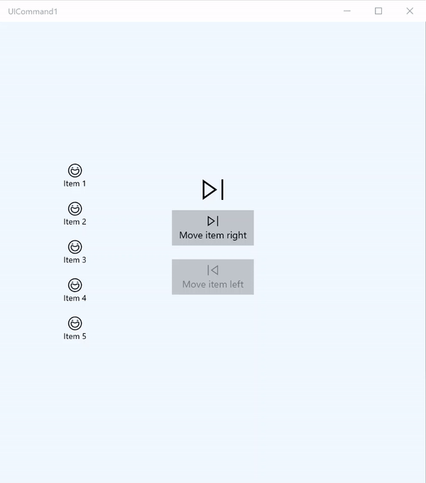
In questo esempio di base viene illustrato come richiamare un singolo comando con un clic del pulsante, un acceleratore di tastiera e ruotare una rotellina del mouse.
| Scaricare il codice per questo esempio |
|---|
| Esempio di comando (ICommand) |
<Page
x:Class="UICommand1.View.MainPage"
xmlns="http://schemas.microsoft.com/winfx/2006/xaml/presentation"
xmlns:x="http://schemas.microsoft.com/winfx/2006/xaml"
xmlns:vm="using:UICommand1.ViewModel"
xmlns:d="http://schemas.microsoft.com/expression/blend/2008"
xmlns:mc="http://schemas.openxmlformats.org/markup-compatibility/2006"
mc:Ignorable="d"
Background="{ThemeResource ApplicationPageBackgroundThemeBrush}">
<Page.Resources>
<vm:OpacityConverter x:Key="opaque" />
</Page.Resources>
<Grid Name="ItemGrid"
Background="AliceBlue"
PointerWheelChanged="Page_PointerWheelChanged">
<Grid.ColumnDefinitions>
<ColumnDefinition Width="*"/>
<ColumnDefinition Width="2*"/>
<ColumnDefinition Width="*"/>
</Grid.ColumnDefinitions>
<ListView Grid.Column="0" VerticalAlignment="Center"
x:Name="CommandListView"
ItemsSource="{x:Bind Path=ViewModel.ListItemLeft}"
SelectionMode="None" IsItemClickEnabled="False"
HorizontalAlignment="Right">
<ListView.ItemTemplate>
<DataTemplate x:DataType="vm:ListItemData">
<Grid VerticalAlignment="Center">
<AppBarButton Label="{x:Bind ListItemText}">
<AppBarButton.Icon>
<SymbolIcon Symbol="{x:Bind ListItemIcon}"/>
</AppBarButton.Icon>
</AppBarButton>
</Grid>
</DataTemplate>
</ListView.ItemTemplate>
</ListView>
<Grid Grid.Column="1" Margin="0,0,0,0"
HorizontalAlignment="Center"
VerticalAlignment="Center">
<Grid.RowDefinitions>
<RowDefinition Height="*"/>
<RowDefinition Height="*"/>
<RowDefinition Height="*"/>
</Grid.RowDefinitions>
<StackPanel Grid.Row="1">
<FontIcon FontFamily="{StaticResource SymbolThemeFontFamily}"
FontSize="40" Glyph=""
Opacity="{x:Bind Path=ViewModel.ListItemLeft.Count,
Mode=OneWay, Converter={StaticResource opaque}}"/>
<Button Name="MoveItemRightButton"
Margin="0,10,0,10" Width="120" HorizontalAlignment="Center"
Command="{x:Bind Path=ViewModel.MoveRightCommand}">
<Button.KeyboardAccelerators>
<KeyboardAccelerator
Modifiers="Control"
Key="Add" />
</Button.KeyboardAccelerators>
<StackPanel>
<SymbolIcon Symbol="Next"/>
<TextBlock>Move item right</TextBlock>
</StackPanel>
</Button>
<Button Name="MoveItemLeftButton"
Margin="0,10,0,10" Width="120" HorizontalAlignment="Center"
Command="{x:Bind Path=ViewModel.MoveLeftCommand}">
<Button.KeyboardAccelerators>
<KeyboardAccelerator
Modifiers="Control"
Key="Subtract" />
</Button.KeyboardAccelerators>
<StackPanel>
<SymbolIcon Symbol="Previous"/>
<TextBlock>Move item left</TextBlock>
</StackPanel>
</Button>
<FontIcon FontFamily="{StaticResource SymbolThemeFontFamily}"
FontSize="40" Glyph=""
Opacity="{x:Bind Path=ViewModel.ListItemRight.Count,
Mode=OneWay, Converter={StaticResource opaque}}"/>
</StackPanel>
</Grid>
<ListView Grid.Column="2"
x:Name="CommandListViewRight"
VerticalAlignment="Center"
IsItemClickEnabled="False"
SelectionMode="None"
ItemsSource="{x:Bind Path=ViewModel.ListItemRight}"
HorizontalAlignment="Left">
<ListView.ItemTemplate>
<DataTemplate x:DataType="vm:ListItemData">
<Grid VerticalAlignment="Center">
<AppBarButton Label="{x:Bind ListItemText}">
<AppBarButton.Icon>
<SymbolIcon Symbol="{x:Bind ListItemIcon}"/>
</AppBarButton.Icon>
</AppBarButton>
</Grid>
</DataTemplate>
</ListView.ItemTemplate>
</ListView>
</Grid>
</Page>
Ecco il code-behind per l'interfaccia utente precedente.
Nel code-behind ci si connette al modello di visualizzazione che contiene il codice del comando. Inoltre, definiamo un gestore per l'input dalla rotellina del mouse, che collega anche il nostro codice del comando.
using Windows.UI.Xaml;
using Windows.UI.Xaml.Input;
using Windows.UI.Xaml.Controls;
using UICommand1.ViewModel;
using Windows.System;
using Windows.UI.Core;

namespace UICommand1.View
{
    /// <summary>
    /// An empty page that can be used on its own or navigated to within a Frame.
    /// </summary>
    public sealed partial class MainPage : Page
    {
        // Reference to our view model.
        public UICommand1ViewModel ViewModel { get; set; }

        // Initialize our view and view model.
        public MainPage()
        {
            this.InitializeComponent();
            ViewModel = new UICommand1ViewModel();
        }

        /// <summary>
        /// Handle mouse wheel input and assign our
        /// commands to appropriate direction of rotation.
        /// </summary>
        /// <param name="sender"></param>
        /// <param name="e"></param>
        private void Page_PointerWheelChanged(object sender, PointerRoutedEventArgs e)
        {
            var props = e.GetCurrentPoint(sender as UIElement).Properties;

            // Require CTRL key and accept only vertical mouse wheel movement
            // to eliminate accidental wheel input.
            if ((Window.Current.CoreWindow.GetKeyState(VirtualKey.Control) !=
                CoreVirtualKeyStates.None) && !props.IsHorizontalMouseWheel)
            {
                bool delta = props.MouseWheelDelta < 0 ? true : false;

                switch (delta)
                {
                    case true:
                        ViewModel.MoveRight();
                        break;
                    case false:
                        ViewModel.MoveLeft();
                        break;
                    default:
                        break;
                }
            }
        }
    }
}
Ecco il codice del modello di visualizzazione
Il modello di visualizzazione definisce i dettagli di esecuzione per i due comandi nell'app, popola un controllo ListView e fornisce un convertitore di valori di opacità per nascondere o visualizzare un'interfaccia utente aggiuntiva in base al numero di elementi di ogni controllo ListView.
using System;
using System.Collections.ObjectModel;
using System.ComponentModel;
using Windows.UI.Xaml.Controls;
using Windows.UI.Xaml.Data;

namespace UICommand1.ViewModel
{
    /// <summary>
    /// UI properties for our list items.
    /// </summary>
    public class ListItemData
    {
        /// <summary>
        /// Gets and sets the list item content string.
        /// </summary>
        public string ListItemText { get; set; }
        /// <summary>
        /// Gets and sets the list item icon.
        /// </summary>
        public Symbol ListItemIcon { get; set; }
    }

    /// <summary>
    /// View Model that sets up a command to handle invoking the move item buttons.
    /// </summary>
    public class UICommand1ViewModel
    {
        /// <summary>
        /// The command to invoke when the Move item left button is pressed.
        /// </summary>
        public RelayCommand MoveLeftCommand { get; private set; }

        /// <summary>
        /// The command to invoke when the Move item right button is pressed.
        /// </summary>
        public RelayCommand MoveRightCommand { get; private set; }

        // Item collections
        public ObservableCollection<ListItemData> ListItemLeft { get; } =
           new ObservableCollection<ListItemData>();
        public ObservableCollection<ListItemData> ListItemRight { get; } =
           new ObservableCollection<ListItemData>();

        public ListItemData listItem;

        /// <summary>
        /// Sets up a command to handle invoking the move item buttons.
        /// </summary>
        public UICommand1ViewModel()
        {
            MoveLeftCommand =
               new RelayCommand(new Action(MoveLeft), CanExecuteMoveLeftCommand);
            MoveRightCommand =
               new RelayCommand(new Action(MoveRight), CanExecuteMoveRightCommand);

            LoadItems();
        }

        /// <summary>
        ///  Populate our list of items.
        /// </summary>
        public void LoadItems()
        {
            for (var x = 0; x <= 4; x++)
            {
                listItem = new ListItemData();
                listItem.ListItemText = "Item " + (ListItemLeft.Count + 1).ToString();
                listItem.ListItemIcon = Symbol.Emoji;
                ListItemLeft.Add(listItem);
            }
        }

        /// <summary>
        /// Move left command valid when items present in the list on right.
        /// </summary>
        /// <returns>True, if count is greater than 0.</returns>
        private bool CanExecuteMoveLeftCommand()
        {
            return ListItemRight.Count > 0;
        }

        /// <summary>
        /// Move right command valid when items present in the list on left.
        /// </summary>
        /// <returns>True, if count is greater than 0.</returns>
        private bool CanExecuteMoveRightCommand()
        {
            return ListItemLeft.Count > 0;
        }

        /// <summary>
        /// The command implementation to execute when the Move item right button is pressed.
        /// </summary>
        public void MoveRight()
        {
            if (ListItemLeft.Count > 0)
            {
                listItem = new ListItemData();
                ListItemRight.Add(listItem);
                listItem.ListItemText = "Item " + ListItemRight.Count.ToString();
                listItem.ListItemIcon = Symbol.Emoji;
                ListItemLeft.RemoveAt(ListItemLeft.Count - 1);
                MoveRightCommand.RaiseCanExecuteChanged();
                MoveLeftCommand.RaiseCanExecuteChanged();
            }
        }

        /// <summary>
        /// The command implementation to execute when the Move item left button is pressed.
        /// </summary>
        public void MoveLeft()
        {
            if (ListItemRight.Count > 0)
            {
                listItem = new ListItemData();
                ListItemLeft.Add(listItem);
                listItem.ListItemText = "Item " + ListItemLeft.Count.ToString();
                listItem.ListItemIcon = Symbol.Emoji;
                ListItemRight.RemoveAt(ListItemRight.Count - 1);
                MoveRightCommand.RaiseCanExecuteChanged();
                MoveLeftCommand.RaiseCanExecuteChanged();
            }
        }

        /// <summary>
        /// Views subscribe to this event to get notified of property updates.
        /// </summary>
        public event PropertyChangedEventHandler PropertyChanged;

        /// <summary>
        /// Notify subscribers of updates to the named property
        /// </summary>
        /// <param name="propertyName">The full, case-sensitive, name of a property.</param>
        protected void NotifyPropertyChanged(string propertyName)
        {
            PropertyChangedEventHandler handler = this.PropertyChanged;
            if (handler != null)
            {
                PropertyChangedEventArgs args = new PropertyChangedEventArgs(propertyName);
                handler(this, args);
            }
        }
    }

    /// <summary>
    /// Convert a collection count to an opacity value of 0.0 or 1.0.
    /// </summary>
    public class OpacityConverter : IValueConverter
    {
        /// <summary>
        /// Converts a collection count to an opacity value of 0.0 or 1.0.
        /// </summary>
        /// <param name="value">The count passed in</param>
        /// <param name="targetType">Ignored.</param>
        /// <param name="parameter">Ignored</param>
        /// <param name="language">Ignored</param>
        /// <returns>1.0 if count > 0, otherwise returns 0.0</returns>
        public object Convert(object value, Type targetType, object parameter, string language)
        {
            return ((int)value > 0 ? 1.0 : 0.0);
        }

        /// <summary>
        /// Not used, converter is not intended for two-way binding.
        /// </summary>
        /// <param name="value">Ignored</param>
        /// <param name="targetType">Ignored</param>
        /// <param name="parameter">Ignored</param>
        /// <param name="language">Ignored</param>
        /// <returns></returns>
        public object ConvertBack(object value, Type targetType, object parameter, string language)
        {
            throw new NotImplementedException();
        }
    }
}
Infine, ecco l'implementazione dell'interfaccia ICommand
In questo caso viene definito un comando che implementa l'interfaccia ICommand e ne inoltra semplicemente le funzionalità ad altri oggetti.
using System;
using System.Windows.Input;

namespace UICommand1
{
    /// <summary>
    /// A command whose sole purpose is to relay its functionality
    /// to other objects by invoking delegates.
    /// The default return value for the CanExecute method is 'true'.
    /// <see cref="RaiseCanExecuteChanged"/> needs to be called whenever
    /// <see cref="CanExecute"/> is expected to return a different value.
    /// </summary>
    public class RelayCommand : ICommand
    {
        private readonly Action _execute;
        private readonly Func<bool> _canExecute;

        /// <summary>
        /// Raised when RaiseCanExecuteChanged is called.
        /// </summary>
        public event EventHandler CanExecuteChanged;

        /// <summary>
        /// Creates a new command that can always execute.
        /// </summary>
        /// <param name="execute">The execution logic.</param>
        public RelayCommand(Action execute)
            : this(execute, null)
        {
        }

        /// <summary>
        /// Creates a new command.
        /// </summary>
        /// <param name="execute">The execution logic.</param>
        /// <param name="canExecute">The execution status logic.</param>
        public RelayCommand(Action execute, Func<bool> canExecute)
        {
            if (execute == null)
                throw new ArgumentNullException("execute");
            _execute = execute;
            _canExecute = canExecute;
        }

        /// <summary>
        /// Determines whether this <see cref="RelayCommand"/> can execute in its current state.
        /// </summary>
        /// <param name="parameter">
        /// Data used by the command. If the command does not require
        /// data to be passed, this object can be set to null.
        /// </param>
        /// <returns>true if this command can be executed; otherwise, false.</returns>
        public bool CanExecute(object parameter)
        {
            return _canExecute == null ? true : _canExecute();
        }

        /// <summary>
        /// Executes the <see cref="RelayCommand"/> on the current command target.
        /// </summary>
        /// <param name="parameter">
        /// Data used by the command. If the command does not require
        /// data to be passed, this object can be set to null.
        /// </param>
        public void Execute(object parameter)
        {
            _execute();
        }

        /// <summary>
        /// Method used to raise the <see cref="CanExecuteChanged"/> event
        /// to indicate that the return value of the <see cref="CanExecute"/>
        /// method has changed.
        /// </summary>
        public void RaiseCanExecuteChanged()
        {
            var handler = CanExecuteChanged;
            if (handler != null)
            {
                handler(this, EventArgs.Empty);
            }
        }
    }
}
Riassunto
WinUI offre un sistema di comandi affidabile e flessibile che consente di creare app che condividono e gestiscono comandi tra tipi di controllo, dispositivi e tipi di input.
Usare gli approcci seguenti per la creazione di comandi per le app di Windows:
- Ascoltare e gestire gli eventi in XAML/code-behind
- Eseguire l'associazione a un metodo di gestione degli eventi, ad esempio Click WinUI, offre un sistema di comandi affidabile e flessibile che consente di creare app che condividono e gestiscono comandi tra tipi di controllo, dispositivi e tipi di input.
- Creare oggetti XamlUICommand con valori personalizzati per un set predefinito di proprietà
- Creare oggetti StandardUICommand con un set di proprietà e valori della piattaforma predefiniti
Passaggi successivi
Aprire l'app Raccolta WinUI 3 e vedere XamlUICommand in azione
Vedere anche
Controlli e modelli per le app di Windows
Samples
Esempi di argomenti
- Esempio di comando (StandardUICommand)
- Esempio di comando (XamlUICommand)
- Esempio di comando (ICommand)
Altri esempi
Collabora con noi su GitHub
L'origine di questo contenuto è disponibile in GitHub, in cui è anche possibile creare ed esaminare i problemi e le richieste pull. Per ulteriori informazioni, vedere la guida per i collaboratori.
