Windows にはすべてのウィンドウに既定のタイトル バーが用意されており、アプリの個性に合わせてカスタマイズできます。 既定のタイトル バーには、ウィンドウのドラッグやサイズ変更などの標準コンポーネントと基本機能が含まれています。
アプリの タイトル バー 、許容できるタイトル バー領域のコンテンツ、推奨される UI パターンのカスタマイズに関するガイダンスについては、タイトル バーの設計に関する記事を参照してください。
Important
Windows アプリ SDK 1.7 に新しい Title bar コントロールが追加されました。 これにより、タイトル バーのカスタマイズプロセスが簡略化されます。
- Applies to: Windows アプリ SDK、WinUI デスクトップ アプリ
- 重要な API: AppWindow.TitleBar プロパティ、 AppWindowTitleBar クラス、 AppWindow クラス、 Microsoft.UI.Xaml.Window クラス、 Window.ExtendsContentIntoTitleBar プロパティ、 Window.SetTitleBar メソッド
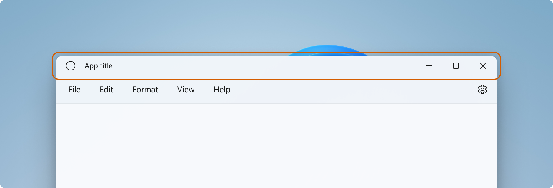
タイトル バーのコンポーネント
この一覧では、標準のタイトル バーのコンポーネントについて説明します。
- タイトル バーの四角形
- タイトル テキスト
- システム アイコン
- システム メニュー - アプリアイコンをクリックするか、タイトル バーを右クリックしてアクセスします
- キャプション コントロール
- 最小化ボタン
- 最大化/復元ボタン
- [閉じる] ボタン
Windowing
Windows アプリ SDK のウィンドウ機能は、Win32 HWND モデルに基づく Microsoft.UI.Windowing.AppWindow クラスを使用します。 アプリ内の AppWindow と最上位の HWND との間には 1 対 1 の対応関係があります。 AppWindow とその関連クラスは、タイトル バーのカスタマイズを含む、アプリの最上位ウィンドウの多くの側面を管理できる API を提供します。 Windows が提供する既定のタイトル バーを変更して他の UI と統一感を持たせたり、アプリ キャンバスをタイトル バー領域に拡張して独自のタイトル バー コンテンツを提供したりできます。
WinUI のウィンドウ機能は、Win32 HWND モデルにも基づく Microsoft.UI.Xaml.Window クラスを使用します。 WinUI を使用する XAML アプリの場合、XAML ウィンドウ API はタイトル バーをカスタマイズする簡単な方法を提供しますが、必要に応じて AppWindow API をaccessできます。
AppWindow の使用方法
AppWindow API は、Windows アプリ SDKがサポートする任意の UI フレームワーク (Win32、WPF、WinForms、または WinUI) で使用でき、必要な API のみを使用して段階的に導入できます。
WinUI XAML をアプリの UI フレームワークとして使用する場合は、 Window API と AppWindow API の両方を使用できます。 Windows アプリ SDK 1.4 以降、XAML ウィンドウと AppWindow は、タイトル バーのカスタマイズに同じ AppWindowTitleBar オブジェクトを使用します。
Window.AppWindow プロパティを使用して、既存の XAML ウィンドウから AppWindow オブジェクトを取得します。 この AppWindow オブジェクトを使用すると、タイトル バーのカスタマイズ API にaccess。
タイトル バーの追加機能をaccessするには、XAML ウィンドウから AppWindow API (AppWindow.TitleBar.ForegroundColor = Colors.White;) を使用します。
WinUI 1.3 以降を使用していない場合は、相互運用 API を使用して AppWindow を取得し、AppWindow API を使用してタイトル バーをカスタマイズします。 相互運用 API の詳細については、「Manage アプリ ウィンドウ - UI フレームワークと HWND 相互運用およびウィンドウギャラリーのサンプルを参照してください。
タイトル バーのカスタマイズの程度
タイトル バーには 2 種類のカスタマイズ方法があります。既定のタイトル バーに軽微な変更を加える方法と、アプリ キャンバスをタイトル バー領域に拡張して完全に独自のコンテンツを提供する方法です。
Simple
タイトル バーの色の変更など、簡単なカスタマイズを行う場合は、AppWindowTitleBar オブジェクトのプロパティを設定して、タイトル バー要素に使用する色を指定できます。 この場合、アプリ タイトルの描画やドラッグ領域の定義など、タイトル バーの他の側面はすべてシステムによって処理されます。
Full
もう 1 つの方法は、既定のシステム タイトル バーを非表示にして、独自のカスタム コンテンツで置き換える方法です。 たとえば、テキスト、検索ボックス、カスタム メニューなどをタイトル バー領域に配置できます。 また、このオプションを使用して、Mica などの素材の背景をタイトル バー領域に拡張する必要があります。
完全にカスタマイズする場合は、タイトル バー領域に配置するコンテンツの作成や、独自のドラッグ領域の定義をユーザー自身で行う必要があります。 キャプション コントロール (システムの [閉じる]、[最小化]、[最大化] ボタン) は引き続きシステムによって提供および処理されますが、アプリ タイトルなどの要素は含まれません。 これらの要素は、アプリの要件に応じて自分で作成する必要があります。
シンプルなカスタマイズ
タイトル バーのタイトル、色、アイコンのみをカスタマイズする場合は、アプリ ウィンドウのタイトル バー オブジェクトのプロパティを設定できます。
Title
既定では、タイトル バーにはアプリの種類がウィンドウ タイトルとして表示されます (例: "WinUI Desktop")。 ウィンドウ タイトルは、アプリのわかりやすい表示名を表示するように更新する必要があります。
XAML アプリの表示名は Package.appxmanifest ファイルで設定されています。 この値を取得し、Title プロパティに次のように設定します。
Title = AppInfo.Current.DisplayInfo.DisplayName;
ウィンドウのタイトルを変更するには、次に示すように 、Window.Title プロパティを 1 行のテキスト値に設定します。
<Window
    ...
    Title="App title">
    ...
</Window>
public MainWindow()
{
    InitializeComponent();
    Title = "App title";
}
AppWindow API を使用してウィンドウ のタイトルを変更するには、次に示すように 、AppWindow.Title プロパティを 1 行のテキスト値に設定します。 この例では、アプリが WinUI 1.3 以降を使用していない場合に必要となる AppWindow を取得するために、相互運用 API を使用する方法を示します。
using Microsoft.UI;           // Needed for WindowId.
using Microsoft.UI.Windowing; // Needed for AppWindow.
using WinRT.Interop;          // Needed for XAML/HWND interop.

private AppWindow m_AppWindow;

public MainWindow()
{
    this.InitializeComponent();

    m_AppWindow = GetAppWindowForCurrentWindow();
    m_AppWindow.Title = "App title";
}

private AppWindow GetAppWindowForCurrentWindow()
{
    IntPtr hWnd = WindowNative.GetWindowHandle(this);
    WindowId wndId = Win32Interop.GetWindowIdFromWindow(hWnd);
    return AppWindow.GetFromWindowId(wndId);
}
Colors
既定のタイトル バーの色をカスタマイズする場合や、既定のウィンドウ アイコンを変更する場合は、AppWindow API を使用するか、タイトル バーを完全にカスタマイズする必要があります。
この例では、 AppWindowTitleBar のインスタンスを取得し、その色プロパティを設定する方法を示します。
Important
アプリがWindows 10で実行されている場合、色のカスタマイズは無視されます。
// Assumes "this" is a XAML Window. In projects that don't use
// WinUI 1.3 or later, use interop APIs to get the AppWindow.
AppWindow m_AppWindow = this.AppWindow;

private bool SetTitleBarColors()
{
    // Check to see if customization is supported.
    // The method returns true on Windows 10 since Windows App SDK 1.2,
    // and on all versions of Windows App SDK on Windows 11.
    if (AppWindowTitleBar.IsCustomizationSupported())
    {
        AppWindowTitleBar m_TitleBar = m_AppWindow.TitleBar;

        // Set active window colors.
        // Note: No effect when app is running on Windows 10
        // because color customization is not supported.
        m_TitleBar.ForegroundColor = Colors.White;
        m_TitleBar.BackgroundColor = Colors.Green;
        m_TitleBar.ButtonForegroundColor = Colors.White;
        m_TitleBar.ButtonBackgroundColor = Colors.SeaGreen;
        m_TitleBar.ButtonHoverForegroundColor = Colors.Gainsboro;
        m_TitleBar.ButtonHoverBackgroundColor = Colors.DarkSeaGreen;
        m_TitleBar.ButtonPressedForegroundColor = Colors.Gray;
        m_TitleBar.ButtonPressedBackgroundColor = Colors.LightGreen;

        // Set inactive window colors.
        // Note: No effect when app is running on Windows 10
        // because color customization is not supported.
        m_TitleBar.InactiveForegroundColor = Colors.Gainsboro;
        m_TitleBar.InactiveBackgroundColor = Colors.SeaGreen;
        m_TitleBar.ButtonInactiveForegroundColor = Colors.Gainsboro;
        m_TitleBar.ButtonInactiveBackgroundColor = Colors.SeaGreen;
        return true;
    }
    return false;
}
タイトル バーの色を設定するときには、次の点に注意する必要があります。
- ボタンの背景色は、閉じるボタンの ホバー 状態と 押された状態には 適用されません。 それらの状態に対して、[閉じる] ボタンには常にシステム定義の色が使用されます。
- 色のプロパティを
nullに設定すると、既定のシステム色にリセットされます。 - 透明色は設定できません。 色のアルファ チャンネルは無視されます。
- カラー フィルターやハイ コントラスト モードなどの設定により、画面上の色が選択内容と異なる場合があります。 重要な情報を伝えるために色だけに頼らないでください。
Windows では、選択した アクセント カラー をタイトル バーに適用するオプションがユーザーに提供されます。 タイトル バーの色を設定する場合は、すべての色を明示的に設定することをお勧めします。 これにより、ユーザー定義の色設定によって意図しない色の組み合わせが発生することを防止できます。
アイコンとシステム メニュー
システム アイコンを非表示にしたり、カスタム アイコンに置き換えたりできます。 システム アイコンを右クリックするか 1 回タップすると、システム メニューが表示されます。 ウィンドウは、ダブルクリックまたは 2 回タップすると閉じられます。
システム アイコンと関連する動作を表示または非表示にするには、タイトル バー IconShowOptions プロパティを設定します。
m_TitleBar.IconShowOptions = IconShowOptions.HideIconAndSystemMenu;
カスタム ウィンドウ アイコンを使用するには、 AppWindow.SetIcon メソッドのいずれかを呼び出して新しいアイコンを設定します。
SetIcon(String)SetIcon(String) メソッドは現在、.ico ファイルでのみ機能します。 このメソッドには、.ico ファイルへの完全修飾パスを渡します。
m_AppWindow.SetIcon("iconPath/iconName.ico");SetIcon(IconId)HICONなどのいずれかのアイコン関数からアイコン () へのハンドルが既にある場合は、GetIconIdFromIcon 相互運用 API を使用して IconId を取得できます。 その後、IconIdを SetIcon(IconId) メソッドに渡して、ウィンドウ アイコンを設定できます。m_AppWindow.SetIcon(iconId));
完全なカスタマイズ
タイトル バーの全面的なカスタマイズを選択すると、アプリのクライアント領域が拡張され、タイトル バーの領域を含めてウィンドウ全体が対象になります。 キャプション ボタンを除くウィンドウ全体の描画および入力処理は、ユーザーが行う必要があります。キャプション ボタンは引き続きウィンドウによって提供されます。
システム タイトル バーを非表示にしてコンテンツをタイトル バー領域に拡張するには、アプリのコンテンツをタイトル バー領域に拡張するプロパティを true に設定します。 XAML アプリでは、このプロパティはアプリの OnLaunched メソッド (App.xaml.cs) またはアプリの最初のページで設定できます。
Tip
すべてのコードをまとめて確認するには、「完全なカスタマイズの例」セクションを参照してください。
この例では、 Window.ExtendsContentIntoTitleBar プロパティを true に設定する方法を示します。
public MainWindow()
{
    this.InitializeComponent();

    // Hide system title bar.
    ExtendsContentIntoTitleBar = true;
}
Caution
ExtendsContentIntoTitleBar は、XAML IntelliSense では Window に対して表示されますが、XAML 内で記述するとエラーになります。 このプロパティはコードで設定してください。
この例では、 AppWindowTitleBar を取得し、 AppWindowTitleBar.ExtendsContentIntoTitleBar プロパティを true に設定する方法を示します。 この例では、相互運用 API を使用して AppWindow を取得する方法を示します。これは、アプリが WinUI 1.3 以降を使用していない場合に必要です。
using Microsoft.UI;           // Needed for WindowId.
using Microsoft.UI.Windowing; // Needed for AppWindow.
using WinRT.Interop;          // Needed for XAML/HWND interop.

private AppWindow m_AppWindow;

public MainWindow()
{
    this.InitializeComponent();

    m_AppWindow = GetAppWindowForCurrentWindow();
    var titleBar = m_AppWindow.TitleBar;
    // Hide system title bar.
    titleBar.ExtendsContentIntoTitleBar = true;
}

private AppWindow GetAppWindowForCurrentWindow()
{
    IntPtr hWnd = WindowNative.GetWindowHandle(this);
    WindowId wndId = Win32Interop.GetWindowIdFromWindow(hWnd);
    return AppWindow.GetFromWindowId(wndId);
}
タイトル バーのコンテンツと既定のドラッグ領域
アプリをタイトル バー領域に拡張する場合は、タイトル バーの UI を定義して構成する必要があります。 通常、少なくともタイトル テキストとドラッグ領域の指定が必要です。 タイトル バーのドラッグ領域とは、ユーザーがクリックしてウィンドウを移動できる領域のことです。 また、ユーザーが右クリックしてシステム メニューを表示できる領域でもあります。
タイトル バーのコンテンツとして適切な内容や、推奨される UI パターンの詳細については、タイトル バーのデザインに関する記事を参照してください。
この例は、対話型コンテンツを含まないカスタム タイトル バー UI の XAML を示しています。
<Grid x:Name="AppTitleBar"
      Height="32">
    <Grid.ColumnDefinitions>
        <ColumnDefinition x:Name="LeftPaddingColumn" Width="0"/>
        <ColumnDefinition/>
        <ColumnDefinition x:Name="RightPaddingColumn" Width="0"/>
    </Grid.ColumnDefinitions>
    <Image x:Name="TitleBarIcon" Source="ms-appx:///Assets/StoreLogo.png"
           Grid.Column="1"
           HorizontalAlignment="Left"
           Width="16" Height="16"
           Margin="8,0,0,0"/>
    <TextBlock x:Name="TitleBarTextBlock"
               Text="App title"
               Style="{StaticResource CaptionTextBlockStyle}"
               Grid.Column="1"
               VerticalAlignment="Center"
               Margin="28,0,0,0"/>
</Grid>
Important
LeftPaddingColumn と RightPaddingColumn は、キャプション ボタン用の領域を予約するために使われます。 これらの列に対する Width 値は、後述のコードで設定します。 コードと説明については、「システム キャプション ボタン」セクションを参照してください。
XAML アプリの表示名は Package.appxmanifest ファイルで設定されています。 この値を取得して、このようにカスタム タイトル バーで次のように使用できます。
TitleBarTextBlock.Text = AppInfo.Current.DisplayInfo.DisplayName;
コンテンツをタイトル バー領域に拡張すると、システム タイトル バーが非表示になり、既定の AppWindowTitleBar が作成され、キャプション ボタンと画面の幅全体のドラッグ領域が提供されます。これは、システム タイトル バーと同じです。 タイトル バーに対話型コンテンツを配置しない場合は、既定のドラッグ領域をそのまま使用できます。 タイトル バーに対話型コンテンツを配置する場合は、どの領域が対話型かを指定する必要があります。これについては次のセクションで説明します。
Caution
カスタムのドラッグ領域を定義する場合、既定のタイトル バー領域のウィンドウの上部に配置する必要はありません。UI の任意の部分をドラッグ領域として定義できます。 ただし、ドラッグ領域を別の場所に配置すると、ユーザーが見つけにくくなる可能性があります。
対話型コンテンツ
ボタン、メニュー、検索ボックスなどの対話型コントロールをアプリの上部に配置して、それらがタイトル バーであるかのように見せることができます。 ただし、対話型要素がユーザーによる入力を確実に受け取り、同時にユーザーがウィンドウを自由に移動できるためには、どの領域が対話型であるかを指定する必要があります。
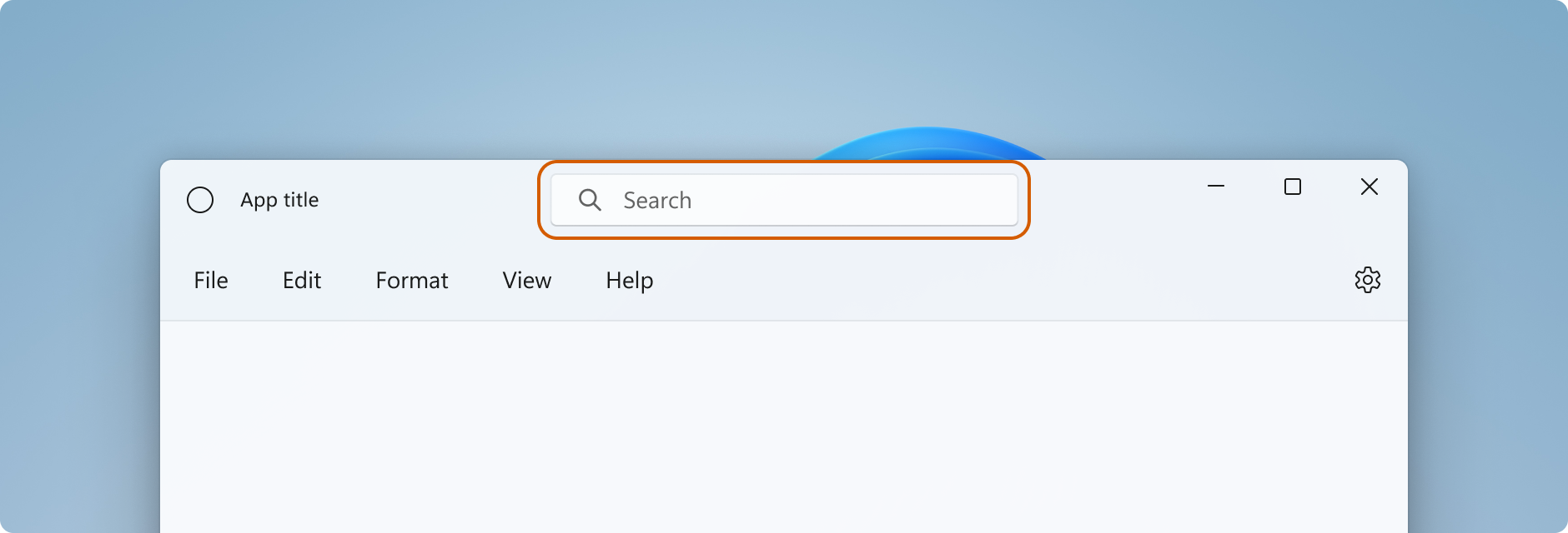
タイトル バー領域に対話型コンテンツを追加する場合は、 InputNonClientPointerSource クラスを使用して、入力がタイトル バーによって処理されるのではなく、対話型コントロールに渡される領域を指定する必要があります。 対話型領域を設定するには、 InputNonClientPointerSource.SetRegionRects メソッドを呼び出します。 このメソッドには、設定する領域の種類 (この場合は Passthrough) と、それぞれが Passthrough 領域を定義する矩形の配列を渡します。 タイトル バーのサイズが変わった場合は、新しいサイズに合わせて対話型領域を再計算し、新しい値を使って SetRegionRects を呼び出す必要があります。
この例では、検索ボックスと PersonPicture アカウント コントロールを備えたカスタム タイトル バー UI を示しています。 これらのコントロールが入力を受け取れるように、対話型の四角形を計算して設定する方法を示しています。
このコードに関して特に重要なポイントをいくつか挙げます。
-
AppTitleBarグリッドの高さを 48 に設定して、対話型コンテンツのタイトル バーのデザイン ガイダンスに従います。 -
PreferredHeightOption を
Tallに設定して、キャプション ボタンの高さがタイトル バーと同じになるようにします。 - コントロールのサイズ変更や領域の計算を簡単にするには、複数の名前付き列を持つ
Gridを使用してレイアウトします。 -
スター (*) サイズを使用して
MinWidth、AutoSuggestBoxを含む列がウィンドウに合わせて自動的にサイズ変更されるようにするとよいでしょう。 - ウィンドウのサイズが変更された場合でも常にドラッグ可能な小さな領域を確保するには、
MinWidthに対してRightDragColumnを設定します。 - MainWindow のコンストラクターで
ExtendsContentIntoTitleBarをtrueに設定します。 後で呼び出すコードで設定すると、最初に既定のシステム タイトル バーが表示されてから非表示になる場合があります。 - まず
AppTitleBar要素を読み込み、それが完了してから、最初の呼び出しを行って対話型領域を計算します。 そうしなければ、計算に使用される要素の値が正しいことを保証できません。 - 対話型の四角形の計算は、必ず
AppTitleBar要素のサイズ (AppTitleBar_SizeChanged) が変更されてから行ってください。 ウィンドウのChangedイベントに依存している場合、AppTitleBarのサイズが変更される前にイベントが発生し、誤った値を使用して計算が実行される可能性があります。 -
ExtendsContentIntoTitleBarを調べてカスタム タイトル バーが使われていることを確認した後、カスタム ドラッグおよび対話型領域を設定します。
<Grid x:Name="AppTitleBar"
      Height="48">
    <Grid.ColumnDefinitions>
        <ColumnDefinition x:Name="LeftPaddingColumn" Width="0"/>
        <ColumnDefinition x:Name="IconColumn" Width="Auto"/>
        <ColumnDefinition x:Name="TitleColumn" Width="Auto"/>
        <ColumnDefinition x:Name="LeftDragColumn" Width="*"/>
        <ColumnDefinition x:Name="SearchColumn" Width="4*" MinWidth="220"/>
        <ColumnDefinition x:Name="RightDragColumn" Width="*" MinWidth="48"/>
        <ColumnDefinition x:Name="AccountColumn" Width="Auto"/>
        <ColumnDefinition x:Name="RightPaddingColumn" Width="0"/>
    </Grid.ColumnDefinitions>
    <Image x:Name="TitleBarIcon"
           Source="ms-appx:///Assets/StoreLogo.png"
           Grid.Column="1"
           Width="16" Height="16"
           Margin="8,0,4,0"/>
    <TextBlock x:Name="TitleBarTextBlock"
               Text="App title"
               Style="{StaticResource CaptionTextBlockStyle}"
               Grid.Column="2"
               VerticalAlignment="Center">
    </TextBlock>
    <AutoSuggestBox x:Name="TitleBarSearchBox"
                    Grid.Column="4"
                    QueryIcon="Find"
                    PlaceholderText="Search"
                    VerticalAlignment="Center"
                    MaxWidth="600"/>
    <PersonPicture x:Name="PersonPic"
                   Grid.Column="6"
                   Height="32" Margin="0,0,16,0"/>
</Grid>
このコードは 、AutoSuggestBox コントロールと PersonPicture コントロールに対応する対話型領域を計算および設定する方法を示しています。
public sealed partial class MainWindow : Window
{
    public MainWindow()
    {
        this.InitializeComponent();

        // Assumes "this" is a XAML Window. In projects that don't use
        // WinUI 1.3 or later, use interop APIs to get the AppWindow.
        m_AppWindow = this.AppWindow;
        AppTitleBar.Loaded += AppTitleBar_Loaded;
        AppTitleBar.SizeChanged += AppTitleBar_SizeChanged;
        ExtendsContentIntoTitleBar = true;
        TitleBarTextBlock.Text = AppInfo.Current.DisplayInfo.DisplayName;
    }

    private void AppTitleBar_Loaded(object sender, RoutedEventArgs e)
    {
        if (ExtendsContentIntoTitleBar == true)
        {
            // Set the initial interactive regions.
            SetRegionsForCustomTitleBar();
        }
    }

    private void AppTitleBar_SizeChanged(object sender, SizeChangedEventArgs e)
    {
        if (ExtendsContentIntoTitleBar == true)
        {
            // Update interactive regions if the size of the window changes.
            SetRegionsForCustomTitleBar();
        }
    }

    private void SetRegionsForCustomTitleBar()
    {
        // Specify the interactive regions of the title bar.

        double scaleAdjustment = AppTitleBar.XamlRoot.RasterizationScale;

        RightPaddingColumn.Width = new GridLength(m_AppWindow.TitleBar.RightInset / scaleAdjustment);
        LeftPaddingColumn.Width = new GridLength(m_AppWindow.TitleBar.LeftInset / scaleAdjustment);

        GeneralTransform transform = TitleBarSearchBox.TransformToVisual(null);
        Rect bounds = transform.TransformBounds(new Rect(0, 0,
                                                         TitleBarSearchBox.ActualWidth,
                                                         TitleBarSearchBox.ActualHeight));
        Windows.Graphics.RectInt32 SearchBoxRect = GetRect(bounds, scaleAdjustment);

        transform = PersonPic.TransformToVisual(null);
        bounds = transform.TransformBounds(new Rect(0, 0,
                                                    PersonPic.ActualWidth,
                                                    PersonPic.ActualHeight));
        Windows.Graphics.RectInt32 PersonPicRect = GetRect(bounds, scaleAdjustment);

        var rectArray = new Windows.Graphics.RectInt32[] { SearchBoxRect, PersonPicRect };

        InputNonClientPointerSource nonClientInputSrc =
            InputNonClientPointerSource.GetForWindowId(this.AppWindow.Id);
        nonClientInputSrc.SetRegionRects(NonClientRegionKind.Passthrough, rectArray);
    }

    private Windows.Graphics.RectInt32 GetRect(Rect bounds, double scale)
    {
        return new Windows.Graphics.RectInt32(
            _X: (int)Math.Round(bounds.X * scale),
            _Y: (int)Math.Round(bounds.Y * scale),
            _Width: (int)Math.Round(bounds.Width * scale),
            _Height: (int)Math.Round(bounds.Height * scale)
        );
    }
}
Warning
AppWindow は、物理ピクセルを使用して、論理座標を使用しない UI フレームワークとの互換性を確保します。 WPFまたは WinUI、RightInset、LeftInset を使用する場合、表示スケールが 100%でない場合は、領域の計算に使用する値を調整する必要があります。 この例では、表示倍率の設定を考慮するために、scaleAdjustment 値を取得します。
- WinUI の場合は、 XamlRoot.RasterizationScale プロパティを使用してスケール調整を取得します。
- WPFでは、Window.DpiChanged イベントを処理して、NewDpi 値を取得し、スケール調整を計算できます。
システム キャプション ボタン
アプリ ウィンドウの左上隅または右上隅は、システム キャプション ボタン (最小化、最大化/元に戻す、閉じる) 用に予約されています。 ウィンドウをドラッグ、最小化、最大化、および閉じる操作のための最小限の機能を確保するために、キャプション ボタン領域の制御は、システムが保持します。 [閉じる] ボタンは左から右に読む言語では右上に、右から左に読む言語では左上に表示されます。
キャプション コントロール領域の下にアプリの背景などのコンテンツを描画することはできますが、ユーザーが操作できる UI を配置しないでください。 キャプション コントロールへの入力はシステムによって処理されるため、この領域は入力を受け付けません。
前の例にあった以下の行は、タイトル バーを定義する XAML のパディング列を示しています。 余白ではなくパディング列を使うと、キャプション コントロール ボタンの下の領域にも背景が描画されます (透明なボタンの場合)。 左右の両方のパディング列を使うと、右から左、左から右のどちらのレイアウトでも、タイトル バーが正しく動作します。
<Grid.ColumnDefinitions>
    <ColumnDefinition x:Name="LeftPaddingColumn" Width="0"/>
    <ColumnDefinition/>
    <ColumnDefinition x:Name="RightPaddingColumn" Width="0"/>
</Grid.ColumnDefinitions>
キャプションコントロール領域の寸法と位置は AppWindowTitleBar クラスによって伝達されるため、タイトル バー UI のレイアウトで説明できます。 両側の予約リージョンの幅は LeftInset プロパティまたは RightInset プロパティによって指定され、高さは Height プロパティによって指定されます。
ドラッグ領域を計算して設定するときに、パディング列の幅を指定する方法を次に示します。
RightPaddingColumn.Width =
    new GridLength(m_AppWindow.TitleBar.RightInset / scaleAdjustment);
LeftPaddingColumn.Width =
    new GridLength(m_AppWindow.TitleBar.LeftInset / scaleAdjustment);
Important
表示のスケーリングがこれらの値にどのように影響するかについては、「 対話型コンテンツ」 セクションの重要な情報を参照してください。
カスタム タイトル バーでの縦長のタイトル バーのサポート
検索ボックスや人物画像などの対話型コンテンツをタイトル バーに追加する場合は、タイトル バーの縦を長くして、このような要素の領域を確保することをお勧めします。 タイトル バーを高くすると、タッチ操作も容易になります。
AppWindowTitleBar.PreferredHeightOption プロパティを使用すると、タイトル バーの高さを標準の高さ (既定値) から高さより高い高さに増やします。
Tall タイトル バー モードを選ぶと、システムがクライアント領域にオーバーレイとして描画するキャプション ボタンの縦が長くなり、最小/最大/閉じるのグリフが中央に配置されます。 ドラッグ領域を指定していない場合は、ウィンドウの幅と、設定した PreferredHeightOption 値で決定される高さのドラッグ領域がシステムによって描画されます。
この例では、PreferredHeightOption プロパティを設定する方法を示しています。
// A taller title bar is only supported when drawing a fully custom title bar.
if (ExtendsContentIntoTitleBar == true)
{
    m_AppWindow.TitleBar.PreferredHeightOption = TitleBarHeightOption.Tall;
}
Caution
AppWindowTitleBar.ExtendsContentIntoTitleBar プロパティは、true プロパティを設定する前にPreferredHeightOptionしなければなりません。
PreferredHeightOption が ExtendsContentIntoTitleBar の場合、false を設定しようとすると、例外がスローされます。
キャプション ボタンの色と透明度
アプリのコンテンツをタイトル バー領域に拡張する場合、キャプション ボタンの背景を透明にして、アプリの背景を透過表示できます。 通常、背景を Colors.Transparent に設定すると、完全な透明度が得られます。 部分的な透明度を設定するには、プロパティを設定する 色 のアルファ チャネルを設定します。
以下のタイトル バーのプロパティは透明に設定できます。
- ButtonBackgroundColor
- ButtonHoverBackgroundColor
- ButtonPressedBackgroundColor
- ButtonInactiveBackgroundColor
他のすべての色プロパティでは、アルファ チャネルが引き続き無視されます。
ExtendsContentIntoTitleBar が false に設定されている場合、アルファ チャネルは、すべての AppWindowTitleBar 色プロパティで常に無視されます。
ボタンの背景色は、[閉じる] ボタンの ホバー 状態と 押された状態には 適用されません。 それらの状態に対して、[閉じる] ボタンには常にシステム定義の色が使用されます。
Tip
マイカ は、フォーカスしているウィンドウを区別するのに役立つ楽しい 素材 です。 Windows 11の有効期間の長いウィンドウの背景としてお勧めします。 ウィンドウのクライアント領域に Mica を適用している場合は、それをタイトル バー領域まで拡張し、キャプション ボタンを透明にして Mica が透けて見えるように設定できます。 詳細については、 マイカの資料 を参照してください。
ウィンドウが非アクティブなときにタイトル バーを淡色表示にする
ウィンドウがアクティブか非アクティブかをひと目でわかるように表示する必要があります。 少なくとも、タイトル バー内のテキスト、アイコン、ボタンの色を変更する必要があります。
XAML アプリの場合は、 Window.Activated イベントを処理してウィンドウのアクティブ化状態を判断し、必要に応じてタイトル バーの UI を更新します。
public MainWindow()
{
    ...
    Activated += MainWindow_Activated;
}

private void MainWindow_Activated(object sender, WindowActivatedEventArgs args)
{
    if (args.WindowActivationState == WindowActivationState.Deactivated)
    {
        TitleBarTextBlock.Foreground =
            (SolidColorBrush)App.Current.Resources["WindowCaptionForegroundDisabled"];
    }
    else
    {
        TitleBarTextBlock.Foreground =
            (SolidColorBrush)App.Current.Resources["WindowCaptionForeground"];
    }
}
他の UI フレームワークを使用している場合は、ウィンドウのアクティブ状態を判断するイベントを処理して、必要に応じてタイトル バーの UI を更新します。 ウィンドウの状態を確認する方法は、アプリに使用する UI フレームワークによって異なります。
- Win32: WM_ACTIVATE メッセージをリッスンして応答します。
- WPF: Window.Activatedイベントの処理、Window.Deactivatedイベントの処理。
- WinForms: Form.Activated、 Form.Deactivate を処理します。
タイトル バーをリセットする
アプリの実行中にシステム タイトル バーをリセットまたは切り替えるには、 AppWindowTitleBar.ResetToDefault を呼び出します。
m_AppWindow.TitleBar.ResetToDefault();
XAML アプリでは、以下の方法でタイトル バーをリセットすることもできます。
- SetTitleBar を呼び出して、アプリの実行中に新しいタイトル バー要素に切り替えます。
-
SetTitleBarをパラメーターとして指定してnullを呼び出すと、既定のAppWindowTitleBarドラッグ領域にリセットされます。 - パラメーターとして
SetTitleBarを使用してnullを呼び出し、ExtendsContentIntoTitleBar をfalseに設定して、既定のシステム タイトル バーに戻します。
タイトル バーの表示と非表示
全画面表示モードまたはコンパクト オーバーレイ モードのサポートをアプリに追加する場合は、アプリがこれらのモードを切り替えるときにタイトル バーに変更を加える必要がある場合があります。 XAML ウィンドウには、全画面表示モードをサポートする API は用意されていません。この用途には AppWindow API を使用できます。
アプリが 全画面表示 モードで実行されると、システムはタイトル バーとキャプション コントロール ボタンを非表示にします。 AppWindow.Changed イベントを処理し、イベント引数 DidPresenterChange プロパティを確認して、新しいウィンドウ プレゼンテーションに応答してタイトル バーを表示、非表示、または変更するかどうかを判断できます。
この例では、前の例にある Changed イベントを処理して、AppTitleBar 要素の表示と非表示を切り替える方法を示しています。 ウィンドウが コンパクト オーバーレイ モードの場合、タイトル バーは既定のシステム タイトル バーにリセットされます (または、コンパクト オーバーレイ用に最適化されたカスタム タイトル バーを提供することもできます)。
public MainWindow()
{
    this.InitializeComponent();

    m_AppWindow = this.AppWindow;
    m_AppWindow.Changed += AppWindow_Changed;
}

private void AppWindow_Changed(AppWindow sender, AppWindowChangedEventArgs args)
{
    if (args.DidPresenterChange)
    {
        switch (sender.Presenter.Kind)
        {
            case AppWindowPresenterKind.CompactOverlay:
                // Compact overlay - hide custom title bar
                // and use the default system title bar instead.
                AppTitleBar.Visibility = Visibility.Collapsed;
                sender.TitleBar.ResetToDefault();
                break;

            case AppWindowPresenterKind.FullScreen:
                // Full screen - hide the custom title bar
                // and the default system title bar.
                AppTitleBar.Visibility = Visibility.Collapsed;
                sender.TitleBar.ExtendsContentIntoTitleBar = true;
                break;

            case AppWindowPresenterKind.Overlapped:
                // Normal - hide the system title bar
                // and use the custom title bar instead.
                AppTitleBar.Visibility = Visibility.Visible;
                sender.TitleBar.ExtendsContentIntoTitleBar = true;
                break;

            default:
                // Use the default system title bar.
                sender.TitleBar.ResetToDefault();
                break;
        }
    }
}
Note
全画面表示 モードと コンパクト オーバーレイ モードは、アプリでサポートされている場合にのみ入力できます。 詳細については、「アプリ ウィンドウを管理する」、「FullScreenPresenter」、「CompactOverlayPresenter」を参照してください。
推奨と非推奨
- ウィンドウがアクティブまたは非アクティブであるときには、それをわかりやすく示してください。 少なくとも、タイトル バー内のテキスト、アイコン、ボタンの色を変更します。
- アプリ キャンバスの上端に沿ってドラッグ領域を定義します。 システム タイトル バーの配置に合わせると、ユーザーが見つけやすくなります。
- アプリのキャンバスにタイトル バーが表示される場合は、それに一致するドラッグ領域を定義します。
完全なカスタマイズの例
この例は、「完全なカスタマイズ」セクションで説明したすべてのコードを示します。
<Window
    x:Class="WinUI3_CustomTitleBar.MainWindow"
    xmlns="http://schemas.microsoft.com/winfx/2006/xaml/presentation"
    xmlns:x="http://schemas.microsoft.com/winfx/2006/xaml"
    xmlns:d="http://schemas.microsoft.com/expression/blend/2008"
    xmlns:mc="http://schemas.openxmlformats.org/markup-compatibility/2006"
    mc:Ignorable="d">

    <Grid>
        <Grid.RowDefinitions>
            <RowDefinition Height="Auto"/>
            <RowDefinition/>
        </Grid.RowDefinitions>

        <Grid x:Name="AppTitleBar"
      Height="48">
            <Grid.ColumnDefinitions>
                <ColumnDefinition x:Name="LeftPaddingColumn" Width="0"/>
                <ColumnDefinition x:Name="IconColumn" Width="Auto"/>
                <ColumnDefinition x:Name="TitleColumn" Width="Auto"/>
                <ColumnDefinition x:Name="LeftDragColumn" Width="*"/>
                <ColumnDefinition x:Name="SearchColumn" Width="4*" MinWidth="220"/>
                <ColumnDefinition x:Name="RightDragColumn" Width="*" MinWidth="48"/>
                <ColumnDefinition x:Name="AccountColumn" Width="Auto"/>
                <ColumnDefinition x:Name="RightPaddingColumn" Width="0"/>
            </Grid.ColumnDefinitions>
            <Image x:Name="TitleBarIcon"
           Source="ms-appx:///Assets/StoreLogo.png"
           Grid.Column="1"
           Width="16" Height="16"
           Margin="8,0,4,0"/>
            <TextBlock x:Name="TitleBarTextBlock"
                       Text="App title"
                       Style="{StaticResource CaptionTextBlockStyle}"
                       Grid.Column="2"
                       VerticalAlignment="Center">
            </TextBlock>
            <AutoSuggestBox x:Name="TitleBarSearchBox"
                            Grid.Column="4"
                            QueryIcon="Find"
                            PlaceholderText="Search"
                            VerticalAlignment="Center"
                            MaxWidth="600"/>
            <PersonPicture x:Name="PersonPic"
                           Grid.Column="6"
                           Height="32" Margin="0,0,16,0"/>
        </Grid>

        <NavigationView Grid.Row="1"
                        IsBackButtonVisible="Collapsed"
                        IsSettingsVisible="False">
            <StackPanel>
                <TextBlock Text="Content"
                           Style="{ThemeResource TitleTextBlockStyle}"
                           Margin="32,0,0,0"/>
                <StackPanel Grid.Row="1" VerticalAlignment="Center">
                    <Button Margin="4" x:Name="CompactoverlaytBtn"
                            Content="Enter CompactOverlay"
                            Click="SwitchPresenter"/>
                    <Button Margin="4" x:Name="FullscreenBtn"
                            Content="Enter FullScreen"
                            Click="SwitchPresenter"/>
                    <Button Margin="4" x:Name="OverlappedBtn"
                            Content="Revert to default (Overlapped)"
                            Click="SwitchPresenter"/>
                </StackPanel>
            </StackPanel>
        </NavigationView>
    </Grid>
</Window>
using Microsoft.UI.Input;
using Microsoft.UI.Windowing;
using Microsoft.UI.Xaml;
using Microsoft.UI.Xaml.Controls;
using Microsoft.UI.Xaml.Media;
using System;
using Windows.ApplicationModel;
using Rect = Windows.Foundation.Rect;

public sealed partial class MainWindow : Window
{
    private AppWindow m_AppWindow;

    public MainWindow()
    {
        this.InitializeComponent();

        // Assumes "this" is a XAML Window. In projects that don't use
        // WinUI 1.3 or later, use interop APIs to get the AppWindow.
        m_AppWindow = this.AppWindow;
        m_AppWindow.Changed += AppWindow_Changed;
        Activated += MainWindow_Activated;
        AppTitleBar.SizeChanged += AppTitleBar_SizeChanged;
        AppTitleBar.Loaded += AppTitleBar_Loaded;

        ExtendsContentIntoTitleBar = true;
        if (ExtendsContentIntoTitleBar == true)
        {
            m_AppWindow.TitleBar.PreferredHeightOption = TitleBarHeightOption.Tall;
        }
        TitleBarTextBlock.Text = AppInfo.Current.DisplayInfo.DisplayName;
    }

    private void AppTitleBar_Loaded(object sender, RoutedEventArgs e)
        {
            if (ExtendsContentIntoTitleBar == true)
            {
                // Set the initial interactive regions.
                SetRegionsForCustomTitleBar();
            }
        }

    private void AppTitleBar_SizeChanged(object sender, SizeChangedEventArgs e)
        {
            if (ExtendsContentIntoTitleBar == true)
            {
                // Update interactive regions if the size of the window changes.
                SetRegionsForCustomTitleBar();
            }
        }

    private void SetRegionsForCustomTitleBar()
    {
        // Specify the interactive regions of the title bar.

        double scaleAdjustment = AppTitleBar.XamlRoot.RasterizationScale;

        RightPaddingColumn.Width = new GridLength(m_AppWindow.TitleBar.RightInset / scaleAdjustment);
        LeftPaddingColumn.Width = new GridLength(m_AppWindow.TitleBar.LeftInset / scaleAdjustment);

        // Get the rectangle around the AutoSuggestBox control.
        GeneralTransform transform = TitleBarSearchBox.TransformToVisual(null);
        Rect bounds = transform.TransformBounds(new Rect(0, 0,
                                                         TitleBarSearchBox.ActualWidth,
                                                         TitleBarSearchBox.ActualHeight));
        Windows.Graphics.RectInt32 SearchBoxRect = GetRect(bounds, scaleAdjustment);

        // Get the rectangle around the PersonPicture control.
        transform = PersonPic.TransformToVisual(null);
        bounds = transform.TransformBounds(new Rect(0, 0,
                                                    PersonPic.ActualWidth,
                                                    PersonPic.ActualHeight));
        Windows.Graphics.RectInt32 PersonPicRect = GetRect(bounds, scaleAdjustment);

        var rectArray = new Windows.Graphics.RectInt32[] { SearchBoxRect, PersonPicRect };

        InputNonClientPointerSource nonClientInputSrc =
            InputNonClientPointerSource.GetForWindowId(this.AppWindow.Id);
        nonClientInputSrc.SetRegionRects(NonClientRegionKind.Passthrough, rectArray);
    }

    private Windows.Graphics.RectInt32 GetRect(Rect bounds, double scale)
    {
        return new Windows.Graphics.RectInt32(
            _X: (int)Math.Round(bounds.X * scale),
            _Y: (int)Math.Round(bounds.Y * scale),
            _Width: (int)Math.Round(bounds.Width * scale),
            _Height: (int)Math.Round(bounds.Height * scale)
        );
    }

    private void MainWindow_Activated(object sender, WindowActivatedEventArgs args)
    {
        if (args.WindowActivationState == WindowActivationState.Deactivated)
        {
            TitleBarTextBlock.Foreground =
                (SolidColorBrush)App.Current.Resources["WindowCaptionForegroundDisabled"];
        }
        else
        {
            TitleBarTextBlock.Foreground =
                (SolidColorBrush)App.Current.Resources["WindowCaptionForeground"];
        }
    }

    private void AppWindow_Changed(AppWindow sender, AppWindowChangedEventArgs args)
    {
        if (args.DidPresenterChange)
        {
            switch (sender.Presenter.Kind)
            {
                case AppWindowPresenterKind.CompactOverlay:
                    // Compact overlay - hide custom title bar
                    // and use the default system title bar instead.
                    AppTitleBar.Visibility = Visibility.Collapsed;
                    sender.TitleBar.ResetToDefault();
                    break;

                case AppWindowPresenterKind.FullScreen:
                    // Full screen - hide the custom title bar
                    // and the default system title bar.
                    AppTitleBar.Visibility = Visibility.Collapsed;
                    sender.TitleBar.ExtendsContentIntoTitleBar = true;
                    break;

                case AppWindowPresenterKind.Overlapped:
                    // Normal - hide the system title bar
                    // and use the custom title bar instead.
                    AppTitleBar.Visibility = Visibility.Visible;
                    sender.TitleBar.ExtendsContentIntoTitleBar = true;
                    break;

                default:
                    // Use the default system title bar.
                    sender.TitleBar.ResetToDefault();
                    break;
            }
        }
    }

    private void SwitchPresenter(object sender, RoutedEventArgs e)
    {
        if (AppWindow != null)
        {
            AppWindowPresenterKind newPresenterKind;
            switch ((sender as Button).Name)
            {
                case "CompactoverlaytBtn":
                    newPresenterKind = AppWindowPresenterKind.CompactOverlay;
                    break;

                case "FullscreenBtn":
                    newPresenterKind = AppWindowPresenterKind.FullScreen;
                    break;

                case "OverlappedBtn":
                    newPresenterKind = AppWindowPresenterKind.Overlapped;
                    break;

                default:
                    newPresenterKind = AppWindowPresenterKind.Default;
                    break;
            }

            // If the same presenter button was pressed as the
            // mode we're in, toggle the window back to Default.
            if (newPresenterKind == AppWindow.Presenter.Kind)
            {
                AppWindow.SetPresenter(AppWindowPresenterKind.Default);
            }
            else
            {
                // Else request a presenter of the selected kind
                // to be created and applied to the window.
                AppWindow.SetPresenter(newPresenterKind);
            }
        }
    }
}
関連資料
GitHub で Microsoft と共同作業する
このコンテンツのソースは GitHub にあります。そこで、issue や pull request を作成および確認することもできます。 詳細については、共同作成者ガイドを参照してください。

Windows developer