このトピックでは、Windows アプリケーションでのコマンド実行について説明します。 具体的には、 XamlUICommand クラスと StandardUICommand クラス (ICommand インターフェイスと共に) を使用して、使用されているデバイスと入力の種類に関係なく、さまざまなコントロールの種類でコマンドを共有および管理する方法について説明します。
デバイスと入力の種類に関係なく、さまざまなコントロール間でコマンドを共有する
重要な API
概要
コマンドは、ボタンのクリックやコンテキスト メニューからの項目の選択などの UI 操作によって直接呼び出すことができます。 また、キーボード アクセラレータ、ジェスチャ、音声認識、オートメーション/アクセシビリティ ツールなどの入力デバイスを介して間接的に呼び出すこともできます。 呼び出されると、コマンドはコントロール (編集コントロール内のテキスト ナビゲーション)、ウィンドウ (戻るナビゲーション)、またはアプリケーション (終了) によって処理できます。
コマンドは、テキストの削除や操作の元に戻すなど、アプリ内の特定のコンテキストで動作するか、オーディオのミュートや明るさの調整などのコンテキストフリーにすることができます。
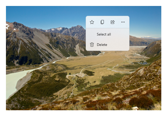
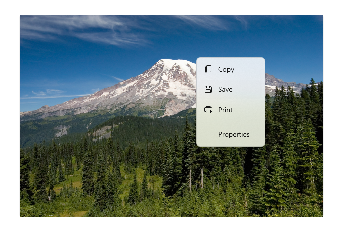
次の図は、同じコマンドの一部を共有する 2 つのコマンド インターフェイス ( CommandBar とフローティング コンテキスト CommandBarFlyout) を示しています。
コマンド バー
Microsoft フォト ギャラリーのコンテキスト メニュー
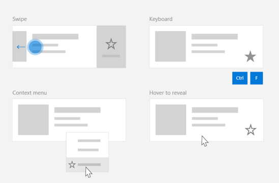
コマンド操作
さまざまなデバイス、入力の種類、およびコマンドの呼び出し方法に影響を与える可能性がある UI サーフェスのため、できるだけ多くのコマンド 実行サーフェイスを使用してコマンドを公開することをお勧めします。 これには、スワイプ、MenuBar、CommandBar、CommandBarFlyout、従来のコンテキスト メニューの組み合わせが含まれます。
重要なコマンドの場合は、入力固有のアクセラレータを使用します。 入力アクセラレータを使用すると、ユーザーが使用している入力デバイスに応じてアクションをより迅速に実行できます。
さまざまな入力の種類の一般的な入力アクセラレータを次に示します。
- ポインター - マウス & ペンホバー ボタン
- キーボード - ショートカット (アクセス キーとアクセラレータ キー)
- タッチ - スワイプ
- タッチ - プルしてデータを更新する
アプリケーションの機能に汎用的にアクセスできるようにするには、入力の種類とユーザー エクスペリエンスを考慮する必要があります。 たとえば、コレクション (特にユーザーが編集可能なもの) には、通常、入力デバイスに応じてまったく異なる方法で実行されるさまざまな特定のコマンドが含まれます。
次の表は、一般的なコレクション コマンドとそのコマンドを公開する方法を示しています。
| Command | 入力に依存しない | マウス アクセラレータ | キーボード アクセラレータ | タッチ アクセラレータ |
|---|---|---|---|---|
| アイテムの削除 | コンテキスト メニュー | ホバー ボタン | DEL キー | スワイプして削除する |
| フラグ項目 | コンテキスト メニュー | ホバー ボタン | Ctrl + Shift + G | スワイプしてフラグを設定する |
| データの更新 | コンテキスト メニュー | N/A | F5 キー | プルして更新する |
| アイテムをお気に入りにする | コンテキスト メニュー | ホバー ボタン | F、Ctrl + S | お気に入りにスワイプ |
常にコンテキスト メニューを提供する すべての入力の種類でサポートされるため、関連するすべてのコンテキスト コマンドを従来のコンテキスト メニューまたは CommandBarFlyout に含めてお勧めします。 たとえば、ポインター ホバー イベント中にのみコマンドが公開されている場合、タッチのみのデバイスでは使用できません。
Windows アプリケーションのコマンド
Windows アプリケーションでコマンド エクスペリエンスを共有および管理するには、いくつかの方法があります。 コードビハインドで、Click などの標準的な対話のイベントハンドラーを定義することができます (UI が複雑であれば、非常に非効率的な場合があります)。また、標準の対話のイベントリスナーを共有ハンドラーにバインドすることや、コントロールの Command プロパティをコマンドロジックを定義するための ICommand 実装にバインドすることもできます。
コマンド サーフェイス全体で効率的かつ最小限のコード重複を伴う豊富で包括的なユーザー エクスペリエンスを提供するには、このトピックで説明されているコマンド バインド機能を使用することをお勧めします (標準のイベント処理については、個々のイベント トピックを参照してください)。
コントロールを共有コマンド リソースにバインドするには、ICommand インターフェイスを自分で実装するか、 XamlUICommand 基底クラスまたは StandardUICommand 派生クラスで定義されているプラットフォーム コマンドのいずれかからコマンドをビルドできます。
- ICommand インターフェイス (Microsoft。Ui。Xaml.Input.ICommand または System.Windows。Input.ICommand) を使用すると、アプリ全体で完全にカスタマイズされた再利用可能なコマンドを作成できます。
- XamlUICommand もこの機能を提供しますが、コマンド動作、キーボード ショートカット (アクセス キーとアクセラレータ キー)、アイコン、ラベル、説明など、組み込みのコマンド プロパティのセットを公開することで開発を簡略化します。
- StandardUICommand では、定義済みのプロパティを持つ一連の標準プラットフォーム コマンドから選択できるため、さらに簡単になります。
Important
WinUI アプリケーションでは、コマンドは、選択した言語フレームワークに応じて、Microsoft.UI.Xaml.Input.ICommand (C++) または System.Windows.Input.ICommand (C#) インターフェイスのいずれかを実装したものです。
StandardUICommand クラスを使用したコマンド エクスペリエンス
XamlUICommand から派生した(C++ では Microsoft.UI.Xaml.Input.ICommand から、C# では System.Windows.Input.ICommand から派生した)StandardUICommand クラスは、アイコン、キーボード アクセラレータ、説明などの定義済みプロパティを備えた標準プラットフォーム コマンドのセットを提供します。
StandardUICommand を使用すると、SaveやDeleteなどの一般的なコマンドをすばやく一貫性のある方法で定義できます。 実行関数と canExecute 関数を指定する必要があります。
Example
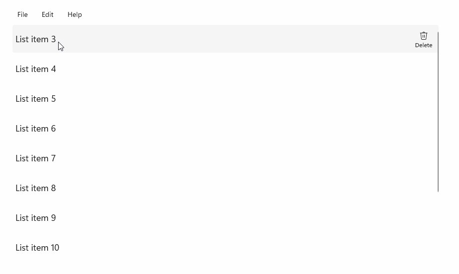
StandardUICommandSample
この例では、StandardUICommand クラスを使用して実装された Delete 項目コマンドを使用して基本的な ListView を拡張し、MenuBar、スワイプ コントロール、ホバー ボタン、コンテキスト メニューを使用してさまざまな入力の種類のユーザー エクスペリエンスを最適化する方法を示します。
Xaml:
サンプル UI には、5 つの項目の ListView が含まれています。 Delete StandardUICommand は、 MenuBarItem、 SwipeItem、 AppBarButton、 ContextFlyout メニューにバインドされます。
<Page
    x:Class="StandardUICommandSample.MainPage"
    xmlns="http://schemas.microsoft.com/winfx/2006/xaml/presentation"
    xmlns:x="http://schemas.microsoft.com/winfx/2006/xaml"
    xmlns:local="using:StandardUICommandSample"
    xmlns:d="http://schemas.microsoft.com/expression/blend/2008"
    xmlns:mc="http://schemas.openxmlformats.org/markup-compatibility/2006"
    xmlns:muxcontrols="using:Microsoft.UI.Xaml.Controls"
    mc:Ignorable="d"
    Background="{ThemeResource ApplicationPageBackgroundThemeBrush}">

    <Page.Resources>
        <Style x:Key="HorizontalSwipe"
               TargetType="ListViewItem"
               BasedOn="{StaticResource ListViewItemRevealStyle}">
            <Setter Property="Height" Value="60"/>
            <Setter Property="Padding" Value="0"/>
            <Setter Property="HorizontalContentAlignment" Value="Stretch"/>
            <Setter Property="VerticalContentAlignment" Value="Stretch"/>
            <Setter Property="BorderThickness" Value="0"/>
        </Style>
    </Page.Resources>

    <Grid Loaded="ControlExample_Loaded">
        <Grid.RowDefinitions>
            <RowDefinition Height="Auto" />
            <RowDefinition Height="Auto" />
            <RowDefinition Height="*"/>
        </Grid.RowDefinitions>

        <StackPanel Grid.Row="0"
                    Padding="10"
                    BorderThickness="0,0,0,1"
                    BorderBrush="LightBlue"
                    Background="AliceBlue">
            <TextBlock Style="{StaticResource HeaderTextBlockStyle}">
                StandardUICommand sample
            </TextBlock>
            <TextBlock Style="{StaticResource SubtitleTextBlockStyle}" Margin="0,0,0,10">
                This sample shows how to use the StandardUICommand class to
                share a platform command and consistent user experiences
                across various controls.
            </TextBlock>
            <TextBlock Style="{StaticResource SubtitleTextBlockStyle}" Margin="0,0,0,0">
                Specifically, we define a standard delete command and add it
                to a variety of command surfaces, all of which share a common
                icon, label, keyboard accelerator, and description.
            </TextBlock>
        </StackPanel>

        <muxcontrols:MenuBar Grid.Row="1" Padding="10">
            <muxcontrols:MenuBarItem Title="File">
            </muxcontrols:MenuBarItem>
            <muxcontrols:MenuBarItem Title="Edit">
                <MenuFlyoutItem x:Name="DeleteFlyoutItem"/>
            </muxcontrols:MenuBarItem>
            <muxcontrols:MenuBarItem Title="Help">
            </muxcontrols:MenuBarItem>
        </muxcontrols:MenuBar>

        <ListView x:Name="ListViewRight" Grid.Row="2"
                  Loaded="ListView_Loaded"
                  IsItemClickEnabled="True"
                  SelectionMode="Single"
                  SelectionChanged="ListView_SelectionChanged"
                  ItemContainerStyle="{StaticResource HorizontalSwipe}">
            <ListView.ItemTemplate>
                <DataTemplate x:DataType="local:ListItemData">
                    <UserControl PointerEntered="ListViewSwipeContainer_PointerEntered"
                                 PointerExited="ListViewSwipeContainer_PointerExited">
                        <UserControl.ContextFlyout>
                            <MenuFlyout>
                                <MenuFlyoutItem
                                    Command="{x:Bind Command}"
                                    CommandParameter="{x:Bind Text}" />
                            </MenuFlyout>
                        </UserControl.ContextFlyout>
                        <Grid AutomationProperties.Name="{x:Bind Text}">
                            <VisualStateManager.VisualStateGroups>
                                <VisualStateGroup x:Name="HoveringStates">
                                    <VisualState x:Name="HoverButtonsHidden" />
                                    <VisualState x:Name="HoverButtonsShown">
                                        <VisualState.Setters>
                                            <Setter Target="HoverButton.Visibility"
                                                    Value="Visible" />
                                        </VisualState.Setters>
                                    </VisualState>
                                </VisualStateGroup>
                            </VisualStateManager.VisualStateGroups>
                            <SwipeControl x:Name="ListViewSwipeContainer" >
                                <SwipeControl.RightItems>
                                    <SwipeItems Mode="Execute">
                                        <SwipeItem x:Name="DeleteSwipeItem"
                                                   Background="Red"
                                                   Command="{x:Bind Command}"
                                                   CommandParameter="{x:Bind Text}"/>
                                    </SwipeItems>
                                </SwipeControl.RightItems>
                                <Grid VerticalAlignment="Center">
                                    <TextBlock Text="{x:Bind Text}"
                                               Margin="10"
                                               FontSize="18"
                                               HorizontalAlignment="Left"
                                               VerticalAlignment="Center"/>
                                    <AppBarButton x:Name="HoverButton"
                                                  IsTabStop="False"
                                                  HorizontalAlignment="Right"
                                                  Visibility="Collapsed"
                                                  Command="{x:Bind Command}"
                                                  CommandParameter="{x:Bind Text}"/>
                                </Grid>
                            </SwipeControl>
                        </Grid>
                    </UserControl>
                </DataTemplate>
            </ListView.ItemTemplate>
        </ListView>
    </Grid>
</Page>
コード ビハインド
- まず、ListView の各 ListViewItem に対してテキスト文字列と ICommand を含む
ListItemDataクラスを定義します。
public class ListItemData
{
    public String Text { get; set; }
    public ICommand Command { get; set; }
}
- MainPage クラスでは、
ListItemDataItemTemplate の DataTemplate の オブジェクトのコレクションを定義します。 次に、5つの項目 (テキストとそれに対応する StandardUICommand の Delete) の初期コレクションを入力します。
/// <summary>
/// ListView item collection.
/// </summary>
ObservableCollection<ListItemData> collection =
    new ObservableCollection<ListItemData>();

/// <summary>
/// Handler for the layout Grid control load event.
/// </summary>
/// <param name="sender">Source of the control loaded event</param>
/// <param name="e">Event args for the loaded event</param>
private void ControlExample_Loaded(object sender, RoutedEventArgs e)
{
    // Create the standard Delete command.
    var deleteCommand = new StandardUICommand(StandardUICommandKind.Delete);
    deleteCommand.ExecuteRequested += DeleteCommand_ExecuteRequested;

    DeleteFlyoutItem.Command = deleteCommand;

    for (var i = 0; i < 5; i++)
    {
        collection.Add(
            new ListItemData {
                Text = "List item " + i.ToString(),
                Command = deleteCommand });
    }
}

/// <summary>
/// Handler for the ListView control load event.
/// </summary>
/// <param name="sender">Source of the control loaded event</param>
/// <param name="e">Event args for the loaded event</param>
private void ListView_Loaded(object sender, RoutedEventArgs e)
{
    var listView = (ListView)sender;
    // Populate the ListView with the item collection.
    listView.ItemsSource = collection;
}
- 次に、項目削除コマンドを実装する ICommand ExecuteRequested ハンドラーを定義します。
/// <summary>
/// Handler for the Delete command.
/// </summary>
/// <param name="sender">Source of the command event</param>
/// <param name="e">Event args for the command event</param>
private void DeleteCommand_ExecuteRequested(
    XamlUICommand sender, ExecuteRequestedEventArgs args)
{
    // If possible, remove specified item from collection.
    if (args.Parameter != null)
    {
        foreach (var i in collection)
        {
            if (i.Text == (args.Parameter as string))
            {
                collection.Remove(i);
                return;
            }
        }
    }
    if (ListViewRight.SelectedIndex != -1)
    {
        collection.RemoveAt(ListViewRight.SelectedIndex);
    }
}
- 最後に、PointerEntered、PointerExited、SelectionChanged イベントなど、さまざまな ListView イベントのハンドラーを定義します。 ポインター イベント ハンドラーは、各項目の [削除] ボタンを表示または非表示にするために使用されます。
/// <summary>
/// Handler for the ListView selection changed event.
/// </summary>
/// <param name="sender">Source of the selection changed event</param>
/// <param name="e">Event args for the selection changed event</param>
private void ListView_SelectionChanged(object sender, SelectionChangedEventArgs e)
{
    if (ListViewRight.SelectedIndex != -1)
    {
        var item = collection[ListViewRight.SelectedIndex];
    }
}

/// <summary>
/// Handler for the pointer entered event.
/// Displays the delete item "hover" buttons.
/// </summary>
/// <param name="sender">Source of the pointer entered event</param>
/// <param name="e">Event args for the pointer entered event</param>
private void ListViewSwipeContainer_PointerEntered(
    object sender, PointerRoutedEventArgs e)
{
    if (e.Pointer.PointerDeviceType ==
        Windows.Devices.Input.PointerDeviceType.Mouse ||
        e.Pointer.PointerDeviceType ==
        Windows.Devices.Input.PointerDeviceType.Pen)
    {
        VisualStateManager.GoToState(
            sender as Control, "HoverButtonsShown", true);
    }
}

/// <summary>
/// Handler for the pointer exited event.
/// Hides the delete item "hover" buttons.
/// </summary>
/// <param name="sender">Source of the pointer exited event</param>
/// <param name="e">Event args for the pointer exited event</param>

private void ListViewSwipeContainer_PointerExited(
    object sender, PointerRoutedEventArgs e)
{
    VisualStateManager.GoToState(
        sender as Control, "HoverButtonsHidden", true);
}
XamlUICommand クラスを使用したコマンド エクスペリエンス
StandardUICommand クラスで定義されていないコマンドを作成する必要がある場合、またはコマンドの外観をより詳細に制御する必要がある場合、XamlUICommand クラスは ICommand インターフェイスから派生し、さまざまな UI プロパティ (アイコン、ラベル、説明、キーボード ショートカットなど)、メソッド、イベントを追加して、カスタム コマンドの UI と動作をすばやく定義します。
XamlUICommand では、個々のプロパティを設定せずに、アイコン、ラベル、説明、キーボード ショートカット (アクセス キーとキーボード アクセラレータの両方) などのコントロール バインドを使用して UI を指定できます。
Example
XamlUICommandSample
この例のコードをダウンロードする (XamlUICommand) 多くのプラットフォーム コントロールでは、前のセクションの StandardUICommand の例と同様に、XamlUICommand プロパティが内部で使用されます。
Xaml:
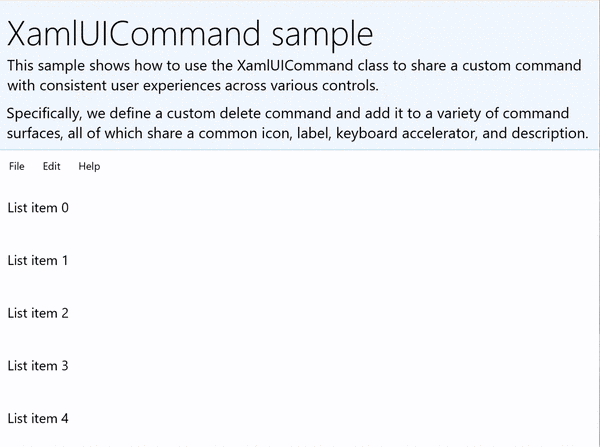
サンプル UI には、5 つの項目の ListView が含まれています。 カスタム XamlUICommand CustomXamlUICommand は、 MenuBarItem、 SwipeItem、 AppBarButton、 ContextFlyout メニューにバインドされます。
<Page
x:Class="XamlUICommand_Sample.MainPage"
xmlns="http://schemas.microsoft.com/winfx/2006/xaml/presentation"
xmlns:x="http://schemas.microsoft.com/winfx/2006/xaml"
xmlns:local="using:XamlUICommand_Sample"
xmlns:d="http://schemas.microsoft.com/expression/blend/2008"
xmlns:mc="http://schemas.openxmlformats.org/markup-compatibility/2006"
xmlns:muxcontrols="using:Microsoft.UI.Xaml.Controls"
mc:Ignorable="d"
Background="{ThemeResource ApplicationPageBackgroundThemeBrush}">
<Page.Resources>
<XamlUICommand x:Name="CustomXamlUICommand"
ExecuteRequested="DeleteCommand_ExecuteRequested"
Description="Custom XamlUICommand"
Label="Custom XamlUICommand">
<XamlUICommand.IconSource>
<FontIconSource FontFamily="Wingdings" Glyph="M"/>
</XamlUICommand.IconSource>
<XamlUICommand.KeyboardAccelerators>
<KeyboardAccelerator Key="D" Modifiers="Control"/>
</XamlUICommand.KeyboardAccelerators>
</XamlUICommand>
<Style x:Key="HorizontalSwipe"
TargetType="ListViewItem"
BasedOn="{StaticResource ListViewItemRevealStyle}">
<Setter Property="Height" Value="70"/>
<Setter Property="Padding" Value="0"/>
<Setter Property="HorizontalContentAlignment" Value="Stretch"/>
<Setter Property="VerticalContentAlignment" Value="Stretch"/>
<Setter Property="BorderThickness" Value="0"/>
</Style>
</Page.Resources>
<Grid Loaded="ControlExample_Loaded" Name="MainGrid">
<Grid.RowDefinitions>
<RowDefinition Height="Auto" />
<RowDefinition Height="Auto" />
<RowDefinition Height="*"/>
</Grid.RowDefinitions>
<StackPanel Grid.Row="0"
Padding="10"
BorderThickness="0,0,0,1"
BorderBrush="LightBlue"
Background="AliceBlue">
<TextBlock Style="{StaticResource HeaderTextBlockStyle}">
XamlUICommand sample
</TextBlock>
<TextBlock Style="{StaticResource SubtitleTextBlockStyle}" Margin="0,0,0,10">
This sample shows how to use the XamlUICommand class to
share a custom command with consistent user experiences
across various controls.
</TextBlock>
<TextBlock Style="{StaticResource SubtitleTextBlockStyle}" Margin="0,0,0,0">
Specifically, we define a custom delete command and add it
to a variety of command surfaces, all of which share a common
icon, label, keyboard accelerator, and description.
</TextBlock>
</StackPanel>
<muxcontrols:MenuBar Grid.Row="1">
<muxcontrols:MenuBarItem Title="File">
</muxcontrols:MenuBarItem>
<muxcontrols:MenuBarItem Title="Edit">
<MenuFlyoutItem x:Name="DeleteFlyoutItem"
Command="{StaticResource CustomXamlUICommand}"/>
</muxcontrols:MenuBarItem>
<muxcontrols:MenuBarItem Title="Help">
</muxcontrols:MenuBarItem>
</muxcontrols:MenuBar>
<ListView x:Name="ListViewRight" Grid.Row="2"
Loaded="ListView_Loaded"
IsItemClickEnabled="True"
SelectionMode="Single"
SelectionChanged="ListView_SelectionChanged"
ItemContainerStyle="{StaticResource HorizontalSwipe}">
<ListView.ItemTemplate>
<DataTemplate x:DataType="local:ListItemData">
<UserControl PointerEntered="ListViewSwipeContainer_PointerEntered"
PointerExited="ListViewSwipeContainer_PointerExited">
<UserControl.ContextFlyout>
<MenuFlyout>
<MenuFlyoutItem
Command="{x:Bind Command}"
CommandParameter="{x:Bind Text}" />
</MenuFlyout>
</UserControl.ContextFlyout>
<Grid AutomationProperties.Name="{x:Bind Text}">
<VisualStateManager.VisualStateGroups>
<VisualStateGroup x:Name="HoveringStates">
<VisualState x:Name="HoverButtonsHidden" />
<VisualState x:Name="HoverButtonsShown">
<VisualState.Setters>
<Setter Target="HoverButton.Visibility"
Value="Visible" />
</VisualState.Setters>
</VisualState>
</VisualStateGroup>
</VisualStateManager.VisualStateGroups>
<SwipeControl x:Name="ListViewSwipeContainer">
<SwipeControl.RightItems>
<SwipeItems Mode="Execute">
<SwipeItem x:Name="DeleteSwipeItem"
Background="Red"
Command="{x:Bind Command}"
CommandParameter="{x:Bind Text}"/>
</SwipeItems>
</SwipeControl.RightItems>
<Grid VerticalAlignment="Center">
<TextBlock Text="{x:Bind Text}"
Margin="10"
FontSize="18"
HorizontalAlignment="Left"
VerticalAlignment="Center"/>
<AppBarButton x:Name="HoverButton"
IsTabStop="False"
HorizontalAlignment="Right"
Visibility="Collapsed"
Command="{x:Bind Command}"
CommandParameter="{x:Bind Text}"/>
</Grid>
</SwipeControl>
</Grid>
</UserControl>
</DataTemplate>
</ListView.ItemTemplate>
</ListView>
</Grid>
</Page>
コード ビハインド
- まず、ListView の各 ListViewItem に対してテキスト文字列と ICommand を含む
ListItemDataクラスを定義します。
public class ListItemData
{
    public String Text { get; set; }
    public ICommand Command { get; set; }
}
- MainPage クラスでは、
ListItemDataItemTemplate の DataTemplate の オブジェクトのコレクションを定義します。 次に、5 つの項目 (テキストと関連する XamlUICommand を含む) の初期コレクションを設定します。
ObservableCollection<ListItemData> collection = new ObservableCollection<ListItemData>();

private void ControlExample_Loaded(object sender, RoutedEventArgs e)
{
    for (var i = 0; i < 5; i++)
    {
        collection.Add(
           new ListItemData { Text = "List item " + i.ToString(), Command = CustomXamlUICommand });
    }
}

private void ListView_Loaded(object sender, RoutedEventArgs e)
{
    var listView = (ListView)sender;
    listView.ItemsSource = collection;
}
- 次に、項目削除コマンドを実装する ICommand ExecuteRequested ハンドラーを定義します。
private void DeleteCommand_ExecuteRequested(
   XamlUICommand sender, ExecuteRequestedEventArgs args)
{
    if (args.Parameter != null)
    {
        foreach (var i in collection)
        {
            if (i.Text == (args.Parameter as string))
            {
                collection.Remove(i);
                return;
            }
        }
    }
    if (ListViewRight.SelectedIndex != -1)
    {
        collection.RemoveAt(ListViewRight.SelectedIndex);
    }
}
- 最後に、PointerEntered、PointerExited、SelectionChanged イベントなど、さまざまな ListView イベントのハンドラーを定義します。 ポインター イベント ハンドラーは、各項目の [削除] ボタンを表示または非表示にするために使用されます。
private void ListView_SelectionChanged(object sender, SelectionChangedEventArgs e)
{
    if (ListViewRight.SelectedIndex != -1)
    {
        var item = collection[ListViewRight.SelectedIndex];
    }
}

private void ListViewSwipeContainer_PointerEntered(object sender, PointerRoutedEventArgs e)
{
    if (e.Pointer.PointerDeviceType ==
        Windows.Devices.Input.PointerDeviceType.Mouse ||
        e.Pointer.PointerDeviceType == Windows.Devices.Input.PointerDeviceType.Pen)
    {
        VisualStateManager.GoToState(sender as Control, "HoverButtonsShown", true);
    }
}

private void ListViewSwipeContainer_PointerExited(object sender, PointerRoutedEventArgs e)
{
    VisualStateManager.GoToState(sender as Control, "HoverButtonsHidden", true);
}
ICommand インターフェイスを使用したコマンド エクスペリエンス
標準の WinUI コントロール (ボタン、リスト、選択、カレンダー、予測テキスト) は、多くの一般的なコマンド エクスペリエンスの基礎を提供します。 コントロールの種類の完全な一覧については、「 Windows アプリのコントロールとパターン」を参照してください。
構造化されたコマンド処理をサポートする最も基本的な方法は、ICommand インターフェイスの実装を定義することです(C++ の場合は Microsoft.UI.Xaml.Input.ICommand、C# の場合は System.Windows.Input.ICommand)。 この ICommand インスタンスは、ボタンなどのコントロールにバインドできます。
注
場合によっては、メソッドを Click イベントにバインドし、プロパティを IsEnabled プロパティにバインドするのと同じくらい効率的な場合があります。
Example
ICommand の例
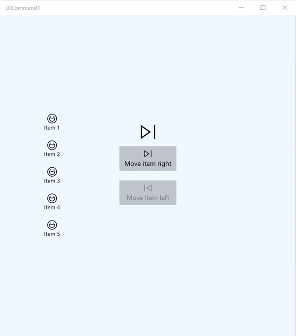
この基本的な例では、ボタン クリック、キーボード アクセラレータ、マウス ホイールの回転を使用して 1 つのコマンドを呼び出す方法を示します。
<Page
x:Class="UICommand1.View.MainPage"
xmlns="http://schemas.microsoft.com/winfx/2006/xaml/presentation"
xmlns:x="http://schemas.microsoft.com/winfx/2006/xaml"
xmlns:vm="using:UICommand1.ViewModel"
xmlns:d="http://schemas.microsoft.com/expression/blend/2008"
xmlns:mc="http://schemas.openxmlformats.org/markup-compatibility/2006"
mc:Ignorable="d"
Background="{ThemeResource ApplicationPageBackgroundThemeBrush}">
<Page.Resources>
<vm:OpacityConverter x:Key="opaque" />
</Page.Resources>
<Grid Name="ItemGrid"
Background="AliceBlue"
PointerWheelChanged="Page_PointerWheelChanged">
<Grid.ColumnDefinitions>
<ColumnDefinition Width="*"/>
<ColumnDefinition Width="2*"/>
<ColumnDefinition Width="*"/>
</Grid.ColumnDefinitions>
<ListView Grid.Column="0" VerticalAlignment="Center"
x:Name="CommandListView"
ItemsSource="{x:Bind Path=ViewModel.ListItemLeft}"
SelectionMode="None" IsItemClickEnabled="False"
HorizontalAlignment="Right">
<ListView.ItemTemplate>
<DataTemplate x:DataType="vm:ListItemData">
<Grid VerticalAlignment="Center">
<AppBarButton Label="{x:Bind ListItemText}">
<AppBarButton.Icon>
<SymbolIcon Symbol="{x:Bind ListItemIcon}"/>
</AppBarButton.Icon>
</AppBarButton>
</Grid>
</DataTemplate>
</ListView.ItemTemplate>
</ListView>
<Grid Grid.Column="1" Margin="0,0,0,0"
HorizontalAlignment="Center"
VerticalAlignment="Center">
<Grid.RowDefinitions>
<RowDefinition Height="*"/>
<RowDefinition Height="*"/>
<RowDefinition Height="*"/>
</Grid.RowDefinitions>
<StackPanel Grid.Row="1">
<FontIcon FontFamily="{StaticResource SymbolThemeFontFamily}"
FontSize="40" Glyph=""
Opacity="{x:Bind Path=ViewModel.ListItemLeft.Count,
Mode=OneWay, Converter={StaticResource opaque}}"/>
<Button Name="MoveItemRightButton"
Margin="0,10,0,10" Width="120" HorizontalAlignment="Center"
Command="{x:Bind Path=ViewModel.MoveRightCommand}">
<Button.KeyboardAccelerators>
<KeyboardAccelerator
Modifiers="Control"
Key="Add" />
</Button.KeyboardAccelerators>
<StackPanel>
<SymbolIcon Symbol="Next"/>
<TextBlock>Move item right</TextBlock>
</StackPanel>
</Button>
<Button Name="MoveItemLeftButton"
Margin="0,10,0,10" Width="120" HorizontalAlignment="Center"
Command="{x:Bind Path=ViewModel.MoveLeftCommand}">
<Button.KeyboardAccelerators>
<KeyboardAccelerator
Modifiers="Control"
Key="Subtract" />
</Button.KeyboardAccelerators>
<StackPanel>
<SymbolIcon Symbol="Previous"/>
<TextBlock>Move item left</TextBlock>
</StackPanel>
</Button>
<FontIcon FontFamily="{StaticResource SymbolThemeFontFamily}"
FontSize="40" Glyph=""
Opacity="{x:Bind Path=ViewModel.ListItemRight.Count,
Mode=OneWay, Converter={StaticResource opaque}}"/>
</StackPanel>
</Grid>
<ListView Grid.Column="2"
x:Name="CommandListViewRight"
VerticalAlignment="Center"
IsItemClickEnabled="False"
SelectionMode="None"
ItemsSource="{x:Bind Path=ViewModel.ListItemRight}"
HorizontalAlignment="Left">
<ListView.ItemTemplate>
<DataTemplate x:DataType="vm:ListItemData">
<Grid VerticalAlignment="Center">
<AppBarButton Label="{x:Bind ListItemText}">
<AppBarButton.Icon>
<SymbolIcon Symbol="{x:Bind ListItemIcon}"/>
</AppBarButton.Icon>
</AppBarButton>
</Grid>
</DataTemplate>
</ListView.ItemTemplate>
</ListView>
</Grid>
</Page>
上記の UI の分離コードを次に示します。
分離コードでは、コマンド コードが含まれるビュー モデルに接続します。 さらに、マウス ホイールからの入力のハンドラーを定義します。これは、コマンド コードも接続します。
using Microsoft.UI.Xaml;
using Microsoft.UI.Xaml.Input;
using Microsoft.UI.Xaml.Controls;
using UICommand1.ViewModel;
using Windows.System;
using Windows.UI.Core; // for CoreVirtualKeyStates
using Microsoft.UI.Input; // for InputKeyboardSource

namespace UICommand1.View
{
    /// <summary>
    /// An empty page that can be used on its own or navigated to within a Frame.
    /// </summary>
    public sealed partial class MainPage : Page
    {
        // Reference to our view model.
        public UICommand1ViewModel ViewModel { get; set; }

        // Initialize our view and view model.
        public MainPage()
        {
            this.InitializeComponent();
            ViewModel = new UICommand1ViewModel();
        }

        /// <summary>
        /// Handle mouse wheel input and assign our
        /// commands to appropriate direction of rotation.
        /// </summary>
        /// <param name="sender"></param>
        /// <param name="e"></param>
        private void Page_PointerWheelChanged(object sender, PointerRoutedEventArgs e)
        {
            var props = e.GetCurrentPoint(sender as UIElement).Properties;

            // Require CTRL key and accept only vertical mouse wheel movement
            // to eliminate accidental wheel input.
            if ((Microsoft.UI.Input.InputKeyboardSource.GetKeyStateForCurrentThread(VirtualKey.Control) !=
                CoreVirtualKeyStates.None) && !props.IsHorizontalMouseWheel)
            {
                bool delta = props.MouseWheelDelta < 0 ? true : false;

                switch (delta)
                {
                    case true:
                        ViewModel.MoveRight();
                        break;
                    case false:
                        ViewModel.MoveLeft();
                        break;
                    default:
                        break;
                }
            }
        }
    }
}
ビュー モデルのコードを次に示します。
ビュー モデルでは、アプリで 2 つのコマンドの実行の詳細を定義し、1 つの ListView を設定し、各 ListView の項目数に基づいて追加の UI を非表示または表示するための不透明度値コンバーターを提供します。
using System;
using System.Collections.ObjectModel;
using System.ComponentModel;
using Microsoft.UI.Xaml.Controls;
using Microsoft.UI.Xaml.Data;

namespace UICommand1.ViewModel
{
    /// <summary>
    /// UI properties for our list items.
    /// </summary>
    public class ListItemData
    {
        /// <summary>
        /// Gets and sets the list item content string.
        /// </summary>
        public string ListItemText { get; set; }
        /// <summary>
        /// Gets and sets the list item icon.
        /// </summary>
        public Symbol ListItemIcon { get; set; }
    }

    /// <summary>
    /// View Model that sets up a command to handle invoking the move item buttons.
    /// </summary>
    public class UICommand1ViewModel
    {
        /// <summary>
        /// The command to invoke when the Move item left button is pressed.
        /// </summary>
        public RelayCommand MoveLeftCommand { get; private set; }

        /// <summary>
        /// The command to invoke when the Move item right button is pressed.
        /// </summary>
        public RelayCommand MoveRightCommand { get; private set; }

        // Item collections
        public ObservableCollection<ListItemData> ListItemLeft { get; } =
           new ObservableCollection<ListItemData>();
        public ObservableCollection<ListItemData> ListItemRight { get; } =
           new ObservableCollection<ListItemData>();

        public ListItemData listItem;

        /// <summary>
        /// Sets up a command to handle invoking the move item buttons.
        /// </summary>
        public UICommand1ViewModel()
        {
            MoveLeftCommand =
               new RelayCommand(new Action(MoveLeft), CanExecuteMoveLeftCommand);
            MoveRightCommand =
               new RelayCommand(new Action(MoveRight), CanExecuteMoveRightCommand);

            LoadItems();
        }

        /// <summary>
        ///  Populate our list of items.
        /// </summary>
        public void LoadItems()
        {
            for (var x = 0; x <= 4; x++)
            {
                listItem = new ListItemData();
                listItem.ListItemText = "Item " + (ListItemLeft.Count + 1).ToString();
                listItem.ListItemIcon = Symbol.Emoji;
                ListItemLeft.Add(listItem);
            }
        }

        /// <summary>
        /// Move left command valid when items present in the list on right.
        /// </summary>
        /// <returns>True, if count is greater than 0.</returns>
        private bool CanExecuteMoveLeftCommand()
        {
            return ListItemRight.Count > 0;
        }

        /// <summary>
        /// Move right command valid when items present in the list on left.
        /// </summary>
        /// <returns>True, if count is greater than 0.</returns>
        private bool CanExecuteMoveRightCommand()
        {
            return ListItemLeft.Count > 0;
        }

        /// <summary>
        /// The command implementation to execute when the Move item right button is pressed.
        /// </summary>
        public void MoveRight()
        {
            if (ListItemLeft.Count > 0)
            {
                listItem = new ListItemData();
                ListItemRight.Add(listItem);
                listItem.ListItemText = "Item " + ListItemRight.Count.ToString();
                listItem.ListItemIcon = Symbol.Emoji;
                ListItemLeft.RemoveAt(ListItemLeft.Count - 1);
                MoveRightCommand.RaiseCanExecuteChanged();
                MoveLeftCommand.RaiseCanExecuteChanged();
            }
        }

        /// <summary>
        /// The command implementation to execute when the Move item left button is pressed.
        /// </summary>
        public void MoveLeft()
        {
            if (ListItemRight.Count > 0)
            {
                listItem = new ListItemData();
                ListItemLeft.Add(listItem);
                listItem.ListItemText = "Item " + ListItemLeft.Count.ToString();
                listItem.ListItemIcon = Symbol.Emoji;
                ListItemRight.RemoveAt(ListItemRight.Count - 1);
                MoveRightCommand.RaiseCanExecuteChanged();
                MoveLeftCommand.RaiseCanExecuteChanged();
            }
        }

        /// <summary>
        /// Views subscribe to this event to get notified of property updates.
        /// </summary>
        public event PropertyChangedEventHandler PropertyChanged;

        /// <summary>
        /// Notify subscribers of updates to the named property
        /// </summary>
        /// <param name="propertyName">The full, case-sensitive, name of a property.</param>
        protected void NotifyPropertyChanged(string propertyName)
        {
            PropertyChangedEventHandler handler = this.PropertyChanged;
            if (handler != null)
            {
                PropertyChangedEventArgs args = new PropertyChangedEventArgs(propertyName);
                handler(this, args);
            }
        }
    }

    /// <summary>
    /// Convert a collection count to an opacity value of 0.0 or 1.0.
    /// </summary>
    public class OpacityConverter : IValueConverter
    {
        /// <summary>
        /// Converts a collection count to an opacity value of 0.0 or 1.0.
        /// </summary>
        /// <param name="value">The count passed in</param>
        /// <param name="targetType">Ignored.</param>
        /// <param name="parameter">Ignored</param>
        /// <param name="language">Ignored</param>
        /// <returns>1.0 if count > 0, otherwise returns 0.0</returns>
        public object Convert(object value, Type targetType, object parameter, string language)
        {
            return ((int)value > 0 ? 1.0 : 0.0);
        }

        /// <summary>
        /// Not used, converter is not intended for two-way binding.
        /// </summary>
        /// <param name="value">Ignored</param>
        /// <param name="targetType">Ignored</param>
        /// <param name="parameter">Ignored</param>
        /// <param name="language">Ignored</param>
        /// <returns></returns>
        public object ConvertBack(object value, Type targetType, object parameter, string language)
        {
            throw new NotImplementedException();
        }
    }
}
最後に、ICommand インターフェイスの実装を次に示します。
ここでは、 ICommand インターフェイスを実装し、その機能を他のオブジェクトに中継するコマンドを定義します。
using System;
using System.Windows.Input;

namespace UICommand1
{
    /// <summary>
    /// A command whose sole purpose is to relay its functionality
    /// to other objects by invoking delegates.
    /// The default return value for the CanExecute method is 'true'.
    /// <see cref="RaiseCanExecuteChanged"/> needs to be called whenever
    /// <see cref="CanExecute"/> is expected to return a different value.
    /// </summary>
    public class RelayCommand : ICommand
    {
        private readonly Action _execute;
        private readonly Func<bool> _canExecute;

        /// <summary>
        /// Raised when RaiseCanExecuteChanged is called.
        /// </summary>
        public event EventHandler CanExecuteChanged;

        /// <summary>
        /// Creates a new command that can always execute.
        /// </summary>
        /// <param name="execute">The execution logic.</param>
        public RelayCommand(Action execute)
            : this(execute, null)
        {
        }

        /// <summary>
        /// Creates a new command.
        /// </summary>
        /// <param name="execute">The execution logic.</param>
        /// <param name="canExecute">The execution status logic.</param>
        public RelayCommand(Action execute, Func<bool> canExecute)
        {
            if (execute == null)
                throw new ArgumentNullException("execute");
            _execute = execute;
            _canExecute = canExecute;
        }

        /// <summary>
        /// Determines whether this <see cref="RelayCommand"/> can execute in its current state.
        /// </summary>
        /// <param name="parameter">
        /// Data used by the command. If the command does not require
        /// data to be passed, this object can be set to null.
        /// </param>
        /// <returns>true if this command can be executed; otherwise, false.</returns>
        public bool CanExecute(object parameter)
        {
            return _canExecute == null ? true : _canExecute();
        }

        /// <summary>
        /// Executes the <see cref="RelayCommand"/> on the current command target.
        /// </summary>
        /// <param name="parameter">
        /// Data used by the command. If the command does not require
        /// data to be passed, this object can be set to null.
        /// </param>
        public void Execute(object parameter)
        {
            _execute();
        }

        /// <summary>
        /// Method used to raise the <see cref="CanExecuteChanged"/> event
        /// to indicate that the return value of the <see cref="CanExecute"/>
        /// method has changed.
        /// </summary>
        public void RaiseCanExecuteChanged()
        {
            var handler = CanExecuteChanged;
            if (handler != null)
            {
                handler(this, EventArgs.Empty);
            }
        }
    }
}
概要
WinUI は、コントロールの種類、デバイス、入力の種類間でコマンドを共有および管理するアプリを構築できる堅牢で柔軟なコマンド システムを提供します。
Windows アプリのコマンドをビルドする場合は、次の方法を使用します。
- XAML/コードビハインドでイベントを監視して処理する
- Click などのイベント処理メソッドにバインドする
- 定義済みの一連のプロパティに対して独自の値を使用して XamlUICommand オブジェクトを作成する
- 定義済みのプラットフォームのプロパティと値のセットを使用して StandardUICommand オブジェクトを作成する
次のステップ
こちらも参照ください
Samples
トピックのサンプル
その他のサンプル
GitHub で Microsoft と共同作業する
このコンテンツのソースは GitHub にあります。そこで、issue や pull request を作成および確認することもできます。 詳細については、共同作成者ガイドを参照してください。

Windows developer