リボン コマンド バーでホストされるコントロールは、Windows リボン フレームワークによって適用されるレイアウト ルールの対象であり、リボン マークアップで宣言されている既定の動作とレイアウト テンプレート (フレームワーク定義のものとカスタムの両方) の組み合わせに基づいています。 これらのルールは、実行時にコマンド バーのコントロールがさまざまなリボン サイズに適応する方法に影響を与えるリボン フレームワークの適応レイアウト動作を定義します。
はじめに
アダプティブ レイアウトは、リボン フレームワークによって定義されているように、実行時のリボンのサイズ変更に基づき、リボン UI 内のすべてのコントロールで構成、サイズ、形式、相対スケールを動的に調整できる機能です。
フレームワークは、さまざまなレイアウト動作を指定しカスタマイズするために用意された一連のマークアップ要素を使用して、アダプティブ レイアウト機能を公開します。 SizeDefinitions と呼ばれるテンプレートのコレクションは、フレームワークによって定義され、各テンプレートではさまざまなコントロールとレイアウトのシナリオがサポートされます。 ただし、このフレームワークは、アプリケーションに必要な UI エクスペリエンスやレイアウトが定義済みのテンプレートで提供されない場合、カスタム テンプレートもサポートします。
特定のリボン サイズで優先レイアウトのコントロールを表示するために、定義済みのテンプレートとカスタム テンプレートはどちらも、ScalingPolicy 要素と連携して機能します。 この要素には、リボンのレンダリング時にフレームワークがガイドとして使用するサイズ設定のマニフェストが含まれています。
Note
リボン フレームワークは、定義済みの SizeDefinition テンプレートを必要とせず、コントロールの構成とプレゼンテーションに使用される一連の組み込みヒューリスティックに基づいて、既定のレイアウト動作を提供します。 ただし、この機能はプロトタイプ作成のみを目的としています。
リボンの SizeDefinition テンプレート
リボン フレームワークには、リボン コントロールのグループに対してサイズとレイアウト動作を指定する SizeDefinition テンプレートの包括的なセットが用意されています。 これらのテンプレートは、リボン アプリケーションでコントロールを構成するための最も一般的なシナリオに対応しています。
リボン アプリケーション間で一貫したユーザー エクスペリエンスを適用するため、各 SizeDefinition テンプレートは、サポートしているコントロールまたはコントロール ファミリに制限を設けています。
たとえば、コントロールのボタン ファミリには次のものが含まれます。
コントロールの入力ファミリには次のものが含まれます。
チェック ボックスとリボン内ギャラリーは、ボタン ファミリまたは入力ファミリに属していません。 これら 2 つのコントロールは、SizeDefinition テンプレートで明示的に示されている場合にのみ使用できます。
各テンプレートで使用できるレイアウトとコントロールの説明と、SizeDefinition テンプレートの一覧を次に示します。
重要
マークアップで宣言されているコントロールが、関連付けられているテンプレートで定義されているコントロールの型、順序、数量に正確にマップされない場合は、検証エラーのログがマークアップ コンパイラによって記録され、コンパイルが終了します。
OneButton
1 つのボタンファミリ コントロール。
大きなグループ サイズのみがサポートされます。

TwoButtons
2 つのボタンファミリ コントロール。
大と中のグループ サイズのみがサポートされます。
ThreeButtons
3 つのボタンファミリ コントロール。
大と中のグループ サイズのみがサポートされます。
ThreeButtons-OneBigAndTwoSmall
3 つのボタンファミリ コントロール。
最初のボタンは、3 つのサイズのすべてで目立つように表示されます。
ThreeButtonsAndOneCheckBox
1 つの CheckBox コントロールが付随する 3 つのボタンファミリ コントロール。
大と中のグループ サイズのみがサポートされます。
FourButtons
4 つのボタンファミリ コントロール。
FiveButtons
5 つのボタンファミリ コントロール。
FiveOrSixButtons
5 つのボタンファミリ コントロールとオプションの 6 番目のボタン。
SixButtons
6 つのボタンファミリ コントロール。
SixButtons-TwoColumns
6 つのボタンファミリ コントロール (代替プレゼンテーション)。
SevenButtons
7 つのボタンファミリ コントロール。
EightButtons
8 つのボタンファミリ コントロール。
EightButtons-LastThreeSmall
8 つのボタンファミリ コントロール (代替プレゼンテーション)。
Note
このテンプレートで宣言されているすべてのコントロール要素は、2 つの ControlGroup 要素 (最初の 5 つの要素に対して 1 つ、最後の 3 つの要素に対して 1 つ) に含まれている必要があります。
次の例は、このテンプレートに必要なマークアップを示しています。
<Group CommandName="cmdSizeDefinitionsGroup"
       SizeDefinition="EightButtons-LastThreeSmall">
  <ControlGroup>
    <Button CommandName="cmdSDButton1" />
    <Button CommandName="cmdSDButton2" />
    <Button CommandName="cmdSDButton3" />
    <Button CommandName="cmdSDButton4" />
    <Button CommandName="cmdSDButton5" />
  </ControlGroup>
  <ControlGroup>
    <Button CommandName="cmdSDButton6" />
    <Button CommandName="cmdSDButton7" />
    <Button CommandName="cmdSDButton8" />
  </ControlGroup>
</Group>
NineButtons
9 つのボタンファミリ コントロール。
TenButtons
10 のボタンファミリ コントロール。
ElevenButtons
11 のボタンファミリ コントロール。
OneFontControl
1 つの FontControl。
大と中のグループ サイズのみがサポートされます。
重要
カスタム テンプレート定義内に FontControl を含めすることは、フレームワークではサポートされていません。
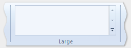
OneInRibbonGallery
1 つの InRibbonGallery コントロール。
大小のグループ サイズのみがサポートされます。
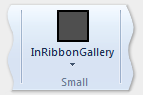
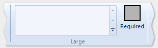
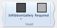
InRibbonGalleryAndBigButton
1 つの InRibbonGallery コントロールとボタンファミリ コントロール。
大小のグループ サイズのみがサポートされます。
InRibbonGalleryAndButtons-GalleryScalesFirst
1 つのリボン内ギャラリー コントロールと、2 つまたは 3 つのボタンファミリ コントロール。
ギャラリーは、中および小のグループ サイズではポップアップ表示の大きさに折りたたまれます。
ButtonGroups
32 個のボタンファミリ コントロールの複雑な配置 (そのほとんどは省略可能)。
Note
大きな ButtonGroups テンプレートの省略可能なフルサイズのボタンは別として、このテンプレートで宣言されているすべてのコントロール要素を ControlGroup 要素に含める必要があります。
次の例では、このテンプレートを使用して 32 個のコントロール要素 (必須と省略可能) をすべて表示するために必要なマークアップを示します。
<Group CommandName="cmdSizeDefinitionsGroup"
       SizeDefinition="ButtonGroups">
  <!-- Row 1 -->
  <ControlGroup>
    <ControlGroup>
      <Button CommandName="cmdSDButton1" />
      <Button CommandName="cmdSDButton2" />
      <Button CommandName="cmdSDButton3" />
      <Button CommandName="cmdSDButton4" />
      <Button CommandName="cmdSDButton5" />
      <Button CommandName="cmdSDButton6" />
      <Button CommandName="cmdSDButton7" />
      <Button CommandName="cmdSDButton8" />
      <Button CommandName="cmdSDButton9" />
      <Button CommandName="cmdSDButton10" />
    </ControlGroup>
    <ControlGroup>
      <Button CommandName="cmdSDButton11" />
      <Button CommandName="cmdSDButton12" />
    </ControlGroup>
    <ControlGroup>
      <Button CommandName="cmdSDButton13" />
      <Button CommandName="cmdSDButton14" />
    </ControlGroup>
    <ControlGroup>
      <Button CommandName="cmdSDButton15" />
    </ControlGroup>
    <ControlGroup>
      <Button CommandName="cmdSDButton16" />
    </ControlGroup>
    <ControlGroup>
      <Button CommandName="cmdSDButton17" />
      <Button CommandName="cmdSDButton18" />
    </ControlGroup>
  </ControlGroup>
  <!-- Row 2 -->
  <ControlGroup>
    <ControlGroup>
      <Button CommandName="cmdSDButton19" />
      <Button CommandName="cmdSDButton20" />
      <Button CommandName="cmdSDButton21" />
      <Button CommandName="cmdSDButton22" />
      <Button CommandName="cmdSDButton23" />
      <Button CommandName="cmdSDButton24" />
      <Button CommandName="cmdSDButton25" />
      <Button CommandName="cmdSDButton26" />
      <Button CommandName="cmdSDButton27" />
      <Button CommandName="cmdSDButton28" />
    </ControlGroup>
    <ControlGroup>
      <Button CommandName="cmdSDButton29" />
    </ControlGroup>
    <ControlGroup>
      <Button CommandName="cmdSDButton30" />
      <Button CommandName="cmdSDButton31" />
    </ControlGroup>
  </ControlGroup>
  <Button CommandName="cmdSDButton32" />
</Group>
ButtonGroupsAndInputs
2 つの入力ファミリ コントロール (2 つ目は省略可能) の後に、29 個のボタンファミリ コントロールの複雑な配置が続きます (そのほとんどは省略可能)。
大と中のグループ サイズのみがサポートされます。
Note
このテンプレートで宣言されているすべてのコントロール要素は、ControlGroup 要素に含まれている必要があります。
次の例では、このテンプレートを使用して、コントロール要素 (必須と省略可能) をすべて表示するために必要なマークアップを示します。
<Group CommandName="cmdSizeDefinitionsGroup"
       SizeDefinition="ButtonGroupsAndInputs">
  <!-- Row 1 -->
  <ControlGroup>
    <ControlGroup>
      <ComboBox CommandName="cmdSDComboBox" />
      <Spinner CommandName="cmdSDSpinner" />
    </ControlGroup>
    <ControlGroup>
      <Button CommandName="cmdSDButton1" />
      <Button CommandName="cmdSDButton2" />
      <Button CommandName="cmdSDButton3" />
      <Button CommandName="cmdSDButton4" />
      <Button CommandName="cmdSDButton5" />
      <Button CommandName="cmdSDButton6" />
      <Button CommandName="cmdSDButton7" />
      <Button CommandName="cmdSDButton8" />
      <Button CommandName="cmdSDButton9" />
    </ControlGroup>
    <ControlGroup>
      <Button CommandName="cmdSDButton10" />
    </ControlGroup>
    <ControlGroup>
      <Button CommandName="cmdSDButton11" />
      <Button CommandName="cmdSDButton12" />
    </ControlGroup>
    <ControlGroup>
      <Button CommandName="cmdSDButton13" />
    </ControlGroup>
    <ControlGroup>
      <Button CommandName="cmdSDButton14" />
    </ControlGroup>
  </ControlGroup>
  <!-- Row 2 -->
  <ControlGroup>
    <ControlGroup>
      <Button CommandName="cmdSDButton15" />
      <Button CommandName="cmdSDButton16" />
      <Button CommandName="cmdSDButton17" />
      <Button CommandName="cmdSDButton18" />
      <Button CommandName="cmdSDButton19" />
      <Button CommandName="cmdSDButton20" />
      <Button CommandName="cmdSDButton21" />
      <Button CommandName="cmdSDButton22" />
      <Button CommandName="cmdSDButton23" />
      <Button CommandName="cmdSDButton24" />
    </ControlGroup>
    <ControlGroup>
      <Button CommandName="cmdSDButton25" />
      <Button CommandName="cmdSDButton26" />
    </ControlGroup>
    <ControlGroup>
      <Button CommandName="cmdSDButton27" />
      <Button CommandName="cmdSDButton28" />
    </ControlGroup>
    <ControlGroup>
      <Button CommandName="cmdSDButton29" />
    </ControlGroup>
  </ControlGroup>
</Group>
BigButtonsAndSmallButtonsOrInputs
2 つのボタンファミリ コントロール (両方とも省略可能) の後に、2 つか 3 つのボタンまたは入力ファミリ コントロールが続きます。
大と中のグループ サイズのみがサポートされます。

基本的な SizeDefinition の例
次のコード例では、リボン マークアップで SizeDefinition テンプレートを宣言する方法の基本的なデモを示します。
この特定の例では、OneInRibbonGallery SizeDefinition が使用されていますが、すべてのフレームワーク テンプレートは同様の方法で指定されます。
<!-- InRibbonGallery -->
<Group CommandName="cmdInRibbonGalleryGroup" SizeDefinition="OneInRibbonGallery">
  <InRibbonGallery CommandName="cmdInRibbonGallery"
                   MaxColumns="10"
                   MaxColumnsMedium="5"
                   MinColumnsLarge="5"
                   MinColumnsMedium="3"
                   Type="Items">
    <InRibbonGallery.MenuLayout>
      <VerticalMenuLayout Rows="2"
                          Gripper="Vertical"/>
    </InRibbonGallery.MenuLayout>
    <InRibbonGallery.MenuGroups>
      <MenuGroup>
        <Button CommandName="cmdButton1"></Button>
        <Button CommandName="cmdButton2"></Button>
      </MenuGroup>
      <MenuGroup>
        <Button CommandName="cmdButton3"></Button>
      </MenuGroup>
    </InRibbonGallery.MenuGroups>
  </InRibbonGallery>
</Group>
スケーリング ポリシーを使用した複雑な SizeDefinition の例
SizeDefinition テンプレートの折りたたみ動作は、リボン マークアップのスケーリング ポリシーを使用して制御できます。
ScalingPolicy 要素には、リボンのサイズが変更されたときに 1 つ以上のグループ要素のアダプティブ レイアウト設定を指定する ScalingPolicy.IdealSizes 宣言と Scale 宣言のマニフェストが含まれています。
Note
サイズ属性が Popup と等しいスケール要素に、グループ要素のすべてではないにしても、ほとんどが関連付けられるように、適切なスケーリング ポリシーの詳細を指定することを強くお勧めします。 そうすることで、フレームワークは、スクロール メカニズムを自動的に導入する前に、可能な範囲の最小サイズでリボンをレンダリングし、最も多岐にわたるディスプレイ デバイスをサポートできます。
次のコード例は、ScalingPolicy マニフェストを示しています。このマニフェストでは、[ホーム] タブ上の 4 つのコントロール グループごとに ScalingPolicy.IdealSizes SizeDefinition 設定を指定します。さらに、各グループの折りたたみ動作に影響を与えるスケール要素が、降順で指定されます。
<Tab CommandName="Home">
  <Tab.ScalingPolicy>
    <ScalingPolicy>
      <ScalingPolicy.IdealSizes>
        <Scale Group="GroupClipboard" Size="Medium"/>
        <Scale Group="GroupView" Size="Large"/>
        <Scale Group="GroupFont" Size="Large"/>
        <Scale Group="GroupParagraph" Size="Large"/>
      </ScalingPolicy.IdealSizes>
      <Scale Group="GroupClipboard" Size="Small"/>
      <Scale Group="GroupClipboard" Size="Popup"/>
      <Scale Group="GroupFont" Size="Medium"/>
      <Scale Group="GroupFont" Size="Popup"/>
      <Scale Group="GroupParagraph" Size="Medium"/>
      <Scale Group="GroupParagraph" Size="Popup"/>
      <!--
        GroupView group is associated with the OneButton SizeDefinition.
        Since this template is constrained to one size (Large) there
        is no need to declare further scaling preferences.
      -->
    </ScalingPolicy>
  </Tab.ScalingPolicy>

  <Group CommandName="GroupClipboard" SizeDefinition="FourButtons">
    <Button CommandName="Paste"/>
    <Button CommandName="Cut"/>
    <Button CommandName="Copy"/>
    <Button CommandName="SelectAll"/>
  </Group>

  <Group CommandName="GroupFont"  ApplicationModes="1">
    <FontControl CommandName="Font" FontType="FontWithColor" />
  </Group>

  <Group CommandName="GroupParagraph"  ApplicationModes="1" SizeDefinition="ButtonGroups">
    <ControlGroup>
      <ControlGroup>
        <ToggleButton CommandName="Numbered" />
        <ToggleButton CommandName="Bulleted" />
      </ControlGroup>
    </ControlGroup>
    <ControlGroup>
      <ControlGroup>
        <ToggleButton CommandName="LeftJustify" />
        <ToggleButton CommandName="CenterJustify" />
        <ToggleButton CommandName="RightJustify" />
      </ControlGroup>
      <ControlGroup/>
      <ControlGroup>
        <Button CommandName="Outdent" />
        <Button CommandName="Indent" />
      </ControlGroup>
    </ControlGroup>
  </Group>

  <Group CommandName="GroupView" SizeDefinition="OneButton" >
    <ToggleButton CommandName="ViewSource"/>
  </Group>

</Tab>
カスタム テンプレート
既定のレイアウト動作と定義済みの SizeDefinition テンプレートが、特定のレイアウト シナリオに対応できる柔軟性を備えていないか、そうしたシナリオをサポートしていない場合、カスタム テンプレートは Ribbon.SizeDefinitions 要素を介してリボン フレームワークでサポートされます。
カスタム テンプレートを宣言する方法には、再利用可能な名前付きテンプレートを宣言するための Ribbon.SizeDefinitions 要素を使用したスタンドアロン メソッド、またはグループ固有のインライン メソッドの 2 つがあります。
スタンドアロン テンプレート
次のコード例は、再利用可能な基本的なカスタム テンプレートを示しています。
<Ribbon.SizeDefinitions>
  <SizeDefinition Name="CustomTemplate">
    <GroupSizeDefinition Size="Large">
      <ControlSizeDefinition ImageSize="Large" IsLabelVisible="true" />
    </GroupSizeDefinition>
    <GroupSizeDefinition Size="Medium">
      <ControlSizeDefinition ImageSize="Small" IsLabelVisible="false" />
    </GroupSizeDefinition>
    <GroupSizeDefinition Size="Small">
      <ControlSizeDefinition ImageSize="Small" IsLabelVisible="false" />
    </GroupSizeDefinition>
  </SizeDefinition>
</Ribbon.SizeDefinitions>
インライン テンプレート
次のコード例は、4 つのボタンのグループに対する基本的なインライン カスタム テンプレートを示しています。
このコードのセクションは、ボタンのグループに対するコマンド宣言を示します。 ここでは、大と小のイメージ リソースも指定します。
<!-- Button -->
<Command Name="cmdButtonGroup"
         Symbol="cmdButtonGroup"
         Comment="Button Group"
         LabelTitle="ButtonGroup"/>
<Command Name="cmdButton1"
         Symbol="cmdButton1"
         Comment="Button1"
         LabelTitle="Button1"/>
<Command Name="cmdButton2"
         Symbol="cmdButton2"
         Comment="Button2"
         LabelTitle="Button2"/>
<Command Name="cmdButton3"
         Symbol="cmdButton3"
         Comment="Button3"
         LabelTitle="Button3"/>
<Command Name="cmdButtonGroup2"
         Symbol="cmdButtonGroup2"
         Comment="Button Group2"
         LabelTitle="ButtonGroup2"/>
<Command Name="cmdButtonG21"
         Symbol="cmdButtonG21"
         Comment="ButtonG21"
         LabelTitle="ButtonG21">
  <Command.LargeImages>
    <Image Source="res/large.bmp"/>
  </Command.LargeImages>
  <Command.SmallImages>
    <Image Source="res/small.bmp"/>
  </Command.SmallImages>
</Command>
<Command Name="cmdButtonG22"
         Symbol="cmdButtonG22"
         Comment="ButtonG22"
         LabelTitle="ButtonG22">
  <Command.LargeImages>
    <Image Source="res/large.bmp"/>
  </Command.LargeImages>
  <Command.SmallImages>
    <Image Source="res/small.bmp"/>
  </Command.SmallImages>
</Command>
<Command Name="cmdButtonG23"
         Symbol="cmdButtonG23"
         Comment="ButtonG23"
         LabelTitle="ButtonG23">
  <Command.LargeImages>
    <Image Source="res/large.bmp"/>
  </Command.LargeImages>
  <Command.SmallImages>
    <Image Source="res/small.bmp"/>
  </Command.SmallImages>
</Command>
<Command Name="cmdButtonG24"
         Symbol="cmdButtonG24"
         Comment="ButtonG24"
         LabelTitle="ButtonG24">
  <Command.LargeImages>
    <Image Source="res/large.bmp"/>
  </Command.LargeImages>
  <Command.SmallImages>
    <Image Source="res/small.bmp"/>
  </Command.SmallImages>
</Command>
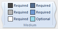
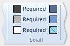
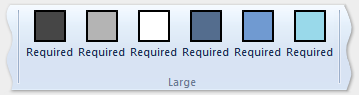
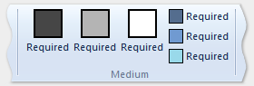
このコードのセクションでは、大、中、小の GroupSizeDefinition テンプレートを定義して、さまざまなサイズとレイアウトで 4 つのボタンを表示する方法を示します。 タブに対する ScalingPolicy 宣言では、アクティブなタブに必要なリボンのサイズと領域に基づいて、コントロールのグループに使用するテンプレートを定義します。
<Tab CommandName="cmdTab6">
<Tab.ScalingPolicy>
<ScalingPolicy>
<ScalingPolicy.IdealSizes>
<Scale Group="cmdButtonGroup"
Size="Large"/>
<Scale Group="cmdButtonGroup2"
Size="Large"/>
<Scale Group="cmdToggleButtonGroup"
Size="Large"/>
</ScalingPolicy.IdealSizes>
<Scale Group="cmdButtonGroup"
Size="Medium"/>
<Scale Group="cmdButtonGroup2"
Size="Medium"/>
<Scale Group="cmdButtonGroup2"
Size="Small"/>
<Scale Group="cmdButtonGroup2"
Size="Popup"/>
</ScalingPolicy>
</Tab.ScalingPolicy>
<Group CommandName="cmdButtonGroup2">
<SizeDefinition>
<ControlNameMap>
<ControlNameDefinition Name="button1"/>
<ControlNameDefinition Name="button2"/>
<ControlNameDefinition Name="button3"/>
<ControlNameDefinition Name="button4"/>
</ControlNameMap>
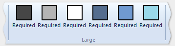
<GroupSizeDefinition Size="Large">
<ControlGroup>
<ControlSizeDefinition ControlName="button1"
ImageSize="Large"
IsLabelVisible="true" />
<ControlSizeDefinition ControlName="button2"
ImageSize="Large"
IsLabelVisible="true" />
</ControlGroup>
<ColumnBreak ShowSeparator="true"/>
<ControlGroup>
<ControlSizeDefinition ControlName="button3"
ImageSize="Large"
IsLabelVisible="true" />
<ControlSizeDefinition ControlName="button4"
ImageSize="Large"
IsLabelVisible="true" />
</ControlGroup>
</GroupSizeDefinition>
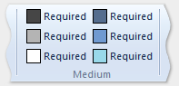
<GroupSizeDefinition Size="Medium">
<Row>
<ControlSizeDefinition ControlName="button1"
ImageSize="Small"
IsLabelVisible="true" />
<ControlSizeDefinition ControlName="button3"
ImageSize="Small"
IsLabelVisible="true" />
</Row>
<Row>
<ControlSizeDefinition ControlName="button2"
ImageSize="Small"
IsLabelVisible="true" />
<ControlSizeDefinition ControlName="button4"
ImageSize="Small"
IsLabelVisible="true" />
</Row>
</GroupSizeDefinition>
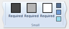
<GroupSizeDefinition Size="Small">
<Row>
<ControlSizeDefinition ControlName="button1"
ImageSize="Small"
IsLabelVisible="true" />
<ControlSizeDefinition ControlName="button3"
ImageSize="Small"
IsLabelVisible="false" />
</Row>
<Row>
<ControlSizeDefinition ControlName="button2"
ImageSize="Small"
IsLabelVisible="true" />
<ControlSizeDefinition ControlName="button4"
ImageSize="Small"
IsLabelVisible="false" />
</Row>
</GroupSizeDefinition>
</SizeDefinition>
<Button CommandName="cmdButtonG21"></Button>
<Button CommandName="cmdButtonG22"></Button>
<Button CommandName="cmdButtonG23"></Button>
<Button CommandName="cmdButtonG24"></Button>
</Group>
<Group CommandName="cmdCheckBoxGroup">
<CheckBox CommandName="cmdCheckBox"></CheckBox>
</Group>
<Group CommandName="cmdToggleButtonGroup"
SizeDefinition="OneButton">
<ToggleButton CommandName="cmdToggleButton"></ToggleButton>
</Group>
<Group CommandName="cmdButtonGroup"
SizeDefinition="ThreeButtons">
<Button CommandName="cmdButton1"></Button>
<Button CommandName="cmdButton2"></Button>
<Button CommandName="cmdButton3"></Button>
</Group>
</Tab>
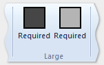
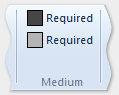
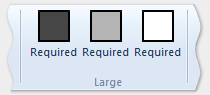
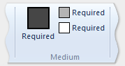
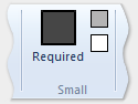
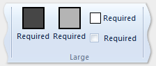
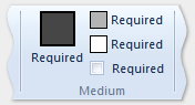
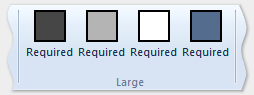
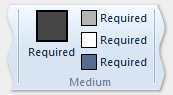
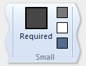
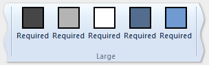
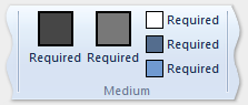
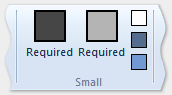
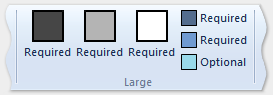
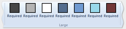
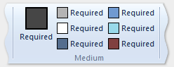
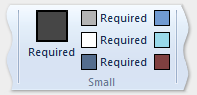
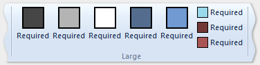
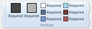
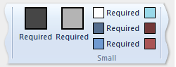
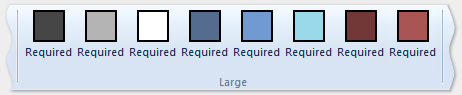
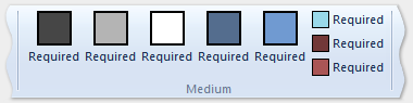
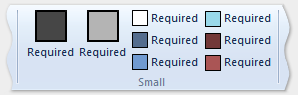
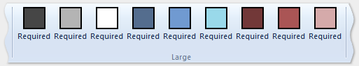
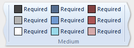
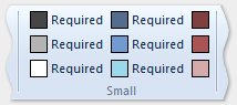
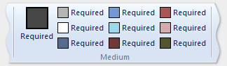
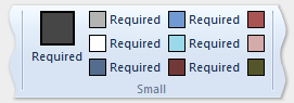
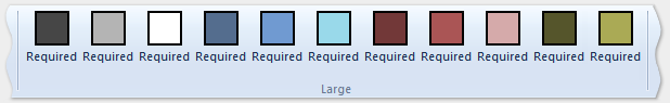
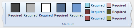
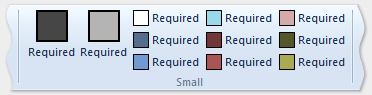
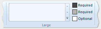
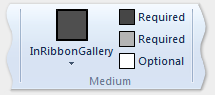
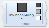
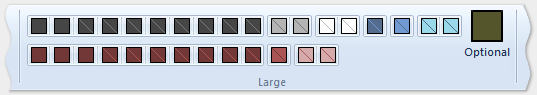
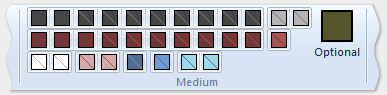
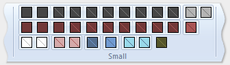
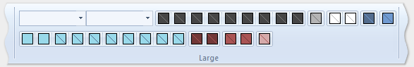
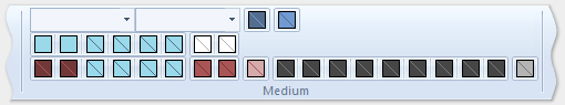
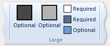
次の画像は、リボン サイズの縮小に対応するために、前の例のテンプレートをリボン UI に適用する方法を示しています。
| Type | イメージ |
|---|---|
| Large | 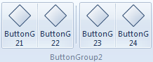 |
| Medium | 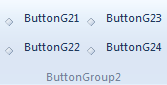 |
| Small | 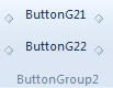 |
| Popup | 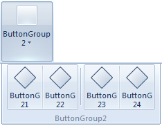 |