Note
Access to this page requires authorization. You can try signing in or changing directories.
Access to this page requires authorization. You can try changing directories.
After adding the webpages you need and managing their hierarchy in the site map, you can add various components. The WYSIWYG design studio page editor is part of the Pages workspace. Use the editor to add and edit the components you need within the canvas.
Using the editor
To use the editor:
Open the design studio to edit the content and components of the portal.
Go to the Pages workspace.
Select the page where you'd like to add the component or section.
To add a section, hover over any editable section area, and then select the plus sign (+). You can then choose between six section layout options.
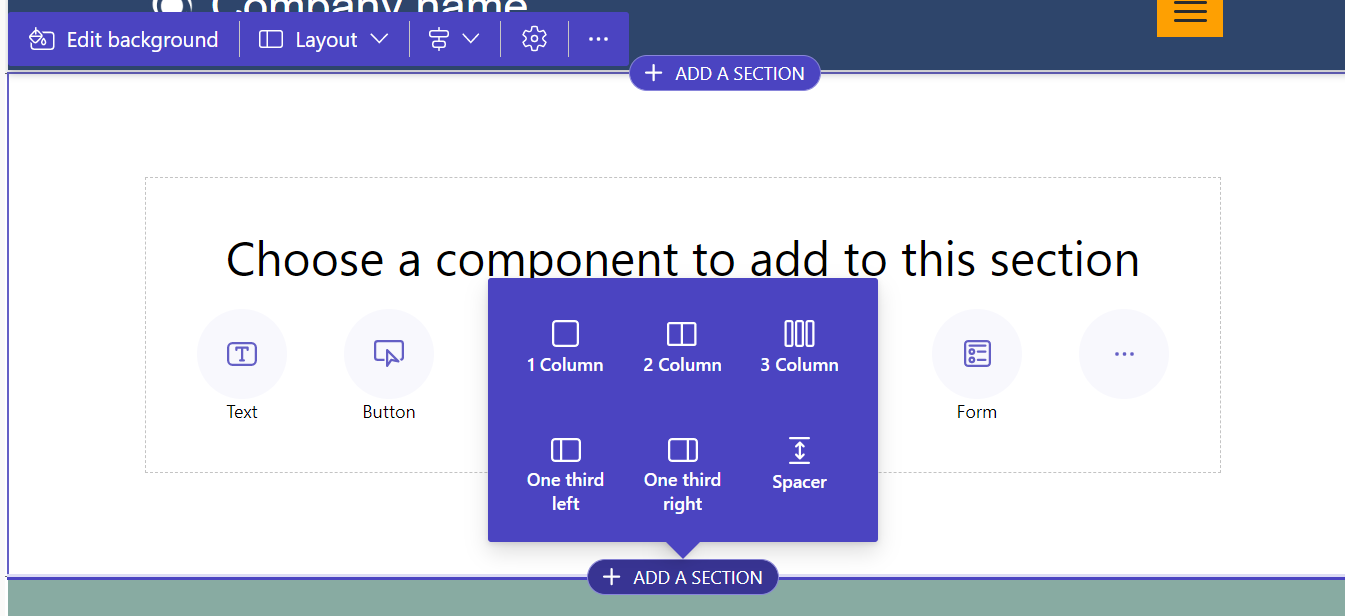
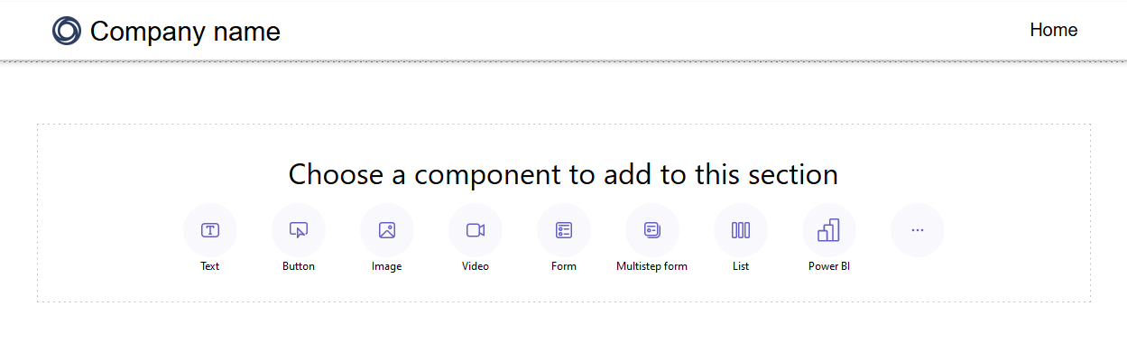
To add a component, hover over the section where you'd like to place the component, and then select +. You can then choose between the available components.
Note
You can also create and use web templates as components in web pages.
More information: How to: Create a web template componentYou can drag and drop sections, columns, and components to rearrange them on a page.
To drag an object, left-click and hold down the mouse button, or press the space bar while it's focused. Next, drag the object to the target area using the mouse or keyboard arrows. Drop zones appear to indicate where the object can be placed. Once you reach the drop zone, release the left mouse button or press the space bar to drop the object.
Note
- Some components are not draggable, including the header, footer, and some nested components (links within a text component, for example).
- Drag and drop functionality is not supported for sections that have the
flex-directionCSS property set torow-reverse.
To delete a component, choose the component on the canvas and then select Delete.
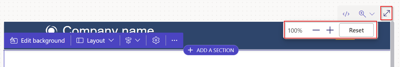
For a more immersive editing experience, you can use the full-screen editing mode by selecting the double arrow icon in the upper-right corner of the editor. You can also switch to Visual Studio Code, zoom in (+), zoom out (-), or Reset the page design canvas view back to 100%.
Edit components
All sections and components allow for in-context editing. You can edit any section or component directly from the canvas.
Select the paintbrush icon to adjust the styles of a section or component.
Available styles are based on the component's type. Currently, sections, text, buttons, images, and videos are supported. Available styles vary depending on the component type and include:
Layout – control the positioning and arrangement of elements on a page, such as margins, padding, and position.
Decorations – enhance the visual appearance of elements, such as borders, shadows, and corner radius.
Typography – change the appearance of text, including properties like font-family, font-size, and letter spacing.
Note
When you use the paintbrush icon to apply styles, these adjustments generally take precedence over settings configured in the Styling workspace and any existing custom CSS. For example, altering the font of a text component with the paintbrush tool will typically override the font specified by a theme (such as "Heading 1") or other inherited styles. However, styles defined with the !important directive in your custom CSS aren't overridden.
Undo/redo
In the Pages workspace, undo/redo buttons display in the top left of the canvas. The undo button is enabled when you make a change. The redo button is enabled when you undo an action.
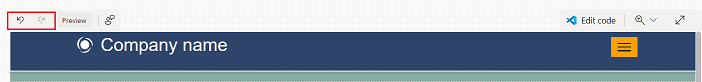
To reverse an action, select the Undo button.
To reverse an undo, select the Redo button.
Undo and redo only support changes that you make in the Pages workspace. Your action history clears when you refresh the browser page or navigate to another workspace inside the design studio.
Limitations
Syncing, saving, previewing, zooming, expanding/reducing the workspace, navigating between workspaces and pages, and uploading media and CSS files aren't supported.
Note
- You can't delete the header or footer in the Pages workspace. See Web templates for information on creating custom page layouts.
- For sites created using Power Pages prior to September 23, 2022 there is a known issue related to themes. More information: Adjusting the background color for your Power Pages site
- When custom JavaScript is written in a script tag inside the page copy, the liquid tags within the custom JavaScript are replaced with an HTML wrapper during Studio load. This replacement breaks the custom JavaScript functionality. To avoid this issue, custom JavaScript should be added only in the custom_javascript attribute.
Edit code components
Code component properties are editable inside of the Pages workspace.
To edit a code component:
Select the component and choose Edit code component from the toolbar.
Set properties for your code component.
Select Done.
For more information on adding code components to forms and pages, see Use code components in Power Pages.
Liquid errors
If a page doesn't render because of a Liquid syntax issue, an error dialog appears. The dialog describes the problem and includes an Edit code button that opens the file in Visual Studio Code for the Web. If you dismiss the dialog by selecting the Continue editing option, you still see the error in notifications with an Edit code option to fix it.
Fix a Liquid error
To fix a Liquid error:
In the error dialog, select Edit code. Visual Studio Code for the Web opens, and you can scroll to the line with the error, such as a missing
{% endif %}tag.
Correct the Liquid markup.
Press Ctrl+S to save the file.
Return to Power Pages Studio and select Sync to reload the page. The page should render without errors.