在本教程中,你将生成一个线性滑块代码组件,用户可以使用该组件通过可视滑块更改数值,而不是在列中键入值。
可以在 PowerApps-Samples/component-framework/LinearInputControl/中找到已完成的线性滑块代码组件的示例代码。
若要生成线性滑块代码组件,请完成以下步骤:
先决条件
对于本教程,请安装以下组件:
- Visual Studio Code (VSCode) (确保已选择 “添加到 PATH ”选项)
- Node.js (建议使用 LTS 版本)
- Microsoft Power Platform CLI (使用适用于 Visual Studio Code 的 Power Platform 工具或适用于 Windows 的 Power Platform CLI)
- 通过安装以下选项之一来获取 .NET 构建工具。 至少选择工作负荷
.NET build tools:- Visual Studio 2022
- Visual Studio 2019
注释
你可能更喜欢使用 .NET 6.x SDK ,而不是用于 Visual Studio 的生成工具。 在本例中,不使用 msbuild,请使用 dotnet build。
小窍门
创建新组件项目
对于本教程,请从位于某个 C:\repos文件夹开始,但你可以使用喜欢的任何文件夹。 选择要在其中签入代码的文件夹。
创建名为
LinearInput的新文件夹。使用 Visual Studio Code 打开
LinearInput文件夹。启动的最快方法是使用命令提示符窗口。 导航到文件夹
LinearInput并键入code .。c:\repos\LinearInput>code .此命令将在 Visual Studio Code 中打开组件项目。
使用 终端 ->新终端在 Visual Studio Code 中打开一个新终端。
在终端提示符处,通过使用 pac pcf init 命令传递基本参数来创建新的组件项目。
pac pcf init --namespace SampleNamespace --name LinearInputControl --template field --run-npm-install该命令还会运行
npm install来设置项目构建工具。Running 'npm install' for you...注释
如果收到错误
The term 'npm' is not recognized as the name of a cmdlet, function, script file, or operable program.,请确保安装 node.js (建议使用 LTS 版本)和所有其他先决条件。
实现清单
控件清单是一个 XML 文件,其中包含代码组件的元数据。 它还定义代码组件的行为。 在本教程中,您将在LinearInputControl 子文件夹下创建此清单文件。 在 Visual Studio Code 中打开 ControlManifest.Input.xml 文件时,可以看到清单文件是使用某些属性预定义的。 有关详细信息,请参阅 清单。
控制节点定义代码组件的命名空间、版本和显示名称。
该工具生成 控件 元素。 它为您的控制提供了良好的起点。
小窍门
通过设置 XML 格式,可以更轻松地阅读 XML,以便属性显示在单独的行上。 在 Visual Studio Code 市场中查找并安装所选的 XML 格式设置工具: 搜索 xml 格式设置扩展。
以下示例已使用单独的行上的属性进行格式化,使其更易于阅读。
| 属性 | 说明 |
|---|---|
namespace |
代码组件的命名空间。 |
constructor |
代码组件的构造函数。 |
version |
组件的版本。 每当更新组件时,请更新版本以查看运行时的最新更改。 |
display-name-key |
UI 上显示的代码组件的名称。 |
description-key |
UI 上显示的代码组件的说明。 |
control-type |
代码组件类型。 此值是一个 standard 控件。 |
如果忽略注释的区域并设置文档的格式,则会看到为你生成的清单:
<?xml version="1.0" encoding="utf-8" ?>
<manifest>
<control namespace="SampleNamespace"
   constructor="LinearInputControl"
   version="0.0.1"
   display-name-key="LinearInputControl"
   description-key="LinearInputControl description"
   control-type="standard">
   <external-service-usage enabled="false">
   </external-service-usage>
   <property name="sampleProperty"
      display-name-key="Property_Display_Key"
      description-key="Property_Desc_Key"
      of-type="SingleLine.Text"
      usage="bound"
      required="true" />
   <resources>
      <code path="index.ts"
         order="1" />
   </resources>
</control>
</manifest>
从此起点开始,进行以下更改:
添加 type-group 元素
在元素内添加名为numbers的control元素的定义。 此元素指定组件值,可以包含整个、货币、浮点或小数值。
将 external-service-usage 元素替换为 type-group 元素,因为此控件不使用 external-service-usage 功能。
<control namespace="SampleNamespace"
   constructor="LinearInputControl"
   version="0.0.1"
   display-name-key="LinearInputControl"
   description-key="LinearInputControl description"
   control-type="standard">
   <external-service-usage enabled="false">
   </external-service-usage>
   <property name="sampleProperty"
      display-name-key="Property_Display_Key"
      description-key="Property_Desc_Key"
      of-type="SingleLine.Text"
      usage="bound"
      required="true" />
   <resources>
      <code path="index.ts"
         order="1" />
   </resources>
   </control>
编辑属性元素
编辑 control 元素中生成的sampleProperty属性元素。 此元素定义代码组件的属性,例如列的数据类型。
| 属性 | 说明 |
|---|---|
name |
属性的名称。 |
display-name-key |
UI 上显示的属性的显示名称。 |
description-key |
UI 上显示的属性的说明。 |
of-type-group |
使用 of-type-group 特性引用特定类型组的名称。 在这种情况下,请参考在上一步中创建的名为 numbers 的 type-group。 |
usage |
有两个属性, bound 以及 input。- 绑定属性仅限于绑定到列的值。 - 输入属性绑定到列或允许静态值。 |
required |
定义属性是否是必需的。 |
编辑 属性 节点,如以下代码所示:
<property name="sampleProperty"
   display-name-key="Property_Display_Key"
   description-key="Property_Desc_Key"
   of-type="SingleLine.Text"
   usage="bound"
   required="true" />
编辑资源元素
资源节点定义代码组件的可视化效果。 它包含生成代码组件的可视化效果和样式的所有资源。 代码指定为 resources 元素下的子元素。
生成的清单已包含代码元素的定义,并pathorder设置了属性值。 使用这些值。 在以下 “向代码组件”部分添加样式 中,为控件添加 CSS 样式。 若要支持该步骤,请在打开清单时编辑清单以添加它们。
已完成的清单
已完成的清单文件应如下所示:
<?xml version="1.0" encoding="utf-8" ?>
<manifest>
<control namespace="SampleNamespace"
constructor="LinearInputControl"
version="0.0.1"
display-name-key="LinearInputControl"
description-key="LinearInputControl description"
control-type="standard">
<type-group name="numbers">
<type>Whole.None</type>
<type>Currency</type>
<type>FP</type>
<type>Decimal</type>
</type-group>
<property name="controlValue"
   display-name-key="Control Value"
   description-key="Control value description."
   of-type-group="numbers"
   usage="bound"
   required="true" />
<resources>
   <code path="index.ts"
   order="1" />
   <css path="css/LinearInputControl.css"
   order="1" />
</resources>
</control>
</manifest>
保存对
ControlManifest.Input.xml文件的更改。使用以下命令生成
ManifestDesignTypes.d.ts文件。npm run refreshTypes输出应如下所示:
PS C:\repos\LinearInput> npm run refreshTypes

> pcf-project@1.0.0 refreshTypes
> pcf-scripts refreshTypes

[12:38:06 PM] [refreshTypes]  Initializing...
[12:38:06 PM] [refreshTypes]  Generating manifest types...
[12:38:06 PM] [refreshTypes]  Generating design types...
[12:38:06 PM] [refreshTypes]  Succeeded
若要查看结果,请打开
C:\repos\LinearInput\LinearInputControl\generated\ManifestTypes.d.ts文件以查看生成的类型:/* *This is auto generated from the ControlManifest.Input.xml file */ // Define IInputs and IOutputs Type. They should match with ControlManifest. export interface IInputs { controlValue: ComponentFramework.PropertyTypes.NumberProperty; } export interface IOutputs { controlValue?: number; }
实现组件逻辑
实现清单文件后,使用 TypeScript 实现组件逻辑。 在 index.ts 文件中实现组件逻辑。 在 Visual Studio Code 中打开 index.ts 该文件时,会看到四个基本函数(init、 updateView、 getOutputs 和 destroy)是预定义的。 现在,实现代码组件的逻辑。
index.ts在所选代码编辑器中打开该文件,并进行以下更改:
添加控件的属性
export class LinearInputControl
implements ComponentFramework.StandardControl<IInputs, IOutputs>
{
/**
   * Empty constructor.
*/
constructor() {}
将 refreshData 函数添加为事件处理程序
public refreshData(evt: Event): void {
this._value = this.inputElement.value as any as number;
this.labelElement.innerHTML = this.inputElement.value;
this._notifyOutputChanged();
}
更新init函数
public init(
context: ComponentFramework.Context<IInputs>,
notifyOutputChanged: () => void,
state: ComponentFramework.Dictionary,
container: HTMLDivElement
): void {
// Add control initialization code
}
编辑updateView函数
public updateView(context: ComponentFramework.Context<IInputs>): void {
// Add code to update control view
}
编辑getOutputs函数
编辑destroy函数
完整 index.ts 文件应如下所示:
import { IInputs, IOutputs } from "./generated/ManifestTypes";
export class LinearInputControl
implements ComponentFramework.StandardControl<IInputs, IOutputs>
{
private _value: number;
private _notifyOutputChanged: () => void;
private labelElement: HTMLLabelElement;
private inputElement: HTMLInputElement;
private _container: HTMLDivElement;
private _context: ComponentFramework.Context<IInputs>;
private _refreshData: EventListenerOrEventListenerObject;
/**
   * Empty constructor.
*/
constructor() {}
/**
* Used to initialize the control instance. Controls can kick off remote server calls
and other initialization actions here.
* Data-set values are not initialized here, use updateView.
* @param context The entire property bag available to control via Context Object;
It contains values as set up by the customizer mapped to property names defined
in the manifest, as well as utility functions.
* @param notifyOutputChanged A callback method to alert the framework that the
control has new outputs ready to be retrieved asynchronously.
* @param state A piece of data that persists in one session for a single user.
Can be set at any point in a controls life cycle by calling 'setControlState'
in the Mode interface.
* @param container If a control is marked control-type='standard', it will receive
an empty div element within which it can render its content.
*/
public init(
context: ComponentFramework.Context<IInputs>,
notifyOutputChanged: () => void,
state: ComponentFramework.Dictionary,
container: HTMLDivElement
): void {
// Add control initialization code
this._context = context;
this._container = document.createElement("div");
this._notifyOutputChanged = notifyOutputChanged;
this._refreshData = this.refreshData.bind(this);
// creating HTML elements for the input type range and binding it to the function which
// refreshes the control data
this.inputElement = document.createElement("input");
this.inputElement.setAttribute("type", "range");
this.inputElement.addEventListener("input", this._refreshData);
//setting the max and min values for the control.
this.inputElement.setAttribute("min", "1");
this.inputElement.setAttribute("max", "1000");
this.inputElement.setAttribute("class", "linearslider");
this.inputElement.setAttribute("id", "linearrangeinput");
// creating a HTML label element that shows the value that is set on the linear range control
this.labelElement = document.createElement("label");
this.labelElement.setAttribute("class", "LinearRangeLabel");
this.labelElement.setAttribute("id", "lrclabel");
// retrieving the latest value from the control and setting it to the HTMl elements.
this._value = context.parameters.controlValue.raw!;
this.inputElement.setAttribute(
"value",
context.parameters.controlValue.formatted
? context.parameters.controlValue.formatted
: "0"
);
this.labelElement.innerHTML = context.parameters.controlValue.formatted
? context.parameters.controlValue.formatted
: "0";
// appending the HTML elements to the control's HTML container element.
this._container.appendChild(this.inputElement);
this._container.appendChild(this.labelElement);
container.appendChild(this._container);
}
public refreshData(evt: Event): void {
   this._value = this.inputElement.value as any as number;
   this.labelElement.innerHTML = this.inputElement.value;
   this._notifyOutputChanged();
}
/**
* Called when any value in the property bag has changed. This includes field values,
data-sets, global values such as container height and width, offline status, control
metadata values such as label, visible, etc.
* @param context The entire property bag available to control via Context Object;
It contains values as set up by the customizer mapped to names defined in the manifest,
as well as utility functions
*/
public updateView(context: ComponentFramework.Context<IInputs>): void {
   // Add code to update control view
   // storing the latest context from the control.
   this._value = context.parameters.controlValue.raw!;
   this._context = context;
   this.inputElement.setAttribute(
      "value",
      context.parameters.controlValue.formatted
      ? context.parameters.controlValue.formatted
      : ""
   );
   this.labelElement.innerHTML = context.parameters.controlValue.formatted
      ? context.parameters.controlValue.formatted
      : "";
}
/**
* It is called by the framework prior to a control receiving new data.
* @returns an object based on nomenclature defined in manifest,
expecting object[s] for property marked as "bound" or "output"
*/
public getOutputs(): IOutputs {
   return {
      controlValue: this._value,
   };
}
/**
* Called when the control is to be removed from the DOM tree.
Controls should use this call for cleanup.
* i.e. cancelling any pending remote calls, removing listeners, etc.
*/
public destroy(): void {
   // Add code to cleanup control if necessary
   this.inputElement.removeEventListener("input", this._refreshData);
   }
}
完成后,保存对 index.ts 文件的更改。
向代码组件添加样式
开发人员和应用创建者可以定义其样式,以便使用 CSS 直观地表示其代码组件。 CSS 允许开发人员描述代码组件的呈现,包括样式、颜色、布局和字体。 线性输入组件的 init 方法创建一个输入元素并将类属性设置为 linearslider。 类的 linearslider 样式在单独的 CSS 文件中定义。 可以将其他组件资源(如 CSS 文件)包含在代码组件中,以支持进一步的自定义。
重要
在使用 CSS 为代码组件实现样式时,请确保通过容器DIV元素上自动生成的 CSS 类将其样式限定在您的控件范围内。
如果 CSS 以全局方式限定范围,则可能会中断呈现代码组件的窗体或屏幕的现有样式。
如果使用第三方 CSS 框架,请使用已进行命名空间化或以其他方式手动将该框架包装在命名空间中的版本,或者通过使用 CSS 预处理器手动包装该框架。
在
css文件夹下创建新的LinearInputControl子文件夹。在
LinearInputControl.css子文件夹中创建新css文件。将以下样式内容添加到
LinearInputControl.css文件:.SampleNamespace\.LinearInputControl input[type=range].linearslider { margin: 1px 0; background:transparent; -webkit-appearance:none; width:100%;padding:0; height:24px; -webkit-tap-highlight-color:transparent } .SampleNamespace\.LinearInputControl input[type=range].linearslider:focus { outline: none; } .SampleNamespace\.LinearInputControl input[type=range].linearslider::-webkit-slider-runnable-track { background: #666; height:2px; cursor:pointer } .SampleNamespace\.LinearInputControl input[type=range].linearslider::-webkit-slider-thumb { background: #666; border:0 solid #f00; height:24px; width:10px; border-radius:48px; cursor:pointer; opacity:1; -webkit-appearance:none; margin-top:-12px } .SampleNamespace\.LinearInputControl input[type=range].linearslider::-moz-range-track { background: #666; height:2px; cursor:pointer } .SampleNamespace\.LinearInputControl input[type=range].linearslider::-moz-range-thumb { background: #666; border:0 solid #f00; height:24px; width:10px; border-radius:48px; cursor:pointer; opacity:1; -webkit-appearance:none; margin-top:-12px } .SampleNamespace\.LinearInputControl input[type=range].linearslider::-ms-track { background: #666; height:2px; cursor:pointer } .SampleNamespace\.LinearInputControl input[type=range].linearslider::-ms-thumb { background: #666; border:0 solid #f00; height:24px; width:10px; border-radius:48px; cursor:pointer; opacity:1; -webkit-appearance:none; }保存
LinearInputControl.css文件。请注意,
ControlManifest.Input.xml该文件已包含css资源元素中的资源文件,因为该步骤已在前面的 “实现清单 ”部分中完成。<resources> <code path="index.ts" order="1" /> <css path="css/LinearInputControl.css" order="1" /> </resources>
注释
Power Apps 组件框架使用 RESX Web 资源 来管理任何用户界面上显示的本地化字符串。 支持本地化的资源也在 resources 节点中注册。
第一个教程不包括本地化功能。 本地化包含在其他教程中。
若要了解如何使用 resx Web 资源本地化代码组件,请参阅 本地化 API 示例。
生成代码组件
添加清单、组件逻辑和样式设置完成后,使用以下命令生成代码组件:
npm run build
输出应类似于以下结果:
> pcf-project@1.0.0 build
> pcf-scripts build

[2:05:41 PM] [build]  Initializing...
[2:05:41 PM] [build]  Validating manifest...
[2:05:41 PM] [build]  Validating control...
[2:05:42 PM] [build]  Running ESLint...
[2:05:43 PM] [build]  Generating manifest types...
[2:05:43 PM] [build]  Generating design types...
[2:05:43 PM] [build]  Compiling and bundling control...
[Webpack stats]:
asset bundle.js 6.56 KiB [emitted] (name: main)
./LinearInputControl/index.ts 4.9 KiB [built] [code generated]
webpack 5.75.0 compiled successfully in 2049 ms
[2:05:45 PM] [build]  Generating build outputs...
[2:05:45 PM] [build]  Succeeded
PS C:\repos\LinearInput\LinearInputcontrol>
生成过程会在LinearInputControl/generated文件夹下生成更新的 TypeScript 类型声明文件。
组件编译到 out/controls/LinearInputControl 文件夹中。 生成工件包括:
-
bundle.js– 捆绑组件源代码。 -
ControlManifest.xml– 上传到 Microsoft Dataverse 组织的实际组件清单文件。
注释
eslint 规则可能会影响构建,具体取决于它们的配置方式。 如果在生成过程中收到错误:
[12:58:30 PM] [build]  Failed:
[pcf-1065] [Error] ESLint validation error:
C:\project\LinearInput\LinearInputControl\index.ts
  10:26  error  'EventListenerOrEventListenerObject' is not defined  no-undef
在 .eslintrc.json 中检查您的 eslint 规则,并将 Lint 分析规则设置为 ["warn"]。 例如,如果收到错误:
error 'EventListenerOrEventListenerObject' is not defined no-undef
然后,可以打开.eslintrc.json和编辑规则,为规则["warn"]添加值no-undef:
    "rules": {
      "no-unused-vars": "off",
      "no-undef": ["warn"]
    }
更新 eslint 规则后,控件应该能成功构建,并且不会出现错误。
调试代码组件
完成实现代码组件逻辑后,运行以下命令以启动调试过程。 有关详细信息,请参阅 调试代码组件。
npm start watch
输出应类似于以下结果:
> pcf-project@1.0.0 start
> pcf-scripts start "watch"

[2:09:10 PM] [start] [watch] Initializing...
[2:09:10 PM] [start] [watch] Validating manifest...
[2:09:10 PM] [start] [watch] Validating control...
[2:09:11 PM] [start] [watch] Generating manifest types...
[2:09:11 PM] [start] [watch] Generating design types...
[2:09:11 PM] [start] [watch] Compiling and bundling control...
[Webpack stats]:
asset bundle.js 6.56 KiB [emitted] (name: main)
./LinearInputControl/index.ts 4.9 KiB [built] [code generated]
webpack 5.75.0 compiled successfully in 2060 ms
[2:09:13 PM] [start] [watch] Generating build outputs...
[2:09:13 PM] [start] [watch] Starting control harness...

Starting control harness...

[Browsersync] Access URLs:

 ----------------------------
 Local: http://localhost:8181
 ----------------------------

[Browsersync] Serving files from: C:\repos\LinearInput\out\controls\LinearInputControl

[Browsersync] Watching files...
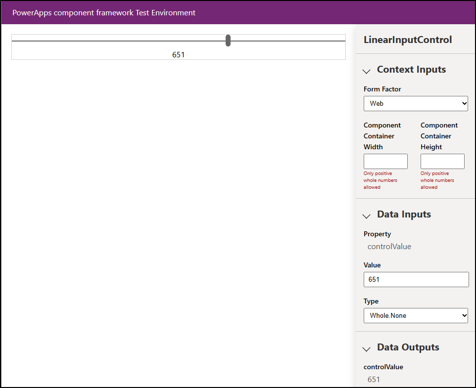
浏览器还会打开到 PCF 控件沙盒,以便你可以看到控件并对其进行测试。
打包您的代码组件
按照以下步骤创建和导入 解决方案 文件:
在 LinearInputControl 文件夹中创建名为 Solutions 的新文件夹,然后转到新文件夹。
  mkdir Solutions
  cd Solutions
使用 pac solution init 命令在 LinearInputControl 文件夹中创建新的解决方案项目:
pac solution init --publisher-name Samples --publisher-prefix samples注释
发布者名称和发布者前缀值必须与现有解决方案发布者或要在目标环境中创建的新发布者匹配。
可以通过在目标环境中运行此查询来检索当前值的列表:
[Environment URI]/api/data/v9.2/publishers?$select=uniquename,customizationprefix有关详细信息,请参阅 使用 Web API 查询数据。
pac solution init 命令的输出如下所示:
Dataverse solution project with name 'solutions' created successfully in: 'C:\repos\LinearInput\linearinputcontrol\solutions'
Dataverse solution files were successfully created for this project in the sub-directory Other, using solution name solutions, publisher name Samples, and customization prefix samples.
Please verify the publisher information and solution name found in the Solution.xml file.
PS C:\repos\LinearInput\linearinputcontrol\solutions>
创建新解决方案项目后,添加对已创建组件位置的引用。 使用以下命令:
pac solution add-reference --path ..\..\注释
提供的路径与在 LinearInputControl 文件夹下创建的当前 Solutions 文件夹相关。 还可以提供绝对路径。
此命令的输出如下所示:
Project reference successfully added to Dataverse solution project.若要从解决方案项目生成 zip 文件,请在位于解决方案项目目录中时使用以下命令:
msbuild /t:restore或者,如果安装了 .NET 6 SDK,请使用:
dotnet build再次运行以下命令:
msbuild注释
如果收到错误
Missing required tool: MSBuild.exe/dotnet.exe,请将MSBuild.exe/dotnet.exe添加到 Path 环境变量中,或使用Developer Command Prompt for Visual Studio Code。 如 先决条件中所述,必须安装 .NET 生成工具。小窍门
当使用
eval命令生成解决方案文件并将其导入 Dataverse 并运行解决方案检查器时,会看到该消息。 使用命令msbuild/property:configuration=Release重新生成解决方案文件。 将解决方案重新导入 Dataverse 并运行解决方案检查器。 有关详细信息,请参阅 调试代码组件。生成的解决方案 zip 文件位于
Solution\bin\debug文件夹中。将解决方案手动导入 Dataverse,方法是在 zip 文件准备就绪后使用 Power Apps,或使用 Microsoft Power Platform 生成工具 自动导入解决方案。
注释
如果要导入非托管解决方案,请手动发布自定义项。
将代码组件添加到应用
若要将代码组件添加到应用,请按照以下文章中的步骤作:
另请参阅
下载示例组件
了解 Power Apps 组件框架
用于 ALM 的工具和应用概述
Power Apps组件框架 API 参考
Power Apps组件框架概述
调试代码组件