在本教程中,你将创建画布应用数据集代码组件,部署它,将其添加到屏幕,并使用Visual Studio Code测试组件。 代码组件显示分页的可滚动数据集网格,该网格提供可排序和可筛选的列。 它还允许通过配置指示器列来突出显示特定行。 这是应用开发者的常见需求,但使用原生画布应用组件实现较为复杂。 可以编写代码组件,以在画布应用和模型驱动应用上运行。 但是,此组件专门针对在画布应用中的使用。
除了这些要求,你还将确保代码组件遵循最佳做法指南:
- 使用 Microsoft Fluent UI
- 在设计和运行时中本地化代码组件标签
- 确保代码组件按父级画布应用屏幕提供的宽高渲染
- 应用创建者尽可能使用输入属性和外部应用元素自定义用户界面的注意事项

注释
在开始之前,请确保已安装所有 必备组件。
Code
可以从 PowerApps-Samples/component-framework/CanvasGridControl/下载完整的示例。
创建新 pcfproj 项目
创建用于代码组件的新文件夹。 例如,
C:\repos\CanvasGrid。打开 Visual Studio Code,然后选择 file>Open Folder并选择
CanvasGrid文件夹。 如果在安装 Visual Studio Code 期间添加了 Windows 资源管理器扩展,则可以在文件夹中使用 Open with Code 上下文菜单选项。 当当前目录设置为该位置时,还可以在命令提示符处使用code .将任何文件夹加载到Visual Studio Code。在新的 Visual Studio Code PowerShell 终端(Terminal>New Terminal),使用 pac pcf init 命令创建新的代码组件项目:
pac pcf init --namespace SampleNamespace --name CanvasGrid --template dataset或者使用简写形式:
pac pcf init -ns SampleNamespace -n CanvasGrid -t dataset这会向当前文件夹添加一个新的
pcfproj以及相关文件,其中包括定义所需模块的packages.json文件。 若要安装所需的模块,请使用 npm 安装:npm install注释
如果收到消息,
The term 'npm' is not recognized as the name of a cmdlet, function, script file, or operable program.请确保已安装所有必备组件,特别是 node.js (建议使用 LTS 版本)。
该模板包含一个 index.ts 文件以及各种配置文件。 这是代码组件的起点,包含 组件实现中所述的生命周期方法。
安装 Microsoft Fluent UI
你将使用 Microsoft Fluent UI 和 React 来创建 UI,因此必须将其安装为依赖项。 在终端使用以下项:
npm install react react-dom @fluentui/react
这会将模块添加到 packages.json 其中并将其安装到 node_modules 文件夹中。 您将不会提交 node_modules 到源代码管理中,因为可以使用 npm install 恢复所有必需的模块。
Microsoft Fluent UI 的优点之一是它提供了一致且 高度可访问的 UI。
配置 eslint
pac pcf init 使用的模板将eslint模块安装到项目,并通过添加.eslintrc.json文件对其进行配置。 你需要为 TypeScript 和 React 的编码样式配置 eslint。 有关详细信息,请参阅 为代码组件配置 ESLint。
定义数据集属性
CanvasGrid\ControlManifest.Input.xml该文件定义描述代码组件行为的元数据。
控件属性将已包含组件的命名空间和名称。
小窍门
通过设置 XML 格式,可以更轻松地阅读 XML,以便属性显示在单独的行上。 在 Visual Studio Code 市场中查找并安装所选的 XML 格式设置工具: 搜索 xml 格式设置扩展。
以下示例已使用单独的行上的属性进行格式化,使其更易于阅读。
必须通过在元素中添加以下内容来定义代码组件可以绑定到的 control 记录,从而替换现有 data-set 元素:
将代码组件添加到画布应用时,记录 数据集 将绑定到数据源。 属性集指示用户必须配置该数据集的其中一列,才能用作行突出显示指示器。
小窍门
可以指定多个数据集元素。 如果要搜索一个数据集,但使用第二个数据集显示记录列表,这可能很有用。
定义输入和输出属性
除了数据集,还可以提供以下 输入 属性:
- 允许应用创建者提供一个值,以与定义为 HighlightValueHighlightIndicator的列进行比较。 当值相等时,应该突出显示该行。-
HighlightColor- 允许应用创建者选择用于突出显示行的颜色。
小窍门
在为画布应用创建代码组件时,建议为代码组件中常见特征的样式提供输入属性。
除了输入属性之外,由于在代码组件内应用了筛选器操作,当行数因而发生变化时,名为的FilteredRecordCount属性将被更新(并触发OnChange事件)。 如果要在父应用中显示 No Rows Found 消息,这非常有用。
注释
将来,代码组件将支持自定义事件,以便可以定义特定事件,而不是使用泛型 OnChange 事件。
若要定义这三个属性,请在元素CanvasGrid\ControlManifest.Input.xml将以下内容data-set添加到文件中:
<property name="FilteredRecordCount"
  display-name-key="FilteredRecordCount_Disp"
  description-key="FilteredRecordCount_Desc"
  of-type="Whole.None"
  usage="output" />
<property name="HighlightValue"
  display-name-key="HighlightValue_Disp"
  description-key="HighlightValue_Desc"
  of-type="SingleLine.Text"
  usage="input"
  required="true"/>
<property name="HighlightColor"
  display-name-key="HighlightColor_Disp"
  description-key="HighlightColor_Desc"
  of-type="SingleLine.Text"
  usage="input"
  required="true"/>
保存 此文件,然后在命令行中使用:
npm run build
注释
如果在运行 npm run build 时遇到此类错误:
[2:48:57 PM] [build]  Running ESLint...
[2:48:57 PM] [build]  Failed:
[pcf-1065] [Error] ESLint validation error:
C:\repos\CanvasGrid\CanvasGrid\index.ts
  2:47  error  'PropertyHelper' is not defined  no-undef
打开index.ts文件,并在以下行的正上方添加:// eslint-disable-next-line no-undef。
import DataSetInterfaces = ComponentFramework.PropertyHelper.DataSetApi;
再次运行 npm run build 。
生成组件后,你将看到:
自动生成的文件
CanvasGrid\generated\ManifestTypes.d.ts将添加到项目中。 此文件由构建过程从ControlManifest.Input.xml生成,提供与输入/输出属性进行交互的类型。生成输出将添加到
out文件夹。bundle.js是在浏览器中运行的转译 JavaScript,而ControlManifest.xml是用于部署期间的ControlManifest.Input.xml文件的重新格式化版本。注释
请勿直接修改
generated和out文件夹的内容。 这些文件将在构建过程中被覆盖。
添加 Grid Fluent UI React 组件
当代码组件使用 React 时,必须在 updateView 方法中呈现单个根组件。 在该 CanvasGrid 文件夹中,添加新的 Grid.tsxTypeScript 文件,并添加以下内容:
import {
    DetailsList,
    ConstrainMode,
    DetailsListLayoutMode,
    IColumn,
    IDetailsHeaderProps,
} from '@fluentui/react/lib/DetailsList';
import { Overlay } from '@fluentui/react/lib/Overlay';
import {
   ScrollablePane,
   ScrollbarVisibility
} from '@fluentui/react/lib/ScrollablePane';
import { Stack } from '@fluentui/react/lib/Stack';
import { Sticky } from '@fluentui/react/lib/Sticky';
import { StickyPositionType } from '@fluentui/react/lib/Sticky';
import { IObjectWithKey } from '@fluentui/react/lib/Selection';
import { IRenderFunction } from '@fluentui/react/lib/Utilities';
import * as React from 'react';

type DataSet = ComponentFramework.PropertyHelper.DataSetApi.EntityRecord & IObjectWithKey;

export interface GridProps {
    width?: number;
    height?: number;
    columns: ComponentFramework.PropertyHelper.DataSetApi.Column[];
    records: Record<string, ComponentFramework.PropertyHelper.DataSetApi.EntityRecord>;
    sortedRecordIds: string[];
    hasNextPage: boolean;
    hasPreviousPage: boolean;
    totalResultCount: number;
    currentPage: number;
    sorting: ComponentFramework.PropertyHelper.DataSetApi.SortStatus[];
    filtering: ComponentFramework.PropertyHelper.DataSetApi.FilterExpression;
    resources: ComponentFramework.Resources;
    itemsLoading: boolean;
    highlightValue: string | null;
    highlightColor: string | null;
}

const onRenderDetailsHeader: IRenderFunction<IDetailsHeaderProps> = (props, defaultRender) => {
    if (props && defaultRender) {
        return (
            <Sticky stickyPosition={StickyPositionType.Header} isScrollSynced>
                {defaultRender({
                    ...props,
                })}
            </Sticky>
        );
    }
    return null;
};

const onRenderItemColumn = (
    item?: ComponentFramework.PropertyHelper.DataSetApi.EntityRecord,
    index?: number,
    column?: IColumn,
) => {
    if (column && column.fieldName && item) {
        return <>{item?.getFormattedValue(column.fieldName)}</>;
    }
    return <></>;
};

export const Grid = React.memo((props: GridProps) => {
    const {
        records,
        sortedRecordIds,
        columns,
        width,
        height,
        hasNextPage,
        hasPreviousPage,
        sorting,
        filtering,
        currentPage,
        itemsLoading,
    } = props;

    const [isComponentLoading, setIsLoading] = React.useState<boolean>(false);

    const items: (DataSet | undefined)[] = React.useMemo(() => {
        setIsLoading(false);

        const sortedRecords: (DataSet | undefined)[] = sortedRecordIds.map((id) => {
            const record = records[id];
            return record;
        });

        return sortedRecords;
    }, [records, sortedRecordIds, hasNextPage, setIsLoading]);

    const gridColumns = React.useMemo(() => {
        return columns
            .filter((col) => !col.isHidden && col.order >= 0)
            .sort((a, b) => a.order - b.order)
            .map((col) => {
                const sortOn = sorting && sorting.find((s) => s.name === col.name);
                const filtered =
                    filtering &&
                    filtering.conditions &&
                    filtering.conditions.find((f) => f.attributeName == col.name);
                return {
                    key: col.name,
                    name: col.displayName,
                    fieldName: col.name,
                    isSorted: sortOn != null,
                    isSortedDescending: sortOn?.sortDirection === 1,
                    isResizable: true,
                    isFiltered: filtered != null,
                    data: col,
                } as IColumn;
            });
    }, [columns, sorting]);

    const rootContainerStyle: React.CSSProperties = React.useMemo(() => {
        return {
            height: height,
            width: width,
        };
    }, [width, height]);

    return (
        <Stack verticalFill grow style={rootContainerStyle}>
            <Stack.Item grow style={{ position: 'relative', backgroundColor: 'white' }}>
                <ScrollablePane scrollbarVisibility={ScrollbarVisibility.auto}>
                    <DetailsList
                        columns={gridColumns}
                        onRenderItemColumn={onRenderItemColumn}
                        onRenderDetailsHeader={onRenderDetailsHeader}
                        items={items}
                        setKey={`set${currentPage}`} // Ensures that the selection is reset when paging
                        initialFocusedIndex={0}
                        checkButtonAriaLabel="select row"
                        layoutMode={DetailsListLayoutMode.fixedColumns}
                        constrainMode={ConstrainMode.unconstrained}
                    ></DetailsList>
                </ScrollablePane>
                {(itemsLoading || isComponentLoading) && <Overlay />}
            </Stack.Item>
        </Stack>
    );
});

Grid.displayName = 'Grid';
注释
该文件具有扩展名 tsx ,它是支持 React 使用的 XML 样式语法的 TypeScript 文件。 它通过生成过程编译为标准 JavaScript。
网格设计说明
本部分包括有关Grid.tsx组件设计的注释。
它是一个功能组件
这是 React 功能组件,但同样,它可以是 类组件。 这是基于你的首选编码样式。 类组件和功能组件也可以在同一项目中混合。 函数和类组件都使用 tsx React 使用的 XML 样式语法。 详细信息: 函数和类组件
最小化 bundle.js 大小
使用路径式导入引入 ChoiceGroup Fluent UI 组件时,请避免以下写法:
import {
    DetailsList,
    ConstrainMode,
    DetailsListLayoutMode,
    IColumn,
    IDetailsHeaderProps,
    Stack
} from "@fluentui/react";
此代码使用:
import {
    DetailsList,
    ConstrainMode,
    DetailsListLayoutMode,
    IColumn,
    IDetailsHeaderProps,
} from '@fluentui/react/lib/DetailsList';
import { Stack } from '@fluentui/react/lib/Stack';
这样,捆绑包大小就会更小,因此容量需求较低,运行时性能更好。
替代方案是采用树摇技术。
解构赋值
此代码:
export const Grid = React.memo((props: GridProps) => {
    const {
        records,
        sortedRecordIds,
        columns,
        width,
        height,
        hasNextPage,
        hasPreviousPage,
        sorting,
        filtering,
        currentPage,
        itemsLoading,
    } = props;
使用解构赋值。 这样,您可以从 props 中提取呈现所需的属性,而无需在每次使用时都为它们加上props.前缀。
代码还使用 React.memo 包裹函数组件,确保仅在输入属性变更时才触发渲染。
使用 React.useMemo
React.useMemo 用于多个位置,以确保项数组仅在输入属性options或configuration发生变化时才会被改变。 这是函数组件的最佳做法,可减少子组件的不必要的呈现。
要注意的其他项:
- 因为稍后会添加包含分页控件的页脚元素,所以
DetailsList中的Stack被封装。 - Fluent UI
Sticky组件用于包装标题列(usingonRenderDetailsHeader),以便在滚动网格时保持可见。 -
setKey将与DetailsList一起传递给initialFocusedIndex,以便在当前页发生更改时,重置滚动位置和选择。 - 该函数
onRenderItemColumn用于呈现单元格内容。 它接受行项并使用 getFormattedValue 返回列的显示值。 getValue 方法返回可用于提供替代呈现的值。getFormattedValue的优点是它包含用于非字符串类型列(例如日期和查找)的格式化字符串。 - 块
gridColumns将数据集上下文提供的列对象形状映射到DetailsList列属性要求的形状。由于它被封装在 React.useMemo 钩子中,因此只有在columns或sorting属性更改时输出才会变化。 可以在代码组件上下文中提供的排序和筛选详细信息与映射列匹配时,显示该列上的排序和筛选图标。 使用属性对列进行排序column.order,以确保它们在应用创建者定义的网格上按正确的顺序排列。 - 您正在 React 组件中维护
isComponentLoading的内部状态。 这是因为当用户选择排序和筛选操作时,您可以将网格灰显作为视觉提示,直到sortedRecordIds更新且状态重置。 还有一个名为itemsLoading的额外输入属性,该属性映射到数据集上下文提供的dataset.loading属性。 这两个标志用于控制使用 Fluent UIOverlay组件实现的视觉加载提示。
更新 index.ts
下一步是更改 index.ts 文件以匹配在其中定义的属性 Grid.tsx.
添加 import 语句并初始化图标
在标头 index.ts 中,将现有导入替换为以下内容:
import {IInputs, IOutputs} from './generated/ManifestTypes';
import DataSetInterfaces = ComponentFramework.PropertyHelper.DataSetApi;
type DataSet = ComponentFramework.PropertyTypes.DataSet;
注释
initializeIcons导入是必需的,因为此代码使用 Fluent UI 图标集。 调用initializeIcons以加载测试工具中的图标。 在画布应用中,它们已经完成初始化。
将字段添加到 CanvasGrid 类
将以下字段添加到 CanvasGrid 类:
export class CanvasGrid implements ComponentFramework.StandardControl<IInputs, IOutputs> {

    /**
     * Empty constructor.
     */
    constructor() {

    }
更新 init 方法
请将以下内容添加到 init:
public init(
    context: ComponentFramework.Context<IInputs>,
    notifyOutputChanged: () => void,
    state: ComponentFramework.Dictionary,
    container: HTMLDivElement): void {
    // Add control initialization code
}
首次初始化应用屏幕上的代码组件时,会调用init函数。 你存储对以下内容的引用:
-
notifyOutputChanged:这是您调用以通知画布应用某个属性已更改的回调函数。 -
container:这是您添加代码组件 UI 的 DOM 元素。 -
resources:这用于检索当前用户语言中的本地化字符串。
context.mode.trackContainerResize(true)用于确保updateView在代码组件尺寸变化时被调用。
注释
目前,无法确定代码组件是否在测试框架中运行。 需要检测元素是否 control-dimensionsdiv 以指示器的形式存在。
更新 updateView 方法
请将以下内容添加到 updateView:
public updateView(context: ComponentFramework.Context<IInputs>): void {
    // Add code to update control view
}
可以看到:
- 您调用 React.createElement,将函数
init内接收到的 DOM 容器引用传递出去。 - 组件
Grid在文件Grid.tsx顶部定义并导入。 -
allocatedWidth和allocatedHeight将在父上下文发生更改时提供(例如,应用调整代码组件大小或进入全屏模式),因为您在函数中调用了init。 - 当 updatedProperties 数组包含
dataset字符串时,可以检测何时显示新行。 - 在测试框架中,
updatedProperties数组未初始化,因此您可以使用在isTestHarness函数中设置的init标志,来跳过设置sortedRecordId和records的逻辑。 需持续维护对当前值的引用直至其变更,这样在传递给子组件时就不会修改这些值——除非需要重新渲染数据。 - 由于代码组件维护显示的页面的状态,因此在父上下文将记录重置为第一页时,将重置页码。 当
hasPreviousPage为false时,您会知道自己已回到第一页。
更新 destroy 方法
最后需在代码组件销毁时进行清理:
启动测试框架
确保所有文件已保存,并在终端执行:
npm start watch
需要设置宽度和高度,以查看使用示例三条记录填充的代码组件网格。 然后,可以从 Dataverse 将一组记录导出到 CSV 文件中,然后使用 “数据输入>记录”面板将其加载到测试工具中:

下面是一些逗号分隔的示例数据,可以保存到 .csv 文件并使用:
address1_city,address1_country,address1_stateorprovince,address1_line1,address1_postalcode,telephone1,emailaddress1,firstname,fullname,jobtitle,lastname
Seattle,U.S.,WA,7842 Ygnacio Valley Road,12150,555-0112,someone_m@example.com,Thomas,Thomas Andersen (sample),Purchasing Manager,Andersen (sample)
Renton,U.S.,WA,7165 Brock Lane,61795,555-0109,someone_j@example.com,Jim,Jim Glynn (sample),Owner,Glynn (sample)
Snohomish,U.S.,WA,7230 Berrellesa Street,78800,555-0106,someone_g@example.com,Robert,Robert Lyon (sample),Owner,Lyon (sample)
Seattle,U.S.,WA,931 Corte De Luna,79465,555-0111,someone_l@example.com,Susan,Susan Burk (sample),Owner,Burk (sample)
Seattle,U.S.,WA,7765 Sunsine Drive,11910,555-0110,someone_k@example.com,Patrick,Patrick Sands (sample),Owner,Sands (sample)
Seattle,U.S.,WA,4948 West Th St,73683,555-0108,someone_i@example.com,Rene,Rene Valdes (sample),Purchasing Assistant,Valdes (sample)
Redmond,U.S.,WA,7723 Firestone Drive,32147,555-0107,someone_h@example.com,Paul,Paul Cannon (sample),Purchasing Assistant,Cannon (sample)
Issaquah,U.S.,WA,989 Caravelle Ct,33597,555-0105,someone_f@example.com,Scott,Scott Konersmann (sample),Purchasing Manager,Konersmann (sample)
Issaquah,U.S.,WA,7691 Benedict Ct.,57065,555-0104,someone_e@example.com,Sidney,Sidney Higa (sample),Owner,Higa (sample)
Monroe,U.S.,WA,3747 Likins Avenue,37925,555-0103,someone_d@example.com,Maria,Maria Campbell (sample),Purchasing Manager,Campbell (sample)
Duvall,U.S.,WA,5086 Nottingham Place,16982,555-0102,someone_c@example.com,Nancy,Nancy Anderson (sample),Purchasing Assistant,Anderson (sample)
Issaquah,U.S.,WA,5979 El Pueblo,23382,555-0101,someone_b@example.com,Susanna,Susanna Stubberod (sample),Purchasing Manager,Stubberod (sample)
Redmond,U.S.,WA,249 Alexander Pl.,86372,555-0100,someone_a@example.com,Yvonne,Yvonne McKay (sample),Purchasing Manager,McKay (sample)
注释
无论加载的 CSV 文件包含多少列,测试框架仅显示单列。 这是因为测试框架仅在定义了 property-set 时才会显示它。
property-set如果未定义,则加载的 CSV 文件中的所有列都将填充。
添加行选择
尽管 Fluent UI DetailsList 默认允许选择记录,但所选记录不会链接到代码组件的输出。 您需要 Selected 和 SelectedItems 属性来反映画布应用中选定的记录,以便相关组件能够更新。 在此示例中,一次只允许选择单个项,因此 SelectedItems 将只包含一条记录。
更新 Grid.tsx 导入
将以下内容添加到 Grid.tsx 的导入中:
import {
    DetailsList,
    ConstrainMode,
    DetailsListLayoutMode,
    IColumn,
    IDetailsHeaderProps,
} from '@fluentui/react/lib/DetailsList';
import { Overlay } from '@fluentui/react/lib/Overlay';
import {
   ScrollablePane,
   ScrollbarVisibility
} from '@fluentui/react/lib/ScrollablePane';
import { Stack } from '@fluentui/react/lib/Stack';
import { Sticky } from '@fluentui/react/lib/Sticky';
import { StickyPositionType } from '@fluentui/react/lib/Sticky';
import { IObjectWithKey } from '@fluentui/react/lib/Selection';
import { IRenderFunction } from '@fluentui/react/lib/Utilities';
import * as React from 'react';
将 setSelectedRecords 添加到 GridProps
在 GridProps 接口的 Grid.tsx 内部,添加以下内容:
export interface GridProps {
    width?: number;
    height?: number;
    columns: ComponentFramework.PropertyHelper.DataSetApi.Column[];
    records: Record<string, ComponentFramework.PropertyHelper.DataSetApi.EntityRecord>;
    sortedRecordIds: string[];
    hasNextPage: boolean;
    hasPreviousPage: boolean;
    totalResultCount: number;
    currentPage: number;
    sorting: ComponentFramework.PropertyHelper.DataSetApi.SortStatus[];
    filtering: ComponentFramework.PropertyHelper.DataSetApi.FilterExpression;
    resources: ComponentFramework.Resources;
    itemsLoading: boolean;
    highlightValue: string | null;
    highlightColor: string | null;
}
将 setSelectedRecords 属性添加到 Grid
在 Grid.tsx 函数组件内部,更新 props 的解构以添加新的 setSelectedRecords 属性。
export const Grid = React.memo((props: GridProps) => {
    const {
        records,
        sortedRecordIds,
        columns,
        width,
        height,
        hasNextPage,
        hasPreviousPage,
        sorting,
        filtering,
        currentPage,
        itemsLoading,
    } = props;
在该部分正下方,添加:
const forceUpdate = useForceUpdate();
const onSelectionChanged = React.useCallback(() => {
const items = selection.getItems() as DataSet[];
const selected = selection.getSelectedIndices().map((index: number) => {
const item: DataSet | undefined = items[index];
return item && items[index].getRecordId();
});
setSelectedRecords(selected);
forceUpdate();
}, [forceUpdate]);
const selection: Selection = useConst(() => {
return new Selection({
selectionMode: SelectionMode.single,
onSelectionChanged: onSelectionChanged,
});
});
React.useCallback 和 useConst 钩子可确保这些值不会在渲染之间发生变动,并导致不必要的子组件渲染。
useForceUpdate 钩子可确保当选择更新时,组件会重新渲染以反映更新后的选择计数。
向 DetailsList 添加选择
selection然后,为维护所选内容状态而创建的对象将传递到DetailsList组件中:
<DetailsList
columns={gridColumns}
onRenderItemColumn={onRenderItemColumn}
onRenderDetailsHeader={onRenderDetailsHeader}
items={items}
setKey={`set${currentPage}`} // Ensures that the selection is reset when paging
initialFocusedIndex={0}
checkButtonAriaLabel="select row"
layoutMode={DetailsListLayoutMode.fixedColumns}
constrainMode={ConstrainMode.unconstrained}
></DetailsList>
定义 setSelectedRecords 回调
需要在setSelectedRecords中定义新的index.ts回调,并将其传递给Grid组件。 在类顶部 CanvasGrid 附近,添加以下内容:
export class CanvasGrid
implements ComponentFramework.StandardControl<IInputs, IOutputs>
{
notifyOutputChanged: () => void;
container: HTMLDivElement;
context: ComponentFramework.Context<IInputs>;
sortedRecordsIds: string[] = [];
resources: ComponentFramework.Resources;
isTestHarness: boolean;
records: {
[id: string]: ComponentFramework.PropertyHelper.DataSetApi.EntityRecord;
};
currentPage = 1;
filteredRecordCount?: number;
注释
该方法定义为 箭头函数 ,以将其绑定到代码组件的当前 this 实例。
对 setSelectedRecordIds 的调用会通知画布应用,画布应用的所选内容已更改,以便更新引用 SelectedItems 和 Selected 的其他组件。
向输入属性添加新回调
最后,在 Grid 方法中,将新的回调函数添加到 updateView 组件的输入属性中:
ReactDOM.render(
React.createElement(Grid, {
width: allocatedWidth,
height: allocatedHeight,
columns: dataset.columns,
records: this.records,
sortedRecordIds: this.sortedRecordsIds,
hasNextPage: paging.hasNextPage,
hasPreviousPage: paging.hasPreviousPage,
currentPage: this.currentPage,
totalResultCount: paging.totalResultCount,
sorting: dataset.sorting,
filtering: dataset.filtering && dataset.filtering.getFilter(),
resources: this.resources,
itemsLoading: dataset.loading,
highlightValue: this.context.parameters.HighlightValue.raw,
highlightColor: this.context.parameters.HighlightColor.raw,
}),
this.container
);
调用 OnSelect 事件
画布应用中存在一种模式,其中,如果库或网格调用了项选择(例如,选择 V 形图标),则会引发 OnSelect 事件。 可以使用数据集的 openDatasetItem 方法实现此模式。
将 onNavigate 添加到 GridProps 接口
与之前一样,通过在 Grid 内的 GridProps 接口中添加以下内容,为 Grid.tsx 组件添加一个额外的回调属性:
export interface GridProps {
width?: number;
height?: number;
columns: ComponentFramework.PropertyHelper.DataSetApi.Column[];
records: Record<
string,
ComponentFramework.PropertyHelper.DataSetApi.EntityRecord
>;
sortedRecordIds: string[];
hasNextPage: boolean;
hasPreviousPage: boolean;
totalResultCount: number;
currentPage: number;
sorting: ComponentFramework.PropertyHelper.DataSetApi.SortStatus[];
filtering: ComponentFramework.PropertyHelper.DataSetApi.FilterExpression;
resources: ComponentFramework.Resources;
itemsLoading: boolean;
highlightValue: string | null;
highlightColor: string | null;
setSelectedRecords: (ids: string[]) => void;
}
将 onNavigate 添加到网格属性
同样需要将新属性添加到 props 解构中:
export const Grid = React.memo((props: GridProps) => {
    const {
        records,
        sortedRecordIds,
        columns,
        width,
        height,
        hasNextPage,
        hasPreviousPage,
        sorting,
        filtering,
        currentPage,
        itemsLoading,
        setSelectedRecords,
    } = props;
向 DetailsList 添加 onItemInvoked
DetailList 有一个回调属性,称为 onItemInvoked,然后你将你的回调传递给它:
<DetailsList
   columns={gridColumns}
   onRenderItemColumn={onRenderItemColumn}
   onRenderDetailsHeader={onRenderDetailsHeader}
   items={items}
   setKey={`set${currentPage}`} // Ensures that the selection is reset when paging
   initialFocusedIndex={0}
   checkButtonAriaLabel="select row"
   layoutMode={DetailsListLayoutMode.fixedColumns}
   constrainMode={ConstrainMode.unconstrained}
   selection={selection}
></DetailsList>
添加 onNavigate 方法到 index.ts
将 onNavigate 方法添加到 index.ts 方法正下方的 setSelectedRecords 中。
onNavigate = (
item?: ComponentFramework.PropertyHelper.DataSetApi.EntityRecord
): void => {
if (item) {
this.context.parameters.records.openDatasetItem(item.getNamedReference());
}
};
这只会调用 openDatasetItem 数据集记录上的方法,以便代码组件将引发 OnSelect 事件。 该方法定义为 箭头函数 ,以将其绑定到代码组件的当前 this 实例。
您需要在 Grid 方法中将此回调函数传递给 updateView 组件的属性:
ReactDOM.render(
React.createElement(Grid, {
width: allocatedWidth,
height: allocatedHeight,
columns: dataset.columns,
records: this.records,
sortedRecordIds: this.sortedRecordsIds,
hasNextPage: paging.hasNextPage,
hasPreviousPage: paging.hasPreviousPage,
currentPage: this.currentPage,
totalResultCount: paging.totalResultCount,
sorting: dataset.sorting,
filtering: dataset.filtering && dataset.filtering.getFilter(),
resources: this.resources,
itemsLoading: dataset.loading,
highlightValue: this.context.parameters.HighlightValue.raw,
highlightColor: this.context.parameters.HighlightColor.raw,
setSelectedRecords: this.setSelectedRecords,
}),
this.container
);
保存所有文件时,测试工具将重新加载。 使用 Ctrl + Shift + I(或F12)后,使用打开文件 (Ctrl + P)搜索index.ts,然后可以在onNavigate方法中放置断点。 双击某一行(或使用光标键突出显示并按 Enter)会触发断点,因为 DetailsList 会调用 onNavigate 回调函数。

存在对 _this 的引用,因为该函数被定义为 箭头函数,并且已被转译为 JavaScript 闭包,以捕获 this 的实例。
添加本地化
在继续之前,您需要将资源字符串添加到代码组件中,以便可以使用本地化字符串处理诸如分页、排序和筛选等消息。
CanvasGrid\strings\CanvasGrid.1033.resx添加一个新文件,并使用Visual Studio资源编辑器或带有扩展的Visual Studio Code输入以下内容:
| 名称 | Value |
|---|---|
Records_Dataset_Display |
记录 |
FilteredRecordCount_Disp |
筛选记录数量 |
FilteredRecordCount_Desc |
筛选后的记录数 |
HighlightValue_Disp |
突出显示值 |
HighlightValue_Desc |
用于标记行应高亮显示的值 |
HighlightColor_Disp |
突出显示颜色 |
HighlightColor_Desc |
使用高亮行时的颜色 |
HighlightIndicator_Disp |
突出显示指标字段 |
HighlightIndicator_Desc |
设置为用于与高亮值比较的字段名称 |
Label_Grid_Footer |
页面 {0} ({1} 已选中) |
Label_SortAZ |
从 A 到 Z |
Label_SortZA |
Z 到 A |
Label_DoesNotContainData |
不包含数据 |
Label_ShowFullScreen |
显示全屏 |
小窍门
不建议直接编辑 resx 文件。 请改用 Visual Studio 的资源编辑器或 Visual Studio Code 的扩展程序。 查找 Visual Studio Code 扩展:在 Visual Studio Marketplace 中搜索 resx 编辑器
还可以通过在记事本中打开 CanvasGrid.1033.resx 文件并复制以下 XML 内容来设置此文件的数据:
<?xml version="1.0" encoding="utf-8"?>
<root>
<xsd:schema id="root" xmlns="" xmlns:xsd="http://www.w3.org/2001/XMLSchema" xmlns:msdata="urn:schemas-microsoft-com:xml-msdata">
<xsd:import namespace="http://www.w3.org/XML/1998/namespace"/>
<xsd:element name="root" msdata:IsDataSet="true">
<xsd:complexType>
<xsd:choice maxOccurs="unbounded">
<xsd:element name="metadata">
<xsd:complexType>
<xsd:sequence>
<xsd:element name="value" type="xsd:string" minOccurs="0"/>
</xsd:sequence>
<xsd:attribute name="name" use="required" type="xsd:string"/>
<xsd:attribute name="type" type="xsd:string"/>
<xsd:attribute name="mimetype" type="xsd:string"/>
<xsd:attribute ref="xml:space"/>
</xsd:complexType>
</xsd:element>
<xsd:element name="assembly">
<xsd:complexType>
<xsd:attribute name="alias" type="xsd:string"/>
<xsd:attribute name="name" type="xsd:string"/>
</xsd:complexType>
</xsd:element>
<xsd:element name="data">
<xsd:complexType>
<xsd:sequence>
<xsd:element name="value" type="xsd:string" minOccurs="0" msdata:Ordinal="1"/>
<xsd:element name="comment" type="xsd:string" minOccurs="0" msdata:Ordinal="2"/>
</xsd:sequence>
<xsd:attribute name="name" type="xsd:string" use="required" msdata:Ordinal="1"/>
<xsd:attribute name="type" type="xsd:string" msdata:Ordinal="3"/>
<xsd:attribute name="mimetype" type="xsd:string" msdata:Ordinal="4"/>
<xsd:attribute ref="xml:space"/>
</xsd:complexType>
</xsd:element>
<xsd:element name="resheader">
<xsd:complexType>
<xsd:sequence>
<xsd:element name="value" type="xsd:string" minOccurs="0" msdata:Ordinal="1"/>
</xsd:sequence>
<xsd:attribute name="name" type="xsd:string" use="required"/>
</xsd:complexType>
</xsd:element>
</xsd:choice>
</xsd:complexType>
</xsd:element>
</xsd:schema>
<resheader name="resmimetype">
<value>text/microsoft-resx</value>
</resheader>
<resheader name="version">
<value>2.0</value>
</resheader>
<resheader name="reader">
<value>System.Resources.ResXResourceReader, System.Windows.Forms, Version=4.0.0.0, Culture=neutral, PublicKeyToken=b77a5c561934e089</value>
</resheader>
<resheader name="writer">
<value>System.Resources.ResXResourceWriter, System.Windows.Forms, Version=4.0.0.0, Culture=neutral, PublicKeyToken=b77a5c561934e089</value>
</resheader>
<data name="Records_Dataset_Display" xml:space="preserve">
<value>Records</value>
</data>
<data name="FilteredRecordCount_Disp" xml:space="preserve">
<value>Filtered Record Count</value>
</data>
<data name="FilteredRecordCount_Desc" xml:space="preserve">
<value>The number of records after filtering</value>
</data>
<data name="HighlightValue_Disp" xml:space="preserve">
<value>Highlight Value</value>
</data>
<data name="HighlightValue_Desc" xml:space="preserve">
<value>The value to indicate a row should be highlighted</value>
</data>
<data name="HighlightColor_Disp" xml:space="preserve">
<value>Highlight Color</value>
</data>
<data name="HighlightColor_Desc" xml:space="preserve">
<value>The color to highlight a row using</value>
</data>
<data name="HighlightIndicator_Disp" xml:space="preserve">
<value>Highlight Indicator Field</value>
</data>
<data name="HighlightIndicator_Desc" xml:space="preserve">
<value>Set to the name of the field to compare against the Highlight Value</value>
</data>
<data name="Label_Grid_Footer" xml:space="preserve">
<value>Page {0} ({1} Selected)</value>
</data>
<data name="Label_SortAZ" xml:space="preserve">
<value>A to Z</value>
</data>
<data name="Label_SortZA" xml:space="preserve">
<value>Z to A</value>
</data>
<data name="Label_DoesNotContainData" xml:space="preserve">
<value>Does not contain data</value>
</data>
<data name="Label_ShowFullScreen" xml:space="preserve">
<value>Show Full Screen</value>
</data>
</root>
您已为 input/output 属性以及 dataset 和相关的 property-set 准备了资源字符串。 这些将在Power Apps Studio设计时根据制作者浏览器语言使用。 还可以添加可在运行时使用 getString 检索的标签字符串。 详细信息: 实现本地化 API 组件。
将此新资源文件添加到 ControlManifest.Input.xml 元素内的 resources 文件中:
添加列排序和筛选
如果要允许用户使用网格列标题进行排序和筛选,Fluent UI DetailList 提供了一种将上下文菜单添加到列标题的简单方法。
将 onSort 和 onFilter 添加到 GridProps
首先,在onSort内的onFilter接口添加GridProps和Grid.tsx,以提供用于排序和筛选的回调函数:
export interface GridProps {
width?: number;
height?: number;
columns: ComponentFramework.PropertyHelper.DataSetApi.Column[];
records: Record<
string,
ComponentFramework.PropertyHelper.DataSetApi.EntityRecord
>;
sortedRecordIds: string[];
hasNextPage: boolean;
hasPreviousPage: boolean;
totalResultCount: number;
currentPage: number;
sorting: ComponentFramework.PropertyHelper.DataSetApi.SortStatus[];
filtering: ComponentFramework.PropertyHelper.DataSetApi.FilterExpression;
resources: ComponentFramework.Resources;
itemsLoading: boolean;
highlightValue: string | null;
highlightColor: string | null;
setSelectedRecords: (ids: string[]) => void;
onNavigate: (
item?: ComponentFramework.PropertyHelper.DataSetApi.EntityRecord
) => void;
}
将 onSort、onFilter 和资源对象添加到属性中
然后,将这些新属性与 resources 引用(以便您可以获取用于排序和过滤的本地化标签)一起添加到属性解构中:
export const Grid = React.memo((props: GridProps) => {
const {
records,
sortedRecordIds,
columns,
width,
height,
hasNextPage,
hasPreviousPage,
sorting,
filtering,
currentPage,
itemsLoading,
setSelectedRecords,
onNavigate,
} = props;
导入 ContextualMenu 组件
需要在 Grid.tsx 顶部添加一些导入,这样您便可以使用 Fluent UI 提供的 ContextualMenu 组件。 可以使用基于路径的导入来减小捆绑包的大小。
import { ContextualMenu, DirectionalHint, IContextualMenuProps } from '@fluentui/react/lib/ContextualMenu';
添加上下文菜单呈现功能
现在,将上下文菜单呈现功能添加到 Grid.tsx 行正下方
const [isComponentLoading, setIsLoading] = React.useState<boolean>(false);:
你将看到:
- 状态
contextualMenuProps控制使用 Fluent UIContextualMenu组件呈现的上下文菜单的可见性。 - 此代码提供一个简单的筛选器,仅显示字段不包含任何数据的值。 可以扩展此项以提供其他筛选。
- 此代码用于
resources.getString在可本地化的上下文菜单上显示标签。 -
React.useCallback钩子与React.useMemo类似,可确保仅在依赖值发生变化时才修改回调函数。 这会优化子组件的呈现。
在列选择和上下文菜单事件中添加新的上下文菜单功能
将这些新的上下文菜单函数添加到列选择和上下文菜单事件。
const gridColumns更新以添加onColumnContextMenu和onColumnClick回调:
const gridColumns = React.useMemo(() => {
return columns
.filter((col) => !col.isHidden && col.order >= 0)
.sort((a, b) => a.order - b.order)
.map((col) => {
const sortOn = sorting && sorting.find((s) => s.name === col.name);
const filtered =
filtering &&
filtering.conditions &&
filtering.conditions.find((f) => f.attributeName == col.name);
return {
key: col.name,
name: col.displayName,
fieldName: col.name,
isSorted: sortOn != null,
isSortedDescending: sortOn?.sortDirection === 1,
isResizable: true,
isFiltered: filtered != null,
data: col,
} as IColumn;
});
}, [columns, sorting]);
将上下文菜单添加到呈现的输出
要显示上下文菜单,需要将其添加到呈现的输出。 在返回的输出中,将以下内容直接添加到 DetailsList 组件之下:
<ScrollablePane scrollbarVisibility={ScrollbarVisibility.auto}>
<DetailsList
columns={gridColumns}
onRenderItemColumn={onRenderItemColumn}
onRenderDetailsHeader={onRenderDetailsHeader}
items={items}
setKey={`set${currentPage}`} // Ensures that the selection is reset when paging
initialFocusedIndex={0}
checkButtonAriaLabel="select row"
layoutMode={DetailsListLayoutMode.fixedColumns}
constrainMode={ConstrainMode.unconstrained}
selection={selection}
onItemInvoked={onNavigate}
></DetailsList>
</ScrollablePane>
添加 onSort 和 OnFilter 函数
添加排序和筛选 UI 后,需要向 index.ts 添加回调,以便实际对绑定到代码组件的记录执行排序和筛选。 将以下内容添加到 index.ts 函数的正下方 onNavigate:
onSort = (name: string, desc: boolean): void => {
const sorting = this.context.parameters.records.sorting;
while (sorting.length > 0) {
sorting.pop();
}
this.context.parameters.records.sorting.push({
name: name,
sortDirection: desc ? 1 : 0,
});
this.context.parameters.records.refresh();
};
onFilter = (name: string, filter: boolean): void => {
const filtering = this.context.parameters.records.filtering;
if (filter) {
filtering.setFilter({
conditions: [
{
attributeName: name,
conditionOperator: 12, // Does not contain Data
},
],
} as ComponentFramework.PropertyHelper.DataSetApi.FilterExpression);
} else {
filtering.clearFilter();
}
this.context.parameters.records.refresh();
};
你将看到:
- 排序和筛选器使用 排序 和 筛选 属性应用于数据集。
- 修改排序列时,必须使用 pop 删除现有排序定义,而不是替换排序数组本身。
- 应用排序和筛选后,必须调用刷新。 如果同时应用筛选器和排序,则只需调用一次刷新。
将 OnSort 和 OnFilter 回调添加到网格呈现
最后,可以将这两个回调传递到 Grid 渲染调用中。
ReactDOM.render(
React.createElement(Grid, {
width: allocatedWidth,
height: allocatedHeight,
columns: dataset.columns,
records: this.records,
sortedRecordIds: this.sortedRecordsIds,
hasNextPage: paging.hasNextPage,
hasPreviousPage: paging.hasPreviousPage,
currentPage: this.currentPage,
totalResultCount: paging.totalResultCount,
sorting: dataset.sorting,
filtering: dataset.filtering && dataset.filtering.getFilter(),
resources: this.resources,
itemsLoading: dataset.loading,
highlightValue: this.context.parameters.HighlightValue.raw,
highlightColor: this.context.parameters.HighlightColor.raw,
setSelectedRecords: this.setSelectedRecords,
onNavigate: this.onNavigate,
}),
this.container
);
注释
此时,不能再使用测试工具进行测试,因为它不支持排序和筛选。 稍后,可以使用 pac pcf push 进行部署,然后添加到 Canvas 应用进行测试。 如果需要,可以跳到该步骤以查看代码组件在画布应用中的外观。
更新 FilteredRecordCount 输出属性
由于网格现在可以在内部筛选记录,因此请务必向画布应用报告显示多少条记录。 这样就可以显示“无记录”类型消息。
小窍门
可以在代码组件内部实现此功能,但建议将尽可能多的用户界面留给画布应用,因为它将赋予应用制造商更大的灵活性。
你已在FilteredRecordCount中定义一个名为ControlManifest.Input.xml的输出属性。 当筛选发生并加载筛选的记录时,将使用 updateViewdataset 数组中的字符串调用该函数。 如果记录数已更改,则需要调用 notifyOutputChanged ,以便画布应用知道它必须更新使用该 FilteredRecordCount 属性的任何控件。 在 updateView 的 index.ts 方法内部,在 ReactDOM.render 上方、allocatedHeight 下方添加以下内容:
将 FilteredRecordCount 添加到 getOutputs
当数据与新接收的数据不同时,这会更新您之前定义的代码组件类中的 filteredRecordCount。 在调用notifyOutputChanged之后,需要确保在调用getOutputs时返回值,因此请将getOutputs方法更新为:
为网格添加分页功能
对于大型数据集,画布应用将跨多个页面拆分记录。 可以添加显示页面导航控件的页脚。 每个按钮都将使用你必须导入的 Fluent UI IconButton 进行呈现。
将 IconButton 添加到导入中
将此添加到Grid.tsx内部的导入中:
import { IconButton } from '@fluentui/react/lib/Button';
添加 stringFormat 函数
以下步骤将添加功能,从资源字符串"Page {0} ({1} Selected)"加载页面指示器标签的格式,并使用简单的stringFormat函数进行格式化。 为了方便起见,此函数同样可以位于单独的文件中并在组件之间共享:
在本教程中,请将其添加到Grid.tsx顶部,直接在type DataSet ...下方。
function stringFormat(template: string, ...args: string[]): string {
for (const k in args) {
template = template.replace("{" + k + "}", args[k]);
}
return template;
}
添加分页按钮
在Grid.tsx中,添加以下Stack.Item,放在包含Stack.Item的现有ScrollablePane下面:
return (
<Stack verticalFill grow style={rootContainerStyle}>
<Stack.Item grow style={{ position: 'relative', backgroundColor: 'white' }}>
<ScrollablePane scrollbarVisibility={ScrollbarVisibility.auto}>
<DetailsList
columns={gridColumns}
onRenderItemColumn={onRenderItemColumn}
onRenderDetailsHeader={onRenderDetailsHeader}
items={items}
setKey={`set${currentPage}`} // Ensures that the selection is reset when paging
initialFocusedIndex={0}
checkButtonAriaLabel="select row"
layoutMode={DetailsListLayoutMode.fixedColumns}
constrainMode={ConstrainMode.unconstrained}
selection={selection}
onItemInvoked={onNavigate}
></DetailsList>
{contextualMenuProps && <ContextualMenu {...contextualMenuProps} />}
</ScrollablePane>
{(itemsLoading || isComponentLoading) && <Overlay />}
</Stack.Item>
</Stack>
);
你将看到:
-
Stack确保页脚会堆叠在DetailsList下方。 该grow属性用于确保网格扩展以填充可用空间。 - 从资源字符串(
"Page {0} ({1} Selected)")加载页面指示器标签的格式,并使用您在上一步中添加的stringFormat函数进行格式化。 - 您可以在分页
alt上提供IconButtons文本以满足无障碍访问需求。 - 页脚的样式同样可通过引用代码组件中添加的 CSS 文件的 CSS 类名来应用。
添加回调属性以支持分页
接下来,您必须添加缺失的 loadFirstPage、loadNextPage 和 loadPreviousPage 回调属性。
在 GridProps 接口中,添加以下内容:
export interface GridProps {
width?: number;
height?: number;
columns: ComponentFramework.PropertyHelper.DataSetApi.Column[];
records: Record<string, ComponentFramework.PropertyHelper.DataSetApi.EntityRecord>;
sortedRecordIds: string[];
hasNextPage: boolean;
hasPreviousPage: boolean;
totalResultCount: number;
currentPage: number;
sorting: ComponentFramework.PropertyHelper.DataSetApi.SortStatus[];
filtering: ComponentFramework.PropertyHelper.DataSetApi.FilterExpression;
resources: ComponentFramework.Resources;
itemsLoading: boolean;
highlightValue: string | null;
highlightColor: string | null;
setSelectedRecords: (ids: string[]) => void;
onNavigate: (item?: ComponentFramework.PropertyHelper.DataSetApi.EntityRecord) => void;
onSort: (name: string, desc: boolean) => void;
onFilter: (name: string, filtered: boolean) => void;
}
为网格添加新分页属性
在属性解构中添加以下新属性:
export const Grid = React.memo((props: GridProps) => {
const {
records,
sortedRecordIds,
columns,
width,
height,
hasNextPage,
hasPreviousPage,
sorting,
filtering,
currentPage,
itemsLoading,
setSelectedRecords,
onNavigate,
onSort,
onFilter,
resources,
} = props;
将回调添加到index.ts
将这些回调添加到 index.ts 方法下方的 onFilter 中:
loadFirstPage = (): void => {
this.currentPage = 1;
this.context.parameters.records.paging.loadExactPage(1);
};
loadNextPage = (): void => {
this.currentPage++;
this.context.parameters.records.paging.loadExactPage(this.currentPage);
};
loadPreviousPage = (): void => {
this.currentPage--;
this.context.parameters.records.paging.loadExactPage(this.currentPage);
};
然后更新 Grid 渲染调用以包含这些回调:
ReactDOM.render(
React.createElement(Grid, {
width: allocatedWidth,
height: allocatedHeight,
columns: dataset.columns,
records: this.records,
sortedRecordIds: this.sortedRecordsIds,
hasNextPage: paging.hasNextPage,
hasPreviousPage: paging.hasPreviousPage,
currentPage: this.currentPage,
totalResultCount: paging.totalResultCount,
sorting: dataset.sorting,
filtering: dataset.filtering && dataset.filtering.getFilter(),
resources: this.resources,
itemsLoading: dataset.loading,
highlightValue: this.context.parameters.HighlightValue.raw,
highlightColor: this.context.parameters.HighlightColor.raw,
setSelectedRecords: this.setSelectedRecords,
onNavigate: this.onNavigate,
onSort: this.onSort,
onFilter: this.onFilter,
}),
this.container
);
添加全屏支持
代码组件提供全屏模式显示的功能。 这对于小屏幕大小或画布应用屏幕中的代码组件空间有限的情况特别有用。
导入 Fluent UI 链接组件
若要启动全屏模式,可以使用 Fluent UI Link 组件。 将其添加到 Grid.tsx 顶部的导入中:
import { Link } from '@fluentui/react/lib/Link';
添加链接控件
若要添加全屏链接,请将以下内容添加到包含分页控件的现有 Stack 控件。
注释
请务必将此内容添加到嵌套的 Stack中,而不是根 Stack。
<Stack horizontal style={{ width: '100%', paddingLeft: 8, paddingRight: 8 }}>
<IconButton
alt="First Page"
iconProps={{ iconName: 'Rewind' }}
disabled={!hasPreviousPage}
onClick={loadFirstPage}
/>
<IconButton
alt="Previous Page"
iconProps={{ iconName: 'Previous' }}
disabled={!hasPreviousPage}
onClick={loadPreviousPage}
/>
<Stack.Item align="center">
{stringFormat(
resources.getString('Label_Grid_Footer'),
currentPage.toString(),
selection.getSelectedCount().toString(),
)}
</Stack.Item>
<IconButton
alt="Next Page"
iconProps={{ iconName: 'Next' }}
disabled={!hasNextPage}
onClick={loadNextPage}
/>
</Stack>
你将看到:
- 此代码使用资源来显示标签以支持本地化。
- 如果全屏模式处于打开状态,则不会显示该链接。 相反,父应用上下文会自动呈现关闭图标。
向 GridProps 添加支持全屏的道具
将onFullScreen和isFullScreen属性添加到在GridProps中的Grid.tsx接口内,以便提供用于排序和筛选的回调函数。
export interface GridProps {
width?: number;
height?: number;
columns: ComponentFramework.PropertyHelper.DataSetApi.Column[];
records: Record<string, ComponentFramework.PropertyHelper.DataSetApi.EntityRecord>;
sortedRecordIds: string[];
hasNextPage: boolean;
hasPreviousPage: boolean;
totalResultCount: number;
currentPage: number;
sorting: ComponentFramework.PropertyHelper.DataSetApi.SortStatus[];
filtering: ComponentFramework.PropertyHelper.DataSetApi.FilterExpression;
resources: ComponentFramework.Resources;
itemsLoading: boolean;
highlightValue: string | null;
highlightColor: string | null;
setSelectedRecords: (ids: string[]) => void;
onNavigate: (item?: ComponentFramework.PropertyHelper.DataSetApi.EntityRecord) => void;
onSort: (name: string, desc: boolean) => void;
onFilter: (name: string, filtered: boolean) => void;
loadFirstPage: () => void;
loadNextPage: () => void;
loadPreviousPage: () => void;
}
为网格添加全屏支持属性
在属性解构中添加以下新属性:
export const Grid = React.memo((props: GridProps) => {
const {
records,
sortedRecordIds,
columns,
width,
height,
hasNextPage,
hasPreviousPage,
sorting,
filtering,
currentPage,
itemsLoading,
setSelectedRecords,
onNavigate,
onSort,
onFilter,
resources,
loadFirstPage,
loadNextPage,
loadPreviousPage,
} = props;
更新 index.ts 以支持网格全屏模式
若要提供这些新属性,请在 index.ts 中在 loadPreviousPage 下添加以下回调方法:
onFullScreen = (): void => {
this.context.mode.setFullScreen(true);
};
对 setFullScreen 的调用会导致代码组件打开全屏模式,并且由于在allocatedHeight方法中调用了allocatedWidth,相应地调整trackContainerResize(true)和init。 打开全屏模式后,updateView 将被调用,并根据新的大小更新组件渲染。
updatedProperties包含fullscreen_open或fullscreen_close,具体取决于发生的转换。
若要存储全屏模式的状态,请在以下代码isFullScreen中向CanvasGrid类添加新index.ts字段:
export class CanvasGrid
  implements ComponentFramework.StandardControl<IInputs, IOutputs>
{
  notifyOutputChanged: () => void;
  container: HTMLDivElement;
  context: ComponentFramework.Context<IInputs>;
  sortedRecordsIds: string[] = [];
  resources: ComponentFramework.Resources;
  isTestHarness: boolean;
  records: {
    [id: string]: ComponentFramework.PropertyHelper.DataSetApi.EntityRecord;
  };
  currentPage = 1;
  filteredRecordCount?: number;
编辑 updateView 以跟踪状态
将以下内容添加到 updateView 方法以跟踪状态:
public updateView(context: ComponentFramework.Context<IInputs>): void {
const dataset = context.parameters.records;
const paging = context.parameters.records.paging;
const datasetChanged = context.updatedProperties.indexOf("dataset") > -1;
const resetPaging =
datasetChanged &&
!dataset.loading &&
!dataset.paging.hasPreviousPage &&
this.currentPage !== 1;
if (resetPaging) {
this.currentPage = 1;
}
将回调函数和 isFullScreen 字段传递至网格渲染器
现在,您可以将回调和 isFullScreen 字段传递给 Grid 的渲染属性:
ReactDOM.render(
React.createElement(Grid, {
width: allocatedWidth,
height: allocatedHeight,
columns: dataset.columns,
records: this.records,
sortedRecordIds: this.sortedRecordsIds,
hasNextPage: paging.hasNextPage,
hasPreviousPage: paging.hasPreviousPage,
currentPage: this.currentPage,
totalResultCount: paging.totalResultCount,
sorting: dataset.sorting,
filtering: dataset.filtering && dataset.filtering.getFilter(),
resources: this.resources,
itemsLoading: dataset.loading,
highlightValue: this.context.parameters.HighlightValue.raw,
highlightColor: this.context.parameters.HighlightColor.raw,
setSelectedRecords: this.setSelectedRecords,
onNavigate: this.onNavigate,
onSort: this.onSort,
onFilter: this.onFilter,
loadFirstPage: this.loadFirstPage,
loadNextPage: this.loadNextPage,
loadPreviousPage: this.loadPreviousPage,
}),
this.container
);
突出显示行
现在,你已准备好添加条件行突出显示功能。 你已经定义了HighlightValue和HighlightColor输入属性,以及HighlightIndicatorproperty-set。 该 property-set 允许制作者选择一个字段,以便将其与他们在 HighlightValue 中提供的值进行比较。
导入类型以支持突出显示
在DetailsList中,自定义行呈现需要一些额外的导入。 已经存在一些来自@fluentui/react/lib/DetailsList的类型,因此在IDetailsListProps的 import 语句中添加IDetailsRowStyles、DetailsRow和Grid.tsx。
import {
DetailsList,
ConstrainMode,
DetailsListLayoutMode,
IColumn,
IDetailsHeaderProps
} from '@fluentui/react/lib/DetailsList';
现在,通过在块下方 const rootContainerStyle 添加以下内容来创建自定义行呈现器:
const onRenderRow: IDetailsListProps['onRenderRow'] = (props) => {
const customStyles: Partial<IDetailsRowStyles> = {};
if (props && props.item) {
const item = props.item as DataSet | undefined;
if (highlightColor && highlightValue && item?.getValue('HighlightIndicator') == highlightValue) {
customStyles.root = { backgroundColor: highlightColor };
}
return <DetailsRow {...props} styles={customStyles} />;
}
return null;
};
你将看到:
- 可以使用以下命令通过别名检索创建者选择的
HighlightIndicator字段的值:
item?.getValue('HighlightIndicator')。 - 当字段的值
HighlightIndicator与代码组件上的输入属性提供的值highlightValue匹配时,可以向行添加背景色。 - 组件
DetailsRow被DetailsList用于渲染您定义的列。 除了背景颜色之外,您无需更改其他行为。
添加其他属性以支持突出显示
为highlightColor和highlightValue添加一些额外的道具,这些道具将由updateView内部的渲染提供。 您已经将其添加到 GridProps 接口中,因此只需将其添加到属性解构中即可:
export const Grid = React.memo((props: GridProps) => {
const {
records,
sortedRecordIds,
columns,
width,
height,
hasNextPage,
hasPreviousPage,
sorting,
filtering,
currentPage,
itemsLoading,
setSelectedRecords,
onNavigate,
onSort,
onFilter,
resources,
loadFirstPage,
loadNextPage,
loadPreviousPage,
onFullScreen,
isFullScreen,
} = props;
将 onRenderRow 方法添加到 DetailsList
将 onRenderRow 方法传递到 DetailsList 属性中:
<DetailsList
   columns={gridColumns}
   onRenderItemColumn={onRenderItemColumn}
   onRenderDetailsHeader={onRenderDetailsHeader}
   items={items}
   setKey={`set${currentPage}`} // Ensures that the selection is reset when paging
   initialFocusedIndex={0}
   checkButtonAriaLabel="select row"
   layoutMode={DetailsListLayoutMode.fixedColumns}
   constrainMode={ConstrainMode.unconstrained}
   selection={selection}
   onItemInvoked={onNavigate}
></DetailsList>
部署和配置组件
实现所有功能后,必须将代码组件部署到Microsoft Dataverse进行测试。
- 在 Dataverse 环境中,确保创建一个发布者,其前缀为
samples:
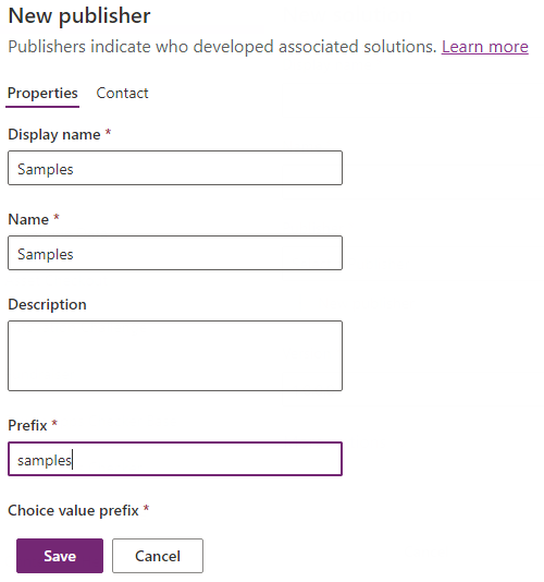
这也可以是您自己的发布者,前提是您在下方对 pac pcf push 的调用中更新了发布者前缀参数。 详细信息: 创建解决方案发布者。
保存发布者后,即可对环境授权 CLI 以推送编译后的代码组件。 在命令行中,使用:
pac auth create --url https://myorg.crm.dynamics.com将
myorg.crm.dynamics.com替换为您自己的 Dataverse 环境的 URL。 出现提示时,使用管理员/自定义用户登录。 需要这些用户角色提供的权限才能将任何代码组件部署到 Dataverse。若要部署代码组件,请使用:
pac pcf push --publisher-prefix samples注释
如果收到错误,
,则必须安装 Visual Studio 2019 for Windows & Mac 或Build Tools for Visual Studio 2019 ,并确保选择先决条件中所述的“.NET 生成工具”工作负载。完成后,此过程将在环境中创建名为 PowerAppTools_samples 的小型临时解决方案,并将
CanvasGrid代码组件添加到此解决方案。 如有必要,可以稍后将代码组件移到自己的解决方案中。 详细信息:代码组件应用程序生命周期管理(ALM)。
若要在画布应用中使用代码组件,必须在正在使用的环境中为画布应用启用 Power Apps 组件框架。
a. 打开 管理中心 (admin.powerplatform.microsoft.com),并导航到你的环境。 b. 导航到 “设置>产品>功能 ”。 确保画布应用的Power Apps component framework 已启用:

使用 平板电脑 布局创建新的画布应用。
在 “插入 ”面板中,选择“ 获取更多组件”。
选择“导入组件”窗格上的“代码”选项卡。
选择
CanvasGrid组件。选择导入。 现在,代码组件将显示在“插入”面板上的“代码”组件下。
将
CanvasGrid组件拖到屏幕上,并绑定到Microsoft Dataverse中的Contacts表。使用属性面板在
CanvasGrid代码组件上设置以下属性:-
突出显示值 =
1- 这是statecode记录处于非活动状态时的值。 -
突出显示颜色 =
#FDE7E9- 这是记录处于非活动状态时要使用的颜色。 -
HighlightIndicator="statecode"- 这是要与之进行比较的字段。 这位于“数据”部分中的“高级”面板上。

-
突出显示值 =
TextInput添加新组件并将其命名txtSearch。将
CanvasGrid.Items属性更新为Search(Contacts,txtSearch.Text,"fullname").当您在文本输入中键入时,您会看到网格中的联系人已被筛选。
添加新 的文本标签 ,并将文本设置为“找不到记录”。 将标签置于画布网格的顶部。
将文本标签的 Visible 属性设置为
CanvasGrid1.FilteredRecordCount=0.
这意味着,如果没有与值匹配的 txtSearch 记录,或者如果使用不返回任何记录的上下文菜单应用列筛选器(例如 ,全名 不包含数据),则将显示标签。
添加显示窗体(从“输入”组中的“插入”面板)。
将窗体
DataSource设置为Contacts表格并添加一些 窗体字段。将窗体
Item属性设置为CanvasGrid1.Selected.现在应会看到,在网格中选择项目时,窗体将显示所选的项。
在画布应用程序中添加一个名为 的新
scrDetails。复制上一个屏幕中的表单并将其粘贴到新屏幕上。
将
CanvasGrid1.OnSelect属性设置为Navigate(scrDetails).当你调用网格行选择操作时,应该会看到应用跳转到第二个屏幕,并显示已选择的项目。
部署后调试
在代码组件在画布应用中运行时,可以通过使用 Ctrl+Shift+I 打开开发人员工具来轻松调试代码组件。
选择 Ctrl+P 并键入 Grid.tsx 或 Index.ts。 此时可设置断点并逐步执行代码。
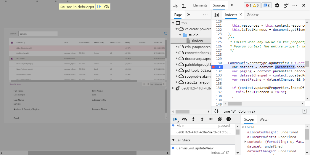
如果需要对组件进行进一步更改,则无需每次部署。 请改用 调试代码组件 中所述的技术来创建 Fiddler AutoResponder ,以在运行时从本地文件系统 npm start watch 加载该文件。
AutoResponder 如下所示:
REGEX:(.*?)((?'folder'css|html)(%252f|\/))?SampleNamespace\.CanvasGrid[\.\/](?'fname'[^?]*\.*)(.*?)$
C:\repos\CanvasGrid\out\controls\CanvasGrid\${folder}\${fname}

还需要启用筛选器来添加 Access-Control-Allow-Origin 标头。 有关详细信息,请参阅部署到Microsoft Dataverse后调试代码组件。
你的浏览器会话需要 清空缓存并进行强制刷新,这样才能识别AutoResponder 文件。 加载后,只需刷新浏览器,因为 Fiddler 会将缓存控件标头添加到文件,以防止缓存它。
确认更改满意后,可以在清单中递增补丁版本,然后使用 pac pcf push 重新部署。
到目前为止,你已部署了一个开发版本,该版本未经过优化,在运行时运行速度会变慢。 您可以通过编辑 ,使用 CanvasGrid.pcfproj 部署一个优化的构建版本。 在 OutputPath下方,添加以下内容: <PcfBuildMode>production</PcfBuildMode>
  <PropertyGroup>
    <Name>CanvasGrid</Name>
    <ProjectGuid>a670bba8-e0ae-49ed-8cd2-73917bace346</ProjectGuid>
    <OutputPath>$(MSBuildThisFileDirectory)out\controls</OutputPath>
  </PropertyGroup>
相关文章
使用 Microsoft Power Platform 进行应用程序生命周期管理 (ALM)
Power Apps组件框架 API 参考
创建您的第一个组件
调试代码组件