通过命令栏浮出控件,可以在与 UI 画布上的元素相关的浮动工具栏中显示命令,从而为用户提供轻松访问常见任务的方式。
与 CommandBar 一样,CommandBarFlyout 的 PrimaryCommands 和 SecondaryCommands 属性可以用来添加命令。 可以将命令置于这两个集合中,或者置于其中的一个中。 主要命令和辅助命令何时显示以及以何种方式显示取决于显示模式。
命令栏弹出菜单有两个显示模式:“折叠”和“展开”。
- 在折叠模式下,仅显示主要命令。 如果命令栏弹出项目包含主要命令和辅助命令,则会显示由省略号 [...] 表示的“查看更多”按钮。 这允许用户通过转换为扩展模式来access辅助命令。
- 在展开模式下,主要命令和辅助命令都会显示。 (如果此控件只有辅助项,则这些辅助项的显示方式类似于 MenuFlyout 控件。)
这是正确的控制吗?
使用命令栏弹出控件,可以在应用画布元素相关的上下文中为用户显示一组命令,例如按钮和菜单项。
建议使用命令栏弹出项目来创建上下文菜单。 这允许将与上下文菜单的场景最相关的常用命令(例如复制、剪切、粘贴、删除、共享或文本选择命令)添加为主要命令,以便这些命令在命令栏弹出项目中显示为单一的水平行。 TextCommandBarFlyout 已正确配置为在 TextBox、TextBlock、RichEditBox、RichTextBlock 和 PasswordBox 控件中自动显示文本命令。 CommandBarFlyout 可用于替换文本控件上的默认文本命令。
要在列表项上显示上下文命令,请按用于集合和列表的上下文命令中的指南操作。
主动调用与被动调用
通常可以通过两种方式来调用与 UI 画布上的某个元素相关联的弹出项目或菜单:主动调用和被动调用。
在主动调用中,当用户与项交互时,与该项关联的命令会自动显示。 例如,当用户选择文本框中的文本时,文本格式设置命令可能会弹出。 在这种情况下,命令栏弹出窗口不获取焦点。 而是将相关命令呈现在用户正在交互的项目附近。 如果用户不与这些命令交互,这些命令会被取消。
在被动调用中,只有在用户通过显式操作(例如右键单击)来请求命令时,命令才会显示。 这对应于传统的上下文菜单概念。
可以通过任一方式使用 CommandBarFlyout,甚至可以将这两种方式混合使用。
创建命令栏弹出菜单

WinUI 3 示例库应用包含 WinUI 控件和功能的交互式示例。 从 Microsoft Store 或浏览 GitHub 上的源代码获取应用。
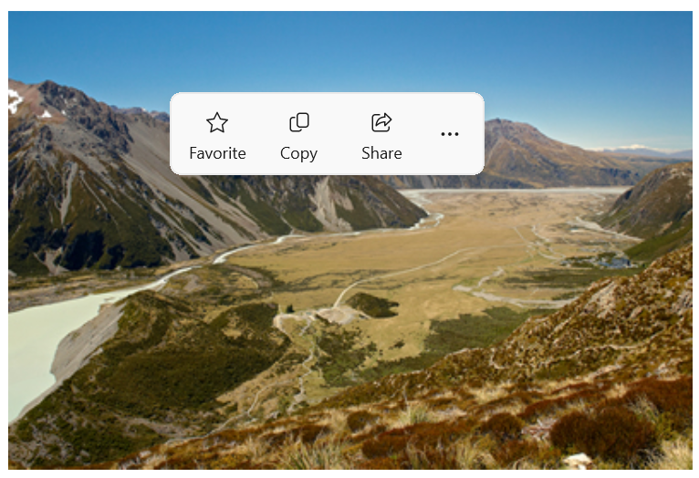
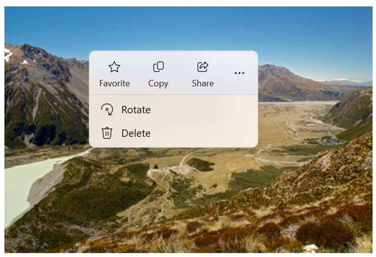
以下示例介绍了如何创建命令栏弹出项目并以主动和被动两种方式使用它。 点击图像时,弹出菜单会以折叠模式显示。 作为上下文菜单显示时,弹出项目以展开模式显示。 不管哪一种情况,用户都可以在弹出项目打开后将其展开或折叠。
<Grid>
    <Grid.Resources>
        <CommandBarFlyout x:Name="ImageCommandsFlyout">
            <AppBarButton Label="Favorite" Icon="OutlineStar" ToolTipService.ToolTip="Favorite"/>
            <AppBarButton Label="Copy" Icon="Copy" ToolTipService.ToolTip="Copy"/>
            <AppBarButton Label="Share" Icon="Share" ToolTipService.ToolTip="Share"/>
            <CommandBarFlyout.SecondaryCommands>
                <AppBarButton Label="Rotate" Icon="Rotate"/>
                <AppBarButton Label="Delete" Icon="Delete"/>
            </CommandBarFlyout.SecondaryCommands>
        </CommandBarFlyout>
    </Grid.Resources>

    <Image Source="Assets/image1.png" Width="300"
           Tapped="Image_Tapped"
           FlyoutBase.AttachedFlyout="{x:Bind ImageCommandsFlyout}"
           ContextFlyout="{x:Bind ImageCommandsFlyout}"/>
</Grid>
private void Image_Tapped(object sender, TappedRoutedEventArgs e)
{
    var flyout = FlyoutBase.GetAttachedFlyout((FrameworkElement)sender);
    var options = new FlyoutShowOptions()
    {
        // Position shows the flyout next to the pointer.
        // "Transient" ShowMode makes the flyout open in its collapsed state.
        Position = e.GetPosition((FrameworkElement)sender),
        ShowMode = FlyoutShowMode.Transient
    };
    flyout?.ShowAt((FrameworkElement)sender, options);
}
这是折叠状态下的命令栏弹出菜单。
这是其展开状态中显示辅助命令的相同命令栏快捷菜单。
主动显示命令
主动显示上下文命令时,默认情况下只应显示主要命令(命令栏弹出项目应该折叠)。 请将最重要的命令置于主要命令集合中,将其他会按传统方式进入上下文菜单中的命令置于辅助命令集合中。
要主动显示命令,通常需要通过处理 Click 或 Tapped 事件来显示命令栏弹出菜单。 将弹出窗口的 ShowMode 设置为 Transient 或 TransientWithDismissOnPointerMoveAway,以不获取焦点的方式在折叠模式下打开弹出窗口。
文本控件具有 SelectionFlyout 属性。 为此属性分配弹出项目后,当文本处于选中状态时,弹出项目会自动显示。
响应式显示命令
在上下文菜单中被动展示上下文命令时,默认情况下辅助命令会显示(命令栏弹出窗口应展开)。 在这种情况下,命令栏弹出项目可能有主要命令和辅助命令,也可能只有辅助命令。
要在上下文菜单中显示命令,通常需将弹出项目分配给 UI 元素的 ContextFlyout 属性。 这样,弹出框的打开由该元素处理,你无需再做任何其他工作。
如果你自己负责显示弹出项目(例如,在出现 RightTapped 事件时这样做),请将弹出项目的 ShowMode 设置为 Standard,以便在展开模式下打开弹出项目并为其提供焦点。
小窍门
要详细了解显示弹出项目时的选项以及如何控制弹出项目的放置,请参阅弹出项目。
显示总是展开的 CommandBarFlyout
在 CommandBarFlyout 中有主要命令和辅助命令时,默认显示“查看更多”[...] 按钮,可用于展开和折叠辅助命令。 如果你想将 CommandBarFlyout 保持在展开模式并始终显示辅助命令,则可以使用 CommandBarFlyout.AlwaysExpanded 属性。
AlwaysExpanded 属性设置为时 true,不会显示“查看更多”按钮,并且用户无法切换控件的展开状态。 当单击次要命令或用户在弹出菜单外单击时,CommandBarFlyout 仍将正常关闭。
仅当 CommandBarFlyout 具有辅助命令时,此属性才有效。 如果没有辅助命令,则 CommandBarFlyout 将始终处于折叠模式。
命令和内容
CommandBarFlyout 控件有 2 个可用于添加命令和内容的属性:PrimaryCommands 和 SecondaryCommands。
默认情况下,命令栏项目会被添加到 PrimaryCommands 集合中。 这些命令显示在命令栏中,在折叠模式和展开模式下均可见。 与 CommandBar 不同,主要命令不会自动溢出到辅助命令,可能会被截断。
也可将命令添加到 SecondaryCommands 集合中。 辅助命令显示在控件的菜单部分,仅在展开模式下可见。
如果有对场景很重要的常用命令(如复制、剪切、粘贴、删除、共享或文本选择命令),建议将这些命令添加为主命令,而不是辅助命令。
应用栏按钮
可以直接使用 AppBarButton、AppBarToggleButton 和 AppBarSeparator 控件填充 PrimaryCommands 和 SecondaryCommands。
应用栏按钮控件以一个图标和文本标签为特征。 这些控件经优化后适合在命令栏中使用,其外观会变化,具体取决于控件是显示在命令栏中还是显示在溢出菜单中。
-
In Windows App SDK 1.5 及更高版本:用作主命令的应用栏按钮会显示在命令栏中,其中包含文本标签和图标(如果两者均已设置)。
<AppBarButton Icon="Copy" Label="Copy"/> -
In Windows App SDK 1.4 及更低版本:用作主命令的应用栏按钮仅显示在命令栏中,其图标仅显示;不显示文本标签。 建议使用工具提示来显示命令的文本说明,如下所示。
<AppBarButton Icon="Copy" ToolTipService.ToolTip="Copy"/> - 用作辅助命令的应用栏按钮显示在菜单中,标签和图标均可见。
Icons
请考虑为菜单项提供图标:
- 最常使用的项。
- 图标为标准或知名的菜单项。
- 图标可明确说明命令功能的菜单项。
对于没有标准可视化的命令可不必提供图标。 难以理解的图标无助于使用,造成视觉干扰,并妨碍用户关注重要的菜单项。
其他内容
可以将其他控件添加到命令栏弹出项目中,只需将它们包装在 AppBarElementContainer 中即可。 这样就可以添加 DropDownButton 或 SplitButton 之类的控件,或者添加 StackPanel 之类的容器,以便创建更复杂的 UI。
元素必须实现 ICommandBarElement 接口才能添加到命令栏弹出项目的主要命令或辅助命令集合中。 AppBarElementContainer 是一个实现此接口的包装器,因此即使某个元素不自行实现此接口,也可将该元素添加到命令栏。
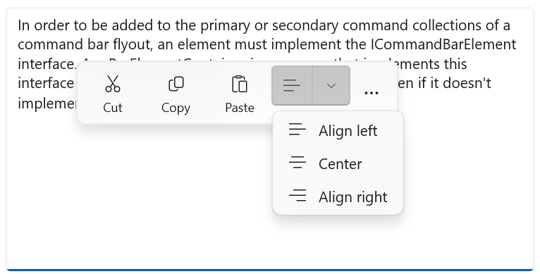
在这里,使用 AppBarElementContainer 将额外元素添加到命令栏的弹出菜单中。 在主要命令中添加了一个 SplitButton,以启用文本对齐功能。 为辅助命令添加了 StackPanel,以便为缩放控件实现更复杂的布局。
小窍门
默认情况下,为应用画布设计的元素可能在命令栏中显示不正确。 使用 AppBarElementContainer 添加某个元素时,应该执行某些步骤,使该元素与其他命令栏元素匹配:
- 使用轻型样式设置覆盖默认的画笔,使该元素的背景和边框与应用栏按钮匹配。
- 调整元素的大小和位置。
- 将图标包装在宽度和高度为 16px 的 Viewbox 中。
<CommandBarFlyout>
    <AppBarButton Icon="Cut" Label="Cut" ToolTipService.ToolTip="Cut"/>
    <AppBarButton Icon="Copy" Label="Copy" ToolTipService.ToolTip="Copy"/>
    <AppBarButton Icon="Paste" Label="Paste" ToolTipService.ToolTip="Paste"/>
    <!-- Alignment controls -->
    <AppBarElementContainer>
         <SplitButton ToolTipService.ToolTip="Alignment">
            <SplitButton.Resources>
                <!-- Override default brushes to make the SplitButton
                     match other command bar elements. -->
                <Style TargetType="SplitButton">
                    <Setter Property="Height" Value="38"/>
                </Style>
                <SolidColorBrush x:Key="SplitButtonBackground"
                                 Color="Transparent"/>
                <SolidColorBrush x:Key="SplitButtonBackgroundPressed"
                                 Color="{ThemeResource SystemListMediumColor}"/>
                <SolidColorBrush x:Key="SplitButtonBackgroundPointerOver"
                                 Color="{ThemeResource SystemListLowColor}"/>
                <SolidColorBrush x:Key="SplitButtonBorderBrush" Color="Transparent"/>
                <SolidColorBrush x:Key="SplitButtonBorderBrushPointerOver"
                                 Color="Transparent"/>
                <SolidColorBrush x:Key="SplitButtonBorderBrushChecked"
                                 Color="Transparent"/>
            </SplitButton.Resources>
            <SplitButton.Content>
                <Viewbox Width="16" Height="16" Margin="0,2,0,0">
                    <SymbolIcon Symbol="AlignLeft"/>
                </Viewbox>
            </SplitButton.Content>
            <SplitButton.Flyout>
                <MenuFlyout>
                    <MenuFlyoutItem Icon="AlignLeft" Text="Align left"/>
                    <MenuFlyoutItem Icon="AlignCenter" Text="Center"/>
                    <MenuFlyoutItem Icon="AlignRight" Text="Align right"/>
                </MenuFlyout>
            </SplitButton.Flyout>
        </SplitButton>
    </AppBarElementContainer>
    <!-- end Alignment controls -->
    <CommandBarFlyout.SecondaryCommands>
        <!-- Zoom controls -->
        <AppBarElementContainer>
            <AppBarElementContainer.Resources>
                <!-- Override default brushes to make the Buttons
                     match other command bar elements. -->
                <SolidColorBrush x:Key="ButtonBackground"
                                 Color="Transparent"/>
                <SolidColorBrush x:Key="ButtonBackgroundPressed"
                                 Color="{ThemeResource SystemListMediumColor}"/>
                <SolidColorBrush x:Key="ButtonBackgroundPointerOver"
                                 Color="{ThemeResource SystemListLowColor}"/>
                <SolidColorBrush x:Key="ButtonBorderBrush"
                                 Color="Transparent"/>
                <SolidColorBrush x:Key="ButtonBorderBrushPointerOver"
                                 Color="Transparent"/>
                <SolidColorBrush x:Key="ButtonBorderBrushChecked"
                                 Color="Transparent"/>
                <Style TargetType="TextBlock">
                    <Setter Property="VerticalAlignment" Value="Center"/>
                </Style>
                <Style TargetType="Button">
                    <Setter Property="Height" Value="40"/>
                    <Setter Property="Width" Value="40"/>
                </Style>
            </AppBarElementContainer.Resources>
            <Grid Margin="12,-4">
                <Grid.ColumnDefinitions>
                    <ColumnDefinition Width="Auto"/>
                    <ColumnDefinition Width="76"/>
                    <ColumnDefinition Width="Auto"/>
                </Grid.ColumnDefinitions>
                <Viewbox Width="16" Height="16" Margin="0,2,0,0">
                    <SymbolIcon Symbol="Zoom"/>
                </Viewbox>
                <TextBlock Text="Zoom" Margin="10,0,0,0" Grid.Column="1"/>
                <StackPanel Orientation="Horizontal" Grid.Column="2">
                    <Button ToolTipService.ToolTip="Zoom out">
                        <Viewbox Width="16" Height="16">
                            <SymbolIcon Symbol="ZoomOut"/>
                        </Viewbox>
                    </Button>
                    <TextBlock Text="50%" Width="40"
                               HorizontalTextAlignment="Center"/>
                    <Button ToolTipService.ToolTip="Zoom in">
                        <Viewbox Width="16" Height="16">
                            <SymbolIcon Symbol="ZoomIn"/>
                        </Viewbox>
                    </Button>
                </StackPanel>
            </Grid>
        </AppBarElementContainer>
        <!-- end Zoom controls -->
        <AppBarSeparator/>
        <AppBarButton Label="Undo" Icon="Undo"/>
        <AppBarButton Label="Redo" Icon="Redo"/>
        <AppBarButton Label="Select all" Icon="SelectAll"/>
    </CommandBarFlyout.SecondaryCommands>
</CommandBarFlyout>
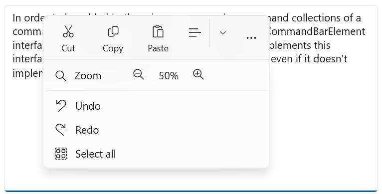
下面是折叠命令栏的弹出菜单,其中显示了一个打开的 SplitButton。
菜单中带有自定义缩放用户界面的扩展命令栏下拉菜单如下所示。
创建仅包含辅助命令的上下文菜单
你可以使用仅带有次级命令的命令栏弹出项来创建上下文菜单,以实现与菜单弹出项相同的外观和行为。
<Grid>
    <Grid.Resources>
        <!-- A command bar flyout with only secondary commands. -->
        <CommandBarFlyout x:Name="ContextMenu">
            <CommandBarFlyout.SecondaryCommands>
                <AppBarButton Label="Copy" Icon="Copy"/>
                <AppBarButton Label="Save" Icon="Save"/>
                <AppBarButton Label="Print" Icon="Print"/>
                <AppBarSeparator />
                <AppBarButton Label="Properties"/>
            </CommandBarFlyout.SecondaryCommands>
        </CommandBarFlyout>
    </Grid.Resources>

    <Image Source="Assets/image1.png" Width="300"
           ContextFlyout="{x:Bind ContextMenu}"/>
</Grid>
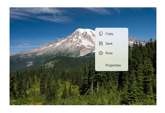
这是作为上下文菜单的命令栏弹出菜单。
也可将 CommandBarFlyout 与 DropDownButton 配合使用来创建标准菜单。
<CommandBarFlyout>
    <AppBarButton Icon="Placeholder"/>
    <AppBarElementContainer>
        <DropDownButton Content="Mail">
            <DropDownButton.Resources>
                <!-- Override default brushes to make the DropDownButton
                     match other command bar elements. -->
                <Style TargetType="DropDownButton">
                    <Setter Property="Height" Value="38"/>
                </Style>
                <SolidColorBrush x:Key="ButtonBackground"
                                 Color="Transparent"/>
                <SolidColorBrush x:Key="ButtonBackgroundPressed"
                                 Color="{ThemeResource SystemListMediumColor}"/>
                <SolidColorBrush x:Key="ButtonBackgroundPointerOver"
                                 Color="{ThemeResource SystemListLowColor}"/>

                <SolidColorBrush x:Key="ButtonBorderBrush"
                                 Color="Transparent"/>
                <SolidColorBrush x:Key="ButtonBorderBrushPointerOver"
                                 Color="Transparent"/>
                <SolidColorBrush x:Key="ButtonBorderBrushChecked"
                                 Color="Transparent"/>
            </DropDownButton.Resources>
            <DropDownButton.Flyout>
                <CommandBarFlyout Placement="BottomEdgeAlignedLeft">
                    <CommandBarFlyout.SecondaryCommands>
                        <AppBarButton Icon="MailReply" Label="Reply"/>
                        <AppBarButton Icon="MailReplyAll" Label="Reply all"/>
                        <AppBarButton Icon="MailForward" Label="Forward"/>
                    </CommandBarFlyout.SecondaryCommands>
                </CommandBarFlyout>
            </DropDownButton.Flyout>
        </DropDownButton>
    </AppBarElementContainer>
    <AppBarButton Icon="Placeholder"/>
    <AppBarButton Icon="Placeholder"/>
</CommandBarFlyout>
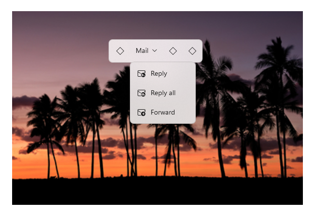
下面是命令栏弹出项目中的下拉按钮菜单。
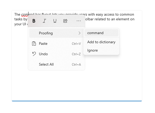
用于文本控件的命令栏弹出菜单
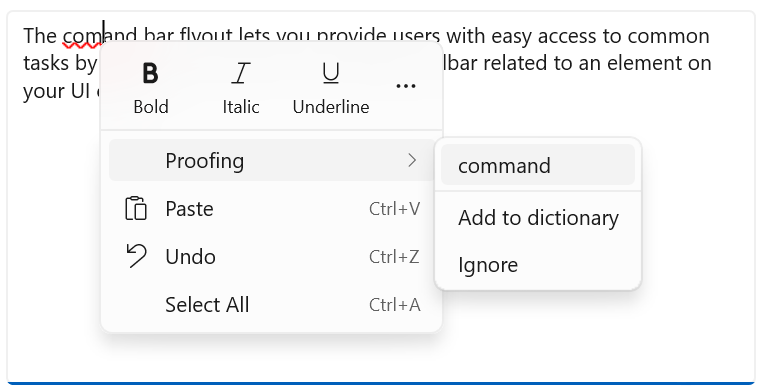
TextCommandBarFlyout 是专用的命令栏弹出项目,其中包含用于编辑文本的命令。 每个文本控件会自动将 TextCommandBarFlyout 显示为上下文菜单(右键单击),或者会在文本处于选中状态时显示它。 文本命令栏弹出项目会根据文本选择情况进行调整,仅显示相关命令。
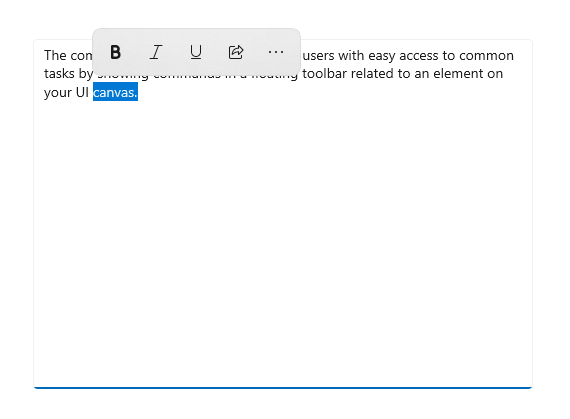
这是文本选择时出现的文本命令栏浮动弹出窗口。
展开的文本命令栏弹出窗口显示辅助命令。
可用的命令
下表介绍了包含在 TextCommandBarFlyout 中的命令,以及这些命令何时显示。
| Command | 显示... |
|---|---|
| Bold | 当文本控件不是只读时(仅适用于 RichEditBox)。 |
| 斜体 | 当文本控件不是只读时(仅适用于 RichEditBox)。 |
| 下划线 | 当文本控件不是只读时(仅适用于 RichEditBox)。 |
| 校对 | 当 IsSpellCheckEnabled 为 true 且拼写错误的文本处于选中状态时。 |
| 剪切 | 当文本控件不是只读且文本处于选中状态时。 |
| 复制 | 当文本处于选中状态时。 |
| 粘贴 | 当文本控件不是只读且剪贴板有内容时。 |
| 撤消 | 当存在可以撤消的操作时。 |
| 全选 | 当文本可以选择时。 |
自定义文本命令栏弹出菜单
TextCommandBarFlyout 不能自定义,由每个文本控件自动管理。 不过,可以将默认的 TextCommandBarFlyout 替换为自定义命令。
- 要替换在选中文本时显示的默认 TextCommandBarFlyout,可以创建一个自定义的 CommandBarFlyout(或其他弹出类型)并将其分配给 SelectionFlyout 属性。 如果将 SelectionFlyout 设置为 null,则在选中文本时不显示任何命令。
- 要替换作为上下文菜单显示的默认 TextCommandBarFlyout,请将自定义 CommandBarFlyout(或其他弹出菜单类型)分配给文本控件的 ContextFlyout 属性。 如果将 ContextFlyout 设置为 null,则会显示文本控件旧版中显示的菜单弹出项,而不是 TextCommandBarFlyout。
轻触取消
轻量级消除控件(如菜单、上下文菜单和其他弹出项目)会限制临时用户界面内的键盘焦点和游戏板焦点,直到被消除为止。 若要为此行为提供视觉提示,Xbox 上的“轻量消除”控件将绘制一个覆盖层,使范围外的 UI 的可见性变暗。 可以使用 LightDismissOverlayMode 属性来修改此行为。 默认情况下,暂时性 UI 在 Xbox(Auto)上会绘制光消除覆盖,而在其他设备系列上则不会。 你可以选择强制叠加层始终为“打开”或始终为“关闭”。
<CommandBarFlyout LightDismissOverlayMode="Off" /> >
