TitleBar 控件提供了为应用创建自定义标题栏的简化方法。 标题栏是Windows应用的用户界面的基本组件,它通过其图标和标题标识应用,包含系统标题按钮,允许用户关闭、最大化、最小化和还原窗口,并允许用户在屏幕上拖动窗口。
可以使用自定义标题栏更好地将标题栏区域与应用 UI 集成。 可以使用 Mica 主题设置自定义标题栏以匹配应用的视觉样式。 它可以包括其他相关信息,例如文档标题或当前状态(例如“编辑”、“查看”等)。 它还可以托管其他 WinUI 3 控件,例如 AutoSuggestBox 和 PersonPicture,为应用提供一致用户体验。

这是正确的控制吗?
如果要使用字幕、 Mica 主题和 WinUI 控件等自定义项将标题栏区域与应用 UI 集成,请使用 TitleBar 控件。
解剖学
默认情况下,标题栏仅显示系统标题按钮。 标题栏的其他部分根据关联的属性设置显示或隐藏。
标题栏划分为以下区域:
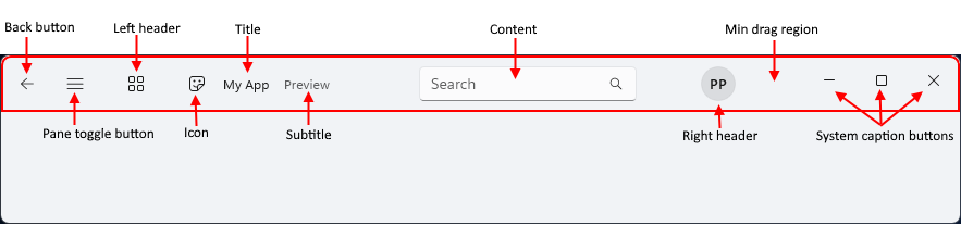
- 后退按钮:IsBackButtonEnabled、 IsBackButtonVisible、 BackRequested - 用于导航的内置后退按钮。
- 窗格切换按钮:IsPaneToggleButtonVisible、 PaneToggleRequested - 此按钮旨在与 NavigationView 控件结合使用。
- 左标题:LeftHeader
- 图标:IconSource
- 标题:标题
- 副标题:副标题
- 内容:内容
- 右标题:RightHeader
- 最小拖动区域: 此区域保留在系统标题按钮旁边,以便用户始终有一个用于抓取窗口以供拖动的位置。
- 系统标题按钮: 这些按钮不是 TitleBar 控件的一部分- 它只是分配标题按钮显示的空间,具体取决于 RTL 或 LTR 设置。 标题按钮和自定义由 AppWindowTitleBar 处理。
当 FlowDirection 为 RightToLeft 时,布局将相反。
创建标题栏
- 重要 API:TitleBar 类、 Title 属性

WinUI 3 示例库应用包含 WinUI 控件和功能的交互式示例。 从 Microsoft Store 或浏览 GitHub 上的源代码获取应用。
此示例创建一个简单的标题栏,用于替换系统标题栏。 它具有标题、图标和 Mica 主题。
<Window
... >
<Window.SystemBackdrop>
<MicaBackdrop Kind="Base"/>
</Window.SystemBackdrop>
<Grid>
<Grid.RowDefinitions>
<RowDefinition Height="Auto" />
<RowDefinition Height="*" />
</Grid.RowDefinitions>
<TitleBar x:Name="SimpleTitleBar"
Title="My App">
<TitleBar.IconSource>
<FontIconSource Glyph=""/>
</TitleBar.IconSource>
</TitleBar>
<!-- App content -->
<Frame x:Name="RootFrame" Grid.Row="1"/>
</Grid>
</Window>
public MainWindow()
{
    this.InitializeComponent();

    // Hides the default system title bar.
    ExtendsContentIntoTitleBar = true;
    // Replace system title bar with the WinUI TitleBar control.
    SetTitleBar(SimpleTitleBar);
}
与 NavigationView 集成
导航视图具有内置的后退按钮和窗格切换按钮。 Fluent Design 指南建议在使用自定义标题栏时将这些控件放在标题栏中。
此示例演示如何通过将后退按钮和窗格切换按钮隐藏在导航视图中并使用标题栏上的相应按钮,将 TitleBar 控件与 NavigationView 控件集成。
<Grid>
    <Grid.RowDefinitions>
        <RowDefinition Height="Auto" />
        <RowDefinition Height="*" />
    </Grid.RowDefinitions>

    <TitleBar Title="My App"
              IsBackButtonVisible="True"
              IsBackButtonEnabled="{x:Bind RootFrame.CanGoBack, Mode=OneWay}"
              BackRequested="TitleBar_BackRequested"
              IsPaneToggleButtonVisible="True"
              PaneToggleRequested="TitleBar_PaneToggleRequested">
    </TitleBar>

    <NavigationView x:Name="RootNavigationView" Grid.Row="1"
                    IsBackButtonVisible="Collapsed"
                    IsPaneToggleButtonVisible="False">
        <Frame x:Name="RootFrame" />
    </NavigationView>
</Grid>
private void TitleBar_BackRequested(TitleBar sender, object args)
{
    if (RootFrame.CanGoBack)
    {
        RootFrame.GoBack();
    }
}

private void TitleBar_PaneToggleRequested(TitleBar sender, object args)
{
    RootNavigationView.IsPaneOpen = !RootNavigationView.IsPaneOpen;
}
自定义拖动区域
用户通过拖动其标题栏来移动窗口。 TitleBar 控件确定其 内容 区域用户可以拖动哪些部分以及哪些部分接收指针输入,例如单击。
从 Windows 应用 SDK 2.1.3 开始,TitleBar 控件会检查其内容中的元素,并且仅从拖动区域排除交互式控件,如按钮、文本框和组合框。 默认情况下,空白和非交互式元素(如 TextBlock)可拖动,因此无需更改标记。 在早期版本中,内容区域中的空白区域可能会阻止窗口拖动。 此默认行为是 TitleBar_ContentDragRegions 运行时兼容性更改。 有关详细信息,请参阅 RuntimeCompatibilityOptions.DisabledChanges。
以下示例基于 WinUI 3 Gallery 示例。 标题栏内容是包含 AutoSuggestBox 和 Button 的网格。 这两个控件都是可单击的,它们旁边的空白空间是可拖动的。
<TitleBar x:Name="AppTitleBar" Title="My App">
    <TitleBar.Resources>
        <!-- Stretch the content across the available width of the title bar. -->
        <HorizontalAlignment x:Key="TitleBarContentHorizontalAlignment">Stretch</HorizontalAlignment>
    </TitleBar.Resources>
    <TitleBar.Content>
        <Grid ColumnSpacing="8">
            <Grid.ColumnDefinitions>
                <ColumnDefinition Width="*" />
                <ColumnDefinition Width="Auto" />
            </Grid.ColumnDefinitions>

            <AutoSuggestBox MaxWidth="580"
                            VerticalAlignment="Center"
                            PlaceholderText="Search..."
                            QueryIcon="Find" />

            <StackPanel x:Name="RightPanel"
                        Grid.Column="1"
                        Orientation="Horizontal"
                        Spacing="8"
                        VerticalAlignment="Center">
                <Button x:Name="StatusButton"
                        Content="Status"
                        Click="StatusButton_Click" />
            </StackPanel>
        </Grid>
    </TitleBar.Content>
</TitleBar>
覆盖元素的拖拽行为
若要重写标题栏内容中元素的默认行为,请设置 TitleBar.IsDragRegion 附加属性。 该属性是可为 null 的布尔值。
| Value | Behavior |
|---|---|
未设置 (null) |
由 TitleBar 控件确定。 交互式控件可单击,其他元素可拖动。 |
True |
即使元素是交互式控件,该元素也是可拖动的。 元素上的指针输入将移动窗口,因此用户无法单击该元素。 |
False |
该元素是可单击的,即使它不是交互式控件。 |
可以在面板上设置该属性,例如 StackPanel:
- 如果将其设置为
False,面板的整个区域是可单击的,包括其子级之间的空间。 - 如果将其设置为
True,面板及其子级是可拖动的,但属性设置为False的子级除外。
在需要它的最小的元素上设置属性,以便不会意外地使标题栏的大面积区域可拖动或可单击。
本示例将一组格式设置控件设为可作为一个整体点击,以便在用户点击控件之间的空白处时不会拖动窗口。
<StackPanel Orientation="Horizontal" Spacing="8" TitleBar.IsDragRegion="False">
    <ComboBox PlaceholderText="Font" />
    <ComboBox PlaceholderText="Size" />
    <ToggleButton Content="Bold" />
</StackPanel>
在代码中,调用 SetIsDragRegion 以设置值,并使用 IsDragRegionProperty 来调用 ClearValue 以返回到默认行为。 若要读取该值,请调用 GetIsDragRegion。 如果未设置该属性,则返回 null。 当值更改时,TitleBar 控件会更新其拖动区域。
// Make the button draggable. Users can't click it.
TitleBar.SetIsDragRegion(StatusButton, true);

// Make the button clickable.
TitleBar.SetIsDragRegion(StatusButton, false);

// Clear the value so that the TitleBar control decides.
StatusButton.ClearValue(TitleBar.IsDragRegionProperty);
内容更改时更新拖动区域
当设置或替换其内容、内容加载时、标题栏更改大小以及元素上的 TitleBar.IsDragRegion 的值发生更改时,TitleBar 控件将更新其拖动区域。
如果在运行时在标题栏内容中添加、删除或调整元素大小,请在进行更改后调用 RecomputeDragRegions 。
private void AddButton_Click(object sender, RoutedEventArgs e)
{
    RightPanel.Children.Insert(0, new Button { Content = "Extra" });

    // Update the drag regions so that the new button is clickable.
    AppTitleBar.RecomputeDragRegions();
}
如果标题栏内容经常更改,则可以改为将 AutoRefreshDragRegions 设置为 True 。 然后,TitleBar 控件在每个布局过程后更新其拖动区域。 此选项可能会影响性能,因此默认情况下为 False。
<TitleBar x:Name="AppTitleBar" Title="My App" AutoRefreshDragRegions="True">
    <!-- Title bar content that changes at run time. -->
</TitleBar>
Note
拖动区域仅影响指针输入。 它们不会更改键盘焦点或UI 自动化客户端(如屏幕阅读器)与标题栏中的元素交互的方式。 确保仍可使用键盘访问标题栏中的交互式控件。
如果应用不使用 TitleBar 控件,请使用 InputNonClientPointerSource 类设置自定义标题栏的交互式区域。 有关详细信息,请参阅 交互式内容。
