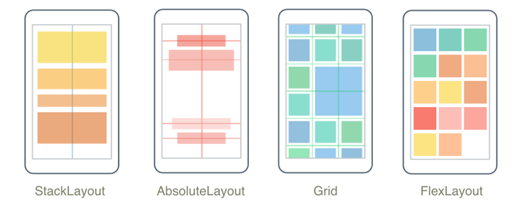
版面配置
.NET 多平台應用程式 UI (.NET MAUI) 版面配置類別可讓您排列和群組應用程式中的 UI 控制件。 選擇版面配置類別需要瞭解配置如何放置其子元素,以及配置如何調整其子元素的大小。 此外,可能需要巢狀配置來建立您想要的版面配置。
StackLayout
會 StackLayout 以水平或垂直方式組織一維堆疊中的元素。 屬性 Orientation 會指定專案的方向,而預設方向為 Vertical。 StackLayout 通常用來排列頁面上 UI 的子區段。
下列 XAML 示範如何建立包含三Label個 物件的垂直StackLayout:
<StackLayout Margin="20,35,20,25">
    <Label Text="The StackLayout has its Margin property set, to control the rendering position of the StackLayout." />
    <Label Text="The Padding property can be set to specify the distance between the StackLayout and its children." />
    <Label Text="The Spacing property can be set to specify the distance between views in the StackLayout." />
</StackLayout>
在 中 StackLayout,如果未明確設定專案的大小,則會展開以填滿可用的寬度,如果 Orientation 屬性設定為 Horizontal,則為 高度。
StackLayout通常用來做為父版面配置,其中包含其他子版面配置。 不過, StackLayout 不應該使用 對象的組合來重現 Grid 版面配置 StackLayout 。 下列程式代碼示範此不良做法的範例:
<ContentPage xmlns="http://schemas.microsoft.com/dotnet/2021/maui"
             xmlns:x="http://schemas.microsoft.com/winfx/2009/xaml"
             x:Class="Details.HomePage"
             Padding="0,20,0,0">
    <StackLayout>
        <StackLayout Orientation="Horizontal">
            <Label Text="Name:" />
            <Entry Placeholder="Enter your name" />
        </StackLayout>
        <StackLayout Orientation="Horizontal">
            <Label Text="Age:" />
            <Entry Placeholder="Enter your age" />
        </StackLayout>
        <StackLayout Orientation="Horizontal">
            <Label Text="Occupation:" />
            <Entry Placeholder="Enter your occupation" />
        </StackLayout>
        <StackLayout Orientation="Horizontal">
            <Label Text="Address:" />
            <Entry Placeholder="Enter your address" />
        </StackLayout>
    </StackLayout>
</ContentPage>
這很浪費資源,因為會執行不必要的版面配置計算。 相反地,想要的版面配置最好使用 Grid來達成。
如需詳細資訊,請參閱 StackLayout。
HorizontalStackLayout
會 HorizontalStackLayout 組織一維水準堆疊中的子檢視,而且是 較高效能的 StackLayout替代方法。 HorizontalStackLayout 通常用來排列頁面上 UI 的子區段。
下列 XAML 示範如何建立 HorizontalStackLayout 包含不同子檢視的 :
<HorizontalStackLayout Margin="20">
   <Rectangle Fill="Red"
              HeightRequest="30"
              WidthRequest="30" />
   <Label Text="Red"
          FontSize="18" />
</HorizontalStackLayout>
在 中 HorizontalStackLayout,如果未明確設定專案的大小,則會展開以填滿可用的高度。
如需詳細資訊,請參閱 HorizontalStackLayout。
VerticalStackLayout
會 VerticalStackLayout 組織一維垂直堆疊中的子檢視,而且是 較高效能的 StackLayout替代方法。 VerticalStackLayout 通常用來排列頁面上 UI 的子區段。
下列 XAML 示範如何建立包含三Label個 VerticalStackLayout 物件的 :
<VerticalStackLayout Margin="20,35,20,25">
    <Label Text="The VericalStackLayout has its Margin property set, to control the rendering position of the VerticalStackLayout." />
    <Label Text="The Padding property can be set to specify the distance between the VerticalStackLayout and its children." />
    <Label Text="The Spacing property can be set to specify the distance between views in the VerticalStackLayout." />
</VerticalStackLayout>
在 中 VerticalStackLayout,如果未明確設定專案的大小,則會展開以填滿可用的寬度。
如需詳細資訊,請參閱 VerticalStackLayout。
方格
Grid用於在數據列和數據行中顯示元素,其大小可以有比例或絕對大小。 網格線的數據列和數據行會以 RowDefinitions 和 ColumnDefinitions 屬性指定。
若要將專案放置在特定 Grid 儲存格中,請使用 Grid.Column 和 Grid.Row 附加屬性。 若要讓元素跨越多個數據列和數據行,請使用 Grid.RowSpan 和 Grid.ColumnSpan 附加屬性。
注意
Grid配置不應與數據表混淆,而且不適合呈現表格式數據。
下列 XAML 示範如何使用兩個 Grid 資料列和兩個資料行來建立 :
<Grid>
    <Grid.RowDefinitions>
        <RowDefinition Height="50" />
        <RowDefinition Height="50" />
    </Grid.RowDefinitions>
    <Grid.ColumnDefinitions>
        <ColumnDefinition Width="Auto" />
        <ColumnDefinition />
    </Grid.ColumnDefinitions>
    <Label Text="Column 0, Row 0"
           WidthRequest="200" />
    <Label Grid.Column="1"
           Text="Column 1, Row 0" />
    <Label Grid.Row="1"
           Text="Column 0, Row 1" />
    <Label Grid.Column="1"
           Grid.Row="1"
           Text="Column 1, Row 1" />
</Grid>
在此範例中,重設大小的運作方式如下:
- 每個數據列都有50個裝置獨立單位的明確高度。
- 第一個數據行的寬度會設定為
Auto,因此其子系所需的寬度也一樣寬。 在此情況下,其為200個裝置獨立單位,以容納第一個 Label的寬度。
空間可以使用自動重設大小在數據行或數據列內散發,讓數據行和數據列大小符合其內容。 若要達到此目的,請將 的高度設定RowDefinition為 ,或的寬度ColumnDefinitionAuto。 比例重設大小也可以用來依加權比例在網格線的數據列和數據行之間分配可用空間。 若要達成此目的,請將 的高度或的寬度ColumnDefinition設定RowDefinition為使用 * 運算符的值。
警告
請嘗試確保盡可能少的數據列和數據行設定為 Auto 大小。 每個自動調整大小的資料列或資料行都會導致版面配置引擎執行額外的版面配置計算。 可能的話,請改用固定大小的資料列和資料行。 或者,設定數據列和數據行以佔用具有列舉值的比例空間 GridUnitType.Star 量。
如需詳細資訊,請參閱 方格。
FlexLayout
FlexLayout類似於 StackLayout ,其會在堆疊中水準或垂直顯示子專案。 不過, FlexLayout 如果單一數據列或數據行中容納太多,也可以包裝其子系,也能夠更細微地控制其子元素的大小、方向和對齊方式。
下列 XAML 示範如何建立 FlexLayout ,以在單一資料列中顯示其檢視:
<FlexLayout Direction="Column"
            AlignItems="Center"
            JustifyContent="SpaceEvenly">
    <Label Text="FlexLayout in Action" />
    <Button Text="Button" />
    <Label Text="Another Label" />
</FlexLayout>
在此範例中,版面配置的運作方式如下:
- 屬性
Direction會設定為Column,這會使的 FlexLayout 子系排列在專案的單一數據行中。 - 屬性
AlignItems會設定為Center,這會導致每個項目水準置中。 - 屬性
JustifyContent會設定為SpaceEvenly,它會將所有剩餘的垂直空間平均配置於所有項目之間,以及第一個專案上方,以及最後一個專案下方。
如需詳細資訊,請參閱 FlexLayout。
AbsoluteLayout
AbsoluteLayout是用來使用明確值來定位和調整專案大小,或相對於版面配置大小的值。 相對於的左上角,這個位置是由子系的左上角 AbsoluteLayout所指定。
AbsoluteLayout應該將 視為特殊用途的版面配置,只有在您可以對子系施加大小時,或當元素的大小不會影響其他子系的位置時使用。 此版面配置的標準用法是建立覆疊,其涵蓋頁面與其他控件,或許可保護使用者與頁面上的一般控件互動。
重要
HorizontalOptions和 VerticalOptions 屬性對的AbsoluteLayout子系沒有任何影響。
AbsoluteLayout在內,AbsoluteLayout.LayoutBounds附加屬性可用來指定項目的水準位置、垂直位置、寬度和高度。 此外, AbsoluteLayout.LayoutFlags 附加屬性會指定如何解譯版面配置界限。
下列 XAML 示範如何在 中 AbsoluteLayout排列專案:
<AbsoluteLayout Margin="40">
    <BoxView Color="Red"
             AbsoluteLayout.LayoutFlags="PositionProportional"
             AbsoluteLayout.LayoutBounds="0.5, 0, 100, 100"
             Rotation="30" />
    <BoxView Color="Green"
             AbsoluteLayout.LayoutFlags="PositionProportional"
             AbsoluteLayout.LayoutBounds="0.5, 0, 100, 100"
             Rotation="60" />
    <BoxView Color="Blue"
             AbsoluteLayout.LayoutFlags="PositionProportional"
             AbsoluteLayout.LayoutBounds="0.5, 0, 100, 100" />
</AbsoluteLayout>
在此範例中,版面配置的運作方式如下:
- 每個 BoxView 都會指定 100x100 的明確大小,並以水準置中方式以相同的位置顯示。
- 紅色 BoxView 旋轉 30 度,綠色 BoxView 旋轉 60 度。
- 在每個 BoxView上
AbsoluteLayout.LayoutFlags,附加屬性會設定為PositionProportional,表示寬度和高度後的位置與剩餘空間成正比。
警告
請盡可能避免使用 AbsoluteLayout.AutoSize 屬性,因為這會導致配置引擎執行額外的版面配置計算。
如需詳細資訊,請參閱 AbsoluteLayout。
BindableLayout
BindableLayout可讓衍生自 Layout 類別的任何版面配置類別,藉由系結至專案集合來產生其內容,以及使用 設定每個專案DataTemplate外觀的選項。
可系結的配置會填入數據,方法是將其 ItemsSource 屬性設定為任何實作 的集合 IEnumerable,並將其附加至 Layout衍生類別。 您可以在可繫結設定中定義每個項目的外觀,方法是將 BindableLayout.ItemTemplate 附加屬性設定為 DataTemplate。
下列 XAML 示範如何將 系結 StackLayout 至專案的集合,並使用 定義其外觀 DataTemplate:
<StackLayout BindableLayout.ItemsSource="{Binding User.TopFollowers}"
             Orientation="Horizontal">
    <BindableLayout.ItemTemplate>
        <DataTemplate>
            <Image Source="{Binding}"
                   Aspect="AspectFill"
                   WidthRequest="44"
                   HeightRequest="44" />
        </DataTemplate>
    </BindableLayout.ItemTemplate>
</StackLayout>
只有當要顯示的專案集合很小,而且不需要捲動和選取時,才應該使用可繫結的配置。
如需詳細資訊,請參閱 BindableLayout。
自訂版面配置
在 .NET MAUI 中,配置類別衍生自抽象 Layout 類。 此類別會將跨平臺配置和度量委派給配置管理員類別。 每個版面配置管理員類別都會實作 ILayoutManager 介面,指定 Measure 必須提供 和 ArrangeChildren 實作:
- 實作 Measure 會呼叫 IView.Measure 配置中的每個檢視,並傳回指定條件約束的配置總大小。
- 實作 ArrangeChildren 會決定每個檢視應該放在版面配置界限內的位置,並呼叫 Arrange 每個檢視及其適當界限。 傳回值是版面配置的實際大小。
.NET MAUI 的配置具有預先定義的版面配置管理員來處理其配置。 不過,有時候必須使用 .NET MAUI 未提供的版面配置來組織頁面內容。 您可以藉由撰寫自己的自訂版面配置來達成此目的。 如需詳細資訊,請參閱 自定義版面配置。
輸入透明度
每個視覺專案都有一個 InputTransparent 可系結屬性,用來定義專案是否可以接收輸入。 其預設值為 false,可確保元素可以接收輸入。 當這個屬性位於 true 專案上時,元素將不會收到任何輸入。 相反地,輸入會傳遞至以視覺方式在 元素後方的任何元素。
類別 Layout 會從中衍生所有版面配置,具有 CascadeInputTransparent 可系結屬性,可控制子專案是否繼承版面配置的輸入透明度。 其預設值為 true,確保將 配置類別上的 屬性設定 InputTransparent 為 true ,會導致配置中的所有專案未收到任何輸入。
意見反應
即將登場:在 2024 年,我們將逐步淘汰 GitHub 問題作為內容的意見反應機制,並將它取代為新的意見反應系統。 如需詳細資訊,請參閱:https://aka.ms/ContentUserFeedback。
提交並檢視相關的意見反應