Shell 提供的 Xamarin.Forms 瀏覽體驗是以飛出視窗和索引標籤為基礎。 飛出視窗是Shell應用程式的選擇性根功能表,而且完全可自定義。 它可透過圖示或從螢幕側邊撥動來存取。 飛出視窗包含選擇性標頭、飛出視窗項目、選擇性功能表項,以及選擇性頁尾:
飛出視窗項目
您可以將一或多個飛出視窗項目新增至飛出視窗,每個飛出視窗項目都會以一個FlyoutItem物件表示。 每個 FlyoutItem 物件都應該是子類別化 Shell 物件的子系。 飛出視窗標頭不存在時,飛出視窗專案會出現在飛出視窗頂端。
下列範例會建立包含兩個飛出視窗項目的飛出視窗:
<Shell xmlns="http://xamarin.com/schemas/2014/forms"
       xmlns:x="http://schemas.microsoft.com/winfx/2009/xaml"
       xmlns:controls="clr-namespace:Xaminals.Controls"
       xmlns:views="clr-namespace:Xaminals.Views"
       x:Class="Xaminals.AppShell">
    <FlyoutItem Title="Cats"
                Icon="cat.png">
       <Tab>
           <ShellContent ContentTemplate="{DataTemplate views:CatsPage}" />
       </Tab>
    </FlyoutItem>
    <FlyoutItem Title="Dogs"
                Icon="dog.png">
       <Tab>
           <ShellContent ContentTemplate="{DataTemplate views:DogsPage}" />
       </Tab>
    </FlyoutItem>
</Shell>
FlyoutItem.Title類型的 string屬性會定義飛出視窗項目的標題。 FlyoutItem.Icon類型的 ImageSource屬性會定義飛出視窗項目的圖示:

在此範例中,每個 ShellContent 物件只能透過飛出視窗專案存取,而不能透過索引標籤來存取。 這是因為根據預設,只有在飛出視窗專案包含多個索引標籤時,才會顯示索引標籤。
重要
在 Shell 應用程式中,頁面會視需要建立,以響應流覽。 這可藉由使用DataTemplate標記延伸將每個ShellContent物件的 屬性設定ContentTemplate為 ContentPage 物件來完成。
Shell 具有隱含的轉換運算子,可簡化 Shell 視覺階層,而不需要將其他檢視引進視覺化樹狀結構。 有此可能性,因為子類別 Shell 物件只能包含 FlyoutItem 物件或 TabBar 物件,而其只能包含 Tab 物件,而其只能包含 ShellContent 物件。 這些隱含的轉換運算子可以用來移除上一個範例中的 FlyoutItem、和 Tab 物件:
<Shell xmlns="http://xamarin.com/schemas/2014/forms"
       xmlns:x="http://schemas.microsoft.com/winfx/2009/xaml"
       xmlns:controls="clr-namespace:Xaminals.Controls"
       xmlns:views="clr-namespace:Xaminals.Views"
       x:Class="Xaminals.AppShell">
   <ShellContent Title="Cats"
                 Icon="cat.png"
                 ContentTemplate="{DataTemplate views:CatsPage}" />
   <ShellContent Title="Dogs"
                 Icon="dog.png"
                 ContentTemplate="{DataTemplate views:DogsPage}" />
</Shell>
這個隱含轉換會自動將每個 ShellContent 物件包裝在 物件中 Tab ,這些物件會包裝在物件中 FlyoutItem 。
注意
子類別Shell化物件中的所有FlyoutItem物件都會自動新增至Shell.FlyoutItems集合,該集合會定義飛出視窗中顯示的專案清單。
飛出視窗顯示選項
屬性 FlyoutItem.FlyoutDisplayOptions 會設定飛出視窗專案及其子系在飛出視窗中的顯示方式。 此屬性應該設定為 FlyoutDisplayOptions 列舉成員:
AsSingleItem,指出項目將顯示為單一項目。 此為FlyoutDisplayOptions屬性的預設值。AsMultipleItems,指出項目及其子系都會在飛出視窗中顯示為一組項目。
將 屬性AsMultipleItems設定FlyoutItem.FlyoutDisplayOptions為 ,即可顯示 中FlyoutItem每個Tab物件的飛出視窗專案:
<Shell xmlns="http://xamarin.com/schemas/2014/forms"
       xmlns:x="http://schemas.microsoft.com/winfx/2009/xaml"
       xmlns:controls="clr-namespace:Xaminals.Controls"
       xmlns:views="clr-namespace:Xaminals.Views"
       FlyoutHeaderBehavior="CollapseOnScroll"
       x:Class="Xaminals.AppShell">

    <FlyoutItem FlyoutDisplayOptions="AsMultipleItems">
        <Tab Title="Domestic"
             Icon="paw.png">
            <ShellContent Title="Cats"
                          Icon="cat.png"
                          ContentTemplate="{DataTemplate views:CatsPage}" />
            <ShellContent Title="Dogs"
                          Icon="dog.png"
                          ContentTemplate="{DataTemplate views:DogsPage}" />
        </Tab>
        <ShellContent Title="Monkeys"
                      Icon="monkey.png"
                      ContentTemplate="{DataTemplate views:MonkeysPage}" />
        <ShellContent Title="Elephants"
                      Icon="elephant.png"
                      ContentTemplate="{DataTemplate views:ElephantsPage}" />
        <ShellContent Title="Bears"
                      Icon="bear.png"
                      ContentTemplate="{DataTemplate views:BearsPage}" />
    </FlyoutItem>

    <ShellContent Title="About"
                  Icon="info.png"
                  ContentTemplate="{DataTemplate views:AboutPage}" />
</Shell>
在此範例中,會針對 Tab 物件 (其為 FlyoutItem 物件的子系) 和 ShellContent 物件 (其為 FlyoutItem 物件的子系) 建立飛出視窗項目。 這是因為每個 ShellContent 物件 (其為 FlyoutItem 物件的子系) 都會自動包裝於 Tab 物件中。 此外,也會為最終 ShellContent 物件建立飛出視窗專案,該物件會自動包裝在 Tab 物件中,然後在物件中 FlyoutItem 。
注意
當 包含多個 ShellContent 物件時FlyoutItem,會顯示索引標籤。
這會產生下列飛出視窗項目:

定義 FlyoutItem 外觀
透過將 Shell.ItemTemplate 附加屬性設定為 DataTemplate,可自訂每個 FlyoutItem 的外觀:
<Shell ...>
    ...
    <Shell.ItemTemplate>
        <DataTemplate>
            <Grid ColumnDefinitions="0.2*,0.8*">
                <Image Source="{Binding FlyoutIcon}"
                       Margin="5"
                       HeightRequest="45" />
                <Label Grid.Column="1"
                       Text="{Binding Title}"
                       FontAttributes="Italic"
                       VerticalTextAlignment="Center" />
            </Grid>
        </DataTemplate>
    </Shell.ItemTemplate>
</Shell>
此範例會以斜體顯示每個 FlyoutItem 物件的標題:

因為 Shell.ItemTemplate 是附加屬性,因此可以將不同的範本附加至特定 FlyoutItem 物件。
注意
Shell 會將 Title 和 FlyoutIcon 屬性提供給 ItemTemplate 的 BindingContext。
此外,Shell 也包含三個樣式類別,這些類別會自動套用至 FlyoutItem 物件。 如需詳細資訊,請參閱 Style FlyoutItem 和 MenuItem 物件。
FlyoutItems 的預設範本
每個FlyoutItem使用的預設值DataTemplate如下所示:
<DataTemplate x:Key="FlyoutTemplate">
    <Grid x:Name="FlyoutItemLayout"
          HeightRequest="{x:OnPlatform Android=50}"
          ColumnSpacing="{x:OnPlatform UWP=0}"
          RowSpacing="{x:OnPlatform UWP=0}">
        <VisualStateManager.VisualStateGroups>
            <VisualStateGroupList>
                <VisualStateGroup x:Name="CommonStates">
                    <VisualState x:Name="Normal" />
                    <VisualState x:Name="Selected">
                        <VisualState.Setters>
                            <Setter Property="BackgroundColor"
                                    Value="{x:OnPlatform Android=#F2F2F2, iOS=#F2F2F2}" />
                        </VisualState.Setters>
                    </VisualState>
                </VisualStateGroup>
            </VisualStateGroupList>
        </VisualStateManager.VisualStateGroups>
        <Grid.ColumnDefinitions>
            <ColumnDefinition Width="{x:OnPlatform Android=54, iOS=50, UWP=Auto}" />
            <ColumnDefinition Width="*" />
        </Grid.ColumnDefinitions>
        <Image x:Name="FlyoutItemImage"
               Source="{Binding FlyoutIcon}"
               VerticalOptions="Center"
               HorizontalOptions="{x:OnPlatform Default=Center, UWP=Start}"
               HeightRequest="{x:OnPlatform Android=24, iOS=22, UWP=16}"
               WidthRequest="{x:OnPlatform Android=24, iOS=22, UWP=16}">
            <Image.Margin>
                <OnPlatform x:TypeArguments="Thickness">
                    <OnPlatform.Platforms>
                        <On Platform="UWP"
                            Value="12,0,12,0" />
                    </OnPlatform.Platforms>
                </OnPlatform>
            </Image.Margin>
        </Image>
        <Label x:Name="FlyoutItemLabel"
               Grid.Column="1"
               Text="{Binding Title}"
               FontSize="{x:OnPlatform Android=14, iOS=Small}"
               HorizontalOptions="{x:OnPlatform UWP=Start}"
               HorizontalTextAlignment="{x:OnPlatform UWP=Start}"
               FontAttributes="{x:OnPlatform iOS=Bold}"
               VerticalTextAlignment="Center">
            <Label.TextColor>
                <OnPlatform x:TypeArguments="Color">
                    <OnPlatform.Platforms>
                        <On Platform="Android"
                            Value="#D2000000" />
                    </OnPlatform.Platforms>
                </OnPlatform>
            </Label.TextColor>
            <Label.Margin>
                <OnPlatform x:TypeArguments="Thickness">
                    <OnPlatform.Platforms>
                        <On Platform="Android"
                            Value="20, 0, 0, 0" />
                    </OnPlatform.Platforms>
                </OnPlatform>
            </Label.Margin>
            <Label.FontFamily>
                <OnPlatform x:TypeArguments="x:String">
                    <OnPlatform.Platforms>
                        <On Platform="Android"
                            Value="sans-serif-medium" />
                    </OnPlatform.Platforms>
                </OnPlatform>
            </Label.FontFamily>
        </Label>
    </Grid>
</DataTemplate>
此範本可用來做為變更現有飛出視窗配置的基礎,也會顯示針對飛出視窗項目實作的視覺狀態。
此外, Grid、 Image和 Label 元素都有 x:Name 值,因此可以使用 Visual State Manager 來設定目標。 如需詳細資訊,請參閱 在多個元素上設定狀態。
注意
相同的範本也 MenuItem 可用於物件。
取代飛出窗口內容
代表飛出視窗內容的飛出視窗專案可以選擇性地取代為您自己的內容,方法是將 Shell.FlyoutContent 可繫結屬性設定為 object:
<Shell ...
       x:Name="shell">
    ...
    <Shell.FlyoutContent>
        <CollectionView BindingContext="{x:Reference shell}"
                        IsGrouped="True"
                        ItemsSource="{Binding FlyoutItems}">
            <CollectionView.ItemTemplate>
                <DataTemplate>
                    <Label Text="{Binding Title}"
                           TextColor="White"
                           FontSize="Large" />
                </DataTemplate>
            </CollectionView.ItemTemplate>
        </CollectionView>
    </Shell.FlyoutContent>
</Shell>
在此範例中,飛出視窗內容會取代為 CollectionView ,以顯示集合中 FlyoutItems 每個項目的標題。
注意
類別 FlyoutItems 中的 Shell 屬性是飛出視窗專案的唯讀集合。
或者,將可系結屬性設定 Shell.FlyoutContentTemplate 為 DataTemplate,即可定義飛出視窗內容:
<Shell ...
       x:Name="shell">
    ...
    <Shell.FlyoutContentTemplate>
        <DataTemplate>
            <CollectionView BindingContext="{x:Reference shell}"
                            IsGrouped="True"
                            ItemsSource="{Binding FlyoutItems}">
                <CollectionView.ItemTemplate>
                    <DataTemplate>
                        <Label Text="{Binding Title}"
                               TextColor="White"
                               FontSize="Large" />
                    </DataTemplate>
                </CollectionView.ItemTemplate>
            </CollectionView>
        </DataTemplate>
    </Shell.FlyoutContentTemplate>
</Shell>
重要
飛出視窗標頭可以選擇性地顯示在飛出視窗內容上方,而飛出視窗頁尾也可以選擇性地顯示在飛出視窗內容下方。 如果您的飛出視窗內容可捲動,Shell 會嘗試接受飛出視窗標頭的捲動行為。
功能表項目
您可以選擇性地將功能表項目新增至飛出視窗,每個功能表項目都會以一個MenuItem物件表示。 飛出視窗上的物件位置 MenuItem 取決於它們在 Shell 視覺階層中的宣告順序。 因此,任何在FlyoutItem物件之前宣告的MenuItem物件都會出現在飛出視窗中的其他FlyoutItem物件之前,而任何 在FlyoutItem物件之後 宣告的MenuItem物件都會出現在飛出視窗中的其他FlyoutItem物件之後。
MenuItem 類別具有 Clicked 事件及 Command 屬性。 因此,MenuItem 物件會啟用執行動作以回應點選 MenuItem 的案例。
MenuItem 物件可以被加入飛出視窗,如下列範例所示:
<Shell ...>
    ...
    <MenuItem Text="Help"
              IconImageSource="help.png"
              Command="{Binding HelpCommand}"
              CommandParameter="https://learn.microsoft.com/xamarin/xamarin-forms/app-fundamentals/shell" />
</Shell>
本範例會將 物件新增 MenuItem 至飛出視窗,位於所有飛出視窗專案下方:

物件 MenuItem 會 ICommand 執行名為 HelpCommand的 ,這會在系統網頁瀏覽器中開啟 屬性所 CommandParameter 指定的URL。
注意
每個 MenuItem 的 BindingContext 皆繼承自子類別化的 Shell 物件。
定義 MenuItem 的外觀
透過將 Shell.MenuItemTemplate 附加屬性設定為 DataTemplate,可自訂每個 MenuItem 的外觀:
<Shell ...>
    <Shell.MenuItemTemplate>
        <DataTemplate>
            <Grid ColumnDefinitions="0.2*,0.8*">
                <Image Source="{Binding Icon}"
                       Margin="5"
                       HeightRequest="45" />
                <Label Grid.Column="1"
                       Text="{Binding Text}"
                       FontAttributes="Italic"
                       VerticalTextAlignment="Center" />
            </Grid>
        </DataTemplate>
    </Shell.MenuItemTemplate>
    ...
    <MenuItem Text="Help"
              IconImageSource="help.png"
              Command="{Binding HelpCommand}"
              CommandParameter="https://learn.microsoft.com/xamarin/xamarin-forms/app-fundamentals/shell" />
</Shell>
本範例會將 DataTemplate 附加至每個 MenuItem 物件,並在斜體中顯示物件的標題 MenuItem :

因為 Shell.MenuItemTemplate 是附加屬性,因此可以將不同的範本附加至特定 MenuItem 物件。
注意
Shell 會將 Text 和 IconImageSource 屬性提供給 MenuItemTemplate 的 BindingContext。 您也可以使用 Title 取代 Text 和 Icon IconImageSource 取代,這可讓您針對功能表項和飛出視窗項目重複使用相同的範本。
對象的預設範本 FlyoutItem 也 MenuItem 可用於物件。 如需詳細資訊,請參閱 FlyoutItems 的預設範本。
Style FlyoutItem 和 MenuItem 物件
Shell 包含三個樣式類別,這些類別會自動套用至 FlyoutItem 和 MenuItem 物件。 樣式類別名稱稱為 FlyoutItemLabelStyle、 FlyoutItemImageStyle和 FlyoutItemLayoutStyle。
下列 XAML 示範定義這些樣式類別的樣式範例:
<Style TargetType="Label"
       Class="FlyoutItemLabelStyle">
    <Setter Property="TextColor"
            Value="Black" />
    <Setter Property="HeightRequest"
            Value="100" />
</Style>

<Style TargetType="Image"
       Class="FlyoutItemImageStyle">
    <Setter Property="Aspect"
            Value="Fill" />
</Style>

<Style TargetType="Layout"
       Class="FlyoutItemLayoutStyle"
       ApplyToDerivedTypes="True">
    <Setter Property="BackgroundColor"
            Value="Teal" />
</Style>
這些樣式會自動套用至 FlyoutItem 和 MenuItem 物件,而不需要將其 StyleClass 屬性設定為樣式類別名稱。
此外,自定義樣式類別可以定義並套用至 FlyoutItem 和 MenuItem 物件。 如需樣式類別的詳細資訊,請參閱 Xamarin.Forms 樣式類別。
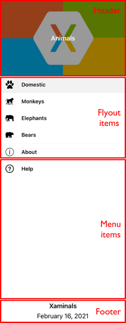
飛出視窗標題
飛出視窗標頭是選擇性出現在飛出視窗頂端的內容,其外觀是由 object 可以設定可繫結屬性的 Shell.FlyoutHeader 所定義:
<Shell ...>
    <Shell.FlyoutHeader>
        <controls:FlyoutHeader />
    </Shell.FlyoutHeader>
</Shell>
下列範例中會顯示 FlyoutHeader 型別:
<ContentView xmlns="http://xamarin.com/schemas/2014/forms"
             xmlns:x="http://schemas.microsoft.com/winfx/2009/xaml"
             x:Class="Xaminals.Controls.FlyoutHeader"
             HeightRequest="200">
    <Grid BackgroundColor="Black">
        <Image Aspect="AspectFill"
               Source="xamarinstore.jpg"
               Opacity="0.6" />
        <Label Text="Animals"
               TextColor="White"
               FontAttributes="Bold"
               HorizontalTextAlignment="Center"
               VerticalTextAlignment="Center" />
    </Grid>
</ContentView>
這會產生下列飛出視窗標題:
或者,將可系結屬性設定 Shell.FlyoutHeaderTemplate 為 DataTemplate,即可定義飛出視窗標頭外觀:
<Shell ...>
    <Shell.FlyoutHeaderTemplate>
        <DataTemplate>
            <Grid BackgroundColor="Black"
                  HeightRequest="200">
                <Image Aspect="AspectFill"
                       Source="xamarinstore.jpg"
                       Opacity="0.6" />
                <Label Text="Animals"
                       TextColor="White"
                       FontAttributes="Bold"
                       HorizontalTextAlignment="Center"
                       VerticalTextAlignment="Center" />
            </Grid>
        </DataTemplate>
    </Shell.FlyoutHeaderTemplate>
</Shell>
根據預設,飛出視窗標題將會固定在飛出視窗中,而如果有足夠的項目,以下內容就會捲動。 不過,透過將 Shell.FlyoutHeaderBehavior 可繫結屬性設定為其中一個 FlyoutHeaderBehavior 列舉成員,即可變更此行為:
Default:指出將使用平台的預設行為。 此為FlyoutHeaderBehavior屬性的預設值。Fixed:指出飛出視窗標題隨時都會維持可見且不變。Scroll:指出當使用者捲動項目時,飛出視窗標題會捲動到檢視之外。CollapseOnScroll:指出當使用者捲動項目時,飛出視窗標題會摺疊到只剩標題。
下列範例示範當使用者捲動時,如何摺疊飛出視窗標題:
<Shell ...
       FlyoutHeaderBehavior="CollapseOnScroll">
    ...
</Shell>
飛出視窗頁尾
飛出視窗頁尾是選擇性出現在飛出視窗底部的內容,其外觀是由 object 可以設定可系結屬性的 Shell.FlyoutFooter 所定義:
<Shell ...>
    <Shell.FlyoutFooter>
        <controls:FlyoutFooter />
    </Shell.FlyoutFooter>
</Shell>
下列範例中會顯示 FlyoutFooter 型別:
<ContentView xmlns="http://xamarin.com/schemas/2014/forms"
             xmlns:x="http://schemas.microsoft.com/winfx/2009/xaml"
             xmlns:sys="clr-namespace:System;assembly=netstandard"
             x:Class="Xaminals.Controls.FlyoutFooter">
    <StackLayout>
        <Label Text="Xaminals"
               TextColor="GhostWhite"
               FontAttributes="Bold"
               HorizontalOptions="Center" />
        <Label Text="{Binding Source={x:Static sys:DateTime.Now}, StringFormat='{0:MMMM dd, yyyy}'}"
               TextColor="GhostWhite"
               HorizontalOptions="Center" />
    </StackLayout>
</ContentView>
這會導致下列飛出視窗頁尾:

或者,將屬性設定 Shell.FlyoutFooterTemplate 為 DataTemplate,即可定義飛出視窗頁尾外觀:
<Shell ...>
    <Shell.FlyoutFooterTemplate>
        <DataTemplate>
            <StackLayout>
                <Label Text="Xaminals"
                       TextColor="GhostWhite"
                       FontAttributes="Bold"
                       HorizontalOptions="Center" />
                <Label Text="{Binding Source={x:Static sys:DateTime.Now}, StringFormat='{0:MMMM dd, yyyy}'}"
                       TextColor="GhostWhite"
                       HorizontalOptions="Center" />
            </StackLayout>
        </DataTemplate>
    </Shell.FlyoutFooterTemplate>
</Shell>
飛出視窗頁尾固定在飛出視窗底部,而且可以是任何高度。 此外,頁尾永遠不會遮蔽任何功能表項。
飛出視窗寬度和高度
飛出視窗的寬度和高度可以藉由將 和 Shell.FlyoutHeight 附加屬性設定Shell.FlyoutWidth為double值來自定義:
<Shell ...
       FlyoutWidth="400"
       FlyoutHeight="200">
    ...
</Shell>
這可讓跨整個螢幕展開飛出視窗,或減少飛出視窗的高度,使其不會遮蔽製表符等案例。
飛出視窗圖示
根據預設,Shell 應用程式有個漢堡圖示,按下圖示時,即會開啟飛出視窗。 透過將型別為 ImageSource 的 Shell.FlyoutIcon 可繫結屬性設定為適當的圖示,即可變更此圖示:
<Shell ...
       FlyoutIcon="flyouticon.png">
    ...
</Shell>
飛出視窗背景
飛出視窗的背景色彩可以使用可繫結屬性來設定 Shell.FlyoutBackgroundColor :
<Shell ...
       FlyoutBackgroundColor="AliceBlue">
    ...
</Shell>
注意
Shell.FlyoutBackgroundColor也可以從級聯樣式表 (CSS) 設定 。 如需詳細資訊,請參閱 Xamarin.Forms 殼層特定屬性。
或者,您可以將可繫結屬性設定 Shell.FlyoutBackground 為 Brush,以指定飛出視窗的背景:
<Shell ...
       FlyoutBackground="LightGray">
    ...
</Shell>
在此範例中,飛出視窗背景會以淺灰色 SolidColorBrush繪製。
下列範例顯示將飛出視窗背景設定為 LinearGradientBrush:
<Shell ...>
    <Shell.FlyoutBackground>
        <LinearGradientBrush StartPoint="0,0"
                             EndPoint="1,1">
            <GradientStop Color="#8A2387"
                          Offset="0.1" />
            <GradientStop Color="#E94057"
                          Offset="0.6" />
            <GradientStop Color="#F27121"
                          Offset="1.0" />
        </LinearGradientBrush>
    </Shell.FlyoutBackground>
    ...
</Shell>
如需筆刷的詳細資訊,請參閱 Xamarin.Forms 筆刷。
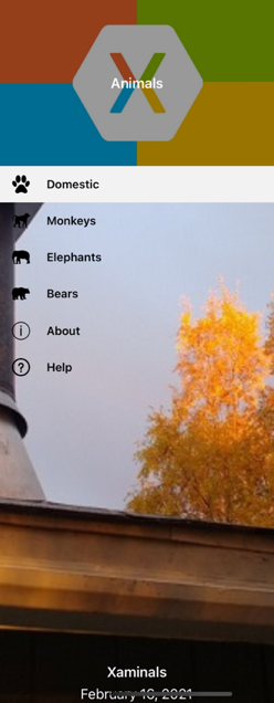
飛出視窗背景影像
飛出視窗可以有選擇性的背景影像,其會出現在飛出視窗標頭和飛出視窗專案、功能表項和飛出視窗頁尾下方。 將類型為 ImageSource 的 FlyoutBackgroundImage 可繫結屬性設定為檔案、內嵌資源、URI 或資料流,即可指定背景影像。
將類型為 Aspect 的 FlyoutBackgroundImageAspect 可繫結屬性設定為 Aspect 其中一個列舉成員,即可設定背景影像的外觀比例:
AspectFill- 裁剪影像使其填滿顯示區域,同時保留外觀比例。AspectFit- 視需要為影像加上上下黑邊,使影像與顯示區域相契合,並根據影像的寬度或高度,在上下左右新增空白空間。 此為FlyoutBackgroundImageAspect屬性的預設值。Fill- 完全自動縮放影像並剛好填滿顯示區域。 這可能會導致影像失真。
下列範例會示範如何設定這些屬性:
<Shell ...
       FlyoutBackgroundImage="photo.jpg"
       FlyoutBackgroundImageAspect="AspectFill">
    ...
</Shell>
這會在飛出視窗標頭下方顯示背景影像:
飛出視窗背景
飛出視窗的背景,這是飛出視窗重疊的外觀,可以藉由將附加屬性設定 Shell.FlyoutBackdrop 為 Brush來指定:
<Shell ...
       FlyoutBackdrop="Silver">
    ...
</Shell>
在此範例中,飛出視窗背景會以銀色 SolidColorBrush繪製。
重要
FlyoutBackdrop附加屬性可以在任何 Shell 元素上設定,但只會在、 FlyoutItem或 TabBar 物件上Shell設定時套用。
下列範例顯示將飛出視窗背景設定為 LinearGradientBrush:
<Shell ...>
    <Shell.FlyoutBackdrop>
        <LinearGradientBrush StartPoint="0,0"
                             EndPoint="1,1">
            <GradientStop Color="#8A2387"
                          Offset="0.1" />
            <GradientStop Color="#E94057"
                          Offset="0.6" />
            <GradientStop Color="#F27121"
                          Offset="1.0" />
        </LinearGradientBrush>
    </Shell.FlyoutBackdrop>
    ...
</Shell>
如需筆刷的詳細資訊,請參閱 Xamarin.Forms 筆刷。
飛出視窗行為
飛出視窗可透過漢堡圖示或從螢幕側邊撥動來存取。 不過,透過將 Shell.FlyoutBehavior 附加屬性設定為其中一個 FlyoutBehavior 列舉成員,即可變更此行為:
Disabled:指出使用者無法開啟飛出視窗。Flyout:指出使用者可以開啟和關閉飛出視窗。 這是FlyoutBehavior屬性的預設值。Locked:指出使用者無法關閉飛出視窗,而且它不會重疊內容。
下列範例示範如何停用飛出視窗:
<Shell ...
       FlyoutBehavior="Disabled">
    ...
</Shell>
注意
FlyoutBehavior 附加屬性可設定於 Shell、FlyoutItem、ShellContent 及頁面物件上,以覆寫預設的飛出視窗行為。
飛出視窗垂直捲動
根據預設,飛出視窗專案不符合飛出視窗時,可以垂直捲動飛出視窗。 將可系結屬性設定 Shell.FlyoutVerticalScrollMode 為其中 ScrollMode 一個列舉成員,即可變更此行為:
Disabled– 表示將會停用垂直捲動。Enabled– 表示將啟用垂直捲動。Auto– 表示如果飛出視窗專案不符合飛出視窗,則會啟用垂直捲動。 此為FlyoutVerticalScrollMode屬性的預設值。
下列範例示範如何停用垂直捲動:
<Shell ...
       FlyoutVerticalScrollMode="Disabled">
    ...
</Shell>
FlyoutItem 定位順序
根據預設,FlyoutItem 物件的定位順序會與其列在 XAML 中的順序或以程式設計方式新增至子集合的順序相同。 此順序為透過鍵盤巡覽 FlyoutItem 物件的順序,而這個預設順序通常也是最佳順序。
透過設定 FlyoutItem.TabIndex 屬性,即可變更預設定位順序,其會指定當使用者按下 Tab 鍵來巡覽項目時,FlyoutItem 物件接收焦點的順序。 屬性的預設值為 0,而且可以設定為任何 int 值。
在使用預設定位順序或設定 TabIndex 屬性時,會套用下列規則:
TabIndex等於 0 的FlyoutItem物件會根據其在 XAML 或子集合中的宣告順序新增至定位順序。TabIndex大於 0 的FlyoutItem物件則會根據其TabIndex值新增至定位順序。TabIndex小於 0 的FlyoutItem物件會新增至定位順序並顯示在任何零值之前。TabIndex的衝突由宣告順序來解決。
在定義定位順序之後,按下 Tab 鍵將會以遞增的 TabIndex 順序循環 FlyoutItem 物件的焦點,從開頭一直循環到最後一個物件。
除了設定 FlyoutItem 物件的定位順序,可能也需要從定位順序中排除一些物件。 上述作業可透過 FlyoutItem.IsTabStop 屬性來完成,其指出 TAB 導覽中是否包含 FlyoutItem。 其預設值為 true,而當其值為 false 時,不論是否設定 TabIndex,TAB 導覽基礎結構均會略過 FlyoutItem。
FlyoutItem 選取專案
第一次執行使用飛出視窗的 Shell 應用程式時,Shell.CurrentItem屬性會設定為子類別Shell化物件中的第一個FlyoutItem物件。 不過,您可以將屬性設定為另一個 FlyoutItem,如下列範例所示:
<Shell ...
       CurrentItem="{x:Reference aboutItem}">
    <FlyoutItem FlyoutDisplayOptions="AsMultipleItems">
        ...
    </FlyoutItem>
    <ShellContent x:Name="aboutItem"
                  Title="About"
                  Icon="info.png"
                  ContentTemplate="{DataTemplate views:AboutPage}" />
</Shell>
這個範例會將 CurrentItem 屬性設定為 ShellContent 名為 aboutItem的物件,這會導致它被選取並顯示。 在此範例中,隱含的轉換會用來將 ShellContent 物件包裝於 Tab 物件中,其包裝於 FlyoutItem 物件中。
指定名為aboutItem的物件時,對等的 ShellContent C# 程式代碼為:
CurrentItem = aboutItem;
在此範例中, CurrentItem 屬性是在子類別化 Shell 類別中設定。 或者, CurrentItem 屬性可以透過 Shell.Current 靜態屬性在任何類別中設定:
Shell.Current.CurrentItem = aboutItem;
注意
應用程式可能會進入選取飛出視窗專案不是有效作業的狀態。 在這種情況下, FlyoutItem 可以藉由將其 IsEnabled 屬性設定為 false來停用 。 這可防止用戶選取飛出窗口專案。
FlyoutItem 可見性
飛出視窗項目預設會顯示在飛出視窗中。 不過,專案可以使用 屬性隱藏在飛出視窗中,並使用 屬性從飛出視窗FlyoutItemIsVisibleIsVisible移除:
FlyoutItemIsVisible型bool別為 的 ,表示專案是否隱藏在飛出視窗中,但仍可使用GoToAsync導覽方法連線。 此屬性的預設值為true。IsVisible型bool別為 的 ,表示專案是否應該從可視化樹狀結構中移除,因此不會出現在飛出視窗中。 其預設值為true。
下列範例顯示隱藏飛出視窗中的專案:
<Shell ...>
    <FlyoutItem ...
                FlyoutItemIsVisible="False">
        ...
    </FlyoutItem>
</Shell>
注意
另外還有Shell.FlyoutItemIsVisible附加屬性,可以在、MenuItem、 Tab和 ShellContent 對象上FlyoutItem設定。
以程式設計方式開啟和關閉飛出視窗
飛出視窗可以透過程式設計方式開啟和關閉,方法是將可系結屬性設定 Shell.FlyoutIsPresented 為 boolean 值,指出飛出視窗目前是否開啟:
<Shell ...
       FlyoutIsPresented="{Binding IsFlyoutOpen}">
</Shell>
或者,這可以在程式代碼中執行:
Shell.Current.FlyoutIsPresented = false;