Note
Access to this page requires authorization. You can try signing in or changing directories.
Access to this page requires authorization. You can try changing directories.
This tutorial presents an end-to-end example of a Synapse Data Science workflow in Microsoft Fabric. The scenario builds a model to predict whether or not bank customers churn. The churn rate, or the rate of attrition, involves the rate at which bank customers end their business with the bank.
This tutorial covers these steps:
- Install custom libraries
- Load the data
- Understand and process the data through exploratory data analysis, and show the use of the Fabric Data Wrangler feature
- Use scikit-learn and LightGBM to train machine learning models, and track experiments with the MLflow and Fabric Autologging features
- Evaluate and save the final machine learning model
- Show the model performance with Power BI visualizations
Prerequisites
Get a Microsoft Fabric subscription. Or, sign up for a free Microsoft Fabric trial.
Sign in to Microsoft Fabric.
Switch to Fabric by using the experience switcher on the lower-left side of your home page.

- If necessary, create a Microsoft Fabric lakehouse as described in Create a lakehouse in Microsoft Fabric.
Follow along in a notebook
To follow along in a notebook, choose one of these options:
- Open and run the built-in notebook.
- Upload your notebook from GitHub.
Open the built-in notebook
The sample Customer churn notebook accompanies this tutorial.
To open the sample notebook for this tutorial, follow the instructions in Prepare your system for data science tutorials.
Make sure to attach a lakehouse to the notebook before you start running code.
Import the notebook from GitHub
The AIsample - Bank Customer Churn.ipynb notebook accompanies this tutorial.
To open the accompanying notebook for this tutorial, follow the instructions in Prepare your system for data science tutorials to import the notebook to your workspace.
If you'd rather copy and paste the code from this page, you can create a new notebook.
Be sure to attach a lakehouse to the notebook before you start running code.
Step 1: Install custom libraries
For machine learning model development or ad-hoc data analysis, you might need to quickly install a custom library for your Apache Spark session. You have two options to install libraries.
- Use the inline installation capabilities (
%pipor%conda) of your notebook to install a library, in your current notebook only. - Alternatively, create a Fabric environment. Install libraries from public sources or upload custom libraries to it. Your workspace admin can attach the environment as the default for the workspace. All the libraries in the environment become available for use in any notebooks and Spark job definitions in the workspace. For more information on environments, see create, configure, and use an environment in Microsoft Fabric.
For this tutorial, use %pip install to install the imblearn library in your notebook.
Note
The PySpark kernel restarts after %pip install runs. Install the needed libraries before you run any other cells.
# Use pip to install libraries
%pip install imblearn
Step 2: Load the data
The dataset in churn.csv contains the churn status of 10,000 customers, along with 14 attributes that include:
- Credit score
- Geographical location (Germany, France, Spain)
- Gender (male, female)
- Age
- Tenure (number of years the person was a customer at that bank)
- Account balance
- Estimated salary
- Number of products that a customer purchased through the bank
- Credit card status (whether or not a customer has a credit card)
- Active member status (whether or not the person is an active bank customer)
The dataset also includes row number, customer ID, and customer surname columns. Values in these columns shouldn't influence a customer's decision to leave the bank.
A customer bank account closure event defines the churn for that customer. The dataset Exited column refers to the customer's abandonment. Since you have little context about these attributes, you don't need background information about the dataset. You want to understand how these attributes contribute to the Exited status.
Out of those 10,000 customers, only 2,037 customers (roughly 20%) left the bank. Because of the class imbalance ratio, generate synthetic data. Confusion matrix accuracy might not have relevance for imbalanced classification. You might want to measure the accuracy using the Area Under the Precision-Recall Curve (AUPRC).
- This table shows a preview of the
churn.csvdata:
| CustomerID | Surname | CreditScore | Geography | Gender | Age | Tenure | Balance | NumOfProducts | HasCrCard | IsActiveMember | EstimatedSalary | Exited |
|---|---|---|---|---|---|---|---|---|---|---|---|---|
| 15634602 | Hargrave | 619 | France | Female | 42 | 2 | 0.00 | 1 | 1 | 1 | 101348.88 | 1 |
| 15647311 | Hill | 608 | Spain | Female | 41 | 1 | 83807.86 | 1 | 0 | 1 | 112542.58 | 0 |
Download the dataset and upload to the lakehouse
Define these parameters so that you can use this notebook with different datasets:
IS_CUSTOM_DATA = False  # If TRUE, the dataset has to be uploaded manually

IS_SAMPLE = False  # If TRUE, use only SAMPLE_ROWS of data for training; otherwise, use all data
SAMPLE_ROWS = 5000  # If IS_SAMPLE is True, use only this number of rows for training

DATA_ROOT = "/lakehouse/default"
DATA_FOLDER = "Files/churn"  # Folder with data files
DATA_FILE = "churn.csv"  # Data file name
This code downloads a publicly available version of the dataset, and then stores that dataset in a Fabric lakehouse:
Important
Before running the notebook, add a lakehouse. If you don't add a lakehouse, an error occurs.
import os, requests
if not IS_CUSTOM_DATA:
# With an Azure Synapse Analytics blob, this can be done in one line

# Download demo data files into the lakehouse if they don't exist
    remote_url = "https://synapseaisolutionsa.z13.web.core.windows.net/data/bankcustomerchurn"
    file_list = ["churn.csv"]
    download_path = "/lakehouse/default/Files/churn/raw"

    if not os.path.exists("/lakehouse/default"):
        raise FileNotFoundError(
            "Default lakehouse not found, please add a lakehouse and restart the session."
        )
    os.makedirs(download_path, exist_ok=True)
    for fname in file_list:
        if not os.path.exists(f"{download_path}/{fname}"):
            r = requests.get(f"{remote_url}/{fname}", timeout=30)
            with open(f"{download_path}/{fname}", "wb") as f:
                f.write(r.content)
    print("Downloaded demo data files into lakehouse.")
Start recording the time needed to run the notebook:
# Record the notebook running time
import time

ts = time.time()
Read raw data from the lakehouse
This code reads raw data from the Files section of the lakehouse, and adds more columns for different date parts. Creation of the partitioned delta table uses this information.
df = (
    spark.read.option("header", True)
    .option("inferSchema", True)
    .csv("Files/churn/raw/churn.csv")
    .cache()
)
Create a pandas DataFrame from the dataset
This code converts the Spark DataFrame to a pandas DataFrame, for easier processing and visualization:
df = df.toPandas()
Step 3: Perform exploratory data analysis
Display raw data
Explore the raw data by using display. Calculate some basic statistics, and show chart views. First, import the required libraries for data visualization - for example, seaborn. Seaborn is a Python data visualization library, and it provides a high-level interface to build visuals on dataframes and arrays.
import seaborn as sns
sns.set_theme(style="whitegrid", palette="tab10", rc = {'figure.figsize':(9,6)})
import matplotlib.pyplot as plt
import matplotlib.ticker as mticker
from matplotlib import rc, rcParams
import numpy as np
import pandas as pd
import itertools
display(df, summary=True)
Use Data Wrangler to perform initial data cleaning
Launch Data Wrangler directly from the notebook to explore and transform pandas dataframes. Select the Data Wrangler dropdown from the horizontal toolbar to browse the activated pandas DataFrames available for editing. Select the DataFrame you want to open in Data Wrangler.
Note
Data Wrangler can't be opened while the notebook kernel is busy. The cell execution must finish before you launch Data Wrangler. Learn more about Data Wrangler.

After Data Wrangler launches, it generates a descriptive overview of the data panel, as shown in the following images. The overview includes information about the dimension of the DataFrame, any missing values, and more. You can use Data Wrangler to generate the script to drop the rows with missing values, the duplicate rows, and the columns with specific names. Then, you can copy the script into a cell. The next cell shows that copied script.


def clean_data(df):
    # Drop rows with missing data across all columns
    df.dropna(inplace=True)
    # Drop duplicate rows in columns: 'RowNumber', 'CustomerId'
    df.drop_duplicates(subset=['RowNumber', 'CustomerId'], inplace=True)
    # Drop columns: 'RowNumber', 'CustomerId', 'Surname'
    df.drop(columns=['RowNumber', 'CustomerId', 'Surname'], inplace=True)
    return df

df_clean = clean_data(df.copy())
Determine attributes
This code determines the categorical, numerical, and target attributes:
# Determine the dependent (target) attribute
dependent_variable_name = "Exited"
print(dependent_variable_name)
# Determine the categorical attributes
categorical_variables = [col for col in df_clean.columns if col in "O"
                        or df_clean[col].nunique() <=5
                        and col not in "Exited"]
print(categorical_variables)
# Determine the numerical attributes
numeric_variables = [col for col in df_clean.columns if df_clean[col].dtype != "object"
                        and df_clean[col].nunique() >5]
print(numeric_variables)
Show the five-number summary
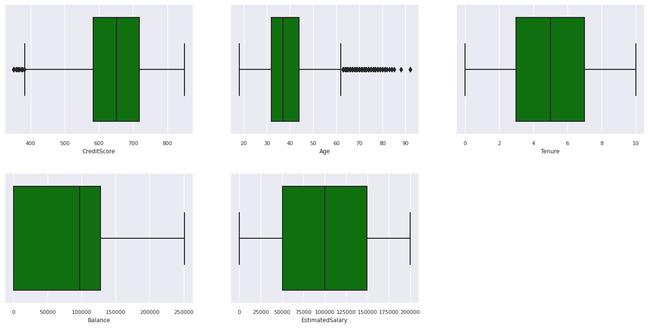
Use box plots to show the five-number summary
- the minimum score
- first quartile
- median
- third quartile
- maximum score
for the numerical attributes.
df_num_cols = df_clean[numeric_variables]
sns.set(font_scale = 0.7)
fig, axes = plt.subplots(nrows = 2, ncols = 3, gridspec_kw =  dict(hspace=0.3), figsize = (17,8))
fig.tight_layout()
for ax,col in zip(axes.flatten(), df_num_cols.columns):
    sns.boxplot(x = df_num_cols[col], color='green', ax = ax)
# fig.suptitle('visualize and compare the distribution and central tendency of numerical attributes', color = 'k', fontsize = 12)
fig.delaxes(axes[1,2])
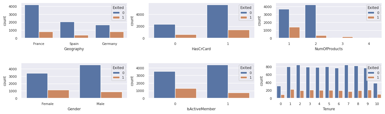
Show the distribution of exited and non-exited customers
Show the distribution of exited versus non-exited customers, across the categorical attributes:
attr_list = ['Geography', 'Gender', 'HasCrCard', 'IsActiveMember', 'NumOfProducts', 'Tenure']
fig, axarr = plt.subplots(2, 3, figsize=(15, 4))
for ind, item in enumerate (attr_list):
    sns.countplot(x = item, hue = 'Exited', data = df_clean, ax = axarr[ind%2][ind//2])
fig.subplots_adjust(hspace=0.7)
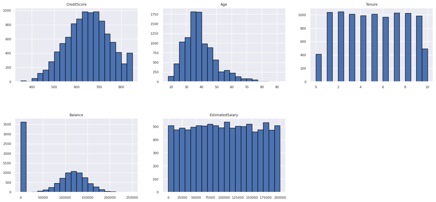
Show the distribution of numerical attributes
Use a histogram to show the frequency distribution of numerical attributes:
columns = df_num_cols.columns[: len(df_num_cols.columns)]
fig = plt.figure()
fig.set_size_inches(18, 8)
length = len(columns)
for i,j in itertools.zip_longest(columns, range(length)):
    plt.subplot((length // 2), 3, j+1)
    plt.subplots_adjust(wspace = 0.2, hspace = 0.5)
    df_num_cols[i].hist(bins = 20, edgecolor = 'black')
    plt.title(i)
# fig = fig.suptitle('distribution of numerical attributes', color = 'r' ,fontsize = 14)
plt.show()
Perform feature engineering
This feature engineering generates new attributes based on the current attributes:
df_clean["NewTenure"] = df_clean["Tenure"]/df_clean["Age"]
df_clean["NewCreditsScore"] = pd.qcut(df_clean['CreditScore'], 6, labels = [1, 2, 3, 4, 5, 6])
df_clean["NewAgeScore"] = pd.qcut(df_clean['Age'], 8, labels = [1, 2, 3, 4, 5, 6, 7, 8])
df_clean["NewBalanceScore"] = pd.qcut(df_clean['Balance'].rank(method="first"), 5, labels = [1, 2, 3, 4, 5])
df_clean["NewEstSalaryScore"] = pd.qcut(df_clean['EstimatedSalary'], 10, labels = [1, 2, 3, 4, 5, 6, 7, 8, 9, 10])
Use Data Wrangler to perform one-hot encoding
Use the same steps to launch Data Wrangler, as discussed earlier. Use Data Wrangler to perform one-hot encoding. This cell shows the copied generated script for one-hot encoding:


df_clean = pd.get_dummies(df_clean, columns=['Geography', 'Gender'])
Create a delta table to generate the Power BI report
table_name = "df_clean"
# Create a PySpark DataFrame from pandas
sparkDF=spark.createDataFrame(df_clean)
sparkDF.write.mode("overwrite").format("delta").save(f"Tables/{table_name}")
print(f"Spark DataFrame saved to delta table: {table_name}")
Summary of observations from the exploratory data analysis
- Most of the customers are from France. Spain has the lowest churn rate, compared to France and Germany.
- Most customers have credit cards.
- Some customers are both over the age of 60 and have credit scores below 400. However, they aren't considered as outliers.
- Very few customers have more than two bank products.
- Inactive customers have a higher churn rate.
- Gender and tenure years have little impact on a customer's decision to close a bank account.
Step 4: Perform model training and tracking
With the data in place, you can now define the model. Apply random forest and LightGBM models in this notebook.
Use the scikit-learn and LightGBM libraries to implement the models, with a few lines of code. Additionally, use MLfLow and Fabric Autologging to track the experiments.
This code sample loads the delta table from the lakehouse. You can use other delta tables that themselves use the lakehouse as the source.
SEED = 12345
df_clean = spark.read.format("delta").load("Tables/df_clean").toPandas()
Generate an experiment for tracking and logging the models by using MLflow
This section shows how to generate an experiment, and it specifies the model and training parameters and the scoring metrics. Additionally, it shows how to train the models, log them, and save the trained models for later use.
import mlflow

# Set up the experiment name
EXPERIMENT_NAME = "sample-bank-churn-experiment"  # MLflow experiment name
Autologging automatically captures both the input parameter values and the output metrics of a machine learning model, as that model is trained. This information is then logged to your workspace, where the MLflow APIs or the corresponding experiment in your workspace can access and visualize it.
When complete, your experiment resembles this image:

All the experiments with their respective names are logged, and you can track their parameters and performance metrics. To learn more about autologging, see Autologging in Microsoft Fabric.
Set experiment and autologging specifications
mlflow.set_experiment(EXPERIMENT_NAME) # Use a date stamp to append to the experiment
mlflow.autolog(exclusive=False)
Import scikit-learn and LightGBM
# Import the required libraries for model training
from sklearn.model_selection import train_test_split
from lightgbm import LGBMClassifier
from sklearn.ensemble import RandomForestClassifier
from sklearn.metrics import accuracy_score, f1_score, precision_score, confusion_matrix, recall_score, roc_auc_score, classification_report
Prepare training and test datasets
y = df_clean["Exited"]
X = df_clean.drop("Exited",axis=1)
# Train/test separation
X_train, X_test, y_train, y_test = train_test_split(X, y, test_size=0.20, random_state=SEED)
Apply SMOTE to the training data
Imbalanced classification has a problem: it has too few examples of the minority class for a model to effectively learn the decision boundary. To handle this problem, the most widely used technique is the Synthetic Minority Oversampling Technique (SMOTE), which synthesizes new samples for the minority class. Access SMOTE by using the imblearn library that you installed in step 1.
Apply SMOTE only to the training dataset. Leave the test dataset in its original imbalanced distribution, so you get a valid approximation of model performance on the original data. This experiment represents the situation in production.
from collections import Counter
from imblearn.over_sampling import SMOTE

sm = SMOTE(random_state=SEED)
X_res, y_res = sm.fit_resample(X_train, y_train)
new_train = pd.concat([X_res, y_res], axis=1)
For more information, see SMOTE and From random over-sampling to SMOTE and ADASYN. The imbalanced-learn website hosts these resources.
Train the model
Use Random Forest to train the model, with a maximum depth of four, and with four features:
mlflow.sklearn.autolog(registered_model_name='rfc1_sm')  # Register the trained model with autologging
rfc1_sm = RandomForestClassifier(max_depth=4, max_features=4, min_samples_split=3, random_state=1) # Pass hyperparameters
with mlflow.start_run(run_name="rfc1_sm") as run:
    rfc1_sm_run_id = run.info.run_id # Capture run_id for model prediction later
    print("run_id: {}; status: {}".format(rfc1_sm_run_id, run.info.status))
    # rfc1.fit(X_train,y_train) # Imbalanced training data
    rfc1_sm.fit(X_res, y_res.ravel()) # Balanced training data
    rfc1_sm.score(X_test, y_test)
    y_pred = rfc1_sm.predict(X_test)
    cr_rfc1_sm = classification_report(y_test, y_pred)
    cm_rfc1_sm = confusion_matrix(y_test, y_pred)
    roc_auc_rfc1_sm = roc_auc_score(y_res, rfc1_sm.predict_proba(X_res)[:, 1])
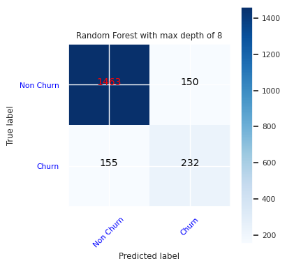
Use Random Forest to train the model, with a maximum depth of eight, and with six features:
mlflow.sklearn.autolog(registered_model_name='rfc2_sm')  # Register the trained model with autologging
rfc2_sm = RandomForestClassifier(max_depth=8, max_features=6, min_samples_split=3, random_state=1) # Pass hyperparameters
with mlflow.start_run(run_name="rfc2_sm") as run:
    rfc2_sm_run_id = run.info.run_id # Capture run_id for model prediction later
    print("run_id: {}; status: {}".format(rfc2_sm_run_id, run.info.status))
    # rfc2.fit(X_train,y_train) # Imbalanced training data
    rfc2_sm.fit(X_res, y_res.ravel()) # Balanced training data
    rfc2_sm.score(X_test, y_test)
    y_pred = rfc2_sm.predict(X_test)
    cr_rfc2_sm = classification_report(y_test, y_pred)
    cm_rfc2_sm = confusion_matrix(y_test, y_pred)
    roc_auc_rfc2_sm = roc_auc_score(y_res, rfc2_sm.predict_proba(X_res)[:, 1])
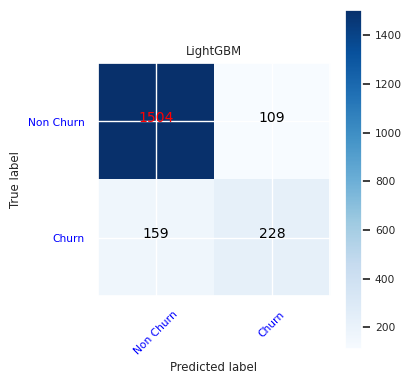
Train the model with LightGBM:
# lgbm_model
mlflow.lightgbm.autolog(registered_model_name='lgbm_sm')  # Register the trained model with autologging
lgbm_sm_model = LGBMClassifier(learning_rate = 0.07,
                        max_delta_step = 2,
                        n_estimators = 100,
                        max_depth = 10,
                        eval_metric = "logloss",
                        objective='binary',
                        random_state=42)

with mlflow.start_run(run_name="lgbm_sm") as run:
    lgbm1_sm_run_id = run.info.run_id # Capture run_id for model prediction later
    # lgbm_sm_model.fit(X_train,y_train) # Imbalanced training data
    lgbm_sm_model.fit(X_res, y_res.ravel()) # Balanced training data
    y_pred = lgbm_sm_model.predict(X_test)
    accuracy = accuracy_score(y_test, y_pred)
    cr_lgbm_sm = classification_report(y_test, y_pred)
    cm_lgbm_sm = confusion_matrix(y_test, y_pred)
    roc_auc_lgbm_sm = roc_auc_score(y_res, lgbm_sm_model.predict_proba(X_res)[:, 1])
View the experiment artifact to track model performance
The experiment runs are automatically saved in the experiment artifact. You can find the artifact in the workspace. The artifact name is based on the experiment name. The experiment page logs all of the trained models, their runs, performance metrics, and model parameters.
To view your experiments:
- On the left panel, select your workspace.
- Find and select the experiment name, in this case, sample-bank-churn-experiment.
Step 5: Evaluate and save the final machine learning model
Open the saved experiment from the workspace to select and save the best model:
# Define run_uri to fetch the model
# MLflow client: mlflow.model.url, list model
load_model_rfc1_sm = mlflow.sklearn.load_model(f"runs:/{rfc1_sm_run_id}/model")
load_model_rfc2_sm = mlflow.sklearn.load_model(f"runs:/{rfc2_sm_run_id}/model")
load_model_lgbm1_sm = mlflow.lightgbm.load_model(f"runs:/{lgbm1_sm_run_id}/model")
Assess the performance of the saved models on the test dataset
ypred_rfc1_sm = load_model_rfc1_sm.predict(X_test) # Random forest with maximum depth of 4 and 4 features
ypred_rfc2_sm = load_model_rfc2_sm.predict(X_test) # Random forest with maximum depth of 8 and 6 features
ypred_lgbm1_sm = load_model_lgbm1_sm.predict(X_test) # LightGBM
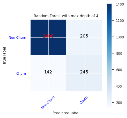
Show true/false positives/negatives by using a confusion matrix
To evaluate the accuracy of the classification, build a script that plots the confusion matrix. You can also plot a confusion matrix using SynapseML tools, as shown in the Fraud Detection sample.
def plot_confusion_matrix(cm, classes,
                          normalize=False,
                          title='Confusion matrix',
                          cmap=plt.cm.Blues):
    print(cm)
    plt.figure(figsize=(4,4))
    plt.rcParams.update({'font.size': 10})
    plt.imshow(cm, interpolation='nearest', cmap=cmap)
    plt.title(title)
    plt.colorbar()
    tick_marks = np.arange(len(classes))
    plt.xticks(tick_marks, classes, rotation=45, color="blue")
    plt.yticks(tick_marks, classes, color="blue")

    fmt = '.2f' if normalize else 'd'
    thresh = cm.max() / 2.
    for i, j in itertools.product(range(cm.shape[0]), range(cm.shape[1])):
        plt.text(j, i, format(cm[i, j], fmt),
                 horizontalalignment="center",
                 color="red" if cm[i, j] > thresh else "black")

    plt.tight_layout()
    plt.ylabel('True label')
    plt.xlabel('Predicted label')
Create a confusion matrix for the random forest classifier, with a maximum depth of four, with four features:
cfm = confusion_matrix(y_test, y_pred=ypred_rfc1_sm)
plot_confusion_matrix(cfm, classes=['Non Churn','Churn'],
                      title='Random Forest with max depth of 4')
tn, fp, fn, tp = cfm.ravel()
Create a confusion matrix for the random forest classifier with maximum depth of eight, with six features:
cfm = confusion_matrix(y_test, y_pred=ypred_rfc2_sm)
plot_confusion_matrix(cfm, classes=['Non Churn','Churn'],
                      title='Random Forest with max depth of 8')
tn, fp, fn, tp = cfm.ravel()
Create a confusion matrix for LightGBM:
cfm = confusion_matrix(y_test, y_pred=ypred_lgbm1_sm)
plot_confusion_matrix(cfm, classes=['Non Churn','Churn'],
                      title='LightGBM')
tn, fp, fn, tp = cfm.ravel()
Save results for Power BI
Save the delta frame to the lakehouse, to move the model prediction results to a Power BI visualization.
df_pred = X_test.copy()
df_pred['y_test'] = y_test
df_pred['ypred_rfc1_sm'] = ypred_rfc1_sm
df_pred['ypred_rfc2_sm'] =ypred_rfc2_sm
df_pred['ypred_lgbm1_sm'] = ypred_lgbm1_sm
table_name = "df_pred_results"
sparkDF=spark.createDataFrame(df_pred)
sparkDF.write.mode("overwrite").format("delta").option("overwriteSchema", "true").save(f"Tables/{table_name}")
print(f"Spark DataFrame saved to delta table: {table_name}")
Step 6: Access visualizations in Power BI
Access your saved table in Power BI:
- On the left, select OneLake.
- Select the lakehouse that you added to this notebook.
- In the Open this Lakehouse section, select Open.
- On the ribbon, select New semantic model. Select
df_pred_results, and then select Confirm to create a new Power BI semantic model linked to the predictions. - Open new semantic model. You can find it in OneLake.
- Select Create New report under file from the tools at the top of the semantic models page, to open the Power BI report authoring page.
The following screenshot shows some example visualizations. The data panel shows the delta tables and columns to select from a table. After selection of appropriate category (x) and value (y) axis, you can choose the filters and functions - for example, sum or average of the table column.
Note
In this screenshot, the illustrated example describes the analysis of the saved prediction results in Power BI:

However, for a real customer churn use case, the user might need a more thorough set of requirements of the visualizations to create, based on subject matter expertise, and what the firm and business analytics team and firm have standardized as metrics.
The Power BI report shows that customers who use more than two of the bank products have a higher churn rate. However, few customers had more than two products. (See the plot in the bottom left panel.) The bank should collect more data, but should also investigate other features that correlate with more products.
Bank customers in Germany have a higher churn rate compared to customers in France and Spain. (See the plot in the bottom right panel). Based on the report results, an investigation into the factors that encouraged customers to leave might help.
There are more middle-aged customers (between 25 and 45). Customers between 45 and 60 tend to exit more.
Finally, customers with lower credit scores would most likely leave the bank for other financial institutions. The bank should explore ways to encourage customers with lower credit scores and account balances to stay with the bank.
# Determine the entire runtime
print(f"Full run cost {int(time.time() - ts)} seconds.")