View predefined 3D shapes in mixed reality
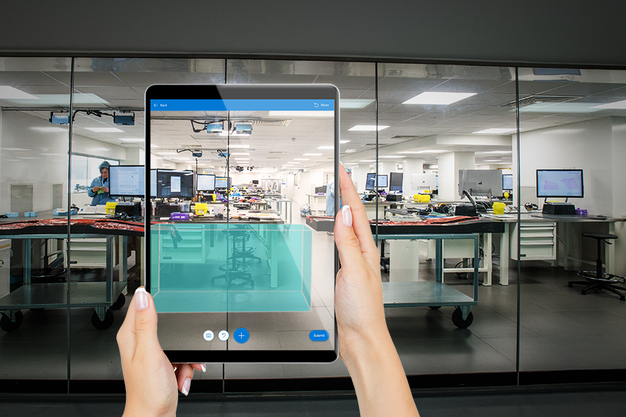
Use the View shape in MR control in a canvas app to see whether a digital cube of a given size fits in a real-world space. (To compare a 3D model of an object instead, use the View in MR control.)
The View shape in MR control adds a button to your app. When a user selects the button, the app overlays a cube on the device camera feed. The cube's dimensions are set as a property on the control when you author the app in Microsoft Power Apps Studio. Users may not change the size of the cube while they use the app.
Tip
The mixed-reality (MR) controls work best in well-lit environments with flat-textured surfaces. Tracking is better on LIDAR-enabled devices.
Tip
The MR controls in Power Apps use Babylon and Babylon React Native. Mixed reality content that works in the Babylon sandbox should work in Power Apps through this shared MR platform. If your content works in Babylon but not in Power Apps, ask a question in the Power Apps Community Forum. (Tag it with "mixed reality.")
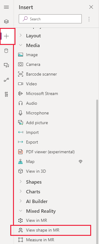
Add a View shape in MR button to an app screen
With your app open for editing in Power Apps Studio:
- Open the Insert tab and expand Mixed Reality.
- Select View shape in MR to place the control in the app screen, or drag the control to the screen to position it more precisely.
The control is a button that's labeled with an icon of a cube and the text Place a cube. Change the label and hide the icon if you like in the Text and Display type properties.
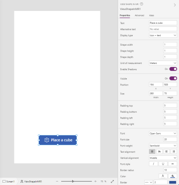
Properties
Change the View shape in MR button's behavior and appearance using properties. Some properties are only available on the Advanced tab.
| Property | Description | Type | Location |
|---|---|---|---|
| Text | Sets the button label text. | String | Properties; Advanced: Text |
| Alternative text | Specifies the text to be displayed if the model can't load or if the user hovers over the model. | String | Properties; Advanced: AltText |
| Display type | Determines whether the button label shows an icon of a cube, text, or both. | Drop-down selection | Properties; Advanced: DisplayType |
| Shape width | Sets the width of the cube. | Integer | Properties; Advanced: ShapeWidth |
| Shape height | Sets the height of the cube. | Integer | Properties; Advanced: ShapeHeight |
| Shape depth | Sets the depth of the cube. | Integer | Properties; Advanced: ShapeDepth |
| Unit of measurement | Sets the measurement unit used for the cube's width, height, and depth. | Drop-down selection | Properties; Advanced: Units |
| Enable Shadows | Determines whether shadows are used to enhance the 3D effect when the cube is shown. | Boolean | Properties; Advanced: EnableShadows |
| Enable Marker Detection | Determines whether marker detection will be used to to determine model position and rotation. See Use marker detection with mixed reality controls | Boolean | Properties; Advanced: EnableMarkerDetection |
| Visible | Shows or hides the button. | Boolean | Properties; Advanced: Visible |
| Position | Places the upper-left corner of the button at the screen coordinates specified in x and y. | Floating point number | Properties; Advanced: X, Y |
| Size | Determines the size of the button using the pixel values provided in Width and Height. | Integer | Properties; Advanced: Width, Height |
| Padding top | Sets the distance between the button label text and the top of the button. | Floating point number | Properties; Advanced: PaddingTop |
| Padding bottom | Sets the distance between the button label text and the bottom of the button. | Floating point number | Properties; Advanced: PaddingBottom |
| Padding left | Sets the distance between the button label text and the left edge of the button. | Floating point number | Properties; Advanced: PaddingLeft |
| Padding right | Sets the distance between the button label text and the right edge of the button. | Floating point number | Properties; Advanced: PaddingRight |
| Font | Sets the name of the family of fonts used for the button label text. | Dropdown list | Properties; Advanced: Font |
| Font size | Sets the size of the button label text. | Floating point number | Properties; Advanced: FontSize |
| Font weight | Sets the weight of the button label text, either Bold, Lighter, Normal, or Semibold. | Dropdown list | Properties; Advanced: FontWeight |
| Text alignment | Sets the horizontal alignment of the label text in the button, either Center, Justify, Left, or Right. | Not applicable | Properties; Advanced: TextAlignment |
| Vertical alignment | Sets the vertical alignment of the label text in the button, either Bottom, Middle, or Top. | Dropdown list | Properties; Advanced: VerticalAlign |
| Font style | Sets the style of the button label text, either Italic, Underline, Strikethrough, or none. | Not applicable | Properties; Advanced: Italic, Underline, Strikethrough |
| Border radius | Determines the corner radius of the button border. | Floating point number | Properties; Advanced: BorderRadius |
| Color | Sets the colors of the button label text and the button background. | Not applicable | Properties; Advanced: FillColor, TextColor |
| Border | Determines the style, width, and color of the button border. | Not applicable | Properties; Advanced: BorderStyle, BorderThickness, BorderFillColor |
| Disabled | Turns off the button but leaves it visible. | Boolean | Properties; Advanced: Disabled |
| Disabled color | Sets the colors of the button label text, the button background, and the button border if DisplayMode is Disabled. | Not applicable | Properties; Advanced: DisabledContentColor, DisabledFillColor, DisabledBorderColor |
| Pressed color | Sets the colors of the button label text, the button background, and the button border when the user selects the button. | Not applicable | Properties; Advanced: PressedContentColor, PressedFillColor, PressedBorderColor |
| Hover color | Sets the colors of the button label text, the button background, and the button border when the user hovers the mouse pointer over it. | Not applicable | Properties; Advanced: HoverContentColor, HoverFillColor, HoverBorderColor |
| OnMixedRealitySelect | Behavior that is triggered when user selects the button to launch into the mixed reality experience. | Defined action | Advanced |
| OnChange | Behavior that is triggered when any property on the button is changed. This is a common property across multiple controls. | Defined action | Advanced |
| Tooltip | Determines the text to display when the user hovers over the button. | String | Advanced |
| ContentLanguage | Determines the display language of the button label, if it's different from the language used in the app. | String | Advanced |
| DisplayMode | Determines whether the button allows user input (Edit), only displays data (View), or is disabled (Disabled). | Enum | Advanced |
| TabIndex | Specifies the order the button is selected if the user navigates the app using the Tab key. | Integer | Properties; Advanced: TabIndex |
Output properties
Your app can make use of more properties when a user interacts with the View shape in MR control. These are known as output properties. You can use these properties in other controls or to customize the app experience.
| Property | Description | Type |
|---|---|---|
| Photos | Collects the photos captured during the mixed reality session. You can upload the mixed-reality photos to OneDrive and show them in a gallery. | Not applicable |
Other mixed reality controls
- View 3D content with the 3D object control.
- View images and 3D content in the real world with the View in mixed reality control.
- Measure distance, area, and volume with the Measure in mixed reality control.
- Paint 3D lines or draw 3D arrows to specify an area or asset in your environment with the Markup in MR control.