events
Microsoft 365 Community Conference
5月6日 14時 - 5月9日 0時
5 月 6 日から 8 日にラスベガスで開催される、コミュニティ主導の究極の Microsoft 365 イベントで AI の時代に向けてスキルアップします。
詳細情報このブラウザーはサポートされなくなりました。
Microsoft Edge にアップグレードすると、最新の機能、セキュリティ更新プログラム、およびテクニカル サポートを利用できます。
The SharePoint Framework (SPFx) v1.20 release introduced a new option to use HTML to render the Viva Connection Adaptive Card Extension (ACE) Quick Views. This enables more advanced user experiences. You can even use whatever suitable JavaScript web framework you prefer (ie: React etc.) in your Quick View experiences.
You can start using this option by updating your Quick View implementation to be inherited from xxx class, which will be automatically detected by the underlying platform.
重要
This tutorial assumes you have installed the SPFx v1.20. For more information on installing the SPFx v1.20, see SharePoint Framework v1.20 release notes.
Create a new project directory for your project and change your current folder to that directory.
Create a new project by running the Yeoman SharePoint Generator from within the new directory you created:
yo @microsoft/sharepoint
When prompted, enter the following values (select the default option for all prompts omitted below):
At this point, Yeoman installs the required dependencies and scaffolds the solution files. This process might take few minutes.
Before digging into the code, run the scaffolded output and see what an Adaptive Card Extension looks like.
The inner development loop with ACEs is similar to SPFx Web Parts. We can serve locally and run the code on the SharePoint Online hosted workbench.
gulp serve
Once local web server is running, navigate to the hosted Workbench: https://{tenant}.sharepoint.com/_layouts/15/workbench.aspx
Open the Web Part Toolbox and select your ACE.
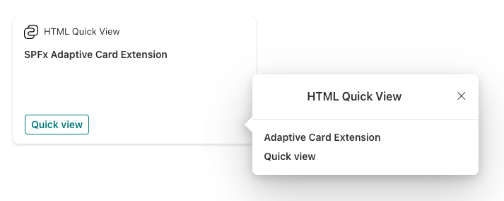
Once added to the page, select the Preview link in the top-right area of the workbench to interact with the ACE. Next, select the Quick View button. This will open the default Adaptive Card implementation of the Quick View defined in the src/adaptiveCardExtensions/htmlQuickView/quickView/template/QuickViewTemplate.json file:
With the ACE project created and working, let's now update to use an HTML rendering instead of using the included Adaptive Card.
Start by adding the welcome light image from a default web part project:
Create a new folder assets within the existing quickView folder.
Add the welcome-light.png file to this folder.
注意
You can use any image in this tutorial, or you can find the image in the sample project accompanying this tutorial: Sample: HTML Quick View demo.
To be sure you won't use the default Adaptive Card template for the Quick View, delete the following file from the project: ./src/adaptiveCardExtensions/htmlQuickView/quickView/template/QuickViewTemplate.json
Now you'll make a few changes to the project to add a stylesheet to the project. This will simplify formatting the content in the HTML rendering that you'll add.
Install the SPFx Fluent UI core library into the project that we'll use to apply some styles to our project.
From the console, run the following command in the root of the project:
npm install @microsoft/sp-office-ui-fabric-core@{{REPLACE_VERSION}} --save-prod --save-exact
重要
Before running this command, check the version of the @microsoft/sp-core-library package in the project's package.json file. Replace the {{REPLACE_VERSION}} in the previous command with the version of the @microsoft/sp-core-library. This is to ensure you're using the same version of all SPFx libraries in your project.
Add a new style sheet to the project, QuickView.module.scss in the same folder as the QuickView.ts file and add the following code that you'll use in the HTML rendering:
@import '~@microsoft/sp-office-ui-fabric-core/dist/sass/SPFabricCore.scss';

.helloWorld {
  overflow: hidden;
  padding: 1em;
  color: "[theme:bodyText, default: #323130]";
  color: var(--bodyText);
  &.teams {
    font-family: $ms-font-family-fallbacks;
  }
}

.welcome {
  text-align: center;
}

.welcomeImage {
  width: 100%;
  max-width: 420px;
}

.links {
  a {
    text-decoration: none;
    color: "[theme:link, default:#03787c]";
    color: var(--link); // note: CSS Custom Properties support is limited to modern browsers only

    &:hover {
      text-decoration: underline;
      color: "[theme:linkHovered, default: #014446]";
      color: var(--linkHovered); // note: CSS Custom Properties support is limited to modern browsers only
    }
  }
}
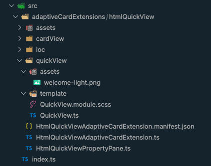
At this point, your ACE component should look similar to the following with the new files added and after removing the default Adaptive Card:
The last step is to update the Quick View component to import the style sheet and use HTML for the rendering instead of the Adaptive Card.
Locate and open the ./src/adaptiveCardExtensions/htmlQuickView/quickView/QuickView.ts file.
Update the import statement for the ACE base component. Locate the following line at the top of the file:
import { ISPFxAdaptiveCard, BaseAdaptiveCardQuickView } from '@microsoft/sp-adaptive-card-extension-base';
Replace this line with the following line:
import { BaseWebQuickView } from '@microsoft/sp-adaptive-card-extension-base';
Add the following two import statements after the existing import statements:
import { escape } from '@microsoft/sp-lodash-subset';
import styles from './QuickView.module.scss';
Locate the QuickView class declaration and change the base class it extends from the following:
export class QuickView extends BaseWebQuickView<
  IHtmlQuickViewAdaptiveCardExtensionProps,
  IHtmlQuickViewAdaptiveCardExtensionState,
  IQuickViewData
> {
... to the following:
export class QuickView extends BaseWebQuickView<
  IHtmlQuickViewAdaptiveCardExtensionProps,
  IHtmlQuickViewAdaptiveCardExtensionState
> {
Remove the existing template() method from the QuickView class.
Add the following render() method to the QuickView class to render the Quick View using HTML:
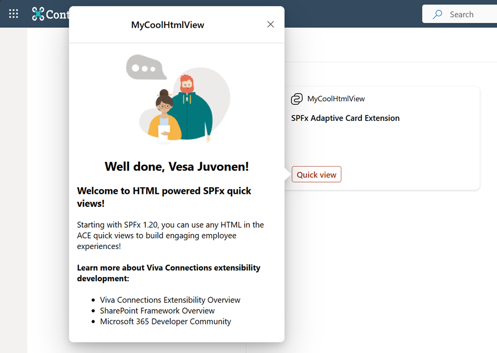
render(): void {
  this.domElement.innerHTML = `
    <section class="${styles.helloWorld}">
      <div class="${styles.welcome}">
        <img alt="" src="${require('./assets/welcome-light.png')}" class="${styles.welcomeImage}" />
        <h2>Well done, ${escape(this.context.pageContext.user.displayName)}!</h2>
      </div>
      <div>
        <h3>Welcome to HTML powered SPFx Quick Views!</h3>
        <p>
        Starting with SPFx 1.20, you can use any HTML in the ACE Quick Views to build engaging employee experiences!
        </p>
        <h4>Learn more about Viva Connections extensibility development:</h4>
          <ul class="${styles.links}">
            <li><a href="https://aka.ms/spfx" target="_blank">Viva Connections Extensibility Overview</a></li>
            <li><a href="https://aka.ms/spfx" target="_blank">SharePoint Framework Overview</a></li>

            <li><a href="https://aka.ms/m365pnp" target="_blank">Microsoft 365 Developer Community</a></li>
          </ul>
      </div>
    </section>`;
}
With all the changes now applied, retest solution in the hosted workbench to see the new HTML enabled Quick View:
events
Microsoft 365 Community Conference
5月6日 14時 - 5月9日 0時
5 月 6 日から 8 日にラスベガスで開催される、コミュニティ主導の究極の Microsoft 365 イベントで AI の時代に向けてスキルアップします。
詳細情報