WPF 概觀
Windows Presentation Foundation (WPF) 可讓您建立具有豐富視覺效果之使用者介面的 Windows 桌面用戶端應用程式。
WPF 的核心是與解析度無關並以向量為基礎的轉譯引擎,其建置目的是為了利用現代化圖形硬體。 WPF 利用一組完整的應用程式開發功能來擴充核心,包括 Extensible Application Markup Language (XAML)、控制項、資料繫結、版面配置、2D 和 3D 圖形、動畫、樣式、範本、文件、媒體、文字,以及印刷樣式。 WPF 是 .NET 的一部分,因此您可以建置能納入 .NET API 其他元素的應用程式。
本概觀適用於初學者,內容涵蓋 WPF 的主要功能和概念。
使用 WPF 的程式
WPF 是以 .NET 類型的子集來表示,這些類型大部分位於 System.Windows 命名空間中。 如果您之前曾使用 ASP.NET 和 Windows Forms 等受控技術來搭配 .NET 建置應用程式,便應該很熟悉基本 WPF 程式設計功能;您可以具現化類別、設定屬性、呼叫方法,以及處理事件;這些工作都可以透過您最愛的 .NET 程式設計語言 (例如 C# 或 Visual Basic) 來完成。
WPF 包含可增強屬性和事件的額外程式設計建構: 相依性屬性 和 路由事件。
標記和程式碼後置
WPF 可讓您使用「標記」和「程式碼後置」來開發應用程式,這是 ASP.NET 開發人員應該很熟悉的功能。 您通常會使用 XAML 標記來實作應用程式的外觀,同時使用 Managed 程式設計語言 (程式碼後置) 來實作其行為。 將外觀與行為區隔開來的優點如下:
由於外觀特定標記未與行為特定程式碼緊密結合,因此可降低開發和維護成本。
由於實作應用程式外觀的設計人員可以與實作應用程式行為的設計人員同時進行,因此開發作業會更有效率。
WPF 應用程式的全球化和當地語系化 已經過簡化。
加成
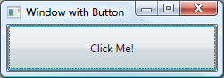
XAML 是以宣告方式來實作應用程式外觀的 XML 標記語言。 您通常可以使用它來建立視窗、對話方塊、頁面和使用者控制項,並填入控制項、圖案和圖形。
下列範例使用 XAML 來實作包含單一按鈕的視窗外觀:
<Window
    xmlns="http://schemas.microsoft.com/winfx/2006/xaml/presentation"
    Title="Window with Button"
    Width="250" Height="100">

  <!-- Add button to window -->
  <Button Name="button">Click Me!</Button>

</Window>
具體而言,這個 XAML 會分別使用 Window 和 Button 項目來定義一個視窗和一個按鈕。 每個項目都會透過屬性進行設定,例如 Window 項目的 Title 屬性可指定視窗的標題列文字。 在執行階段,WPF 會將標記中定義的項目和屬性轉換成 WPF 類別的執行個體。 例如, Window 項目會轉換成 Window 類別的執行個體,其 Title 屬性即為 Title 屬性的值。
下圖顯示上述範例中 XAML 所定義的使用者介面 (UI):
由於 XAML 是以 XML 為基礎,您以此撰寫的 UI 會組合成巢狀項目階層架構,稱為 項目樹狀結構。 項目樹狀結構提供一個邏輯和直覺方式來建立及管理 UI。
程式碼後置
應用程式的主要行為是實作回應使用者互動的功能,包括處理事件 (例如按一下功能表、工具列或按鈕),以及呼叫商務邏輯和資料存取邏輯進行回應。 在 WPF 中,這項行為會在與標記建立關聯的程式碼中實作。 這種類型的程式碼稱為程式碼後置。 下列範例顯示從上一個範例更新的標記和程式碼後置:
<Window
    xmlns="http://schemas.microsoft.com/winfx/2006/xaml/presentation"
    xmlns:x="http://schemas.microsoft.com/winfx/2006/xaml"
    x:Class="SDKSample.AWindow"
    Title="Window with Button"
    Width="250" Height="100">

  <!-- Add button to window -->
  <Button Name="button" Click="button_Click">Click Me!</Button>

</Window>
using System.Windows; // Window, RoutedEventArgs, MessageBox

namespace SDKSample
{
    public partial class AWindow : Window
    {
        public AWindow()
        {
            // InitializeComponent call is required to merge the UI
            // that is defined in markup with this class, including
            // setting properties and registering event handlers
            InitializeComponent();
        }

        void button_Click(object sender, RoutedEventArgs e)
        {
            // Show message box when button is clicked.
            MessageBox.Show("Hello, Windows Presentation Foundation!");
        }
    }
}
Namespace SDKSample

    Partial Public Class AWindow
        Inherits System.Windows.Window

        Public Sub New()

            ' InitializeComponent call is required to merge the UI
            ' that is defined in markup with this class, including
            ' setting properties and registering event handlers
            InitializeComponent()

        End Sub

        Private Sub button_Click(ByVal sender As Object, ByVal e As RoutedEventArgs)

            ' Show message box when button is clicked.
            MessageBox.Show("Hello, Windows Presentation Foundation!")

        End Sub

    End Class

End Namespace
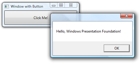
在這個範例中,程式碼後置會實作一個衍生自 Window 類別的類別。 它使用 x:Class 屬性來建立標記與程式碼後置類別的關聯, 並從程式碼後置類別的建構函式呼叫 InitializeComponent,以合併標記中定義的 UI 與程式碼後置類別 ( InitializeComponent 會在建置應用程式時為您產生,這就是為什麼您不需要手動實作它的原因。和 InitializeComponent 的組合 x:Class 可確保您的實作會在建立時正確初始化。 程式碼後置類別也會針對按鈕的 Click 事件實作事件處理常式。 當您按一下按鈕時,事件處理常式會呼叫 System.Windows.MessageBox.Show 方法來顯示訊息方塊。
下圖顯示按下按鈕的結果:
控制項
應用程式模型所傳遞的使用者體驗是已建構的控制項。 在 WPF 中,「控制項」是一個籠統的名詞,泛指裝載於視窗或頁面上之具有使用者介面並實作一些行為的某種 WPF 類別。
如需詳細資訊,請參閱 控制項。
依功能列出 WPF 控制項
以下列出內建 WPF 控制項:
按鈕: Button 和 RepeatButton。
日期顯示和選取: Calendar 和 DatePicker。
對話方塊: OpenFileDialog、 PrintDialog和 SaveFileDialog。
數位筆跡: InkCanvas 和 InkPresenter。
文件: DocumentViewer、 FlowDocumentPageViewer、 FlowDocumentReader、 FlowDocumentScrollViewer和 StickyNoteControl。
輸入: TextBox、 RichTextBox和 PasswordBox。
版面配置: Border、 BulletDecorator、 Canvas、 DockPanel、 Expander、 Grid、 GridView、 GridSplitter、 GroupBox、 Panel、 ResizeGrip、 Separator、 ScrollBar、 ScrollViewer、 StackPanel、 Thumb、 Viewbox、 VirtualizingStackPanel、 Window和 WrapPanel。
媒體: Image、 MediaElement和 SoundPlayerAction。
功能表: ContextMenu、 Menu和 ToolBar。
巡覽: Frame、 Hyperlink、 Page、 NavigationWindow和 TabControl。
選取: CheckBox、 ComboBox、 ListBox、 RadioButton和 Slider。
使用者資訊: AccessText、 Label、 Popup、 ProgressBar、 StatusBar、 TextBlock和 ToolTip。
輸入和命令
控制項最常用來偵測及回應使用者輸入。 WPF 輸入系統 使用直接和路由事件來支援文字輸入、焦點管理和滑鼠定位。
應用程式通常具有複雜的輸入需求。 WPF 提供一個命令系統,將使用者輸入動作與回應這些動作的程式碼區隔開。
版面配置
當您建立使用者介面時,您可依位置和大小排列控制項,以形成一個版面配置。 所有版面配置的一個關鍵需求是隨視窗大小和顯示設定的變更進行調整。 WPF 為您提供一流且可擴充的版面配置系統,而不是強迫您在這些情況下撰寫程式碼來調整版面配置。
這個版面配置系統是以相對定位為基礎,藉此提升依視窗和顯示狀況變更來做調整的能力。 此外,這個版面配置系統可管理控制項之間的交涉,以決定版面配置。 此交涉是兩個步驟的程序:控制項會先指示其父代所需的位置和大小,然後再由父代指示控制項其可擁有的空間。
版面配置系統會透過基底 WPF 類別公開給子控制項。 WPF 針對格線、堆疊和停駐等常見版面配置,提供了數個版面配置控制項:
Canvas:子控制項會提供自己的版面配置。
DockPanel:子控制項會沿著面板邊緣對齊。
Grid:子控制項會依資料列和資料行定位。
StackPanel:子控制項會垂直或水平堆疊。
VirtualizingStackPanel:子控制項會依水平或垂直方向,以單行顯示及排列。
WrapPanel:子控制項會從左至右排序定位,並在目前這一行的控制項超出空間所允許的數目時,換至下一行。
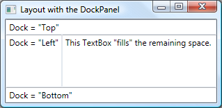
下列範例使用 DockPanel 來配置多個 TextBox 控制項:
<Window
    xmlns="http://schemas.microsoft.com/winfx/2006/xaml/presentation"
    xmlns:x="http://schemas.microsoft.com/winfx/2006/xaml"
    x:Class="SDKSample.LayoutWindow"
    Title="Layout with the DockPanel" Height="143" Width="319">

  <!--DockPanel to layout four text boxes-->
  <DockPanel>
    <TextBox DockPanel.Dock="Top">Dock = "Top"</TextBox>
    <TextBox DockPanel.Dock="Bottom">Dock = "Bottom"</TextBox>
    <TextBox DockPanel.Dock="Left">Dock = "Left"</TextBox>
    <TextBox Background="White">This TextBox "fills" the remaining space.</TextBox>
  </DockPanel>

</Window>
DockPanel 可讓子 TextBox 控制項指示排列方式。 為了執行這項操作,DockPanel 會實作公開給子控制項的 Dock 附加屬性,讓每個控制項都能指定停駐樣式。
注意
WPF 建構是由父控制項實作並可供子控制項使用的屬性,又稱為附加屬性。
下圖顯示上述範例中的 XAML 標記結果:
資料繫結
大多數已建立的應用程式會為使用者提供檢視及編輯資料的方法。 至於 WPF 應用程式,儲存和存取資料的工作已由 SQL Server 和 ADO.NET 等技術提供。 存取資料並將資料載入應用程式的 Managed 物件之後,才會開始 WPF 應用程式的困難工作。 基本上,這涉及兩個動作:
將資料從 Managed 物件複製到控制項,以在其中顯示及編輯資料。
確保使用控制項對資料所做的變更,會複製回 Managed 物件。
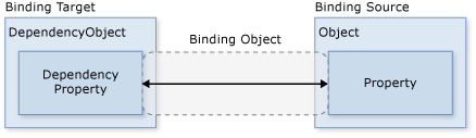
為了簡化應用程式開發工作,WPF 提供資料繫結引擎以自動執行這些步驟。 資料繫結引擎的核心單位是 Binding 類別,其工作是將控制項 (繫結目標) 繫結至資料物件 (繫結來源)。 下圖說明這個關聯性:
下個範例示範如何將 TextBox 繫結至自訂 Person 物件的執行個體。 Person 實作則如下列程式碼所示:
Namespace SDKSample

    Class Person

        Private _name As String = "No Name"

        Public Property Name() As String
            Get
                Return _name
            End Get
            Set(ByVal value As String)
                _name = value
            End Set
        End Property

    End Class

End Namespace
namespace SDKSample
{
    class Person
    {
        string name = "No Name";

        public string Name
        {
            get { return name; }
            set { name = value; }
        }
    }
}
下列標記會將 TextBox 系結至自訂 Person 物件的實例:
 <Window
     xmlns="http://schemas.microsoft.com/winfx/2006/xaml/presentation"
     xmlns:x="http://schemas.microsoft.com/winfx/2006/xaml"
     x:Class="SDKSample.DataBindingWindow">

   <!-- Bind the TextBox to the data source (TextBox.Text to Person.Name) -->
   <TextBox Name="personNameTextBox" Text="{Binding Path=Name}" />

 </Window>
Imports System.Windows ' Window

Namespace SDKSample

    Partial Public Class DataBindingWindow
        Inherits Window

        Public Sub New()
            InitializeComponent()

            ' Create Person data source
            Dim person As Person = New Person()

            ' Make data source available for binding
            Me.DataContext = person

        End Sub

    End Class

End Namespace
using System.Windows; // Window

namespace SDKSample
{
    public partial class DataBindingWindow : Window
    {
        public DataBindingWindow()
        {
            InitializeComponent();

            // Create Person data source
            Person person = new Person();

            // Make data source available for binding
            this.DataContext = person;
        }
    }
}
在這個範例中, Person 類別會在程式碼後置中具現化,並已設定為 DataBindingWindow的資料內容。 在標記中, Text 的 TextBox 屬性已繫結至 Person.Name 屬性 (使用"{Binding ... }" XAML 語法)。 這個 XAML 會指示 WPF 將 TextBox 控制項繫結至儲存在視窗之 Person 屬性中的 DataContext 物件。
WPF 資料繫結引擎還提供其他支援,包括驗證、排序、篩選和群組。 此外,資料繫結可在標準 WPF 控制項所顯示的使用者介面不適用時,使用資料範本來建立繫結資料的自訂使用者介面。
如需詳細資訊,請參閱資料繫結概觀。
圖形
WPF 引進了一組詳盡、可擴充且彈性的圖形功能,其優點如下:
解析度獨立與裝置獨立圖形。 WPF 圖形系統的基本測量單位是裝置獨立畫素,不論實際螢幕解析度為何,都是 1 英吋的 1/96,並會為解析度獨立與裝置獨立轉譯提供基礎。 每個裝置獨立畫素會依轉譯所在系統的 DPI (每英吋的點數) 設定來自動調整。
改進精確度。 WPF 座標系統是使用雙精確度浮點數進行測量,而不是單精確度。 轉換和透明度值也會以雙精確度來表示。 WPF 也支援廣色域 (scRGB),並提供整合式支援,以管理來自不同色彩空間的輸入。
進階圖形和動畫支援: WPF 藉由為您管理動畫場景來簡化圖形程式設計;您不需要擔心場景處理、轉譯迴圈和雙線性插補。 此外,WPF 還提供叫用測試支援和完整的 alpha 複合支援。
硬體加速: WPF 圖形系統利用圖形硬體將 CPU 使用量降到最低。
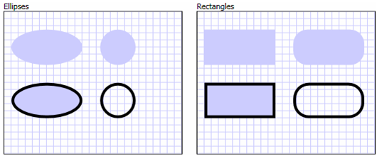
2D 圖形
WPF 提供以通用向量繪製之 2D 圖形的圖庫,例如下圖所示的矩形和橢圓形:
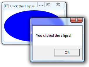
圖案有趣的一點是它不僅用於顯示,還可實作許多您預期控制項會有的功能,包括鍵盤和滑鼠輸入。 下列範例顯示 MouseUp 所處理的 事件 Ellipse :
<Window
    xmlns="http://schemas.microsoft.com/winfx/2006/xaml/presentation"
    xmlns:x="http://schemas.microsoft.com/winfx/2006/xaml"
    x:Class="SDKSample.EllipseEventHandlingWindow"
    Title="Click the Ellipse">
    <Ellipse Name="clickableEllipse" Fill="Blue" MouseUp="clickableEllipse_MouseUp" />
</Window>
Imports System.Windows ' Window, MessageBox
Imports System.Windows.Input ' MouseButtonEventArgs

Namespace SDKSample

    Public Class EllipseEventHandlingWindow
        Inherits Window

        Public Sub New()
            InitializeComponent()
        End Sub

        Private Sub clickableEllipse_MouseUp(ByVal sender As Object, ByVal e As MouseButtonEventArgs)
            MessageBox.Show("You clicked the ellipse!")
        End Sub

    End Class

End Namespace
using System.Windows; // Window, MessageBox
using System.Windows.Input; // MouseButtonEventHandler

namespace SDKSample
{
    public partial class EllipseEventHandlingWindow : Window
    {
        public EllipseEventHandlingWindow()
        {
            InitializeComponent();
        }

        void clickableEllipse_MouseUp(object sender, MouseButtonEventArgs e)
        {
            // Display a message
            MessageBox.Show("You clicked the ellipse!");
        }
    }
}
下圖顯示上述程式碼所產生的內容:
如需詳細資訊,請參閱 WPF 中圖案和基本繪圖概觀。
2D 幾何
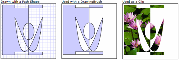
WPF 提供的 2D 圖形涵蓋一組標準的基本圖形。 不過,您可能需要建立自訂圖案,來實現自訂使用者介面的設計。 為了達成這個目的,WPF 提供了幾何。 下圖示範如何使用幾何來建立自訂圖案,您可以直接繪製、當做筆刷來使用,或是用來裁剪其他圖案和控制項。
Path 物件可用來繪製封閉或開放的圖案、多個圖案,甚至是彎曲的圖案。
Geometry 物件可用來裁剪、叫用測試及轉譯 2D 圖表資料。
如需詳細資訊,請參閱幾何概觀。
2D 效果
WPF 2D 功能子集包含漸層、點陣圖、繪圖、利用視訊繪製、旋轉、縮放和傾斜等視覺效果。 這些都是用筆刷達成的:下圖顯示一些範例:
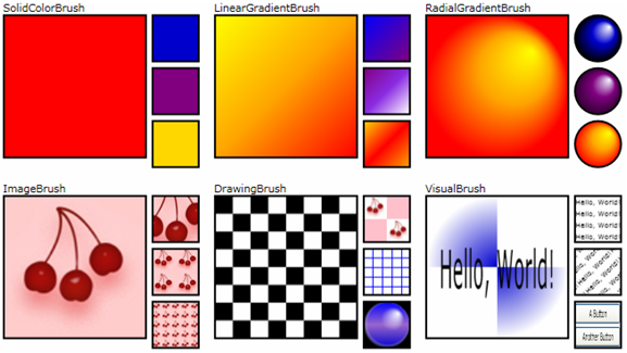
如需詳細資訊,請參閱 WPF 筆刷概觀。
3D 轉譯
WPF 也包含可與 2D 圖形互動的 3D 轉譯功能,以便建立更生動有趣的使用者介面。 例如,下圖顯示轉譯成 3D 圖形的 2D 影像:
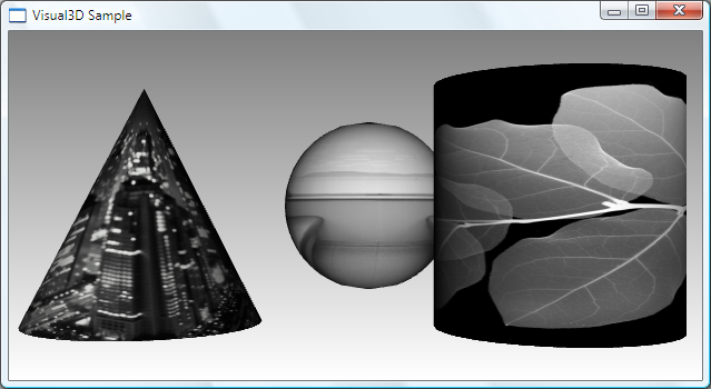
如需詳細資訊,請參閱 3D 圖形診斷。
動畫
WPF 動畫支援可讓您將控制項設為放大、搖晃、旋轉和淡出,以建立有趣的網頁切換及執行其他工作。 您可以建立大多數 WPF 類別的動畫,甚至是自訂類別。 下圖顯示簡單動畫的實際運作方式:
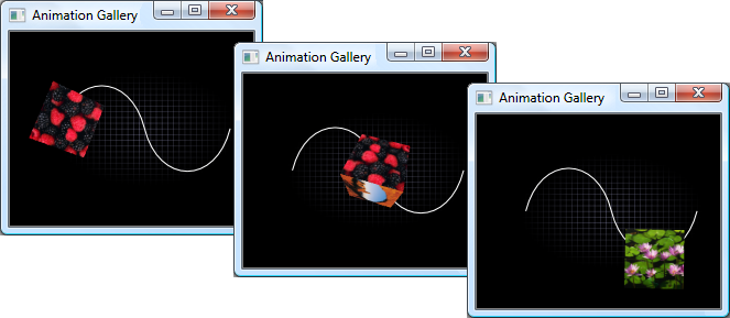
如需詳細資訊,請參閱動畫概觀。
媒體
傳達豐富內容的一個方式是透過視聽媒體。 WPF 提供對影像、視訊和音訊的特殊支援。
圖像
影像是大多數應用程式的共通功能,WPF 提供數種方式來使用影像。 下圖顯示具有包含縮圖影像之清單方塊的使用者介面。 選取縮圖時,會顯示完整大小的影像。
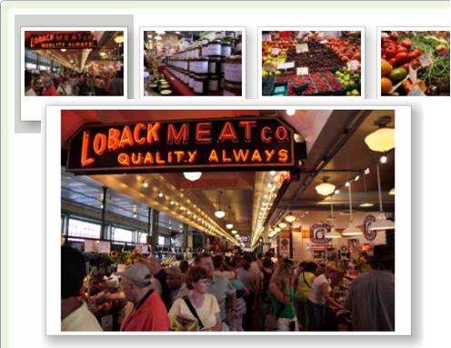
如需詳細資訊,請參閱影像處理概觀。
影片和音訊
MediaElement 控制項可播放視訊和音訊,而且有足夠的彈性可做為自訂媒體播放程式的基礎。 下列 XAML 標記會實作媒體播放機:
<MediaElement
  Name="myMediaElement"
  Source="media/wpf.wmv"
  LoadedBehavior="Manual"
  Width="350" Height="250" />
下圖中的視窗顯示 MediaElement 作用中的控制項:
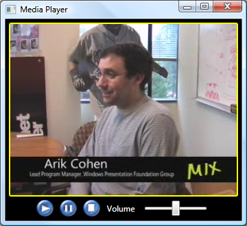
如需詳細資訊,請參閱圖形和多媒體。
文字和印刷樣式
為了達成高品質文字轉譯,WPF 提供下列功能:
OpenType 字型支援。
ClearType 增強功能。
利用硬體加速的高效能。
將文字與媒體、圖形和動畫進行整合。
國際字型支援和後援機制。
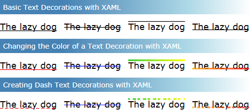
為了示範文字與圖形的整合,下圖顯示文字裝飾的應用:
如需詳細資訊,請參閱 Windows Presentation Foundation 中的印刷樣式。
自訂 WPF 應用程式
到目前為止,您已經認識用於開發應用程式的核心 WPF 建置組塊。 您可以使用應用程式模型,來裝載及傳遞主要由控制項所組成的應用程式內容。 為了簡化使用者介面中的控制項排列方式,並確保不論視窗大小和顯示設定如何變更,都能維持此排列方式,您可以使用 WPF 版面配置系統。 大多數應用程式可讓使用者與資料互動,因此您可以使用資料繫結來減少使用者介面與資料整合的工作。 若要改進應用程式的視覺外觀,您可以使用的 WPF 所提供的各種圖形、動畫和媒體支援。
不過,這些基本功能通常並不足以建立及管理與眾不同且具有豐富視覺效果的使用者介面。 標準 WPF 控制項可能未與應用程式所需的外觀進行整合。 資料可能不會以最有效的方式來顯示。 Windows 佈景主題的預設外觀和風格可能不適合您應用程式的整體使用者介面。 在許多方面,呈現技術除了其他任何類型的擴充性之外,也需要視覺擴充性。
因此,WPF 會提供各種不同的機制來建立唯一的使用者介面,包括控制項、觸發程序、控制項和資料範本、樣式、使用者介面資源,以及佈景主題和面板的豐富內容模型。
內容模型
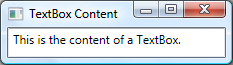
大多數 WPF 控制項的主要用途在於顯示內容。 在 WPF 中,可構成控制項內容的項目類型和數目,稱為控制項的 「內容模型」(Content Model)。 有些控制項可能包含單一內容類型的單一項目;例如, TextBox 的內容是指派給 Text 屬性的字串值。 下列範例會設定 的內容 TextBox :
<Window
    xmlns="http://schemas.microsoft.com/winfx/2006/xaml/presentation"
    xmlns:x="http://schemas.microsoft.com/winfx/2006/xaml"
    x:Class="SDKSample.TextBoxContentWindow"
    Title="TextBox Content">

    <TextBox Text="This is the content of a TextBox." />
</Window>
下圖顯示結果:
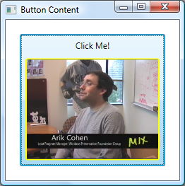
不過,其他控制項可能包含不同內容類型的多個項目; Button屬性所指定的 Content 內容可包含各種項目,包括版面配置控制項、文字、影像和圖案。 下列範例顯示 Button 包含 、、 Label 、、 Border 和 MediaElement 內容的 DockPanel :
<Window
    xmlns="http://schemas.microsoft.com/winfx/2006/xaml/presentation"
    xmlns:x="http://schemas.microsoft.com/winfx/2006/xaml"
    x:Class="SDKSample.ButtonContentWindow"
    Title="Button Content">

  <Button Margin="20">
    <!-- Button Content -->
    <DockPanel Width="200" Height="180">
      <Label DockPanel.Dock="Top" HorizontalAlignment="Center">Click Me!</Label>
      <Border Background="Black" BorderBrush="Yellow" BorderThickness="2"
        CornerRadius="2" Margin="5">
        <MediaElement Source="media/wpf.wmv" Stretch="Fill" />
      </Border>
    </DockPanel>
  </Button>
</Window>
下圖顯示此按鈕的內容:
如需各種控制項所支援之內容類型的詳細資訊,請參閱 WPF 內容模型。
觸發程序
雖然 XAML 標記的主要目的是要實作應用程式的外觀,您也可以使用 XAML 來實作某些方面的應用程式行為。 其中一個範例是使用觸發程序,根據使用者互動來變更應用程式的外觀。 如需詳細資訊,請參閱樣式和範本。
控制項範本
WPF 控制項的預設使用者介面通常是從其他控制項和圖案建構而來。 例如, Button 是由 ButtonChrome 和 ContentPresenter 控制項所組成。 ButtonChrome 提供標準按鈕外觀,而 ContentPresenter 則顯示 Content 屬性所指定的按鈕內容。
有時候,控制項的預設外觀可能與應用程式的整體外觀不搭。 在這種情況下,您可以使用 ControlTemplate 變更控制項使用者介面的外觀,而不需要變更其內容和行為。
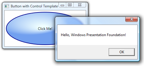
下列範例示範如何使用 來變更 的外觀 ButtonControlTemplate :
<Window
  xmlns="http://schemas.microsoft.com/winfx/2006/xaml/presentation"
  xmlns:x="http://schemas.microsoft.com/winfx/2006/xaml"
  x:Class="SDKSample.ControlTemplateButtonWindow"
  Title="Button with Control Template" Height="158" Width="290">

  <!-- Button using an ellipse -->
  <Button Content="Click Me!" Click="button_Click">
    <Button.Template>
      <ControlTemplate TargetType="{x:Type Button}">
        <Grid Margin="5">
          <Ellipse Stroke="DarkBlue" StrokeThickness="2">
            <Ellipse.Fill>
              <RadialGradientBrush Center="0.3,0.2" RadiusX="0.5" RadiusY="0.5">
                <GradientStop Color="Azure" Offset="0.1" />
                <GradientStop Color="CornflowerBlue" Offset="1.1" />
              </RadialGradientBrush>
            </Ellipse.Fill>
          </Ellipse>
          <ContentPresenter Name="content" HorizontalAlignment="Center"
            VerticalAlignment="Center"/>
        </Grid>
      </ControlTemplate>
    </Button.Template>

  </Button>

</Window>
using System.Windows; // Window, RoutedEventArgs, MessageBox

namespace SDKSample
{
    public partial class ControlTemplateButtonWindow : Window
    {
        public ControlTemplateButtonWindow()
        {
            InitializeComponent();
        }

        void button_Click(object sender, RoutedEventArgs e)
        {
            // Show message box when button is clicked
            MessageBox.Show("Hello, Windows Presentation Foundation!");
        }
    }
}
Imports System.Windows ' Window, RoutedEventArgs, MessageBox

Namespace SDKSample

    Public Class ControlTemplateButtonWindow
        Inherits Window

        Public Sub New()

            InitializeComponent()

        End Sub

        Private Sub button_Click(ByVal sender As Object, ByVal e As RoutedEventArgs)
            MessageBox.Show("Hello, Windows Presentation Foundation!")
        End Sub

    End Class

End Namespace
在這個範例中,預設按鈕的使用者介面已取代成具有深藍色框線的 Ellipse ,並使用 RadialGradientBrush填滿。 控制項 ContentPresenter 會顯示 Button 的內容,「按一下我! Button 按一下 時, Click 仍會引發 事件做為控制項預設行為的一部分 Button 。 其結果如下圖所示:
資料範本
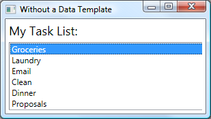
控制項範本可讓您指定控制項的外觀,而資料範本則可讓您指定控制項內容的外觀。 資料範本通常可用來增強繫結資料的顯示方式。 下圖顯示繫結至 Task 物件集合的 ListBox 預設外觀,其中每項工作都有名稱、描述和優先順序:
預設外觀是您可預期的 ListBox外觀。 不過,每項工作的預設外觀只包含工作名稱。 若要顯示工作名稱、描述和優先權,則必須使用 ListBox 變更 DataTemplate控制項之繫結清單項目的預設外觀。 下列 XAML 會定義這類 DataTemplate ,其會使用 ItemTemplate 屬性套用至每個工作:
<Window
  xmlns="http://schemas.microsoft.com/winfx/2006/xaml/presentation"
  xmlns:x="http://schemas.microsoft.com/winfx/2006/xaml"
  x:Class="SDKSample.DataTemplateWindow"
  Title="With a Data Template">
  <Window.Resources>
    <!-- Data Template (applied to each bound task item in the task collection) -->
    <DataTemplate x:Key="myTaskTemplate">
      <Border Name="border" BorderBrush="DarkSlateBlue" BorderThickness="2"
        CornerRadius="2" Padding="5" Margin="5">
        <Grid>
          <Grid.RowDefinitions>
            <RowDefinition/>
            <RowDefinition/>
            <RowDefinition/>
          </Grid.RowDefinitions>
          <Grid.ColumnDefinitions>
            <ColumnDefinition Width="Auto" />
            <ColumnDefinition />
          </Grid.ColumnDefinitions>
          <TextBlock Grid.Row="0" Grid.Column="0" Padding="0,0,5,0" Text="Task Name:"/>
          <TextBlock Grid.Row="0" Grid.Column="1" Text="{Binding Path=TaskName}"/>
          <TextBlock Grid.Row="1" Grid.Column="0" Padding="0,0,5,0" Text="Description:"/>
          <TextBlock Grid.Row="1" Grid.Column="1" Text="{Binding Path=Description}"/>
          <TextBlock Grid.Row="2" Grid.Column="0" Padding="0,0,5,0" Text="Priority:"/>
          <TextBlock Grid.Row="2" Grid.Column="1" Text="{Binding Path=Priority}"/>
        </Grid>
      </Border>
    </DataTemplate>
  </Window.Resources>

  <!-- UI -->
  <DockPanel>
    <!-- Title -->
    <Label DockPanel.Dock="Top" FontSize="18" Margin="5" Content="My Task List:"/>

    <!-- Data template is specified by the ItemTemplate attribute -->
    <ListBox
      ItemsSource="{Binding}"
      ItemTemplate="{StaticResource myTaskTemplate}"
      HorizontalContentAlignment="Stretch"
      IsSynchronizedWithCurrentItem="True"
      Margin="5,0,5,5" />

 </DockPanel>
</Window>
下圖顯示此程式碼的效果:
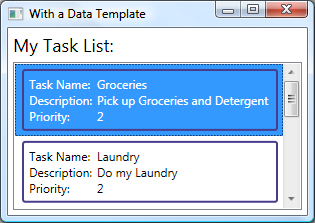
請注意, ListBox 已保留其行為和整體外觀,只會變更清單方塊所要顯示的內容外觀。
如需詳細資訊,請參閱資料範本化概觀。
樣式
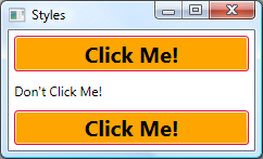
樣式可讓開發人員和設計人員標準化其產品的特定外觀。 WPF 提供強式樣式模型,其中的基礎就是 Style 項目。 下列範例會建立樣式,將視窗上每個 Button 的背景色彩設定為 Orange :
<Window
    xmlns="http://schemas.microsoft.com/winfx/2006/xaml/presentation"
    xmlns:x="http://schemas.microsoft.com/winfx/2006/xaml"
    x:Class="SDKSample.StyleWindow"
    Title="Styles">

    <Window.Resources>
        <!-- Style that will be applied to all buttons for this window -->
        <Style TargetType="{x:Type Button}">
            <Setter Property="Background" Value="Orange" />
            <Setter Property="BorderBrush" Value="Crimson" />
            <Setter Property="FontSize" Value="20" />
            <Setter Property="FontWeight" Value="Bold" />
            <Setter Property="Margin" Value="5" />
        </Style>
    </Window.Resources>
    <StackPanel>

        <!-- This button will have the style applied to it -->
        <Button>Click Me!</Button>

        <!-- This label will not have the style applied to it -->
        <Label>Don't Click Me!</Label>

        <!-- This button will have the style applied to it -->
        <Button>Click Me!</Button>

    </StackPanel>
</Window>
由於這種樣式是以所有 Button 控制項為目標,系統會將該樣式自動套用至視窗中的所有按鈕,如下圖所示:
如需詳細資訊,請參閱樣式和範本。
資源
應用程式中的控制項應該共用相同的外觀,可包含從字型和背景色彩,到控制項範本、資料範本和樣式的任何項目。 您可以使用 WPF 對使用者介面資源的支援,將這些資源封裝到單一位置以重複使用。
下列範例會定義 Button 和 Label 共用的一般背景色彩:
<Window
    xmlns="http://schemas.microsoft.com/winfx/2006/xaml/presentation"
    xmlns:x="http://schemas.microsoft.com/winfx/2006/xaml"
    x:Class="SDKSample.ResourcesWindow"
    Title="Resources Window">

  <!-- Define window-scoped background color resource -->
  <Window.Resources>
    <SolidColorBrush x:Key="defaultBackground" Color="Red" />
  </Window.Resources>

  <!-- Button background is defined by window-scoped resource -->
  <Button Background="{StaticResource defaultBackground}">One Button</Button>

  <!-- Label background is defined by window-scoped resource -->
  <Label Background="{StaticResource defaultBackground}">One Label</Label>
</Window>
這個範例使用 Window.Resources 屬性項目來實作背景色彩資源。 這項資源可供 Window的所有子系使用。 以下依其解析順序列出各種資源範圍,包括:
個別控制項 (使用繼承的 System.Windows.FrameworkElement.Resources 屬性)。
Window 或 Page (也使用繼承的 System.Windows.FrameworkElement.Resources 屬性)。
上述各種範圍可讓您彈性地定義及共用資源。
除了直接建立資源與特定範圍的關聯之外,您還可以使用個別 ResourceDictionary 封裝一或多項資源,以做為應用程式的其他組件來參考。 例如,下列範例會在資源字典中定義預設背景色彩:
<ResourceDictionary
    xmlns="http://schemas.microsoft.com/winfx/2006/xaml/presentation"
    xmlns:x="http://schemas.microsoft.com/winfx/2006/xaml">

  <!-- Define background color resource -->
  <SolidColorBrush x:Key="defaultBackground" Color="Red" />

  <!-- Define other resources -->
</ResourceDictionary>
下列範例會參考上一個範例中定義的資源字典,以便跨應用程式共用資源字典:
<Application
    xmlns="http://schemas.microsoft.com/winfx/2006/xaml/presentation"
    xmlns:x="http://schemas.microsoft.com/winfx/2006/xaml"
    x:Class="SDKSample.App">

  <Application.Resources>
    <ResourceDictionary>
      <ResourceDictionary.MergedDictionaries>
        <ResourceDictionary Source="BackgroundColorResources.xaml"/>
      </ResourceDictionary.MergedDictionaries>
    </ResourceDictionary>
  </Application.Resources>
</Application>
資源與資源字典是 WPF 支援佈景主題和面板的基礎。
如需詳細資訊,請參閱資源。
自訂控制項
雖然 WPF 提供許多自訂支援,但是您可能還是會遇到現有 WPF 控制項不符合應用程式或其使用者需求的情況。 這種情況的發生原因包括:
您無法藉由自訂現有 WPF 實作的外觀和風格,來建立所需的使用者介面。
現有 WPF 實作不支援 (或無法輕易支援) 您需要的行為。
不過在這種情況下,您可以利用三種 WPF 模型之一來建立新的控制項。 每個模型各有適用的特定情況,並要求您的自訂控制項衍生自特定 WPF 基底類別。 以下列出這三種模型:
使用者控制項模型: 自訂控制項衍生自 UserControl ,並由一或多個其他控制項所組成。
控制項模型: 自訂控制項衍生自 Control ,並使用範本來建置實作以區隔其行為和外觀,與大多數 WPF 控制項非常類似。 衍生自 Control 比使用者控制項更能夠讓您自由地建立自訂使用者介面,但可能需要投入更多時間。
架構項目模型: 如果其外觀是由自訂轉譯邏輯 (而不是範本) 所定義,自訂控制項衍生自 FrameworkElement 。
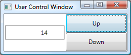
下列範例顯示衍生自 UserControl 的自訂數值向上/向下控制項:
<UserControl
  xmlns="http://schemas.microsoft.com/winfx/2006/xaml/presentation"
  xmlns:x="http://schemas.microsoft.com/winfx/2006/xaml"
  x:Class="SDKSample.NumericUpDown">

  <Grid>

    <Grid.RowDefinitions>
      <RowDefinition/>
      <RowDefinition/>
    </Grid.RowDefinitions>
    <Grid.ColumnDefinitions>
      <ColumnDefinition/>
      <ColumnDefinition/>
    </Grid.ColumnDefinitions>

    <!-- Value text box -->
    <Border BorderThickness="1" BorderBrush="Gray" Margin="2" Grid.RowSpan="2"
      VerticalAlignment="Center" HorizontalAlignment="Stretch">
      <TextBlock Name="valueText" Width="60" TextAlignment="Right" Padding="5"/>
    </Border>

    <!-- Up/Down buttons -->
    <RepeatButton Name="upButton" Click="upButton_Click" Grid.Column="1"
      Grid.Row="0">Up</RepeatButton>
    <RepeatButton Name="downButton" Click="downButton_Click" Grid.Column="1"
      Grid.Row="1">Down</RepeatButton>

  </Grid>

</UserControl>
using System; // EventArgs
using System.Windows; // DependencyObject, DependencyPropertyChangedEventArgs,
                      // FrameworkPropertyMetadata, PropertyChangedCallback,
                      // RoutedPropertyChangedEventArgs
using System.Windows.Controls; // UserControl

namespace SDKSample
{
    public partial class NumericUpDown : UserControl
    {
        // NumericUpDown user control implementation
    }
}
imports System 'EventArgs
imports System.Windows 'DependencyObject, DependencyPropertyChangedEventArgs,
                       ' FrameworkPropertyMetadata, PropertyChangedCallback,
                       ' RoutedPropertyChangedEventArgs
imports System.Windows.Controls 'UserControl

Namespace SDKSample

    ' Interaction logic for NumericUpDown.xaml
    Partial Public Class NumericUpDown
        Inherits System.Windows.Controls.UserControl

        'NumericUpDown user control implementation

    End Class

End Namespace
下列範例說明將使用者控制項納入 所需的 Window XAML:
<Window
    xmlns="http://schemas.microsoft.com/winfx/2006/xaml/presentation"
    xmlns:x="http://schemas.microsoft.com/winfx/2006/xaml"
    x:Class="SDKSample.UserControlWindow"
    xmlns:local="clr-namespace:SDKSample"
    Title="User Control Window">

  <!-- Numeric Up/Down user control -->
  <local:NumericUpDown />

</Window>
下圖顯示 NumericUpDown 中裝載的 Window 控制項:
如需自訂控制項的詳細資訊,請參閱控制項撰寫概觀。
WPF 最佳做法
如同任何開發平台,您可以透過各種方式來使用 WPF,以取得想要的結果。 為了確保您的 WPF 應用程式提供所需的使用者體驗,並符合一般大眾的需求,已針對協助工具、全球化和當地語系化,以及效能提供了建議的最佳作法。 如需詳細資訊,請參閱
下一步
我們已經討論過 WPF 的主要功能。 現在是時候建置您的第一個 WPF 應用程式。
另請參閱
意見反應
即將登場:在 2024 年,我們將逐步淘汰 GitHub 問題作為內容的意見反應機制,並將它取代為新的意見反應系統。 如需詳細資訊,請參閱:https://aka.ms/ContentUserFeedback。
提交並檢視相關的意見反應