Show data in a line, pie, or bar chart in canvas apps
Use line charts, pie charts, and bar charts to display your data in a canvas app. When you work with charts, the data that you import should be structured based on these criteria:
- Each series should be in the first row.
- Labels should be in the leftmost column.
For example, your data should look similar to the following:
| Product | Revenue2012 | Revenue2013 | Revenue2014 |
|---|---|---|---|
| Europa | 21000 | 26000 | 28000 |
| Ganymede | 15000 | 17000 | 21000 |
| Callisto | 14000 | 19000 | 23000 |
You can create and use these charts within Power Apps. Let's get started.
Prerequisites
- Sign up for Power Apps, and then sign in using the same credentials that you used to sign up.
- Create an app from a template, from data, or from scratch.
- Learn how to configure a control in Power Apps.
- Create your own sample data using the example above and save it in Excel. Follow the steps in this topic to import it directly into your app.
Import the sample data
In these steps, we import the sample data into a collection, named ProductRevenue.
On the command bar selelct, Insert > Media > Import.
Set the control's OnSelect property to the following function:
Collect(ProductRevenue, Import1.Data)On the app actions menu, select Preview the app and then select the Import Data button.
In the Open dialog box, select your Excel file, select Open, and then press Esc.
On the app authoring menu select, Variables > Collections.
The ProductRevenue collection should be listed with the chart data you imported.
Note
The import control is used to import Excel-like data and create the collection. The import control imports data when you are creating your app, and previewing your app. Currently, the import control does not import data when you publish your app.
Press Esc to return to the default workspace.
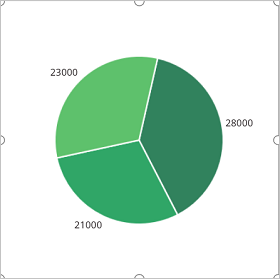
Add a pie chart
On the command bar selelct, Insert > Charts > Pie Chart.
Move the pie chart under the Import data button.
In the pie-chart control, select the middle of the pie chart:
Set the Items property of the pie chart to this expression:
ProductRevenue.Revenue2014
The pie chart shows the revenue data from 2014.
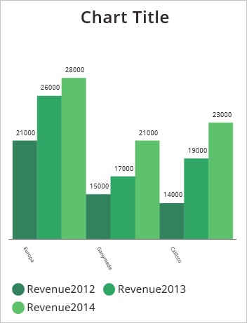
Add a bar chart to display your data
Now, let's use this ProductRevenue collection in a bar chart:
On the command bar, select New screen > Blank.
On the command bar, select Insert > Tree view > Column Chart.
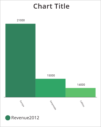
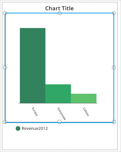
Select the middle of the column chart. Set the Items property of the column chart to
ProductRevenue: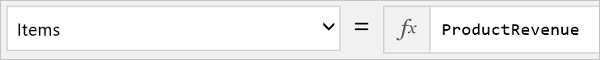
The column chart shows the revenue data from 2012:
In the column chart, select the center square:
On the Chart tab, select Number of Series, and then enter 3 in the formula bar:
The column chart shows revenue data for each product over three years: